100% Security Verified | No Subscription Required | No Malware

Cottagecore Color is associated with comfort, softness, nature, and a slower way of living. Its muted greens, faded florals, warm creams, earthy browns, and gentle pastels can make visual content feel welcoming, nostalgic, and handmade.
These tones work beautifully in video intros, vlog thumbnails, branding, social posts, title cards, and lifestyle edits. Below, you will find Cottagecore Color color palettes with HEX codes for creators and Filmora users who want to build a cozy nature color palette or a vintage cottage color combination with more consistency.
In this article
Soft & Romantic Cottagecore Color Palettes
Rosebud Morning
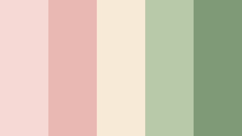
- HEX Codes: #f6d8d5, #e9b8b2, #f7ead7, #b7c9a8, #7f9b76
- Mood: Tender, peaceful, and gently nostalgic.
- Use for: This palette works well for romantic vlog thumbnails, wedding videos, lifestyle branding, and soft social content.
Rosebud Morning blends faded rose, cream, and botanical green for a delicate countryside feeling. The pale pink tones bring warmth and emotion, while the soft greens keep the design connected to gardens, leaves, and natural textures.
Use this palette for warm introductions, personal stories, wedding edits, elegant editorial graphics, and lifestyle thumbnails. Pair the darker green with cream or blush text to create readable overlays without losing the gentle Cottagecore Color mood.
Pro Tip: Enhance Your Cottagecore Color Visuals with Filmora
Filmora can help you carry the Rosebud Morning look through an entire edit instead of limiting it to one thumbnail or title card. Use the blush and cream tones for intro graphics, lower thirds, and transitions, then echo the botanical greens in b-roll, captions, and end screens.
For a more unified cottagecore color themed video, apply similar adjustments to indoor and outdoor clips. A consistent balance of warm highlights, soft contrast, and muted greens can make footage from different locations feel like part of the same visual story.
AI Color Palette
Creators can use a reference image, mood board, or Rosebud Morning color card to guide the look of an entire project. Filmora's AI Color Palette feature helps transfer the visual character of the reference to selected clips, which is useful when combining camera footage, phone videos, and downloaded assets.
This workflow is especially helpful for vlogs and social edits where the intro, talking-head footage, and b-roll need to share the same soft romantic finish.
 secure download


HSL, Color Wheels & Curves
Use HSL controls to soften overly bright reds, shift greens toward a muted sage, or reduce saturation in blue areas. Color wheels can add a little warmth to highlights and a subtle green or neutral balance to shadows, helping Rosebud Morning feel cinematic rather than flat.
Curves are useful for creating a gentle matte finish and protecting the pale cream tones from becoming too stark. Keep skin tones natural, then use the same adjustments across clips to maintain a calm, cohesive visual rhythm.
secure download1000+ Video Filters & 3D LUTs
Filmora's creative library can quickly transform Rosebud Morning into a polished aesthetic color palette for vlog content. Start with a soft, warm filter, then reduce its intensity so the blush and cream tones remain natural in faces, fabrics, and daylight scenes.
Filmora's video filters and 3D LUTs make it easy to test several versions of the look. Choose a lighter treatment for wedding videos and a slightly deeper version for cinematic lifestyle montages.
secure downloadLavender Lace
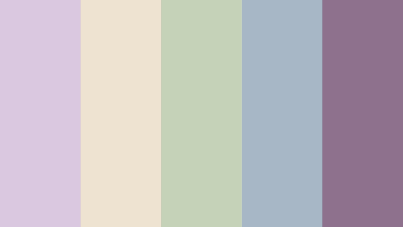
- HEX Codes: #d9c8df, #eee2d1, #c6d2b8, #a8b7c5, #8e718c
- Mood: Dreamy, graceful, and quietly whimsical.
- Use for: This palette is ideal for dreamy fashion reels, handmade product packaging, journaling content, and delicate video overlays.
Lavender Lace pairs muted purple with lace cream, sage, and dusty blue. It creates a refined cottage feeling for calm, artistic, and feminine designs, especially when the darkest mauve is reserved for text, borders, or small graphic details.
Use it for fashion reels, journaling videos, handmade product packaging, and delicate title sequences. The pale colors work well as backgrounds, while dusty blue and mauve provide enough contrast for captions and logo elements.
Honeyed Petals
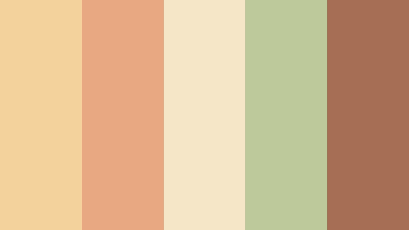
- HEX Codes: #f3d39b, #e8a982, #f5e6c8, #bdc99b, #a66f55
- Mood: Sunny, welcoming, and softly rustic.
- Use for: Use this palette for recipe videos, cozy brand intros, farmers market graphics, and cheerful lifestyle thumbnails.
Honeyed Petals combines golden honey, apricot, cream, and leafy green. The palette feels like sunlight across a cottage kitchen, with enough warmth to make food, interiors, and friendly personal content appear inviting.
Use cream for large backgrounds, honey and apricot for accents, and leafy green for supporting details. The deep brown adds definition to thumbnail text and helps a cheerful Cottagecore Color design remain readable.
Misty Rose Window

- HEX Codes: #e5c4c0, #c99b9b, #d9dfd0, #f1e9da, #8b9b86
- Mood: Quiet, reflective, and softly vintage.
- Use for: This palette works well for slow living videos, poetic title cards, skincare branding, and nostalgic photo collages.
Misty Rose Window uses muted rose, pale sage, and warm ivory to evoke a rainy afternoon beside an old cottage window. It brings softness and intimacy to visual projects without appearing overly bright or decorative.
Apply it to slow living edits, skincare branding, poetic intros, and nostalgic photo slideshows. Pale ivory is useful for text panels, while the darker sage can anchor logos, subtitles, and framing elements.
Meadow & Garden Cottagecore Color Palettes
Wildflower Meadow
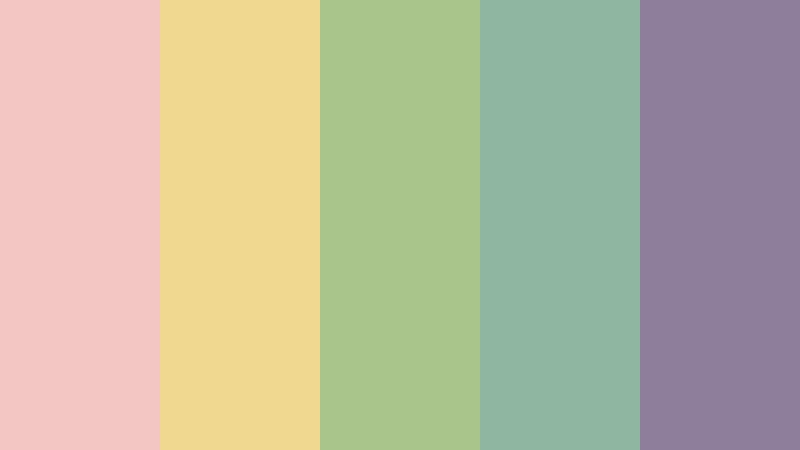
- HEX Codes: #f2c6c2, #f0d88f, #a9c58b, #8fb6a0, #8f7d9c
- Mood: Playful, fresh, and full of natural joy.
- Use for: Use this palette for garden tutorials, cheerful vlog covers, seasonal campaigns, and bright nature-inspired social posts.
Wildflower Meadow brings together poppy pink, butter yellow, meadow green, and soft lavender. It feels lively without losing the gentle charm of cottage design, making it a strong option for colorful but approachable content.
Use yellow and pink as small accents in thumbnails, then let the greens create a natural base. Lavender can add variety to captions, stickers, and transitions in garden tutorials or seasonal social campaigns.
Sage Garden Gate
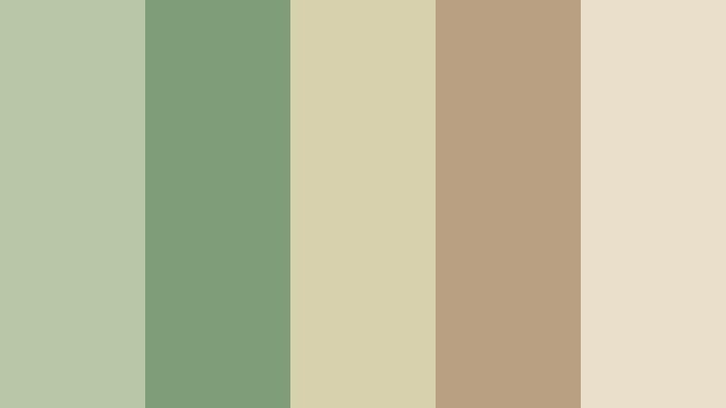
- HEX Codes: #b8c7a5, #7f9d77, #d7d2ad, #b9a083, #eadfca
- Mood: Grounded, restorative, and naturally elegant.
- Use for: This palette is a strong choice for wellness videos, plant brands, eco packaging, home decor content, and calming UI accents.
Sage Garden Gate centers on layered greens with muted clay and creamy beige. It creates a calm garden atmosphere that feels dependable, organic, and well suited to sustainable and slow living themes.
Use the light cream as a background and the deeper sage for headings, logos, or navigation elements. Muted clay can add warmth to home decor videos and prevent an all-green design from feeling too cold.
Bluebell Path
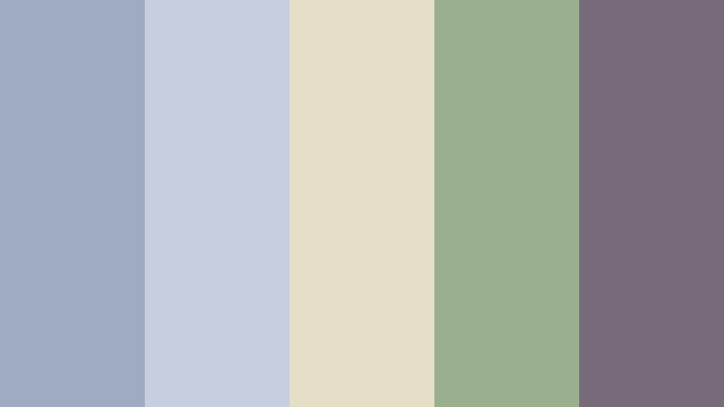
- HEX Codes: #9eabc3, #c5cfe0, #e5dfc8, #9aaf8b, #766b78
- Mood: Serene, airy, and gently mysterious.
- Use for: This palette suits nature documentaries, reflective vlogs, book graphics, travel diaries, and peaceful digital interfaces.
Bluebell Path combines misty blue, stone cream, leafy green, and plum gray. It suggests a quiet woodland trail and adds a thoughtful, storybook quality to designs that need a little mystery.
Use blue for atmospheric backgrounds and cream for readable title cards. Plum gray creates a refined contrast for book graphics, travel diaries, and reflective video captions, while green keeps the palette connected to the outdoors.
Apple Orchard Picnic
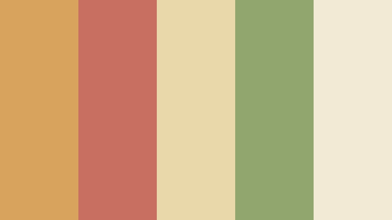
- HEX Codes: #d7a35d, #c96f61, #e9d8aa, #91a66f, #f3ead5
- Mood: Cheerful, homespun, and inviting.
- Use for: Use this palette for food videos, picnic invitations, farm branding, seasonal thumbnails, and friendly family content.
Apple Orchard Picnic mixes warm apple red, harvest gold, leafy green, and picnic cream. It feels abundant and approachable while keeping a soft vintage finish that works well for food and family storytelling.
Reserve apple red for calls to action, labels, or thumbnail accents, and use cream to create breathing room. Gold and green can support recipe graphics, farm branding, and seasonal video transitions.
Earthy & Rustic Cottagecore Color Palettes
Mossy Farmhouse
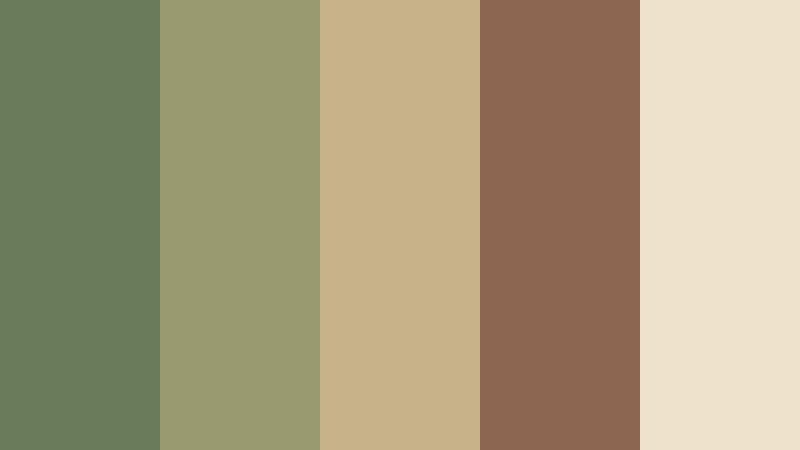
- HEX Codes: #697b5b, #9a9a70, #c8b28a, #8c6650, #eee2ca
- Mood: Rustic, steady, and connected to the land.
- Use for: This palette works well for farm-to-table brands, woodworking videos, rustic logos, documentary graphics, and earthy product packaging.
Mossy Farmhouse pairs deep moss with olive, weathered wood, straw, and warm cream. It delivers a grounded countryside mood with strong readability and natural contrast.
The deep moss and brown are effective for logos, subtitles, and title cards, while straw and cream can brighten layouts. Use this combination for farm content, documentary graphics, and packaging that needs to feel durable and authentic.
Clay Hearth
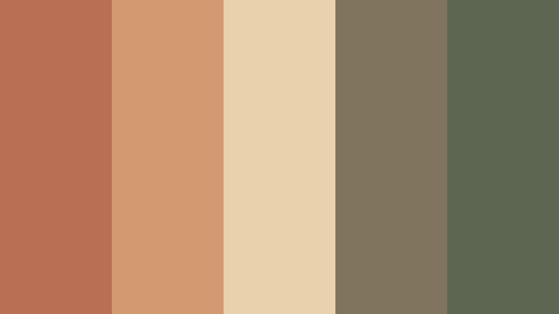
- HEX Codes: #b86f54, #d39a72, #ead1ad, #81745f, #5d6651
- Mood: Warm, comforting, and handcrafted.
- Use for: Use this palette for pottery brands, cooking channels, craft tutorials, artisan packaging, and cozy interior design content.
Clay Hearth layers terracotta, biscuit, taupe, and deep olive for a tactile handmade feeling. Its warm colors suggest fired pottery, freshly baked food, wood, and natural materials.
It is especially effective in projects centered on craft, food, and home. Use biscuit or pale beige behind text, terracotta for visual emphasis, and olive or taupe for supporting graphics and subtle contrast.
Woodland Pantry
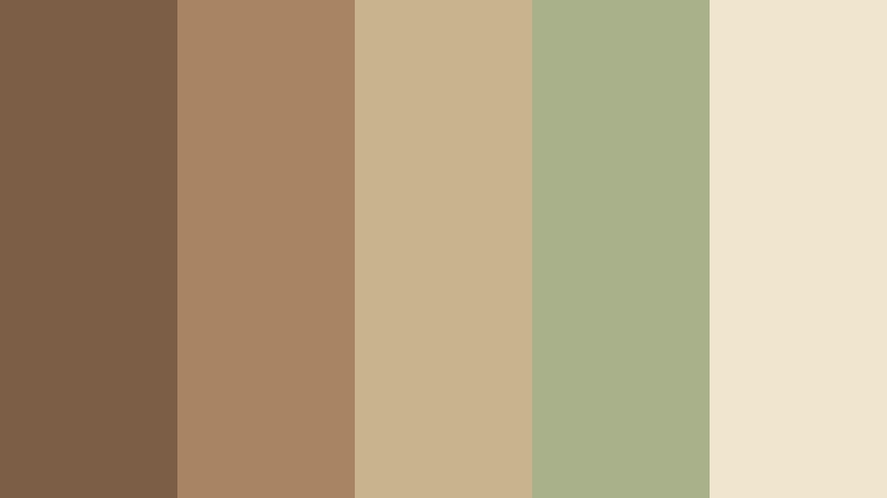
- HEX Codes: #7b5e45, #a88462, #c8b38c, #a8b18a, #f0e5cf
- Mood: Comforting, practical, and richly nostalgic.
- Use for: This palette is suited to recipe thumbnails, pantry labels, homestead content, rustic websites, and vintage-inspired brand systems.
Woodland Pantry combines walnut brown, oat beige, muted sage, and flour cream. The palette feels like handwritten labels and shelves filled with homemade provisions, creating a practical yet nostalgic visual identity.
Use brown for headings and borders, cream for backgrounds, and sage for natural accents. The warm oat tone can connect footage of bread, wood, dried herbs, and kitchen surfaces in a cohesive recipe video.
Autumn Cottage Road

- HEX Codes: #a85f48, #c58a54, #d8b477, #7b8060, #5d5960
- Mood: Nostalgic, mellow, and richly seasonal.
- Use for: This palette works for autumn reels, travel films, book covers, seasonal campaigns, and cinematic countryside montages.
Autumn Cottage Road blends russet, ochre, faded green, and charcoal mauve. It gives cottagecore visuals a deeper seasonal tone while preserving warmth and a sense of open-air comfort.
Use russet and ochre to emphasize changing leaves, warm interiors, and sunset footage. Charcoal mauve can add a cinematic anchor to titles and credits, while faded green keeps the palette tied to the countryside.
Vintage & Whimsical Cottagecore Color Palettes
Tea Room Heirloom
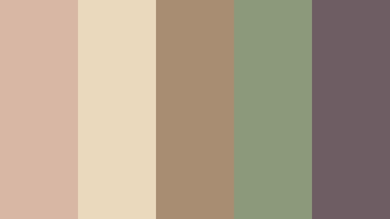
- HEX Codes: #d8b8a5, #ead9bd, #a98d72, #8c9a7b, #6e5d62
- Mood: Elegant, nostalgic, and softly collected.
- Use for: Use this palette for vintage lifestyle channels, tea branding, editorial templates, stationery, and refined social media graphics.
Tea Room Heirloom pairs dusty blush with antique cream, muted brown, sage, and mauve. It evokes floral china, old photographs, and quiet afternoon rituals without looking overly formal.
This palette works well for refined intros, stationery, tea branding, and editorial content. Use antique cream for open space, dusty blush for gentle emphasis, and mauve for small but readable text elements.
Storybook Attic
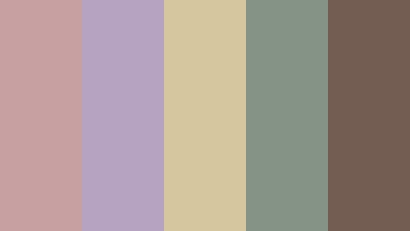
- HEX Codes: #c7a1a1, #b6a3c2, #d5c69f, #849386, #735c51
- Mood: Magical, introspective, and charmingly old-fashioned.
- Use for: This palette is ideal for bookish videos, fantasy edits, handmade journals, creative portfolios, and whimsical title sequences.
Storybook Attic blends faded pink, dusty lilac, parchment, and antique green. It creates a treasured, imaginative feeling for narrative and literary visuals, especially when paired with paper textures or gentle film grain.
Use parchment as the main background for titles and portfolios, then add lilac and faded pink for decorative details. Antique green and brown provide structure for book covers, fantasy edits, and handmade journal content.
Pressed Flower Journal
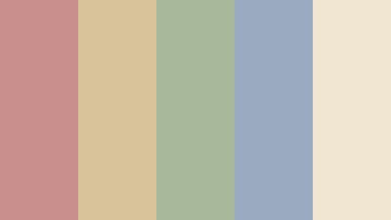
- HEX Codes: #c98f8c, #d8c39b, #a8b89b, #9aabc0, #f1e6d2
- Mood: Creative, delicate, and memory-filled.
- Use for: Use this palette for journaling content, scrapbook videos, stationery brands, creative workshops, and sentimental photo slideshows.
Pressed Flower Journal combines faded floral tones with sage, dusty blue, and paper cream. It feels personal and handcrafted, making it ideal for memory-driven designs and content built around small details.
Paper cream gives scrapbook layouts a light foundation, while faded rose and dusty blue can separate chapters or themes. Sage adds a natural touch that works well with pressed flower imagery, handwritten captions, and sentimental video transitions.
Tips for Creating Cottagecore Color Color Palettes
A successful Cottagecore Color palette should feel natural, readable, and consistent with the story behind the content. Combine soft botanical shades with warm neutrals, then add one darker color for structure and contrast in video and design.
- Use cream, parchment, or pale beige as a background so muted colors remain visible without creating harsh contrast.
- Choose one deep shade, such as moss, walnut, olive, or mauve, for subtitles, logos, borders, and important thumbnail text.
- Limit bright accent colors to small areas so the overall design keeps its calm, handmade Cottagecore Color character.
- Match the palette to your footage. Greens and creams suit gardens and kitchens, while blush, lavender, and dusty blue work well with bedrooms, journals, and soft daylight.
- Check text readability on mobile screens, especially when using pale pink, yellow, or sage behind white lettering.
- Keep branding consistent by assigning specific colors to recurring elements such as intro cards, lower thirds, calls to action, and end screens.
- Use HSL adjustments to reduce oversaturated colors in footage that looks too modern or vivid for a vintage cottage style.
- Test the palette in both landscape and vertical formats so thumbnails, reels, and video covers remain balanced across platforms.
Cottagecore Color palettes can shape the emotional direction of a project before viewers hear the first line of narration. Soft roses and creams can suggest tenderness, layered greens can communicate restoration, and earthy browns can make a brand feel grounded and handmade.
Whether you are editing a slow living vlog, designing a recipe channel, or building a vintage-inspired brand system, these combinations give you a practical starting point. Use the HEX codes as a guide, then adjust saturation and contrast to match your footage and audience.
Filmora makes it easier to test these Cottagecore Color palette ideas across full videos, intros, b-roll, thumbnails, and social edits. Try a reference-based color match, fine-tune the result with HSL and curves, and explore filters or LUTs until the final look feels consistent.
secure download