100% Security Verified | No Subscription Required | No Malware

Instagram Color Palette colors often lean into identity first and decoration second. Soft pinks can feel warm and approachable, neon brights can boost urgency and excitement, while muted neutrals can make a feed look polished and premium. In video, these tones do more than look pretty - they shape the mood of a thumbnail, intro, lower third, reel cover, or branded title card in just a few seconds.
This article gives creators and Filmora users a set of Instagram Color Palette color palettes with HEX codes, so you can build a consistent look across thumbnails, reels, stories, branding, and social posts. Whether you want a soft feed aesthetic palette or a bold creator identity palette, these combinations make it easier to keep your visuals cohesive.
In this article
Soft Blush And Dreamy Instagram Color Palettes
Blush Hour Glow
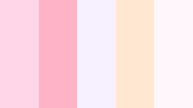
- HEX Codes: #ffd6e7, #ffb3c7, #f7f0ff, #ffe7d1, #fff7fb
- Mood: soft, romantic, and airy
- Use for: Use this palette for dreamy thumbnails, gentle intro cards, and beauty or lifestyle social content.
Blush Hour Glow feels delicate and polished, with pastel pinks and creamy highlights that give every frame a light, floating effect. It is a strong fit for soft branding, wedding edits, and content that should feel warm without becoming too saturated.
Use it for intro cards, reel covers, and subtle text overlays when you want your visuals to feel feminine and refined. The palette also works well for feed planning because the tones stay coordinated across photos, titles, and motion graphics.
Pro Tip: Keep Blush Hour Glow Soft And Cinematic In Filmora
Blush Hour Glow can stay consistent across an edit when you reuse the same pink, cream, and lilac accents in titles, transitions, and overlays. In Filmora, that makes it easier to build a matching look for intro screens, b-roll captions, and thumbnail frames without losing the airy mood.
If you are cutting beauty clips, wedding highlights, or lifestyle reels, use the palette as a visual guide for text boxes, stickers, and background plates. Small color repeats help the whole project feel intentional from the first shot to the final outro.
AI Color Palette
Filmora's AI Color Palette feature lets you sample this blush set from a reference image or color card and apply it across an entire video. That makes it easy to keep your intro, talking-head shots, and B-roll aligned with the same soft brand look.
For creator workflows, this is especially useful when you want every scene to share the same warm pastel tone. Instead of correcting each clip one by one, you can match the palette once and keep the mood stable throughout the edit.
 secure download


HSL, Color Wheels & Curves
Use HSL to soften the pinks and lift the cream tones so the palette stays clean instead of looking heavy. With color wheels and curves, you can warm the mids and keep the highlights bright for a gentle, dreamy finish that works well in lifestyle edits.
If you want a deeper look at fine-tuning color balance, Filmora's color correction tools help shape the same palette into a more polished result. A small lift in shadows or a soft curve in the highlights can make thumbnails and intro cards feel more professional.
secure download1000+ Video Filters & 3D LUTs
Filmora's video filters and 3D LUTs make it easy to push this palette into a more stylized pastel aesthetic. A soft filter can brighten the whites, smooth skin tones, and keep blush colors from drifting too orange.
For reels, thumbnails, and social promos, filters can quickly give the whole project one unified finish. That saves time when you need the same gentle mood across multiple clips, cover images, and branded transitions.
secure downloadPetal Feed Pastels
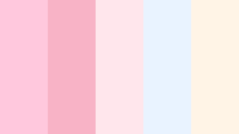
- HEX Codes: #ffc8dd, #f8b4c6, #ffe5ec, #e8f3ff, #fff4e6
- Mood: sweet, playful, and calm
- Use for: Use this palette for story covers, pastel reels, and bright lifestyle visuals that need a friendly look.
Petal Feed Pastels blends blush pink with soft sky tones for a fresh, approachable look. The palette feels friendly and modern, which makes it a strong choice for creator pages, product launches, and gentle lifestyle branding.
Use it when you want your feed to feel cohesive without becoming too heavy or dramatic. It works especially well for story highlights, playful reels, and cover images that need a soft, welcoming mood.
Morning Story Bloom

- HEX Codes: #fde2e4, #fad2e1, #e2ece9, #bee1e6, #fff1e6
- Mood: fresh, gentle, and optimistic
- Use for: Use this palette for morning routine edits, wellness content, and soft branded overlays.
Morning Story Bloom mixes airy pink, mint, and cream for a clean but cozy effect. It feels bright and calm at the same time, which makes it a great match for wellness channels and personal branding.
This palette can support morning routine edits, journal style content, and soft social graphics with an optimistic tone. It also gives text overlays enough contrast to stay readable while keeping the whole frame light.
Rosy Grid Whisper
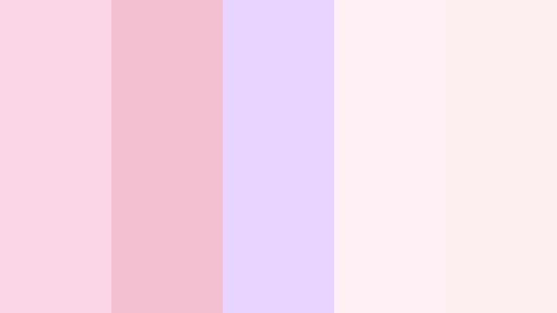
- HEX Codes: #f9d5e5, #f2c1d1, #e7d5ff, #fff0f5, #fcefee
- Mood: elegant, tender, and dreamy
- Use for: Use this palette for subtle post templates, creator quotes, and polished Instagram feed planning.
Rosy Grid Whisper keeps things delicate with muted rose and lavender notes. It has an editorial softness that feels refined, making it a natural choice for feminine branding and understated promo layouts.
Use it for quote cards, soft banner graphics, and feed planning when you want a dreamy but controlled look. The palette is gentle enough for beauty content, yet structured enough for clean template systems.
Bold Neon And High Energy Instagram Color Palettes
Neon Reel Pop
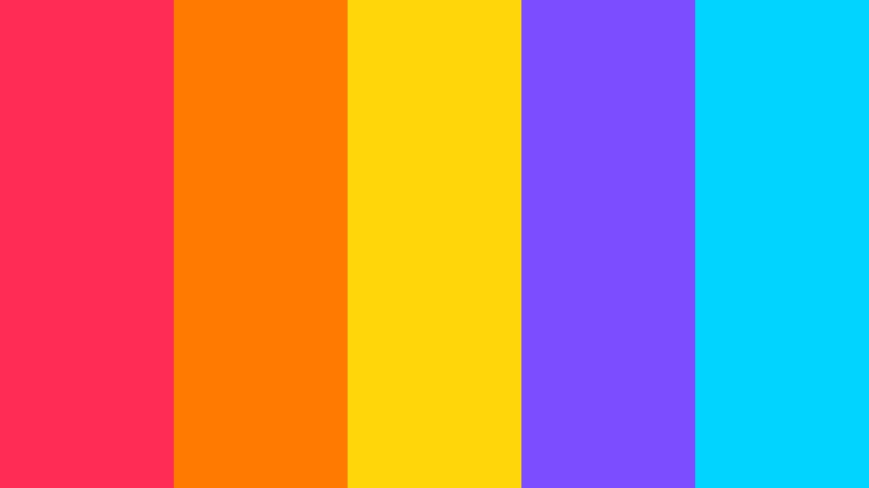
- HEX Codes: #ff2d55, #ff7a00, #ffd60a, #7c4dff, #00d4ff
- Mood: loud, energetic, and trend forward
- Use for: Use this palette for reel covers, motion graphics, and fast paced social edits that need instant attention.
Neon Reel Pop delivers sharp contrast and electric punch in every frame. The bright mix of pink, orange, yellow, purple, and cyan makes it ideal for bold content that needs to stand out immediately.
Use it for creator intros, announcement cards, and viral style edits where attention matters most. It brings strong movement to thumbnails and motion graphics without needing complex design elements.
Creator Pink Rush
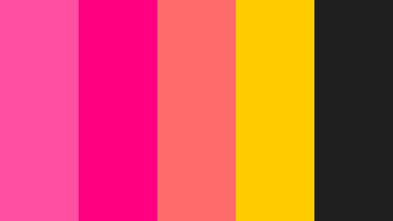
- HEX Codes: #ff4fa3, #ff0080, #ff6b6b, #ffcc00, #1f1f1f
- Mood: bold, vibrant, and high impact
- Use for: Use this palette for channel branding, standout thumbnails, and energetic campaign visuals.
Creator Pink Rush pairs hot pink with strong accent colors for a fearless social look. It feels lively and modern, with enough dark contrast to keep the design from becoming too sweet.
This palette works well for fashion content, promo graphics, and bold video branding. Use it when your thumbnail or reel cover needs a clear visual hook that still feels on brand.
Electric Story Splash
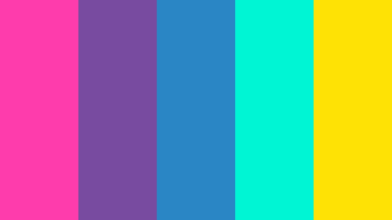
- HEX Codes: #ff3cac, #784ba0, #2b86c5, #00f5d4, #fce205
- Mood: electric, modern, and expressive
- Use for: Use this palette for animated transitions, tech themed posts, and content that needs a vivid digital edge.
Electric Story Splash combines neon pink, cyan, blue, and gold for a dramatic digital feel. It has a futuristic energy that works well for content with motion, sound, and fast cuts.
Use it for event promos, tech stories, and animated transitions that need to feel vivid and current. The bright contrast also helps key text and icons stay visible in quick social formats.
Sunset Filter Burst

- HEX Codes: #ff5f6d, #ffc371, #ffb347, #8e2de2, #2f80ed
- Mood: sunny, vivid, and cinematic
- Use for: Use this palette for travel edits, summer campaigns, and bold thumbnail art with a warm glow.
Sunset Filter Burst captures the glow of an evening sky with a punchy modern twist. The warm oranges and golds give it a sunlit feel, while the purple and blue accents add a cinematic edge.
It is a strong choice for travel reels, seasonal promos, and colorful social banners. Use it when you want the frame to feel energetic, bright, and easy to remember.
Clean Minimal And Modern Instagram Color Palettes
Glass UI Bloom
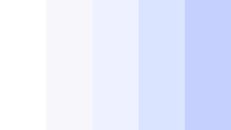
- HEX Codes: #ffffff, #f7f7fb, #eef1ff, #dbe4ff, #c5d0ff
- Mood: clean, calm, and polished
- Use for: Use this palette for UI mockups, minimal title cards, and sleek creator brand systems.
Glass UI Bloom uses cool whites and soft blue tints for a crisp modern look. It feels spacious and refined, which makes it especially useful for interface previews and clean branded layouts.
Use it for product explainers, app content, and minimal social covers where clarity matters more than decoration. The palette keeps the design light while still feeling polished and intentional.
Soft Brand Canvas

- HEX Codes: #faf8f5, #f1ebe3, #e6e0d7, #d9d9d9, #b9c0c8
- Mood: neutral, balanced, and elegant
- Use for: Use this palette for brand decks, clean cover images, and understated social content.
Soft Brand Canvas keeps things neutral with warm beige and gentle gray tones. It creates a premium, understated feel that works well for creators and brands that want to look calm and reliable.
Use it for portfolio pages, packaging mockups, and minimal social content with a clean finish. This palette gives you a flexible base that can support almost any style of text or product imagery.
Modern Grid Linen

- HEX Codes: #fcfcfc, #f4efe8, #e3d5ca, #b08968, #7f5539
- Mood: structured, warm, and modern
- Use for: Use this palette for editorial thumbnails, guide covers, and tasteful lifestyle branding.
Modern Grid Linen balances soft neutrals with earthy brown accents for a grounded look. It feels organized and warm, which makes it a strong fit for editorial layouts and lifestyle content.
Use it for design portfolios, home content, and polished social templates. The palette adds structure without feeling cold, so it can support clean thumbnails and guide covers with ease.
Muted App Accent

- HEX Codes: #f8fafc, #d9e2ec, #9fb3c8, #486581, #243b53
- Mood: professional, calm, and trustworthy
- Use for: Use this palette for app previews, explainer videos, and modern brand assets that need clarity.
Muted App Accent pairs soft blue grays with deeper navy for a clean digital feel. It looks professional and steady, which makes it useful for business content and interface design.
Use it when you need a palette that supports clarity in tutorials, explainers, and modern brand assets. It is especially effective for layouts that need strong readability and simple structure.
Luxe Dark And Editorial Instagram Color Palettes
Midnight Feed Luxe
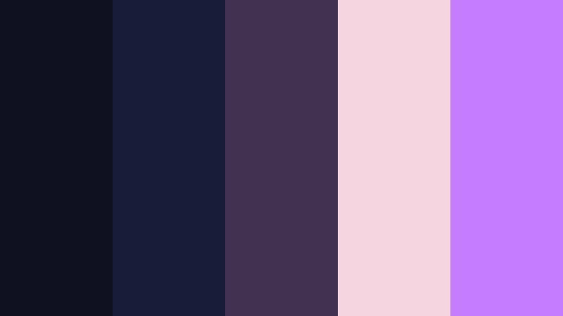
- HEX Codes: #0f1020, #1b1b3a, #3f3351, #f5d5e0, #c77dff
- Mood: moody, luxurious, and refined
- Use for: Use this palette for premium branding, dark mode thumbnails, and dramatic intro sequences.
Midnight Feed Luxe combines deep indigo with soft rose and violet highlights. The result feels polished and dramatic, with a premium edge that suits editorial content and luxury branding.
Use it for dark mode thumbnails, intro sequences, and brand visuals that need a memorable, high-end mood. The contrast between the dark base and the soft highlights helps important details stand out.
Velvet Contrast Suite
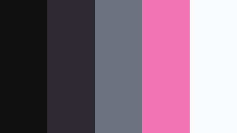
- HEX Codes: #111111, #2d2a32, #6b7280, #f472b6, #f9fafb
- Mood: elegant, bold, and high contrast
- Use for: Use this palette for luxury fashion edits, sleek promo cards, and dramatic presentation slides.
Velvet Contrast Suite uses near black tones with vivid pink for a chic editorial finish. It feels sharp and confident, making it a natural match for fashion, beauty, and premium product visuals.
Use it for promo cards, slides, and cover art that needs strong contrast and a clean luxury feel. The palette is especially effective when you want the pink accent to carry the whole design.
Noir Highlight Frame

- HEX Codes: #0b0f19, #1f2937, #374151, #f59e0b, #e5e7eb
- Mood: cinematic, sharp, and dramatic
- Use for: Use this palette for film style posts, high contrast thumbnails, and premium social storytelling.
Noir Highlight Frame layers dark charcoal with warm gold for a cinematic look. It feels dramatic and intentional, with enough brightness in the accent color to pull the eye exactly where you want it.
Use it for trailer graphics, luxury branding, and bold editorial layouts. This palette is a strong choice when you want your content to look moody but still readable at a glance.
Tips for Creating Instagram Color Palette Color Palettes
When you combine Instagram Color Palette colors with other shades, focus on balance first and decoration second. Strong palettes work best when they support your subject, improve readability, and stay consistent across video, thumbnails, and branded graphics.
- Keep one dominant color and use the rest as accents.
- Check contrast so text stays readable on mobile screens.
- Match the palette to your footage style, lighting, and subject matter.
- Reuse the same tones in titles, overlays, transitions, and end screens.
- Limit neon or dark shades if they distract from faces or product shots.
- Use softer tones for lifestyle content and stronger contrast for promos or reels.
- Build a brand system so your feed, intros, and thumbnails feel connected.
- Test the palette on both light and dark backgrounds before exporting.
Instagram Color Palette styles can define how your audience feels before they even watch the video. From dreamy blush tones to neon energy and editorial darks, the right palette can make your brand look more recognizable and your content more polished.
Try these combinations in Filmora to keep your visuals consistent across reels, thumbnails, intros, and social posts. With the right color choices, even simple edits can feel more deliberate and memorable.
Whether you are building a soft feed aesthetic palette or a bold creator identity palette, Filmora gives you the tools to apply, refine, and repeat that look with less effort.
secure download