100% Security Verified | No Subscription Required | No Malware
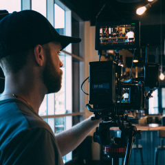
Vintage Color palettes combine softened tones, warm neutrals, and slightly faded accents to create feelings of nostalgia, comfort, and timeless character. These colors often remind viewers of analog film, old photographs, printed posters, travel postcards, and carefully kept personal mementos.
In video and design, Vintage Color can make a project feel more personal and memorable. It works especially well for vlogs, branding, thumbnails, title cards, intros, lifestyle content, and cinematic storytelling. Below, you will find Vintage Color color palettes with HEX codes for creators and Filmora users, along with practical ideas for using each combination.
In this article
Soft & Nostalgic Vintage Color Palettes
Dusty Rose Memory
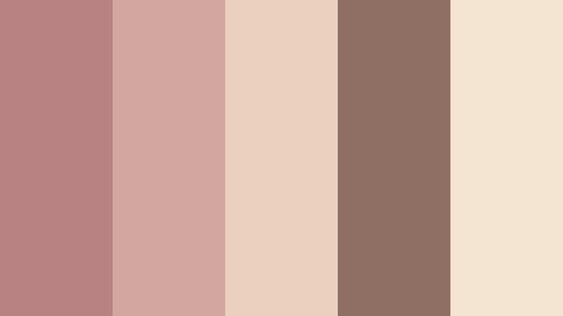
- HEX Codes: #b98282, #d3a6a0, #ead0bd, #8f6f63, #f4e5d3
- Mood: Tender, nostalgic, and quietly romantic.
- Use for: This palette works well for wedding videos, lifestyle thumbnails, personal brand intros, and sentimental social content.
Dusty rose and warm beige create a gentle vintage feeling with a personal, handcrafted touch. The muted pink tones add emotion without becoming overly bright, while the cream shade gives layouts a soft and welcoming base.
Use this palette for wedding highlight videos, relationship stories, beauty branding, and personal introductions. In thumbnails, apply the deeper brown as a readable text color and reserve the lighter cream tones for backgrounds, borders, and subtle overlays.
Pro Tip: Build A Romantic Vintage Color Look in Filmora
Filmora can help you keep the Dusty Rose Memory palette consistent from the opening title to the final frame. Use the warm beige tones for intro cards and transitions, then bring in dusty rose accents for lower thirds, captions, and key moments in your b-roll.
For a cohesive social edit, use the same rose and brown tones in thumbnail text, animated stickers, and end screens. This creates a recognizable visual identity even when your footage changes from indoor portraits to outdoor scenes.
AI Color Palette
Creators can use a reference image, mood board, or color card based on the Dusty Rose Memory palette and apply its visual character across an entire video. Filmora's AI Color Palette feature helps match the look of different clips so the faded pink, cream, and warm brown tones feel connected.
This is useful when a project combines footage recorded in different lighting conditions. Apply the palette to the main video, supporting b-roll, and short-form versions to build a consistent vintage color themed video.
 secure download


HSL, Color Wheels & Curves
Use Filmora's HSL controls to soften the saturation of pinks and oranges while preserving natural skin tones. The color wheels can add a small amount of warmth to the midtones and highlights, while slightly cooling the shadows for a more cinematic contrast.
Curves are useful for creating a gentle faded effect. Lift the black point slightly, reduce harsh highlights, and keep the overall contrast controlled so the footage feels aged rather than flat.
secure download1000+ Video Filters & 3D LUTs
Filmora's video filters and 3D LUTs make it easy to stylize the Dusty Rose Memory palette quickly. Start with a warm film filter, then lower its intensity so the rose, beige, and brown tones remain soft and believable.
Use the filter library to create alternate versions for a long-form video, vertical reel, and thumbnail background. Small adjustments to filter strength can help the same vintage branding colors work across different screen sizes and types of footage.
secure downloadSunday Paper Bloom
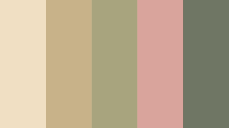
- HEX Codes: #f1dfc4, #c7b28a, #a6a57e, #d8a49c, #6f7764
- Mood: Calm, homely, and warmly nostalgic.
- Use for: This palette is ideal for recipe videos, slow living content, stationery designs, packaging, and cozy channel branding.
Muted green, faded coral, and paper cream evoke an old Sunday newspaper beside a vase of flowers. The combination feels relaxed and approachable, with enough contrast to support clear layouts and gentle editorial storytelling.
Use the cream as a background for recipe cards or channel graphics, then add faded coral for buttons, headings, and transition accents. The muted green is a useful grounding color for logos, subtitles, and botanical or home-focused footage.
Sepia Garden Waltz
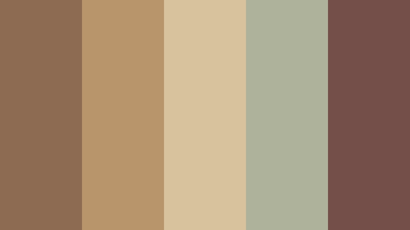
- HEX Codes: #8c6b52, #b9956b, #d8c29d, #aeb29a, #744f4a
- Mood: Earthy, poetic, and softly cinematic.
- Use for: Use this palette for nature documentaries, travel reels, historical storytelling, book covers, and rustic product visuals.
Sepia brown and faded sage form a cinematic garden-inspired combination. The warm browns give the design a grounded quality, while the soft green adds a natural note that keeps the palette from feeling too heavy.
It is a strong choice for historical videos, slow travel edits, and rustic branding. Try using the dark plum-brown for title cards and the pale sand tone for maps, captions, or textured paper backgrounds.
Porcelain Keepsake
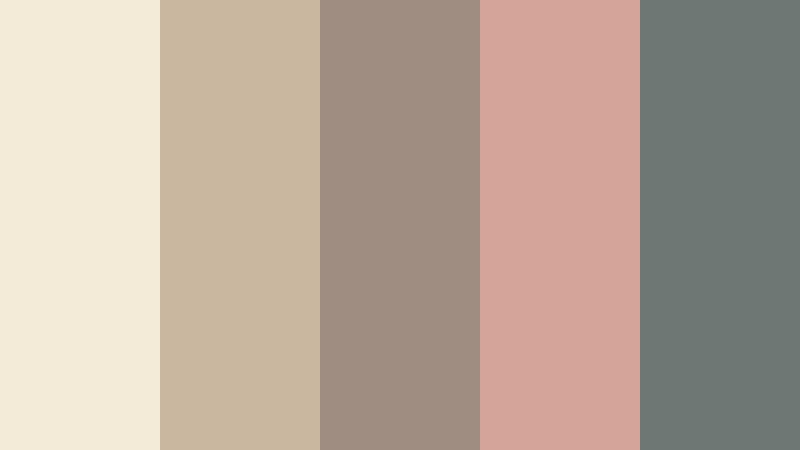
- HEX Codes: #f3ead8, #c9b7a0, #9f8d82, #d4a39a, #6e7774
- Mood: Delicate, refined, and sentimental.
- Use for: This palette fits beauty tutorials, handmade product packaging, elegant social templates, and soft-focus video overlays.
Porcelain cream, muted mauve, and weathered teal give this palette the feel of a cherished heirloom. Its pale base creates a polished appearance, while the faded teal provides a subtle contrast for modern digital design.
Use it for beauty intros, handmade product showcases, and refined social templates. The mauve works well for decorative details, while the teal can make small text elements and icons easier to distinguish.
Cottage Film Fade
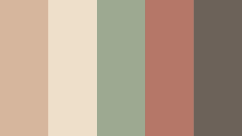
- HEX Codes: #d6b69c, #eee0c8, #9caa91, #b47768, #6c6259
- Mood: Relaxed, rustic, and warmly familiar.
- Use for: Use it in cottagecore videos, home tours, outdoor vlogs, craft content, and relaxed lifestyle thumbnails.
Faded clay, soft cream, and sage green create an inviting cottage film effect. The combination feels natural and friendly, with a quiet warmth that works well for everyday stories and handmade projects.
Use the cream and clay tones for thumbnail backgrounds, then introduce sage in borders, labels, and lower thirds. A small amount of charcoal gray can improve readability without disturbing the relaxed mood.
Bold & Earthy Vintage Color Palettes
Record Shop Sunset
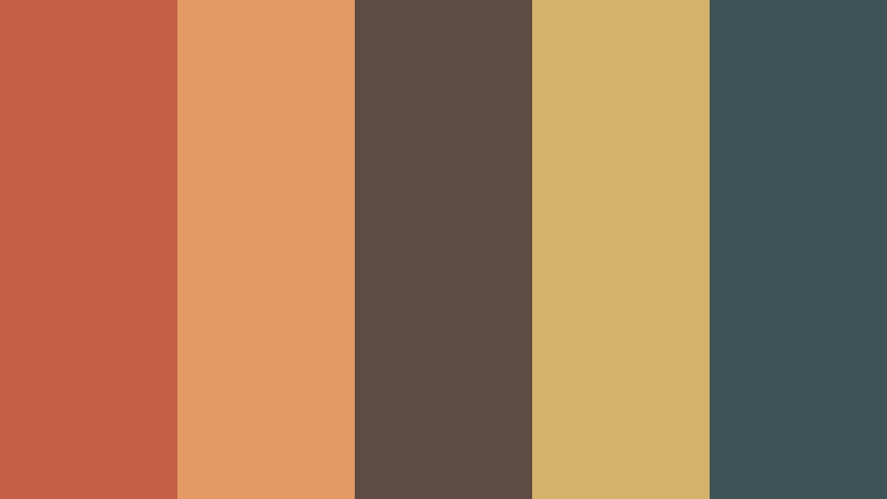
- HEX Codes: #c45f45, #e29b62, #5e4b43, #d3b36a, #3f5555
- Mood: Energetic, artistic, and warmly retro.
- Use for: This palette works well for music videos, podcast covers, event posters, bold thumbnails, and creative brand intros.
Burnt orange, mustard, and deep teal capture the character of a vintage record shop at sunset. The strong warm-cool contrast adds personality and energy while keeping the overall impression grounded in analog design.
Use burnt orange for major titles and calls to action, then balance it with deep teal or charcoal backgrounds. This palette is especially effective when paired with grain, paper textures, bold typography, and quick rhythmic edits.
Copper Cinema Club
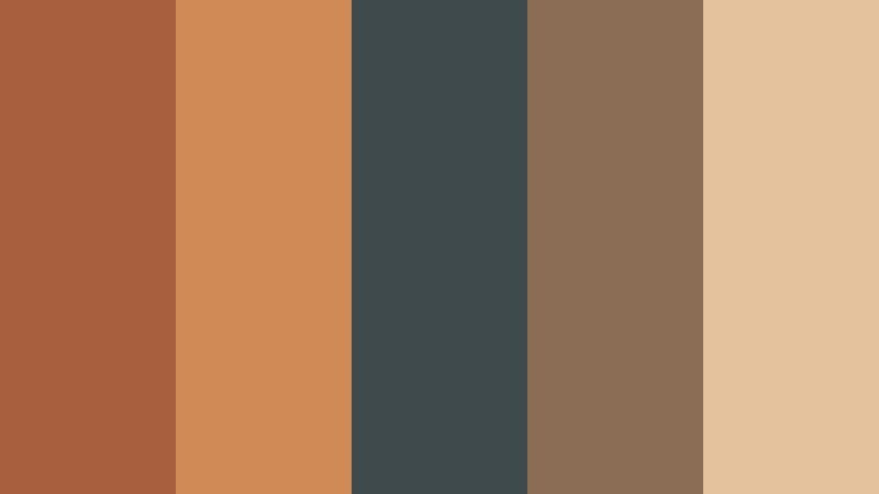
- HEX Codes: #a85f3d, #d08a55, #3e4a4b, #8b6d55, #e4c29d
- Mood: Confident, cinematic, and sophisticated.
- Use for: Use this palette for film reviews, cinema branding, title cards, creator portfolios, and dramatic promotional graphics.
Copper and caramel tones are grounded by charcoal teal for a classic cinema-inspired look. It creates strong visual hierarchy without losing its vintage warmth, making it suitable for both dramatic and professional projects.
Try copper for title animations and key graphic elements, while using charcoal teal behind light text. The pale caramel tone can soften transitions and help portfolio layouts feel more balanced.
Motor Lodge Maroon
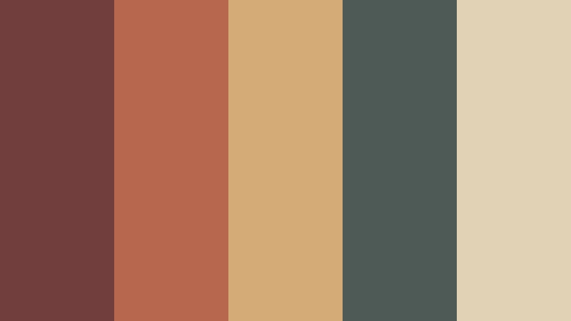
- HEX Codes: #713d3d, #b7674d, #d4aa76, #4d5a55, #e1d1b5
- Mood: Roadside, nostalgic, and confidently rugged.
- Use for: This palette is a strong fit for travel videos, automotive content, outdoor brands, diner-inspired packaging, and adventure thumbnails.
Maroon, faded red, and dusty gold suggest a classic roadside motel sign. The muted contrast gives modern designs a memorable road trip character without the overly bright appearance of many contemporary travel palettes.
Use maroon for bold text, logos, or title cards, and place it against the pale linen shade for immediate contrast. The dusty gold accent can highlight locations, dates, prices, or important moments in an adventure video.
Autumn Tin Sign
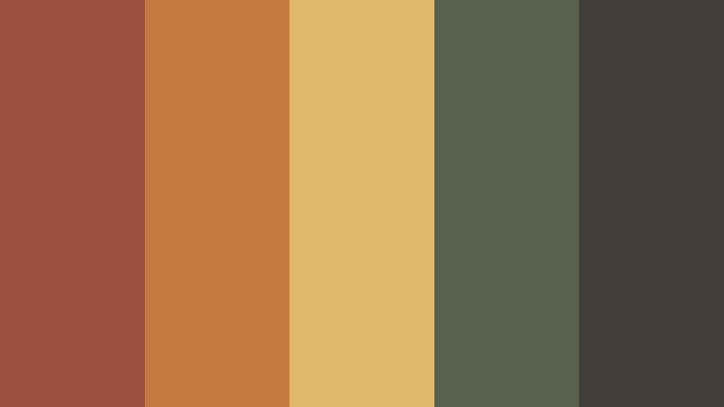
- HEX Codes: #9b4f3f, #c47a43, #e0b86b, #59604d, #403d3a
- Mood: Rustic, lively, and weathered.
- Use for: Use it for food packaging, farm-to-table brands, seasonal content, festival posters, and attention-grabbing social graphics.
Weathered red, harvest gold, and olive green resemble a hand-painted sign from another era. The palette feels bold enough for display text and rich enough for backgrounds, labels, and decorative shapes.
It works well for autumn campaigns, cooking videos, and local business branding. Use the dark gray for readable typography, then combine red and gold in small doses to create a lively but controlled visual rhythm.
Tobacco And Turquoise
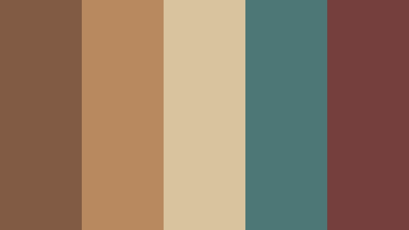
- HEX Codes: #815b43, #b8895f, #d9c39e, #4d7776, #743f3d
- Mood: Adventurous, soulful, and richly atmospheric.
- Use for: This palette suits travel storytelling, documentary graphics, artisan branding, album artwork, and textured video title cards.
Tobacco brown and faded turquoise create a distinctive vintage contrast. The brown tones feel earthy and collected, while turquoise adds a sense of distance, travel, and discovery.
Add the muted plum accent for a worldly look with plenty of visual depth. This combination is effective for documentary title cards, artisan packaging, and travel thumbnails that need a strong identity without bright saturation.
Elegant & Faded Vintage Color Palettes
Antique Blue Hour
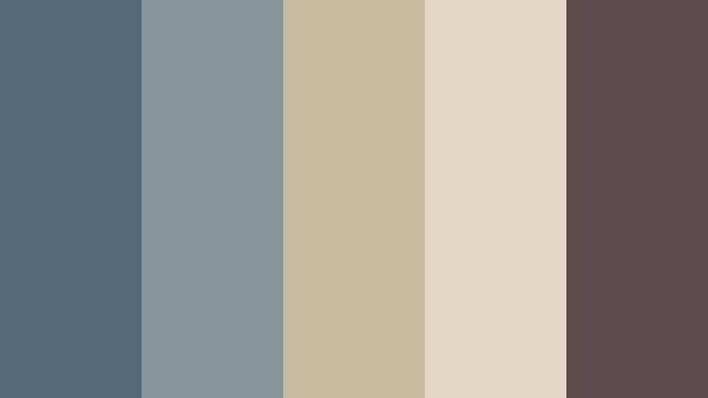
- HEX Codes: #536b78, #87949a, #c8b89d, #e2d8c5, #5e4c4d
- Mood: Thoughtful, elegant, and cinematic.
- Use for: This palette works beautifully for documentary intros, editorial layouts, travel films, premium presentations, and atmospheric UI design.
Faded blue and antique cream mirror the quiet light just after sunset. The palette has a calm, reflective quality, while the muted plum accent adds sophistication and gives important design elements more presence.
Use the deeper blue for title cards and navigation elements, with cream as the main background color. It is a good choice for thoughtful video essays, travel films, and premium presentations that need a quiet cinematic mood.
Museum Velvet
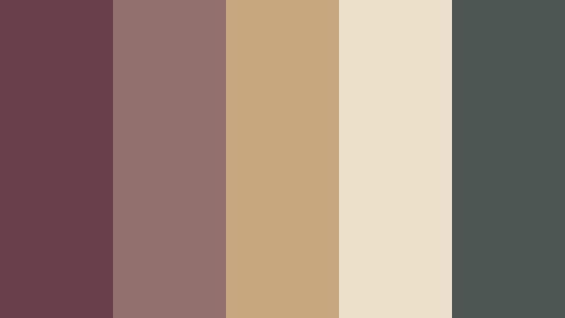
- HEX Codes: #693f4c, #92706d, #c7a77e, #ede0c8, #4c5754
- Mood: Luxurious, cultured, and quietly dramatic.
- Use for: Use this palette for fashion edits, museum promotions, premium packaging, art portfolios, and sophisticated brand presentations.
Velvety plum, antique gold, and soft ivory create a refined gallery-inspired mood. The deep accent colors are ideal for elegant titles and statement details, while the ivory shade prevents the design from becoming too dark.
Use plum for opening titles, gold for thin lines or highlights, and ivory for spacious layouts. In fashion videos, this palette can give footage a premium editorial finish without relying on highly saturated colors.
Faded Riviera
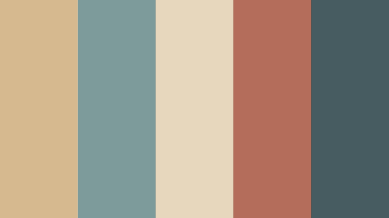
- HEX Codes: #d7b98f, #7d9b9a, #e7d7bd, #b56d5b, #465c60
- Mood: Breezy, nostalgic, and sunwashed.
- Use for: This palette is ideal for vacation vlogs, resort branding, travel thumbnails, lifestyle websites, and summery social campaigns.
Sun-faded sand, coastal teal, and terracotta recall an old seaside postcard. It brings relaxed elegance to bright visuals without relying on saturated color, making it flexible for both travel storytelling and lifestyle branding.
Use sand and pale cream as spacious background colors, then add coastal teal to captions, icons, and title treatments. Terracotta is best used as a controlled accent for location names, buttons, or key moments in a vacation vlog.
Old Library Ledger
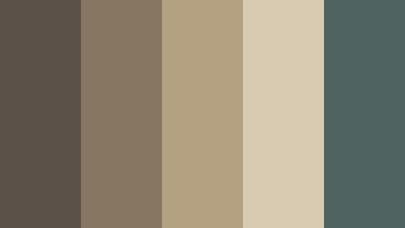
- HEX Codes: #5b5148, #887760, #b4a181, #d8cbb1, #4f6461
- Mood: Scholarly, grounded, and timeless.
- Use for: Use this palette for educational videos, book channels, author branding, presentation decks, and editorial website design.
Warm ledger brown and aged paper cream deliver a composed library atmosphere. Faded teal keeps the combination contemporary enough for digital layouts, giving the palette a subtle balance between tradition and modern clarity.
Apply the browns to headings, dividers, and frames, then use the paper cream for text areas and backgrounds. Faded teal can distinguish links, chapter markers, or educational graphics without breaking the scholarly mood.
Brass And Linen
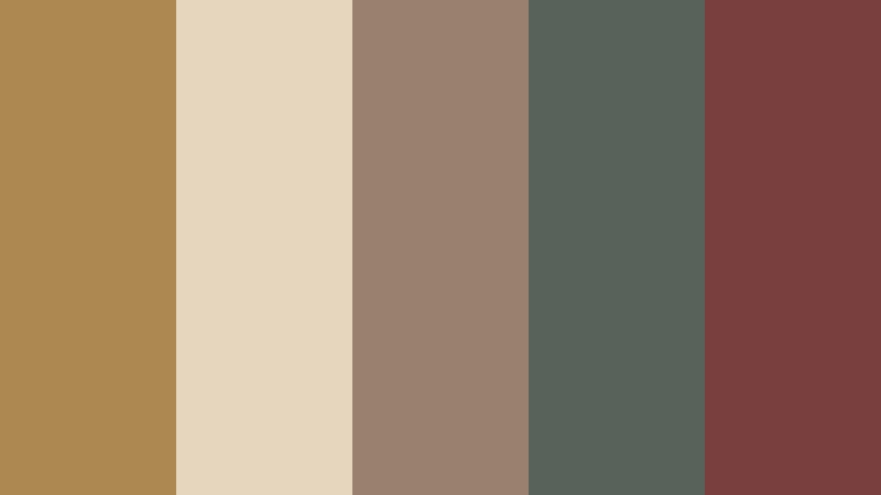
- HEX Codes: #ad8850, #e5d6bd, #9a806e, #59615b, #793f3f
- Mood: Warm, crafted, and understatedly luxurious.
- Use for: This palette fits artisan brands, interior design content, product showcases, presentation covers, and polished creator portfolios.
Brushed brass, natural linen, and muted wine create a tactile vintage composition. The combination feels carefully made and works well when you want warmth with a premium finish.
Use linen as the foundation for clean layouts, brass for highlights and fine details, and muted wine for selective emphasis. In product videos, these tones can make packaging, interiors, and close-up textures feel more considered and distinctive.
Tips for Creating Vintage Color Color Palettes
A successful Vintage Color palette should feel intentional rather than simply faded. Combine warm neutrals with one or two muted accent colors, then adjust contrast and saturation based on the footage, platform, and message of the project.
- Choose one dominant background color, such as cream, linen, or aged paper, so the palette has a clear visual foundation.
- Pair muted warm colors with a faded teal, sage, or blue when you need contrast without losing the vintage mood.
- Reserve the darkest shade for headlines, subtitles, logos, and other elements that need strong readability.
- Use brighter accents sparingly in thumbnails, title cards, and calls to action so they attract attention without overpowering the design.
- Check text contrast on mobile screens, especially when using dusty beige, pale rose, or other light vintage tones.
- Match the palette to the footage by considering lighting, skin tones, scenery, and existing colors before applying a filter.
- Keep the same two or three brand colors across intros, thumbnails, captions, transitions, and end screens for stronger recognition.
- Reduce saturation gradually instead of applying a heavy faded effect, which can make footage look dull and reduce detail.
Vintage Color palettes can shape the emotional direction of a project before viewers hear the first line of dialogue. Soft rose and cream suggest intimacy, earthy orange and teal create energy, and faded blue or linen tones add calm sophistication.
Whether you are building a personal brand, editing a travel vlog, designing a thumbnail, or creating a cinematic intro, the right combination can make your visuals feel more unified and memorable. Use the HEX codes as a starting point, then adapt the balance to your footage and audience.
Filmora makes it easier to test these Vintage Color palette ideas across video clips, titles, filters, and social formats. Try different levels of warmth, contrast, and texture until the result feels consistent with your story and brand identity.
secure download