100% Security Verified | No Subscription Required | No Malware
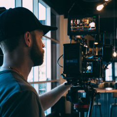
Vintage Film Color brings warmth, texture, and emotional depth to visual communication. Its muted browns, faded amber tones, dusty neutrals, and softened contrast can make modern footage feel more personal, nostalgic, and cinematic. These colors often suggest memories, analog photography, travel journals, classic cinema, and handcrafted design.
In video and design, Vintage Film Color works especially well for intros, b-roll, thumbnails, vlogs, social media edits, branding, packaging, and editorial layouts. This guide provides Vintage Film Color color palettes with HEX codes for creators and Filmora users, including warm combinations, faded pastels, and cinematic contrast palettes.
In this article
Warm & Nostalgic Vintage Film Color Palettes
Sepia Summer Reel
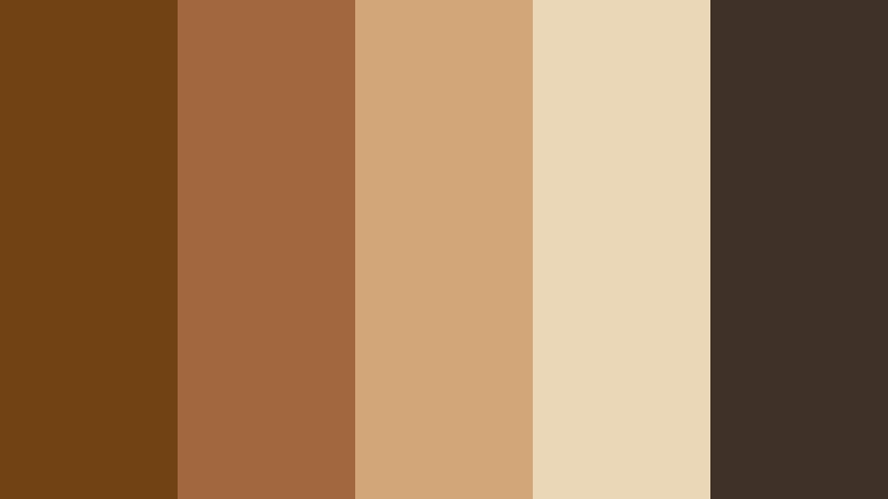
- HEX Codes: #704214, #a2673f, #d2a679, #ead7b7, #3f3028
- Mood: Warm, nostalgic, sunlit, and softly cinematic.
- Use for: This palette works well for travel videos, lifestyle thumbnails, memory reels, and vintage-inspired brand intros.
Sepia Summer Reel recreates the warmth of aged photographs and late afternoon film. Its deep brown anchor creates structure, while amber, tan, and cream shades add the soft glow of sunlight passing through an old camera lens.
Use this palette for personal stories, travel content, memory videos, and nostalgic social posts. The darker brown works well for titles and logos, while the pale cream tones provide a clean background for thumbnails, captions, and opening cards.
Pro Tip: Build A Cinematic Vintage Film Color Look In Filmora
Use Sepia Summer Reel as a visual guide when grading your intro, b-roll, and closing frames in Filmora. Keep the deeper brown tones in shadows and text, then use the warm amber and cream colors for highlights, transitions, and key moments.
For a consistent edit, apply similar warmth across different clips instead of correcting each shot in isolation. This helps travel videos, lifestyle reels, and memory montages feel like one connected vintage film sequence.
AI Color Palette
Creators can capture the Sepia Summer Reel look from a reference image, color card, or still frame and apply it across an entire video. Filmora's AI Color Palette feature helps match the overall color feeling between clips, even when the footage was recorded in different lighting conditions.
This is useful for bringing consistent sepia warmth to talking-head footage, outdoor b-roll, product shots, and social edits without manually repeating the same adjustments on every clip.
 secure download


HSL, Color Wheels & Curves
Filmora's HSL controls can help you refine the balance between sepia browns, amber midtones, and cream highlights. Slightly lowering saturation in the orange range can make the image feel more naturally aged, while warming the highlights and protecting skin tones keeps the result inviting rather than muddy.
Use the color wheels to add gentle warmth to highlights and a controlled brown tint to shadows. Curves can lower contrast slightly for a faded print effect, or add a small amount of contrast when the footage needs stronger definition.
secure download1000+ Video Filters & 3D LUTs
Filmora's built-in effects can give Sepia Summer Reel a quicker starting point. Choose a film, faded, or warm-toned filter, then reduce its intensity so the original details remain visible. This approach works well when creating a repeatable style for a vlog series or a collection of travel thumbnails.
Filmora's video filters and 3D LUTs make it easy to test different levels of grain, warmth, and contrast before choosing the finish that best suits your footage.
secure downloadRustic Cinema Glow
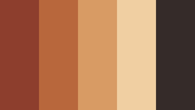
- HEX Codes: #8c3f2b, #b8663c, #d79b63, #f0cfa3, #352b29
- Mood: Earthy, inviting, dramatic, and richly nostalgic.
- Use for: This palette is ideal for food videos, handmade product packaging, cinematic title cards, and cozy brand storytelling.
Rustic Cinema Glow combines burnt earth tones with faded golden highlights for a tactile analog look. The dark brown and terracotta shades create a strong base, while soft peach and cream bring a welcoming sense of light.
Use it for food videos, handmade products, title cards, and cozy brand storytelling. The palette is especially effective when paired with close-up footage, natural textures, warm lighting, and slow camera movement.
Golden Hour Archive

- HEX Codes: #6b4632, #a87345, #d5a85f, #f2d9a4, #5a5042
- Mood: Reflective, golden, peaceful, and gently romantic.
- Use for: This palette works well for sunset edits, wedding films, creator vlogs, editorial covers, and atmospheric website banners.
Golden Hour Archive captures the mellow glow of a well-loved film print. Its amber accents feel optimistic and romantic, while the brown and gray-green neutrals prevent the look from becoming too bright or overly sweet.
Try it in sunset edits, wedding films, creator vlogs, editorial graphics, and atmospheric website banners. Use the pale gold shade behind text and reserve the darkest tones for contrast, logos, and cinematic title treatments.
Café Noir Memories
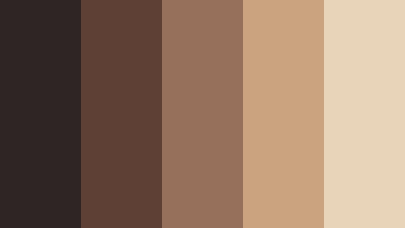
- HEX Codes: #2f2524, #5e4035, #96705a, #c9a47e, #e8d5b9
- Mood: Intimate, sophisticated, moody, and quietly nostalgic.
- Use for: This palette is a strong choice for coffee branding, podcast artwork, cinematic thumbnails, menus, and evening lifestyle content.
Café Noir Memories pairs dark roasted browns with creamy film-washed neutrals. The result feels intimate and sophisticated, with enough tonal range to support both dramatic images and readable typography.
It is a natural choice for coffee brands, podcast covers, menus, cinematic thumbnails, and evening lifestyle videos. Use the cream color for backgrounds and captions, then introduce dark brown in borders, shadows, and logo details.
Faded Pastel Vintage Film Color Palettes
Dusty Rose Premiere
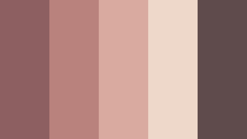
- HEX Codes: #8e5f61, #b9827d, #d8aaa0, #eed8c9, #5f4b4b
- Mood: Romantic, delicate, nostalgic, and softly polished.
- Use for: This palette works well for beauty videos, wedding invitations, fashion reels, social templates, and elegant product packaging.
Dusty Rose Premiere softens vintage warmth with muted pinks and faded rose tones. It feels romantic without becoming overly bright, making it suitable for polished visuals with a gentle editorial character.
Use the deeper rose for headings, overlays, and brand marks, while the pale blush tones can support wedding films, beauty content, social templates, and product packaging.
Minted Film Garden

- HEX Codes: #4f6f63, #83a58d, #b6c8a9, #e4d9b8, #6d5547
- Mood: Fresh, nostalgic, natural, and quietly uplifting.
- Use for: This palette is suitable for plant content, wellness branding, garden videos, eco packaging, and soft educational graphics.
Minted Film Garden blends faded greens with creamy beige and gentle brown. It creates an organic, calming atmosphere that feels connected to gardens, natural materials, and slow living.
This palette suits plant content, wellness branding, eco packaging, garden videos, and educational graphics. The muted green shades can carry visual identity, while beige and brown add warmth and improve balance.
Powder Blue Matinee
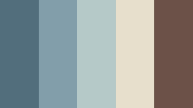
- HEX Codes: #526d7b, #829eaa, #b6c9c9, #e7dfcc, #6b5148
- Mood: Calm, airy, wistful, and lightly cinematic.
- Use for: This palette is effective for coastal videos, travel guides, app interfaces, story covers, and relaxed lifestyle branding.
Powder Blue Matinee gives cool faded blues a warm analog foundation. Its blue-gray shades feel spacious and peaceful, while the cream and brown accents keep the look from becoming sterile.
Use it for coastal videos, travel guides, story covers, app interfaces, and relaxed lifestyle branding. It can also create a calm visual system for thumbnails where pale backgrounds and darker text need to work together.
Lavender Contact Sheet
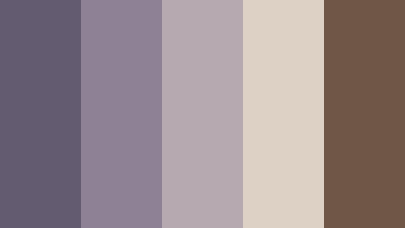
- HEX Codes: #635b70, #8c8195, #b6a9af, #ddd0c4, #705647
- Mood: Dreamy, introspective, elegant, and gently mysterious.
- Use for: This palette works well for music videos, journaling content, mood boards, book covers, and creative portfolio pages.
Lavender Contact Sheet brings faded violet tones into a warm film-inspired range. The muted purple creates a dreamy and reflective mood, while dusty beige and brown add a tactile, photographed quality.
It is well suited to music videos, journaling content, mood boards, book covers, and portfolio pages. Use the deeper violet for visual anchors and the pale neutral for text panels, backgrounds, and soft transitions.
Cinematic Contrast Vintage Film Color Palettes
Midnight Projector
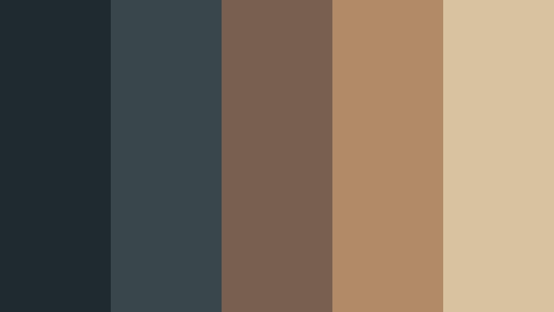
- HEX Codes: #1f2930, #39464a, #77604f, #b18a68, #d9c2a0
- Mood: Cinematic, mysterious, refined, and atmospheric.
- Use for: This palette is ideal for film trailers, gaming thumbnails, dark mode interfaces, music branding, and dramatic video openers.
Midnight Projector contrasts deep blue charcoal with aged bronze highlights. The dark foundation creates suspense and depth, while the muted tan colors add the glow of a projector beam or old theater light.
Use it for film trailers, gaming thumbnails, dark mode interfaces, music branding, and dramatic openers. Keep text in the pale cream shade when readability is important, and use bronze as a focused accent rather than a full background.
Neon Motel Frame
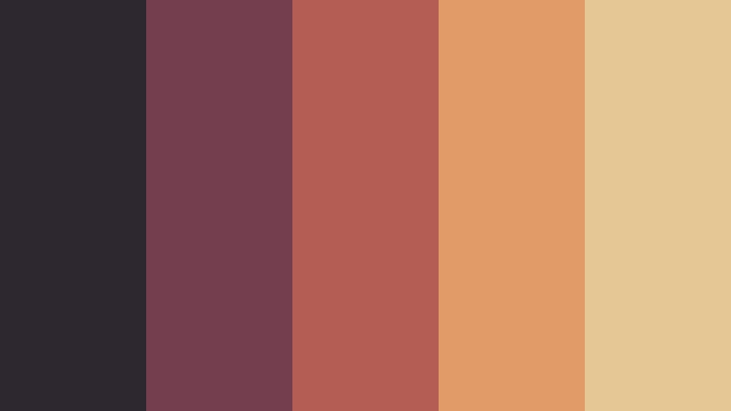
- HEX Codes: #2d2730, #743e4f, #b45d55, #e09b68, #e4c795
- Mood: Retro, energetic, cinematic, and playfully rebellious.
- Use for: This palette works well for nightlife content, music thumbnails, event posters, retro gaming visuals, and bold social campaigns.
Neon Motel Frame mixes dusky shadows with faded red, coral, and amber accents. It evokes roadside signs, late-night drives, and colorful film stills from another era.
Use the dark plum shade as a background for music thumbnails and event posters, then add coral and amber for key text, badges, transitions, or animated lighting effects. The cream tone helps maintain readability.
Olive Newsreel
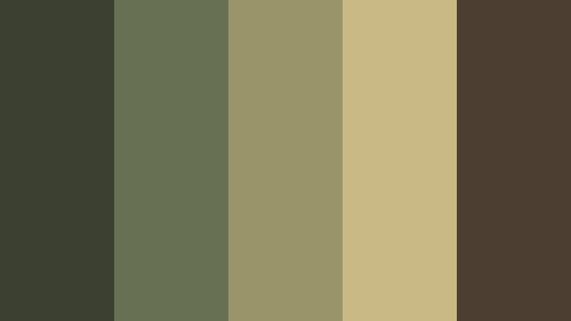
- HEX Codes: #3b4030, #687052, #9a9568, #c9b985, #4d3e32
- Mood: Documentary-inspired, grounded, thoughtful, and timeless.
- Use for: This palette suits historical videos, outdoor campaigns, editorial layouts, documentary thumbnails, and heritage brand identities.
Olive Newsreel uses weathered greens and ochre neutrals to create a grounded archival feel. It suggests field notes, historical footage, outdoor exploration, and printed documents that have aged naturally.
This palette is effective for documentaries, historical videos, editorial layouts, outdoor campaigns, and heritage brands. Use olive for large visual areas and reserve ochre for labels, highlights, captions, and small graphic details.
Crimson Film Flash
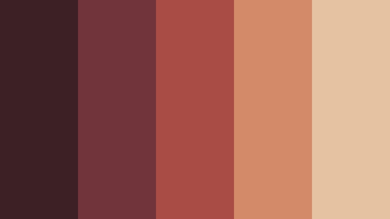
- HEX Codes: #3b2025, #70343a, #a84c45, #d28a68, #e6c3a0
- Mood: Passionate, dramatic, vintage, and emotionally vivid.
- Use for: This palette is a good fit for fashion films, album artwork, dramatic thumbnails, event branding, and expressive social content.
Crimson Film Flash adds a bold red accent to softened cinematic neutrals. It creates immediate focus while preserving the texture and restraint of an aged print.
Use crimson to direct attention toward a title, product, performer, or important moment in a video. The pale peach and cream shades can soften the composition in fashion films, album artwork, event graphics, and expressive social campaigns.
Indigo Darkroom

- HEX Codes: #202b3b, #35465b, #5e7080, #a39b83, #d7c6a5
- Mood: Thoughtful, cool, mysterious, and sophisticated.
- Use for: This palette works well for tech storytelling, documentary intros, photography portfolios, cinematic UI themes, and premium editorial design.
Indigo Darkroom combines deep cool shadows with muted cream highlights for a developed-film effect. It feels modern and controlled while retaining the character of vintage photography.
Use it for technology stories, documentary intros, photography portfolios, cinematic user interfaces, and premium editorial design. The pale cream tone is useful for readable text against dark indigo backgrounds.
Copper Flashbulb
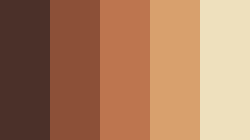
- HEX Codes: #4a3029, #8b5038, #bc754c, #d7a06d, #efe0bd
- Mood: Luminous, confident, nostalgic, and warmly dramatic.
- Use for: This palette is perfect for portrait photography, luxury packaging, creator branding, promotional videos, and polished presentation slides.
Copper Flashbulb turns warm metallic tones into a rich vintage film story. Its copper and bronze shades feel confident and luminous, while the deep brown provides a strong foundation for contrast.
This palette is ideal for portrait photography, luxury packaging, creator branding, promotional videos, and presentation slides. Use the bright cream as a clean highlight and apply copper selectively to make important visual elements stand out.
Tips for Creating Vintage Film Color Color Palettes
Creating a convincing Vintage Film Color palette is about balancing warmth, softness, contrast, and readability. Start with one dominant color, add supporting neutrals, and use a stronger accent only where you want viewers to focus. The right combination should match both the footage and the emotional identity of the project.
- Use one or two dark colors for text, outlines, shadows, and visual structure so faded backgrounds remain readable.
- Pair warm browns and amber tones with cream or dusty beige to create a softer vintage film effect.
- Combine Vintage Film Color with muted blue, olive, rose, or lavender when you want more variety without losing the analog mood.
- Keep highly saturated colors under control. A single faded red, copper, or coral accent usually creates more impact than several bright colors.
- Match the palette to the lighting in your footage. Warm palettes work naturally with sunset, indoor, tungsten, and golden-hour scenes.
- Check thumbnail and caption readability on mobile screens before using pale colors for important text.
- Repeat the same accent colors in intros, lower thirds, transitions, thumbnails, and end cards to strengthen brand consistency.
- Use Filmora's color adjustments, filters, and LUTs carefully. Lower the intensity when the effect hides skin tones or important image details.
Vintage Film Color palettes can shape the emotional direction of a project before viewers hear a single word. Warm sepia combinations can make a vlog feel personal, faded pastels can create a gentle lifestyle identity, and darker cinematic palettes can add suspense, confidence, or sophistication.
Test these HEX combinations across your footage, thumbnails, titles, and brand graphics to see which balance feels most natural. Filmora makes it easier to apply a consistent look, refine individual shots, and build a finished visual style that feels intentional from the first frame to the last.
Use the palettes above as starting points rather than fixed rules. Adjust brightness, saturation, and contrast according to your footage, platform, and audience, then save the combinations that best represent your creative identity.
secure download