
 100% Security Verified | No Subscription Required | No Malware

10 Matching Color Combination That Works Together
An easy yet powerful editor
Numerous effects to choose from
Detailed tutorials provided by the official channel
Color is abundant in our life. Our moods, sensations, and perceptions, as well as our decision-making processes, are all influenced by color. Emotion evokes by color. It affects our perception, eliciting subconscious or conscious responses in the human brain. Color is perhaps the most robust tool at your disposal as a designer because of its influential and communicative nature.

Although not everyone is born with a keen sense of color or a natural aptitude for graphic design, there are methods and principles you can employ to select the best color that matches together to make a b impression and achieve your desired effect. Fortunately, we've got you backed up. The ten best colors that match everything are listed below to help you create your next design.
Part 1 What is Color Combination?
Color Theory is an art when it comes to playing with colors. It explains how people perceive color and the visual effects of colors mixing, pairing, and contrasting with one another. Designers use a color wheel and considerable collected knowledge about human psychology, society, and more to pick the perfect colors that match everything. Color is a crucial, if not the most important, feature of design since it may affect the meaning of the text, how people move across a layout, and how they feel. You may be more intentional in generating graphics that affect you if you understand color theory.
Part 2 Types of Color Combinations
Learning how different colors match together is essential for successful color combinations. Studying the color wheel and color harmonies (what works, what doesn't, and how color communicates) will help you blend colors, establish a ber brand, and share more effectively with your designers and printers.
The color wheel contains:?
● Three primary colors (red, yellow, and blue),?
● Three secondary colors (purple, green, and orange), and?
● Six tertiary colors (colors generated when you mix primary colors), plus (colors created from primary and secondary colors, such as blue-green or red-violet).

Draw a line over the core of the wheel to separate the warm colors (reds, oranges, and yellows) from the cool colors (blues, greens, and purples) (blues, greens, purples).
Warm colors are connected with activity, brightness, and vigor, whereas cold colors are associated with tranquility, peace, and serenity. So when you hold that color has a temperature, you can see how its use might influence your message.
On the color wheel, complementary hues are opposites. They may make artwork jump because of the great contrast between the two hues, but overusing them can get tiring.
Analogous hues are next to each other. Therefore, one color will dominate, one will support, and another will accent when developing a similar color scheme.
Triadic hues are energetic and vibrant, evenly dispersed throughout the color wheel. They provide visual contrast and harmony, allowing everything to shine as the overall image comes to life.
You can build a variety of grand color schemes by using the color wheel. Finding the perfect color combination for the right occasion is vital.
● 10 Matching Color Combination That Works Together
01 Yellow and Blue

Yellow is the ultimate attention-getter, and it provides a young backdrop for the commanding navy. The equally electrifying Blue color that matches with Yellow dazzles the senses. It's one of those color schemes mainly used for parties and casual gatherings. It helps instill a sense of purpose and energy in a design by contributing to enthusiasm.
02 Black and Orange

The vibrant orange contrasts wonderfully with the dark black, providing a sense of mystery and suspense. Black is one of my favorite colors that match with orange.
03 Lime Green and Purple

This high-octane color combination exudes a powerful presence, with purple being a beautiful choice to compliment light green. That?color matches the lime green?and presents a b sense of design.?
04 Dark Brown and Yellow

This fantastic color combination is ideal for creating a design that shouts spontaneity and dependability. The perfect tag-team, marigold yellow, catches the eye while dark brown keeps it. Yellow is yet another favorite pick of color that matches dark brown.
05 Lavender and Indigo

Indigo, a dramatic color associated with the arts, is intuitive and forceful. It creates an exciting backdrop for the softer purple shade.
06 Turquoise Blue and Purple

The imaginative purple and waterleaf turquoise combination create an overall sensation of limitless possibilities. These colors are ideal for communication-related businesses, such as teachers, trainers, and media communication. Purple is the choice of many designers, and this color matches turquoise blue perfectly.
07 Light Pink, Hot Pink & Maroon

The pink color family is your best pick if you're looking for a design that shouts "approachable." These colors are distinct enough to provide visual interest to the design while remaining similar sufficient to maintain an innocent appearance. When you add maroon to the mix, you reduce the chance of appearing foolish while also exuding just the appropriate amount of professionalism. Hot Pink and Maroon are my top picks for a color that matches light pink.
08 Light Gray and Desert Sand Beige

Although desert sand beige is one of the least-used design colors, it will make you stand out if you use it. For fashion or interior design brands, the tones of desert sand and emperor gray work nicely together.
09 Dark Sea Green and Deep Forest Green

Forest green is a color that conjures up images of nature just by its name. This adaptable color connects with growth, and it looks cool and fresh when coupled with lighter seafoam green.
10 Dark Blue, Turquoise, Beige

These colors go well together and reinforce the brand's reliability. When you combine them with the beige backdrop, you feel secure exploring and pursuing. This color combination functions well for vacation, life consulting, and healthcare businesses.
Part 3 Two Color Combination vs. Three Color Combination
Choosing a matching color combination for your brand helps with identification; each color tells something about your business. Let's explore the major differences between the two-colour combination and the three-color combination to help you make the right choice:
Two-Color Combination |
Three-Color Combination |
| The combination helps create a clean and focused design. It also has fewer distractions, which ensures a minimalist appeal. | You have more options to act as an artist and choose from various themes, which makes it look more attractive. |
| The combination is easy to balance, so you don’t need to worry about color clashes. | Let you make your design more engaging by adding layers, which is not easy to balance. |
| The design process is faster since you pick designs quickly and plan layouts afterward. | The design process is slow since you’ll use the combination to set up a mood and tone through different shades. |
| The combination looks eye-catching due to clear color separation. | Your design is more engaging due to more layers, but you must add them carefully. |
| The corporate sector uses a two-colour combination to ensure a smooth look. | Used by all kinds of businesses to display their brand elements. |
| Fewer colors make printing easier, and the costs also become low. | More colors in your branding mean higher printing and production costs. |
Part 4 How to Apply Color Combinations to Your Designs?
Specific color combinations have the power to catch our attention, generate emotion, and ultimately make a lasting statement.
In this section, we'll look at some great colors that match together and can help your brand make a significant impact, along with a step guide on how you can easily color match during video editing.
0110 Beautiful Color Combinations for Your Next Design
● You can produce all kinds of grand color schemes with the color wheel. Find the right color pairing for the right occasion.
● Yellow, magenta, cyan, and black

Hex code: #e2d810, #d9138a, #12a4d9 and #322e2f
Almost each print project is dependent upon these four ink colors. They can create any color imaginable after they combine. Individually, they make a color scheme that's bright, contemporary, and full of life.
● Shades of pink and brown

Hex code: #e75874, #be1558, #fbcbc9 and #322514
Pink is youthful, modern, and luxurious, and using different shades adds even more motion and depth to the design. Combining pink with dark brown adds a basic level of contrast and seriousness.
● Gold, charcoal, and grey

Hex code: #ef9d10f, #3b4d61 and #6b7b8c
It is a perfect merge of seriousness and sunshine. The gold represents nature and cheerfulness, which combines perfectly with two different shades of black and grey that add a layer of maturity.
● Tan, deep turquoise, and black

Hex code: #ecc19c, #1e847f, #000000
Over a natural, masculine tan base, this merge presents turquoise to the forefront to display its utility as a color that displays nature and rebirth.
● Raspberry and shades of blue

Hex code: #8a307f, #79a7d3, #6883bc
Like the palette above, trusted blue forms the foundation of this combination, while the pinkish-purple addition of raspberry adds luxurious femininity.
● Sea-foam, salmon, and navy

Hex code: #aed6dc, #ff9a8d, #4a536b
The ideal beachy palette. This unique pastel combination of salmon, sea-foam, and navy represents everyone's favorite coastal colors and shows the warmth and peacefulness that comes from a day at the ocean.
● Yellow-green, olive, and forest green

Hex code: #e1dd72, #a8c66c, #1b6535
These three color combinations of green are the perfect palette for this lime and mint beverage. They both combine into a brilliant blend of excitement and youthfulness.
● Beige, slate, and khaki

Hex code: #f6ead4, #a2a595, #b4a284
Two complementary shades of lean brown masculine. An accent of khaki-grey represents a touch of elegance and maturity.
● Scarlet, light olive, and light teal

Hex code: #b85042, #e7e8d1, #a7beae
An extremely subdued take on the primary colors, this combination adds a lot of greys to keep the palette's personality feeling severe and mysterious.
● Turquoise, mustard, and black

Hex code: #7fc3c0, #cfb845, #141414
This classic pairing of a calm and warm tone evokes calmness and cheerfulness. The black adds a bold, contemporary accent.
02How to Apply Color Combinations to Your Designs
You can apply color combinations to your designs without learning high-level editing with Wondershare Filmora. This way you can match the color of a video’s one scene with other different colors. Windows and Mac users can access the tool via desktop to edit their designs in minutes, and you can also do it with the Filmora App [iOS/Android].
Filmora lets you customize your clips' colors by providing different options. It provides a side-by-side view to compare and match the color adjustments made using the AI Color Palette.
 secure download

How to Add Matching Color Combinations Using Filmora on Desktop
Did you make a video that doesn’t have color combinations according to your expectations? The following steps will help you add a color match to your clips using the Filmora desktop version:
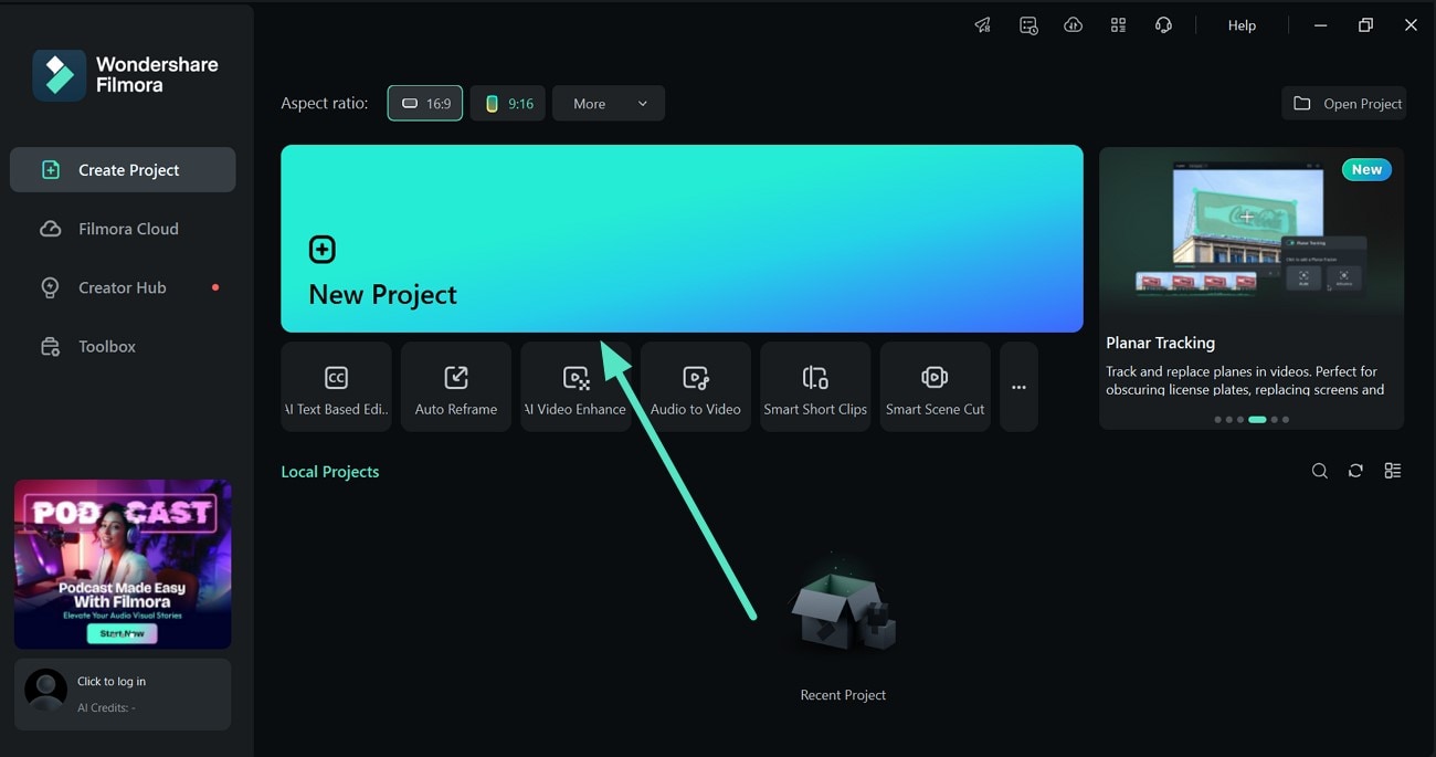
- Step 1. Use the New Project Option to Import a Video. To begin, hit the “New Project” option from Filmora’s homepage to add a video and then drag it to the editing timeline below.
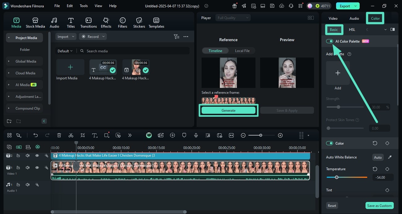
- Step 2. Enable the AI Color Palette from the Right Side. Once the video is imported, head to the right-side panel and access the “Color” section. Turn the toggle on for “AI Color Palette” under the “Basic” section. Next, drag the play head enabled within the video preview to select a reference frame for color matching, and hit the “Generate” button to execute the process.
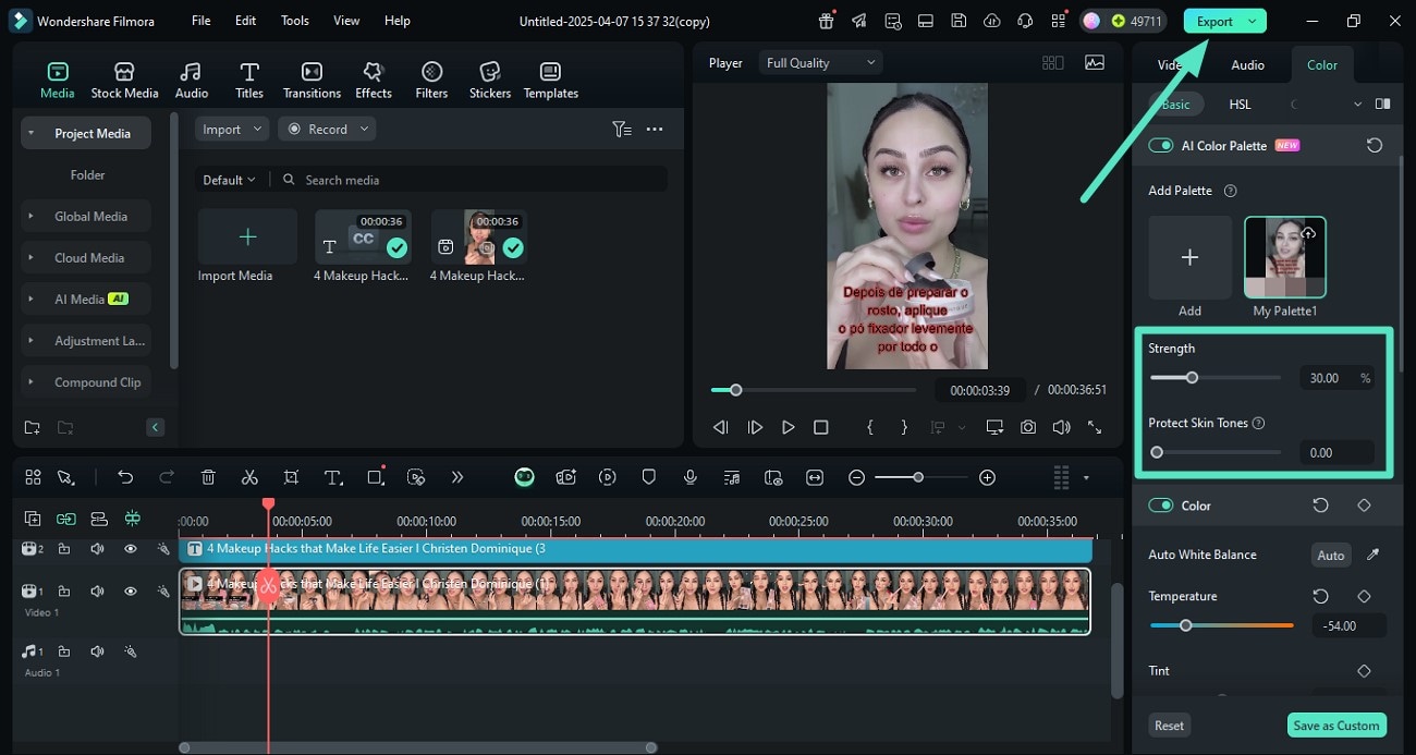
- Step 3. Make Adjustments and Export. Once the palette is generated, it will appear in the panel on the right side for future reference. Furthermore, adjust like “Strength” and “Protect Skin Tones” by dragging the sliders and once you are satisfied with the results press the “Export” button to save the video.
How to Add Matching Color Combinations Using Filmora App
Are you planning to ensure a perfect color combination in your videos, but don’t have a PC or laptop available? Filmora App helps you do that without requiring you to learn high-end editing, and that too in a few steps. You get a dedicated button to analyze and match the color adjustments you made for an instant preview. Learn how to add color combinations to your clips step-by-step using the Filmora App:
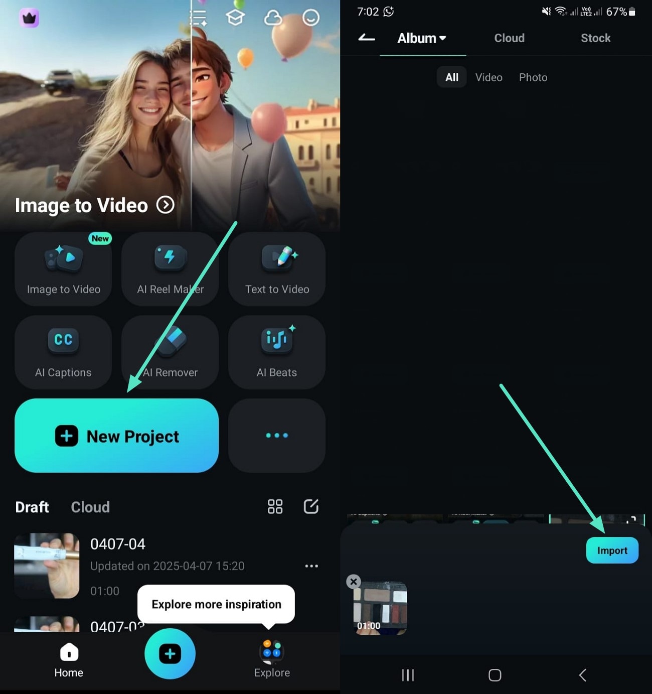
- Step 1. Use the New Project Option to Import a Video. To initiate, select the “New Project” option from Filmora’s main screen. Now, choose a video from your gallery, use the “Import” button from the bottom right, and let it appear.
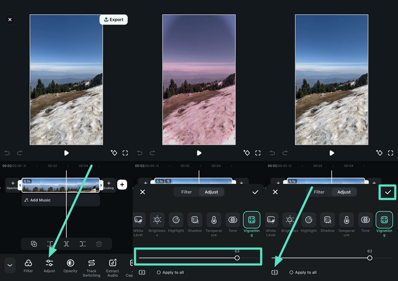
- Step 2. Adjust the Color and Match. After the video is imported, access the “Adjust” option and apply color changing by choosing the desired options and dragging their sliders. Next, tap on the “Compare” icon located at the bottom left corner to match the color adjustment. Once you are satisfied with the results, hit the small “Tick” located at the right side.
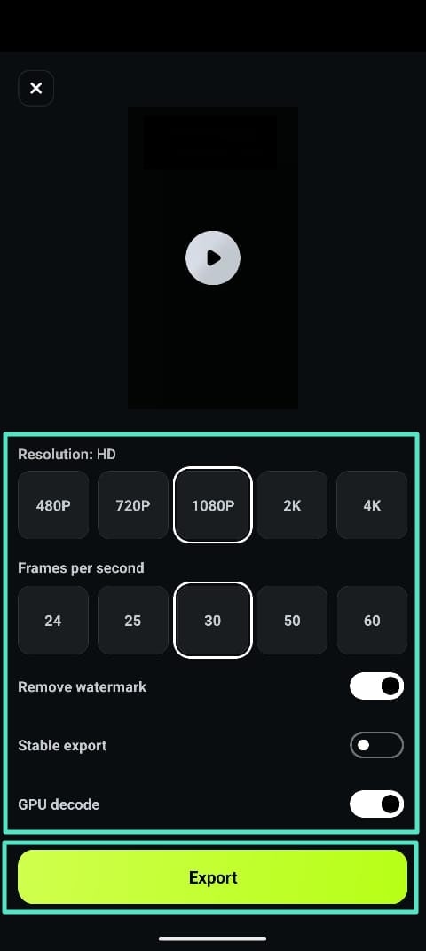
- Step 3. Preview the Results and Export. When the adjustments are made, and you are satisfied with the results, head to the top-right corner and press the “Export” button. Next, configure the output settings and hit the “Export” button to save the video to your smartphone.
secure download
● Key Takeaways from This Episode →
To summarize, the article discussed how to ensure color match in your videos to make them look according to your brand. It also suggested adding a matching color combination using the Filmora App and desktop. With Filmora, you get an AI Color Palette, so you can ensure the right color matches in your clips without needing to learn high-level editing.
