

 TL;DR:
Adobe Color streamlines the design workflow by providing a free, browser-based environment to mathematically generate, test, and sync structural color schemes directly into professional editing software.
● Palettes are generated by applying established color harmony rules to a single base hue across digital-friendly RGB, intuitive HSB, or print-accurate LAB color spaces, or by utilizing the Extract Theme feature to pull a five-swatch setup directly from an uploaded reference image.
● Designers can validate their selections using the built-in Accessibility tools, which verify text-to-background combinations against WCAG standards and flag specific visual conflicts for viewers with deuteranopia, protanopia, and tritanopia.
● Saving combinations natively to Photoshop, Illustrator, and InDesign requires logging into a free Adobe account to access Creative Cloud Libraries, though users can manually copy hex and RGB codes to grade visual identities in external software like Wondershare Filmora.
Ask AI for a summary
 ChatGPT
 Perplexity
 Gemini
 Claude
 Grok
Grok
If you've ever spent way too long trying to find colors that actually work together, Adobe has a tool built exactly for that: Adobe Color. A lot of designers rely on it when building a color palette. Instead of manually testing dozens of shades, Adobe Color applies proven harmony rules and gives you combinations that work.
Today, we'll walk you through how to use Adobe Color to build a good color palette and how to apply it to the project you are working on.

Part 1. What is Adobe Color?
Adobe Color is a free online tool made by Adobe that helps you build, explore, and save color palettes. Since color theory can be a lot to wrap your head around, Adobe Color does the thinking for you when you need a color theme fast and ready to use.
You can access Adobe Color directly at color.adobe.com without any installation. If you are looking for an Adobe Color app on mobile, you can use Adobe Capture instead. It also powers Adobe Express’ Themes feature, which helps you find and apply consistent color palettes across your designs.

What You Can Do With Adobe Color
Adobe Color has at least four main features that serve different purposes.
1. Create color themes
On the Create tab, you can select a base color and a color harmony using the Adobe color wheel, and Adobe Color will generate a color theme around it. You can do it by dragging the markers on the wheel manually or punch in a specific hex value. Or if you have an image reference, you can also upload it and let Adobe Color pull a palette or gradient directly from it.
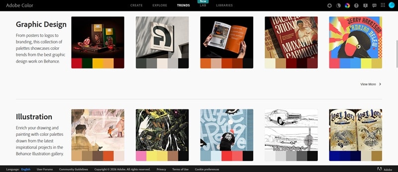
2. Discover trends
The Trends tab pulls Adobe color palettes from what's currently popular across Behance and Adobe Stock. They're sorted by industry, such as fashion, graphic design, illustration, UI/UX, travel, game design, and more. You can use it to zero in on what's relevant to your work.
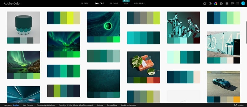
3. Explore community offerings
Under the Explore tab, you'll find thousands of Adobe palettes created and shared by other Adobe Color users. You can search by keyword or browse by color. If you find one you like, you can save it directly to your Adobe Creative Cloud library.
4. Accessibility tools: Contrast Checker and Color Blind Safe
Being inclusive is important in any design project, and Adobe Color helps you cover that base. Under the Accessibility section in the Create tab, there are two tools:
- Contrast Checker: Tests whether your text and background color combination meets WCAG accessibility standards (the guidelines used to measure readability for people with visual impairments).
- Color Blind Safe: Checks your palette against different types of color blindness, such as deuteranopia, protanopia, and tritanopia, and flags combinations that could be hard to distinguish.
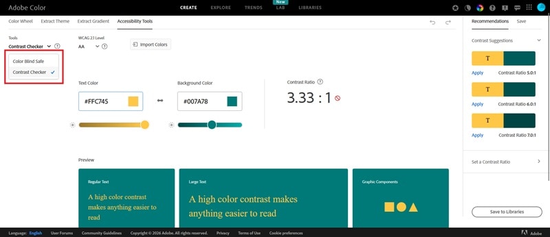
Both tools give you immediate visual feedback, so you can adjust your colors on the spot rather than discovering issues after your design is already done.
Is Adobe Color Free?
Yes, Adobe Color is free to use directly on its website. You can create palettes without a subscription, and you don't even need to log in unless you want to save palettes to your Creative Cloud Libraries.
Part 2. How to Create Color Palettes with Adobe Color Palette Generator
Now that you know what Adobe Color is and what it offers, here's a closer look at the part most of you come for: building color palettes.
Using Adobe Color Wheel
When you open the Create tab, the first thing you'll see is the Adobe color wheel. To build a palette with it, you have a few options:
- Drag one of the color handles around the wheel, and the other markers will move automatically to follow your chosen harmony rule.
- Type in a hex code if you already have a specific color in mind. The wheel will snap to it right away.
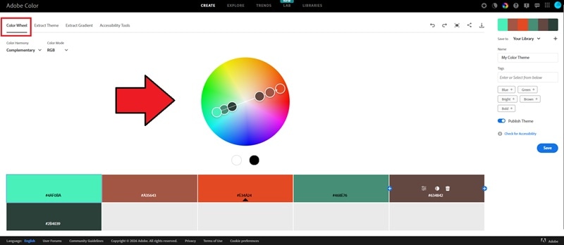
Before you start moving things around though, pick a harmony rule first. This is the setting that tells Adobe Color how to choose the other colors relative to your base color. And since different rules produce very different results, only you know what your design actually needs.
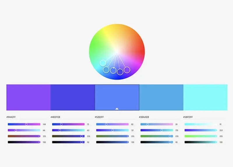
Common Harmony Rules in Adobe Color
- Analogous: Colors sitting next to each other on the wheel.
- Monochromatic: One hue, varied in brightness and saturation.
- Triad: Three colors equally spaced around the wheel.
- Complementary: Two colors directly opposite each other. High contrast.
- Split Complementary: Like complementary, but takes the two colors flanking the opposite point instead of the opposite color itself.
- Square: Four colors evenly spaced around the wheel.
- Compound: Two complementary pairs combined.
- Shades: Lighter and darker variations of a single base color.
- Custom: No rules applied. You move each marker freely and build whatever you want.
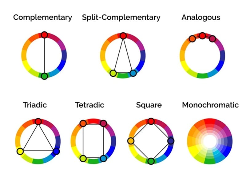
Image: Colors Explained
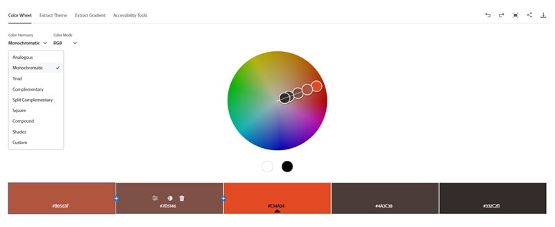
For example, if you select "Monochromatic," it will show the Adobe Monochromatic wheel with all markers locked to the same hue. You can copy the hex codes or RGB values and bring them straight into your project.
Color harmony rules come from basic color theory. They are color combinations that naturally look good together based on their position on the color wheel. Besides selecting a harmony rule, you also need to choose a Color Mode.
Color Mode, on the other hand, determines how your colors are defined and measured numerically. And it matters depending on whether your design is meant for screens or print.
Color Mode in Adobe Color
| RGB | HSB | LAB | |
| How It Works | Mixes red, green, and blue light (0–255) to produce color | Defines color by hue angle, saturation, and brightness | Models color based on human perception, separating lightness from two color channels |
| Typical Use Cases | Anything on a screen (websites, apps, social media, digital ad). | Same as RGB, but preferred when adjusting colors intuitively | Print production and cross-device color consistency |
| Strengths | Universal standard for digital work | Each value controls one distinct quality, making adjustments more predictable | Device-independent and more accurate across different output types |
| Limitations | Not suitable for print | No accuracy advantage over RGB | More technical to work with, especially for everyday digital design |
Extracting Color Palettes from Images
Still in the Create tab, you can switch from the color wheel to Extract Theme to extract a color palette from an existing image. Upload any photo, illustration, or screenshot, and Adobe Color pulls a five-swatch palette directly from it.
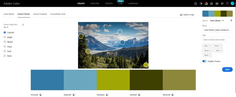
You can control how the palette is extracted using one of five modes: Colorful, Bright, Muted, Deep, and Dark. Each mode targets a different range of tones within the image, so the same photo can produce several different palettes depending on which mode you pick.
Extracting Color Gradients
Besides extracting a color palette from a photo, you can also extract a gradient from the Extract Gradient section. The gradient extraction works similarly, but instead of producing fixed swatches, it maps the colors from your image into a gradient.
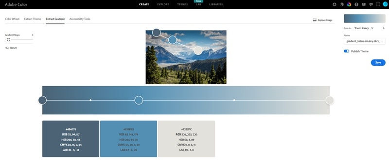
After uploading an image, Adobe Color will generate a gradient reflecting the dominant color transitions within it. You can switch between linear and radial gradient types, and drag the color stops to adjust the result.
Part 3. Where Adobe Color Fits Into Your Design Workflow
Adobe Color works for pretty much anyone who needs to make color decisions. Most people reach for it at the early stage of a project, like when figuring out the visual direction or putting together a color system. But it's also useful when you need to expand an existing palette or check whether your colors hold up for accessibility.
For video creators specifically, Adobe Color can be used when you're planning the visual identity of a channel or a single production. Once you have a palette, tools like Wondershare Filmora let you carry those color decisions directly into your edit.
1. Build a Consistent Brand Identity
A color palette is often the foundation of a brand's visual identity, and that applies to video content just as much as it does to logos or websites. When every element on screen follows the same color scheme, your videos look put-together.
You can apply your color palette to:
- Text and captions
- Background graphics
- Motion design elements

If you have a distinct color scheme, people will start recognizing your content just from the visuals before they even see your name. When they do, that means you've successfully built a strong visual branding.
2. Support Color Grading and Visual Mood
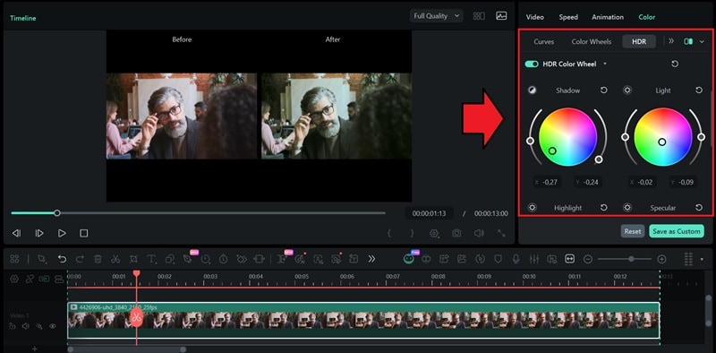
Your palette can also guide color grading decisions. Rather than adjusting shadows, midtones, and highlights purely by feel, you have a concrete color reference to work toward, which makes the process faster.
In Filmora, you can start by using the AI Color Palette feature. It can generate a color grade based on a reference image to give you a solid base to work from. From there, use Filmora's HDR Color Wheels to fine-tune the shadows, midtones, and highlights until they align with the specific values in your Adobe Color palette.
Part 4. Tips for Building Better Color Palettes in Adobe Color
Adobe Color only generates the palette. The quality and the decisions behind it still depend on you. These tips help you get more out of the tool.
1. Start with a Color That Fits Your Project
Don't start by trying to pick five colors at once. Pick one color and let Adobe Color build the rest around it. It can be your brand color or a color pulled from your subject. If you don't have a specific color in mind yet, start with what you want to convey. Colors carry meaning, and you can use that as your starting point.
2. Test your palette in context
A palette that looks great on the color wheel doesn't always translate well in an actual design. It’s best to always test your colors against real elements to see how they actually behave together.
3. Run the Accessibility Check Before You Finalize
It takes less than a minute and can save you from having to redo your color choices later. Don’t forget to use the Contrast Checker in Adobe Color to make sure your text is readable, and the Color Blind Safe tool to catch any combinations that might be hard to distinguish for some viewers.
Conclusion
Getting colors right doesn't have to take hours to figure out anymore. Adobe Color takes the theory part off your plate so you can spend more time actually designing. And if you're a video creator, Filmora makes it easy to bring those colors to life in your edit.
This guide has everything you need to hit the ground running. Try Adobe Color, pick a color you like, and start building better color palettes for your project.
FAQs
-
1. Can you export Adobe Color palettes to other design tools?
Yes. If you have a free Adobe account, you can save palettes directly to your Creative Cloud Libraries, which makes them accessible in Photoshop, Illustrator, and InDesign. If you're working outside the Adobe ecosystem, you can manually copy the hex, RGB, or LAB values and bring them into any tool you're using. -
2. How many colors should a good color palette have?
There's no hard rule, but most palettes work best with 3 to 5 colors. A typical setup includes one dominant color, one or two supporting colors, and one accent. -
3. Can you use Adobe Color for web design?
Definitely, yes. Adobe Color is particularly useful for web design since it works in RGB and hex values by default, which are the standard formats for the web. The Contrast Checker is also useful when you need to make sure that your text and background combinations meet WCAG accessibility standards before you finalize your design.
