
 100% Security Verified | No Subscription Required | No Malware

Are you creating a video to teach history, geography, showcase growth in a certain sector, or turn brand stats into a story? If so, it would be awesome if those numbers could sprint across the screen instead of sitting still. Data is unforgettable when it moves with purpose, and that's where bar chart race videos come in.
They are lively and perfect for classes, promos, and all sorts of presentations. This guide explains what bar chart races are and reviews the best no-code bar chart race makers. Let's dive into the details.
In this article
What Is a Bar Chart Race Video?
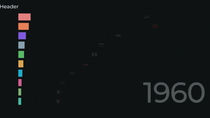
A bar chart race is when you see animated ranked bars over a certain time. As time goes by, these bars grow, shrink, and reorder, just like in a race, and this can help you see dominant trends through years, decades, or even centuries. The entire point is that viewers don't just see a static ranking. They feel a sense of momentum, and it's very fun to see how the race unfolds, turning ordinary data analysis into a kind of sport.
To help you understand them better, here are the top five bar chart video ideas that tend to go viral.
GDP Leaders by Decade
For these types of topics, use a slow, dignified pacing and a clean, sans-serif font to highlight steady shifts in the world economy.
Top Social Networks
This one can be a little more exciting, with bright brand colors and fast, energetic music. You can also add annotations to explain which product rollouts caused the biggest changes.
Most-streamed Artists Per Year
You can get creative with videos that rank any form of art. Add album art as small icons on each bar and change music moods based on the top performers.
Fastest-Growing Programming Languages
For any type of tech race bar video, you can even use a dark theme with neon accents. Add animations to highlight position changes across time.
Team Standings throughout a Season
Sports are an endless supply of different types of data to compare. From points and titles to individual achievements and other accolades, you can create all sorts of videos.
Top 5 Best Bar Chart Race Makers without Coding
There are many tools out there that you can use to animate data without a single line of code. Below, we'll examine the five top ones, their strengths, limitations, and the best scenarios for each.
Filmora
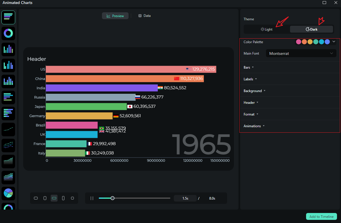
Filmora is a user-friendly video editor that offers a data visualization feature named animated charts. You can use it to convert structured data into different types of animated charts, including pie, bar chart races, column, area, and more. You can customize their style with themes, change color palettes, and fonts. There are also options to customize bars and labels, backgrounds, add animations, and chart headers, all in one place.
How it visualizes data: Turn spreadsheets into different types of charts directly with Filmora's animated chart maker and customize them with a lot of options, edit them like a pro.
 secure download

Best for: Creators who want video-first storytelling with charts that seamlessly integrate with the rest of the edit.
Flourish
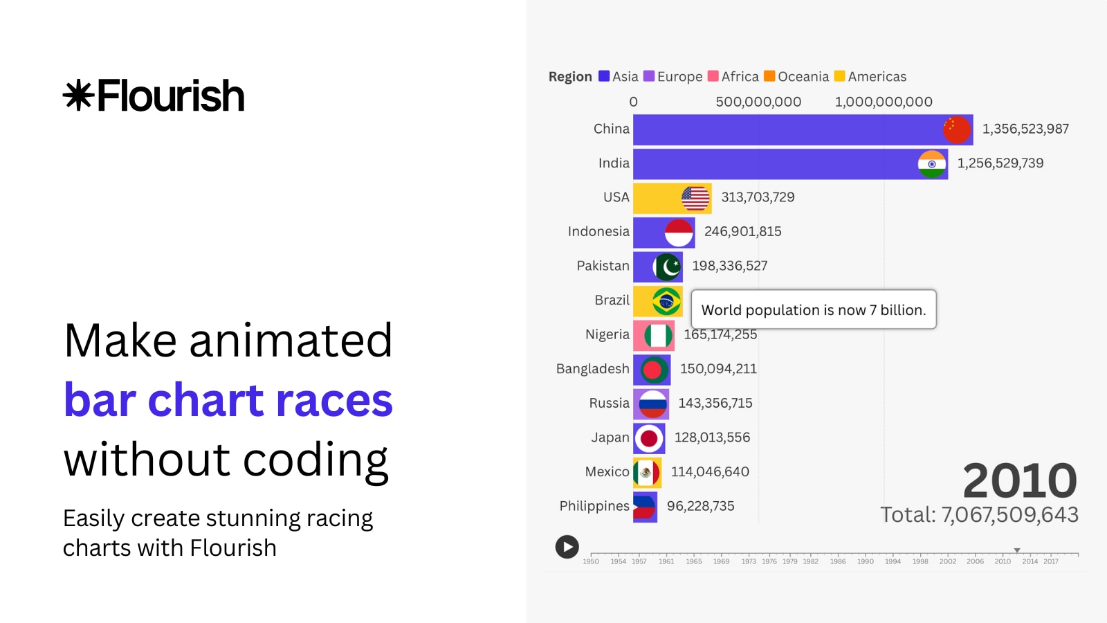
Flourish is a popular and intuitive online data visualization platform that provides access to several bar chart race templates. It has sufficient customization options, enabling you to edit fonts, change colors, and customize captions. Use it to publish interactive graphics, and if desired, combine them to create multi-slide stories. It's widely used for quality visuals, and you can now export stories as MP4 videos if you have a premium account.
How it visualizes data: Upload a CSV or link a Google Sheet. Then, choose the race template, customize fonts, colors, labels, and export the video or embed it in an existing video or document.
Best for: Marketers and educators who want fast, visually appealing races for the web that can be exported as videos.
Datawrapper
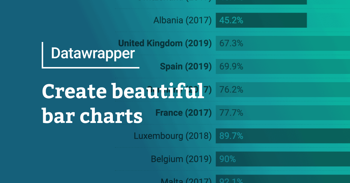
Datawrapper is geared towards professionals, but it's still a web-based, easy-to-use tool. You'll see their charts in the news. They prioritize clarity and accessibility, and the tool excels at both static and interactive charts you can embed or download. The free plan allows you to publish an unlimited number of charts and export PNGs. The Custom plan adds SVG/PDF export and removes attribution. No native video export.
How it visualizes data: Upload or paste spreadsheets, select a chart, and publish clean visuals. For race-style motion, you can sequence exports or use animated options where available.
Best for: Serious explainers and reports where accuracy and readability are more important than looking attractive.
Bar Chart Race App
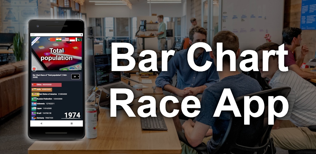
The Bar Chart Race App is a single-purpose bar chart race generator that focuses solely on one thing, and that's creating bar chart races. They all look the same, no matter the type of race you are making. The app is currently available only for Android, but a web-based version is also available. However, all the bar chart races look the same, which is a letdown.
How it visualizes data: You get a simple CSV input. You also get basic speed controls, you can change the colors and label format, but you would need to screen-record to export.
Best for: Quick social posts where you are pressed for time and need a quick bar chart race video.
LivingCharts
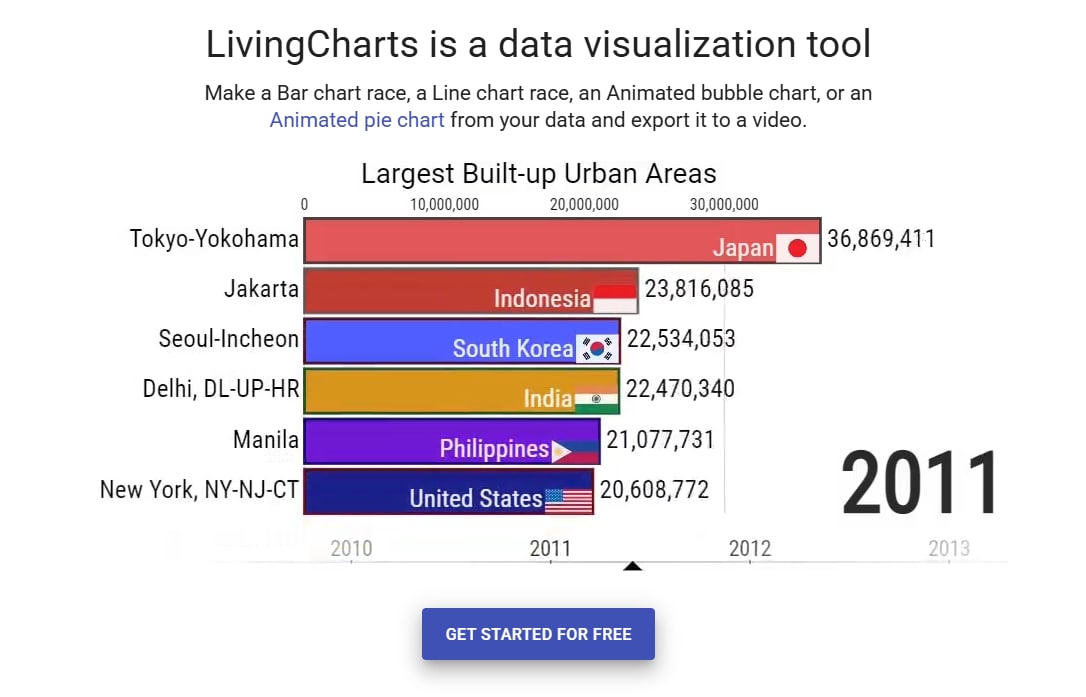
LivingCharts is a browser-based creator app dedicated to animated charts, including bar chart races, line and column races, bubble and pie charts, and more. It emphasizes customization and direct MP4 exports, as well as image sequences and embeddable players. Projects are saved in the cloud, so you can start for free in the browser and scale up.
How it visualizes data: The process is very simple. Import your data, adjust the color scheme with basic colors, pick transition effects, and then export. Simple.
Best for: Casual creators who want simple animations and straightforward exports.
Compare the Best Bar Chart Race Makers
And now, to help you compare these tools easily, we have prepared this simple table that puts these five tools head-to-head. Check it out!
| Tool | Filmora | Flourish | Datawrapper | Bar Chart Race App | LivingCharts |
| Native to Video Editing | Yes | No (export then import) | No (export then import) | No | No |
| True Bar Race Template | Yes | Yes | Partial | Yes | Partial |
| Chart Variety | High | High | Medium | Low | Medium |
| Design Control (Fonts/Colors/Labels) | High | High | High | Medium | Medium |
| Audio/VO Sync | Excellent | Good (indirect) | OK (indirect) | OK | OK |
| Best For | Video-first creators | Web + video export | Journalism, clarity | Quick social | Simple explainer |
How to Make a Bar Chart Race Video Without Coding
Creating bar chart races in Filmora is remarkably easy. Thanks to its built-in animated charts feature, you don't need any coding skills—you can turn raw data into a dynamic, animated bar chart race in just minutes.
- After downloading and installing Filmora on your computer, launch the software and start a new project.
secure download
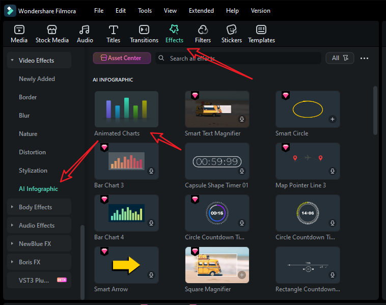
- Go to Effects > navigate to AI Infographic > double click the Animated Charts to activate the feature.
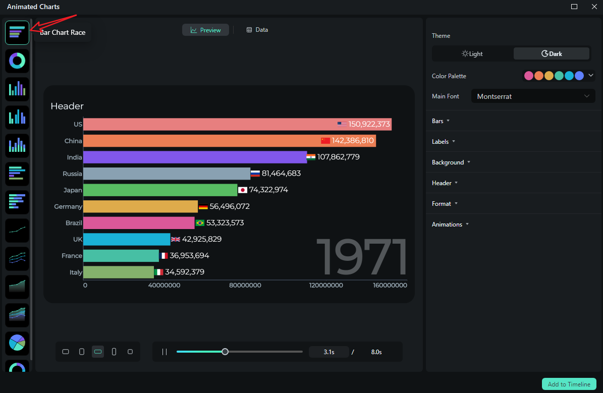
- View and pick a bar chart race template on the left side.
- Switch to the Data section to upload your Excel file or edit the sample data column.
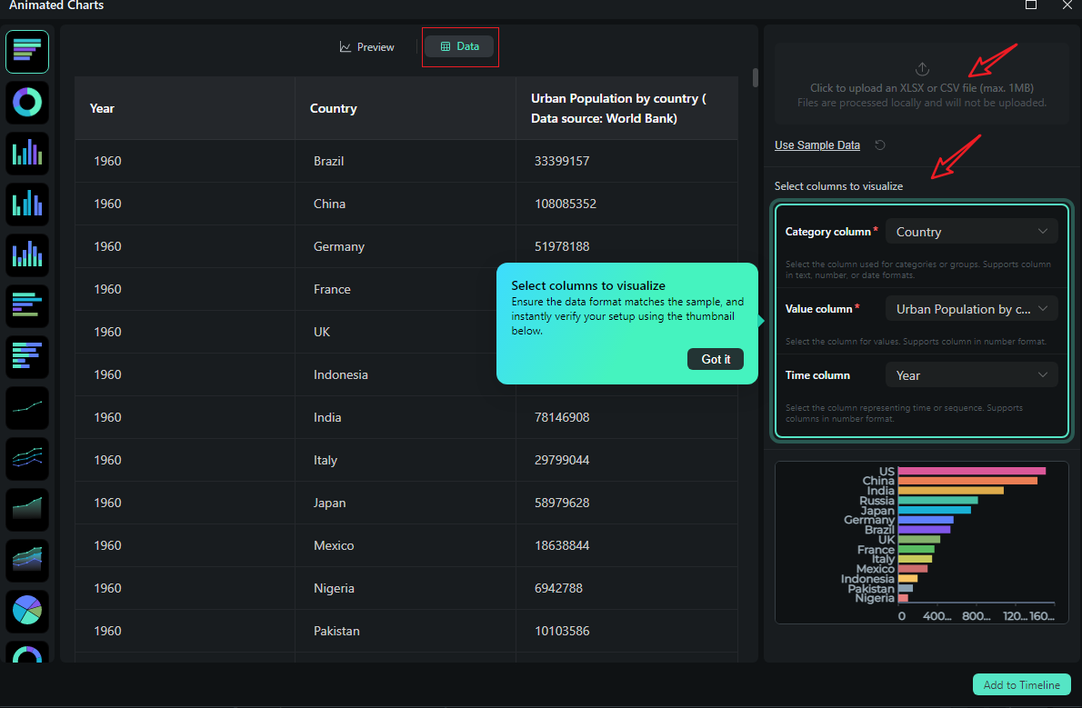
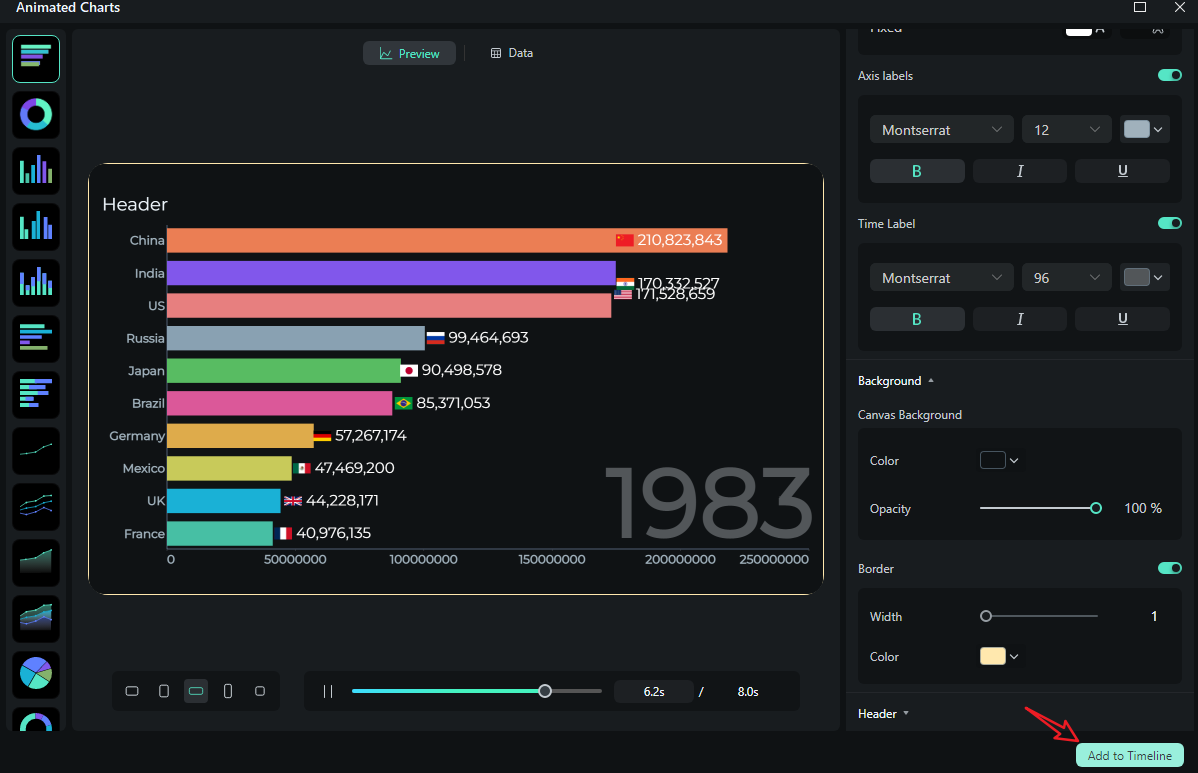
- After uploading the file or editing the data, review it and select what you want to visualize. Switch to the Preview section > you can adjust theme, main font, segments, labels, background, header, format, animation styles, animation orders, aspect ratio, and more accordingly.
- If you are satisfied with the result, you can click on add to the timeline.
- Then you can choose to export the bar chart race you have created.
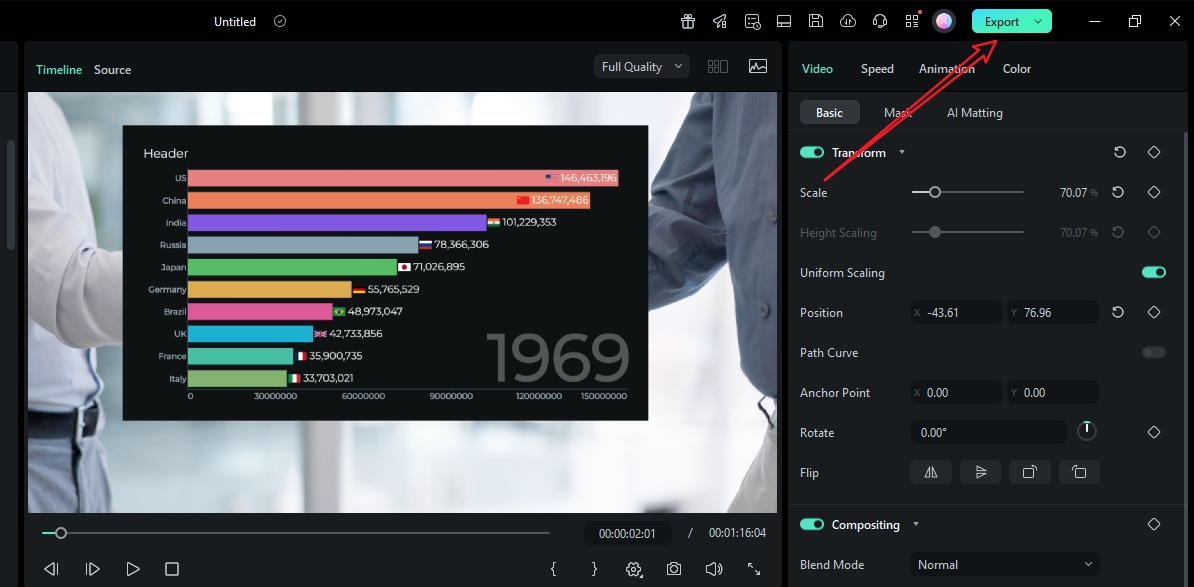
Let's see the final bar chart race video created by Filmora.
Conclusion
Analyzing data is usually a very dull process, but bar chart races make data feel alive. This makes them great for education, product launches, boardroom meetings, and different forms of presentations. With online tools, you can get something that works, but with Filmora's AI chart tools, you can build and add style to your bar chart races right inside your edit. You can skip awkward exports and keep motion perfectly on beat.
Try Filmora today to prepare your workflow, then light up your stats like never before.
secure download 