
 100% Security Verified | No Subscription Required | No Malware

If you are a video editor working on videos that aim to teach a topic, pitch an idea, or create a report, you need some form of data visualization. If so, we have a question for you. Do you need a feature that adds charts directly inside your editor, or is it okay for you to use plugins and exports from external sources? Some video editing tools support chart creation directly in the timeline, while for others, you need to find a way to make it work.
This article compares four popular video editors with data visualizing features. Whether you are looking for a one-stop video infographic maker or using plugins to convert data to charts and add them to the video editing software, we'll cover you all.
In this article
Best Four Video Editing Software with Data Visualization

Let's examine the top tools and see how each one handles data in practice. We'll cover Filmora, Premiere Pro, Final Cut Pro, and CapCut.
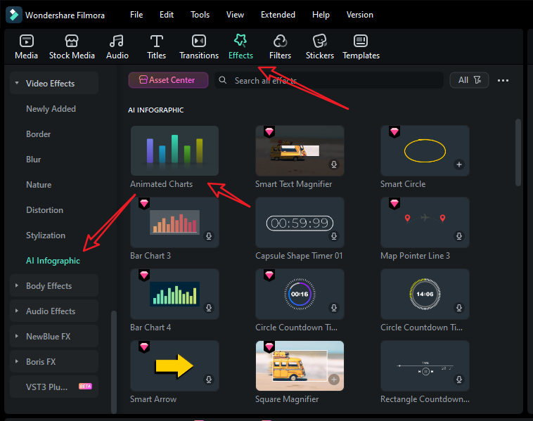
Wondershare Filmora — The Best Video Editor with a Built-in Animated Chart Maker
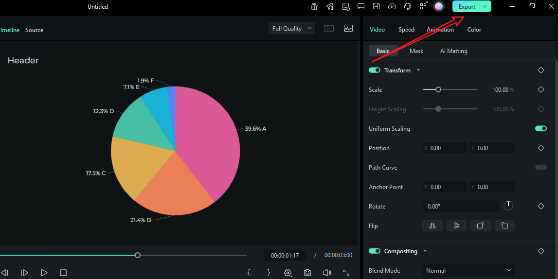
Filmora is a user-friendly video editing software solution that offers comprehensive manual editing and AI-driven video editing workflows. Apart from an extensive selection of useful features, Filmora now features a native data visualization feature named animated charts that converts pasted or imported data into dynamic charts, directly within the timeline.
You can choose from several types of animated charts, including pie, bar, line, column, area, and more. After that, you can adjust the style of the output with themes and different color palettes. Naturally, you can adjust the font and explore different bar and label rules. Finally, pick a custom background color and add animations and chart headers.
 secure download

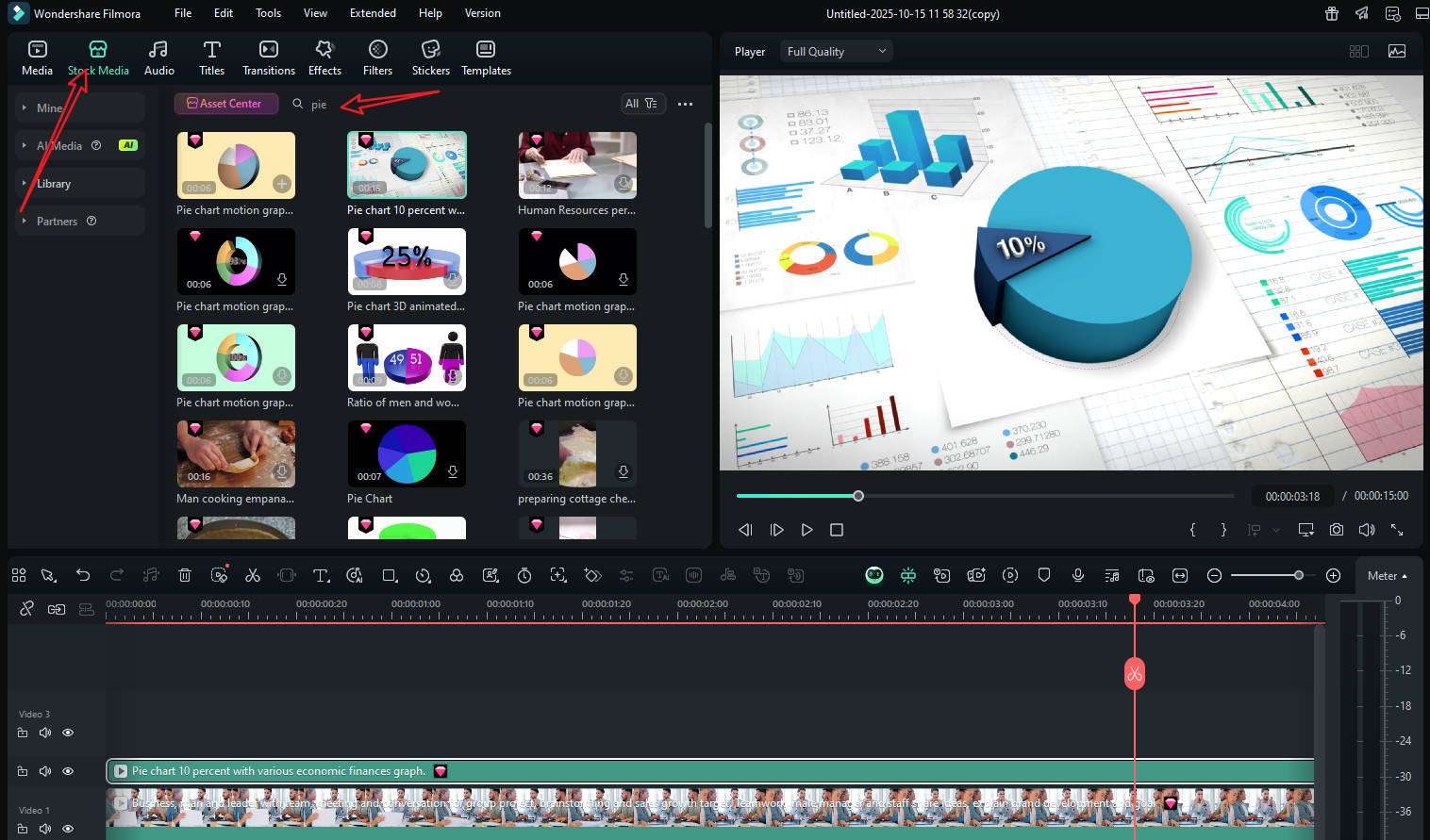
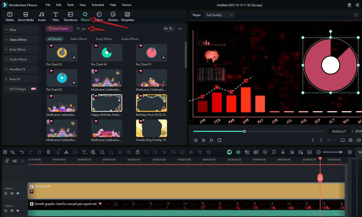
What's more, Filmora also offers plenty of video chart footage in its stock media, so you can directly use it. It even provides different types of animated charts in the effect panel so you can make your video more convincing and attractive.
Given all the features it provides, it can be a great video editor with data visualization features for users, whether you are a beginner, intermediate, or a professional editor.
Premiere Pro — A Top Video Editor, but Plugin-heavy for Charts
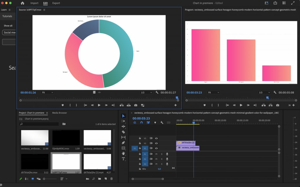
Adobe is a powerhouse for cutting, grading, and adding finishing touches. If you want to visualize data and animate charts in After Effects, you would have to use some motion graphic templates, scripts, or third-party plugins.
Data-driven Motion Graphics templates allow you to quickly and accurately customize bar charts, line graphs, and more, without manual entry or deep knowledge of motion graphics.
You can also use the Essential Graphics panel to create animated infographics or connect a data source like a CSV file to update templates dynamically.
For more advanced or specific visualizations, use third-party plugins like Data Storyteller. You can use metadata to organize and visually track data within your project panel by customizing columns like "Label" or "Video Usage".
If you have a large team with motion designers available, this is acceptable. However, for solo creators on tight deadlines, Premiere Pro can be too complex.
Final Cut Pro — Best Video Editing Software for Mac users with Plugins to Visualize Data
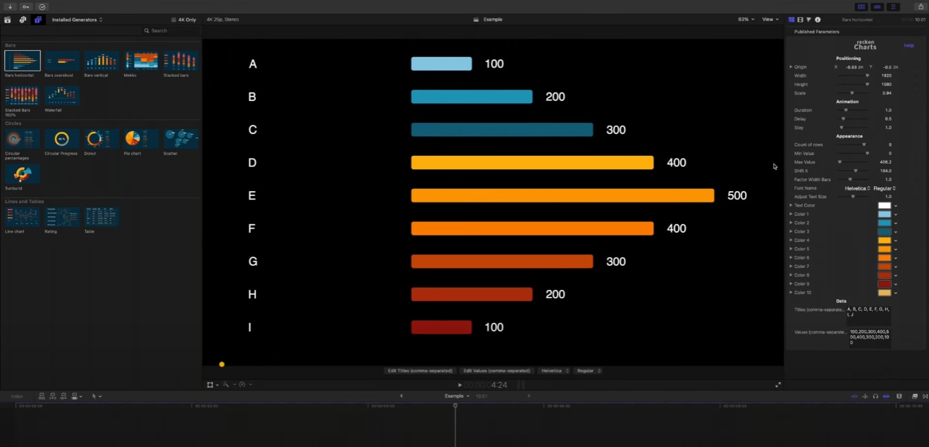
Final Cut Pro is a powerful video editing software for Mac users. If you want to visualize data, you can use third-party plugins to create animated charts and infographics like those found on fxfactory.com. Many plugins offer different chart types, such as bar charts, pie charts, and progress bars, with various animation and customization options. For simple, professional-looking charts, you can also use Keynote to create them and export them as a video to import into Final Cut Pro.
Like Premiere Pro, to visualize data in Final Cut Pro also depends on plugins, which are not friendly for newbies.
CapCut — Great for Quick Social Edits, but Limited for Structured Data.
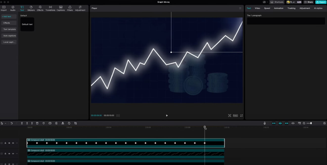
CapCut offers some data chart templates, providing interactive functionality through embedded pages, allowing users to configure charts within them.
The feature initially supports basic chart types (such as bar charts, line charts, and pie charts). It supports data file upload and online editing, as well as customization of various chart types, color schemes, and animation rhythms.
However, suppose you are looking for something that can handle structured, repeatable data stories, like monthly KPI updates, weekly lessons, or reports. In that case, you'll want something that can read data in tables, map different data series, and manage labels without having to add every value by hand.
Compare the Best Video Editing Software that Visualizes Data
Take a look at a quick comparison table that highlights the most important information about these four tools and their approaches to data visualization.
| Editor | Filmora | Premiere Pro | Final Cut Pro | CapCut |
| Built-In Chart Maker | Yes | No | No | Partial (graphics) |
| Plugin Dependence | Low | High (AE/scripts/templates) | High (Motion/templates) | Medium |
| Design Control | High (theme, colors, fonts, labels, headers) | High (with plugins) | High (with plugins) | Medium |
| Ease of Use | High | Medium | Medium | High |
| Audio/VO Sync | Excellent (timeline-native) | Good (via comp renders) | Good (via generator updates) | Good enough |
| Best For | Creators, educators, marketers | Agencies, power users | Mac-centric pros | Quick social edits |
How to Pick the Best Video Editing Software with Data Visualization?
When choosing a tool for your workflow, consider these most important factors.
- Built-in vs. Plugin Support: If you create charts regularly, a built-in tool will save you hours that you would otherwise spend packaging assets and managing revisions. With plugins, you gain some flexibility, but at the cost of taking extra steps.
- Animation and Dynamic Effects: Dynamic charts are more engaging than static infographics. When you are picking a video editing software with data visualizing features, check if it supports animated charts, or if you can animate the charts through editing features like adding keyframes.
- Data Import: Pick a tool that supports importing spreadsheets and turning them into charts or infographics in seconds.
- Visual Customization: Choose a tool that provides customizing options like the theme modes, color palettes that match your design system, font control for titles and labels, rules for abbreviations, background colors, and a place for chart headers so charts will look good next to your logo and other branding assets.
- Learning Curves: Choose a tool according to your editing skills level. Filmora is a top choice for both beginner and intermediate users.
How to Visualize Data for Videos?
If we consider all these aspects, the best choice is Filmora. It ticks all the boxes from the previous section, and it also offers very fun and creative features that will help you bring your idea to life. You can not only convert data into 10+ types of animated charts, but also explore plenty of basic, advanced, and AI-powered video editing features in the same tool.
Here are the steps to visualize data into animated charts in Filmora.
- After downloading and installing Filmora on your computer, launch the software and start a new project.
secure download
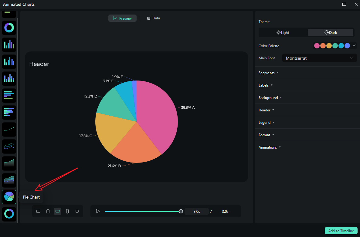
- Go to Effects > navigate to AI Infographic > double click the Animated Charts to activate the feature.
- View and pick an animated pie chart template on the left side. (You can also pick a different one.)
- Switch to the Data section to upload your Excel file or edit the sample data column.
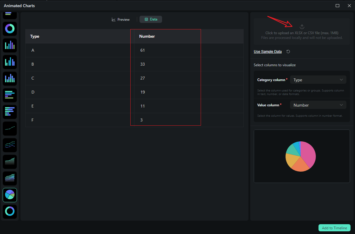
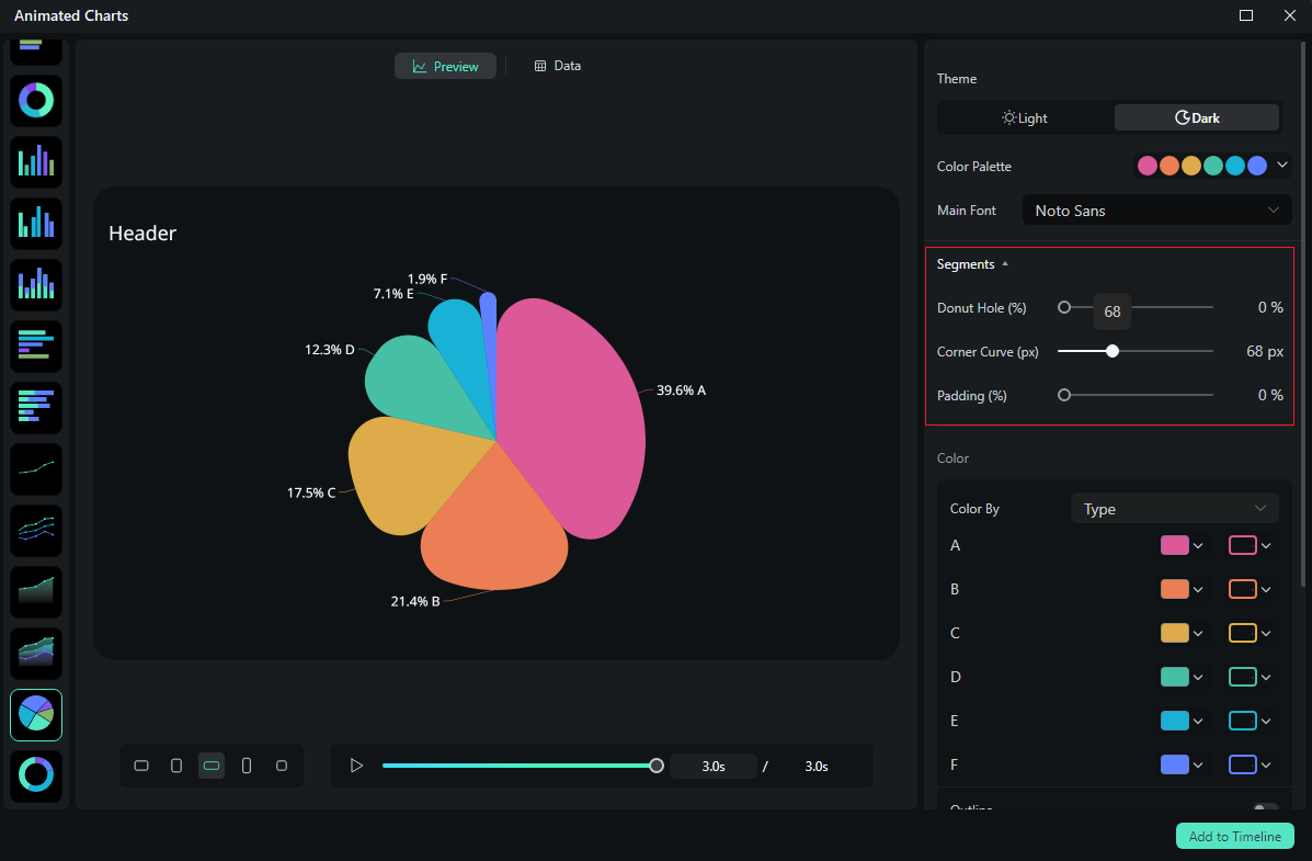
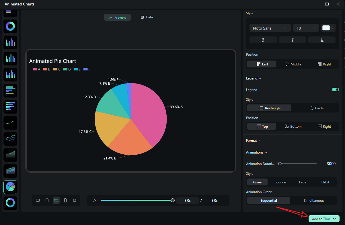
- After uploading the file or editing the data, review it and select what you want to visualize. Switch to the Preview section > you can adjust theme, main font, segments, labels, background, header, format, animation styles, animation orders, aspect ratio, and more accordingly.
- If you are satisfied with the result, you can click on add to the timeline.
- Then you can choose to export the animated chart you have created.
Let's see the final animated pie chart created by Filmora.
If you're just looking to enhance your videos with simple yet eye-catching chart animations directly in a video editor, Wondershare Filmora can also cover that. It comes with a built-in library of animated chart stickers—no complex design or coding skills required. You can add these dynamic chart stickers onto your video timeline in just a few clicks, making it easy to visualize data like sales trends, survey results, or category proportions for your audience.
- Download and install Wondershare Filmora on your computer.
secure download
- Upload your video clip by clicking the import media button.
- If you want to add an animated pie chart footage to your clip, go to Stock Media> search for pie chart> choose the footage and add it to your timeline.
- Alternatively, you can go to Effects > search pie chart > to add an animated pie chart to your video.
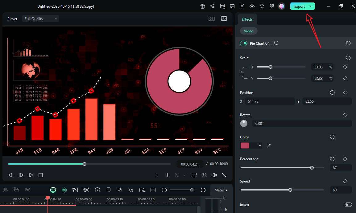
- Customize the chart with all available options. Preview the result and export it if you are satisfied.
Types of Charts You Can Add to Videos
Different types of questions require different visual aids. Here's a practical table to help you select the right chart for your specific needs.
| Chart | Best For | Works Great In |
| Bar / Column | Comparing categories at a point in time, surfacing winners and laggards. | Feature adoption by region; top products this quarter. |
| Stacked Bar / Stacked Area | Showing composition and change over time. | Marketing mix across months; budget allocations by team. |
| Line | Trends and inflection points; deltas across time. | Monthly active users; temperature or performance logs. |
| Area | Trend + magnitude emphasis (fills draw the eye). | Cumulative sign-ups; energy usage profiles. |
| Pie | Simple part-to-whole with few categories (≤6). | Market share snapshot: allocation of a single budget. |
| Donut | Like a pie, but with cleaner labels and a center for totals. | Campaign breakdown with a headline number in the middle. |
| Scatter | Correlations and clusters. | A/B test results; cost vs. performance comparisons. |
| Bubble | 2–3 variables at once (x, y, size). | Market landscape: price, quality, share. |
| Radar / Spider | Multivariate profiles vs. a baseline. | Camera spec comparisons; skill matrices. |
| Bar Chart Race | Ranking that changes over time (momentum stories). | "Since 2010" growth stories; cumulative follower leaderboards. |
Conclusion
If you want to add charts to your videos, the editor you pick determines whether working with data will feel like storytelling or housekeeping. Premiere Pro and Final Cut Pro can produce gorgeous, intricate animations, especially with After Effects in the mix, but every change requires you to go back to the drawing board. CapCut is great for creating quick social media pieces, but it's not built for handling structured data at scale.
Filmora's data-visualization module flips the script, giving you all the tools you need in one place. Download Filmora today and experience it for yourself.
