
 100% Security Verified | No Subscription Required | No Malware


 ChatGPT
 Perplexity
 Gemini
 Claude
 Grok
Grok
Animated charts today are considered a pacing device in videos. When a curve is drawn left-to-right as you speak, viewers can track changes, feel the momentum, get involved, and retain more information due to increased engagement.
Today, we'll learn what an animated line chart actually is, which tools are recommended to get the best results, and how a new animated line chart video maker fastens the data visualization process.
In this article
What Is an Animated Line Chart?

An animated line chart is a dynamic data visualization that shows how values change over time through motion. Instead of displaying all data points at once, the line moves, grows, or transitions smoothly — helping viewers visually follow trends, progress, or fluctuations in a more engaging way.
For example, rather than presenting a static chart showing yearly sales, an animated line chart gradually draws the line from left to right, revealing each year's data as it progresses. This movement not only captures attention but also makes the data story easier to understand.
What is the Best Animated Line Chart Maker?
While tons of spreadsheet tools, design apps, and motion-graphics software can all produce an animated line chart, such as Excel and powerpoint for Windows users, Canva for online chart makers, After Effects for professionals, and Flourish for quick results from templates, for video editors, Filmora offers a far more direct way to visualize data and convert it into motion graphics in videos.
To create an animated line chart in Filmora, you can use its powerful feature named animated charts, which allows you to paste or upload a spreadsheet and convert it into animated charts, such as line chart race, pie charts, bar chart race, column, donut chart, or area charts, and more directly in the video editing timeline.
In addition to that, as a well-known video editor in the market, you can also manually add keyframes to make the line chart animated as you need. Or pick a preset line chart animation template and adjust the values.
 secure download

Why is Filmora the Best Animated Line Graph Maker?
- Style controls flexibility: you can adjust the theme, color palette, main font, and stroke width, and you can add custom markers, adjust label rules, and experiment with background colors, animations, and chart headers.
- 10+ types of animated charts support: you can not only make an animated line graph, but also make other popular types of charts, such as bar chart racing, animated pie charts, donut charts, and more.
- All-in-one animated line graph maker and video editor: you can turn data into animated line graphs and edit the videos with both basic and advanced features within the same tool.
How to Create an Animated Line Chart in Filmora?
Here's how you can use Filmora to create an animated line chart from a spreadsheet.
- Download and install Filmora on your PC or laptop (Windows or Mac).
secure download
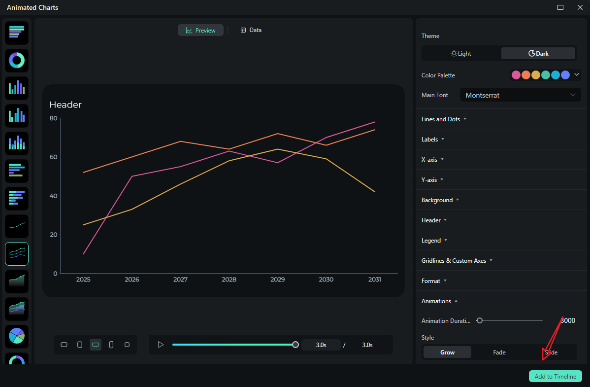
- Start a New Project > Navigate to Effects > Video Effects > AI Infographic > Animated Charts and double click on it.
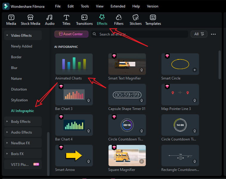
- Pick an animated line chart template; you can choose the single animated line chart or the multiple lines chart.
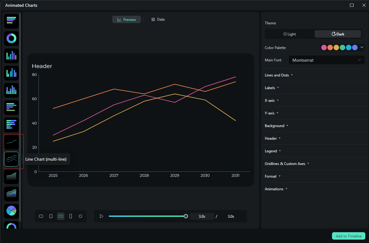
- Switch to data > upload your speedsheet. If you don't want to upload your data, you can directly edit the preset values.
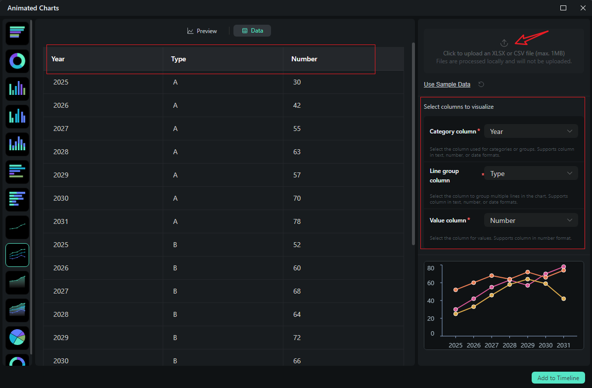
- After uploading the file or editing the data, review it and select what you want to visualize. Switch to the Preview section > you can adjust theme, main font, segments, labels, background, header, format, animation styles, animation orders, aspect ratio, and more accordingly.
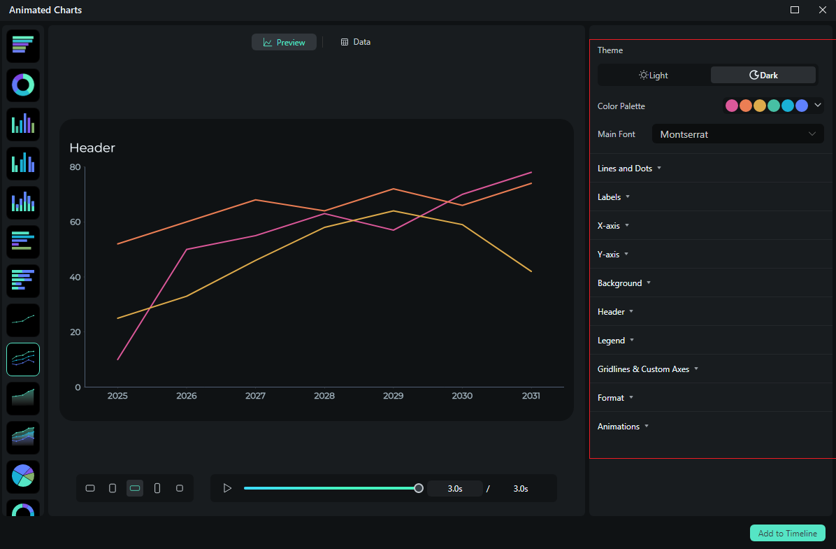
- If you are satisfied with the result, you can click on add to the timeline.
- Then you can choose to export the animated line chart you have created.
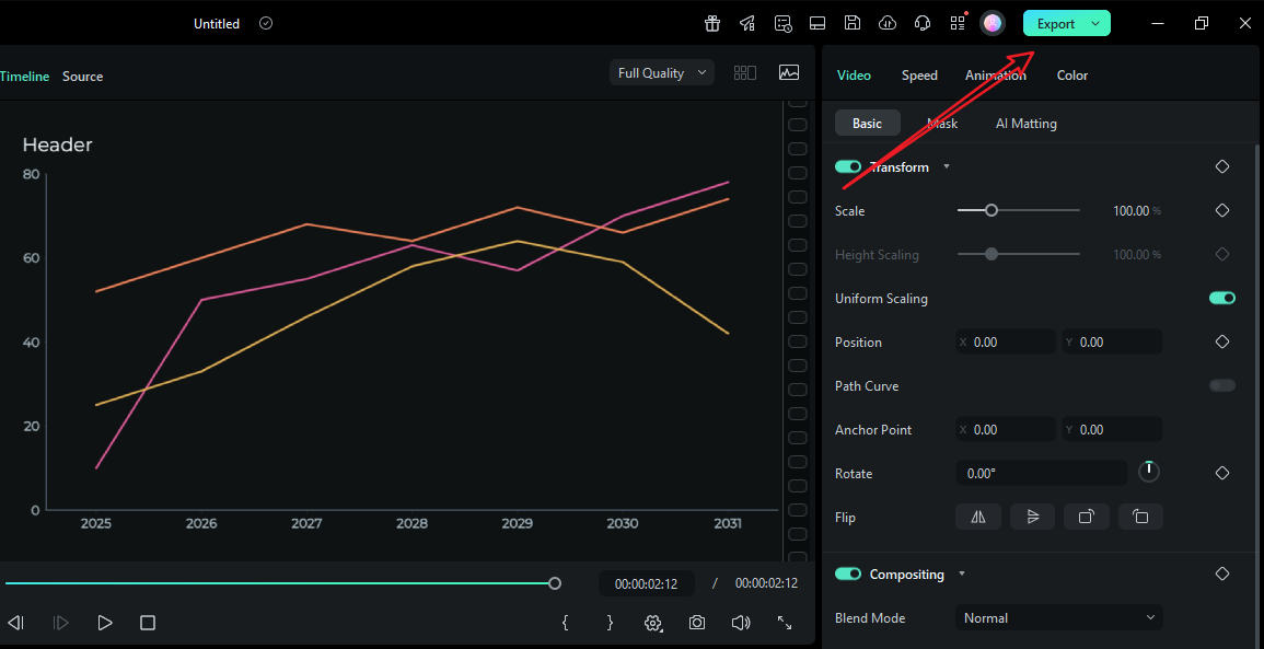
Let's see the final result.
Comparing the Traditional Methods and Filmora to Create Animated Line Charts
| Method | Filmora Animated Charts | Traditional Method |
| How it achieves | Converts spreadsheet data to a line chart clip inside the video editor. | Build in Excel/Canva/Flourish/AE → export (PNG/MP4) → import to editor → try to sync reveals with audio. |
| The time it costs | Fast setup | Slower. Every tweak risks a full render cycle. AE is powerful but time-intensive; Excel/Canva are quicker but still require syncing by hand. |
| Results quality | Consistent brand type and color, precise line-draw pacing, smooth labels, and on-beat reveals. Multi-chart packages look unified because they share presets and project fonts. | Quality varies. AE can be world-class but demands expertise. Spreadsheet/design tools are simpler but yield coarse motion and inconsistent typography across scenes. |
| Advantages | One tool for edit + data visualization; audio-synchronized motion; reusable presets; seamless multi-ratio delivery (16:9, 1:1, 9:16) without rebuilding. | Familiar tools; AE offers deep control; Flourish provides attractive templates and web embeds; Excel/Canva are widely accessible. |
| Disvantages | Requires changing your legacy slide pipeline. | Round-trips waste time; style drift between apps; limited audio sync; revisions are painful; multi-scene consistency takes lots of manual care. |
| When to Pick | Weekly/monthly reporting videos, explainers, launch recaps, and social posts where animated line graph moments need to hit specific beats, and where numbers change late. | One-off hero animations in AE, quick slides where a simple reveal suffices, or web-only embeds that won't be part of a larger video package. |
Conclusion
A great animated line chart is all about tempo and clarity. Introduce the baseline, draw the line in a steady reveal, pulse the inflection points that matter, and let labels appear just after the movement so nobody has to read during motion. You can do that with traditional tools, but Filmora's data-to-video streamlines the process.
Download Filmora today and use this feature to add awesome animated line charts to your videos with ease.
secure download 