
 100% Security Verified | No Subscription Required | No Malware

Have you ever wondered why a chart is more elegant than a simple spreadsheet? When you convert an Excel table into a graphic, you can see a visual representation of the data, and it can show you some insights that you couldn't see by simply examining a spreadsheet.
Converting Excel data into clear visuals is easier than it seems, and today, we'll prove it. We have an easy guide to convert data to a chart in Excel. Stick around for a bonus section where we'll show you how to convert spreadsheets into attractive visuals with zero coding.
In this article
How to Convert Data to a Chart in Excel?

Microsoft's Excel is a very powerful tool for data management, and today, our easy guide will teach you how to create charts from a spreadsheet you have prepared. Here's how.
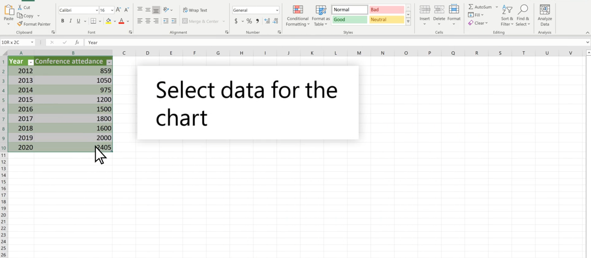
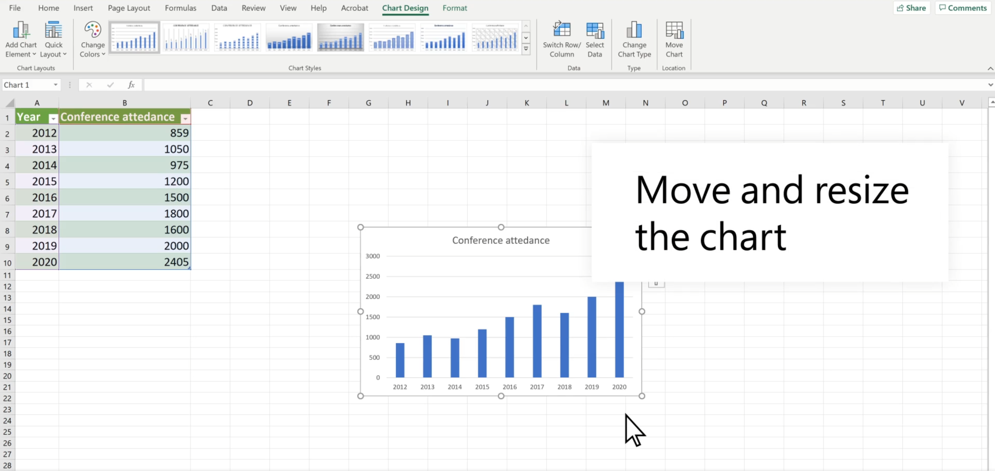
- Prepare your spreadsheet and ensure that the data input is accurate.
- Use your mouse and drag to select the rows and columns you want to convert into a chart.
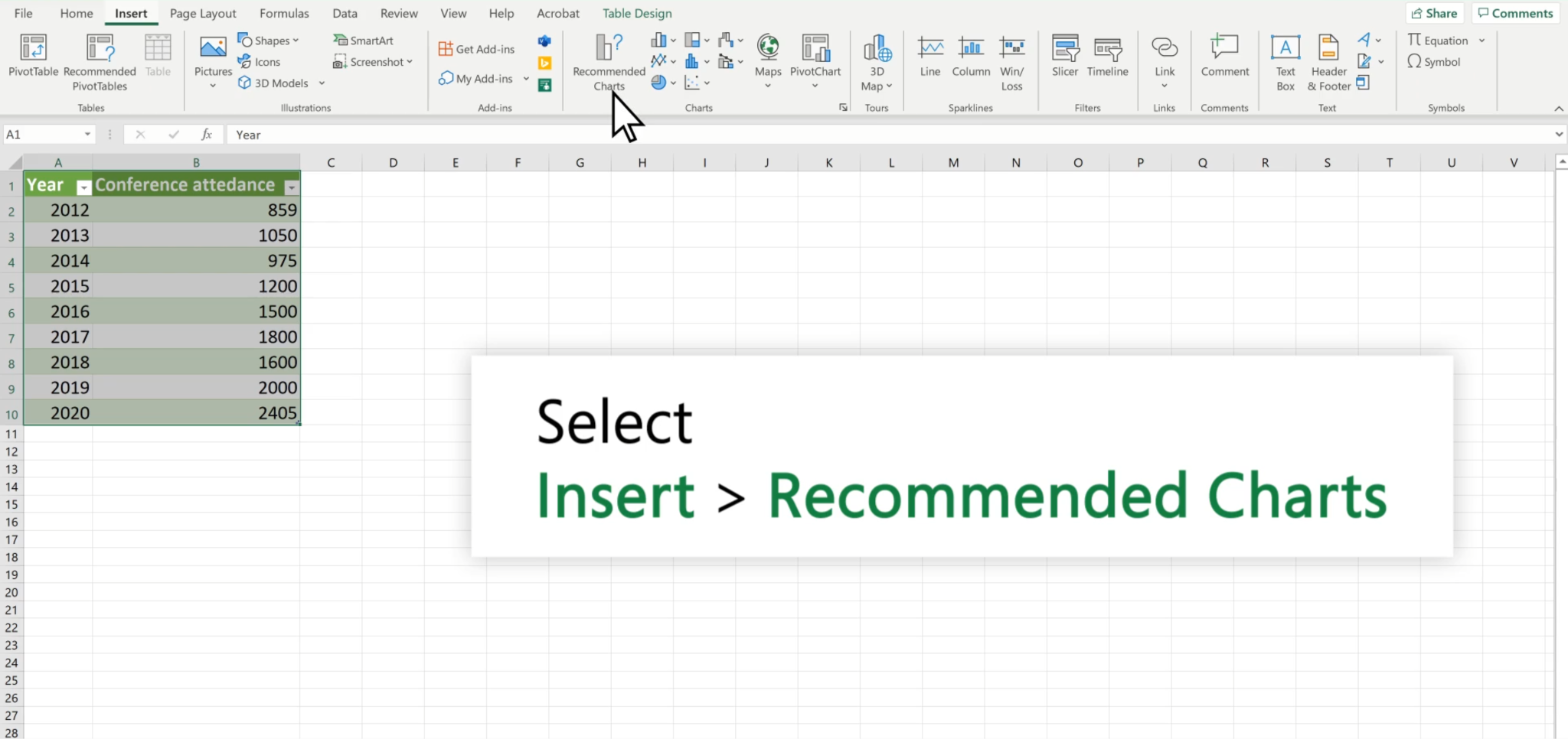
- Select the Insert tab and then click on Recommended Charts.
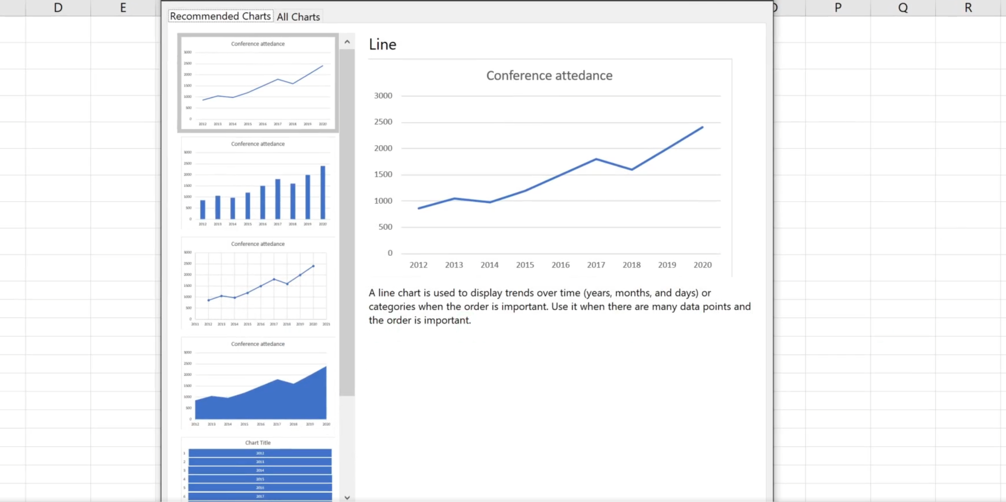
- Pick the type of chart from the available options, and make sure to read the descriptions to understand which type of chart to use for your specific scenario.
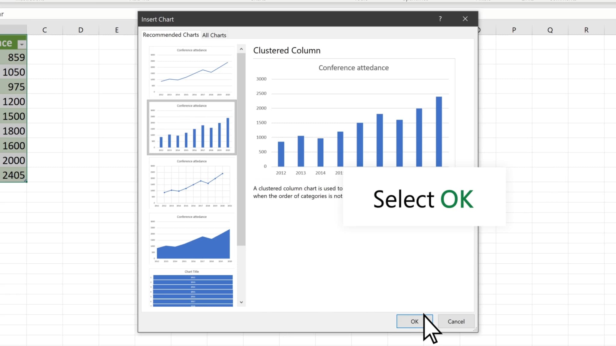
- When you have selected the right type of chart, click OK.
- You can now move and resize the chart according to your preferences.
This will work well for simple presentations and school projects, but if you want to go a step further and convert spreadsheet data into a cool, easy-to-follow video, we have an awesome bonus section for you.
How to Add Converted Charts to Videos?
Nowadays, more and more people prefer presenting charts in their videos, especially for sales marketing, business presentations, and other convincing scenarios. If you have converted the Excel data to a chart, and want to add it to your videos to make them more convincing. You can use a powerful video editing software with a data visualization feature, and Wondershare Filmora is such a great choice.
- Download and install Filmora on your computer.
 secure download

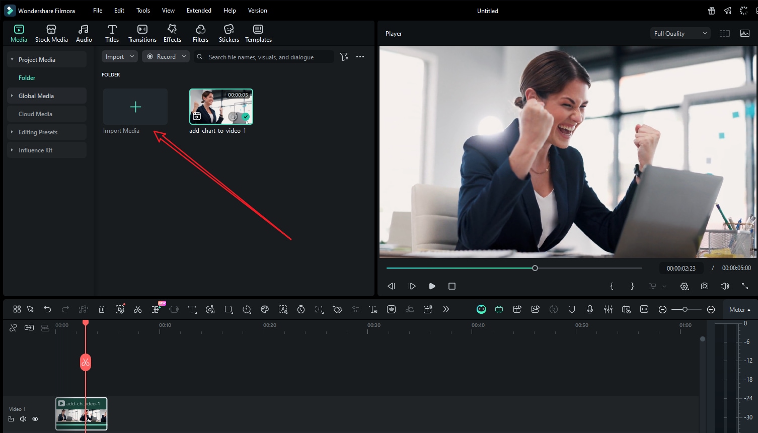
- Import your clip and a chart picture that you have converted with Excel.
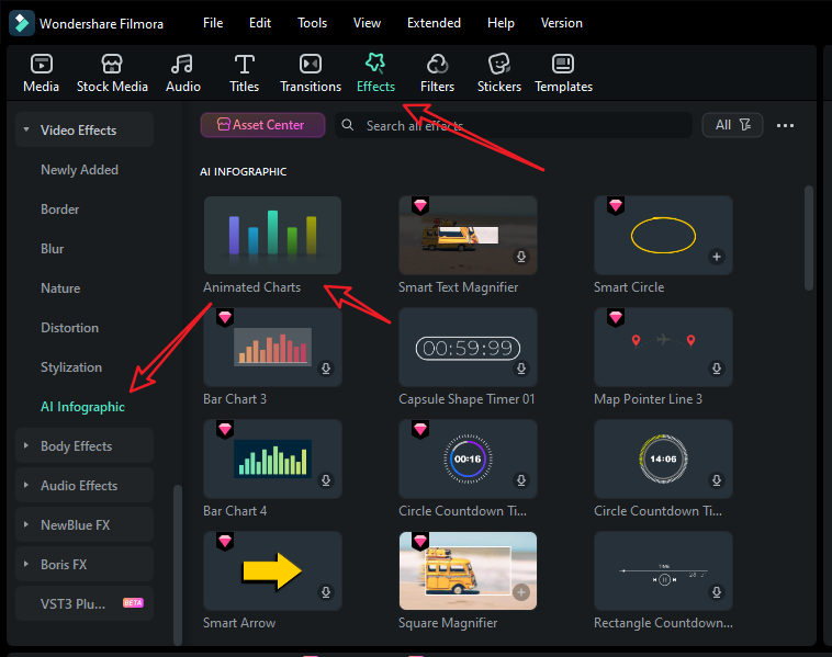
- Alternatively, you can add a chart to videos by navigating to Effects > AI Infographic > pick a chart according to your preference.

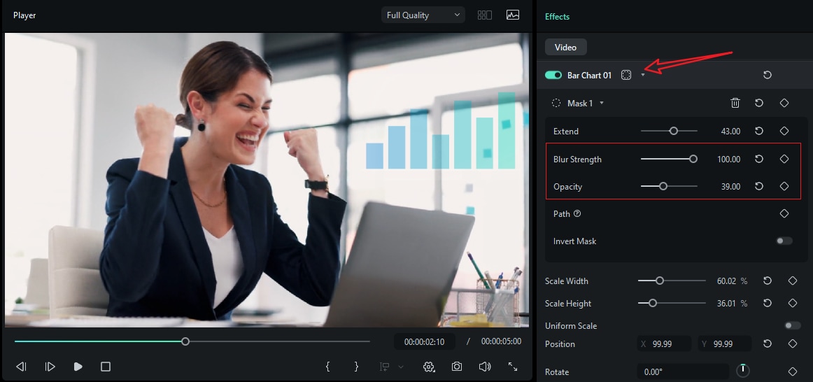
- Drag the chart to the timeline and customize the mask, color, position, speed, number, and more.
- Preview the result and tap on Export to save it if you are satisfied.

Bonus: Turn Speedsheet Data into an Animated Chart Directly in Videos
Static charts are perfectly fine if you want to explain something. However, if you want it to be more attractive and persuasive, a dynamic chart will be a better option, especially if you need to put them into videos. Filmora will also issue a new feature named animated charts that allows you to directly convert spreadsheet data into an animated chart, which means you can import the Excel file to Filmora and turn it into any popular type of chart without using Excel, including pie, bar, column, and area charts.
You can then customize them further by changing their styles, theme modes, color palettes, main fonts, bars, labels, background colors, animations, chart headers, and more. The best part is that you can do all this while working on your video edit.
secure download Here are the steps on how to turn Excel or CSV into animated charts in Filmora.
- After downloading and installing Filmora on your computer, launch the software and start a new project.
- Go to Effects > navigate to AI Infographic > double click the Animated Charts to activate the feature.
- View and pick an animated chart template on the left side.
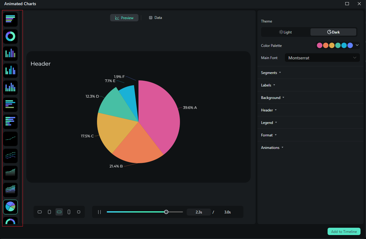
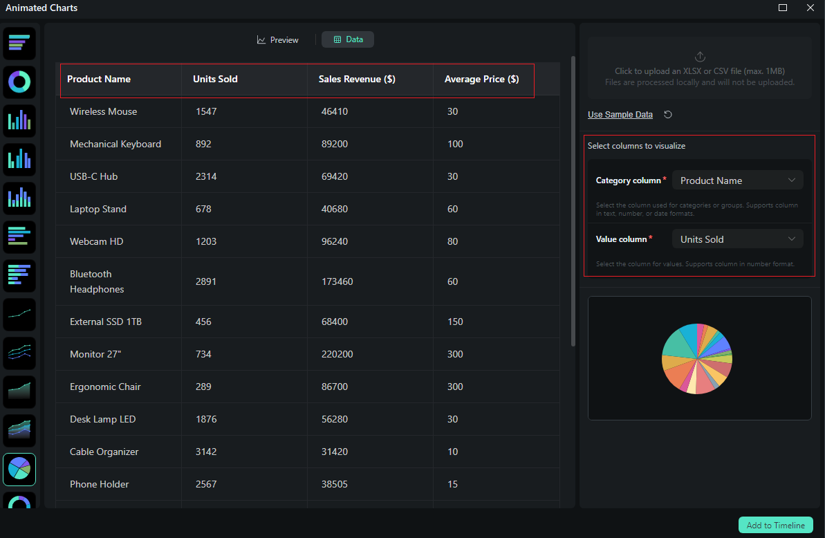
- Switch to the Data section to upload your Excel file. Review the data in the column, and select what you want to visualize.
- Switch to the Preview section > you can adjust theme, main font, segments, labels, background, header, format, animation styles, animation orders, aspect ratio, and more accordingly.
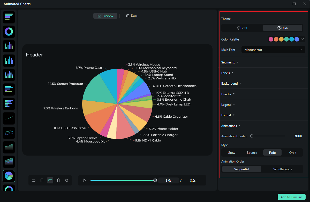
- If you are satisfied with the result, you can click on add to the timeline.
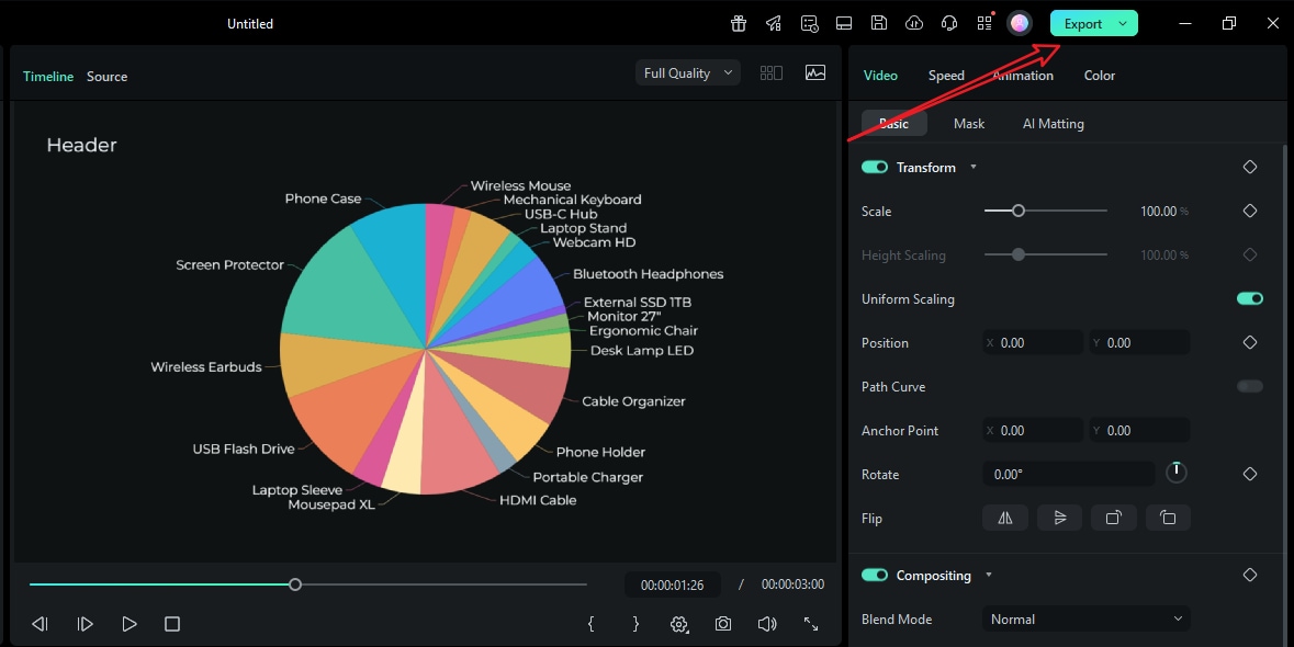
- Then you can choose to export the animated chart you have created from Excel data.
Let's see the final animated charts converted from Excel.
Conclusion
Excel is a very powerful tool, and with it, you can get your hands on a very precise chart. However, if you want to introduce a little magic into the mix, you can use Filmora to turn that chart into exciting visuals by adding motion that follows the beat of your overall story.
Get your data ready now, and create stunning animated explainers with Filmora. Download the tool and set up your project template today.
secure download 