
 100% Security Verified | No Subscription Required | No Malware


 ChatGPT
 Perplexity
 Gemini
 Claude
 Grok
Grok
Although static charts can convey the meaning, animated ones are more attractive and keep users engaged, especially if you are making education and explainer videos, comparisons, showing market shares, feature adoptions, and product benchmarks, reporting quarter-over-quarter growth and campaign recaps into concise, memorable motion, and for social content, with easy short clips that explain a lot quickly.
If you've ever wondered how to create animated charts or turn Excel data into animated graphs in videos, keep reading.
In this article, we will discuss traditional methods and Filmora for creating animated charts, how to select the right chart types for your cases, and provide additional tips.
In this article
Common Methods to Make Animated Charts
As soon as you start researching this topic, you will immediately notice that there are tons of ways to add animation to your charts. Let's see three common apps or video editing software with data visualization for chart animations.
Make Animated Charts with Adobe After Effects (AE)
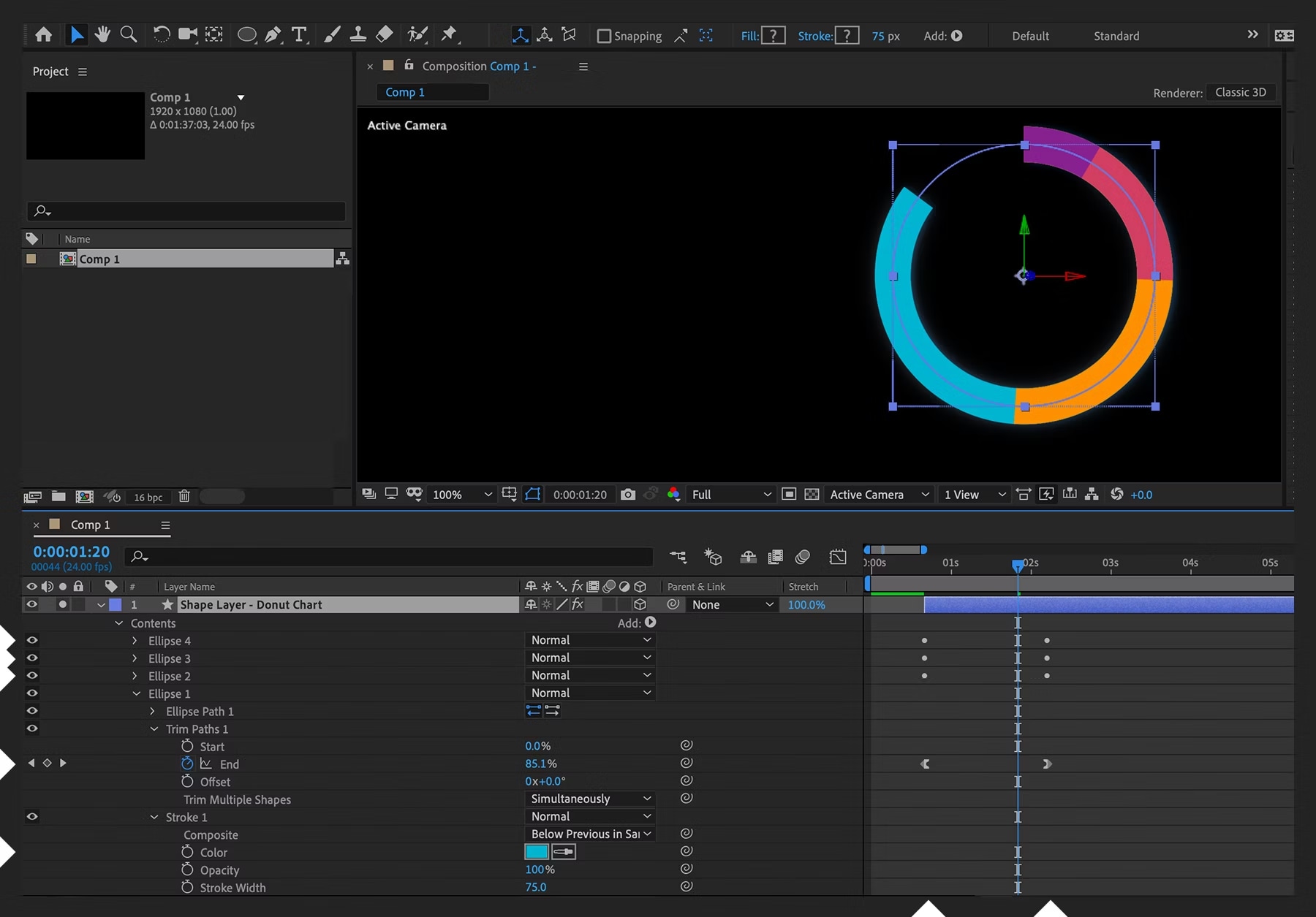
AE is a popular and good tool in the world for motion graphics for skillful users. With it, you can build bars as shape layers (or wedges for a pie), drive values via sliders or JSON (JavaScript Object Notation), and reveal elements using trim paths or radial wipes. It's powerful and precise, but it's also a multi-stage pipeline. Here's how to make animated charts in After Effects.
Import or link data → rig sliders and expressions → design and ease curves in the Graph Editor → render → import the video into your editor → retime to narration → re-render if any numbers change.
For studios with motion designers, AE is fantastic. However, for creators who need a fast solution, that round trip can consume hours for each edit cycle.
Animate Charts with PowerPoint
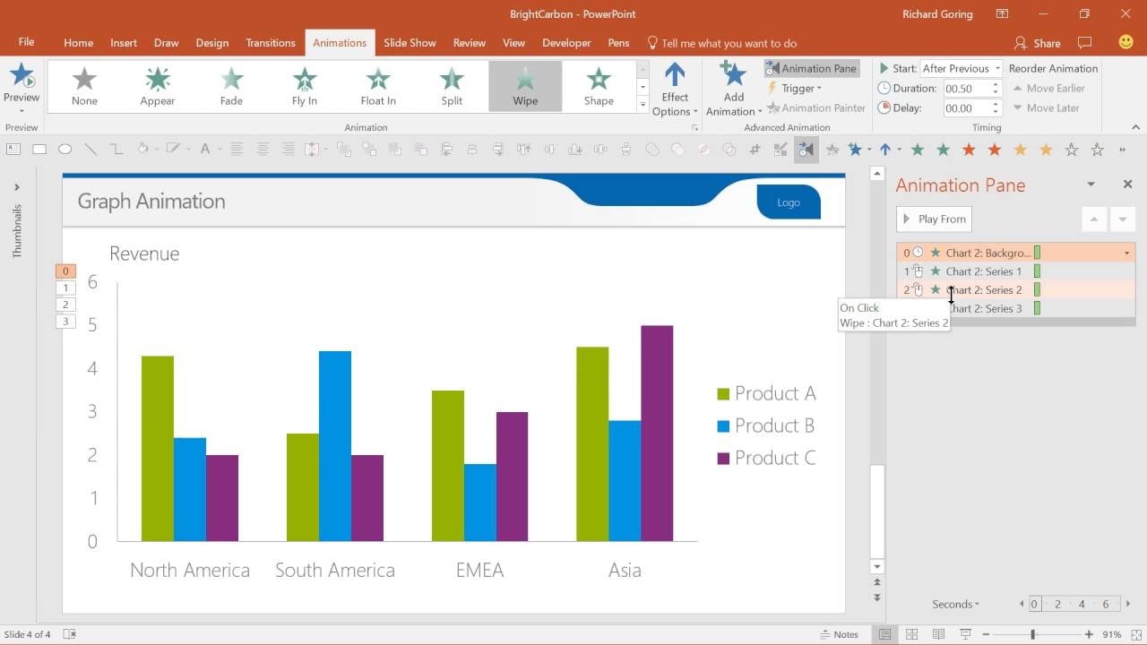
Microsoft's PowerPoint is a powerful tool for creating presentations. You can actually animate a graph in PowerPoint by inserting a chart, applying Wipe or Fade effects, setting different Effect Options (By Series or by category), and adjusting the timing.
PowerPoint is great for basic explainers, and it works surprisingly well. However, once the slide is complete, you still need to export a video, import it into your editor, and synchronize it with music and voiceovers. If a stakeholder updates the data later, you'll need to repeat those steps over and over again.
Create Animated Graphics with Apple Keynote
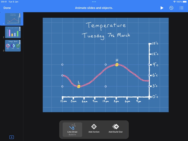
Apple's Keynote also offers a cool option to add animated data graphics to your content. You need to add and select the chart → choose an animation effect → customize the animation.
However, just like PowerPoint to add animated charts in videos, Keynote is still slide-centric. You need to export → import → sync → re-export, and this can take a lot of time. And when you need multiple chart scenes in one video, style drift and timing inconsistencies can happen unless you're meticulous.
So, what can we deduce from all this? Across these three common apps, we can observe that the pattern is consistent. You need to make numerous adjustments between a charting app and your video timeline, as well as perform more exports than you'd like.
That's why a video-first approach matters. Imagine staying inside your editor, pasting data, choosing a chart type, setting the palette and labels, and creating animated charts in seconds.
A More Direct Way to Make Animated Charts in Videos
At this point, we would like to introduce you to Wondershare Filmora. For data visualization, Filmora has introduced a new animated chart feature designed for creators who want to visualize data in their videos.
Instead of dealing with custom animations and having to switch between several programs, you'll be able to paste or upload a spreadsheet and convert it into animated pie charts, bar chart races, donut charts, column charts, line chart races, area charts, and more. The best part is that you can do all this directly in Filmora's magnetic, non-linear video editing timeline.
 secure download

- Theme mode: switch between light/dark bases that match your grade.
- Color palette: apply brand colors or accessible presets; adjacent elements keep a readable contrast.
- Main font: keep labels, totals, and headers in your brand's type system.
- Bars and labels rules: choose percentage or absolute formats, numeric abbreviations (K/M/B), label thresholds, and placement.
- Background color: set solid or transparent overlays that sit cleanly over footage.
- Animations: pick reveal direction, easing, and stagger so shape → value → annotation unfolds cleanly.
- Chart headers: add concise titles/subtitles to set context at a glance.
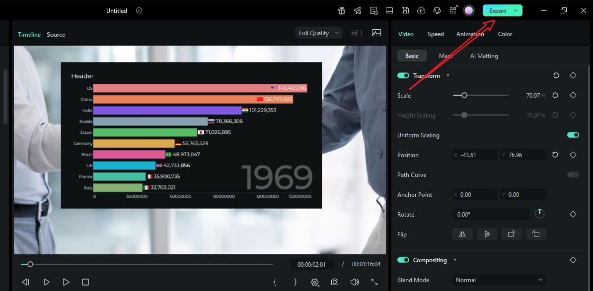
How to Make Animated Charts in Filmora?
- After downloading and installing Filmora on your computer, launch the software and start a new project.
secure download
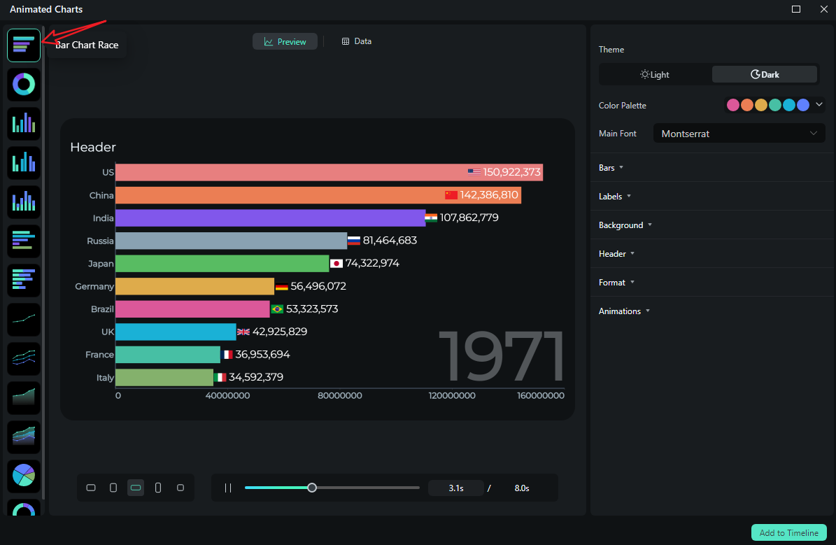
- Go to Effects > navigate to AI Infographic > double click the Animated Charts to activate the feature.
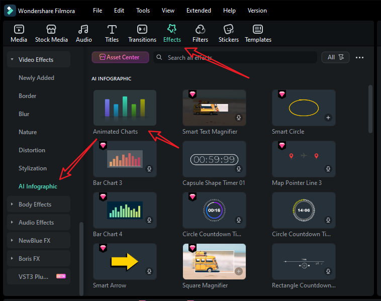
- View and pick a bar chart race template on the left side. (You can also choose other animated chart templates.)
- Switch to the Data section to upload your Excel file or edit the sample data column.
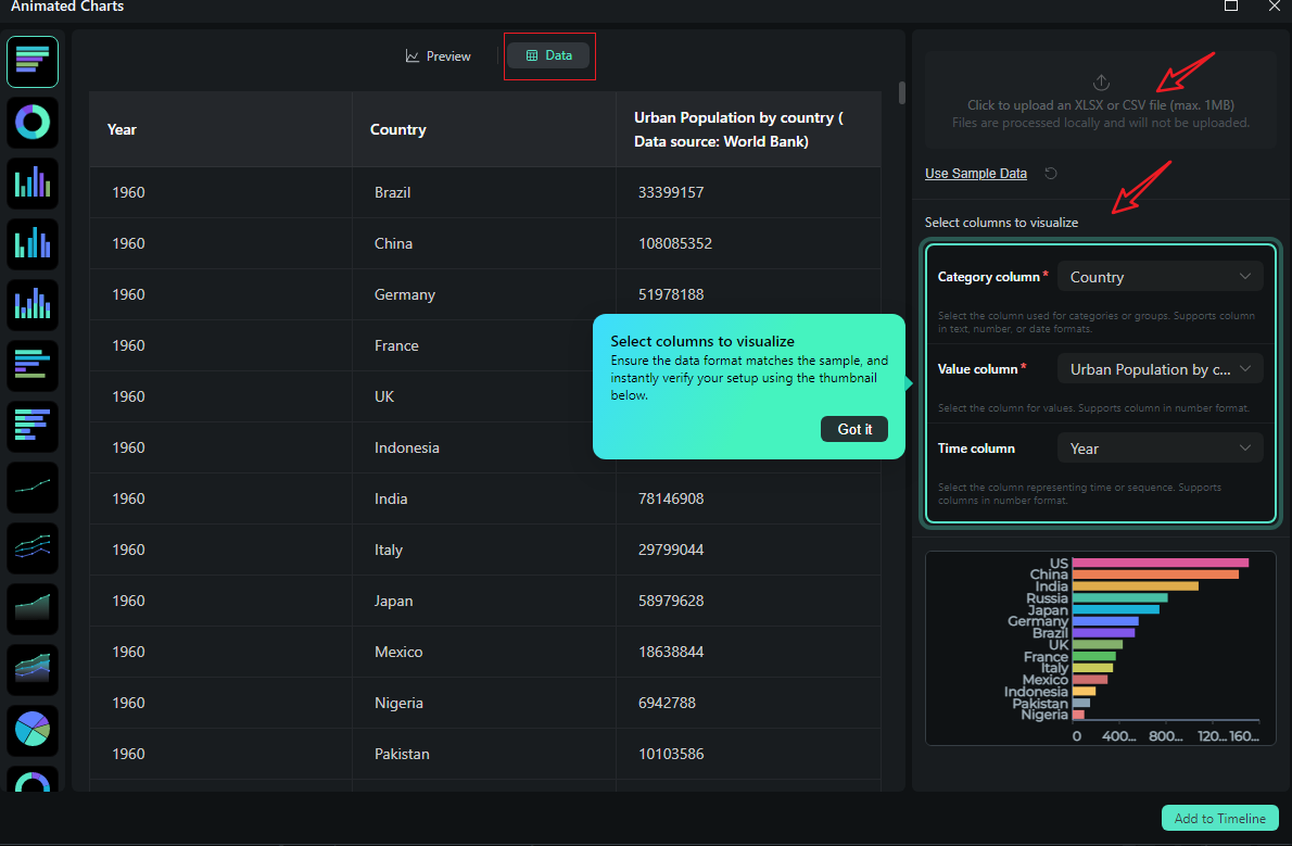
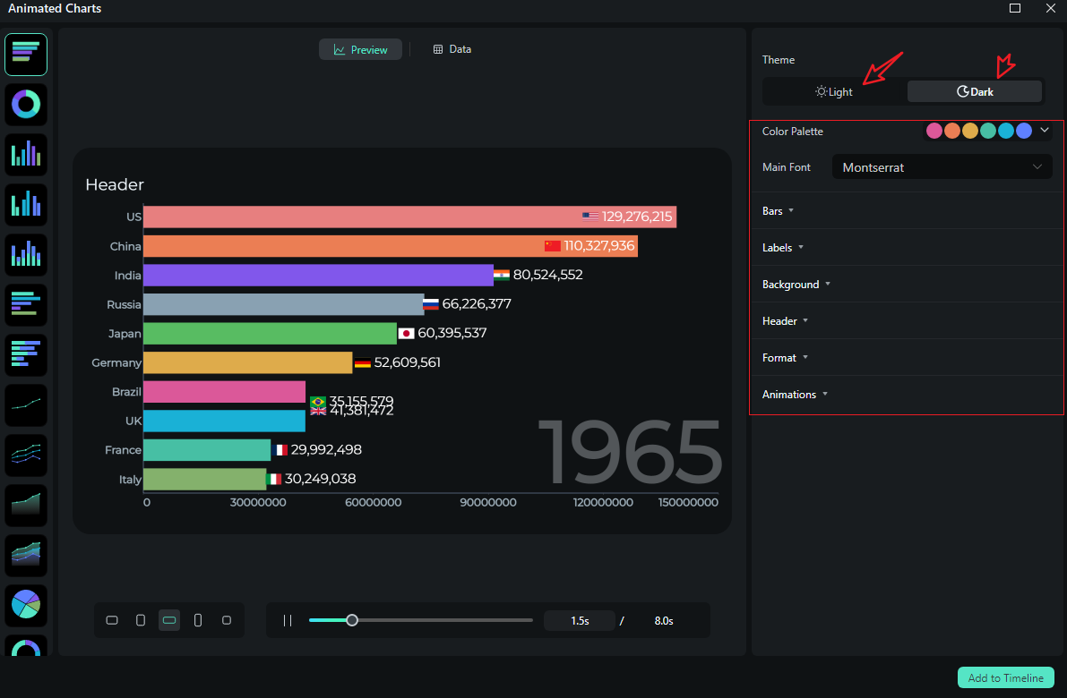
- After uploading the file or editing the data, review it and select what you want to visualize. Switch to the Preview section > you can adjust theme, main font, segments, labels, background, header, format, animation styles, animation orders, aspect ratio, and more accordingly.
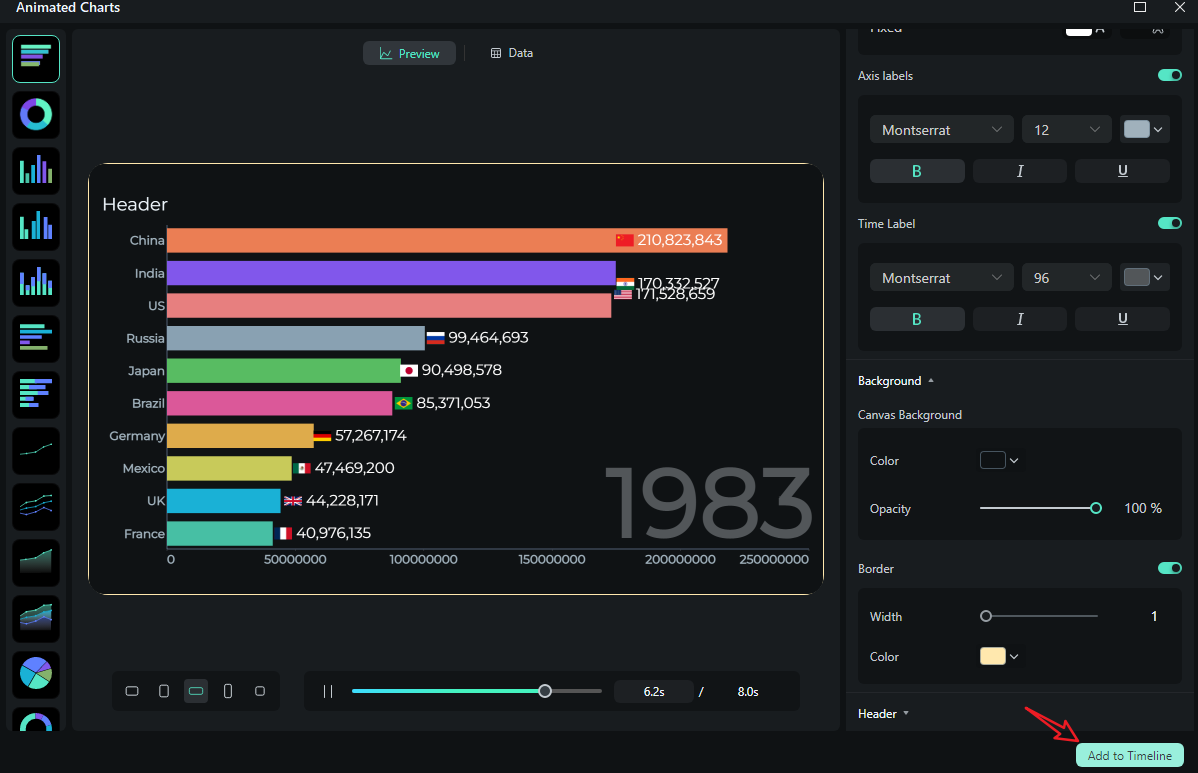
- If you are satisfied with the result, you can click on add to the timeline.
- Then you can choose to export the bar chart race you have created.
Let's see the final bar chart race video created by Filmora.

Comparing the Common Methods and Filmora for Animated Charts
So, as you can see, when it comes to making animated charts in videos, Filmora is a superior option. Take a look at the table below, which compares Filmora with all the common ways of creating dynamic charts and adding them to videos and presentations.
| Methods | Common Ways | Filmora |
| Where you build | Outside your editor (AE/PPT/Keynote) → export → import to timeline. | Inside your editor |
| Data updates | Re-open original file, re-render, re-import, re-sync. | Paste new data; chart updates with saved style. |
| Brand consistency | Easy to drift between apps; fonts/palettes don't always match. | Theme, palette, font are project-wide—charts match titles/lower thirds. |
| Audio timing | Manual sync after import; changes mean re-exports. | Trim the chart clip to narration/music; set markers for beats. |
| Learning curve | AE: steep but powerful; PPT/Keynote: simpler but slide-bound. | Low—focused chart controls built into the editor. |
Popular Animated Charts and Best Uses
If you feel confused about picking the right chart types for your cases, here's a quick field guide to the types of animated charts and graphs that work in videos.
Animated Column Charts

Best use cases: Use the animated bar or column chart when ranking products, comparing categories, or showing before and after metrics. It's also good for A/B test outcomes.
Animated Stacked Bar or Stacked Area Chart
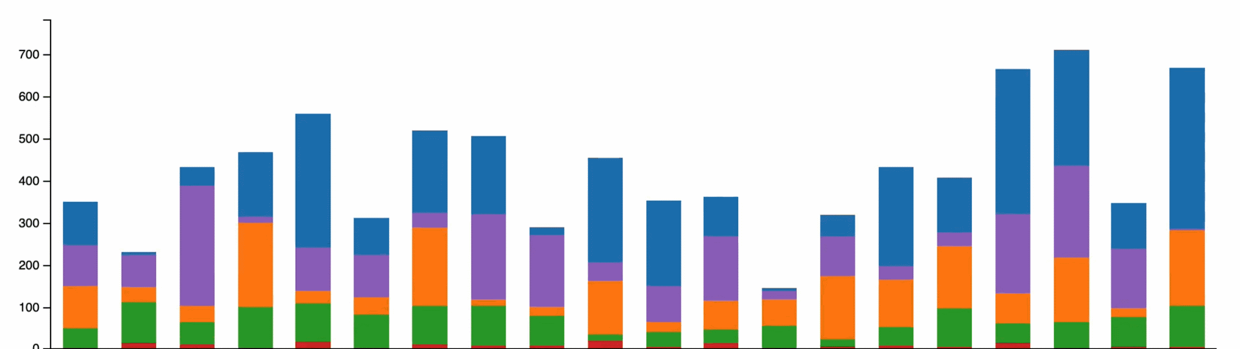
Best use cases: Use the animated stacked bar or stacked area chart when you want to communicate both the total and how each part contributes to the whole as time goes by, like showing marketing spending by month, revenue streams over several quarters, or energy consumption by source.
Line and Area Charts Animation
Best use cases: Use line and area chart animations to track KPIs across several months, see growth curves, or monitor your students' learning progress.
Moving Pie and Donut Charts
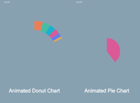
Best use cases: Use pie and donut charts to display market shares, budget allocations, survey responses, traffic sources, etc.
Scatter and Bubble Charts
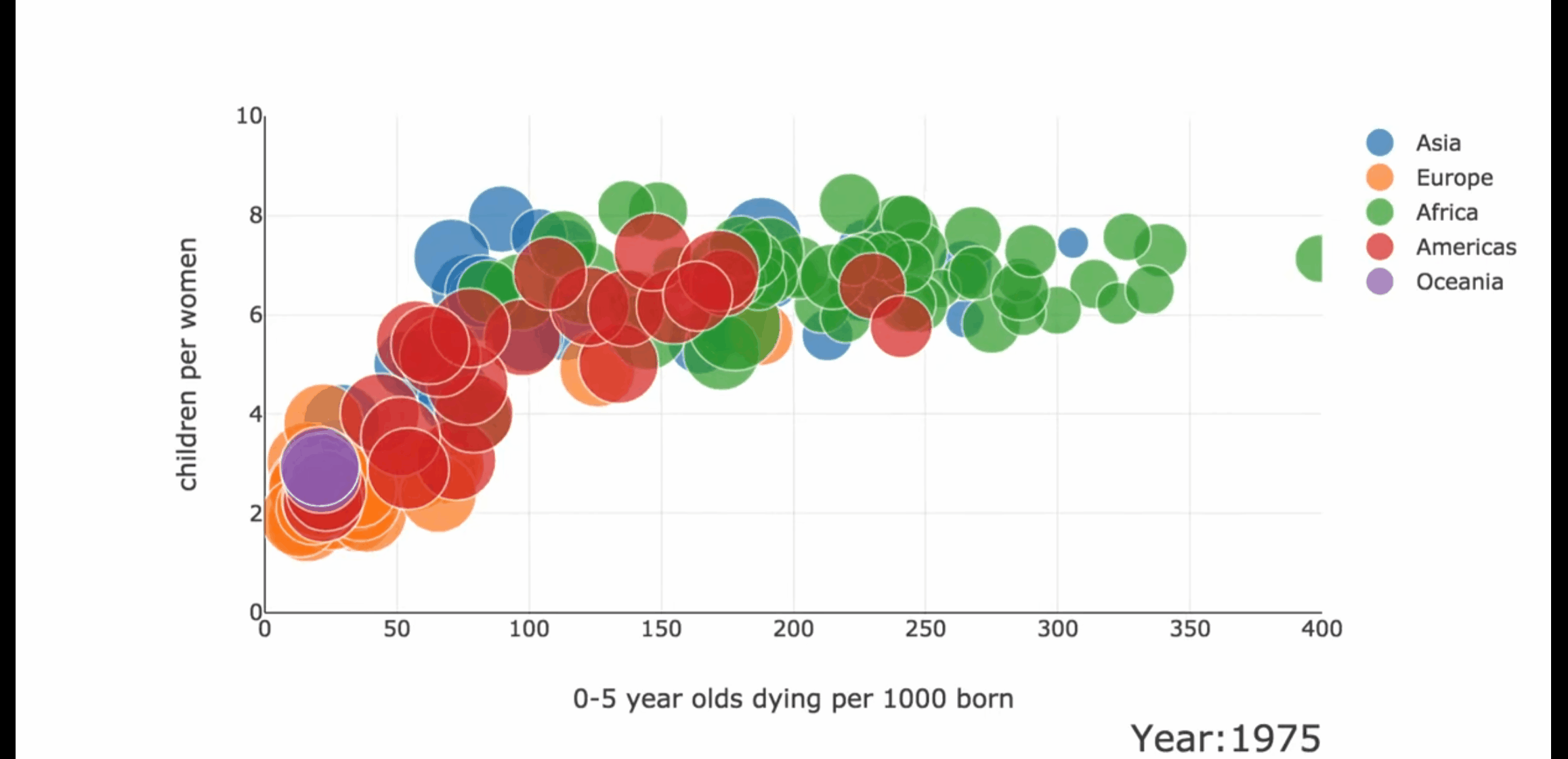
Best use cases: Use them to show price vs. performance comparisons for tech products, compare study hours with exam scores, stack protein content against calories per snack, or compare customer satisfaction with resolution times.
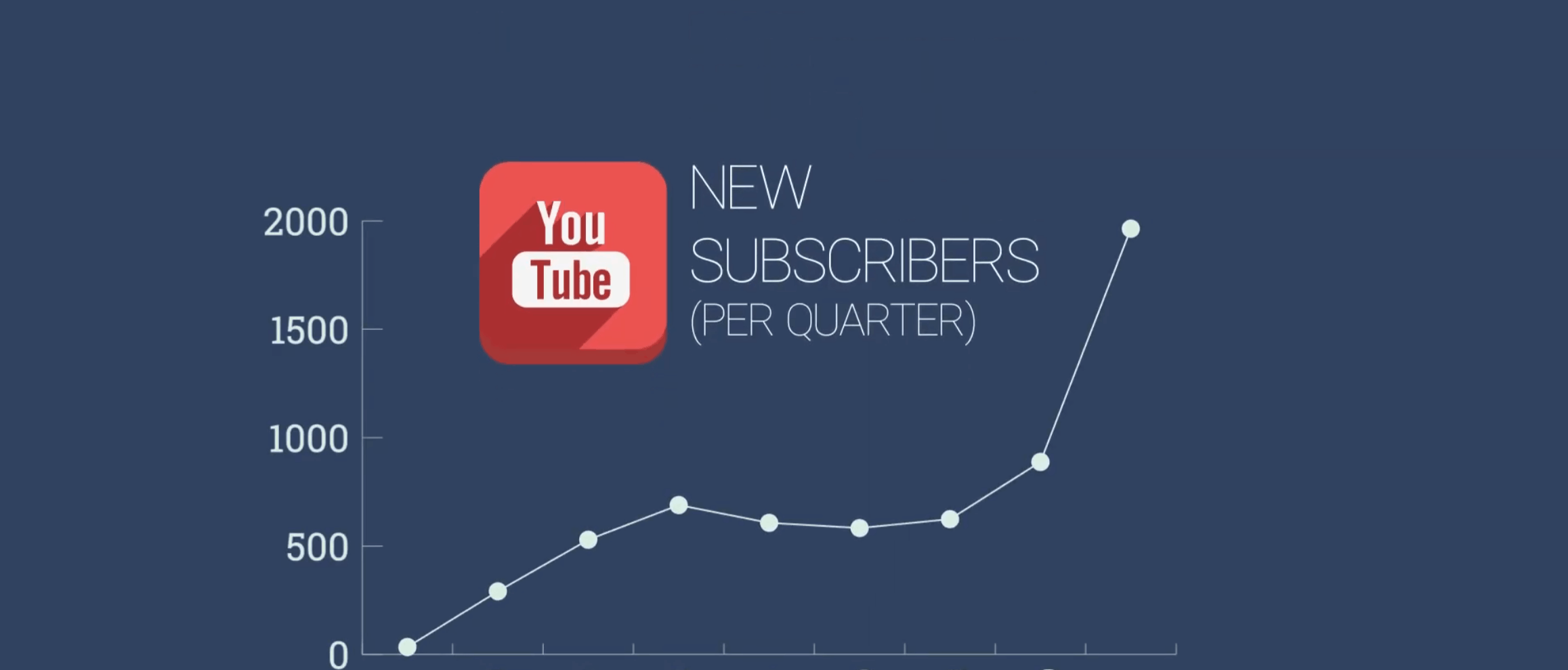
Bar Chart Racing
Best use cases: Use bar chart races to compare top countries by app downloads, city population growth by year, channel subscribers by month, sports team standings across seasons, programming language popularity by year, or top brands each year.
No matter the type of chart you want to use, for each of them, Filmora will let you choose a theme mode, set a custom palette and fonts, define label rules, and pace the animation to follow the intentional rhythm of your video.
secure download Bonus Tip: How to Prepare Your Data (Spreadsheet Hygiene)?
The clean and well-organized data is the basic element for visualizing data in a video. Take a look at some pro tips that will help you practice proper spreadsheet hygiene.
- Clean headers; one header row: Keep column names short and exact (e.g., Region, Q1 Sales). This ensures field mapping is painless and prevents truncated labels in your chart.
- Consistent units and number formats (%, k/M/B): Decide once on percentages or absolutes, decimal places, and abbreviation rules. Inconsistent formatting is confusing on mobile, where space is tight.
- Avoid merged cells; keep categories concise (≤3 words): Merged cells break parsers. Long category names create label collisions. Use shorter labels and explain nuance in narration or captions.
- Time series: consistent intervals; ISO dates: If you're showing month-over-month trends, don't mix weekly and monthly rows. Use ISO 8601 (YYYY-MM-DD) and fill missing periods deliberately.
- Group tiny categories into Other (improves labels on mobile): Anything under 4 or 6% becomes hard to read on a phone. Aggregate and promise a deep dive later in the segment with a bar chart.
- Save a CSV/Sheet you can paste or upload into Filmora: Keep a master data source. When numbers change, replace the table. Your chart will inherit the same style and timing.
These habits make it easy to create animated graphs that feel intentional, not improvised.
Common Charting Mistakes and How to Fix Them
Even strong data can become messy when you add motion. To avoid this mishap, here are a few mistakes to avoid to keep your animation sharp.
- Too many categories → If a pie has 10 slices, viewers won't read any of them. Combine minor ones and follow with a bar or column chart that compares the interesting subsets.
- Low contrast → Adjacent colors should differ in hue and luminance. When slices touch, a subtle separator line reduces color bleed, especially on compressed social videos.
- Label clutter →Add labels when possible, but not too much. If labels collide, show only the top values and abbreviate the rest. Legends are acceptable, but keep them short and ordered.
- Misleading scales → For bars and columns, a non-zero baseline exaggerates differences. If you must zoom the axis, disclose it with a note and use careful tick marks to help users understand the scale.
- ff-beat timing → A value that appears late compared to the voiceover feels wrong. Place markers on your timeline and trim the chart's duration so that data reveals happen in sync with the narration beats.
Conclusion
Animated charts can help you turn spreadsheets into stories with clearer explanations, faster iteration, and on-brand motion. The workflow is straightforward. Prepare tidy data, choose the right chart for the question, apply smart design and motion rules, and then use that to create an awesome video. Remember, you can build everything directly in Filmora so your charts live on the same timeline as your voice and music.
If you've been bouncing between a chart maker and your editor, this new approach eliminates the drag. Set up your brand palette, fonts, and data templates now, and you'll be ready to make animated charts with Filmora's new feature. Download it today, and your numbers won't just be seen. They'll be understood, felt, and remembered!
secure download 