
 100% Security Verified | No Subscription Required | No Malware


 ChatGPT
 Perplexity
 Gemini
 Claude
 Grok
Grok
Have you ever wished your PowerPoint charts could actually move instead of just sitting there? Imagine showing your audience how numbers grow, drop, or change over time — it’s so much more engaging than a static table.
In this article, you will not only learn how to animate a chart in PowerPoint, but also learn the advanced tips and an alternative to make animated charts in video editing software.
In this article
Prepare Your Chart for Animation in PPT (Data & Layout Hygiene)
Animated charts work best when the foundation is solid. Follow these key steps to prepare your data and visuals before pasting your chart into PowerPoint.
- Clean Your Data: Use Excel or another spreadsheet tool to organize your data. Avoid merged cells, keep categories short (2–3 words), and ensure consistent units.
- Choose Your Design Elements: Pick a cohesive brand color palette and a readable font. Remember, good design starts with clarity — animation can enhance but not fix poor visuals.
- Plan Your Storytelling Flow: Map out how each animation will guide your audience. Highlight key moments like milestones, spikes, or turning points for maximum impact.
- Optimize for Screen Size: Adapt your charts for the display medium — large projectors can handle more detail, while mobile screens require simplified layouts.
- Build from Structured Data: Always create your chart from spreadsheet data, rather than manually entering data. This ensures smoother transfer to PowerPoint and cleaner animations.
Step-by-Step: Animate a Chart in PowerPoint
Before you begin following the steps below, make sure that you open PowerPoint and create a new, blank presentation. Then, go to your Excel spreadsheet where you created the chart and simply copy and paste it to your new PowerPoint project. Then follow these steps.
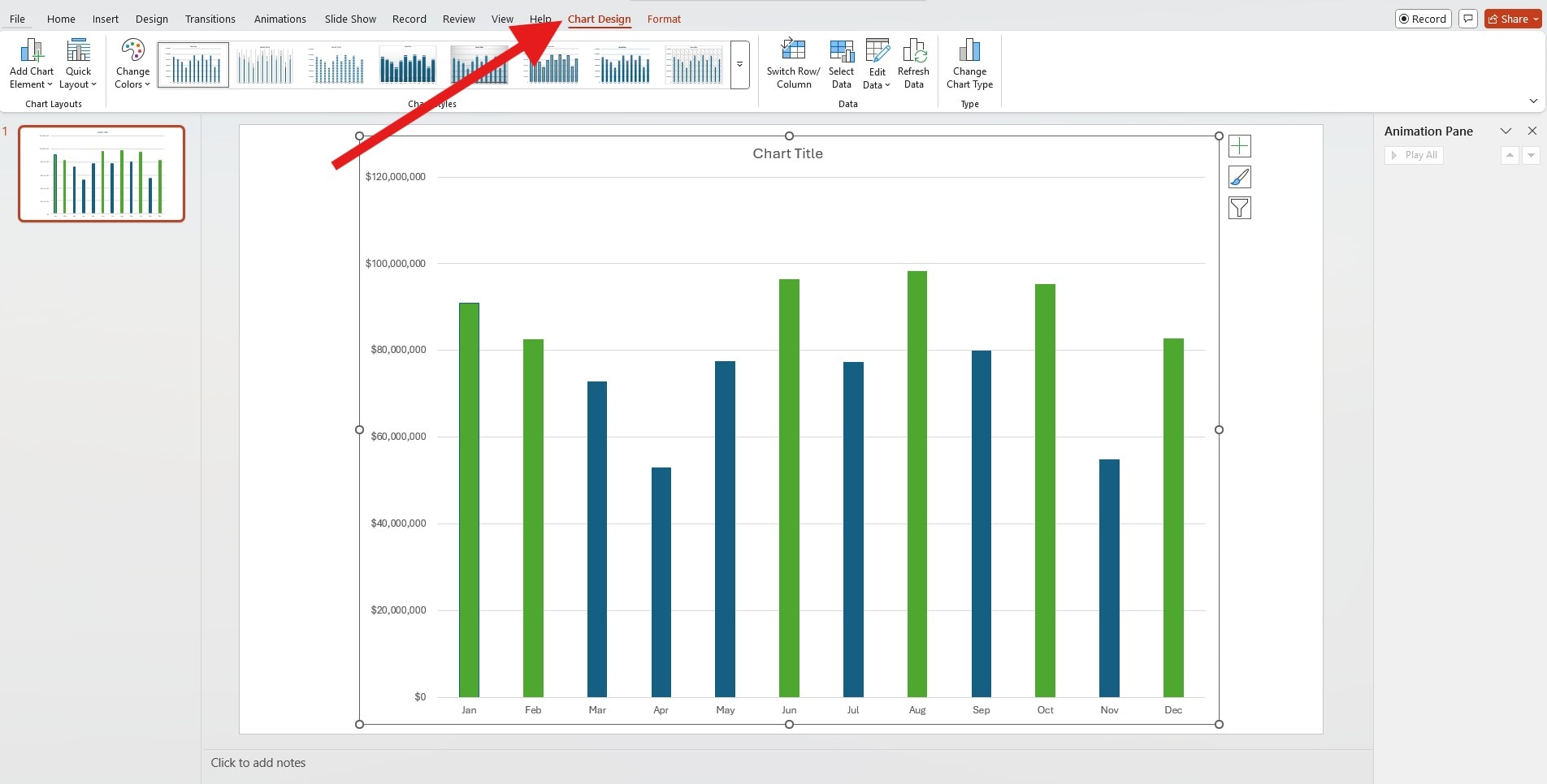
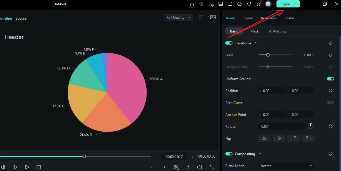
- Click on the chart to select it, and then make sure that the Chart Design feature is there.
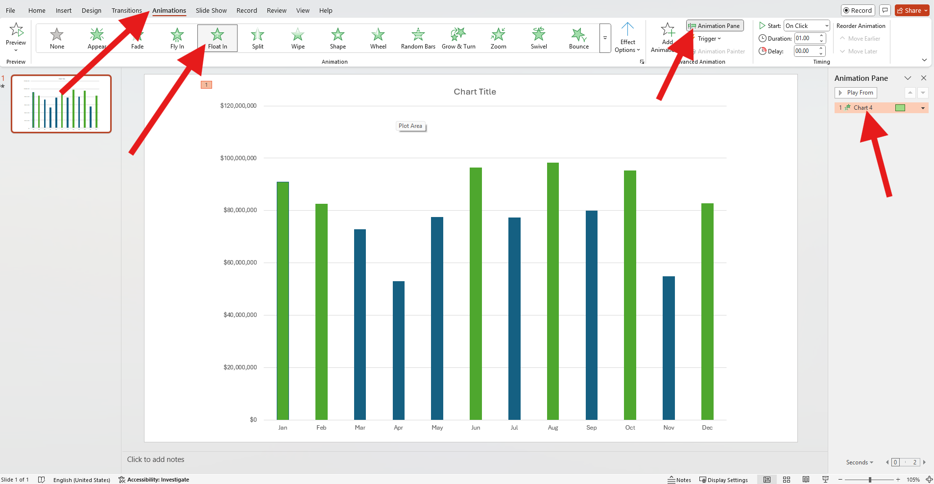
- Now, click on the Animations tab, pick an animation preset from the available options, click on the Animation Pane button, and then double-click on your chart on the right.
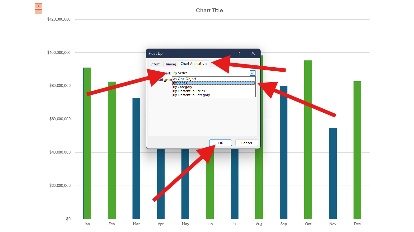
- In the new window, click the Chart Animation cart. Instead of animating it As One Object, choose to animate By Series (or something else). Then, click OK.
And that's pretty much it if you are going for a simple animation to add some dynamics to your presentation. Here's how it looks.

Advanced Techniques to Time Animations Perfectly
Now, as you can imagine, there are many variations and different options that you can choose to animate your charts in PPT, depending on the chart types. Here are some options that you can consider for your presentation.
Animate parts of the graph separately. Animate series and labels on different timings for cleaner reads. For instance, you can let labels come in first, and then the line or pie animation can come second, using a different animation. If you are working with crowded charts, offset labels by a fraction of a second (0.2s) so the eye never has to read during motion. Here's how this would look.

Animate by category separately. If you want to focus on the graph during your presentation, you can animate each element separately and introduce them as you speak. To do this, just select to animate the chart by category. It is slower, so you'll have more time to elaborate. Here's what it looks like.

Use triggers to reveal categories by click. This is for presentations where each part of the metric requires an oral comment. In the example below, each metric is revealed by clicking.

Here are a few other pro tips that you can experiment with as you get more accustomed to PowerPoint and the options available in this platform.
- Make sure to properly rename series and labels in the Animation Pane to keep it organized.
- Use short, descriptive names so you can drag sub-steps quickly without guessing. This saves minutes on every revision.
- Adjust the animation time appropriately.
There are a lot more tricks to learn, but as you can see, it's not easy. Animating charts in PowerPoint is something that you need to learn properly, go back and forth, make mistakes, and climb the learning ladder slowly. What if we told you that there is a tool that lets you use spreadsheets and convert them into all types of animated charts with simple clicks?
A Better Alternative: From Spreadsheet to Animated Chart Video
Let us introduce you to Wondershare Filmora, which is one of the best video editors on the planet, but on top of that, it has a new feature named animated charts that deals with data visualization specifically. If you are working on a complex presentation with lower thirds, b-roll, music, and narration, you might as well create a video instead of a presentation. In PowerPoint, you would need to export and re-import countless times. This is where Filmora shines.
 secure download

The new data visualization feature lets you upload or paste a spreadsheet and create animated charts directly on the timeline. No round-trips. No style drift. No manual re-timing. You'll design and animate charts directly in the video editing timeline.
Here are the top features to look forward to.
- Chart styles: Pick anything from pie and donut to bar, column, and more area charts. You can expect more options as the feature evolves.
- Theme mode: Start with a light or dark base that matches your footage.
- Color palette: Set brand hues or accessible presets with guaranteed contrast between adjacent elements.
- Main font: Keep chart labels, totals, and headers in the same type system as your titles and subtitles.
- Bars and labels rules: Choose percentages or absolute values, rounding, abbreviations (K/M/B), placement, and minimum thresholds to avoid label clutter.
- Background color and opacity: Use clean overlays that sit over footage without muddying it.
- Animations: Pick reveal directions, easing, and stagger features. Time the clip to voiceovers or beats using timeline markers and keyframes.
- Chart headers and captions: Go with concise titles, subtitles, and footnotes to ensure brand continuity.
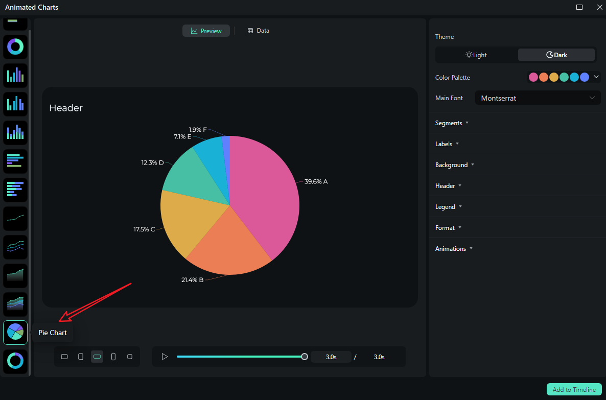
How to Convert Data into an Animated Chart in Filmora?
As we previously covered, Filmora enables you to transform data into 10+ distinct types of animated charts. Below, we'll use the animated pie chart as a demonstration—note that the steps for creating other chart types are nearly identical.
- After downloading and installing Filmora on your computer, launch the software and start a new project.
secure download
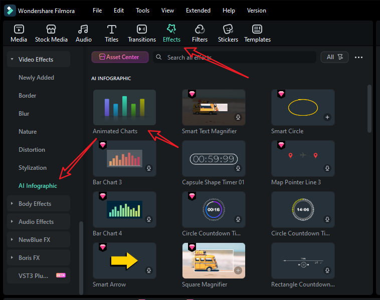
- Go to Effects > navigate to AI Infographic > double click the Animated Charts to activate the feature.
- View and pick an animated pie chart template on the left side.
- Switch to the Data section to upload your Excel file or edit the sample data column.
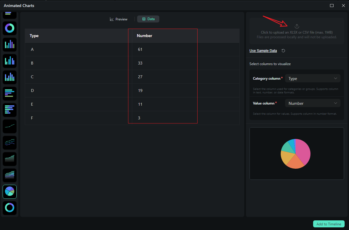
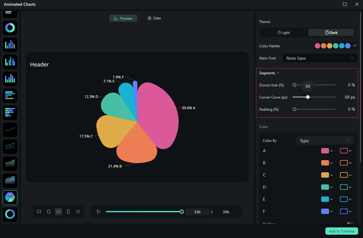
- After uploading the file or editing the data, review it and select what you want to visualize. Switch to the Preview section > you can adjust theme, main font, segments, labels, background, header, format, animation styles, animation orders, aspect ratio, and more accordingly.
- If you are satisfied with the result, you can click on add to the timeline.
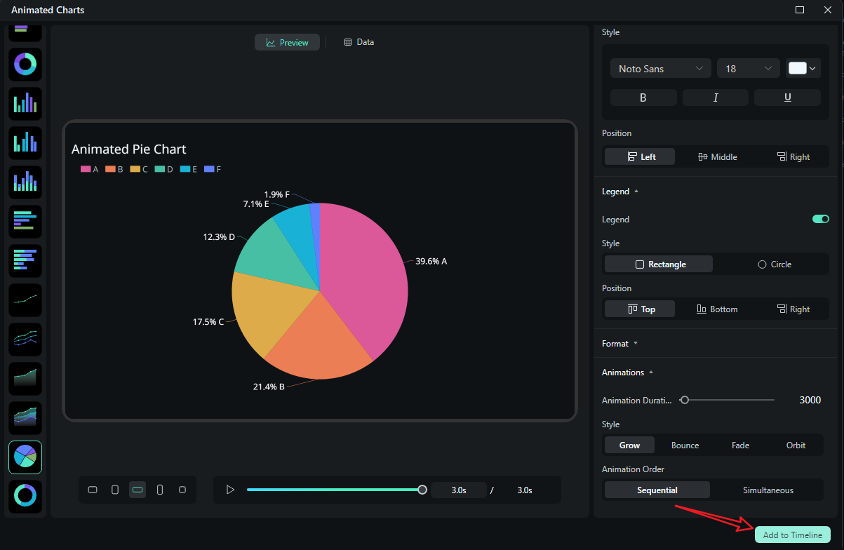
- Then you can choose to export the animated chart you have created.
Let's see the final animated pie chart video created by Filmora.
Conclusion
You now know how to animate a chart in PowerPoint with a clean, repeatable approach. Prepare your data and labels, reveal the geometry first, then values, then annotations, and keep timing aligned to your narrative. For richer, video-first stories or recurring reports that change often, Filmora's spreadsheet-to-chart workflow keeps everything on a single timeline, matching your soundtrack, lower thirds, and brand presets without tedious round-trips.
Try Filmora today and learn why people praise it as the most intuitive video editor with all the features you can think of.
secure download FAQ
-
How to animate a chart in PowerPoint without overdoing it?
Use Wipe or Fade, animate By Series or By Category, and keep labels as a second step. Stage the reveal as geometry → labels → annotation so viewers read one thing at a time. -
How to animate a pie chart in PowerPoint slice-by-slice?
Select By Category in Effect Options after applying Wipe/Fade to the pie. The reveal order follows your data table—reorder categories in the grid if you need a specific sequence. -
Can I animate a graph in PowerPoint to match narration?
Yes. Use On Click for live beats, or set Delays/Durations with After/With Previous for auto-play. Practice with Shift+F5 and consider Rehearse Timings for perfect video exports. -
What if I need multiple aspect ratios for social?
PowerPoint exports one canvas size at a time. If you deliver the same story in 16:9, 1:1, and 9:16, a video editor (e.g., Filmora) is faster. Style once, and export many times.
