
 100% Security Verified | No Subscription Required | No Malware


 ChatGPT
 Perplexity
 Gemini
 Claude
 Grok
Grok
Did you ever wonder if the numbers and graphs in your video could move with the same energy as your story? If you are making videos about trends, comparing categories, or explaining what changed and when, motion will increase retention rates by a significant margin. Today, we'll show you how to build chart animations in After Effects, one of the most popular tools for professional animators, and how to achieve a solid result quickly.
Near the end, you'll also see a simpler, timeline-native alternative for spreadsheet-to-video chart creation if you prefer a no-code path that still looks professional.
In this article
What Is the Importance of Adding Animation to Charts
Animated charts replace the static slides with steady and controlled reveals. You can match the chart development with your voiceover, which makes the chart easier to follow. It's ideal when explaining any kind of trend, launching a new product, monthly updates, and news graphics, where timing matters.
If you do it right, chart animation gives your story a smooth rhythm that static screenshots just can't carry. That's why you can see them everywhere, from simple social media posts on TikTok to highly produced news stories and documentaries on TV.
After Effects Setup and Guide to Animating Graphs and Charts
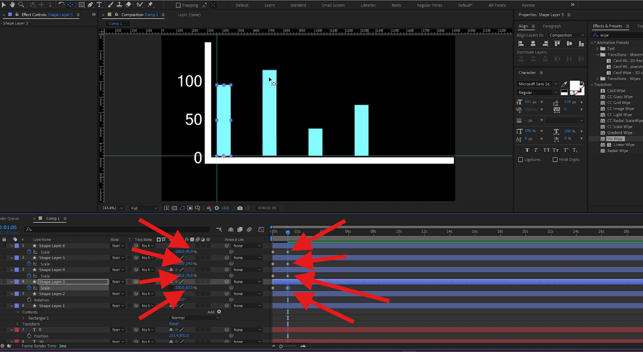
Today, we'll show you how to create an animated chart in After Effects from scratch. Open After Effects on your device, create a new project, and draw a base for your animated chart. You can do this with two simple rectangles and some numbers to guide your animation. Then you can follow the steps below.
- Click the Grid Setup button and activate the Rulers in the preview window.
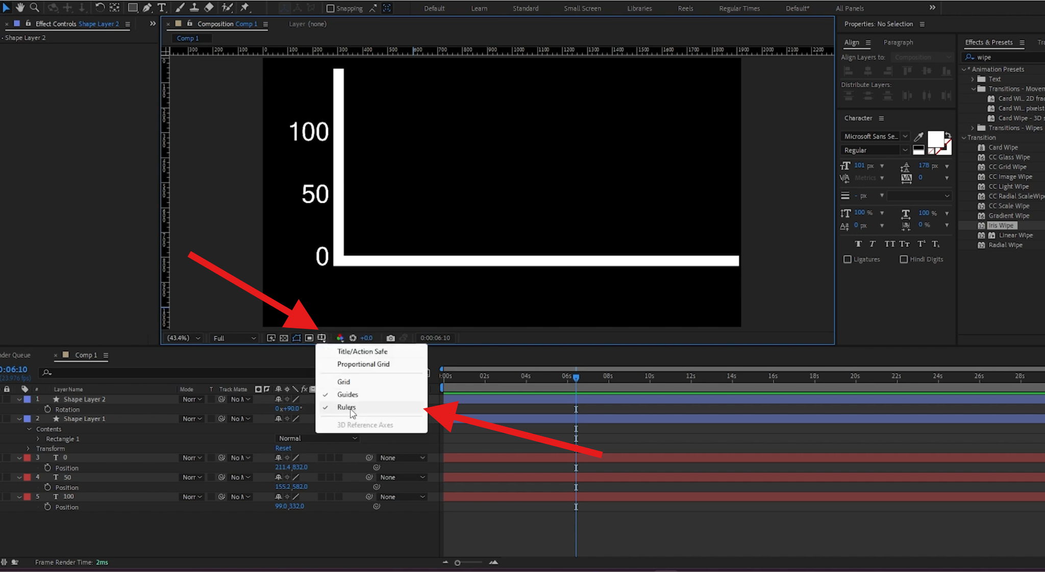
- Add two grid lines from the sides and top or bottom to guide your next steps. They should intersect where you want to start with your first data entry point.
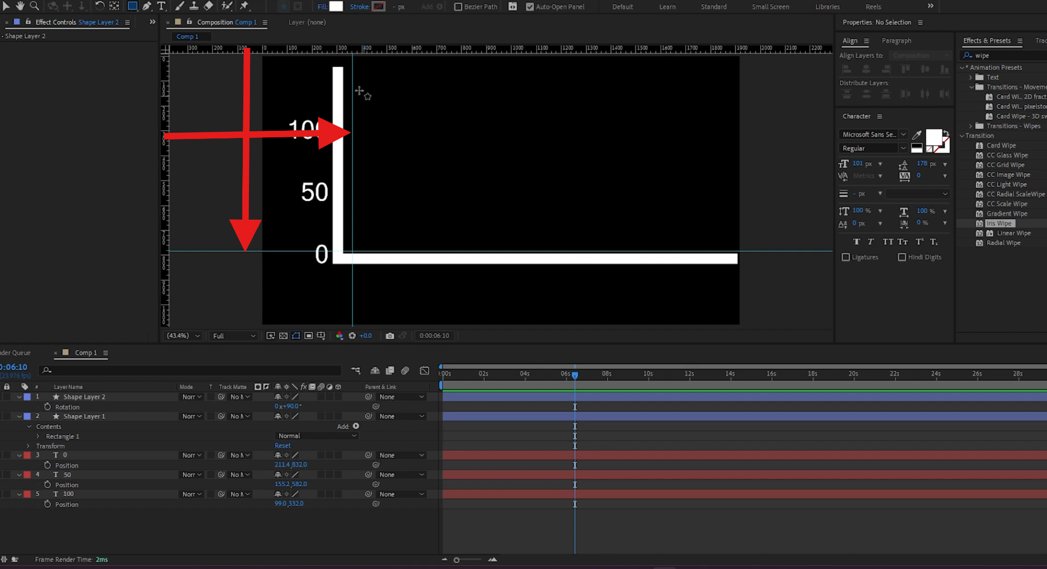
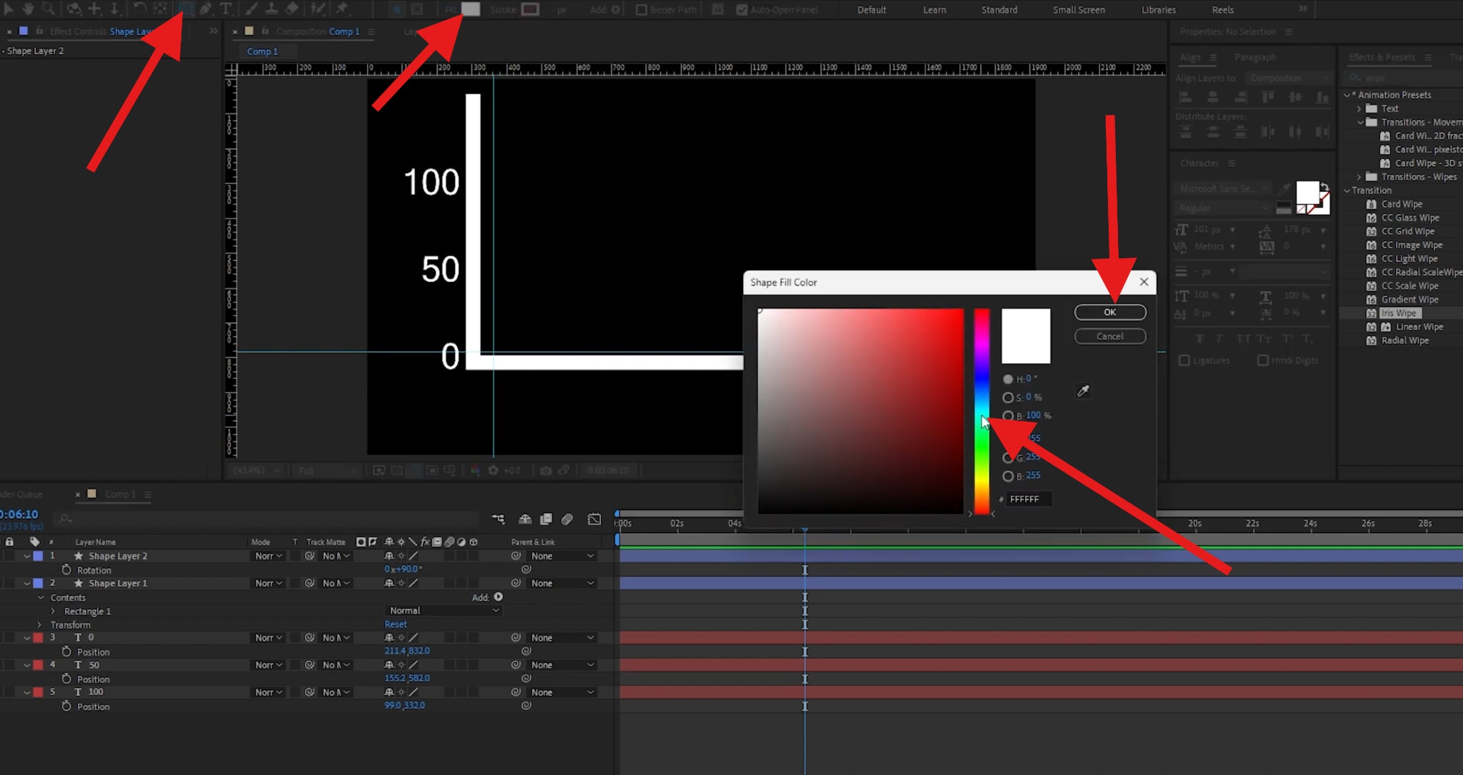
- Click the Rectangle button to add a manual rectangle, then click to select the Color Fill. Pick a color and click OK.
- Now, draw a rectangle.
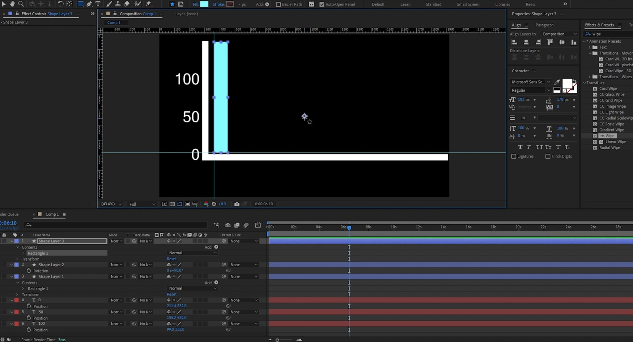
- Select the rectangle and click on the feature at the top that highlights the element's center, and drag that from the center to the bottom of the bar. That way, when you change the Scale slider, the bar will move up or down.
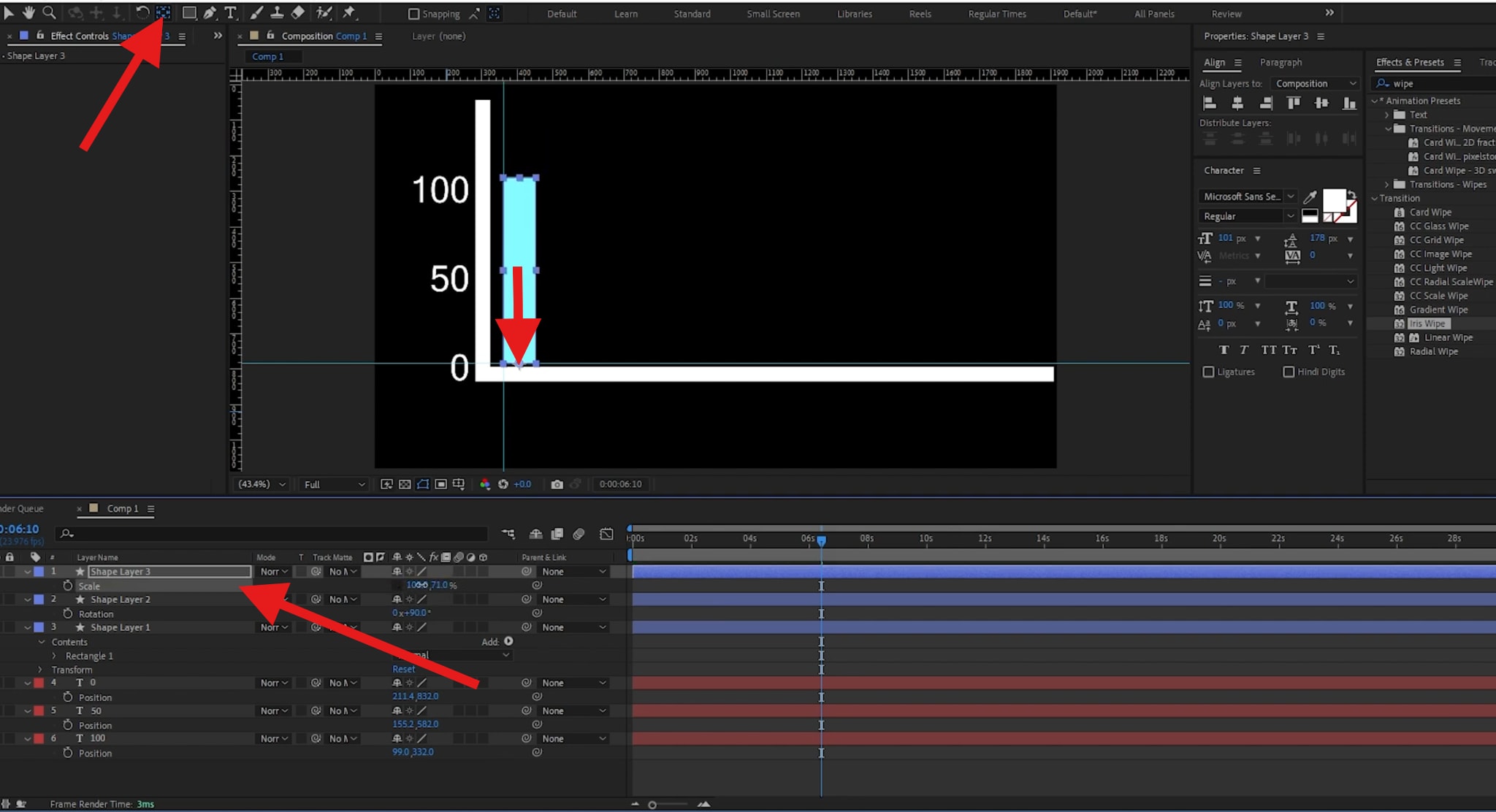
- Select the rectangle Shape Layer and duplicate (Ctrl or Cmd + D) it as many times as you need. Then, adjust the Position of each rectangle by adding the same number to the position coordinates. First, you click on the first rectangle, then duplicate it, then click on the position coordinates and type "+200" or a different number to move it. Then duplicate the second and repeat the process for each new one. You'll get something like this.
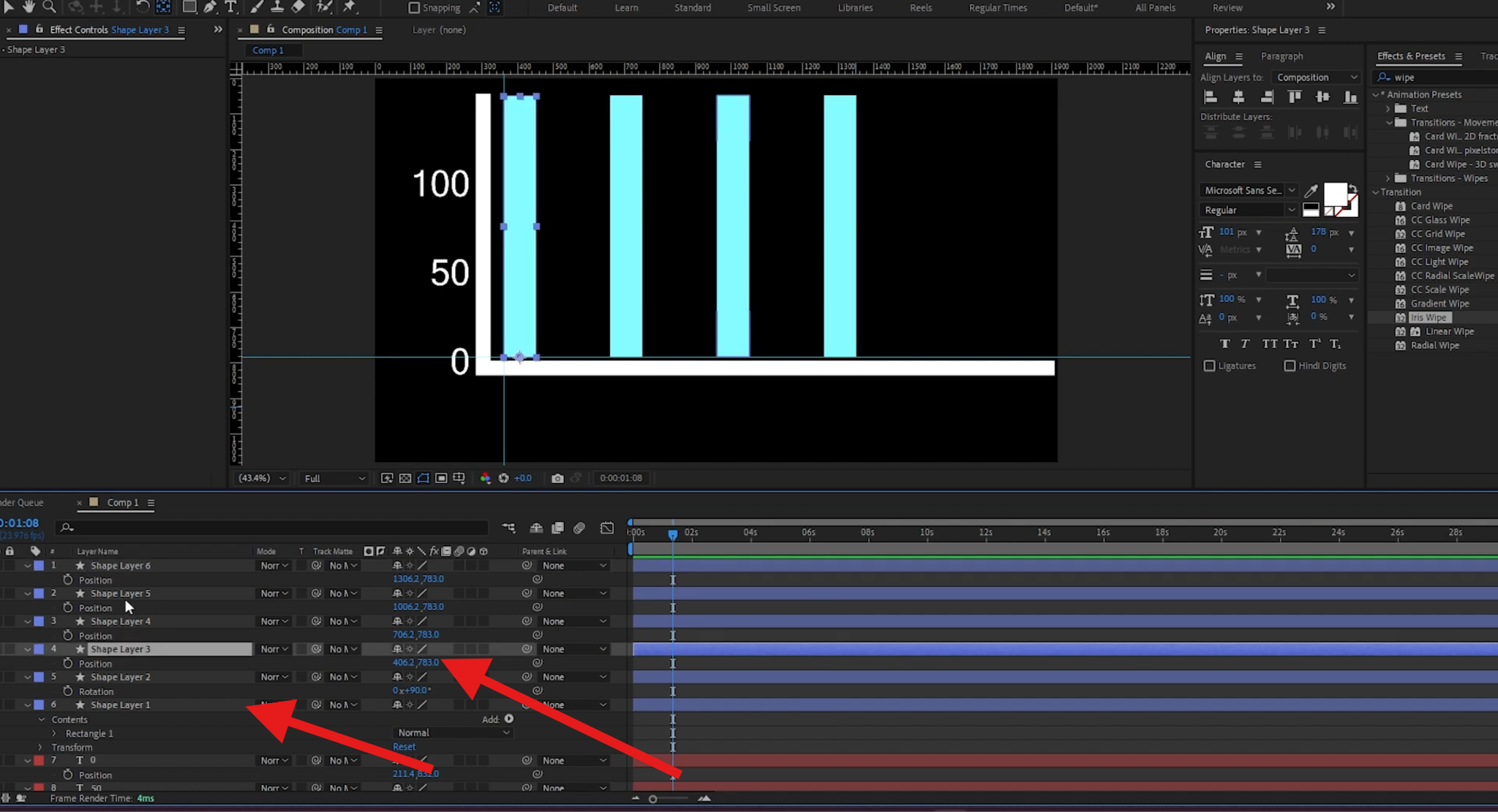
- Hold Shift and click on each element to select all of them, and change their scale all the way down to 0.
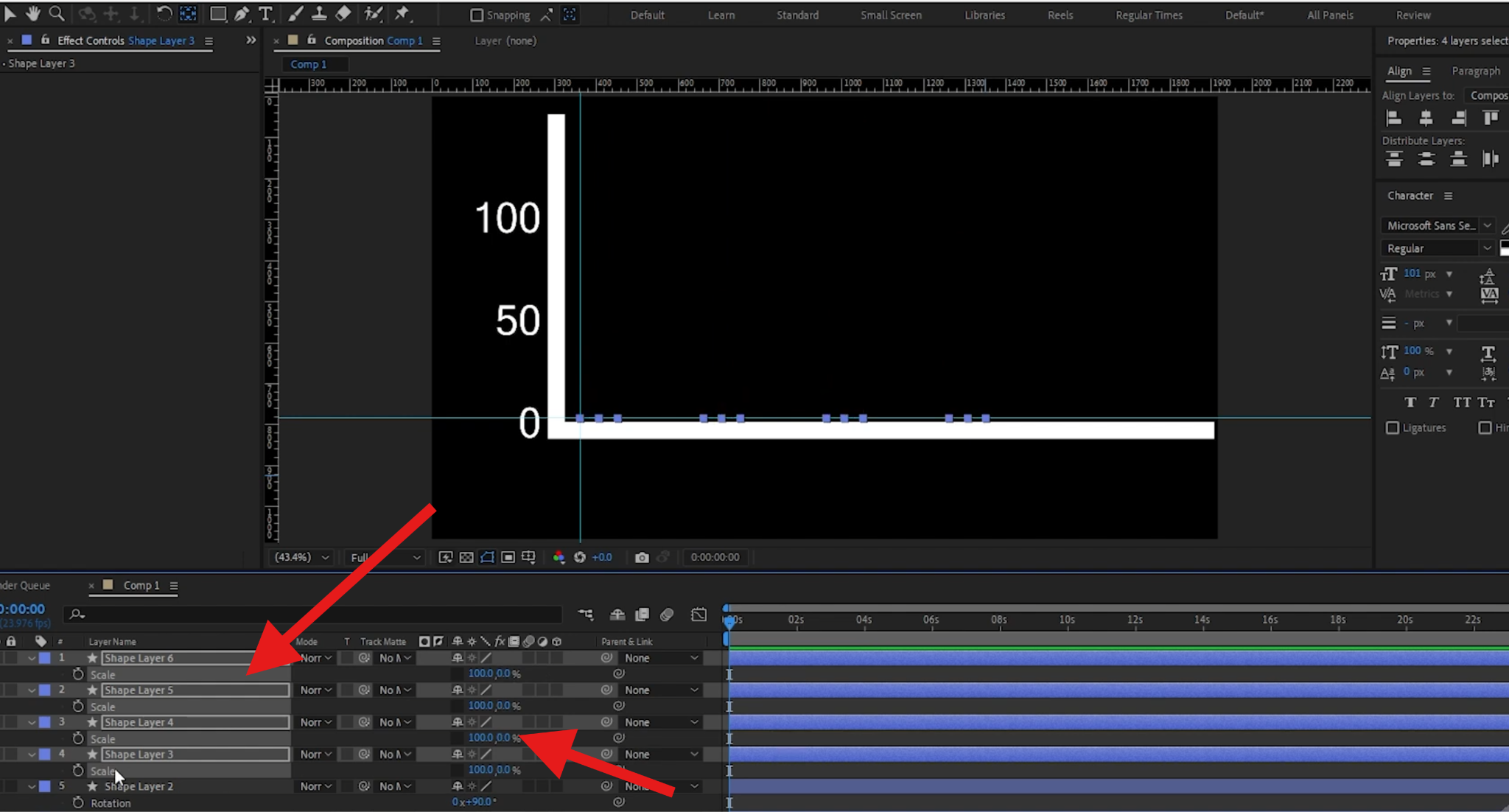
- Click to add a keyframe at the beginning, and then move ahead in the timeline, add another keyframe, and change the scale to 100.
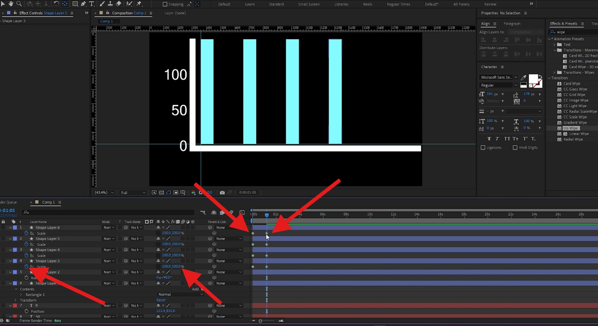
- Now, select the second keyframe on each element and manually reduce the scale of each bar to the designated number in your spreadsheet.
Here's the result.

Of course, you can continue your journey to create something more complex, but this tutorial gives you all the basics you need so that you can build upon them. Now, granted, this is not that impressive, and it's not easy either, which is the problem with After Effects. If you want to create something cool, you need to climb the learning ladder, improve, and then spend a lot of time mastering the software. Luckily, we have an easier alternative.
An Easier Alternative: From Spreadsheet to Animated Charts on a Timeline
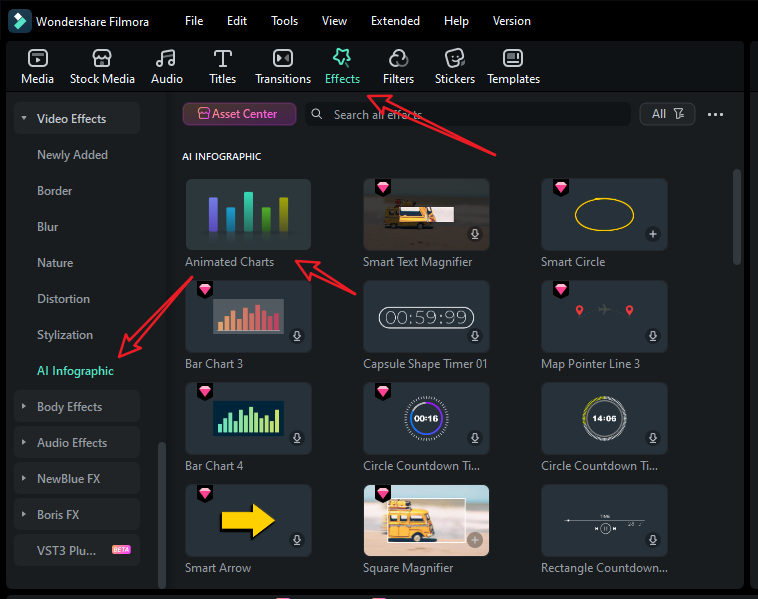
If you want to animate a chart from a spreadsheet directly inside the video editor and automatically sync it with your voiceovers and music, layered with b-roll and titles, After Effects just won't cut it. A great alternative is Wondershare Filmora. This powerful video editing tool offers a simpler path. With a new animated charts feature, Filmora lets you paste or upload a spreadsheet and convert it to animated graphics directly in the timeline.
You can use it to convert spreadsheets to different types of charts, including pie, donut, bar chart races, column, area, and more.
 secure download

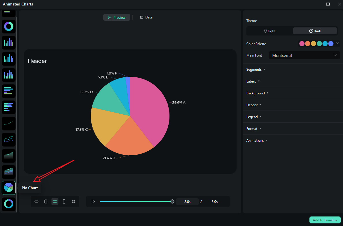
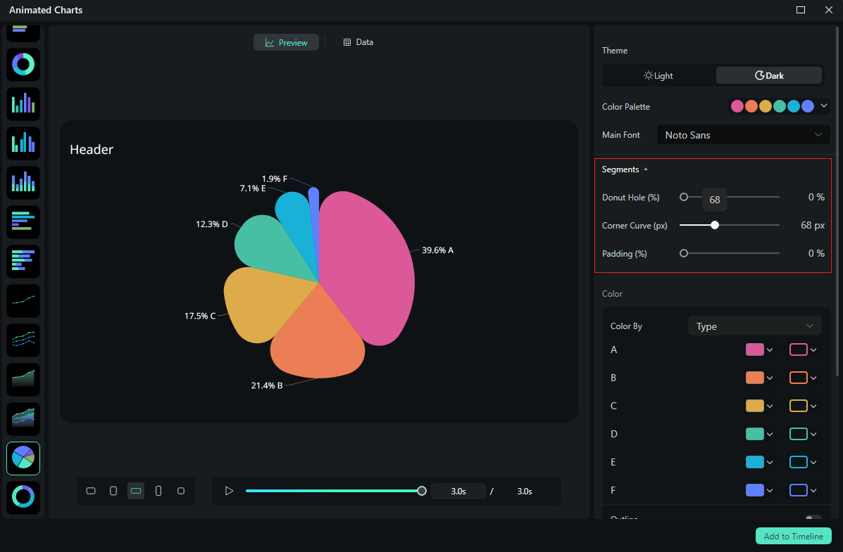
- Pick a theme mode (light or dark), and add a custom color palette and main font.
- Set custom rules for bars and labels (for instance, you can pick between percentages and absolute values, and explore other features like number rounding, thresholds, and various placement options).
- Easily change the background color and opacity if you want to overlay the chart over other footage.
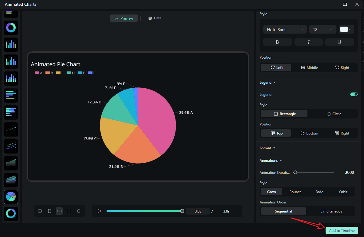
- Add animations and effects with keyframes, just like with any other clip in the editing timeline. Change directions, add stagger effects, and set clear chart headers for context.
How to Turn Data into an Animated Chart in Filmora?
As we discussed before, Filmora can convert data into 10+ different types of animated charts. Here, we will use the animated pie chart as an example; the steps for other types are almost the same.
- After downloading and installing Filmora on your computer, launch the software and start a new project.
- Go to Effects > navigate to AI Infographic > double click the Animated Charts to activate the feature.
- View and pick an animated pie chart template on the left side.
- Switch to the Data section to upload your Excel file or edit the sample data column.
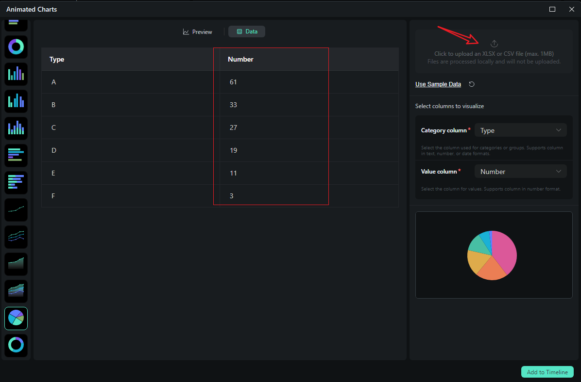
- After uploading the file or editing the data, review it and select what you want to visualize. Switch to the Preview section > you can adjust theme, main font, segments, labels, background, header, format, animation styles, animation orders, aspect ratio, and more accordingly.
- If you are satisfied with the result, you can click on add to the timeline.
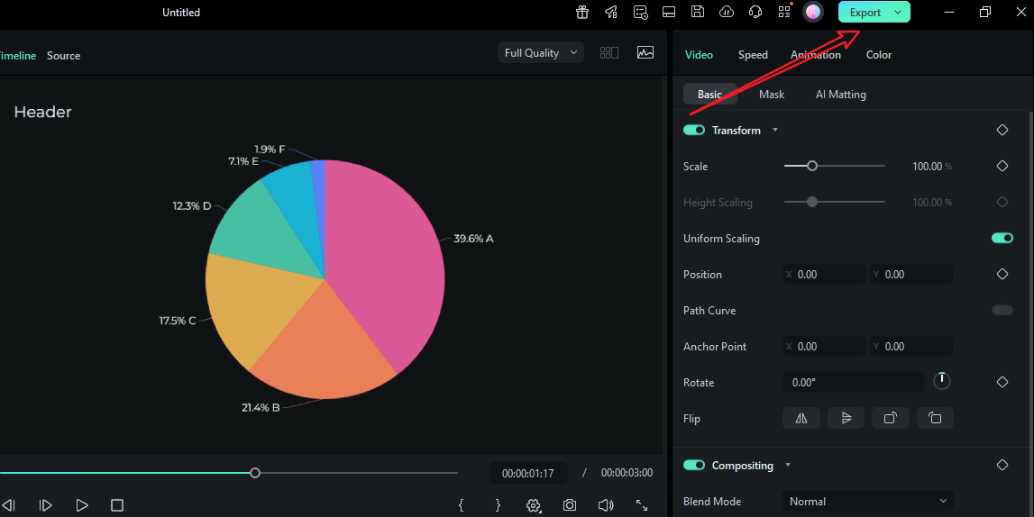
- Then you can choose to export the animated chart you have created.
Let's see the final animated pie chart video created by Filmora.
Compare After Effects and Filmora for Animating Charts in Videos
| Feature | After Effects | Filmora |
| Animating charts | Hand-built with Shape Layers, Trim Paths, Radial Wipe, expression/slider rigs for data. Highest control. | Spreadsheet-to-chart directly with clicks. |
| Extensive chart editing | Unlimited: custom paths, expressions, per-vertex control, layered comps, advanced typography. Time-intensive to maintain. | Focused controls: theme mode, color palette, fonts, label/number rules, background, animations, chart headers—fast to iterate, consistent across scenes. |
| Data updates | Best with Slider/JSON rigs, but still requires renders and re-imports to an editor. | Paste new data; chart updates in place. No round-trip. |
| Audio/VO sync | Possible, but you'll often compose in AE and still re-time in a separate editor. | Native: trim chart clips to VO/music, add timeline markers, and stack with other video elements. |
| Learning curve | Steep for newcomers; power users thrive. | Gentle. Designed for editors/creators who want results without motion-graphics complexity. |
| When to choose | Hero pieces, bespoke motion, heavy brand systems, broadcast packages. | Weekly reports, explainers, social, launch recaps—any workflow where speed, consistency, and frequent updates matter. |
Conclusion
You've seen how to animate simple bar charts in After Effects, and it really takes steps to do that. Compare that with Filmora's direct spreadsheet-to-animated chart workflow, and you quickly realize that Filmora is the superior option for creating chart animations. On top of everything, the best benefit is that it keeps everything inside your editor, preserving style and timing without having to bounce from tool to tool.
Download Filmora today and enjoy maximum speed and consistency when converting data into videos.
secure download FAQ
-
What's the fastest way to animate charts in After Effects?
Use Shape Layers + Trim Paths (for lines) or Radial Wipe (for pies/donuts). Drive values with Slider Controls, then refine pacing in the Graph Editor with Easy Ease. -
How do I animate a pie chart in After Effects slice-by-slice?
Create one layer per slice, apply Radial Wipe, and control each slice with a Slider. Offset Start Angle based on cumulative totals so slices align precisely. -
Can I feed AE a spreadsheet?
Convert to structured JSON and link expressions to values. Otherwise, paste numbers into Sliders in Effect Controls for quick iterations. -
How do I make updates painless?
Rig from day one with Sliders/JSON and avoid hand-keyframing final values. A data-driven setup lets you paste new numbers without rebuilding the animation.
