100% Security Verified | No Subscription Required | No Malware

Color grading in Lightroom is one of the most powerful techniques for enhancing mood, storytelling, and style in photography. Whether you want to achieve a cinematic teal-and-orange look, film-like tones, moody dramatic styles, or simply correct and enhance colors, Lightroom offers flexible and professional color grading tools that are essential for modern photo editing.
In this guide, you'll learn the difference between color grading vs color correction in Lightroom, how to use all major grading tools, advanced techniques and style presets, troubleshooting tips, and an alternative solution for video color grading, where Lightroom is limited.
In this article
Part 1. What Is Color Grading vs Color Correction in Lightroom
Before learning advanced editing, it's important to understand the difference between colour correction and color grading in Lightroom:
| Color Correction | Color Grading |
| Fixes exposure, contrast, and white balance | Adds style, emotion, and creative tone |
| Makes the image look natural | Makes the image look cinematic or artistic |
| Works with technical accuracy | Works with storytelling and mood |
Example workflow:
- Correct white balance for natural skin tones
- Adjust exposure and contrast
- Fix color cast issues
Once basic color correction is done, color grading begins.
Part 2. Adobe Lightroom Color Grading Tools Overview & Why It Matters
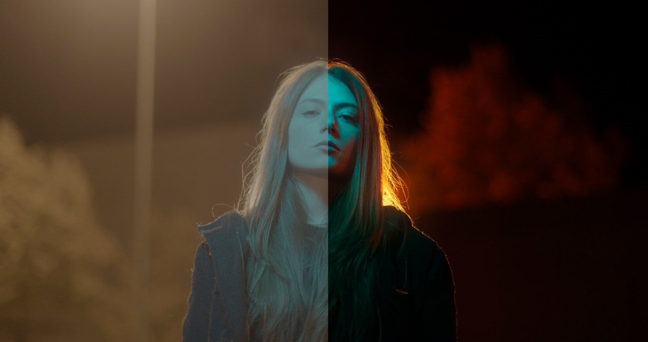
Color grading in Lightroom is not just about making photos prettier—it's about shaping mood, guiding emotion, and telling a story. Unlike simple color correction, which fixes white balance and exposure, color grading adds a creative layer to your images. For example, warm golden tones can evoke nostalgia or romance, while teal shadows in a scene like The Matrix create tension and drama. Understanding the tools behind this process is key to effective Lightroom color grading.
Key Lightroom Tools for Color Grading
| Tool / Panel | Purpose | Key Functions / Tips |
| Color Grading Panel (Shadows, Midtones, Highlights, Global) | Adjust hue and saturation independently per tonal range | Formerly Split Toning; use Shadows & Midtones for cinematic effect; Global wheel applies uniform tint |
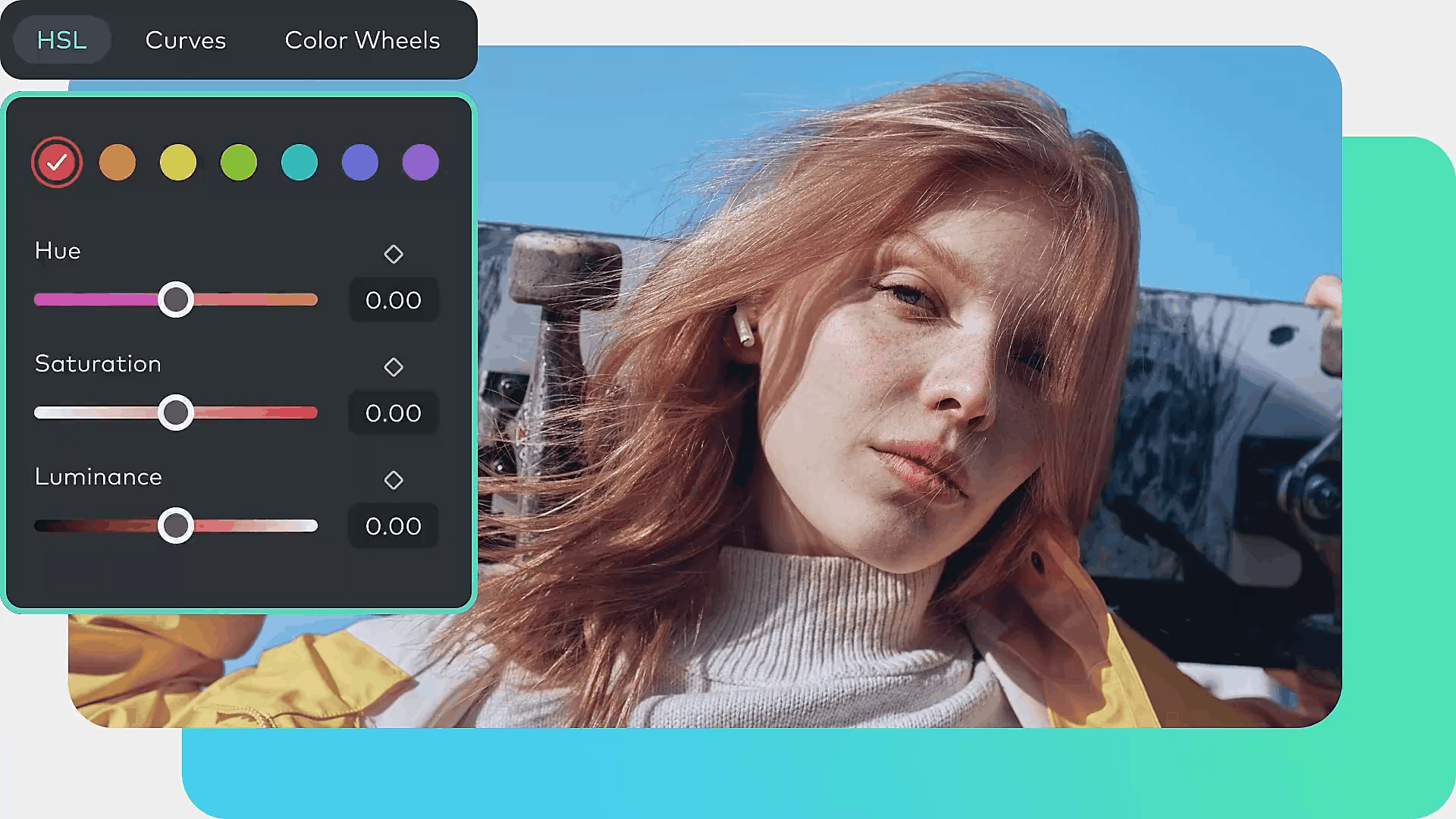
| HSL / Color Panel | Precise control of specific colors | Adjust Hue, Saturation, and Luminance; ideal for skin tones, skies, foliage |
| Tone Curve | Shapes contrast and tonal range | Create S-curve for drama; lift blacks for vintage fade; RGB channels allow color separation |
| Adaptive Profiles | Intelligent automatic adjustments | Enhances color and tone based on image content; works for standard and HDR images |
| Select Landscape Mask | Targeted selective adjustments | Automatically masks landscape elements like mountains, skies, buildings; enables precise localized grading |
| Global Color Wheel | Uniform color tint | Ensures color consistency across the image; complements tonal wheels |
Part 3. How to Do Color Grading in Lightroom (Complete Workflow)
Below is a practical step-by-step workflow used by many photographers and colorists. Much of the original tutorial guidance is preserved, with additional expanded detail for clarity.
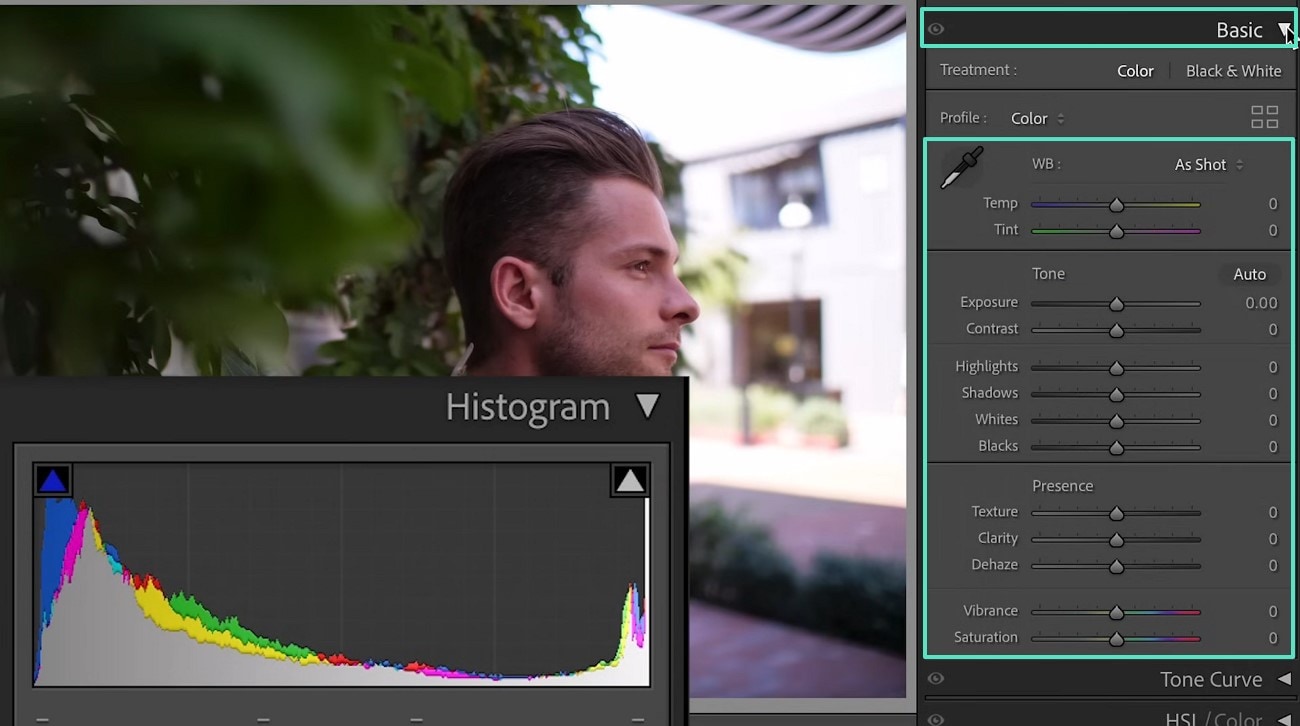
01 of 07 Load Image and Perform Basic Correction
Load your target image in Lightroom and click “Develop” to access the Edit Panel. Move to the Basic tab to perform initial color correction using:
- White Balance
- Tone
- Presence
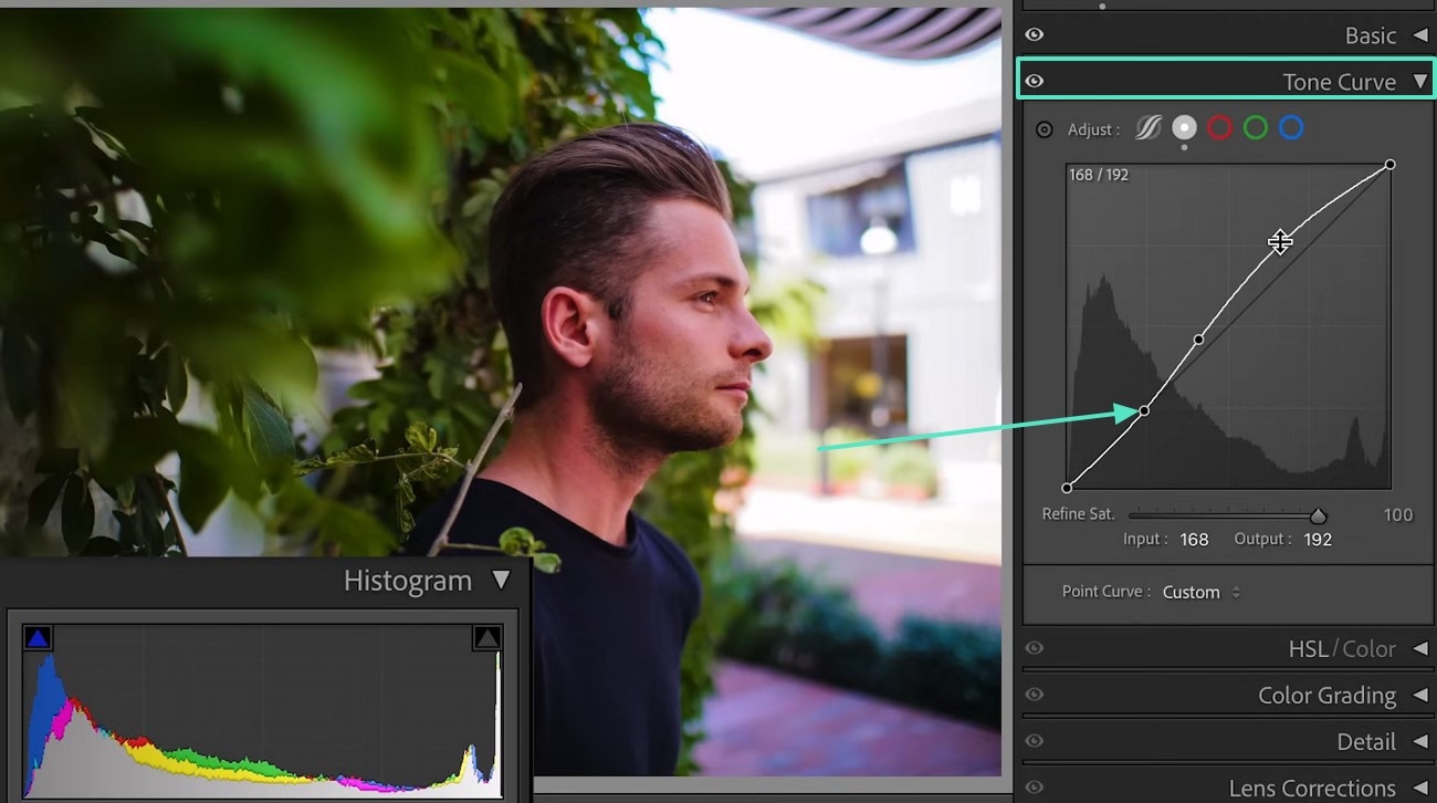
02 of 07 Tone Curve Adjustments
Navigate to the Tone Curve section. Select the desired color and create points on the curve to grade your photo. Adjust the endpoints to achieve your desired look.
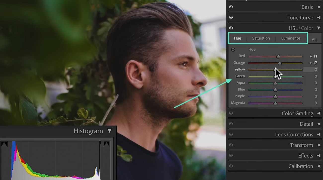
03 of 07 HSL / Color Panel
Go to HSL / Color to adjust Hue, Saturation, and Luminance. Choose your colors and set the values to shape your image's color palette.
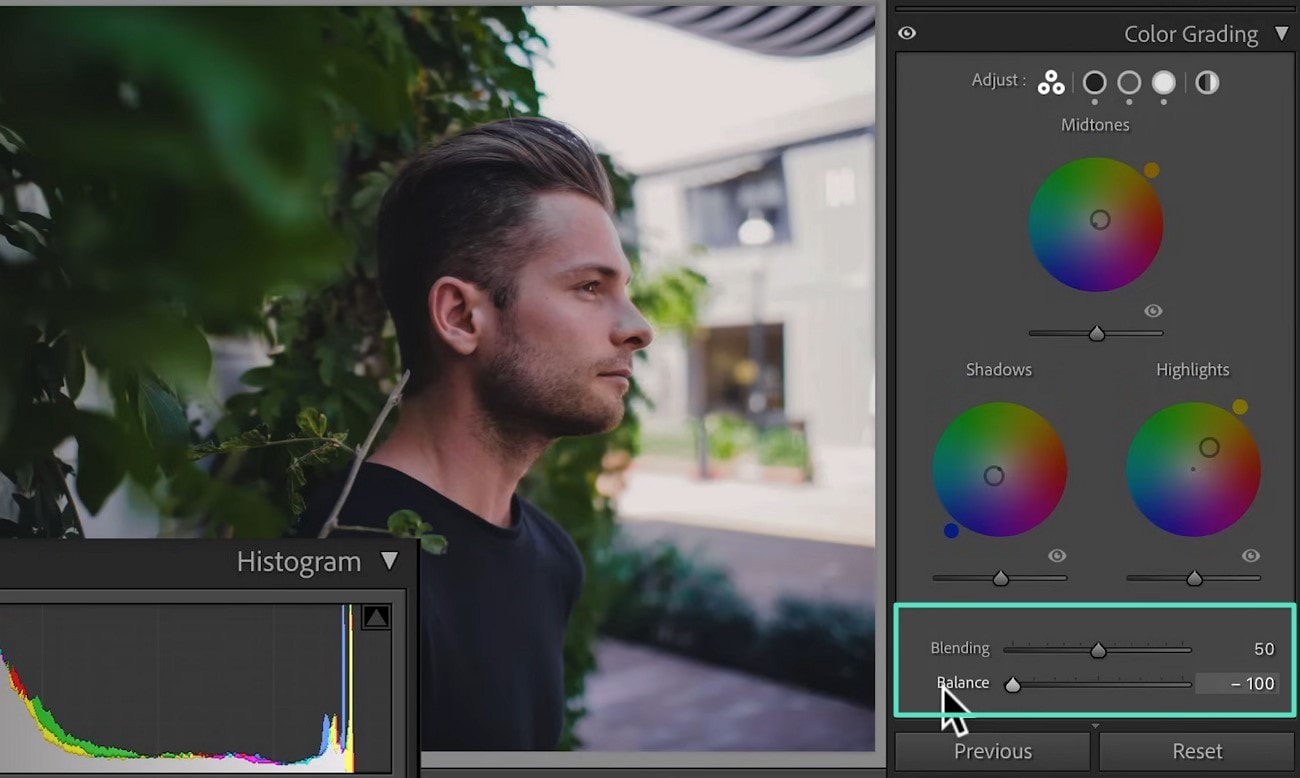
04 of 07 Color Grading Wheels
Access the Color Grading tab to adjust Midtones, Shadows, Highlights, and the Global wheel for overall tone shifts.
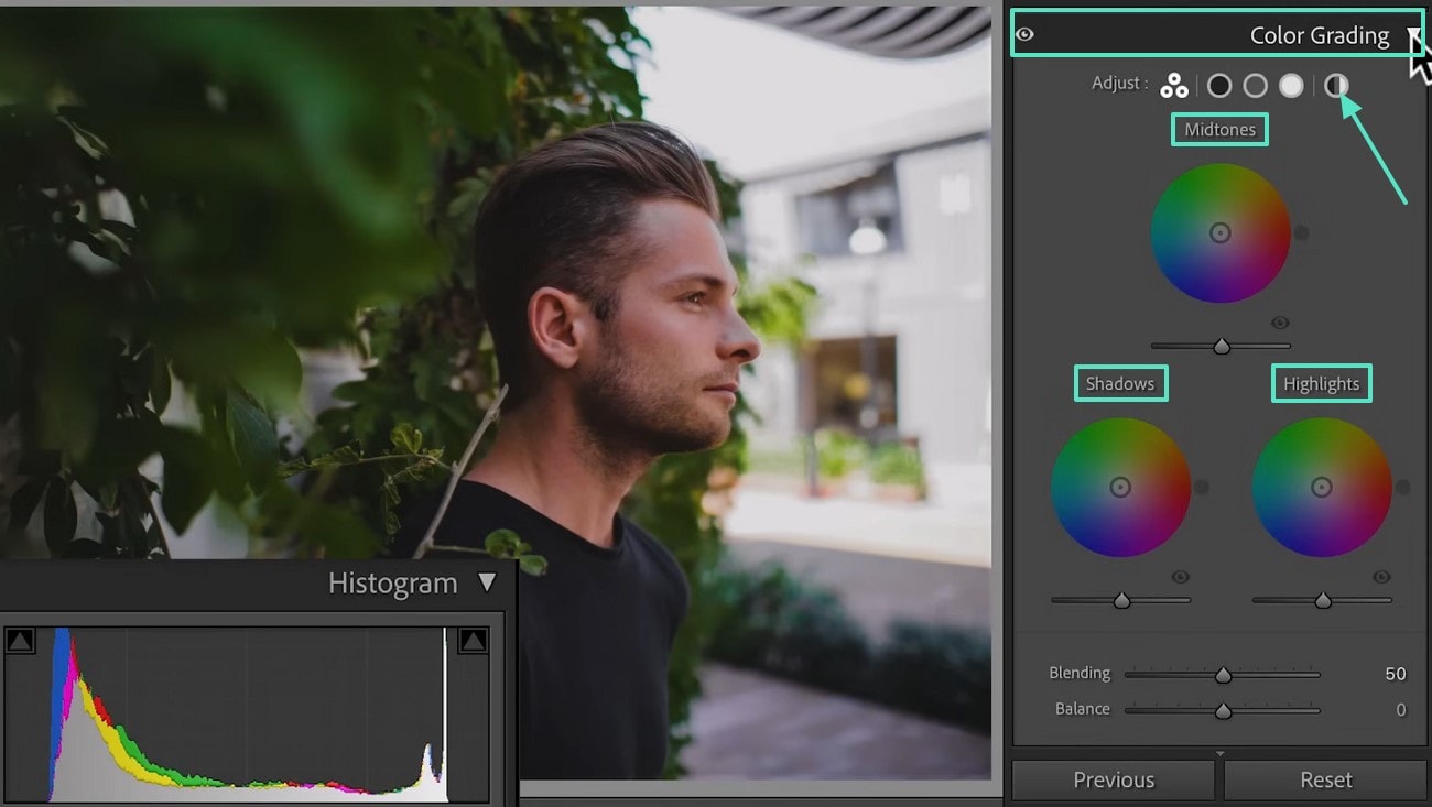
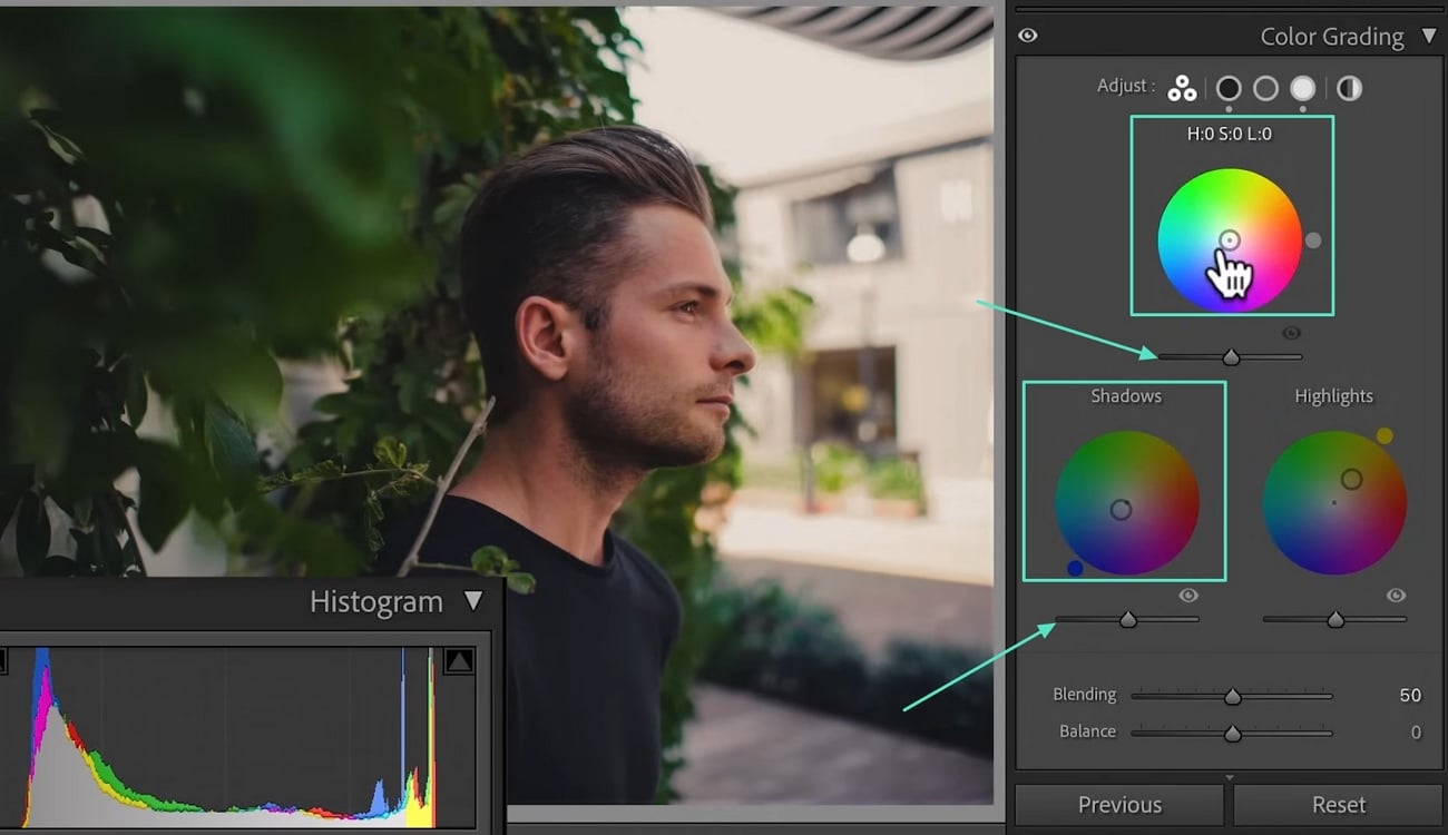
05 of 07 Shadows and Midtones
Drag the Shadows wheel toward the color you want in dark areas. Adjust the Midtones similarly for mid-range tones.
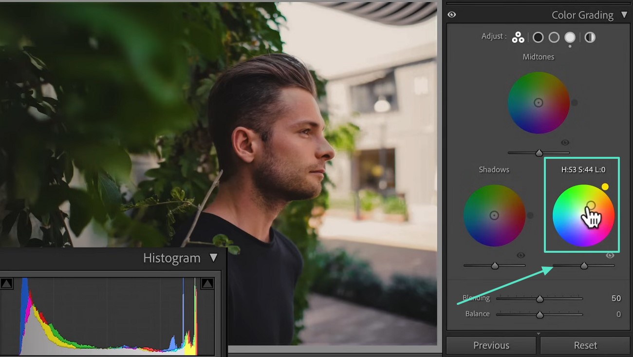
06 of 07 Highlights and Luminance
Use the Highlights wheel to tint bright areas. Adjust the Luminance slider under each wheel to control brightness in that tonal range.
07 of 07 Blending and Balance
Use the Blending slider to control smoothness between the wheels' colors. Adjust Balance to emphasize shadows or highlights.
Part 4. Color Grading with a Simpler, Faster Alternative
While Lightroom excels in photo editing, it isn't optimized for video color grading. So, when you want to bring that polished, cinematic look into your video projects, Wondershare Filmora steps in as the ideal alternative. When aiming to match your video's tone to a beautifully edited photo or create an entirely new visual style, Filmora makes it simple. You can import a reference image to extract its color palette automatically with its AI Color Palette feature.
 secure download

Plus, it lets you take full control with its native grading tools to build a custom look that fits your narrative. Filmora is accessible to all beginners as it was designed with simplicity in mind. As far as the colour grading in Lightroom is concerned, it gives you a much wider range of functions:
- Basic Adjustments: Modify everything from brightness to saturation to enhance the overall look with ease.
- White Balance: Adjust temperature and tint to correct color casts and achieve a natural appearance.
- 3D LUTs: Apply preset color grading profiles inspired by popular movies and TV shows or import your own LUTs for a customized look.
- AI Color Palette: Advanced algorithms power this tool to extract and apply color palettes from videos or images with greater accuracy.
- HSL: Fine-tune individual color ranges to achieve precise color control.
- Color Wheels: Alter values for wheels from shadows to highlights to create depth and mood in your footage.
- Curves: Manipulate the tonal range of your clip for much better brightness and contrast adjustments.
- Vignette: Draw the attention to the very center of the frame by inserting a very subtle dark or light border.
- Histogram: Visualize how tones in your clip are distributed to make informed adjustments.
- Color Match: Set the color scheme of one clip to be exactly the same as another for consistency.
- Presets: Utilize a variety of native presets for quick color grading solutions.
- Protect Skin Tones: An AI feature that maintains natural skin tones while applying color grading effects.
These features collectively provide a robust toolkit for achieving professional-quality color grading in your videos. The elaborate instructions detailed below will let you apply color grading in Filmora with ease:
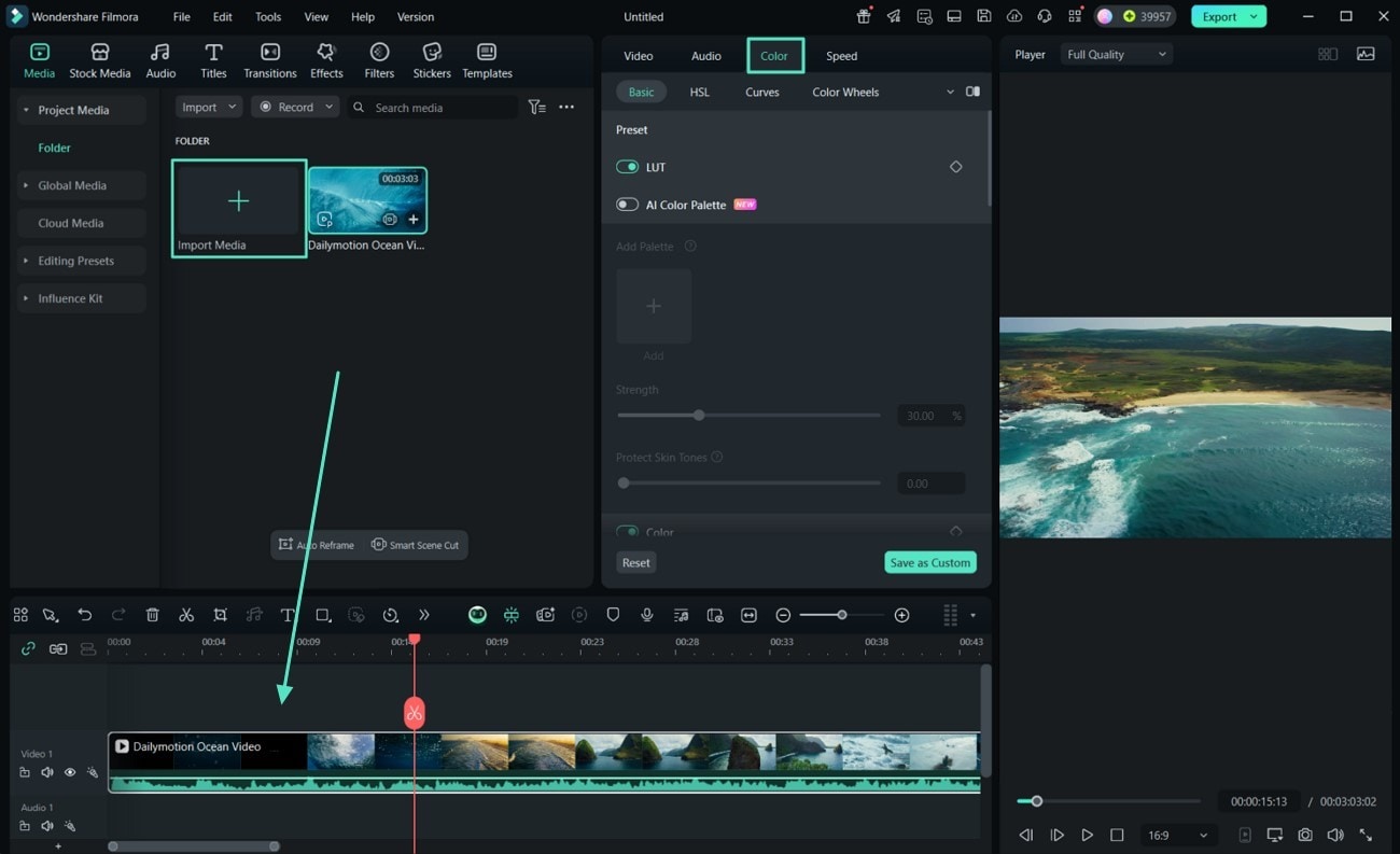
01 of 05 Get the Targeted Clip in The Software to Commence the Task
- Launch Filmora and click on "New Project" to start a new editing session.
- Employ "Import Media" to bring in your targeted clip, drag and drop it to the timeline.
- Double-click the video in the timeline to open the editing panel and access the "Color" tab.
02 of 05 Perform Basic Color Corrections
In the "Light" section, modify parameters ranging from "Brightness" to "Shadow" and "Exposure."
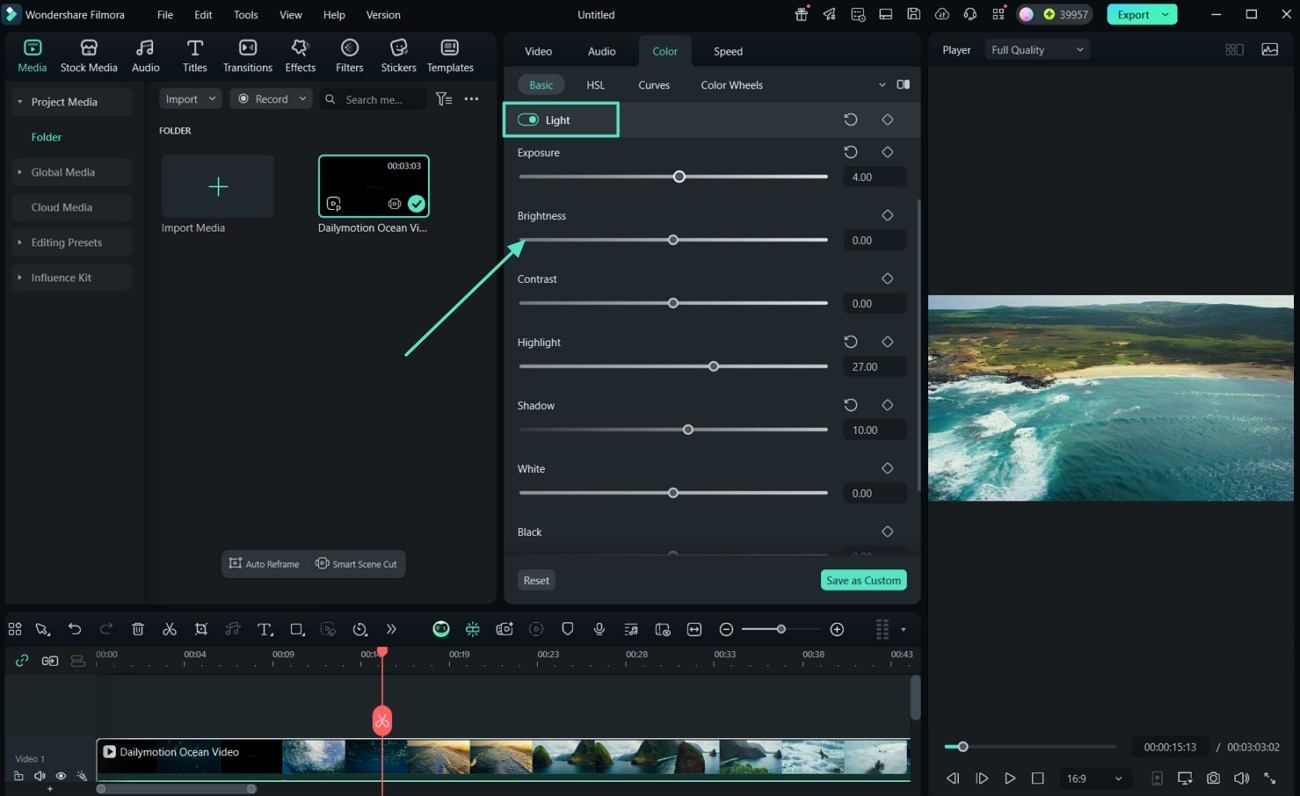
Adjust the "White Balance" by tweaking the "Temperature" and "Tint" sliders to achieve desired colors in the "Color" section.
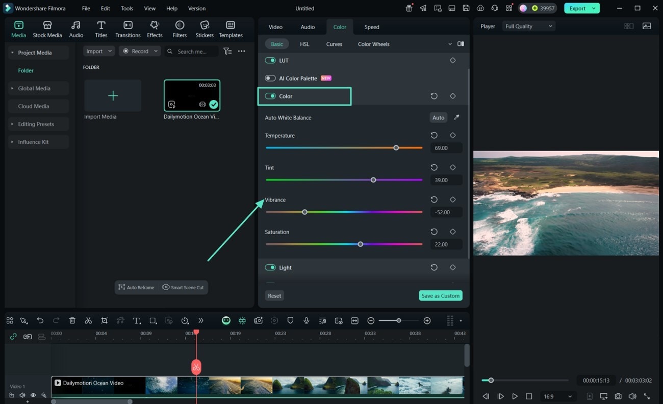
Use the "Vignette" settings to subtly darken or lighten the edges of your video.
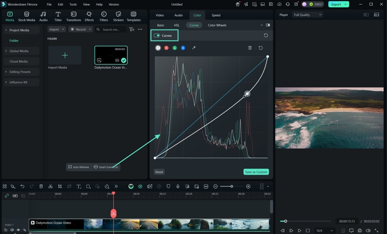
03 of 05 Utilize Advanced Color Grading Tools to Proceed
Approach the "Curves" tool to adjust the tonal range and contrast via the available curve graph.
Apply 3D LUTs by selecting from Filmora's built-in presets or importing your own via the "LUT" section.
Enable "Skin Tone Protection" to maintain natural skin tones while applying the new color scheme.
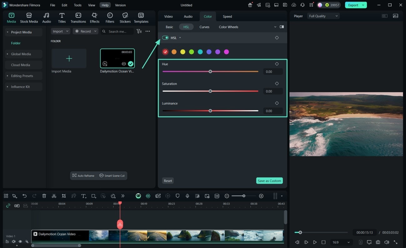
Go to the "HSL" tab from the top to opt for specific colors to set their "Hue," "Saturation," and "Luminance."
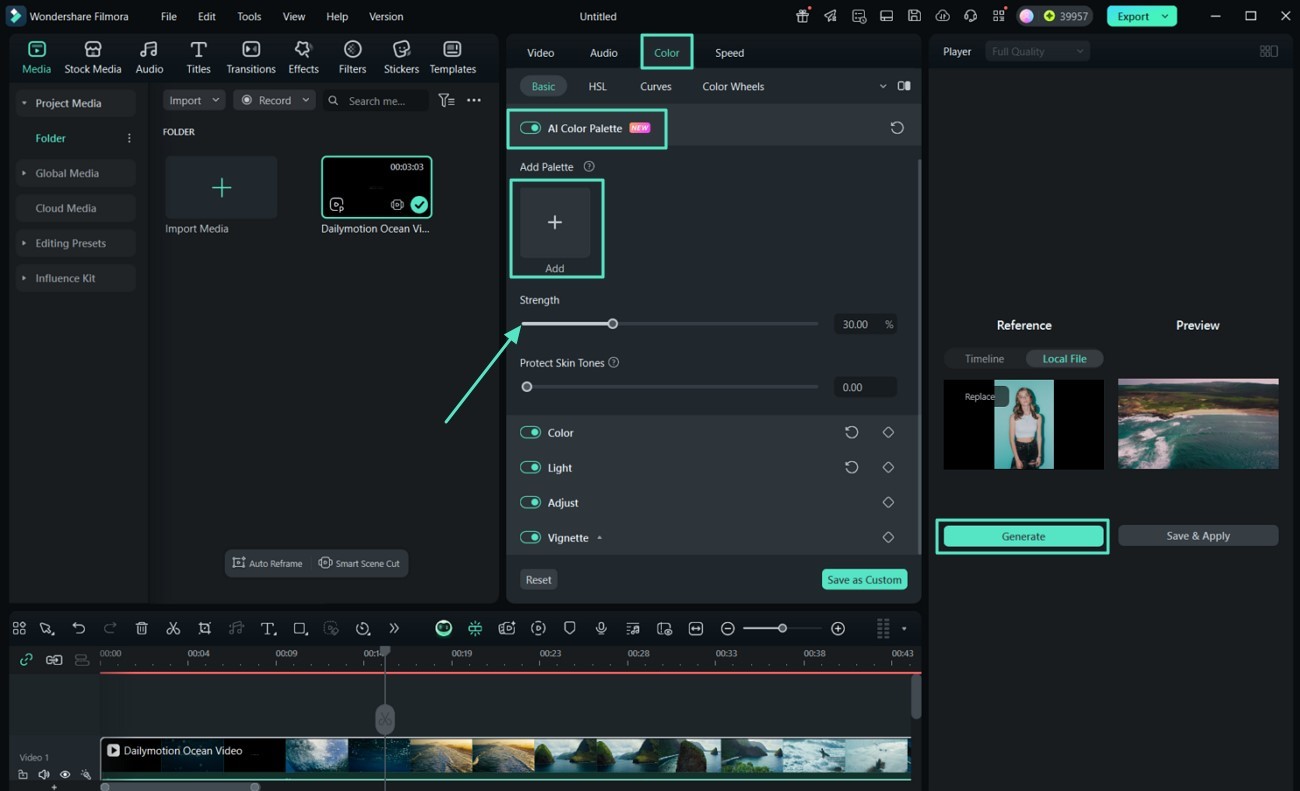
04 of 05 Implement AI Color Palette for Consistent Color Schemes
- In the "Color" section, activate the "AI Color Palette" feature by toggling it on.
- Import a reference image or select a frame that represents the desired color scheme.
- Filmora will analyze the reference and "Generate" a color palette to apply across your video.
- Adjust the "Strength" slider to control the intensity of the applied color palette.
05 of 05 Preview and Save Your Edits
- Use the "A/B Comparison" feature to view the before and after effects of your color grading.
- When satisfied, click "Save as Preset" to save your color grading settings for future projects.
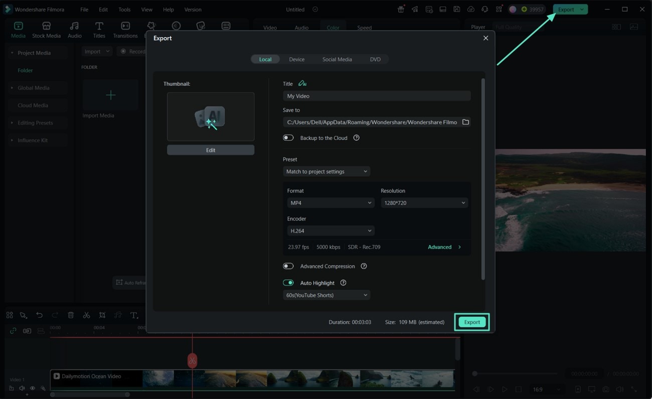
- Tap "Export" to choose your desired preferences and hit "Export" again to save your final video.
Conclusion
In summary, it's clear that cinematic color grading Lightroom plays a decisive role. It very much shapes the emotional and visual impact of both photos and videos. While Adobe Lightroom is a fantastic choice for images, it's not really tailored for the video-focused workflow. Hence, Filmora stands out as the better option when it comes to video editing.
secure download