
 100% Security Verified | No Subscription Required | No Malware


 ChatGPT
 Perplexity
 Gemini
 Claude
 Grok
Grok
Visual storytelling has become a vital part of content creation. Whether you're presenting a report, designing an infographic, or creating a social media post, charts and graphs help your audience see the story behind your data. Canva, one of the world's most popular design platforms, now offers a Graph Maker tool that promises to make data visualization as easy as dragging and dropping.
But does it really deliver professional results? In this Canva Graph Maker Review, we'll break down its features, pros and cons, pricing, and compare it with alternatives like Filmora, especially for users who want animated charts or video-based visualizations.
In this article
What is the Canva Graph Maker?
Canva's Graph Maker is an integrated tool inside Canva that allows users to create line charts, bar graphs, pie charts, area graphs, and more. It's part of Canva's online editor, available both in free and Pro versions.
You can either input data manually or upload a CSV file, and Canva instantly converts it into a clean, visually appealing chart. From there, you can customize colors, fonts, backgrounds, and even embed the chart into a larger design like a presentation or infographic.
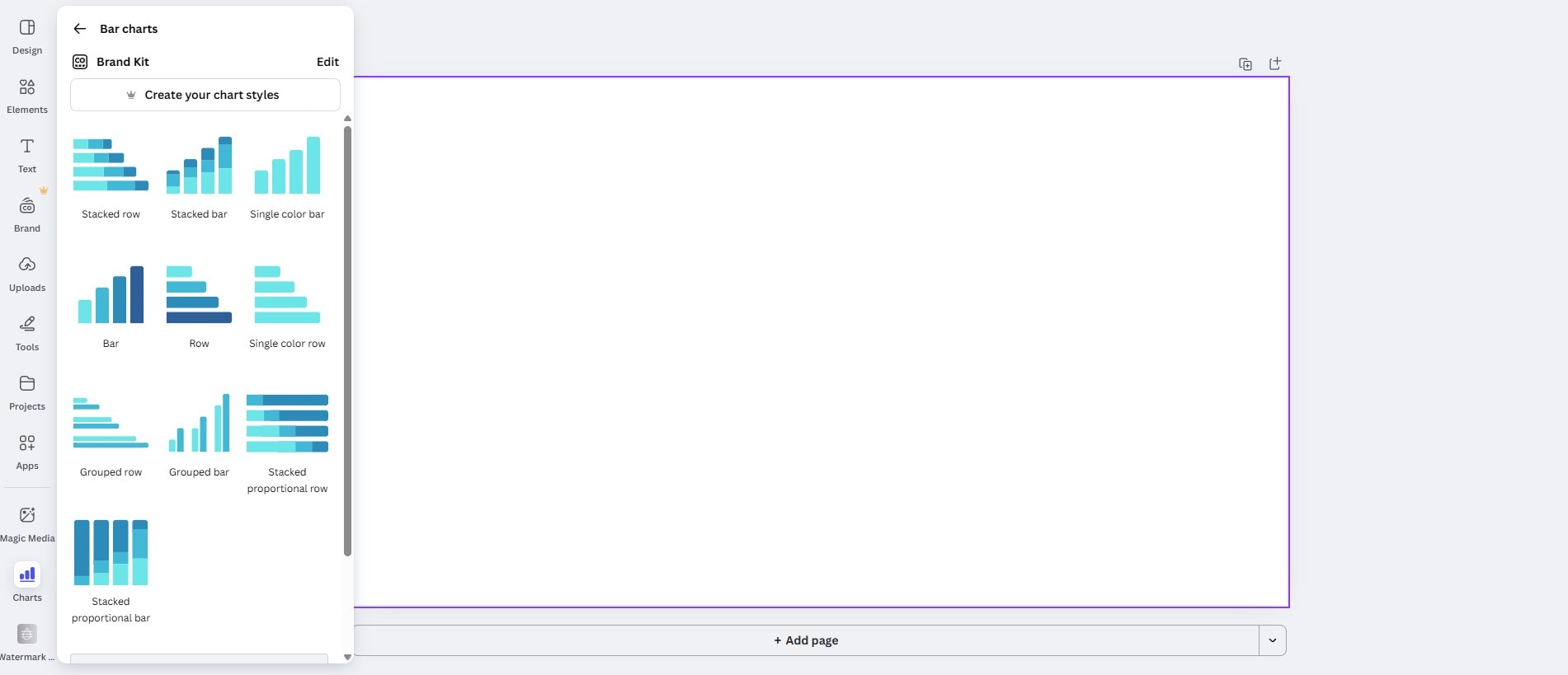
Canva offers the option to create different types of charts.
- A Bar or Column chart is used for category comparisons.
- A Line or Area chart is best for trends over time.
- Pie and Donut charts are designed for part-to-whole snapshots.
- A Scatter chart is for simple relationships.
- A Radar chart is best for multi-variable profiles (like skill matrices or product spec comparisons).
The Key Features of the Canva Graph Maker
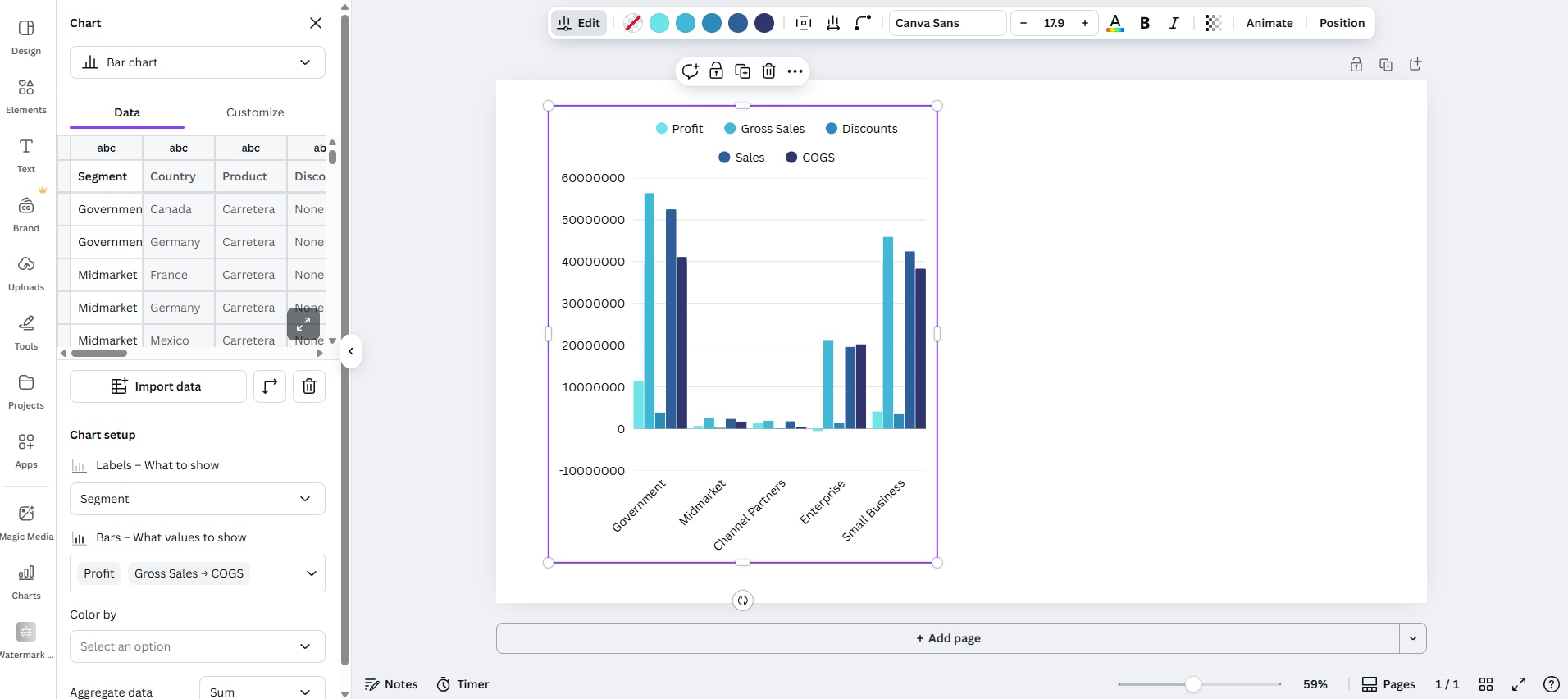
- On-canvas editing: Insert a chart, then edit data, colors, labels, and fonts without leaving the design.
- Quick data entry: Paste a small table directly into the chart's data grid or type values one by one.
- Type switching: Try the same dataset as Bar, Column, Line, Area, or Pie and Donut to see which communicates best with no rebuilding.
- Brand Kit integration: Apply your brand colors and fonts so graphs match titles, captions, and buttons across the project.
- Label control: Toggle data labels on and off, set legend visibility, and format numbers (percentages, simple rounding) for readability.
- Template ecosystem: Start from ready-made layouts (dashboards, one-pagers, slides) that include charts sized and spaced sensibly.
- Resize for channels: Duplicate a design and resize for 16:9 slides, 1:1 posts, or 9:16 stories, keeping the chart style intact.
- Export options: Download stills (PNG, JPG, PDF) or simple animated scenes (MP4/GIF) if you've added page or element animations.
Ease of Use: The Canva Graph Maker Interface
The Canva graph maker has an easy-to-use and clear drag-and-drop interface to visualize data.
- The Charts section in the Left Rail: Opening the Charts feature opens a tall, scrollable panel with a search bar at the top. You can then select from several types of charts, each offering different variations to suit your design needs.
- The Central canvas: This section dominates the screen, bordered by a subtle purple outline. It's intentionally uncluttered so you can arrange charts, text, and brand elements without issues.
- The top Utility bar: You also get standard controls like resizing, cloud saves, plus quick actions for exporting. This area also surfaces contextual actions when an object is selected, keeping everything clear.
- Page and Zoom controls (at the bottom): Just like in any editor, you can add pages and use the zoom slider for quick framing. You can also add notes and explore the timer feature, both of which are pinned to the lower left.
- Consistency across panels: Canva comes with a bunch of other features, including design options, adding elements, text, branding, uploads, other tools, and so on, so swapping between assets and the Charts gallery feels seamless.
Overall, the interface favors visibility. Chart types are previewed visually, brand options are visible when you need them, and layout controls stay out of the way until you select an object. It's approachable for first-timers yet fast for teams who need to work on multiple chart styles within the same deck.
The Pros and Cons of the Canva Graph Maker
Generally speaking, for static deliverables and simple loops, Canva is excellent. For fully animated, video-ready chart sequences, you'll want something more powerful.
Canva Graph Maker for Animated Charts and Videos
The Canva graph maker supports different types of charts, whether you want to make pie charts, donuts, bar charts, or more. Follow the steps below.
- Go to Canva's Graph Maker landing page and click on Create my graph now.
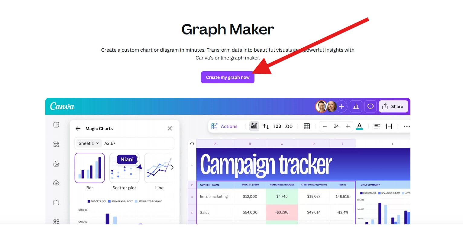
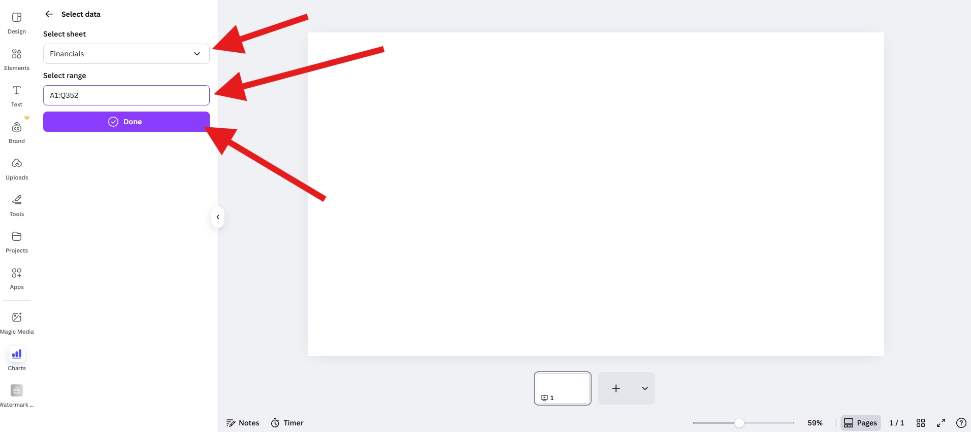
- Now, click on Start with data, and then proceed to import a spreadsheet that contains the data you want to convert into a graph.
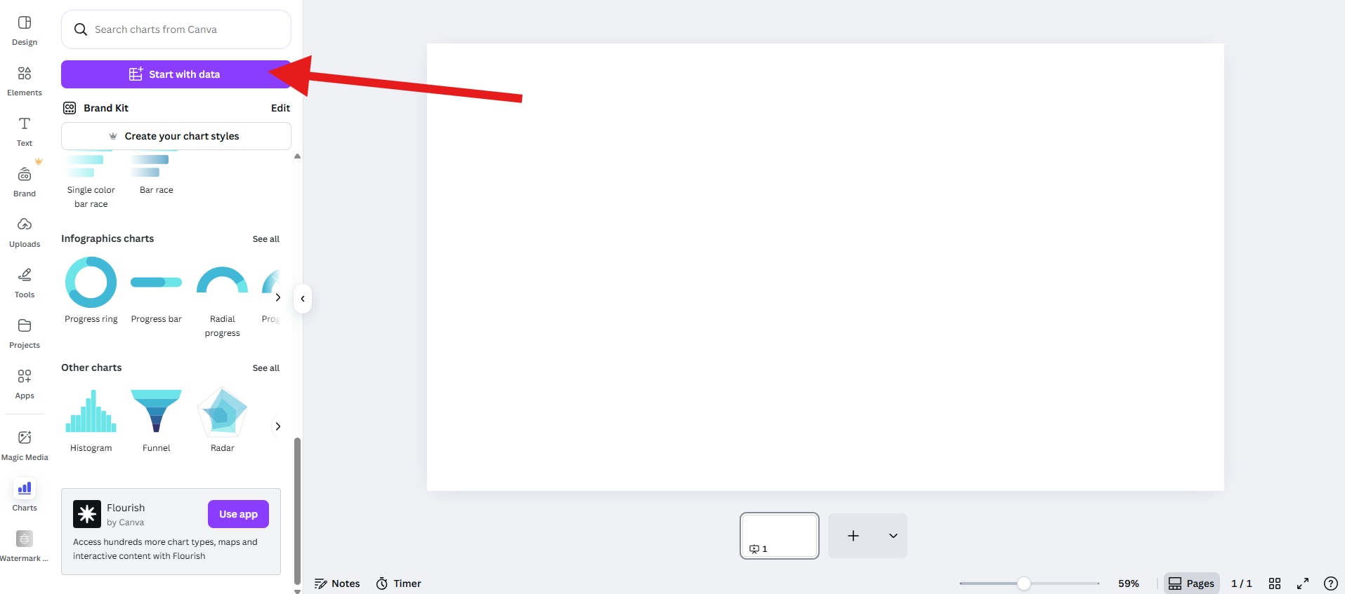
- Now, select a Sheet and Range and click on Done.
- Pick a type of chart (bar, line, column, donut, etc), and drag it to the editor.
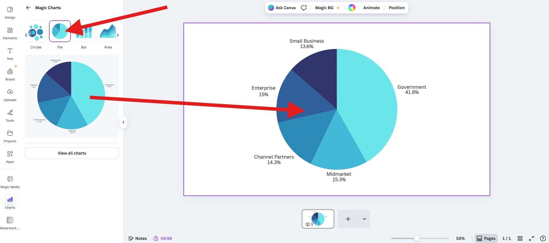
Let's see the result chart with a small animation created by Canva.

Pricing and Availability
As we all know, Canva is a user-friendly tool with many design features. The free version can meet basic requirements for making charts. However, the pro plan can support more advanced features.
- Free Plan: Includes access to basic charts, templates, and limited exports.
- Canva Pro: Unlocks premium templates, brand kits, background remover, and MP4/GIF export options.
Filmora as the Better Alternative for Animated Charts (Pivot to Video)
If you are working on a more complex video with voiceovers, music, lower thirds, and b-roll footage, going back and forth between Canva and a video editor can quickly become tedious. That's where a powerful new feature introduced by Wondershare Filmora comes in.
 secure download

Filmora is a powerful data visualization video editing software packed with all sorts of standard and AI features. It has a new feature named animated charts that can convert your spreadsheet into moving charts directly in the timeline.
Instead of making a chart somewhere online, importing it as a clip, and manually fitting it into your design, in Filmora, you can simply paste or upload data inside the tool, choose an animated chart template such as bar chart races, donut, pie, line charts, and more to visualize data immediately. You can also organize and trim like any other element.
- Pick a theme mode (light/dark) to match your video mood
- Set the color palette to match your brand colors
- Change the main font for titles, labels, and totals
- Edit bars and labels rules (percent/absolute, K/M/B abbreviations, rounding, minimum label thresholds, placement)
- Edit the background color and opacity so charts sit cleanly over other elements
- Add animations (direction, easing, stagger) that respect on-screen readability
- Edit and improve chart headers and short captions for context
How to Make an Animated Chart in Filmora?
- After downloading and installing Filmora on your computer, launch the software and start a new project.
secure download
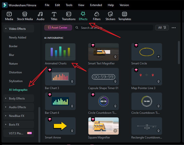
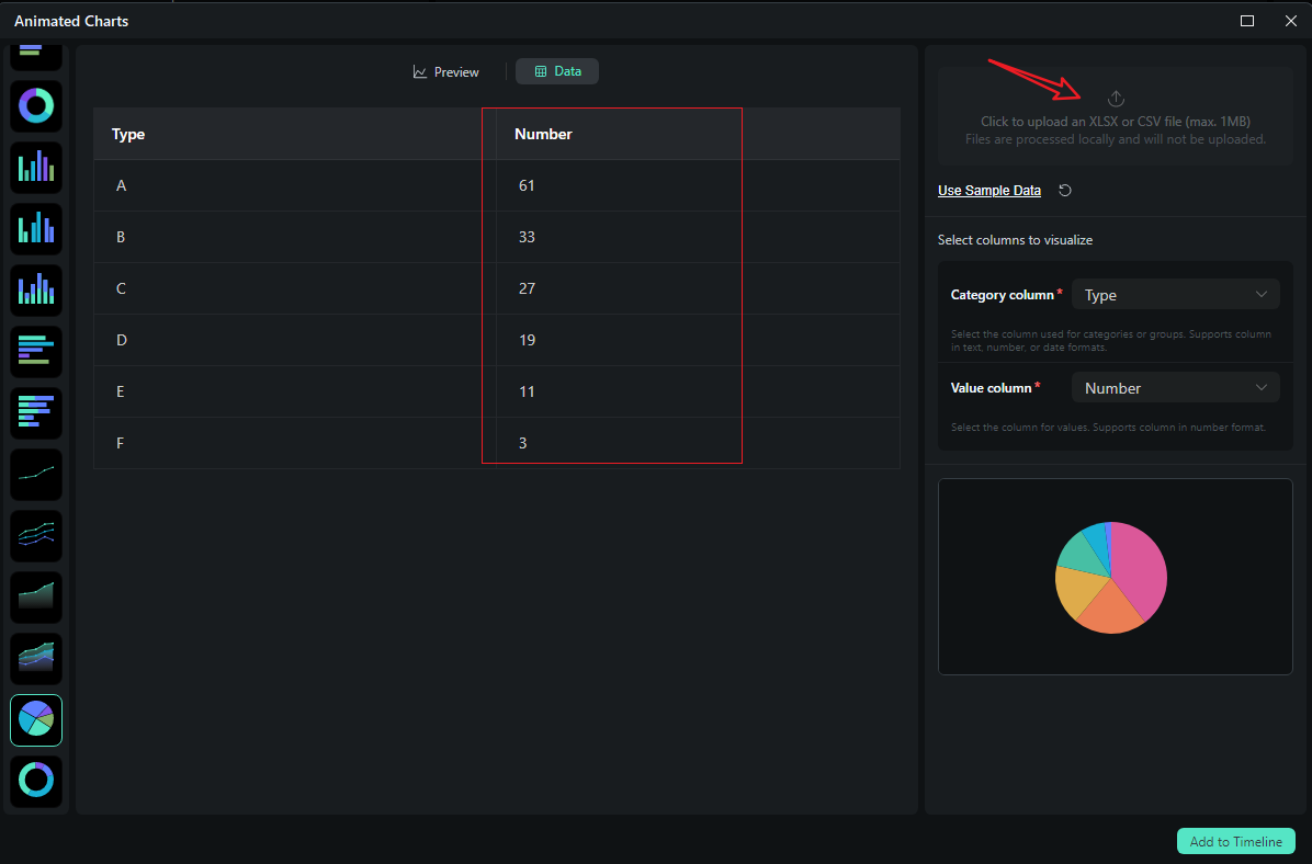
- Go to Effects > navigate to AI Infographic > double click the Animated Charts to activate the feature.
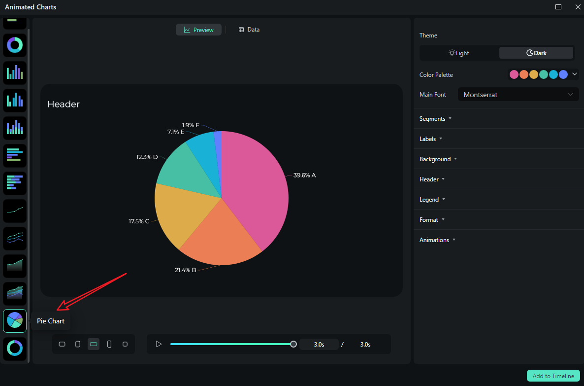
- View and pick an animated pie chart template on the left side.
- Switch to the Data section to upload your Excel file or edit the sample data column.
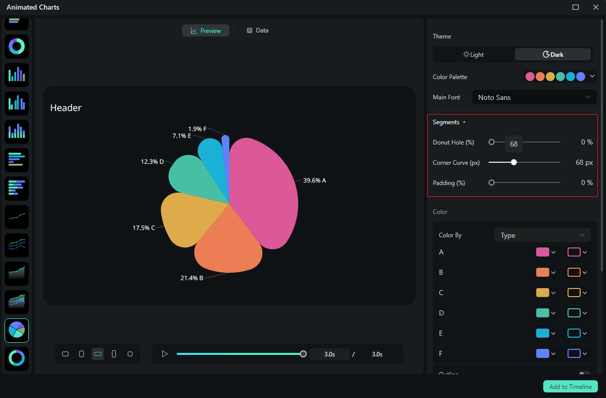
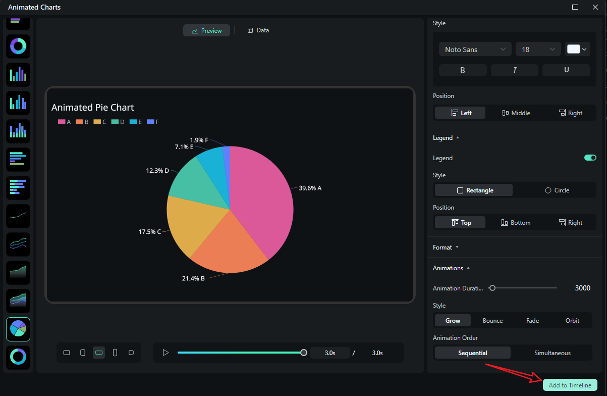
- After uploading the file or editing the data, review it and select what you want to visualize. Switch to the Preview section > you can adjust theme, main font, segments, labels, background, header, format, animation styles, animation orders, aspect ratio, and more accordingly.
- If you are satisfied with the result, you can click on add to the timeline.
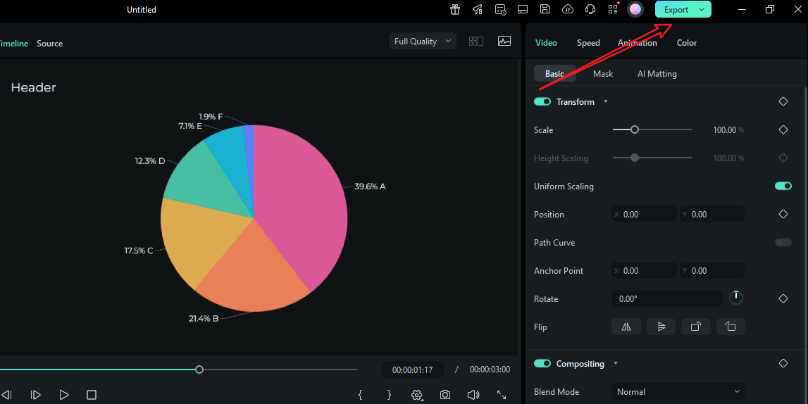
- Then you can choose to export the animated chart you have created.
Let's see the final animated pie chart video created by Filmora.
Head-to-Head: Canva vs. Filmora Animated Charts
| Features | Canva Graph Maker | Filmora (Animated Charts) |
| Customize data value | Yes | Yes |
| Animation depth | Page/element animations; | Chart-aware animation with direction/easing/stagger |
| Audio/VO sync | Not timeline-native; sync elsewhere | Trim clips to beats; markers for narration timing |
| Multi-scene consistency | Manual; match timings by hand | Presets keep fonts, palette, and motion identical |
| Best for | Fast static charts, simple social loops, decks | Video-first data stories, recurring reports, explainers |
Verdict: Is Canva Graph Maker Worth It?
The short answer is yes. For static charts and lightweight animations, the Canva graph maker delivers speed, brand consistency, and share-ready outputs. It shines when you need to make a graph in Canva for a deck, create a pie chart for a one-pager, or spin up a tidy chart for social media. But if your audience will watch your data in a video, with music and narration, Canva just won't cut it.
Filmora allows you to style, animate, and time charts within the editor. Try it out today and see how easy it is to make animated charts and graphs that will amaze your viewers.
secure download FAQs
-
Is the Canva graph maker free?
Yes. You can create charts on the free tier and export stills. Many teams stay there for basic reporting. Pro adds brand governance, premium assets, and productivity features if you need them. -
Can I animate a chart in Canva for social posts?
Yes. You can use Animate to apply subtle page or element transitions (Fade, Rise, Wipe) and export as MP4/GIF. It's great for short loops, but it's not a timeline with beat-matched, data-driven motion. -
What's the easiest way to make a pie chart in Canva?
Add a Pie/Donut from Elements → Charts, paste values, limit slices to five or six, and keep adjacent colors distinct. The donut style leaves room for a center label (total or short title). -
How do I keep labels readable on mobile?
Go for direct labels over legends, and keep names shorter than 2 or 3 words, bump the font size, and group tiny categories into Other. Increase contrast between neighboring bars/slices and add thin separators where needed. -
Why switch to Filmora for video charts?
Filmora turns your spreadsheet into timeline-native chart clips. You style once, trim to fit the narration, reuse presets, export multiple ratios, and paste updated data without rebuilding anything. That's the difference between a "pretty slide" and a publish-ready video.
