


Color grading can make a big difference in how polished a video looks, but getting the right result often takes more than applying a filter. CapCut simplifies this process with built-in filters, manual color tools, and LUT support. With the right CapCut color grading presets and settings, you can create clean, moody, warm, or cinematic styles with relatively little setup.
This guide explores useful CapCut grading settings, cinematic LUTs, free preset options, and how to get more precise control when different areas of a shot need separate adjustments.
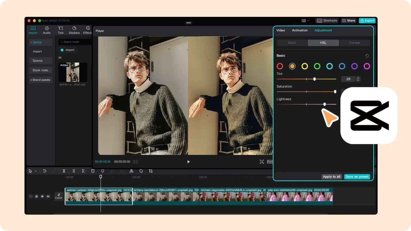
Part 1. What Are CapCut Color Grading Presets?
CapCut color grading presets are an easy way to give your footage a certain look without building the grade from scratch. You can start with a built-in filter, adjust the colors manually, or use a LUT as a base and fine-tune it to suit your footage.
Each approach has its own advantage. Filters are convenient when you want a quick result, manual adjustments give you more control, and LUTs are especially useful when you want a similar look across multiple clips.
| Method | What It Does | Best For |
| Filter/preset | Applies a ready-made visual style | Fast social media edits |
| Manual adjustment | Lets you fine-tune color and tone yourself | Customized grading |
| LUT | Applies a predefined color transformation | Consistency and cinematic looks |
What Makes Color Grading Look Cinematic?
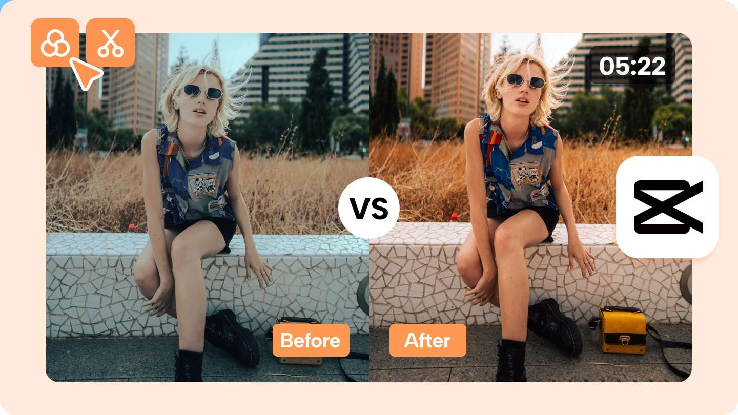
Cinematic color grading is less about copying a specific color and more about making the footage feel consistent and intentional. A few things that usually make the biggest difference in CapCut cinematic color grading are:
- Balanced contrast: Slightly deeper shadows and controlled highlights can give the footage more depth.
- Muted saturation: Pulling back overly bright colors can create a more film-like look.
- Warm and cool tones: A subtle warm highlight and cool shadow balance can add atmosphere.
- Natural skin tones: Keep skin tones looking realistic, even when applying a stronger color grade.
- Consistent colors: Matching the look across different shots makes the video feel more cohesive.
Part 2. CapCut Color Grading Settings for 5 Cinematic Looks
CapCut handles color adjustments through its Adjustment panel, which includes controls for exposure, contrast, saturation, temperature, HSL, Curves, and Color Wheels. You can combine these settings to refine your footage’s overall tone, contrast, and colors.
Below are five starting-point settings for common cinematic looks. However, keep in mind that there’s no universal CapCut color grading settings formula, as camera profile, exposure, white balance, lighting, and skin tones can all affect the result.
1. Clean Cinematic Look

A clean color grading cinematic CapCut grade keeps the image natural while adding a little more contrast and polish. It works especially well for lifestyle videos, travel footage, talking-head videos, YouTube content, Reels, and TikTok. Try starting with:
| Settings | Starting Point |
| Brightness | 0 to -5 |
| Contrast | +10 to +20 |
| Saturation | -5 to +5 |
| Highlights | -20 to -35 |
| Shadows | +5 to +15 |
| Temperature | 0 to +5 |
|
Show More
Show Less
|
|
The main goal is to control bright areas without making the image look flat. Add enough contrast to create separation, but keep the saturation restrained so colors and skin tones still look natural. If the footage already has warm lighting, you may not need to increase the temperature at all.
2. Moody Cinematic Look
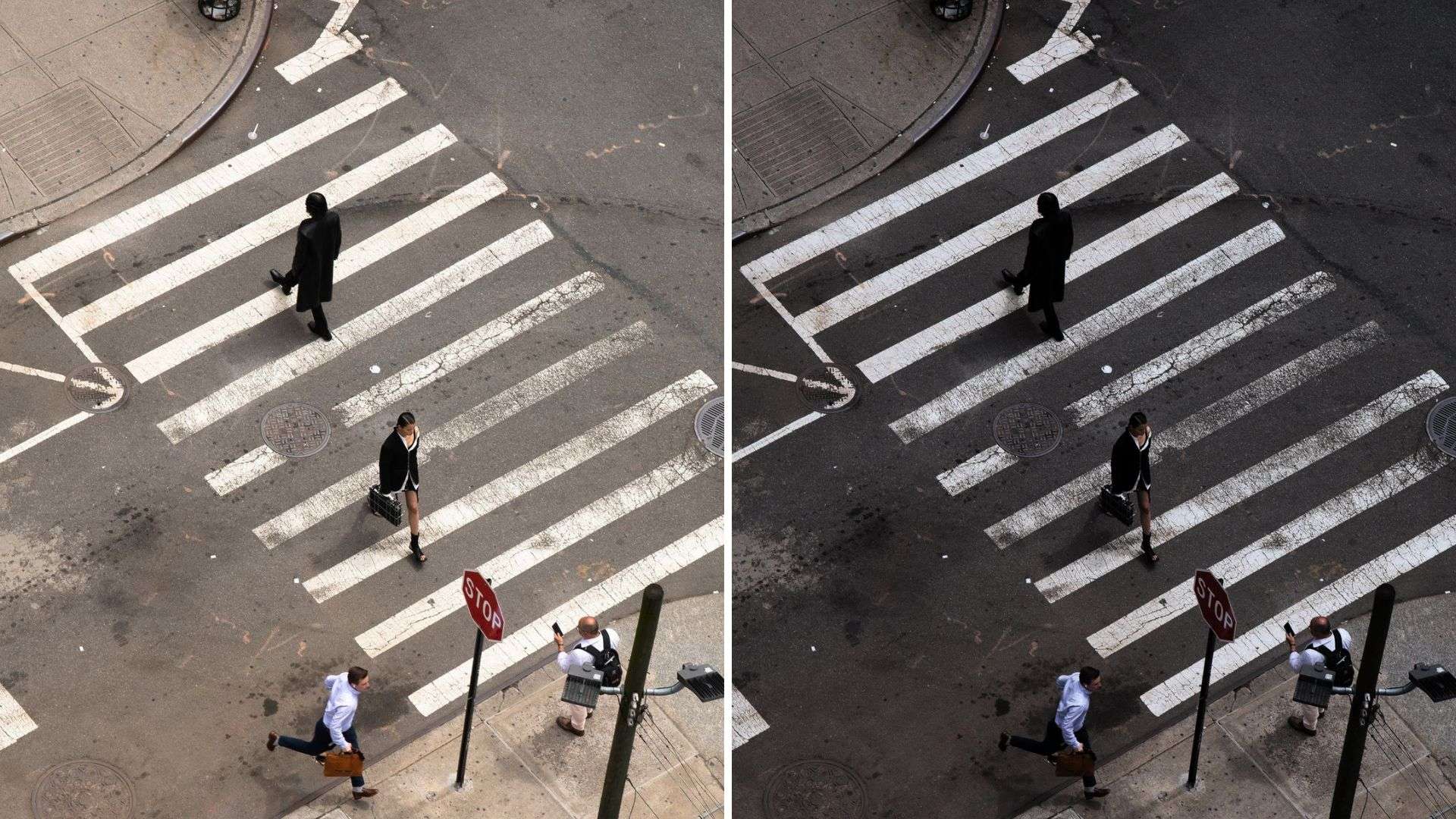
For nighttime footage, street scenes, fashion videos, dramatic sequences, or music videos, a darker and cooler grade can create a more atmospheric look. A useful starting point for moody cinematic color grading in CapCut is:
| Settings | Starting Point |
| Brightness | -5 to -15 |
| Contrast | +15 to +30 |
| Saturation | -10 to -20 |
| Highlights | -20 to -40 |
| Shadows | -10 to -25 |
| Temperature | -5 to -15 |
|
Show More
Show Less
|
|
The point is to make the image feel darker without losing all the detail in the shadows. You can also introduce a subtle cool tone through the temperature controls or push the shadows slightly toward blue or teal with Color Wheels. Be careful with contrast, especially with phone footage. Crushing the blacks too far can quickly remove detail and make the grade look harsher.
3. Warm Film Look
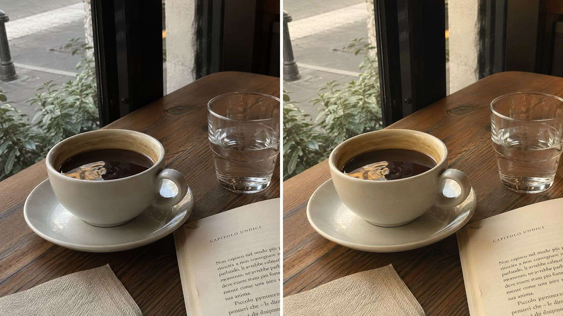
A warm film-inspired grade works well for travel videos, cafés, food content, lifestyle footage, and golden-hour scenes. Instead of pushing the colors heavily, the goal is usually to create softer contrast and a gentle warmth.
| Settings | Starting Point |
| Brightness | 0 to +5 |
| Contrast | -5 to +10 |
| Saturation | -5 to +5 |
| Highlights | -20 to -35 |
| Shadows | +10 to +20 |
| Temperature | +5 to +15 |
| Fade | +5 to +10 |
|
Show More
Show Less
|
|
Keep the warmth subtle. Increasing the temperature too far can quickly make skin tones look orange, especially if the original footage was already shot under warm lighting. A slight lift in the shadows and a small amount of fade can help soften the digital look without making the image appear washed out.
4. Teal-and-Orange Cinematic Look
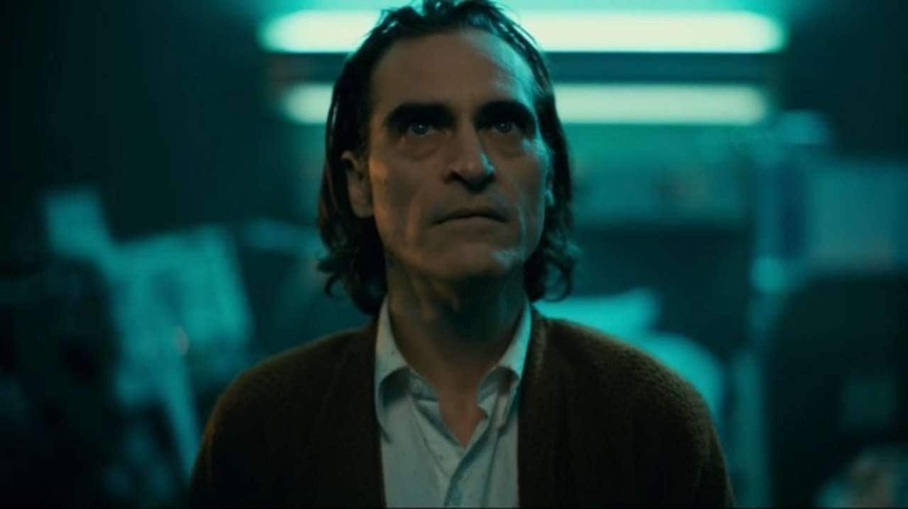
Teal-and-orange grading is based on creating color separation: cooler blue or teal tones are introduced into the shadows and background, while warmer tones are kept around skin and brighter areas.
Rather than increasing blue and orange across the entire image, use CapCut's HSL or Color Wheels for more control. For example, you can:
- Shift blues slightly toward teal
- Reduce overly saturated blues
- Add a subtle teal tone to the shadows
- Keep highlights slightly warmer
- Preserve natural orange and red tones around the skin
| Settings | Starting Point |
| Contrast | +10 to +25 |
| Saturation | -5 to +5 |
| Highlights | -15 to -30 |
| Shadows | -5 to -15 |
| Temperature | 0 to +5 |
|
Show More
Show Less
|
|
The effect should still feel subtle. Orange skin, cyan skies, extremely saturated blues, or very heavy contrast are usually signs that the grade has been pushed too far.
5. Soft Vintage / Faded Film Look
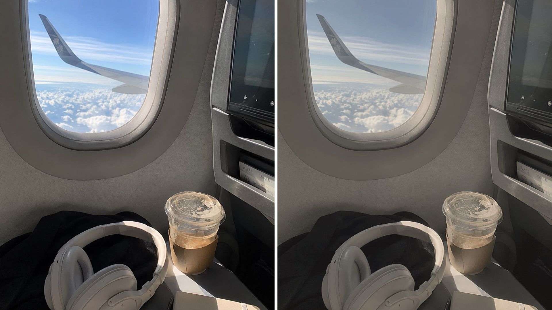
A soft vintage look uses lower contrast, faded blacks, restrained colors, and a slightly warmer or tinted image to create a more nostalgic feel. This preset works well for lifestyle videos, travel footage, memories, fashion content, or clips where you want something softer than a modern high-contrast grade.
| Settings | Starting Point |
| Contrast | -10 to -20 |
| Saturation | -10 to -20 |
| Highlights | -15 to -30 |
| Shadows | +10 to +25 |
| Temperature | +3 to +10 |
| Fade | +10 to +20 |
|
Show More
Show Less
|
|
Part 3. How to Use Cinematic LUTs for CapCut
A LUT applies a predefined color transformation to your footage and gives it a specific look with a few clicks. You can use it as a base for your color grade, then fine-tune the result to match your footage. CapCut currently supports custom LUT imports in .CUBE and .3DL formats.
How to Apply Cinematic LUTs for CapCut
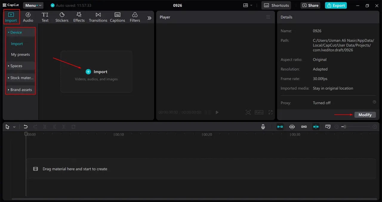
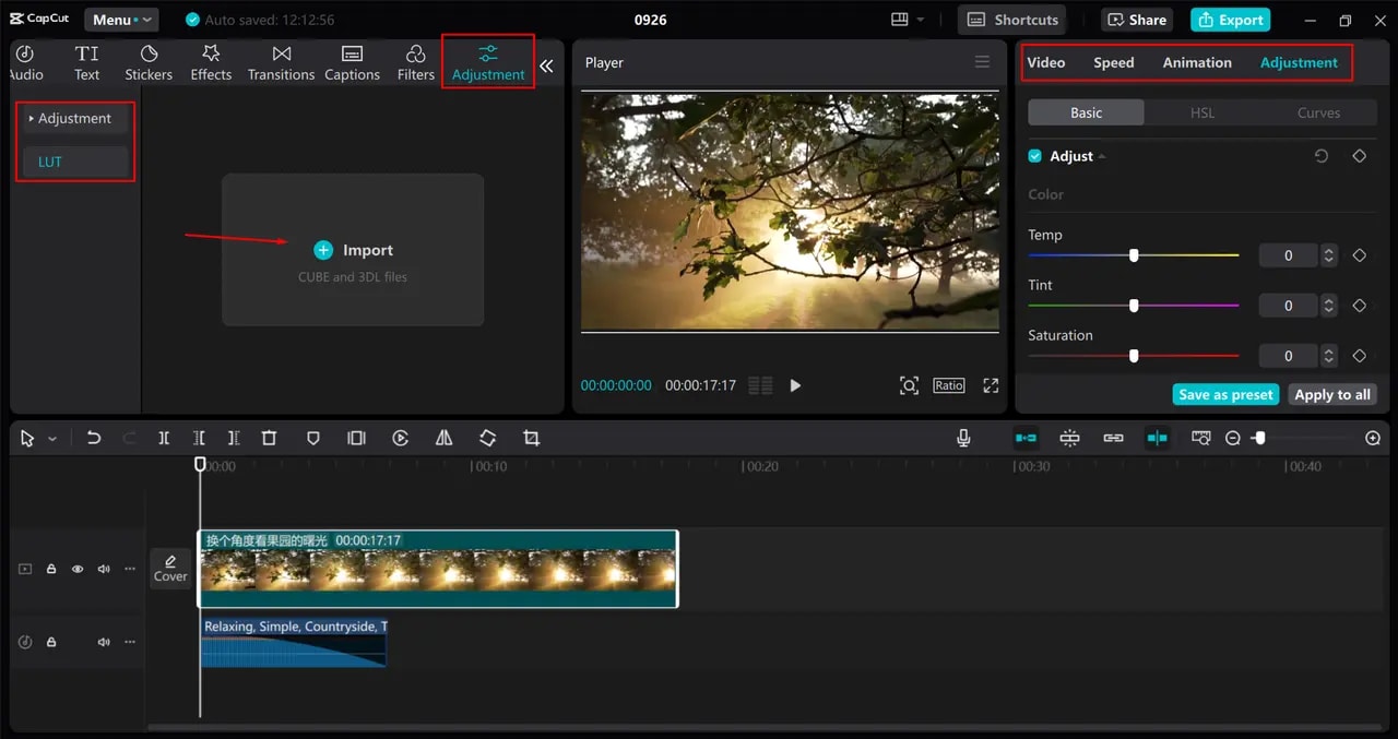
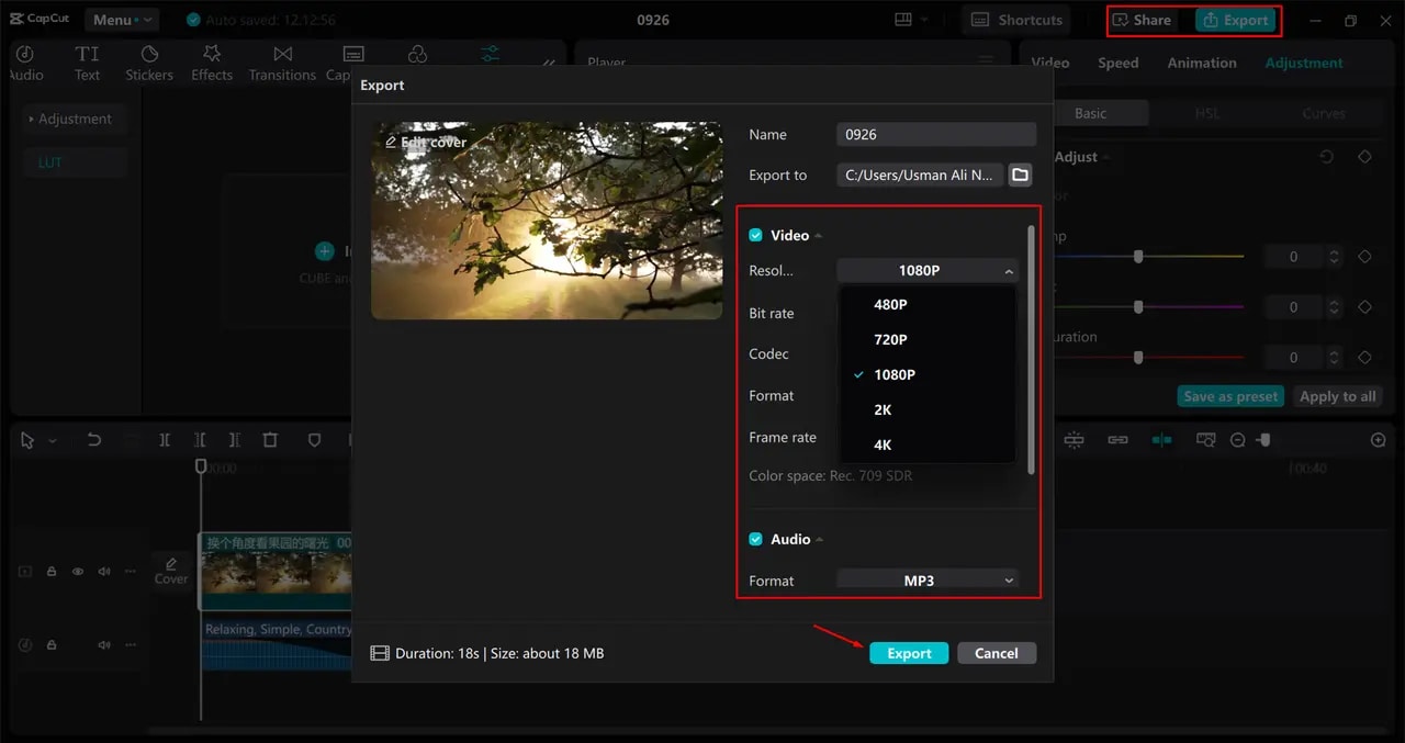
Don't Automatically Use a LUT at 100%
Treat LUT intensity as another adjustable setting. A LUT can look very different depending on the footage it is applied to. At full intensity, some LUTs can crush shadows, oversaturate skin tones, create unnatural colors, or make highlights too harsh.
Part 4. Where to Find Free CapCut Color Grading Presets and LUTs
To find free CapCut color grading LUTs for download, you can browse creator websites, editing communities, and online LUT libraries. Make sure to check the download page and license before using a LUT in commercial projects.
1. Motion Array
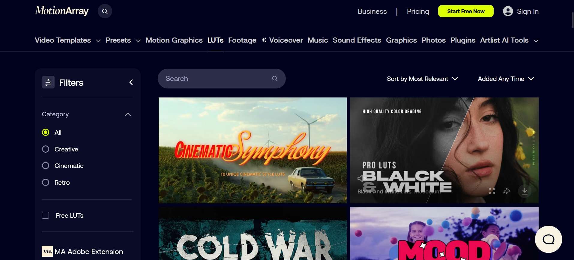
Motion Array has a dedicated collection of free LUTs that you can browse by style, including cinematic, creative, and retro looks. Its free LUT library currently includes options such as Prism Tones and Hue Haven. Motion Array says its LUTs are designed in Rec. 709 and are compatible with major video editing software, including CapCut.
2. FilterGrade

FilterGrade is another useful source for free CapCut color grading LUTs and presets. Its free LUT collection includes cinematic, film, warm-tone, and vlogging looks, with downloads available in formats such as .cube. FilterGrade also has a large marketplace of paid LUTs from different creators, so you can find both free and premium options here.
3. Uppbeat
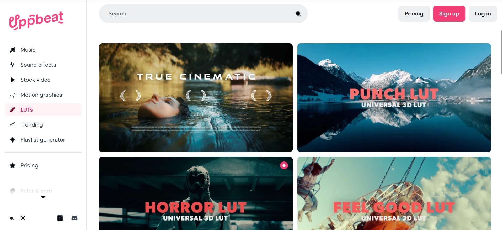
Uppbeat offers a collection of free LUTs and color grading presets you can use in video editors like CapCut. You can browse and preview its LUT collection, download a preset, and import the LUT into CapCut to apply the look to your footage.
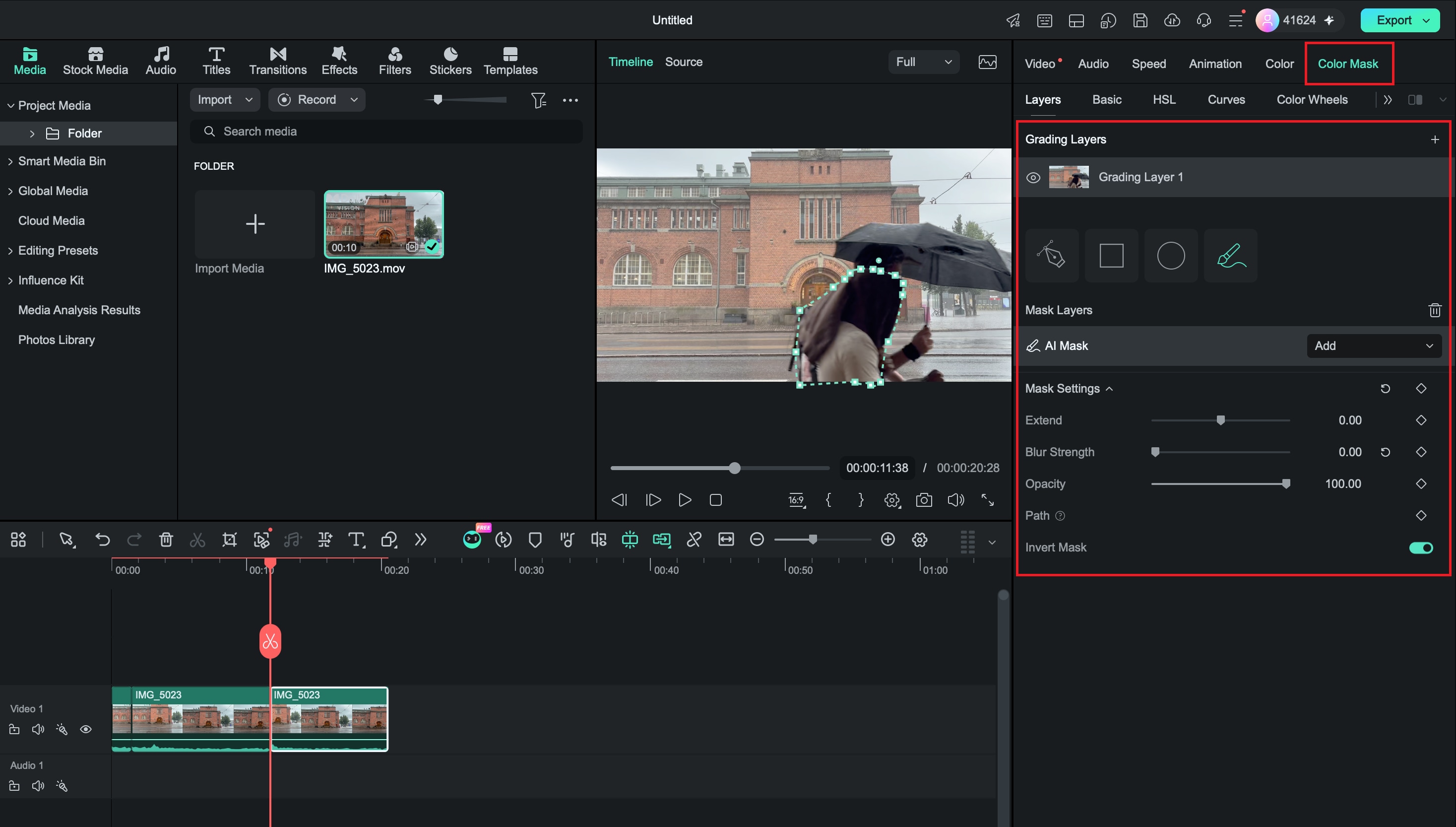
Part 5. Not Getting the Look You Want? Try Filmora’s Color Mask
CapCut gives you useful tools for color grading, including HSL, Curves, Color Wheels, LUTs, and masking. If you want a CapCut alternative for color grading, Wondershare Filmora offers a similar all-in-one editing experience with tools that make it easy to adjust and refine your footage.
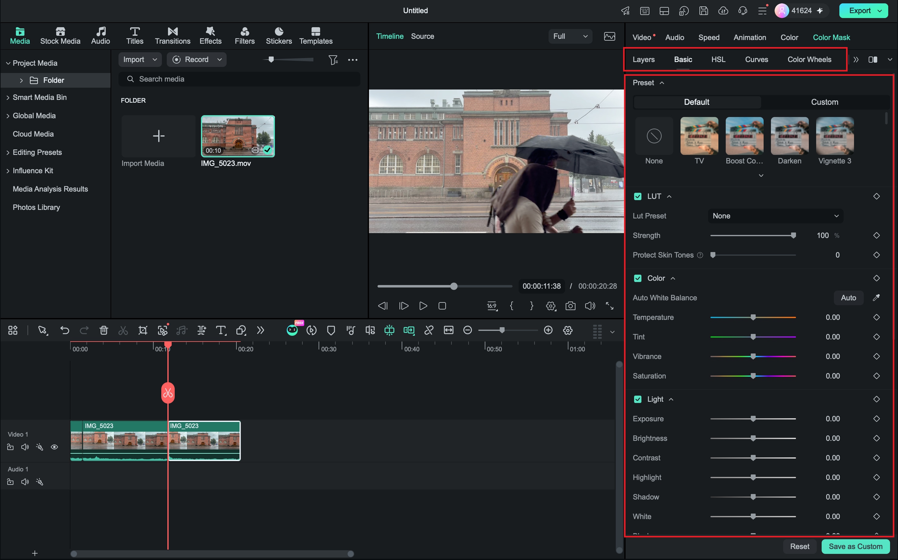
Filmora now features Color Mask, which lets you isolate specific colors or areas in a clip and adjust them separately. Along with other color tools, such as LUTs, filters, and color correction controls, you can fine-tune your footage easily and create different cinematic looks without switching to a more complex color grading app.
How to Use Filmora Color Mask for Smarter Color Grading
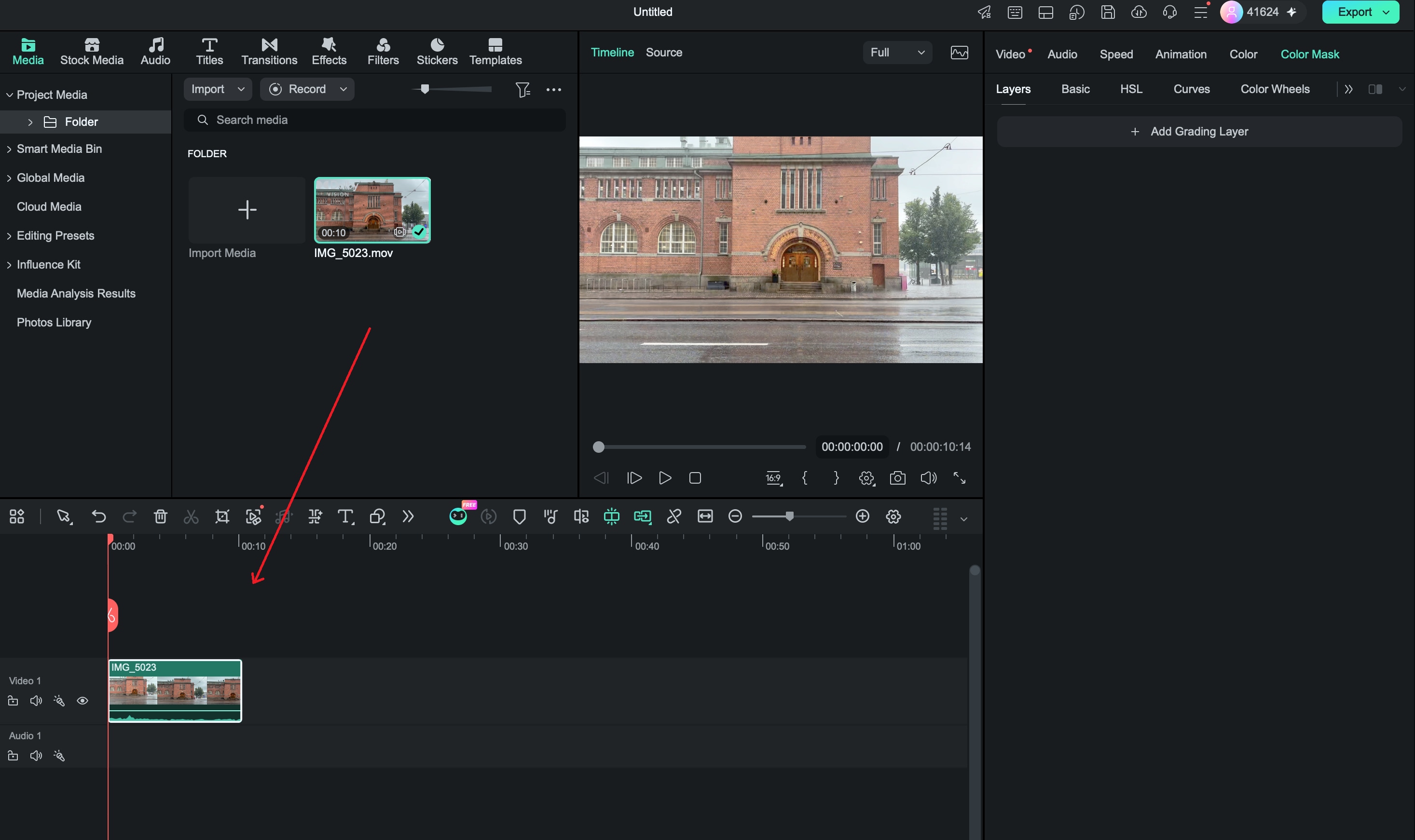
 Secure Download
CapCut vs. Filmora for Cinematic Color Grading
Both editors provide the main tools needed for cinematic color grading. The main differences come down to the interface, editing features, and which one feels more comfortable for your workflow.
| Color Grading Feature | CapCut | Filmora |
| Ready-made filters/looks | ||
| Manual color adjustments | ||
| HSL | ||
| Curves | ||
| Color Wheels | ||
| Custom LUT support | ||
| Adjustment layers | ||
| Masking/selective edits | ||
| Selective color grading (masking) | ||
| Multiple masked Grading Layers on one clip | ||
| Independent color suite per Grading Layer | ||
|
Show More
Show Less
|
||
Which One Should You Use?
If you’re already comfortable with CapCut, its color tools are more than enough for most cinematic looks. Filmora is worth considering if you want a CapCut alternative with a similar color grading workflow, plus a broader set of editing tools in the same desktop editor.
Secure DownloadConclusion
CapCut makes cinematic color grading approachable with filters, manual adjustments, and LUT support. The best results usually come from treating CapCut color grading presets and LUTs as starting points, then refining the grade to match the footage.
For more control, Filmora’s Color Mask adds a structured way to grade different parts of the same shot using multiple Grading Layers and masks. Whichever editor you use, focus on balanced exposure, natural skin tones, controlled contrast, and consistency between shots rather than relying on one fixed preset
FAQs
-
Can I save my own color grading preset in CapCut?
Yes. CapCut lets you save custom grading settings as presets, so you can reuse a similar look across clips or future projects. -
How do I apply the same color grade to multiple clips in CapCut?
On CapCut desktop, you can use an adjustment layer to apply one grade across several clips or copy and paste color attributes between clips. On mobile, you can use Apply all to apply the same adjustments across clips in the project. -
Can CapCut help match footage from different cameras?
Yes. CapCut's Color Match can use another clip or frame as a reference and adjust the target footage toward a similar color appearance. However, footage from different cameras may still need individual exposure, white balance, or color adjustments for a closer match. -
Can I color grade videos in CapCut on mobile?
Yes. CapCut mobile includes manual color adjustments as well as tools such as Color Correction and Color Match, so you can grade footage without using the desktop editor.
