
 100% Security Verified | No Subscription Required | No Malware

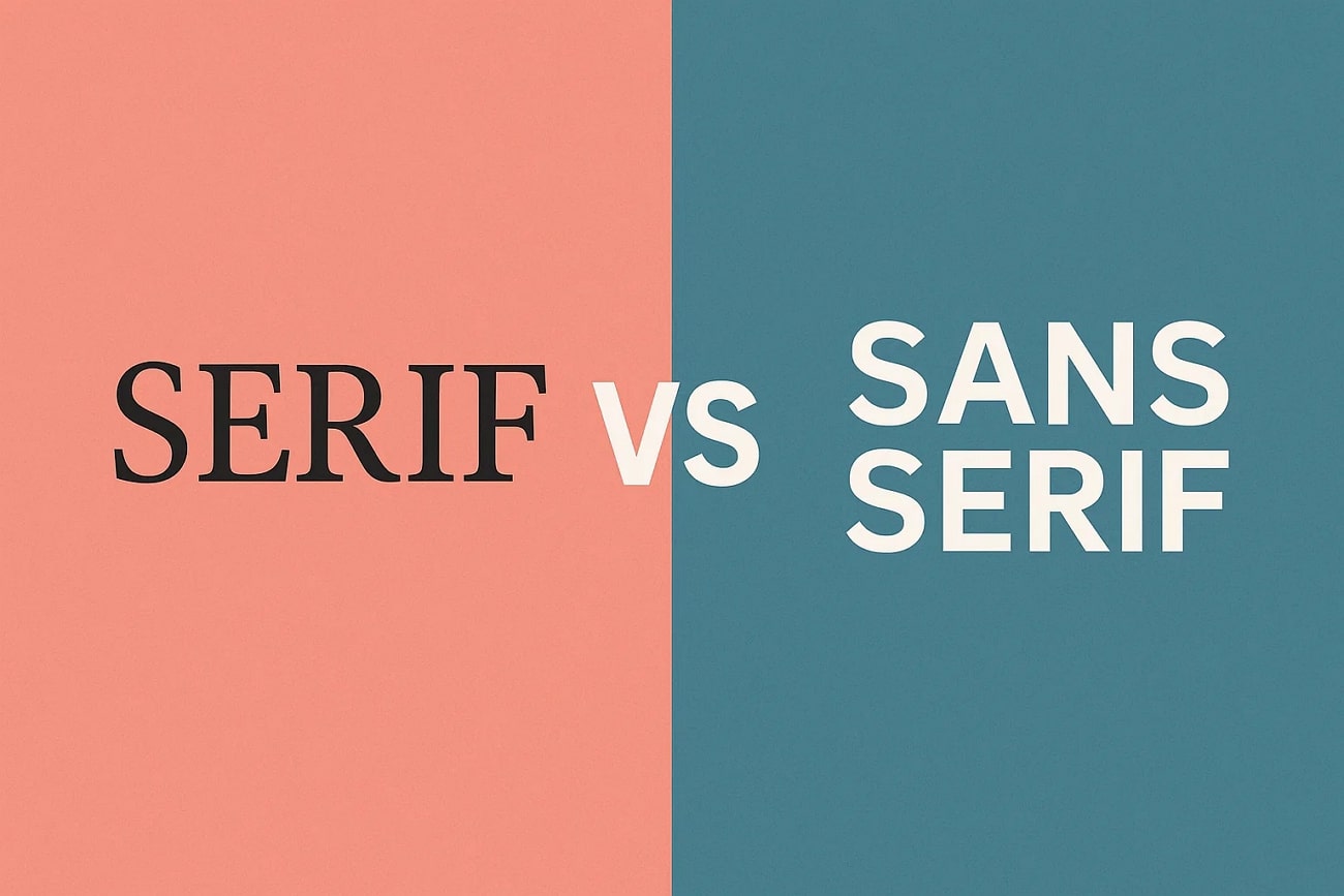
The outlook of your digital interface determines the number of people who will read it. You can make your screen readable and visually appealing with the right font choices. When it comes to typography, serif vs sans serif is a debate. They have their distinguishing features despite sharing the same alphabet.
Having the true knowledge about these styles will help you make informed choices while designing an interface. The article below gathers all the necessary information that you will need about these two typeface families.
In this article
Part 1. What are Serifs? When to Use Serif Fonts?
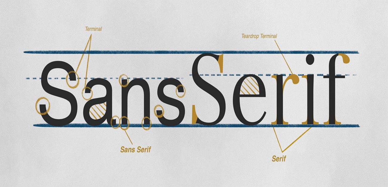
The strokes that extend from the ends of a letter in certain typeface families are referred to as serifs. These letterforms help guide the reader’s eye along lines of text to make reading smoother. Fonts with these details are called serif fonts, while those without them are sans serif. The following section shares more details about serif fonts:
Origin of Serifs
The oldest known use of serifs dates back to ancient Roman stone inscriptions, where chiseled letters had strokes. This letter style was initially introduced to help people prevent stones from chipping. However, this technique tuned into a stylistic hallmark of classical writing and typography.
Evolution of this Font
As the Renaissance era approached, the Sans vs Serif debate began. The latter got frequently used books and newspapers. In every time period, the details of the serif evolved for better readability and aesthetics.
Characteristics of Serifs
The extended strokes of varying thickness on each letter are the distinguishing feature of serif fonts. This characteristic makes this style look modern and readable at the same time.
Practical Applications
This readable text style is frequently used in a wide range of scenarios, from educational to official. The classic style of this typeface family also makes it a perfect fit for marketing and design purposes.

Part 2. What are Sans-Serif Fonts? When to Use Sans-Serif Fonts?
To understand the details of the Serif font vs. Sans Serif debate, you must also learn about the latter. The following section will elaborate on the sans-serif typeface family:
Origin of Sans Serif
In the early 19th century, this typeface was called grotesque due to the absence of strokes. Initially used in posters and advertisements, this font style eventually made it to digital interfaces.
Evolution of this Font
Designers of the 20th century used these fonts because of their stylish yet minimalist outlook. Some of its iconic font styles made it to the graphic design scenarios. Due to its readability and modern approach, this style is frequently used digitally today.
Characteristics of Serifs
Uniform stroke widths and no embellishments, serifs are known for their clear letterforms. While bringing style and readability, serif fonts offer sophistication.
Practical Applications
Brands seeking a contemporary approach in their advertisement can try the sans-serif family. The sturdy structure of this style makes it a perfect fit for headlines and headings on interfaces.
Part 3. Serif vs. Sans Serif: What’s the Difference?
While discussing Serif vs. Sans Serif font, the following table will help you quickly understand the difference:
| Serif | Sans-Serif | |
| Psychological Impact | Convey tradition, authority, and elegance in a professional way. | Communicate modernity and simplicity in an approachable way. |
| Readability in Prints | Guide the eye across lines in long paragraphs. | Lack of clarity in prints featuring long paragraphs. |
| Digital Readability | Sometimes less crisp on screens, especially at small sizes. | Very clear on digital screens due to simple shapes. |
| Origin & History | Dates back to Roman inscriptions | Emerged in the 19th century |
| Best For | Books, newspapers, magazines, and formal branding | Websites, apps, and tech branding |
Part 4. Perfect Font Pairing: How to Combine Serif vs Sans Serif Effectively
For diversity in your text, it is wise to use a combination of sans vs serif fonts. Go through the following section and see how you can blend different text styles:
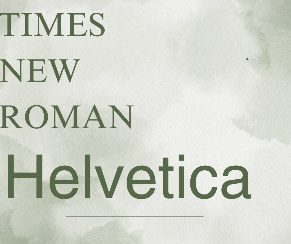
Times New Roman (Serif) + Helvetica (Sans Serif)
Times New Roman communicates a traditional message, while Helvetica balances it with modern aesthetics. This pairing is perfect for corporate reports, academic presentations, or professional websites.
Merriweather (Serif) + Open Sans (Sans Serif)
The strokes of Merriweather bring style and readability, making it perfect for headings over the Open Sans main body. This San Serif font vs Serif combination delivers style and sophistication in one.

Playfair Display (Serif) + Lato (Sans Serif)
This contemporary and clean blend of font styles balances the page layout. This style combo works well for fashion brands, lifestyle blogs, or creative agencies.

Georgia (Serif) + Roboto (Sans Serif)
When used in headings, Georgia makes the headlines bold and draws the reader's attention to your interface. The simplicity and style of Roboto work well, making this a good Serif fonts vs Sans Serif blend.

Baskerville (Serif) + Futura (Sans Serif)
Futura is geometric and serves the purpose of legibility and sophistication in one. When accompanied by the classical style of Baskerville, this style combination becomes a hit.

Part 5. 5 Tips for Using Serif and Sans Serif Fonts Together
Now that we know that the two typeface families under discussion work great together, let's see how you can make the most of this combo. The following tips will guide you on how to combine Serif versus Sans Serif fonts for maximum impact:
- Do Not Make it Messy: To make the interface look clean and readable, avoid cluttering the space with too many fonts. It is practical to stop at two fonts per frame for maximum impact.
- Maintain the Page Layout: Use the serif font for headlines and the sans serif for body text, or vice versa. This contrast helps guide the reader’s eye smoothly, helping them read quickly.
- Create a Harmony: The selected fonts should be different enough to stand out but not clash. If you are going for a decorative serif, combining it with a simple sans serif is a good approach.
- Go For Similar Weights: Consistent weight choice keeps the design visually even, so choose similar weights for a better outlook.
- Pay Attention to Proportions: For enhanced understanding of your content, select font styles that have similar x-heights and letter widths.

Part 6. Serif vs. Sans Serif: Choose One and Add Title Effects in Filmora - PC and Mobile
Once you learn the tips to use Sans vs Sans Serif, the next step is to explore a video editor that has both typeface families. Wondershare Filmora is a diverse video editor that has an extensive library of cool text styles. After adding text to media, you can personalize it by using the premade effects. Users of this editor can enjoy multiple methods for incorporating the two font styles into their videos.
If you are a mobile user, you can avail yourself of the Filmora App [iOS/Android] to get every feature on the go. This application offers users a cool feature of AI Captions that automatically adds sans or sans-serif fonts into their videos. Furthermore, users can also explore the manual methods of adding these fonts to videos. Check out the guides below and explore various techniques that can be used on both versions:
Using Filmora Desktop to Add Serif and Sans Serif Text
Follow the steps below and see how the desktop version of Wondershare Filmora can be used for this purpose:
Method 1. Generating Dynamic Captions for Automated Results
If you do not have the time to add captions manually, this method is for you. The following steps will guide you in integrating sans vs serif into videos using the automated method:
- Step 1. Enter a New Project with a New Imported Video. Using the main interface of the tool, start a “New Project” and import a video.

- Step 2. Generate Captions in Your Preferred Settings. Enter the “Titles” tab at the top and select “Dynamic Captions” from the left panel. Enter your desired language and other specifications to “Generate” the captions.

- Step 3. Save the Edited Video to Your Local Folder. Click the “Export” button at the top right and save the video in your desired settings.

Preview the export result in the video below.
 secure download

Method 2. Manually Adding Serif and Sans Serif Fonts
Users looking for a more controlled approach can follow the steps below:
- Step 1. Select a Title Effect and Customize it. Once you have imported a video, enter the “Titles” tab from the top and select the “Title Effects” option from the left. After selecting the desired resource, type your text and select a serif font from the “Basic” section on the right.
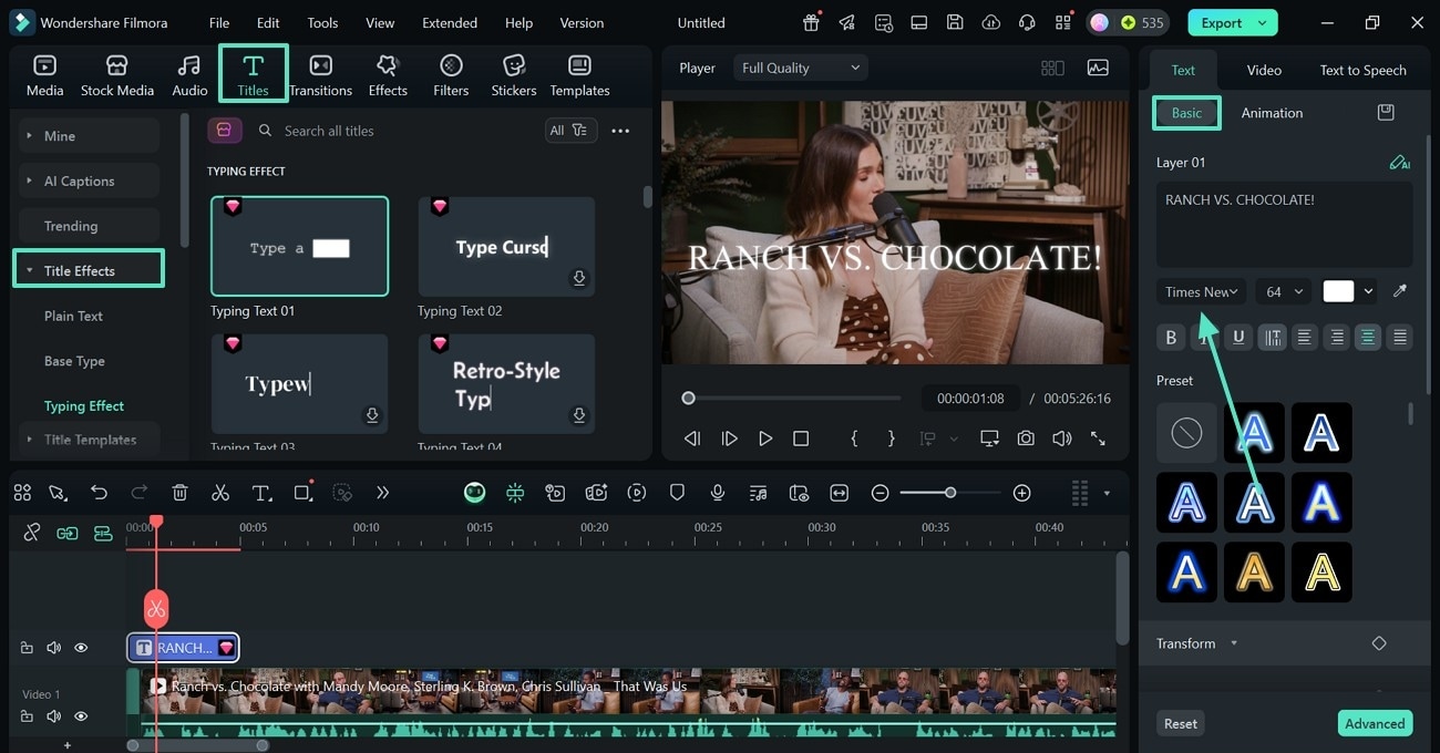
- Step 2. Save the Video in Your Preferred Settings. After you have edited the font, select the “Export” button at the top right to save the video.

secure download
Using the Filmora App to Add Serif vs Sans Serif
The following guide features 2 useful techniques to use Serif font vs Sans Serif in videos:
Method 1. Generating AI Captions
Users looking for automation in adding text to videos can go through the following guide:
- Step 1. Enter the AI Captions Interface. To initiate, open the app and tap the “AI Captions” button to import a video.

- Step 2. Generate AI Captions for the Video. Using the next screen, enter the language and other settings to “Add Captions.”

- Step 3. Select the Captions Template and Save the Video. After the results appear on the next interface, select the desired caption template and tap “Export” to download the video to your device.

View the exported video outcome in the example below.
secure download
Method 2. Using the Manual Technique of Adding Serif and Sans Serif to Videos
The manual technique offered by the Filmora App allows users to tweak the results to their preferences:
- Step 1. Initiate a New Project to Start. First, open the Filmora App and use the main interface to start a “New Project” and import a video.

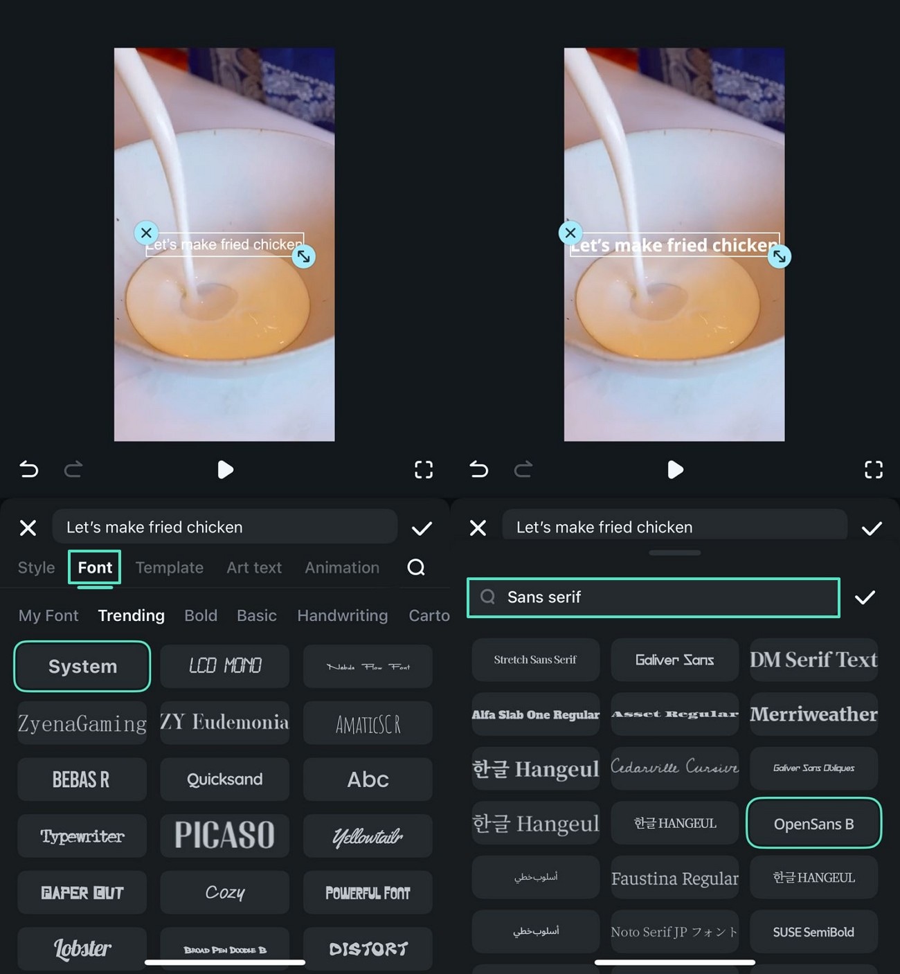
- Step 2. Enter the Text Tab. Enter the “Text” tab on the new screen and continue to the next step.

- Step 3. Pick and Apply a Sans-Serif Font. Now, type the desired text and enter the “Font” section to search for and apply a suitable “Sans Serif” font.
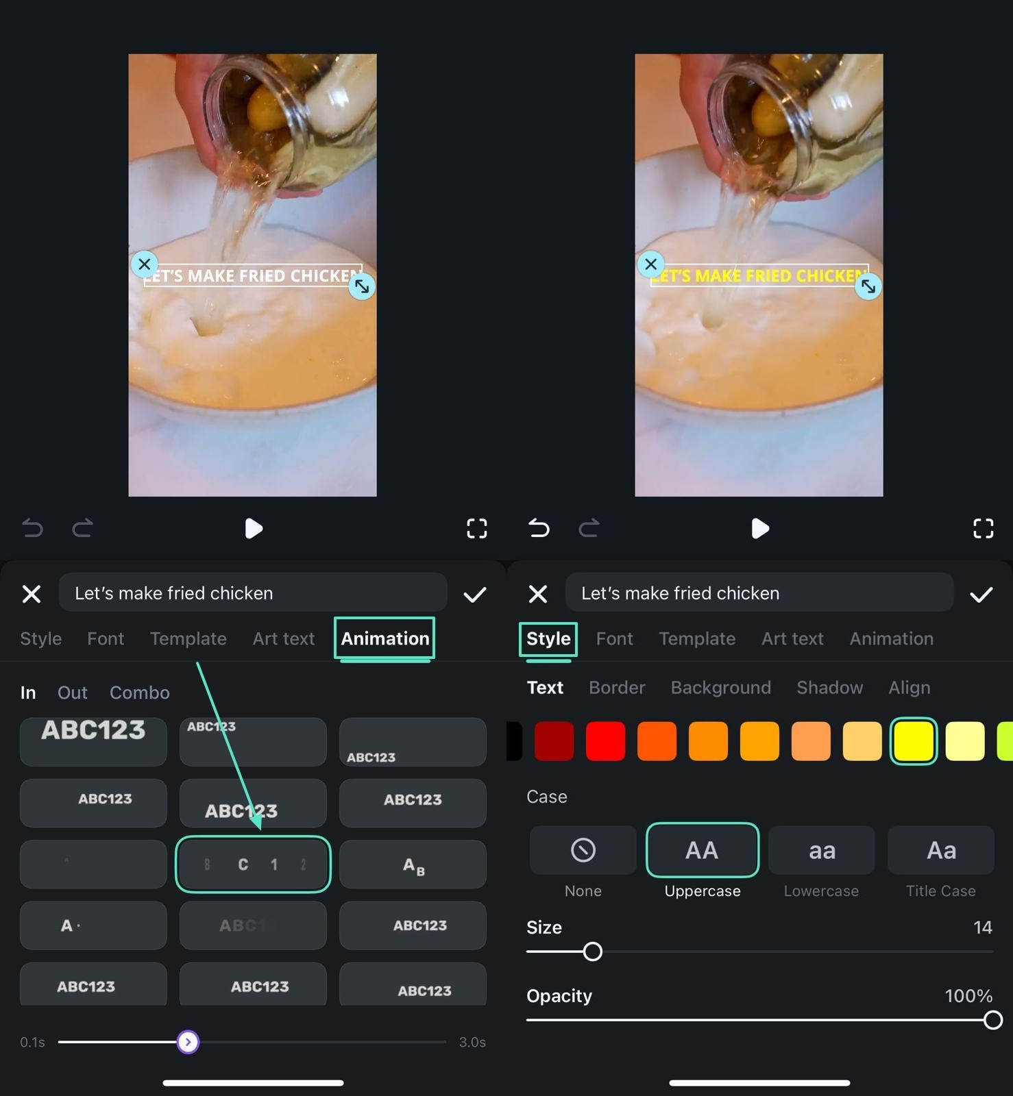
- Step 4. Customize the Text for a Visual Attraction. To add a visual appeal, use the “Animation” section and pick a suitable resource. You can also play with the color of the text under the “Style” section.
- Step 5. Save the Video Project to Your Device. At last, preview the video and save it to your device by tapping the “Export” button.

🤩 Posts You Might Be Interested In:
- The Ultimate List of Best Anime Fonts: Transform Your Projects
- Best Subtitle Fonts Used in Movies: The Ultimate Guide
- Best TikTok Captions Font To Consider[Easy Selection]
- [Various Solutions] How to Add Text in a Video in Filmora
Conclusion
To conclude the discussion, this blog focused on the debate of Serif vs Sans Serif. After learning the details of these typeface families and how they can be blended, we explored Filmora. With a diverse collection of fonts, this video editor gives you the chance to bring variety to your films. You can use both manual and automated methods to add text to videos, available in their desktop and mobile versions.
secure download
