



 100% Security Verified | No Subscription Required | No Malware


 ChatGPT
 Perplexity
 Gemini
 Claude
 Grok
Grok
Color grading photography is the creative process of shaping the colors, contrast, and tonal relationships of a photo to create a specific mood or visual style. Before grading, it usually helps to correct technical issues such as white balance, exposure, and inconsistent colors so you have a balanced image to work from.
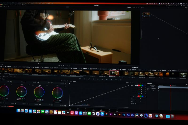
In this guide, you'll learn what color grading means in photography, practical techniques for building a consistent look, which tools are useful for photo color work, and how to adjust the colors of still images when they are used inside a Wondershare Filmora project.
In this article
What Is Color Grading in Photography?
Color grading in photography is the creative adjustment of color and tone to establish a particular visual style. It can involve changes to hue, saturation, luminance, contrast, shadows, highlights, Curves, and other color relationships.
Color grading is related to, but different from, color correction. Color correction aims to fix technical issues and create a balanced, natural-looking image. Color grading builds on that corrected image to create the desired mood or visual identity.
- Color correction: Fix exposure, white balance, contrast, and inaccurate colors.
- Color grading: Shape the mood, style, and overall color palette.
A simple rule is: correct first, then grade.
Best Color Grading Techniques for Photography
Good color grading for photos starts with a clear visual goal. Instead of adjusting every slider randomly, decide how the final image should feel and use the available controls to support that direction.
- Correct the white balance first: Remove unwanted warm, cool, green, or magenta color casts before creating a stylized look.
- Check exposure and contrast: Make sure highlights and shadows retain enough useful detail before adding stronger creative contrast.
- Use color temperature intentionally: Warmer tones can suggest intimacy, nostalgia, or sunlight, while cooler tones can create a cleaner or more restrained feel.
- Adjust individual colors selectively: HSL-style controls are useful when one color range needs to become more saturated, muted, bright, or dark.
- Use Curves for tonal control: Curves can refine contrast and brightness more precisely than a single contrast slider.
- Protect natural skin tones: When people are present, avoid pushing the grade so far that skin becomes unnaturally orange, green, magenta, or desaturated.
- Keep a consistent palette: When multiple photos belong to the same campaign, carousel, slideshow, or visual story, similar grading can help them feel more cohesive.
Use White Balance as the Foundation
White balance determines whether neutral areas in a photo appear neutral under the existing lighting. Correcting the white balance before grading makes later creative adjustments more predictable.
For example, if a photo already has a strong yellow cast and you apply a warm creative grade on top of it, the final image can quickly become excessively orange.
Refine Contrast With Highlights, Midtones, and Shadows
Strong grading is not only about hue and saturation. The relationship between highlights, midtones, and shadows has a major influence on how an image feels.
You may choose softer shadows for an airy style, deeper shadows for a more dramatic look, or slightly warmer highlights and cooler shadows for greater color separation.
Use HSL for Individual Color Ranges
HSL stands for Hue, Saturation, and Luminance. These controls let you modify a particular color range without applying the same adjustment to the entire image.
For example, you can:
- Shift green foliage toward a more muted tone.
- Reduce overly saturated blue skies.
- Brighten selected colors without increasing overall exposure.
- Refine brand colors in product or social content.
Color Grading Tools for Photography
The most suitable tool depends on whether your primary workflow is dedicated photography, graphic design, or photo-based video creation.
Adobe Photoshop
Photoshop is designed for detailed image editing and provides adjustment layers, Curves, Levels, Camera Raw controls, selective color tools, masks, and other options for precise photo color work.
It is particularly relevant when the photo itself is the final deliverable and you need detailed local editing, compositing, or retouching together with color grading.
Adobe Lightroom
Lightroom is built around photography workflows and provides controls for exposure, white balance, HSL, tone curves, color grading, masking, and batch adjustments.
It is particularly useful when you need to process and maintain consistent color across a larger set of photographs.
Capture One
Capture One focuses heavily on RAW processing, tethered photography workflows, and precise color editing. It includes tools for white balance, Curves, color editing, layers, and selective adjustments.
It is commonly considered when accurate color control and professional photography workflows are important.
Final Cut Pro

Final Cut Pro is primarily a video editor rather than a dedicated photo editor. However, it can be relevant when still images are used inside a video project and need to match the color style of surrounding footage.
Filmora
Wondershare Filmora is also primarily a video editor, so it should not be treated as a replacement for a dedicated photography application such as Lightroom or Photoshop.
However, when still images are used in a photo slideshow, social video, photo-to-video project, presentation, or mixed-media edit, Filmora's color tools can help the photos and video clips share a more consistent visual style.
Filmora currently provides:
- Basic Color: White balance, light, sharpening, vignette, LUTs, and Auto Color.
- HSL: Adjust individual color ranges by Hue, Saturation, and Luminance.
- Curves: Refine tonal contrast and RGB color channels.
- Color Wheels: Adjust Shadows, Midtones, and Highlights separately.
- LUTs: Apply built-in or imported color looks and control their intensity.
How to Color Grade Photos in a Filmora Project
If your photographs are being used inside a Filmora video project, you can use the same color workflow to help still images match the overall visual style of the project.
Filmora's current color controls are organized under Color > Basic, while more detailed color adjustments are available through HSL, Curves, and Color Wheels.
Step 1. Import the Photo
Launch Filmora, create a project, and import the image you want to use. Drag the image onto the timeline and select it to open its editing properties.
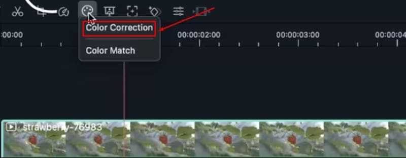
Step 2. Correct Basic Color and Tone
Open Color > Basic. Before creating a stylized grade, correct the overall image when necessary.
You can use the following controls:
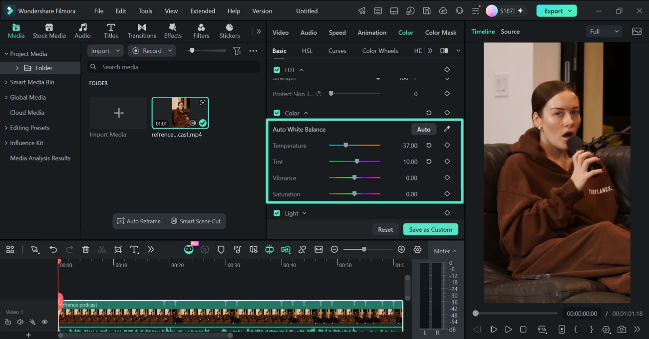
- Color: Correct White Balance with Auto, Eyedropper, Temperature, and Tint.
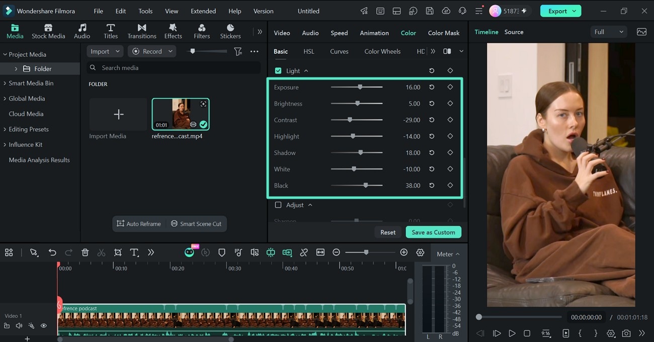
- Light: Adjust Exposure, Brightness, Contrast, Highlight, and Shadow.
- LUT: Apply a built-in or imported LUT and control it with Strength.
- Adjust: Refine apparent detail with Sharpen.
- Vignette: Adjust the appearance around the outer areas of the frame.
- Auto Color: Create an automatic starting point before manual refinement.
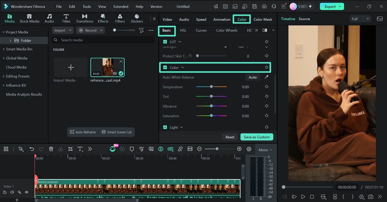
For white balance, use Auto, sample a neutral area with the Eyedropper, or adjust Temperature and Tint manually.
If the image is too bright, dark, or flat, open Light and refine the exposure and tonal balance.
Step 3. Fine-Tune Colors With HSL and Curves
Once the image is technically balanced, move into more detailed color adjustments.
Use HSL to select a color range and change its Hue, Saturation, or Luminance. This is useful when a particular color needs refinement without affecting the entire image.
Filmora's current HSL workflow also provides more precise color selection for targeting specific tones.
Use Curves when you need more precise contrast or color-channel control. The luminance curve can reshape overall tonal contrast, while RGB curves let you introduce or reduce specific color casts.
Step 4. Build the Final Look With Color Wheels
Use Color Wheels to adjust Shadows, Midtones, and Highlights separately. This is useful when the creative grade needs different colors in different tonal regions.
For example, you might introduce cooler shadows and warmer highlights to create more tonal separation while keeping midtones closer to neutral.
Preview the image within the complete project rather than grading it in isolation. If the photo is appearing alongside video footage or other still images, check whether the color style remains consistent between shots.
For the current Filmora workflows, see the Basic Color Adjustment Guide for Windows, the Mac Color Adjustment Guide, and the Advanced Color Adjustment Guide. Filmora's current Basic Color workflow includes LUT, White Balance, Light, Sharpen, Vignette, and Auto Color.
FAQs About Color Grading Photography
Common Questions About Photo Color Grading
-
What is color grading in photography?
Color grading in photography is the creative adjustment of color, contrast, and tonal relationships to establish a particular mood or visual style after the image has been technically corrected.
-
What is the difference between color correction and color grading in photography?
Color correction fixes technical issues such as exposure, white balance, and inaccurate colors. Color grading then builds a deliberate visual style through color and tonal adjustments.
-
Should I correct white balance before color grading a photo?
Usually, yes. Correcting unwanted color casts first provides a more neutral starting point and prevents the creative grade from amplifying an existing white balance problem.
-
What is HSL in photo color grading?
HSL stands for Hue, Saturation, and Luminance. It allows individual color ranges to be shifted, intensified, muted, brightened, or darkened without making the same adjustment to every color in the image.
-
Can Filmora color grade photos?
Filmora is primarily a video editor rather than a dedicated photo editor. However, still images used inside Filmora projects can be adjusted with tools such as White Balance, Light, LUTs, HSL, Curves, Color Wheels, Sharpen, Vignette, and Auto Color.
-
When should I use Filmora instead of a dedicated photo editor?
Filmora is most relevant when photographs are part of a video-based workflow, such as a slideshow, social video, presentation, photo-to-video project, or mixed-media edit. For dedicated RAW development, photo retouching, or advanced still-image workflows, a dedicated photography editor may be more appropriate.
-
Can I use LUTs when color grading photos in Filmora?
Yes. Filmora supports built-in and imported LUTs. You can also adjust LUT Strength so the color style blends more subtly with the original image.
-
Which Filmora tools are useful for cinematic photo color grading?
Start with White Balance and Light for correction, then use HSL, Curves, Color Wheels, and LUTs to build the creative look. A subtle Vignette can also help direct attention toward the main subject.
Conclusion
Color grading photography works best when creative styling comes after technical correction. Start by balancing exposure and white balance, then use HSL, Curves, tonal adjustments, and selective color changes to build the final mood.
Dedicated photo-editing applications remain the more natural choice when the photograph itself is the final deliverable. When photos are being used inside a slideshow, social video, photo-to-video project, or mixed-media edit, Filmora's current color tools provide a practical way to keep still images and video footage visually consistent within the same project.
