


 100% Security Verified | No Subscription Required | No Malware


Adobe’s products have become synonymous with image editing software, which is to be expected from a company that’s been in the industry since the 1980s. When people think of retouching images, they use Photoshop. When they want color corrections, they use Lightroom.
While these connections exist for a good reason, a few questions still need to be answered. Is Adobe’s reputation justified, and are there better alternatives to color grading in Lightroom?
Today’s review aims to answer these questions, so stay tuned as we dive deeper into Adobe Lightroom’s color-grading tools and other valuable features. We’ll show you how to use Lightroom color grading and offer a fantastic alternative to this app.
In this article
Understanding Color Grading
Color grading is a vital component of an image editing workflow. As its name might imply, this process involves manipulating the colors and tones of your images and improving the lighting conditions to enhance the image’s look or change its mood.
While nearly all types of photography can benefit from some color grading and corrections, these tools are even more convenient for images with an incorrect white balance and those that appear under or over-exposed.
Lightroom Color Grading Panel Overview

Once known as split toning, Lightroom’s color grading panel has recently been changed and is modeled after the traditional telecine controls in video color correctors. It uses three color wheels: Shadows, Midtones, and Highlights. There’s also a fourth wheel called Global, which affects the entire image.
These color wheels can be used for essential color corrections, which alter the digital image and help users achieve a more natural look. They’re also great for users going for a more stylized grade, which refers to a creative, artistic approach that goes beyond the natural-looking color corrections and helps editors achieve a more cinematic look and feel.
Lightroom HSL/Color Panel Overview

Most users are likely aware that HSL stands for Hue, Saturation, and Luminance, and Lightroom has a dedicated HSL/Color panel for these components. It lets users edit an image’s specific color range, make precise adjustments, and achieve complete control over the image’s color balance and mood.
Lightroom Curves Panel Overview

Another vital panel in Lightroom’s color grading feature set is the Tone Curve panel, which is beneficial for fine-tuning an image’s tonal range and contrasts. This panel controls the image’s brightness and contrast, allowing users to adjust the shadows, highlights, lights, and darks.
Basic Color Grading Workflow in Lightroom
Now that we know more about Lightroom color grading, we can also explore the basic workflow and show you what color grading in Lightroom usually looks like. Here are the steps you’ll need to follow:
Step 1: Launch Adobe Lightroom on your device and import your image(s) into the editor.
Step 2: Select a photo and tap the Develop tab in the top right corner of the screen.

Step 3: Tap the Edit button (the first of the five buttons below the Histogram) for basic color correction.
Step 4: Click the Basic tab to access the White Balance, Tone, and Presence sections. These sections allow you to edit the image’s exposure, white balance, and saturation, three essential characteristics of basic color correction.

Step 5: To achieve a more cinematic look and professional color grading, access the Tone Curve tab to adjust the luminance curve and change the image’s brightness and darkness levels.

Step 6: You can adjust the other curves for the red, green, and blue channels.

Step 7: Next, open the HSL/Color tab to alter the image’s hue, saturation, and luminance of specific color ranges.

Step 8: Finally, move to the Color Grading tab and adjust the Midtones, Shadows, and Highlights color wheels to your liking.

Advanced color grading will also require you to access the Detail, Lens Corrections, Transform, Effects, and Calibration tabs. However, these adjustments fall into the category of professional color grading, and we won’t be covering them in this introductory Lightroom color grading guide.
Lightroom Color Grading Alternative: Filmora

Although Adobe’s app has become synonymous with color corrections, and for a good reason, color grading in Lightroom isn’t the only way to achieve a natural image look or create a more artistic photo. There’s also Wondershare Filmora, a fantastic alternative to Adobe Lightroom’s color grading.
Unlike Lightroom, which is explicitly designed for photo editing and characterized by a complex user interface tailored for professionals, Filmora is focused on simplicity and accessibility. It places comprehensive video editing tools in a user-friendly interface, bringing them to the masses.
This cross-platform app can be used on Windows, macOS, iOS, and Android and isn’t restricted to image editing. Instead, Filmora serves as a professional editing tool for videos, photos, and audio, making it a far more comprehensive application than Adobe Lightroom.
Color Correction Tools in Filmora
Like Adobe Lightroom’s color grading tools, Wondershare Filmora has a dedicated basic panel that helps users handle essential color corrections and achieve a more natural image look. These features include:
- Presets and LUTs – Packing an extensive library of premade templates, Filmora is rich with Presets and LUTs, which allow users to apply already-made color corrections in a few simple clicks, achieving the desired look in seconds.
- Color – For those who want more customization in their color correction workflow, Filmora’s Color tab allows plenty of Temperature, Tint, Vibrance, Saturation, and White Balance adjustments for both photos and videos.
- Light – Behind Filmora’s Light tab is another set of features that lets users adjust the Exposure, Brightness, Contrast, Highlight, Shadow, White, and Black values.
- Adjust – With a simple Sharpen slider, Filmora’s Adjust section does what you expect and can be added as a Keyframe, but more on that in the advanced section.
- Vignette – The app's Vignette tool makes drawing attention to your video or image’s subject easy. It darkens the edges while keeping the center bright.
- Color Match – As its name implies, this feature allows you to match the colors between different videos or images, making it especially useful for larger projects and multiple media files.
These options will be enough to adjust the image’s basic color settings and create a photo that looks natural to the human eye.
Advanced Color Grading Functionalities of Filmora
Besides the essential color correction tools, Filmora also packs a heavy punch when it comes to advanced color grading, featuring the following tools:
- HSL – Next to the Basic tab is the HSL tab, which includes Hue, Saturation, and Luminance adjustment options for eight primary colors, giving users more control over specific color ranges.
- Curves – The Curves tab beneath the Color section in the right sidebar allows users to access the Y, R, G, and B curves and a Color Picker tool. From there, users can fine-tune the image or video’s colors and tones, creating a more artistic effect and taking their projects to another level.
- Color Wheels – Like Adobe Lightroom, Wondershare Filmora provides three color wheels for Highlights, Midtones, and Shadows, allowing users to make precise color adjustments in different tonal ranges.
Another incredible feature users will find in Filmora’s Color section is Keyframe, a tool for creating complex color grading effects that change over time. With keyframes, users can enable dynamic color changes that evolve throughout a video, creating a mesmerizing effect.
How to Do Color Correction and Grading in Filmora
As mentioned, Wondershare Filmora has a much more accessible user interface than Adobe Lightroom, so a typical color correction and grading workflow is much simpler with this comprehensive tool. It looks something like this:
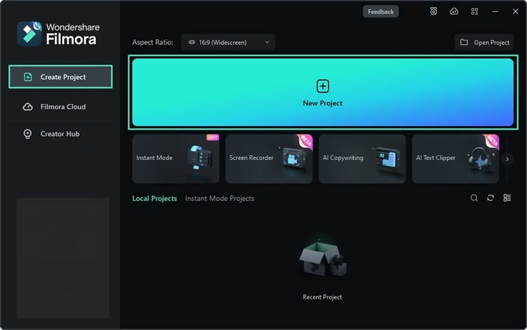
Step 1: Open the Filmora program on your device and select New Project.
Step 2: Navigate to Media > Project Media and tap Import to add your videos or images.
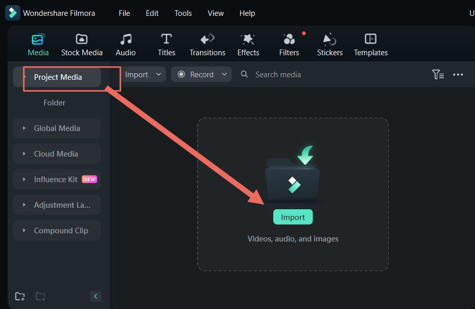
Step 3: Move the images or videos from the Project Media section into the Timeline at the bottom of Filmora’s screen.

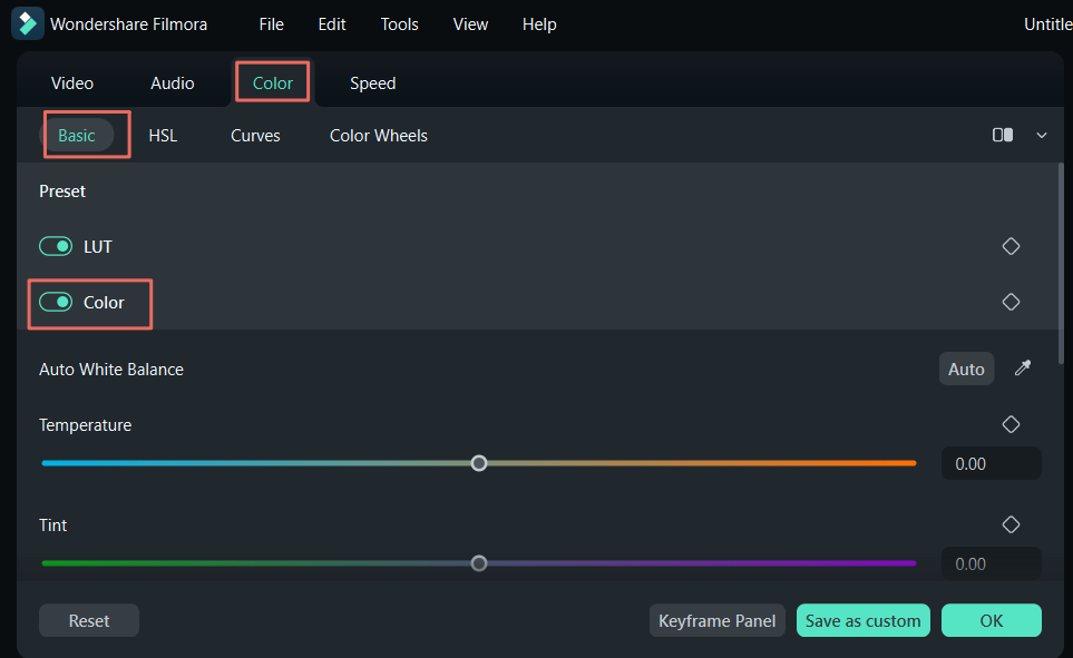
Step 4: Select an image or video in the Timeline and navigate to the Color tab in the right sidebar. Then, select the Basic tab underneath it. You can then tap the Color section and adjust the values to perform the essential color corrections.
Step 5: Scrolling further down, you’ll find the Light section, where you can adjust the Exposure, Brightness, Contrast, Highlight, Shadow, White, and Black values.

Step 6: While the Basic tab provides everything you’ll need for essential color correction processes, users looking for advanced color grading features can move on to the HSL tab and make precise color range adjustments.

Step 7: The Curves panel also has additional tools for professional color grading.
Step 8: Finally, there’s also the Color Wheels tab, where you can adjust the three color wheels for Shadows, Midtones, and Highlights.

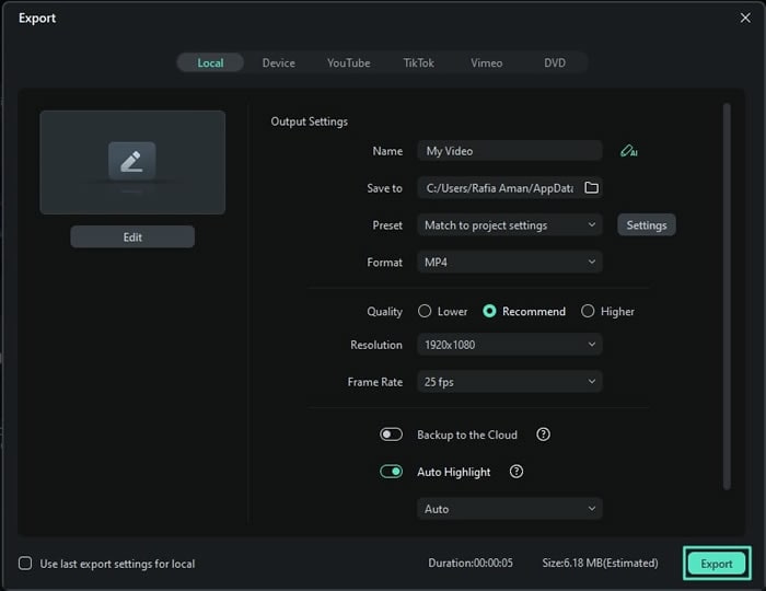
Step 9: Once satisfied with the color corrections and grading, hit the Export button at the top right corner. Adjust the output settings and hit Export again to save the image or video to your device.
It’s worth noting that one of the main reasons behind Filmora’s ease of use is the program’s AI-based editing. It includes a broad range of AI-enhanced features like text-based editing and Copilot, allowing users to describe what they’d like to do and have the app guide them through these tasks.
Filmora’s AI features can also be accessed through the AI Toolbox tab on the app’s start screen. They include text-to-video, instant cutter, auto reframe, and much more, which can be invaluable for basic color corrections and more advanced color grading tasks.
Conclusion
As a company, Adobe has been a force in the photo editing industry for the past four decades, and its products have become almost synonymous with the term. The same goes for Lightroom, a relatively new photo-retouching app focusing on color correction and grading.
While undoubtedly a powerful app with all the necessary features, Lightroom’s color grading isn’t exactly geared toward beginners. Its overly complex user interface has many users looking for alternative color correction and grading tools, like Wondershare Filmora.
Compared to Adobe Lightroom’s color grading tools, Wondershare Filmora’s power might not be as rich. Still, they provide the same level of functionality in a much more user-friendly interface, making it a fantastic alternative to color grading in Lightroom. At the same time, the app’s AI-enhanced features make editing tasks a breeze and allow users to handle color correction and grading in minutes rather than hours.
