
 100% Security Verified | No Subscription Required | No Malware

Isometric art is a great way to illustrate and visualize diverse projects – from interior and exterior design to new products, objects, and logos. Letting you present 2D elements from a 3D perspective, it’s a great way to make your work more eye-catching.
It’s an especially useful art style when you want to place emphasis on your textual content, helping you make slogans and important keywords stand out. Of course, you first have to learn how to make isometric text.
With solutions like Adobe Illustrator, isometric text can be relatively easy to handle. So, let’s see how you can go about creating isometric 3D text in Illustrator.
In this article
How to use the 3D isometric text effect in Adobe Illustrator
Creating isometric letters in Illustrator generally isn’t an overly complicated process if you’re at least somewhat familiar with working in Adobe. However, if you’re a newcomer, things could get confusing.
Illustrator is feature-packed and has a bit of a steeper learning curve than you might be expecting. That said, it’s nothing you can’t handle if you give yourself some time and follow this thorough step-by-step guide.
So, without further ado, here’s how to create the 3D isometric text effect in Adobe Illustrator:
Step 1: Launch Illustrator on your computer and press the Control + N keys to open a new document;
Step 2: Under Units, select Pixels and set your preferred width and height values;
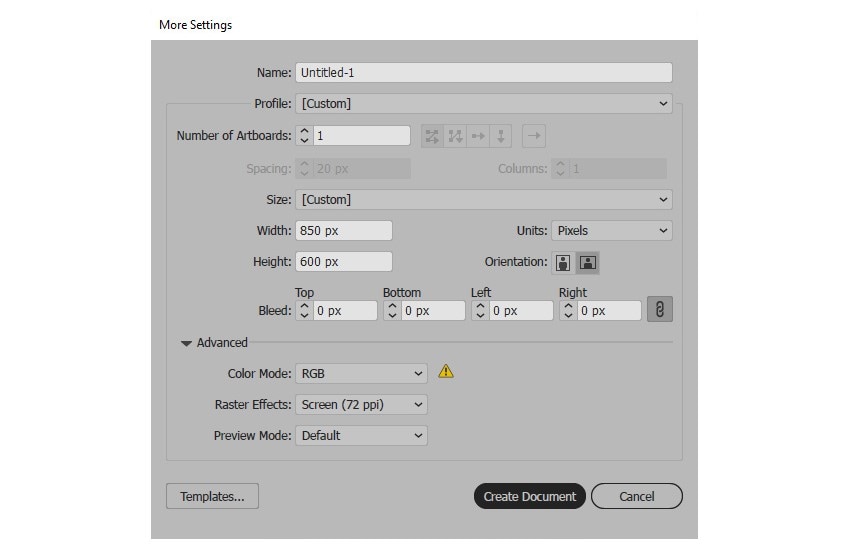
Step 3: Click on the Advanced button, under Color Mode select RGB, and under Raster Effects select Screen (72ppi);
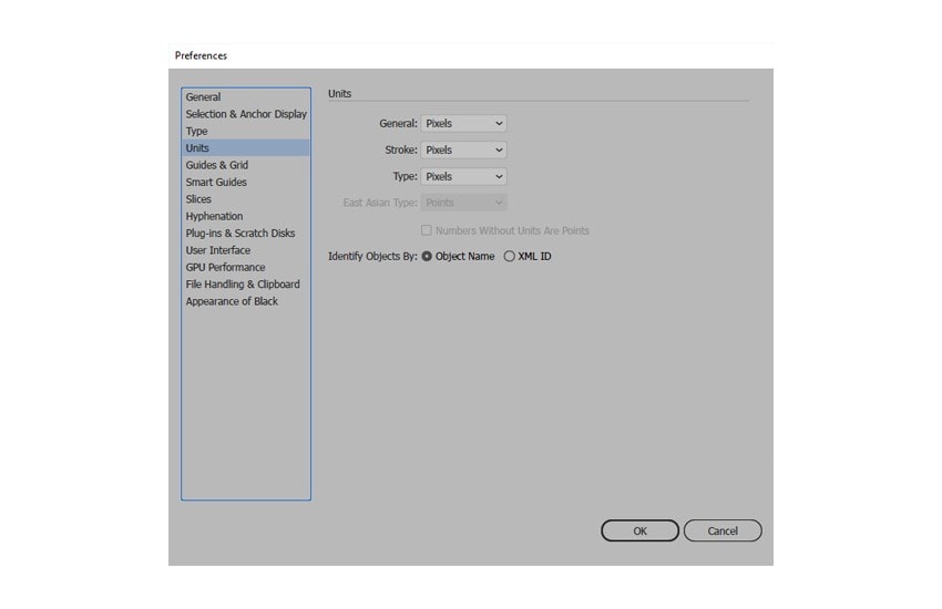
Step 4: Click Create Document and go to Edit > Preferences > Units to set General, Type, and Stroke measurements to Pixels;
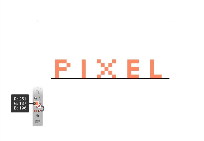
Step 5: Click the Type Tool and select your preferred font and size;
Step 6: Click on your Artboard, type in your text, and set its color;
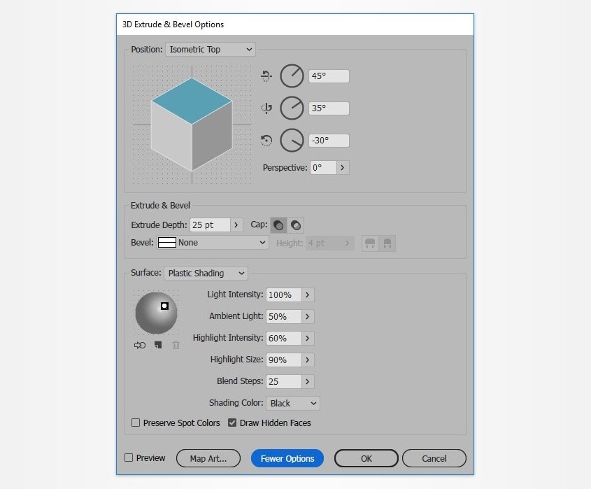
Step 7: Select your text and go to Effect > 3.Extrude and Bevel;
Step 8: Click More Options, set your preferred values, and click OK.
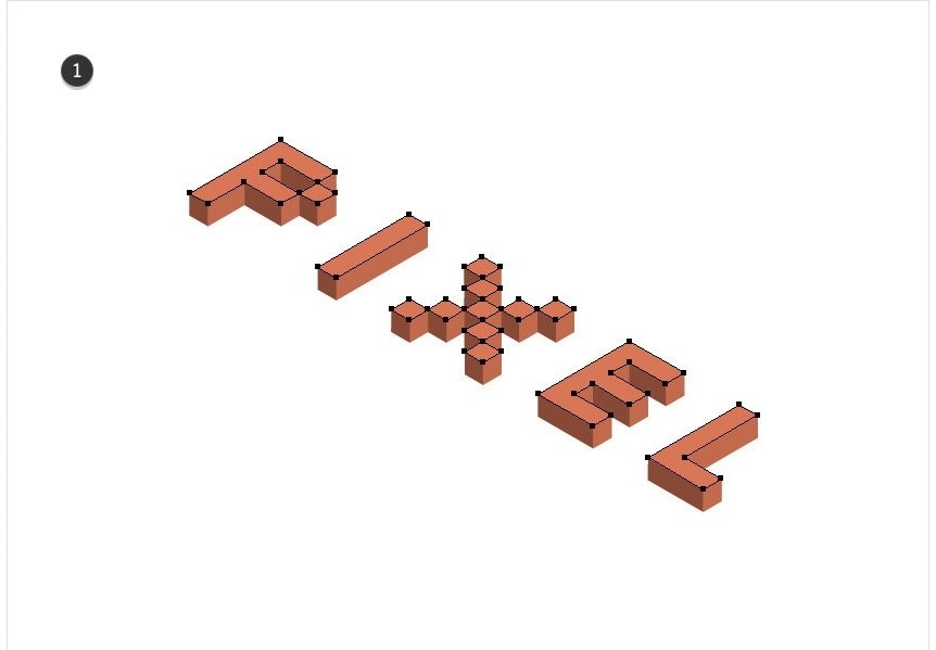
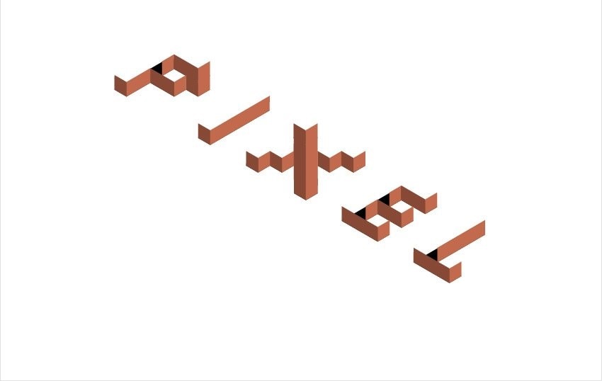
With this step completed, you now have the basic isometric text effect in Illustrator. Depending on your needs, this basic isometric effect could be enough. However, you do have access to some advanced customization techniques if you want to give your text a bit more style.
What are some advanced techniques for customizing isometric text in Illustrator
Illustrator gives you access to plenty of different tools you can use to customize your isometric text. You can easily color and shade your text, adjust its background, and more.
Here’s how to further enhance the appearance of your isometric text:
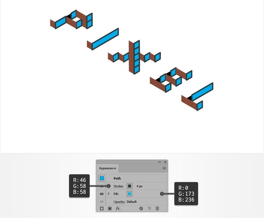
Step 1: Select your isometric letters and go to Object > Expand Appearance;
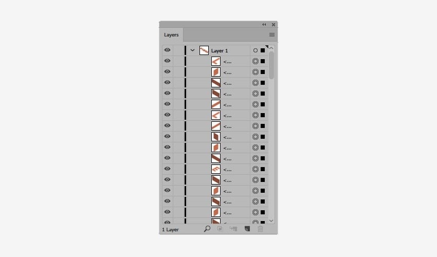
Step 2: With the entire shape group selected, press the Shift + Control + G keys three times, then go to Window > Layers to expand your existing layer;
Step 3: Click on the Selection Tool and select the shapes that define the top part of your letters;
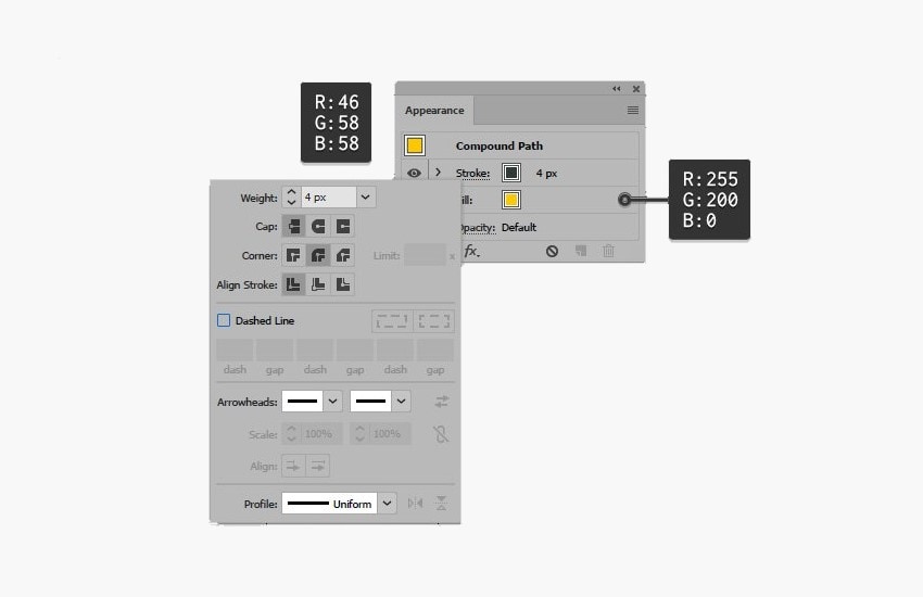
Step 4: Go to Object > Compound Path > Make to combine all these diverse shapes into a singular shape;
Step 5: With the compound path selected, press Shift + Control + ] to bring it to the front;
Step 6: Go to Windows > Appearance, adjust the Fill and Stroke colors, and click Stroke to adjust its settings;
Step 7: In the Layers panel, open the compound path layer you’ve created, rename it to keep it recognizable, and uncheck the Eye icon to lock it for now;
Step 8: Click the Selection Tool and select one of the shapes at the base of your text;
Step 9: Go to Select > Same > Appearance to select all the shapes at the base of your text;
Step 10: Repeat Steps 4 to 7 to create a new compound path and adjust its settings;
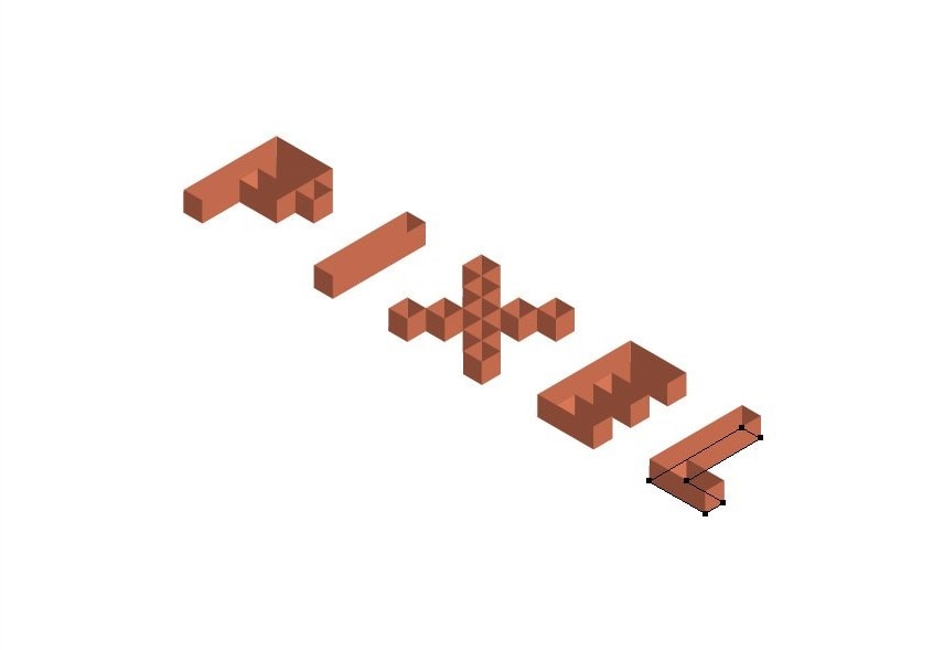
Step 11: To simplify things, select the lateral sides of the text that won’t be visible once the top layer is back on and delete them;
Step 12: Click the Select Tool and select one of the remaining shapes;
Step 13: Go to Select > Same > Color to select all the shapes, then go to Windows > Appearance to adjust Fill and Stroke settings;
Step 14: Click the Rectangle Tool and create a shape to cover your artboard, then set its Fill color for background;
Step 15: Go to the Layers panel and unlock the layer with the base of your text, then select the text;
Step 16: Go to the Appearance Panel and select Soft Light under Blending Mode;
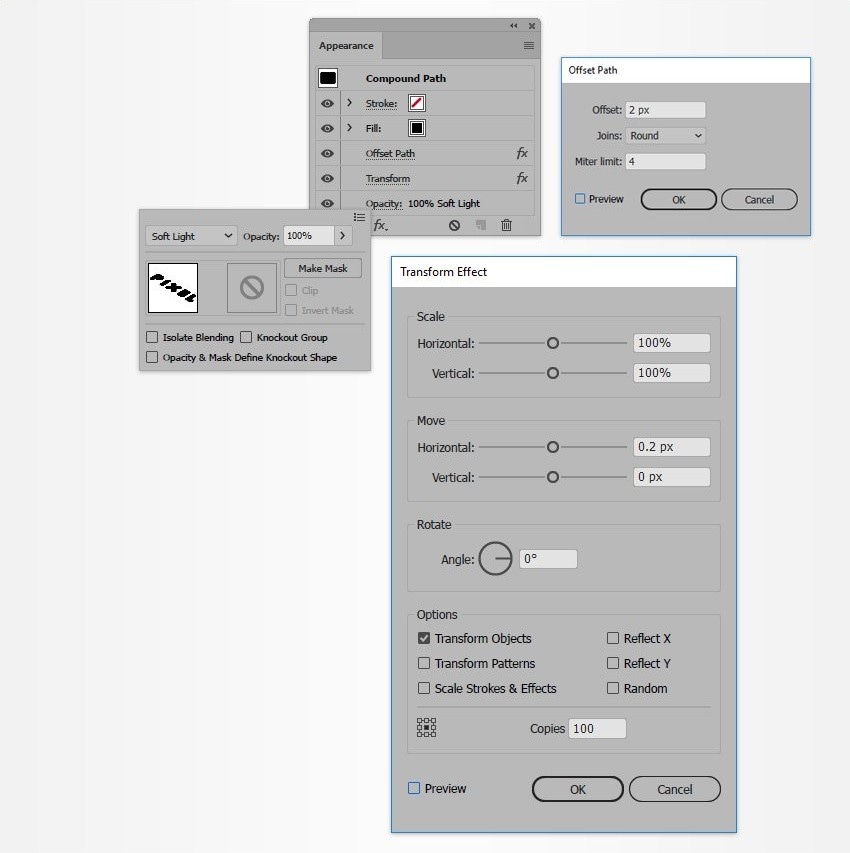
Step 17: Go to Effect > Path > Offset Path, adjust the settings, and click OK;
Step 18: Go to Effect > Distort & Transform > Transform, adjust the settings, and click OK.

With this, your design should be complete. You can always further adjust it, use unique materials, shading, and more to make it more to your liking.
What are the best fonts to use for isometric text effects in Illustrator
Technically, you can use any font you’d like to create an isometric text in Illustrator. Following the steps mentioned above, you should have no trouble getting the desired effect whether you’re using Pragmatica, Sans Serif, Comic Sans, or anything in between.
That said, you’ll want to stick to using fonts that are large and easily legible. Using those like Brush Script or Gothic could make your design seem more off-putting as it could be difficult for viewers to discern the writing.
The pros and cons of using Adobe Illustrator for isometric text
Adobe Illustrator is one of the most popular graphic design tools. However, it does come with its own set of pros and cons that will determine whether it’s the isometric text tool for you.
Keep these pros and cons in mind when making your choice.
A better alternative – much easier to add isometric text with Wondershare Filmora
Illustrator is great if you’re a graphic designer with plenty of experience who wants to create printable isometric text for logos or slogans. But what if you want to add isometric text to your video content to make your titles stand out or highlight important information?
In that case, you need a video editor that lets you add isomeric text to your content, and there’s no better solution for that than Wondershare Filmora.
- Customize fonts for unique isometric styles.
- Animate text for dynamic isometric reveals.
- Modify colors to better visual contrast.
- Organize multiple text layers for greater designs.
- Easily apply 3D effects for depth and perspective.


A powerful video editor, Filmora comes with an abundance of features that can make your content stand out. With over 15 million unique creative audio and video assets, dozens of text effects, AI-powered tools for generating subtitles, music, images, and more, it has everything you need to go viral on any platform.
What’s more, it comes with unique isometric text templates that let you create custom 3D text with the utmost ease. Unlike Illustrator, it’s perfectly easy to use. Even if you’re a complete beginner, it shouldn’t take you more than a few minutes to get used to the layout and find out where all the options you need are located.
Fast, lightweight, affordable, and user-friendly, it’s the go-to tool for creating content that grabs attention.
How to edit and customize text effects in Filmora
Two ways to create:
- Using isometric templates
- Customize isometric texts
With Filmora, it takes just a few steps to create isometric text:
Step 1: Download and launch Filmora, then click the Login button in the main menu to register your account;
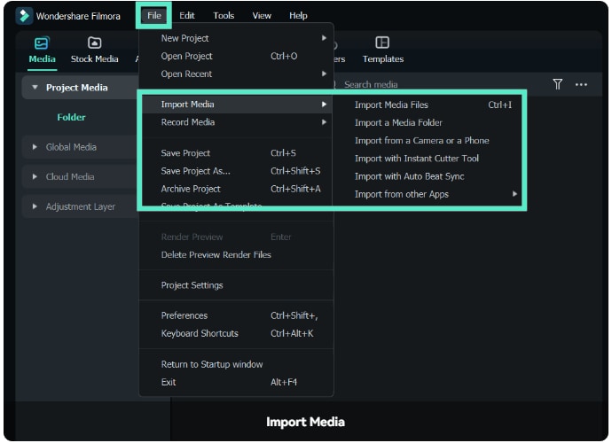
Step 2: Click New Project, then go to File > Import Media to upload your video;
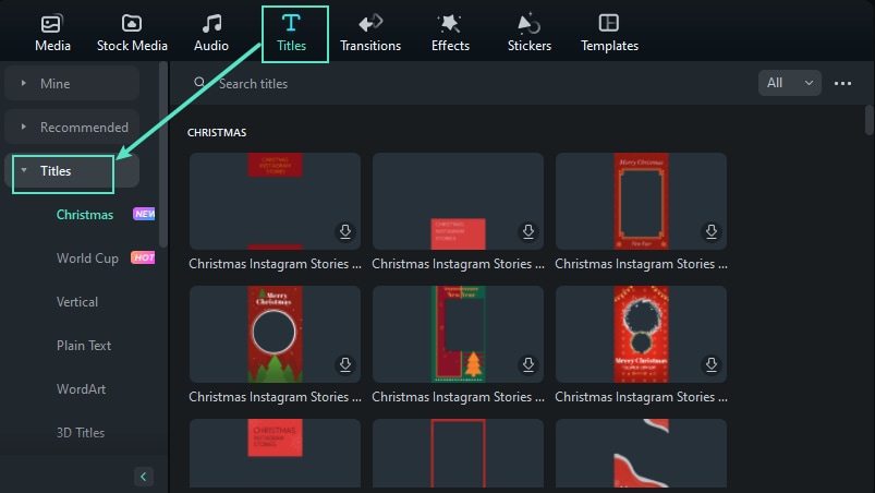
Step 3: Navigate to the Titles tab;
Step 4: Click Search Titles and type in Isometric;
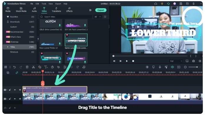
Step 4: Select one of the available isometric templates and drag it to the timeline;
Step 5: Select the template in the timeline, then click on the text to change it.
That’s it! Your video now has isometric text without much fuss. If you want to edit or customize your isometric text, you can do so by following these steps:
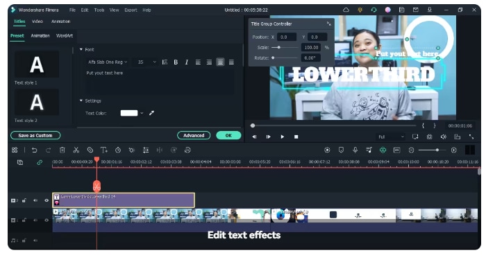
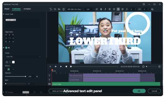
Step 1: Double-click the title in the timeline and open that Text Editing panel;
Step 2: Adjust your text’s font, style, size, color, alignment, and more;
Step 3: Under Titles, click Advanced;
Step 4: Add additional elements like images or new text boxes, and customize things such as text animations, opacity, borders, and more.
When to use isometric text design
Whether you’re using Illustrator for graphic design or Wondershare Filmora for customizing text in your video content, you’ll want to pay attention when you’re using the isometric text effect. While certainly eye-catching, it’s not suitable for all circumstances.
The best applications of isometric text include:
- Brand logos
- Slogans
- Titles
- Short highlights
- Key phrases
- End credits
As a general rule of thumb, you’ll want to avoid isometric text style in longer sentences and paragraphs. It can be too visually overwhelming, causing your viewers to skip over it instead of straining themselves to read what’s written.
Conclusion
While it might take you a while to master it if you’re a beginner, creating isometric text in Illustrator isn’t all that complicated. Once you’ve gotten used to the workflow, you can create stunning effects in just a few minutes.
However, if you’re looking for a simpler solution or want an easy way to add isometric text to your video content, you can always rely on Wondershare Filmora to do it.
