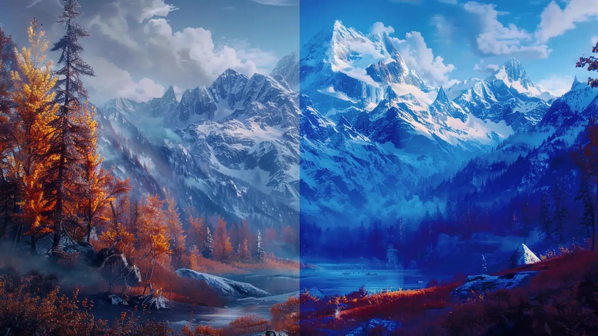
Color harmony is the essence of any visual production in digital design; it is more than a method. Photoshop’s extensive collection includes the ability to precisely and elegantly mix, balance, and intensify colors. Whether creating clean graphics, an eye-catching logo, or photo retouching, knowing essential techniques is necessary to improve your artistic abilities.
Join us as we explore the realm of Photoshop’s color harmony and get ready to discover the techniques that turn standard designs into exceptional works of art.
In this article
The Need for Matching Colors in Photoshop
In the digital design world, where each pixel has the power to express a thought or a feeling, the importance of color matching in Photoshop is useful for reasons other than aesthetics. It maintains the integrity of your design idea and guarantees consistency across all platforms and mediums, from print to digital screens.
Efficiency is also crucial in the rapidly evolving field of digital content development. Photoshop makes workflows more efficient and enables designers to produce up-to-par outputs. These features allow designers to fulfill deadlines without sacrificing quality, whether adjusting the colors in a photo or incorporating intricate color schemes.
As we explore the methods and ideas behind successful color matching, get ready to open the door to a world where imagination and accuracy meet, and each color selection influences the story of your digital work.
How to Color Match Different Photos in Photoshop
Color matching is a crucial Photoshop skill for creating an integrated visual story across your projects. But first, you need to understand the color matching before proceeding to the technical phase. It means altering various photos’ colors, tones, and contrasts to make them look harmonious.
Learning this approach will improve the quality and impact of your work, whether you’re making a collage, developing a website’s image, or ensuring that a photo series is consistent. So, let’s get started on how to use Photoshop to color-match photos:
- Open Pictures in Photoshop: Choose a base photo and open all images you want to color match. Arrange them in separate windows or tabs for easy comparison.
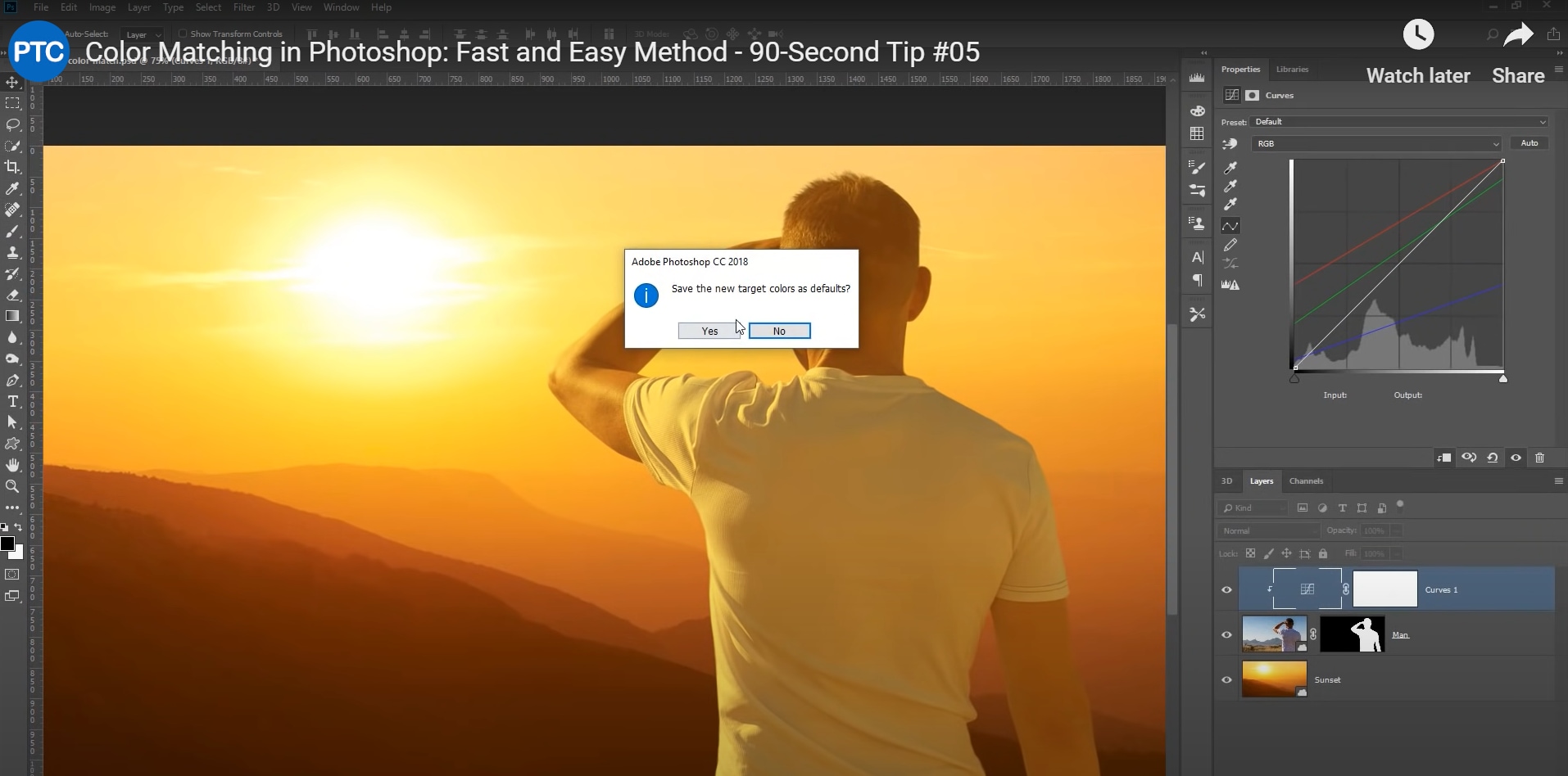
- Adjustment Layers: Create a level or curve adjustment layer. Adjust black, white, or mid-tone sliders to match contrast and brightness. Add a Color Balance adjustment layer. Adjust Shadows, Midtones, and Highlight sliders, and modify hue, saturation, and intensity to match your base photo.

- Blend: Use the Blend if option under Layer Styles for smoother color transitions. Fine-tune light and dark areas for a natural effect.
- Final Modification: Apply additional adjustments like sharpening, noise reduction, or vignetting as needed.

- Save Your Work: Save in the preferred format; consider PSD for future edits.

Different Tools You Can Use to Color Match Photos
Color-matching is crucial for maintaining visual coherence. While Adobe Photoshop has strong features like Adjustment Layers and Match Color for detailed editing, Adobe Lightroom is superior at color grading and batch editing. CaptureOne is preferred because of its significant color editing features and support for RAW files, while DaVinci Resolve offers advanced color grading with its node-based design.
For video editors, Filmora stands out with its intuitive interface and ease of use. It simplifies color matching with pre-installed presets and filters, making it ideal for beginners and content creators. Filmora’s Color Matching function lets you quickly align hues and tones across various clips in your timeline. Filmora automatically adjusts other clips by selecting a reference clip to ensure a consistent look.
Choose the best tool based on your needs and experience level: Photoshop for photo editing or Filmora for seamless color-matching in video projects.
How to Match Colors in Filmora
With Filmora’s color-matching feature, you can ensure that every clip in your video project has a unified visual style and blends flawlessly. Master color matching in Filmora by following this step-by-step guide:
- Import Your Footage: Upload each video clip you want to color match into your Filmora project. Arrange them in the timeline according to the order they will appear in the finished product.

- Use Color Matching Tool: First, choose the reference clip. The optimal version should convey the required tone and color scheme for the full video sequence. Then, right-click the reference clip and select “Color Match” from the drop-down menu to apply color matching. Then, locate the frame with the precise color you want to match using the playback control in the Reference preview window.

- Apply Color Effects and Filters: Filmora offers an assortment of color filters and effects to improve your color matching.
- Use Look-Up Tables (LUTs): Apply LUTs to your clips to give them a present color grading style. Several included LUTs can be modified to match the color tones of your referenced footage.
- Mix Modes and Transparency: Experiment with the blend modes and transparency settings to mix clips smoothly. Adjust the opacity of clips or use blending modes for seamless blending.

- Save and Export: After you’re happy with the color coordination and general editing, export your project to the video format of your choice or save it in Filmora’s native format.
Tips for Matching Colors in Photos
- While color matching requires harmony, purposefully creating color contrast can enhance your images’ depth and visual appeal.
Play around with opposing or complementary colors to produce dynamic, eye-catching compositions.
- Employ the concepts of color theory to strike a balance between harmony and contrast, ensuring that every color election enhances the story of your project.
Using exact masking and layering techniques improves color matching.
Use layer masks to isolate and modify particular areas of your images to achieve a smooth transition between colors in various sections.
- Play with blending modes and opacity modifications to produce delicate color interactions and transitions that improve visual coherence.
- Observe the color profiles.
Make sure all photographs have the same color profiles to represent color accurately.
- Never skip layering and blending.
To achieve a realistic look and fine-tune color transitions, use Layer Styles and Blend If options.
Conclusion
Color matching is essential for a visual narrative to flow together and provide professional finishes and harmonic tones. Filmora provides an approachable solution with its user-friendly color-matching tool and preset filters, making the process easier for novice and intermediate editors. Without the complexity of professional-grade software, color grading, and matching may be done effortlessly with its built-in functionality.
Filmora’s streamlined approach makes it the perfect choice for achieving consistent and visually appealing color schemes for vlogs, tutorials, or creative projects. This easily improves the overall quality and impact of your work.


 100% Security Verified | No Subscription Required | No Malware

