Pop-ups are an integral part of a web's design, giving a visually appealing experience to online viewers. Using pop-ups is a great technique for keeping viewers updated with crucial information or offers regarding your product or service.
By incorporating a variety of transitions or effects, you can create creative and more engaging pop-ups. In this blog, we'll guide you through the top examples and ways of creating CSS animated pop-ups.
In this article
Part 1. What Is Pop-up Animation
Whether you are a content creator or a marketer, you must be aware of the use and benefits of these pop-up animations for your online business. These animated pop-ups can carry information regarding your service, product launch, or upcoming sale. For example, you might have seen captivating pop-up flashes with a feedback survey right after you make a purchase, and this is one of the types of animation pop-up CSS.
Animated pop-ups are the improved versions of simple pop-ups that include animation elements. Apart from the animations, the pop-ups have interesting transitions, effects, or even music effects that create an appealing viewer experience. In the guide below, we will discuss the ways and top examples of creating CSS animated pop-ups to help your online business flourish.
Part 2. Renowned Examples of CSS Pop-up Animations
CSS animation can bring life to your website by using different animations and transitions. Therefore, let's look at several examples of CSS pop-up animation and transitions that you can apply to your website:
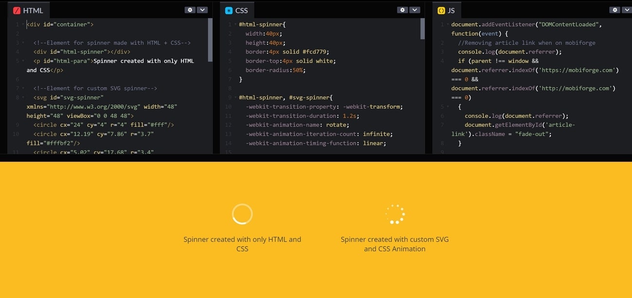
1. Loading Spinners
The loading spinner CSS pop-up animations are usually used on websites and different applications to inform viewers that the data is being loaded. This animation avoids confusion as the person waits for the website to open. Moreover, you can apply an array of loading spinners, such as dotted ones, 3D spinners, and more. They are also easily customizable into different colors, speeds, and sizes.
2. Fade in/Fade Out
Fade-in/fade-out pop-up animation CSS Codepen includes a smooth transition from invisible to fully opaque, showcasing your product. Moreover, it creates curiosity among the viewers as they wait for the popup and pay more attention to the elements. You can change the opacity settings and visibility of this CSS animation pop-up. It is friendly and welcoming to all viewers who visit your website.
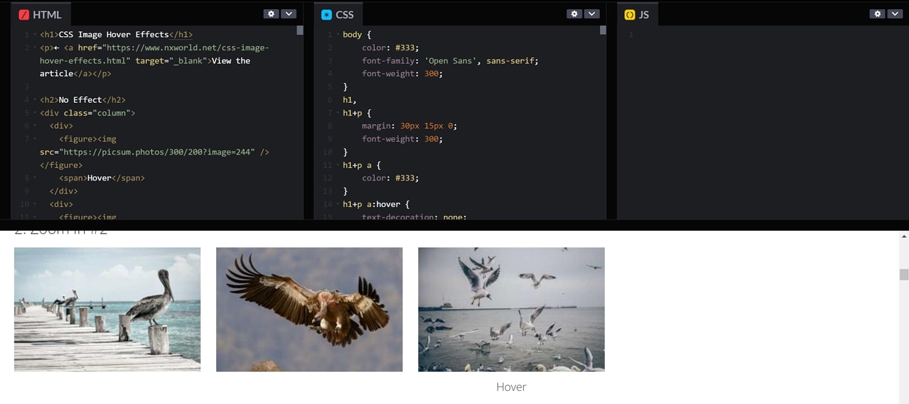
3. Hover Effect
You can stylize your website using the Hover CSS pop animation by applying it to buttons, links, and images. It is like a visual effect that occurs when you hover your mouse over an element. There are various options for customizing this popup, such as transform, color, size, box-shadow, and more. Furthermore, this builds an engaging and interactive interface as the viewers navigate through your website.
4. Split Screen Slider
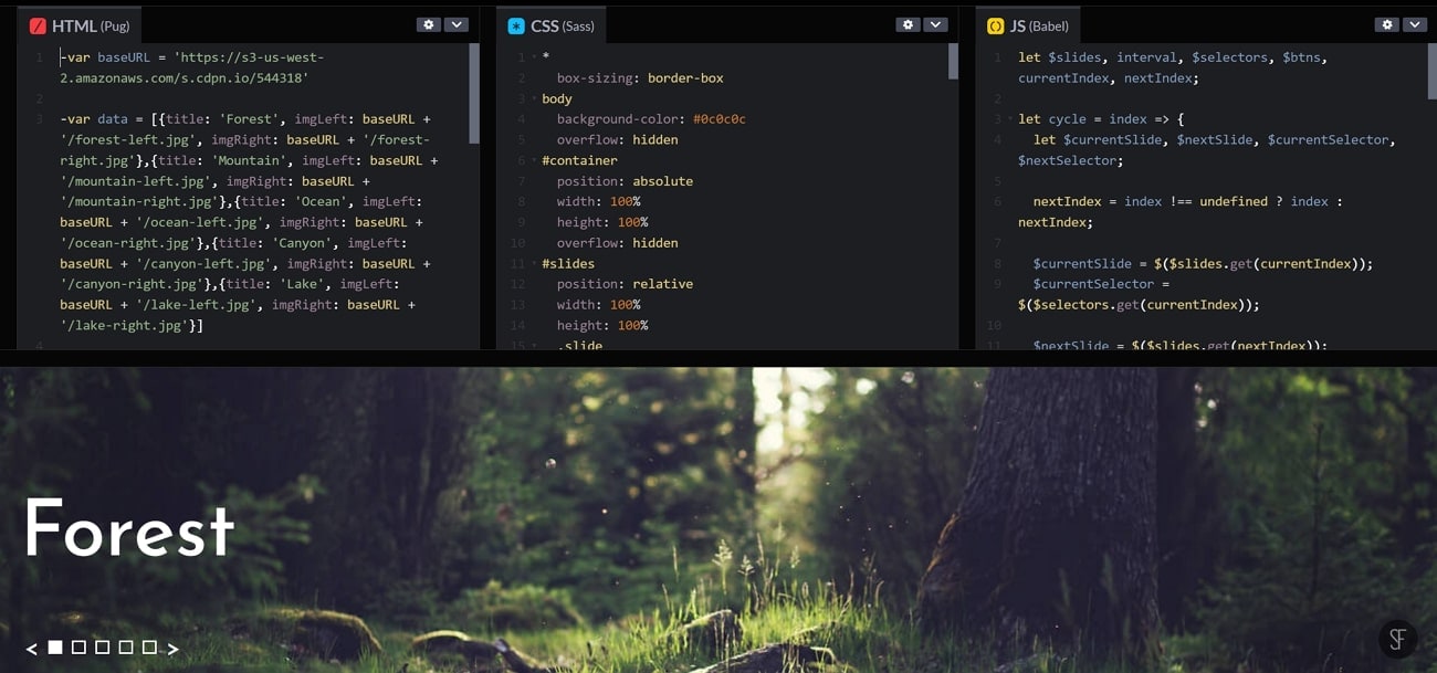
It becomes easy to capture the attention of people with the split screen slider pop animation CSS. This animation splits your screen into two sections and navigates the user with different sections. You can also use it as comparison or before and after content on your website. Furthermore, split screen sliders can be achieved by using HTML, CSS, and JavaScript.
5. Rotating Shapes
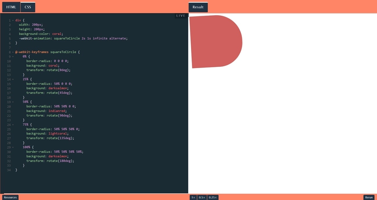
The rotating shapes CSS pop-up animation is widely used as a subtle way of showing different products on your website as you scroll down it. Moreover, the different rotating shapes provide a dynamic and interactive experience to the viewers. These rotating shapes have a central point from which they change into different shapes. Therefore, changing the square into a circle and then into a triangle with different colors can amplify your website.
6. Bounce In
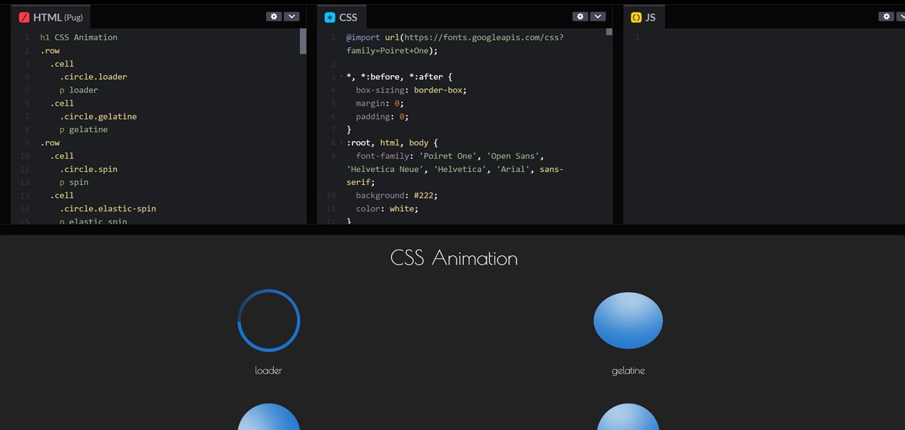
This animation is used to move the element quickly up, down, back, or away after being hit by an object. It is one of the common pop-up animations used to give a touch of interactivity and emphasis. Once the animation is defined on the CSS, it is attached to the desired HTML element. Once the animation is defined, you can specify details like repetition, duration, timing, etc.
7. Gradient Background
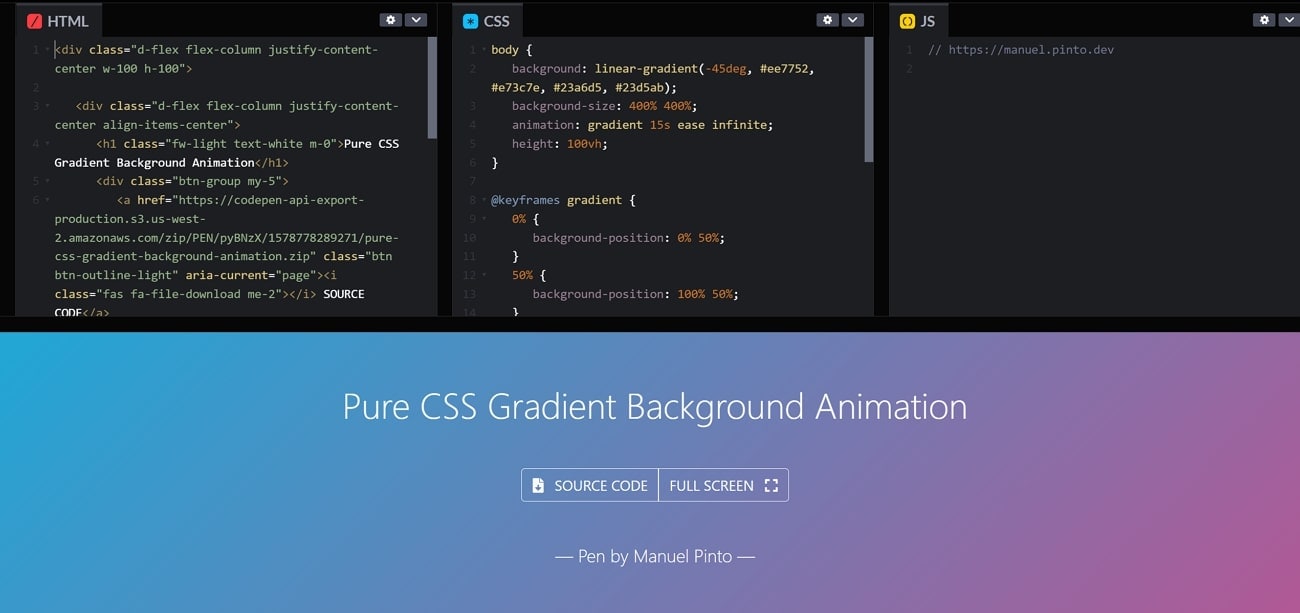
With the gradient background, you can give your web page a pop of color indicating the creativity and subtleness of the business website. You can customize the gradient colors using the CSS codes. You can add the animation to the main layer and lock it. With animated gradients you can create a background that changes between a spectrum of color giving your web page a dynamic and vibrant look.
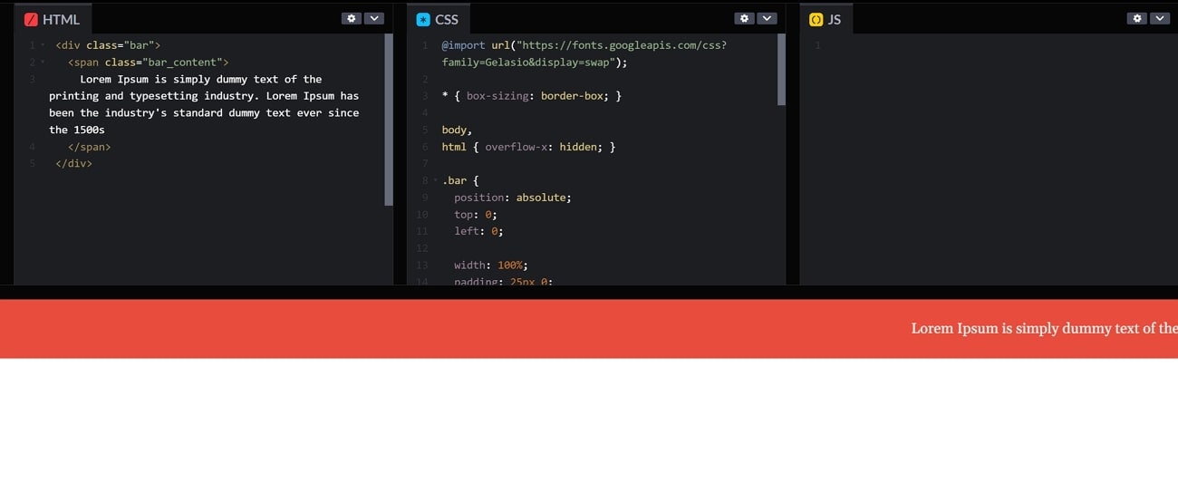
8. Scrolling Text
By applying this CSS pop-up animation, you can grab the attention of your website visitors with the enhanced text. This cool effect hides the text until the users scroll down. As they scroll, the text smoothly pops up on the screen which creates a dynamic and interactive experience. This technique is used by web designers to draw the visitor's attention to the website.
9. Animated Submit Button
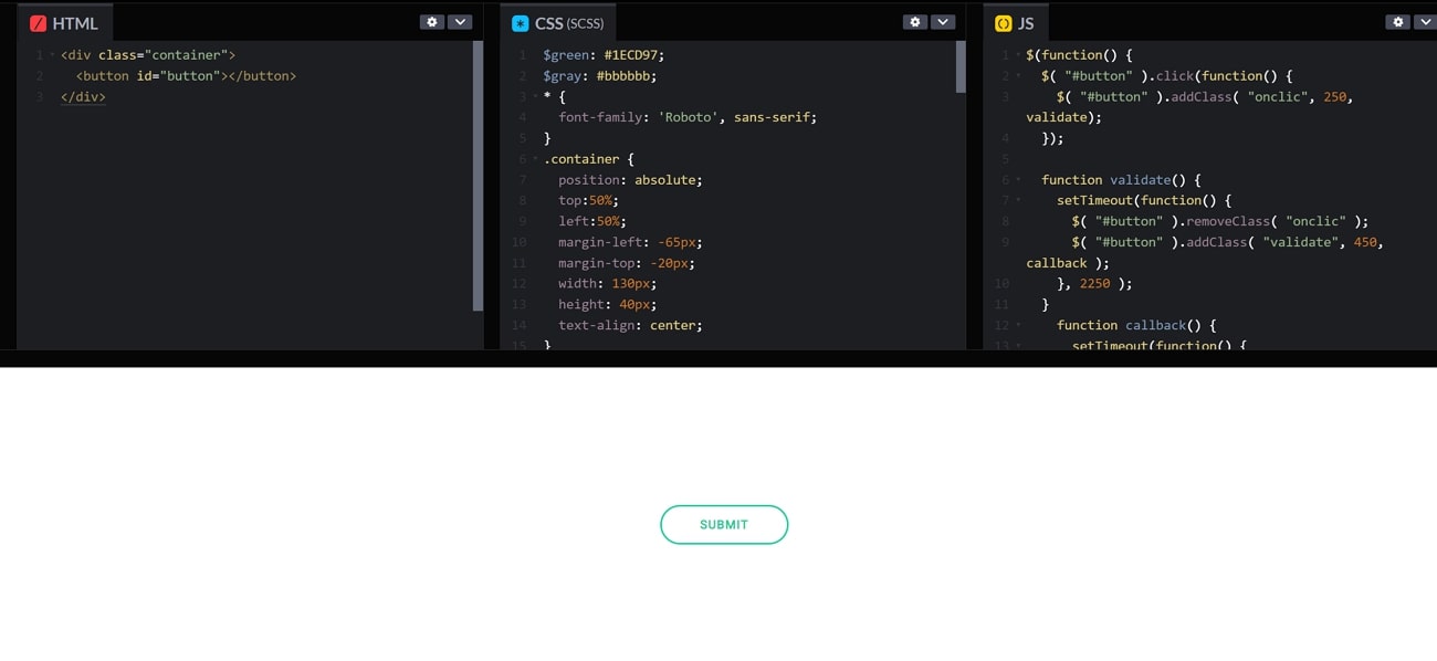
You can give the user interface of your business website a clean and neat flair by adding this “Submit” button pop-up. You can set different background colors and borders to this button to make it look more appealing. This CSS animation provides a simple look without any complex elements. To indicate the reaction on the button, you can also add a hover animation on this submit button.
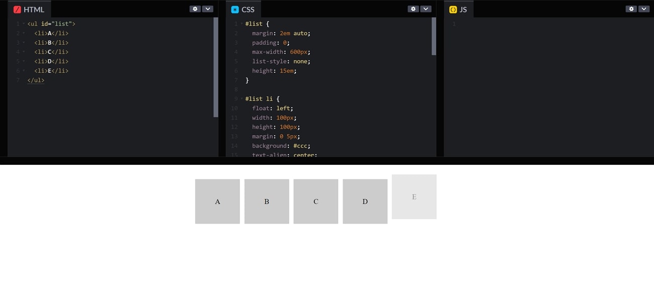
10. Never Ending Box
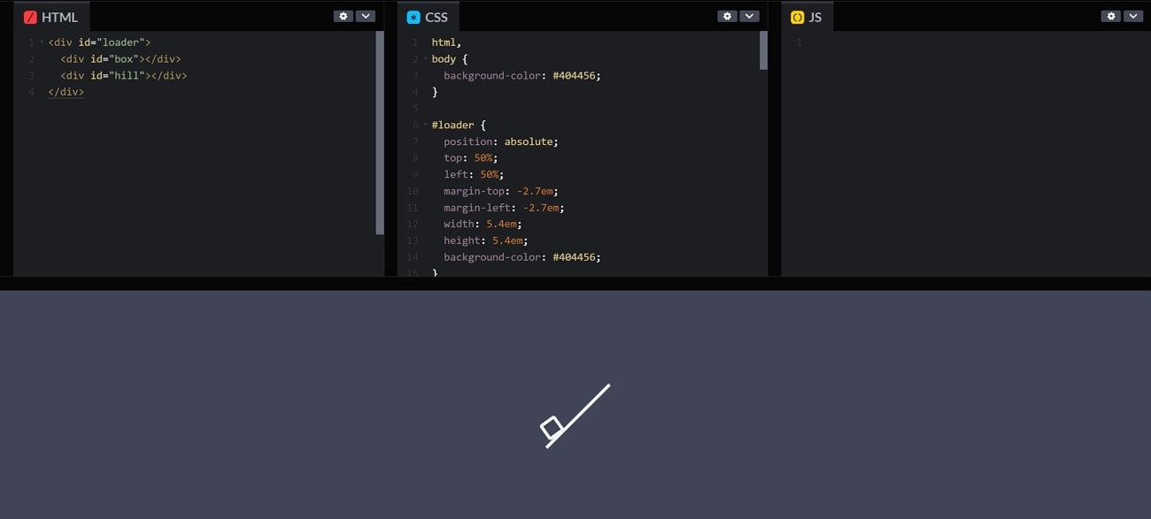
This pop-up animation includes a box trying to climb up but fails when it reaches a height. This element can be used as a loading animation on your HTML website. Users these days find a regular loading animation boring, with this CSS pop-up animation, you can give a creative touch to the frontend of your website.
11. Gooey Menu
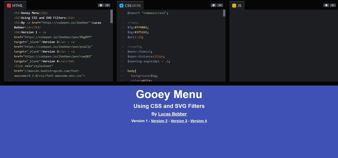
In a Gooey Menu when the menu is closed, it appears condensed and closed off. When you open it expands and divides into individual menu items. It acts in a smooth, fluid motion, resembling a gooey substance. You can change the shape, area, color, and motion of the menu according to your brand. Other than that, using this pop animation makes your website more unique and interactive.
Part 3. Tips for Creating Pop-up Animations Using CSS
CSS is a powerful utility that allows us to play with the animations of our pop-ups. By entering the proper code, we can obtain our desired results and can post them on our HTML website. One must know what exactly to type to get the best out of the CSS system. To help you get the best-looking CSS pop animation, we have listed some tips below that might be useful:
1. Your Style Must Go Well With Your Niche
To attract the maximum number of audiences, you must create a pop-up that match with the vibe of your content. If your content is colorful and funky, a dull pop-up might not attract a lot of people. Similarly, an interface with natural tones should not have a funky looking pop-up, since it will kill the overall aesthetic of the feed.
2. The Pop-up Should Indicate Urgency
One of the main jobs of a pop-up is to grab attention by indicating urgency. A CSS pop-up animation might be your only chance to convey a message to your viewer, and it must be done right. A shaky, wobbly pop-up is more likely to attract a viewer than a static sticker. Use persuasive techniques so that your audience does not miss your message.
3. Keep It Short and Crisp
Lengthy texts in pop-ups can be boring and could pull away the audience from your urgent message. The key to keep the audience intact is the use of a short but meaningful message. A short message is easily readable and increases the chances of engagement on your content. Try using the words that the viewers will read first, like writing “discount” in bold letters to pop the message.
4. Add Enhancements to Your Pop-up
While coding for your CSS pop animation, make sure to add a close button to hide the pop when the viewer has read it. To add uniqueness to your pop-up, you can consult the animation libraries for tutorials on how you can make a stunning pop-up. Try using properties like opacity and transform to create a seamless fade-in and fade-out of your pop-up.
Part 4. [Easy Alternative] Using Filmora for Creating Pop-up Animations
Pop-ups are flash messages that signal important information and urgency. It is essential for a pop-up to really pop the eyes with its stunning colors and funky texts. A well-placed, well-timed pop-up message can fulfill its purpose of education and attention grabbing. Only good software can ensure the creation of a visually stunning flash message which is meaningful at the same time.
Wondershare Filmora is one such video editing software that provides advanced features and an extensive stock media library. Using Filmora, you can educate your viewers about the necessary information they might need. For this purpose, you will find creative text fonts, catchy sound effects, and funky backgrounds in Filmora.
A Guide To Creating Pop-up Animation on Wondershare Filmora
Good software will create a personalized pop-up that reflects the emotions and creativity of the creator. To know how you can create an animation pop-up CSS, follow the steps below.
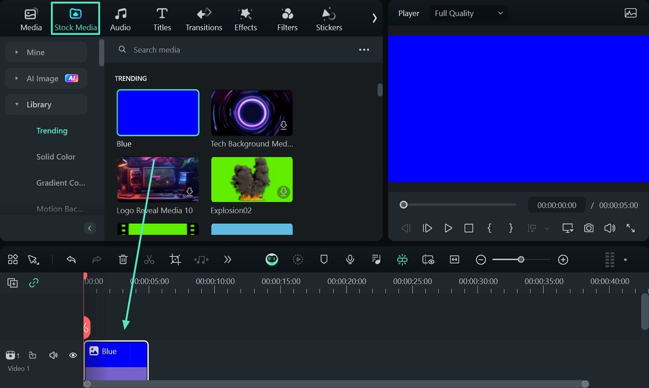
Step 1. Start a New Project and Select a Background
Firstly, when you open Filmora, the main interface will open where you will click “New Project.” Now, click “Stock Media” from the toolbar on the top, and select your preferred backdrop for the pop-up. Next, after choosing the background, drag and drop it to the timeline.
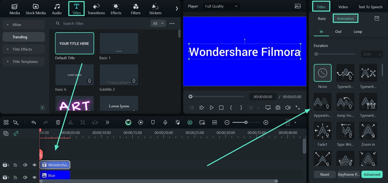
Step 2. Add Text And Animations to Your Pop-up
Now, from the toolbar, click "Titles" and select the text style of your choice to bring it automatically to your backdrop. Next, double-click the text on the timeline and proceed to the editing panel on the right side. Here, go to the "Titles” section and enter the “Animation” subsection to choose your favorite animation style.
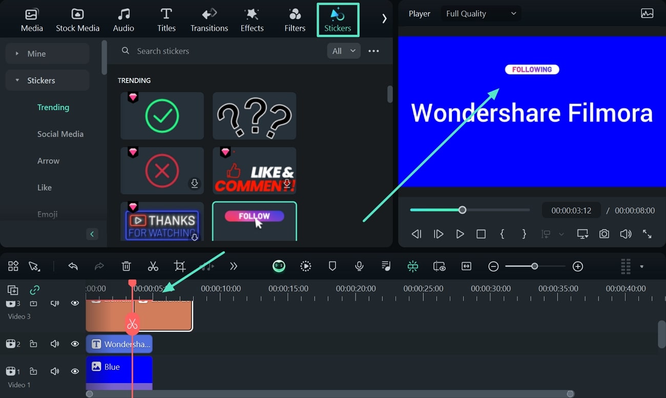
Step 3. Add Sticker to Your Pop-up
Next, select the “Stickers” option from the toolbar and find your desired sticker to add. Afterward, drag the sticker to the timeline and drop it above the background layer while adjusting it across the preview window.
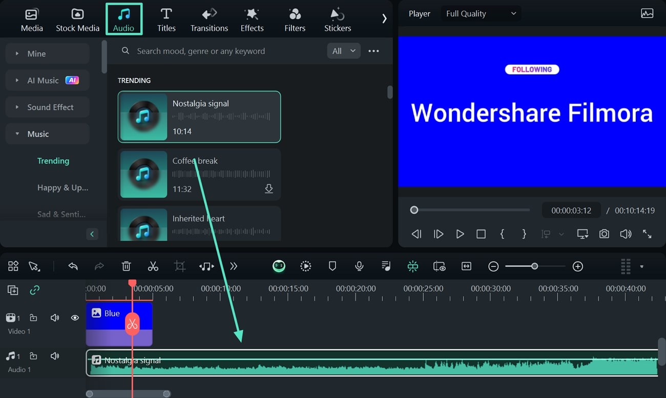
Step 4. Complement Your Pop-up With Music
Now, add music to your pop up by clicking "Music" on the toolbar and searching for a relevant sound effect or music. Download the track and drop it to the timeline below the background overlay.
Step 5. Finalize the Project by Adding a Filter
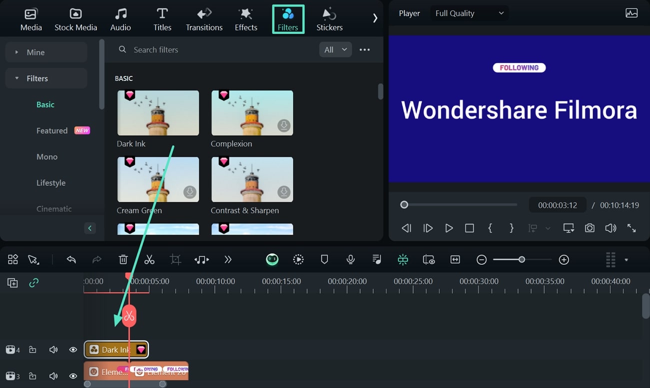
Finally, to change the look of your pop up, click the “Filters” option on the toolbar and an extensive selection of filters will open. Here, choose your favorite filter and drag it towards the timeline to automatically apply it.
Step 6. Export the File When You Are Done Editing
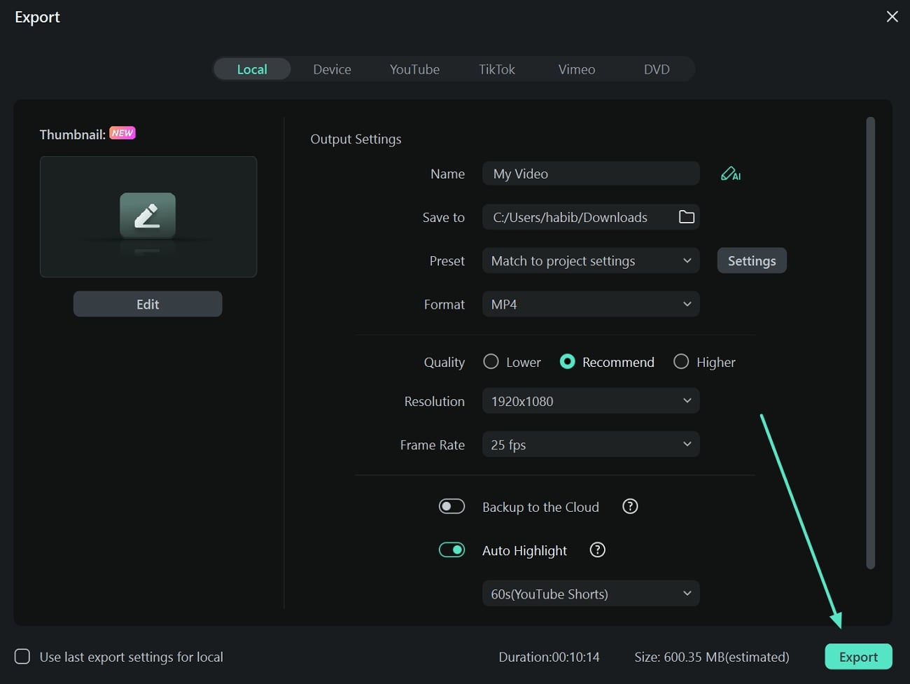
Lastly, review your pop-up and click the “Export” button present on the top right corner of your screen. On the next window, enter the file name, destination, format, resolution, and more before clicking “Export.”
Conclusion
Logo animations play a crucial role in developing better engagement with your viewers. That is why we have shortlisted the best logo intro designing software for you to curate engaging content. Furthermore, this article discusses the steps to design captivating intros by blending Wondershare Filmora's editing tools with Filmstock's templates.


