
In this article
Understanding Responsive Videos
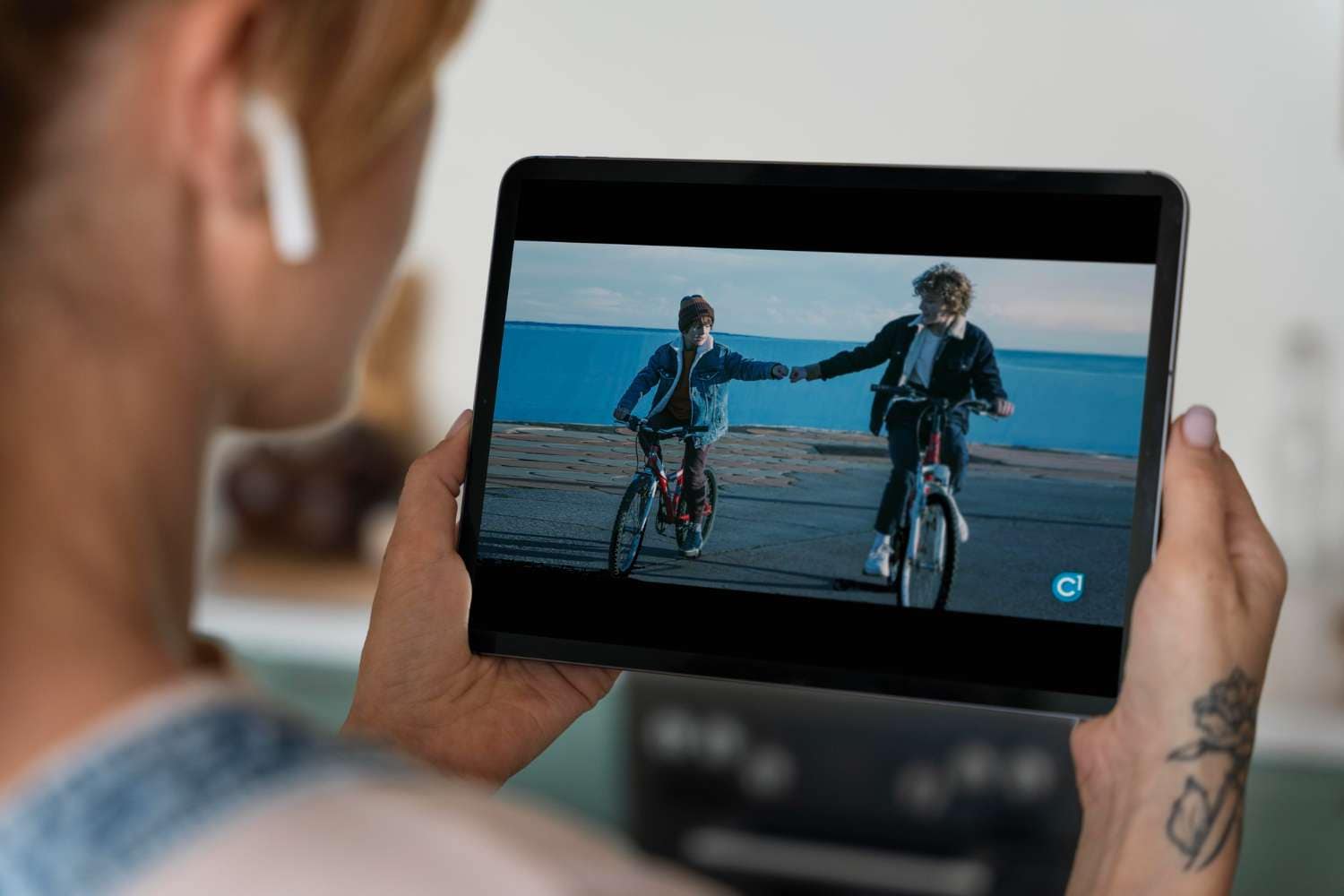
Have you ever opened a website on your phone and found the video cut off, stretched, or with captions so tiny they're barely readable? That's what a non-responsive video looks like. In contrast, responsive video ensures your content adapts perfectly to any screen size, from mobile phones and tablets to ultrawide desktop monitors.
In this guide, we'll explain responsive videos, how they work, where they are used, their limitations, and how to export and create them easily.
A responsive video automatically adjusts its size, aspect ratio, and layout based on the viewer's device. This ensures that your video looks sharp on any screen.
A broader definition of a responsive video would say that, instead of creating a single, fixed-size video for every screen, responsive videos use intrinsic ratio boxes, caption scaling, and safe-area adjustments to maintain consistent framing to improve the viewers' experience. This keeps visuals balanced and all texts readable across all devices. It's just like YouTube. No matter where you play a video, it automatically molds itself to fit your device.
The Technical Side of HTML5 Responsive Videos
Modern responsive video exports combine HTML5 and CSS coding languages along with adaptive streaming technologies to create seamless viewing experiences. Here's how.
The Core Technologies of Responsive Videos
The Key Innovations of HTML5 and CSS Responsive Videos
The Current State of Responsive Videos
HTML5 and CSS responsive videos have long been the norm. In the current landscape, most brands decide to export multiple video versions per platform with different aspect ratios, such as 16:9 (for PC), 1:1 (for square videos), or 9:16 (for vertical videos on mobile devices). When you combine that with adaptive bitrate streaming and responsive layouts, you ensure smooth playback on any device without manual setups.
When and Where to Use Responsive Videos
We have already established that responsive videos are everywhere, but in this section, we want to see their most common real-world applications and examine some of their shortcomings while looking into the future to see what we can expect.
Real-World Applications for Responsive Videos


All these examples are centered around business, because this is where responsive videos shine. Share your message with all audiences, regardless of where they are watching.
What Are the Limitations and Challenges of Responsive Video Content
Even though responsive videos have come a long way, there are still a few kinks that need to be worked out. Here are the most common problems.
And now, let's imagine a future where all these limitations are taken care of.
What is the Future of Responsive Videos?
In the future, we expect responsive video workflows to become fully automated. We will witness smarter auto-reframe tools with scene and face detection for pixel-perfect crops. Dynamic caption layouts will automatically adjust their size and placement based on the platform and device, and there will also be better CMS presets where responsive exports are built directly into publishing workflows. With all this in mind, we can say that very soon, responsive video will feel effortless, handled almost entirely by AI-assisted editing tools.
How to Export Videos to Ensure Responsivity
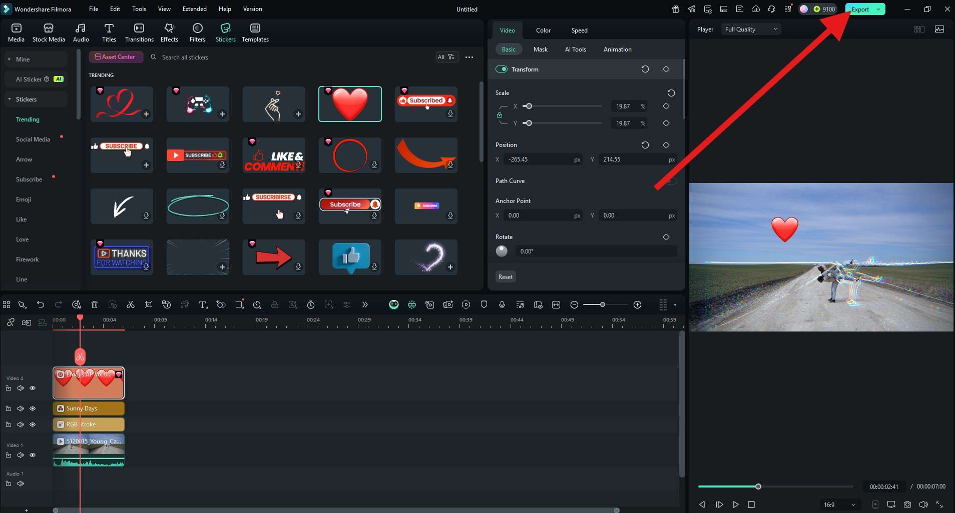
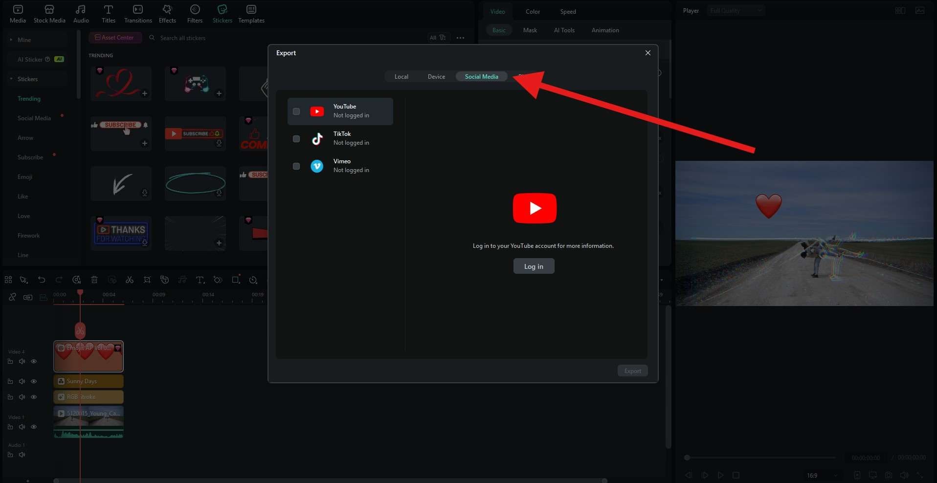
If you want your video to become responsive the second you export it, you need a powerful video editing tool that offers exporting options to the most popular social media apps. One such tool is Wondershare Filmora. What's best about this one is that you can use it to make a perfect video, utilizing easy advanced video editing techniques, tons of creative assets, and a very powerful AI toolbox. After you are done editing, you can export the video directly to YouTube or TikTok, making it instantly responsive. Here's how to do it.
A Step-by-Step Guide to Exporting Videos to Social Media in Filmora
Begin your journey by downloading and installing Filmora on your Windows or Mac desktop or laptop device. When the installation is complete, open Filmora and create a new project. Then, import video, image, or audio content to your project. When the import is complete, check out our easy guide below.

 Secure Download
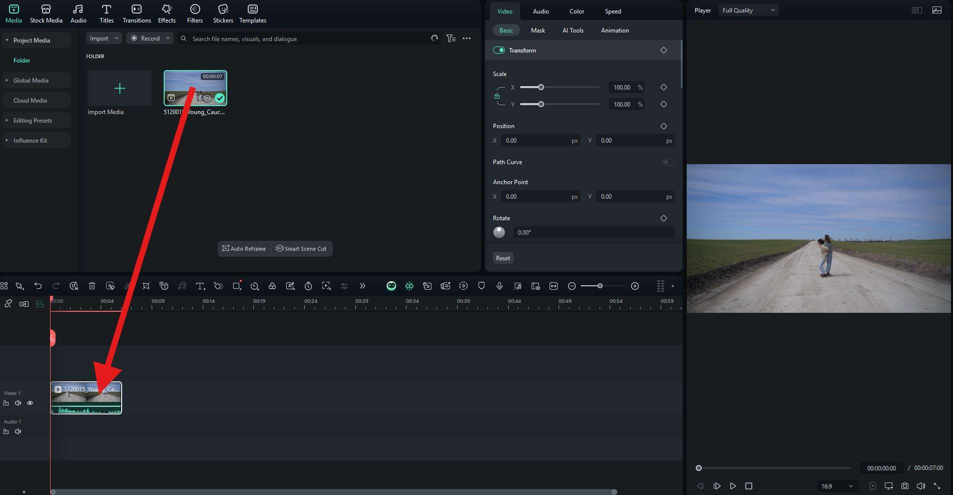
It's that easy to create a responsive video in Filmora. If you want to experience the joy of video editing and see Filmora's editing features, creative assets, and AI tools in action, you can download it today and check it out. There is also a mobile version for Android and iOS, which is perfect if you want to take your video editing tasks on the go.
Frequently Asked Questions
-
What is the main benefit of using responsive videos?
The main benefit of responsive videos is that they automatically adapt to different screen sizes and devices, ensuring optimal viewing experience for all users. This improves user engagement, reduces bounce rates, and ensures your content looks professional regardless of whether it's viewed on a desktop, tablet, or smartphone. -
Do I need to know coding to create responsive videos?
No, you don't necessarily need to know coding to create responsive videos. Modern video editing tools like Filmora offer built-in responsive export options that automatically handle the technical aspects. However, understanding basic HTML5 and CSS can be helpful for custom implementations and troubleshooting. -
What are the most important aspect ratios for responsive videos?
The most important aspect ratios for responsive videos are 16:9 (standard widescreen for desktops and YouTube), 9:16 (vertical for mobile devices like TikTok and Instagram Stories), 1:1 (square for Instagram feed), and 4:5 (vertical for Facebook and Instagram). Creating multiple versions for different platforms ensures optimal viewing across all devices. -
Can I make existing videos responsive?
Yes, you can make existing videos responsive by re-exporting them with the correct settings. Using video editing software that supports multiple aspect ratios and responsive presets, you can adapt your existing content for different platforms. Some tools also offer auto-reframing features that can intelligently crop and adjust your videos for different aspect ratios. -
How do responsive videos affect website loading speed?
Responsive videos can actually improve website loading speed when implemented correctly. Techniques like adaptive bitrate streaming, proper video compression, and lazy loading ensure that users only download the video quality appropriate for their device and network conditions. This prevents mobile users from downloading large desktop-quality videos that would slow down their experience.