
 100% Security Verified | No Subscription Required | No Malware


 ChatGPT
 Perplexity
 Gemini
 Claude
 Grok
Grok
Bronze sits between brown, orange, and metallic gold, so it naturally feels warm, grounded, and premium. Psychologically, a bronze color palette suggests reliability, heritage, and quiet confidence, which is why it shows up so often in luxury branding, cinematic posters, and UI accents.
For video creators, bronze color combinations can turn simple footage into something rich and cinematic. Used in titles, thumbnails, lower thirds, and color grading, bronze can give vlogs, tutorials, and brand intros a polished, cohesive look. Below you will find 15 bronze color palettes with HEX codes tailored for creators and Filmora users, so you can quickly test them in your edits, social graphics, and channel branding.
In this article
Elegant & Modern Bronze Color Palettes
Urban Loft Bronze
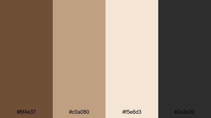
- HEX Codes: #6f4e37, #c0a080, #f5e6d3, #2e2e30
- Mood: sleek, grounded, and metropolitan
- Use for: Perfect for lifestyle vlogs, tech reviews, and modern channel branding that needs a polished yet approachable look.
Urban Loft Bronze mixes a coffee-bronze base with soft neutrals and charcoal accents. It feels like polished concrete, espresso, and warm window light all in one palette, giving you a clean but not clinical mood.
Use the lighter tones as background colors for titles and lower thirds, while the deep bronze and charcoal anchor your typography, icons, and logo. This palette works beautifully for minimalist thumbnails, tech review overlays, and channel headers where you want a modern bronze aesthetic without going overly flashy.
Pro Tip: Build a Cinematic Bronze Look in Filmora
To keep an Urban Loft Bronze style consistent, design your entire visual system around these HEX codes. In Filmora, you can color pick similar tones for text, shapes, and elements in titles, then lightly grade your footage toward warm browns and soft off-whites. This creates a unified bronze color palette from intro to end screen.
Use the bronze shade (#6f4e37) for key accents like subscribe buttons or callout boxes, and repeat the light neutral (#f5e6d3) as a background for chapter cards. Across a playlist or full series, this repetition helps your branding feel deliberate, modern, and highly recognizable.
AI Color Palette
If you have a screenshot or mood board featuring Urban Loft Bronze, you can turn that reference into a full video look with Filmora. Filmora's AI Color Palette feature analyzes the colors in your reference frame and applies a matching palette to your clips, saving you from grading each shot by hand.
Simply choose your best bronze-toned frame or imported image as the source, then let AI Color Palette match the rest of your timeline. This keeps your lifestyle vlogs, tech b-roll, and thumbnail stills aligned to the same sleek bronze aesthetic in just a few clicks.
 secure download

HSL, Color Wheels & Curves
Once you have a base bronze color combination, fine-tune it with Filmora's HSL sliders, color wheels, and curves. You can deepen oranges and reds slightly to push your footage closer to bronze, lift the shadows for a softer loft feel, or cool the highlights so skin tones stay natural while backgrounds remain warm. The Filmora color correction guide is a helpful reference when you start exploring these tools.
Use the color wheels to add a subtle bronze bias to midtones only, keeping blacks neutral to avoid muddy contrast. Then, with curves, gently increase contrast in the midrange for a crisp, metropolitan vibe, while protecting highlight detail in windows, screens, or product shots.
secure download1000+ Video Filters & 3D LUTs
If you want a fast, stylized bronze aesthetic, Filmora's video filters and 3D LUTs make it easy to test different looks. Start with warm cinematic LUTs or retro film filters, then tweak intensity until they sit comfortably with your chosen bronze HEX codes.
This is especially useful when you are building a bronze themed video series or a new brand identity. You can create a few presets that lean warmer, cooler, or more contrasty and switch between them for different segments, while keeping the same bronze color palette in titles, overlays, and graphics.
secure downloadLuxe Studio Glow
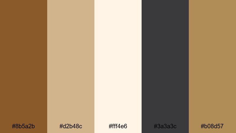
- HEX Codes: #8b5a2b, #d2b48c, #fff4e6, #3a3a3c, #b08d57
- Mood: luxurious, warm, and professional
- Use for: Ideal for branded intros, sponsored content graphics, and premium course visuals.
Luxe Studio Glow layers rich bronze with tan, ivory, and a muted gold accent for an upscale studio feel. It immediately suggests premium content, from expert tutorials to sponsored brand spots.
Use the light ivory (#fff4e6) as your main background for titles and info cards, then highlight key elements with the gold (#b08d57) and rich bronze (#8b5a2b). This bronze aesthetic palette is perfect for intros, lower thirds, and thumbnails where you want to signal authority and quality without looking too flashy.
Modern Copper Bronze
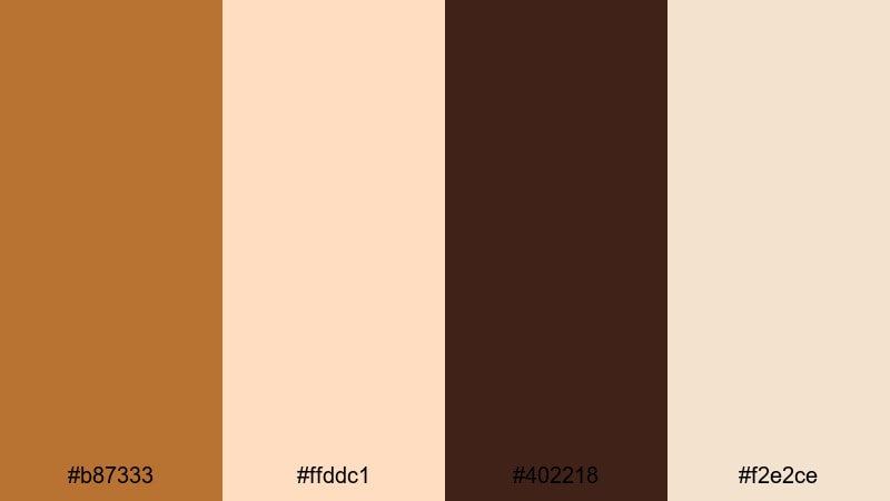
- HEX Codes: #b87333, #ffddc1, #402218, #f2e2ce
- Mood: contemporary, creative, and stylish
- Use for: Great for design breakdowns, portfolio reels, and creative agency bumpers.
Modern Copper Bronze focuses on a bright, coppery bronze paired with creamy highlights and deep espresso shadows. It feels creative and design-driven, ideal for showcasing portfolios, case studies, and UI mockups.
Let the copper (#b87333) and dark brown (#402218) frame your key visuals, while the creams (#ffddc1, #f2e2ce) keep things light and easy to read. This metallic bronze color palette translates well into animated lower thirds, logo stings, and bold but tasteful thumbnails for creative channels.
Midnight Bronze Chic
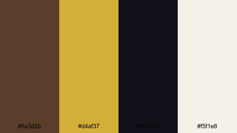
- HEX Codes: #5a3d2b, #d4af37, #101018, #f5f1e8
- Mood: dramatic, refined, and cinematic
- Use for: Use in luxury product showcases, fashion lookbooks, and dramatic title cards.
Midnight Bronze Chic balances dark bronze and near-black with champagne gold and soft ivory. It feels like a night-time studio shoot with carefully placed spotlights and glossy surfaces.
Use the deep tones (#5a3d2b and #101018) as full-screen backgrounds for title cards, product close-ups, or fashion B-roll, then pick out edges and text with the gold (#d4af37). This is a strong bronze color grading reference for dramatic openers, product hero shots, and luxury brand reveals.
Warm & Cinematic Bronze Color Palettes
Golden Hour Bronze

- HEX Codes: #a97142, #ffd39a, #ffb347, #3b2a23, #fff1e0
- Mood: glowing, nostalgic, and cozy
- Use for: Perfect for travel vlogs, family montages, and sunset b-roll sequences.
Golden Hour Bronze captures the soft warmth of late-afternoon light with bronzy browns, peachy golds, and creamy highlights. It instantly gives your footage that glowing, cinematic feeling associated with sunset.
Grade your footage slightly warmer to echo #ffb347 and #ffd39a, then use #3b2a23 for text and outlines so your titles remain legible over bright skies. This palette works beautifully for travel vlogs, nostalgic family edits, and YouTube thumbnails that promise a warm, cinematic experience.
Sunset Ember Bronze
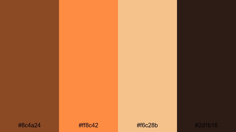
- HEX Codes: #8c4a24, #ff8c42, #f6c28b, #2d1b16
- Mood: fiery, adventurous, and energetic
- Use for: Great for action montages, sports edits, and bold thumbnail designs.
Sunset Ember Bronze pushes bronze into a fiery, ember-like direction. The combination of burnt bronze and bright orange makes everything feel fast, intense, and adventurous.
Lean on the dark shade (#2d1b16) for backgrounds or letterboxing bars, then punch up key text or icons with #ff8c42. This bronze color combination is excellent for sports edits, fitness intros, gaming montages, or any thumbnail where you want maximum energy and clear visual impact.
Vintage Film Bronze

- HEX Codes: #7b5e57, #deb887, #f5deb3, #2f2520, #b59a7a
- Mood: retro, sentimental, and soft
- Use for: Ideal for retro edits, documentary-style videos, and storytelling intros.
Vintage Film Bronze softens bronze into dusty browns, biscuit, and wheat tones that mimic old film stock. It gently desaturates your visuals and adds a sense of memory and time.
Apply this palette for documentary-style edits, personal storytime videos, or old photos brought to life. Use the darker color (#2f2520) for text and frames, while the warm mid-tones (#deb887, #b59a7a) guide your color grading. Paired with a subtle film grain, this bronze aesthetic palette feels intimate and timeless.
Campfire Story Bronze
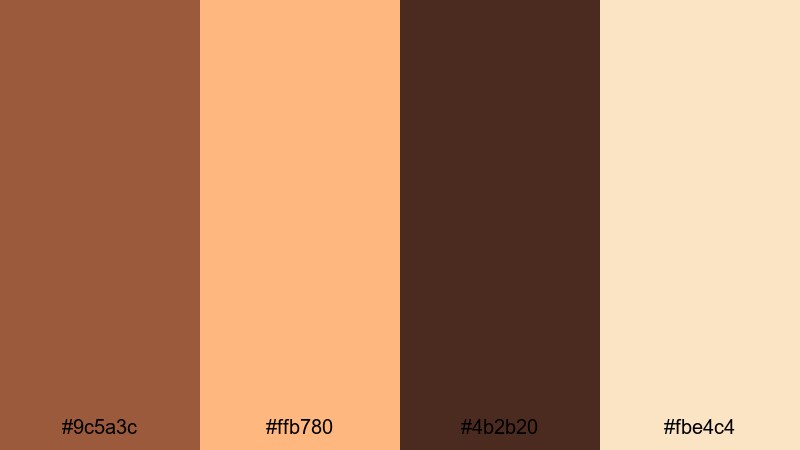
- HEX Codes: #9c5a3c, #ffb780, #4b2b20, #fbe4c4
- Mood: intimate, rustic, and inviting
- Use for: Use in outdoor adventure vlogs, camping reels, and cozy storytime videos.
Campfire Story Bronze combines earthy bronze with ember oranges and soft highlights to recreate the look of a warm fire in the dark. It feels cozy, grounded, and slightly rustic.
Use #4b2b20 for deep shadows, letterboxes, or text, and let #ffb780 and #fbe4c4 glow in skin tones and highlights. This palette is perfect for camp vlogs, van life content, fireside Q&A videos, and thumbnails that promise comfort and storytelling.
Soft & Minimal Bronze Color Palettes
Soft Latte Bronze
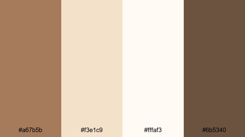
- HEX Codes: #a67b5b, #f3e1c9, #fffaf3, #6b5340
- Mood: calm, welcoming, and understated
- Use for: Great for productivity videos, how-to tutorials, and minimalist branding packages.
Soft Latte Bronze blends gentle latte hues with warm bronze accents for a calm, minimal look. It is friendly and approachable, without any harsh contrast.
Use #fffaf3 or #f3e1c9 as your default background for titles and slides, and reserve #a67b5b and #6b5340 for logos, icons, and important text. This aesthetic color palette for vlogs and tutorials works well when you want to stay neutral but still have a hint of bronze warmth in your brand.
Muted Sand Bronze

- HEX Codes: #c1906b, #f1d8c0, #f8efe6, #5e4b3c
- Mood: serene, airy, and natural
- Use for: Perfect for wellness content, interior design tours, and calm BGM edits.
Muted Sand Bronze uses sandy bronze and pale neutrals to echo beach light and sun-bleached wood. It is airy and desaturated, ideal for relaxed storytelling.
Grade your footage lightly toward #c1906b and use #f8efe6 for overlays, chapter cards, or subtitles backgrounds. This bronze color palette is strong for wellness channels, ASMR, room tours, and slow living content, where soft visuals support a peaceful mood.
Rose Bronze Whisper

- HEX Codes: #b67c73, #f3c6c2, #ffe8e2, #4a3534, #f8f1ed
- Mood: romantic, gentle, and dreamy
- Use for: Ideal for wedding highlights, couple vlogs, and beauty content branding.
Rose Bronze Whisper introduces a rosy tint into bronze, mixing blush and ivory tones with a grounded dark accent. The result is soft and dreamy, perfect for romantic or beauty-focused content.
Let #ffe8e2 and #f8f1ed fill most of your frame in graphics, while #b67c73 becomes the main accent for titles, callouts, and logo marks. The deep shade #4a3534 keeps text readable over pastel backgrounds. This bronze and rose combination is ideal for wedding highlight reels, couple vlogs, and feminine branding kits.
Calm Studio Bronze
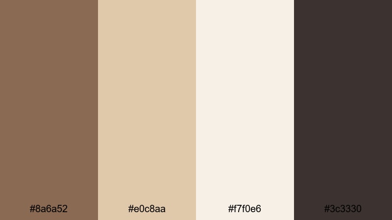
- HEX Codes: #8a6a52, #e0c8aa, #f7f0e6, #3c3330
- Mood: balanced, neutral, and professional
- Use for: Useful for talking-head videos, educational series, and simple lower thirds.
Calm Studio Bronze offers balanced studio-ready tones with gentle beiges and a dark accent. It feels professional but not stiff, making it great for education and commentary channels.
Use #f7f0e6 or #e0c8aa as your slide and title backgrounds, with #8a6a52 for icons and highlight text. #3c3330 anchors main copy and ensures readability. This bronze color palette keeps attention on the content while giving your videos a subtle, polished identity.
Bold & Dramatic Bronze Color Palettes
Inferno Bronze Clash
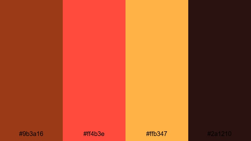
- HEX Codes: #9b3a16, #ff4b3e, #ffb347, #2a1210
- Mood: intense, bold, and high-impact
- Use for: Great for gaming intros, hype reels, and attention-grabbing thumbnails.
Inferno Bronze Clash turns bronze into a high-impact statement with fiery reds and deep shadows. It feels urgent and explosive, instantly grabbing attention on crowded video feeds.
Use #2a1210 as a dramatic background or letterbox color, with #ff4b3e and #ffb347 for bold titles, progress bars, or health bar overlays. This metallic bronze color palette fits gaming intros, sports hype edits, and any thumbnail that needs to stand out at a glance.
Neo Noir Bronze

- HEX Codes: #6a4028, #f0a500, #121212, #e5ded4
- Mood: mysterious, stylish, and edgy
- Use for: Perfect for trailers, mystery narratives, and moody cinematic edits.
Neo Noir Bronze pairs smoky bronze and gold with near-black and a pale neutral. It creates a stylish, noir-inspired mood that is ideal for cinematic storytelling.
Let #121212 dominate backgrounds and shadows, then trace key elements with #f0a500 and #6a4028 to echo streetlights or neon glows. #e5ded4 works well for subtitles or small text when you need contrast. This bronze color grading reference suits trailers, mystery shorts, urban cinematic b-roll, and dramatic podcast visuals.
Stage Spotlight Bronze
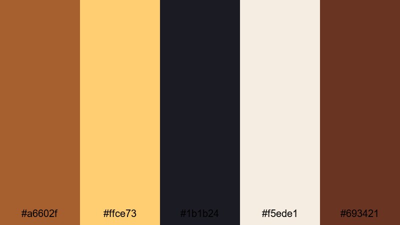
- HEX Codes: #a6602f, #ffce73, #1b1b24, #f5ede1, #693421
- Mood: theatrical, energetic, and confident
- Use for: Ideal for performance videos, event recaps, and bold opener animations.
Stage Spotlight Bronze captures the feeling of a lit stage against a dark audience. Strong bronze and warm golds stand out sharply over deep blacks and off-whites.
Use #1b1b24 as your main background or border color, with #ffce73 and #a6602f for titles, spotlights, and animated shapes. #f5ede1 helps soften information-heavy slides. This bronze aesthetic palette works well for concert recaps, dance reels, event promos, and show-style YouTube openers.
Tips for Creating Bronze Color Palettes
Bronze is versatile enough to feel luxurious, cozy, or edgy depending on what you pair it with. When you build your own bronze color palette for video or design, keep these practical tips in mind.
- Decide on the mood first: warm and friendly (pair bronze with creams and soft oranges) or dramatic and premium (pair bronze with black and champagne gold).
- Use contrast wisely: dark bronze and near-black make great backgrounds, while lighter neutrals keep titles, captions, and UI elements readable.
- Limit your accent colors: 1 bronze, 1 neutral light, and 1 dark anchor color are enough for consistent thumbnails, intros, and overlays.
- Match your footage: when color grading, nudge midtones toward bronze while keeping skin tones natural; then align your graphics to the same HEX codes.
- Think about platform: stronger contrast and bolder bronze work better for small mobile thumbnails, while subtle palettes shine in full-screen videos.
- Check accessibility: always test white or light text over bronze backgrounds at different sizes to avoid readability issues.
- Keep branding consistent: reuse the same bronze HEX values across your logo, lower thirds, end screens, and social banners so your channel feels unified.
- Create presets: in Filmora, save color settings, titles, and overlays that use your core bronze palette, so every new project starts on-brand.
Bronze color palettes can instantly change how your videos feel, from cozy campfire vlogs to sleek, metropolitan tech reviews. By choosing the right bronze color combinations and keeping them consistent, you create a visual identity that viewers recognize before they even read your channel name.
The HEX codes here give you a starting point for thumbnails, title cards, and bronze color grading. Drop these palettes into Filmora, experiment with AI Color Palette, HSL and curves, and pair them with filters or LUTs that match your brand story.
Whether you want a metallic bronze color palette for dramatic trailers or a soft latte bronze look for tutorials, Filmora makes it easy to test, refine, and lock in your signature style across every upload.
secure downloadNext: Candy Apple Red Palette
