
 100% Security Verified | No Subscription Required | No Malware

Burnt Orange sits between fiery red and earthy brown, combining the energy of warm tones with the stability of neutrals. It feels bold yet grounded, evoking sunsets, autumn leaves, and glowing city lights. In color psychology, Burnt Orange often signals confidence, creativity, and warmth, making it perfect when you want visuals that feel cinematic but still approachable.
For video creators and designers, Burnt Orange works beautifully in YouTube thumbnails, vlogs, intros, title cards, and brand systems. It pairs well with teals, creams, deep blues, and soft greens, creating looks that stand out in feeds while remaining cohesive. Below, you will find 15 Burnt Orange color palettes with HEX codes you can plug directly into Filmora, your design tools, and your branding guides to keep your whole visual presence consistent.
In this article
Warm Cinematic Burnt Orange Palettes
Desert Ember Fade
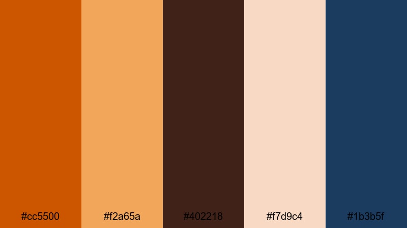
- HEX Codes: #cc5500, #f2a65a, #402218, #f7d9c4, #1b3b5f
- Mood: Epic, adventurous, and cinematic like a sunset over desert dunes.
- Use for: Ideal for travel vlogs, cinematic B-roll, and dramatic documentary titles.
Desert Ember Fade combines a strong Burnt Orange with sandy highlights, deep coffee shadows, and a cool navy accent. It feels like a road trip at golden hour, where the sun slowly sinks behind rocky silhouettes and the sky begins to cool toward blue.
Use this palette to grade sweeping drone shots, slow-motion B-roll, and cinematic titles in travel documentaries or adventure vlogs. The warm oranges and sands can dominate your frames, while the deep blue and dark brown support graphics, channel logos, or lower thirds so your text remains clear but stylish in thumbnails and intros.
Pro Tip: Build a Cinematic Burnt Orange Look in Filmora
To keep a Desert Ember Fade style consistent, decide early which tones are dominant (Burnt Orange and sand) and which are accents (navy and deep brown). In Filmora, you can apply the same color settings across all your clips so your main video, intro sting, and social cutdowns all share that epic, desert-inspired warmth.
Create a preset grade once, then reuse it on B-roll, talking-head footage, and title cards. This not only saves time, it also makes your Burnt Orange aesthetic feel like a deliberate brand choice instead of a one-off filter.
AI Color Palette
If you already have an image that perfectly captures this desert mood, you can turn it into a look for your entire edit. Filmora's AI Color Palette feature analyzes a reference frame and transfers its colors to all your selected clips with a few clicks.
Import your footage, pick a frame where the Burnt Orange sunset looks ideal, then use AI Color Palette to match the rest. This keeps skin tones, skies, and shadows consistent whether you are cutting a long-form travel vlog or a short cinematic reel for social media.
 secure download

HSL, Color Wheels & Curves
Once you have the base palette, refine your Burnt Orange tones using HSL, color wheels, and curves in Filmora. Gently push the orange and yellow hues warmer for a more dramatic sunset, or pull saturation back to get a subtler, filmic look. Use color wheels to cool down the shadows with deep blue while keeping midtones and highlights warm for a rich cinematic contrast.
Curves give you precise control over contrast, letting you lift shadows slightly to preserve detail in darker areas or deepen them for a more moody, adventurous feel that still fits your Burnt Orange concept.
secure download1000+ Video Filters & 3D LUTs
If you want a fast, stylized Burnt Orange look, Filmora’s video filters and 3D LUTs make it easy to experiment. Start with a warm cinematic LUT, then fine-tune intensity so the oranges feel rich without crushing detail in skies and skin tones.
You can combine filters with masks, vignettes, and subtle grain to make Desert Ember Fade feel like a polished, movie-style grade. Save your favorite combinations as presets to reuse across intros, end screens, and shorts so your brand always keeps that same glowing, burnt-sunset character.
secure downloadSunset Lens Flare
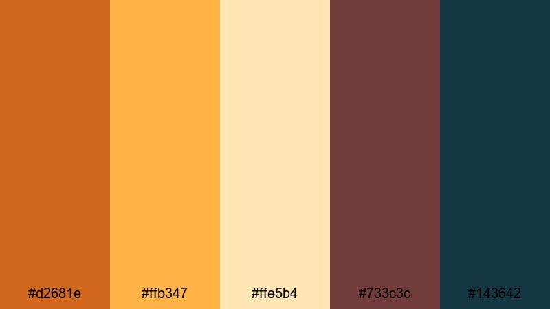
- HEX Codes: #d2681e, #ffb347, #ffe5b4, #733c3c, #143642
- Mood: Nostalgic and glowing, like golden hour through a vintage lens.
- Use for: Perfect for lifestyle vlogs, drone shots, and romantic highlight reels.
Sunset Lens Flare mixes radiant Burnt Orange with soft peach, cream, and contrasting deep teal. It feels like a hazy golden-hour memory, with light leaks and gentle flares washing across your frame.
Use this palette for lifestyle content, romantic couple shoots, or overhead drone footage of cities and coastlines. Apply the warm hues to your grade and reserve the deep teal and burgundy for text, graphics, and lower thirds so your thumbnails and intro titles feel dreamy but still readable.
Rustic Storyteller Grade
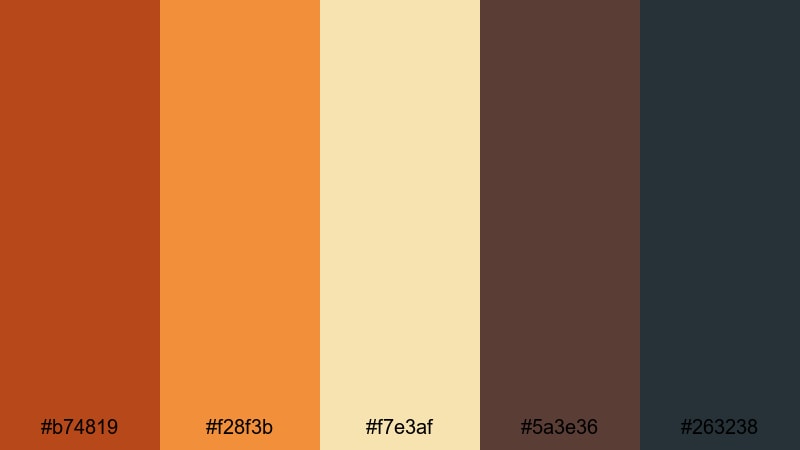
- HEX Codes: #b74819, #f28f3b, #f7e3af, #5a3e36, #263238
- Mood: Earthy, intimate, and documentary-inspired.
- Use for: Use for character-driven documentaries, interviews, and handheld journal-style videos.
Rustic Storyteller Grade combines a grounded Burnt Orange with warm amber, cream, and muted brown and charcoal. This mix feels intimate and handmade, like stories told in small cafes or quiet workshops.
It is ideal for interviews, passion projects, and behind-the-scenes content. Use the lighter tones for backgrounds and subtle overlays, while the darker shades anchor titles, captions, and chapter cards. Your thumbnails can feature warm Burnt Orange accents around faces or key objects, helping them stand out without feeling overly stylized.
Autumn Cinema Glow
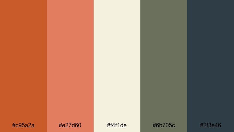
- HEX Codes: #c95a2a, #e27d60, #f4f1de, #6b705c, #2f3e46
- Mood: Cozy, reflective, and cinematic like a fall afternoon.
- Use for: Great for seasonal content, cozy home vlogs, and aesthetic b-roll sequences.
Autumn Cinema Glow blends warm Burnt Orange and coral with soft off-white and muted green-blues. It feels like a slow fall day, where the light is gentle and everything has a soft cinematic haze.
Use it for seasonal vlogs, reading nooks, coffee rituals, and aesthetic B-roll of leaves, sweaters, and interiors. In thumbnails and opening titles, let the oranges and creams dominate while the muted greens support as accent lines, frames, or background shapes to keep everything calm and readable.
Soft Natural Burnt Orange Palettes
Terracotta Morning Light
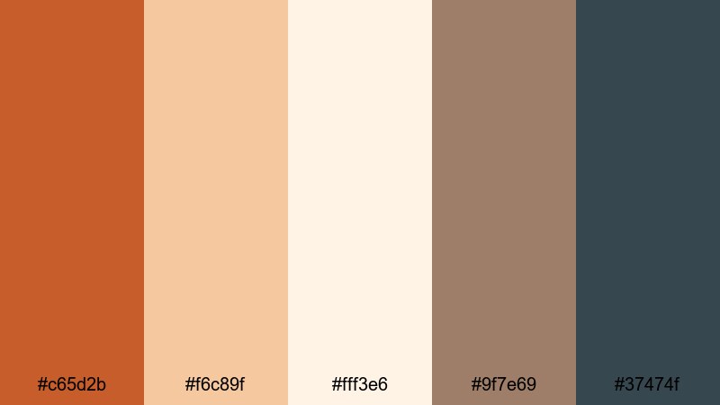
- HEX Codes: #c65d2b, #f6c89f, #fff3e6, #9f7e69, #37474f
- Mood: Calm, sunlit, and organic like a slow morning in a terracotta kitchen.
- Use for: Best for slow-living vlogs, interior reels, and aesthetic how-to videos.
Terracotta Morning Light pairs a soft terracotta Burnt Orange with airy creams, gentle browns, and a cool slate accent. It feels calm and grounded, like light streaming into a handcrafted, ceramic-filled kitchen.
This palette suits slow-living channels, interior design tours, and step-by-step tutorials. Let the soft oranges and creams guide your grade, then use the darker slate for UI elements like lower thirds, subscribe buttons, and chapter markers so they stand out without breaking the quiet mood.
Pumpkin Chai Comfort
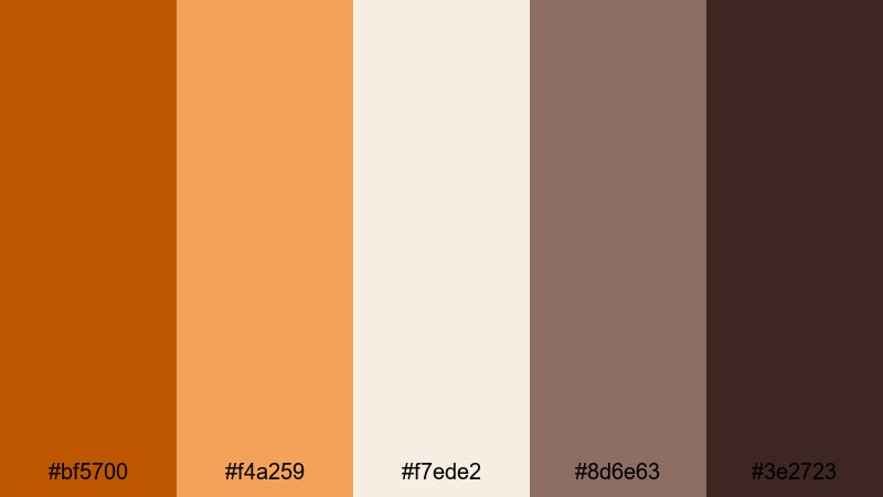
- HEX Codes: #bf5700, #f4a259, #f7ede2, #8d6e63, #3e2723
- Mood: Comforting, cozy, and warm like a cup of spiced chai.
- Use for: Perfect for food videos, cozy recipe reels, and cafe-style b-roll.
Pumpkin Chai Comfort layers spicy Burnt Orange with latte creams and deep chocolate browns. The palette instantly feels like autumn drinks, baked goods, and wood-paneled cafes.
Use it in overhead recipe shots, barista reels, or bakery promos. Let the brighter oranges highlight key ingredients in thumbnails, while the dark brown grounds text boxes and pricing overlays for menus or sponsored content. The gentle cream tones are ideal for backgrounds behind titles or social handles.
Harvest Orchard Fields
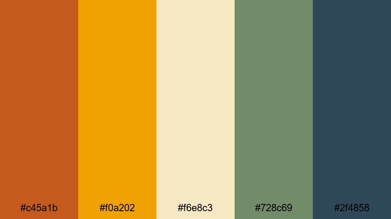
- HEX Codes: #c45a1b, #f0a202, #f6e8c3, #728c69, #2f4858
- Mood: Organic, wholesome, and grounded in nature.
- Use for: Use for farm-to-table stories, outdoor brand shoots, and eco-focused content.
Harvest Orchard Fields blends rich Burnt Orange and golden ochre with creamy neutrals and muted greens and blues. It feels wholesome and grounded, like fresh produce, orchards, and wide open fields.
This palette is perfect for sustainable brands, eco-documentaries, and outdoor shoots. Use the oranges and golds for warm highlights and product shots, while the green and navy tones carry your logo, callouts, and information graphics across videos, carousels, and landing pages.
Clay Roof After Rain
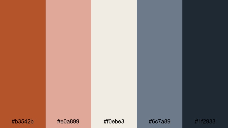
- HEX Codes: #b3542b, #e0a899, #f0ebe3, #6c7a89, #1f2933
- Mood: Quiet, reflective, and softly desaturated like a city after rainfall.
- Use for: Ideal for travel diaries, architectural b-roll, and minimalist city vlogs.
Clay Roof After Rain softens Burnt Orange into weathered tile tones, balanced by muted blush, off-white, and cool blue-greys. It feels like walking a city after a storm, with fresh air and subtle reflections everywhere.
Use it for cityscape vlogs, architectural details, and minimalist travel diaries. Apply the desaturated oranges to buildings and props, then let the cool greys shape your overlays, maps, and lower thirds for a refined, editorial style that still has warmth.
Modern Minimal Burnt Orange Palettes
Urban Loft Accent
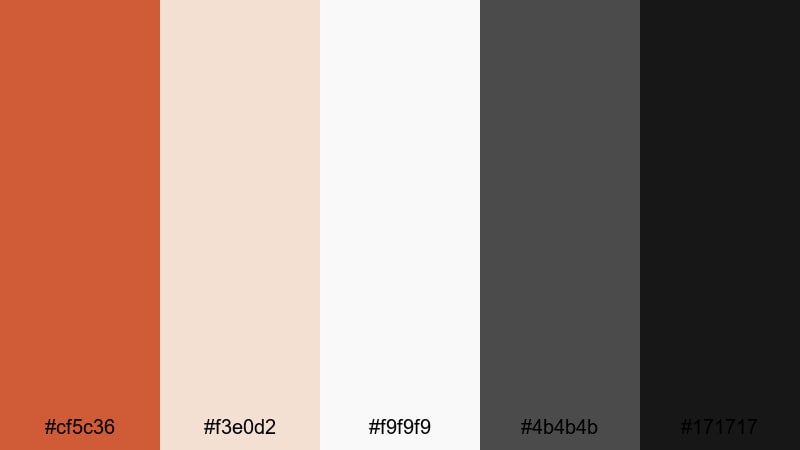
- HEX Codes: #cf5c36, #f3e0d2, #f9f9f9, #4b4b4b, #171717
- Mood: Sleek, stylish, and design-forward with a warm accent.
- Use for: Perfect for channel branding, modern YouTube intros, and UI overlays.
Urban Loft Accent sets a vivid Burnt Orange against soft neutrals and deep charcoal. It feels like a modern apartment or studio space with one bold accent wall surrounded by clean white furniture.
Use this palette for branding-heavy videos, logo reveals, and minimalist intros. Keep backgrounds light and neutral, let Burnt Orange highlight key words or icons, and use the dark greys for text so your thumbnails and end screens look sharp on both desktop and mobile.
Bold Title Overlay
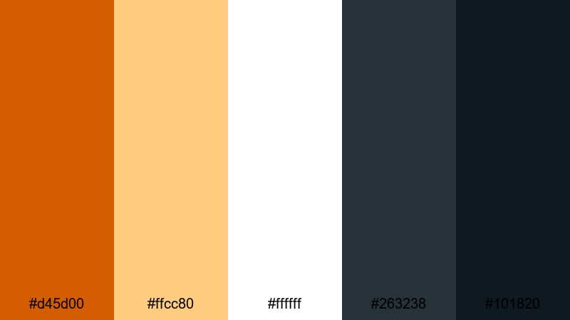
- HEX Codes: #d45d00, #ffcc80, #ffffff, #263238, #101820
- Mood: Confident, high-contrast, and attention-grabbing.
- Use for: Use for YouTube thumbnails, bold title cards, and high-impact lower thirds.
Bold Title Overlay is built for impact. A bright Burnt Orange and soft amber sit against pure white and deep navy-blacks, giving maximum contrast and clarity.
Use it where you need text to pop: thumbnails, chapter titles, lower thirds, and social hooks. Make Burnt Orange your main accent for shapes and highlights, keep text mostly white on dark backgrounds, and use amber as a softer secondary accent for badges, views counts, or calls to action.
Brand Studio Heat
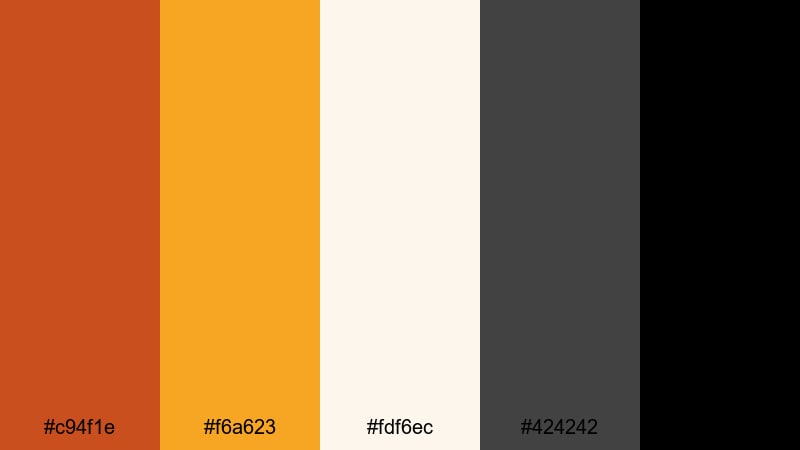
- HEX Codes: #c94f1e, #f6a623, #fdf6ec, #424242, #000000
- Mood: Energetic, professional, and brand-ready.
- Use for: Best for channel rebrands, intro animations, and sponsorship segments.
Brand Studio Heat combines strong Burnt Orange with bright amber, soft off-white, and clear black and charcoal. The palette feels like a bold creative agency brand: energetic yet clean.
Use it if you are building a consistent channel identity or sponsor-ready package. Apply Burnt Orange and amber to your logo, subscribe elements, and animated accents, while using off-white and charcoal as your main background and text colors. This keeps everything readable and professional across intros, mid-roll ads, and outro slates.
Minimal Poster Grain
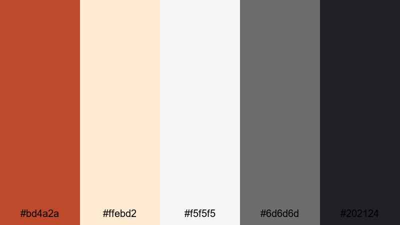
- HEX Codes: #bd4a2a, #ffebd2, #f5f5f5, #6d6d6d, #202124
- Mood: Modern, editorial, and softly textured.
- Use for: Great for title screens, short film posters, and social carousels.
Minimal Poster Grain softens Burnt Orange and places it amid layered off-whites and balanced greys. It feels like an indie film poster or magazine cover with subtle texture and grain.
Use this palette for title sequences, end cards, and key frames that act as posters inside your video. Keep the Burnt Orange focused on a few graphic shapes or key words, and use the off-whites and greys for backgrounds, captions, and credits for a clean, editorial finish.
Festive Retro Burnt Orange Palettes
Vintage Festival Tape
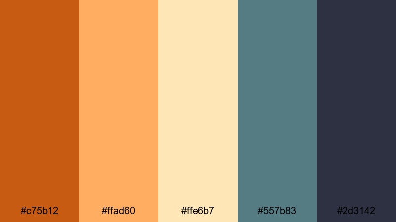
- HEX Codes: #c75b12, #ffad60, #ffe6b7, #557b83, #2d3142
- Mood: Playful, nostalgic, and slightly sun-faded like old tapes.
- Use for: Use for festival recaps, retro edits, and nostalgic montage videos.
Vintage Festival Tape combines sunny Burnt Orange with faded yellows and creams, plus teal and navy accents. It feels like snapshots from disposable cameras and old VHS tapes of concerts and fairs.
Use it for festival recaps, retro travel edits, and nostalgic montages. Grade your clips with a slightly faded warm look, then use teal and navy for timestamps, captions, and tape-style overlays. In thumbnails, pair Burnt Orange titles with cream backgrounds to mimic vintage print posters.
Retro Couch Afternoon
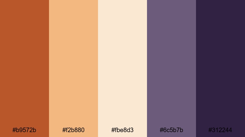
- HEX Codes: #b9572b, #f2b880, #fbe8d3, #6c5b7b, #312244
- Mood: Cozy, retro, and slightly quirky like a 70s living room.
- Use for: Perfect for storytime videos, podcasts on camera, and throwback edits.
Retro Couch Afternoon mixes rich Burnt Orange with caramel, cream, and dusty mauve and plum. It immediately recalls old sofas, patterned rugs, and soft lamps in a 70s-inspired living room.
Use this palette for storytime content, talking-head podcasts, or nostalgia-driven edits. Let the warm oranges and creams fill your background while the mauve and plum shades frame your titles and badges. Add a bit of grain and film burn in Filmora to enhance the analog feel across your videos and social assets.
Neon Marquee Ember
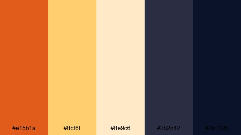
- HEX Codes: #e15b1a, #ffcf6f, #ffe9c6, #2b2d42, #0b132b
- Mood: Lively, cinematic, and night-life inspired.
- Use for: Great for event promos, concert recaps, and energetic channel trailers.
Neon Marquee Ember pairs an electric Burnt Orange with glowing yellows and creams, anchored by deep midnight blues. It feels like bright marquee lights shining against a night sky.
Use this palette for trailers, event recaps, and hype edits. Let the oranges and yellows drive your animated titles, transitions, and light streaks, while the dark blues form rich backgrounds and frames. In thumbnails, a bright Burnt Orange headline against deep navy will grab attention instantly in any feed.
Tips for Creating Burnt Orange Color Palettes
Burnt Orange is powerful, so the right supporting colors will decide whether your visuals feel cinematic, cozy, or high-energy. Use these tips to build and adapt palettes for video, design, and branding.
- Pair Burnt Orange with cool tones like teal, navy, or muted green to create cinematic contrast that still feels balanced.
- Use light neutrals (off-white, cream, sand) behind text and UI so your Burnt Orange accents stay legible on small screens.
- Reserve the boldest Burnt Orange for key actions (titles, buttons, subscribe prompts) to guide viewer attention.
- Check your thumbnails in small sizes and dark mode; adjust brightness and contrast so text remains readable against warm backgrounds.
- Keep a limited palette of 4 to 6 colors for consistent branding across intros, lower thirds, end screens, and social posts.
- Match your color grade to your graphic palette: if your overlays are soft and muted, lower saturation in your footage for a cohesive look.
- Use deeper browns or charcoals instead of pure black when you want a warmer, more organic feel that still has strong contrast.
- Create and save a few variations (cinematic, natural, retro) of your Burnt Orange look so you can switch tones without losing brand recognition.
Burnt Orange is a versatile anchor color that can make your content feel adventurous, cozy, or boldly modern depending on what you pair it with. Whether you are designing thumbnails, setting up a channel rebrand, or grading a cinematic vlog, a well-planned palette keeps everything feeling intentional and on-brand.
Experiment with these 15 palettes, then tweak saturation, contrast, and supporting hues until they match your story and audience. In Filmora, you can quickly test different Burnt Orange looks, save your favorites, and reuse them across your intros, B-roll, and social edits.
Over time, a consistent Burnt Orange style becomes part of your visual identity, helping viewers recognize your work instantly wherever they see it.
secure download