
 100% Security Verified | No Subscription Required | No Malware

Coral Clay sits between warm terracotta and soft blush, giving it a grounded yet romantic personality. It feels inviting, human, and handcrafted, which makes it a powerful color for creators who want their videos and designs to feel warm instead of clinical. In color psychology, tones like Coral Clay suggest comfort, connection, creativity, and gentle confidence.
For video creators, Coral Clay works beautifully in YouTube thumbnails, vlog intros, talking head backdrops, lower thirds, and branding kits. In this guide, you will find ready to use Coral Clay color palettes with HEX codes tailored for Filmora users and designers, so you can match your titles, overlays, LUT choices, and channel art to a cohesive, on brand look.
In this article
Soft And Romantic Coral Clay Color Palettes
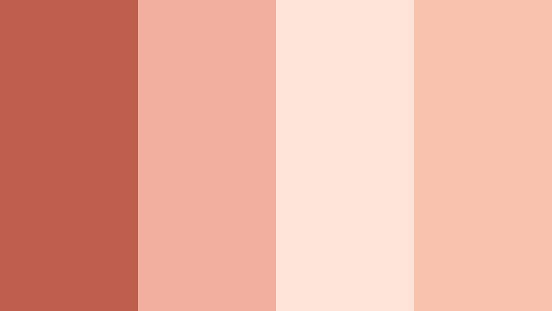
Sunset Blush Story

- HEX Codes: #c96a5a, #ffd1c1, #ffe6d9, #f8b8a5
- Mood: Tender, nostalgic, and softly glowing like a late summer sunset.
- Use for: Ideal for romantic vlog intros, couple travel reels, and dreamy lifestyle thumbnails.
Sunset Blush Story blends warm Coral Clay with creamy pastels to create a glow that feels like golden hour on skin. The deeper coral shade (#c96a5a) anchors the palette, while the lighter blushes add softness and airiness to your frames.
Use this palette for overlays, title cards, and thumbnail backgrounds when you want romance and nostalgia to come through instantly. In couple vlogs, match outfits or props to the Coral Clay accent, then use the lighter tones for text, frames, and lower thirds so everything feels cohesive from intro to end screen.
Pro Tip: Enhance Your Coral Clay Visuals With Filmora
To keep a Sunset Blush Story look consistent across your edit, build a simple style system inside Filmora. Use the main Coral Clay tone for titles and key callouts, the soft blush for subtitle bars, and the lightest cream as your background or safe area color. Save these settings as custom presets so that every vlog intro, B roll sequence, or community post keeps the same warm signature.
You can also color pick from your footage inside Filmora to align wardrobe, decor, and overlays with this Coral Clay palette. This creates a subtle but professional brand impression, especially when viewers binge multiple videos in a row.
AI Color Palette
If you have a reference image of your ideal Coral Clay sunset look, Filmora makes it easy to spread that mood across an entire project. Import a still frame, thumbnail design, or mood board that already uses this palette, then use Filmora's AI Color Palette feature to match the color style to all your clips.
This is perfect when you shoot in different locations or lighting conditions but want everything to feel like one continuous, warm story. A few clicks can unify your A roll, B roll, and social cutdowns with the same tender Coral Clay glow.
 secure download

HSL, Color Wheels & Curves
Once your Coral Clay look is in place, use HSL, color wheels, and curves inside Filmora to refine it. Nudge the oranges and reds toward softer, pinker tones for a more romantic feeling, or deepen the shadows slightly to create cinematic contrast while keeping the highlights warm and flattering.
By adjusting specific channels instead of the entire frame, you can keep skin tones natural while pushing backgrounds and props closer to your chosen palette. The workflow shown in Filmora's color grading tutorials on YouTube mirrors this approach, helping you combine stylized Coral Clay hues with professional looking contrast and depth.
secure download1000+ Video Filters & 3D LUTs
If you prefer a faster workflow, Filmora's video filters and 3D LUTs make it easy to stylize your Coral Clay palettes in seconds. Choose warm, cinematic, or vintage presets that naturally complement Coral Clay, then tweak intensity so your footage keeps detail in skin tones and skies.
You can stack subtle filters for glow, grain, or soft focus on top of your color work to make Sunset Blush Story feel even more dreamy. Save your favorite combinations as presets so every new vlog or reel automatically matches your established Coral Clay brand.
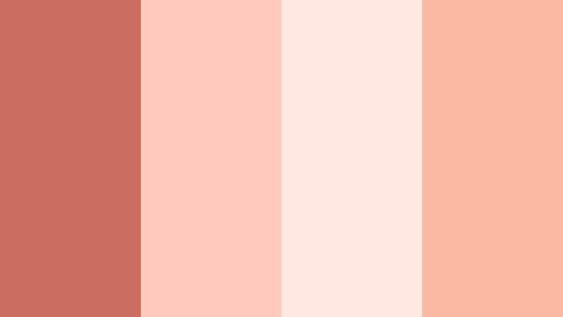
secure downloadRose Clay Diary

- HEX Codes: #cf6f5f, #f4b6a5, #ffe3da, #f7cbc0
- Mood: Soft, heartfelt, and confessional, like pages from a personal journal.
- Use for: Great for talking head videos, honest storytime content, and podcast cover art.
Rose Clay Diary feels like a cozy corner where you share real stories. The base Coral Clay shade is slightly muted, while the surrounding rose and cream tones soften the overall look, making it ideal for introspective or vulnerable content.
Use the deeper coral for your name or episode titles, and the lighter rose tones for lower thirds and background shapes behind text. This palette works well in YouTube storytime thumbnails, podcast cover graphics, or chapter cards inside Filmora for series based content.
Petal Kiss Morning

- HEX Codes: #c76353, #ffcab7, #ffece4, #f6b199
- Mood: Fresh, tender, and optimistic like the first light hitting flower petals.
- Use for: Lovely for morning routines, self care edits, and wellness channel branding.
Petal Kiss Morning combines airy corals with milky whites to give your visuals a clean, luminous feeling. It captures the vibe of slow mornings, skincare routines, and quiet rituals.
Use the softest cream as a background color for text overlays, with Coral Clay accents for progress bars, checklist icons, or call to action buttons. In Filmora, you can apply these tones to animated titles, split screen layouts, and simple motion graphics to build a calm, wellness focused aesthetic.
Whispered Terracotta
- HEX Codes: #bd5d4e, #f0b09d, #fde4d8, #f7c1ac
- Mood: Calm, grounded, and intimate with a handcrafted warmth.
- Use for: Use for aesthetic journaling videos, slow living b-roll, and cozy studio tours.
Whispered Terracotta leans into earthy warmth, with Coral Clay deepened toward terracotta and surrounded by soft, clay like neutrals. It instantly adds a handcrafted, artisanal vibe to your scenes.
In journaling videos or studio tours, use the darker coral for borders and dividers, while letting the pale terracotta shades support handwritten fonts or sketch like graphics. This palette also looks great as a consistent thumbnail frame color around all your uploads, helping your channel stand out in a subtle, organic way.
Blossom Studio Glow
- HEX Codes: #cb6e5f, #ffc9bb, #ffe8df, #f9b9a2
- Mood: Creative, feminine, and softly radiant like a sunlit atelier.
- Use for: Perfect for artist behind the scenes clips, DIY tutorials, and Etsy shop promos.
Blossom Studio Glow wraps Coral Clay in blossom pinks and creamy whites, creating an approachable, feminine studio feel. It brings softness without losing energy, which is ideal for makers and creative entrepreneurs.
Use Coral Clay for main headlines or price tags in product promos, and let the blush tones frame close ups of your hands, tools, or artwork. In Filmora, combine these colors with simple slide in title animations for reels, Etsy listing videos, or DIY tutorials that feel cohesive and on brand.
Warm And Cinematic Coral Clay Color Palettes
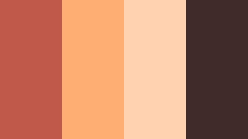
Desert Lens Dream

- HEX Codes: #c66755, #e99b71, #ffd9b5, #9a5b3d
- Mood: Cinematic, adventurous, and sun baked like a road trip through the desert.
- Use for: Great for travel films, cinematic b-roll sequences, and drone landscape shots.
Desert Lens Dream pairs Coral Clay with dusty golds and earthy browns to mimic sun scorched landscapes. It has a naturally cinematic feel that works beautifully with wide shots and textured terrain.
Grade your footage to push midtones toward Coral Clay while highlights pick up the golden tones. Then, use the darker brown for typography or frame lines in travel intros and end screens. This palette also suits adventure thumbnails that mix silhouettes with glowing skies.
Clay City Golden Hour

- HEX Codes: #cb6a59, #ffb87a, #ffd9c1, #5f3b32
- Mood: Urban yet warm, echoing golden hour reflections on city walls.
- Use for: Use for cinematic city montages, fashion lookbooks, and music video color grades.
Clay City Golden Hour warms up concrete and glass with Coral Clay and amber highlights. The palette balances soft peach lights with a rich brown shadow that grounds the image.
Use this scheme when you want to give city footage a more human feel. In Filmora, apply the Coral Clay tone to title cards, lower thirds, or lyric overlays, while adjusting your grade so building facades and skin tones catch the peachy glow for a cohesive golden hour story.
Campfire Frames

- HEX Codes: #c45d4c, #ff934f, #ffd4b3, #60332d
- Mood: Cozy, nostalgic, and slightly rugged like stories shared by the fire.
- Use for: Perfect for camping vlogs, cabin weekends, and storytelling shorts.
Campfire Frames leans into fiery Coral Clay and ember oranges, contrasted with deep wood browns. It is the visual equivalent of sitting around a fire telling stories late at night.
Use the bright orange for accent shapes, progress bars, or animated icons, while the darker brown underpins title cards or chapter markers. This palette is great for travel storytellers and outdoor channels who want warmth and nostalgia in their edits without oversaturating everything.
Vintage Reel Coral

- HEX Codes: #c36b59, #f3ab8c, #fdd5b8, #7c5247
- Mood: Retro, analog, and slightly faded like an old film reel.
- Use for: Great for retro style travel diaries, nostalgic family compilations, and Super 8 inspired edits.
Vintage Reel Coral softens Coral Clay into dusty peaches and cocoa browns, evoking old prints and analog film. It is ideal when you want your content to feel like found footage or a memory.
Add subtle grain and a slight fade in Filmora to complete the retro illusion, using the Coral Clay shade for simple serif titles. This palette also works well in family compilations or throwback reels where nostalgia is the core emotion.
Terracotta Spotlight
- HEX Codes: #bf5a4a, #ffae73, #ffd2b0, #3f2c2a
- Mood: Dramatic, artistic, and focused like a stage light on a performer.
- Use for: Use for dance videos, creative portraits, and cinematic shorts with bold lighting.
Terracotta Spotlight contrasts rich Coral Clay and molten amber with deep, nearly black browns that act like shadows. This creates a strong sense of focus, making it perfect for performance based content.
Place your subject in warm pools of light while keeping the background darker, then reflect this contrast in your graphics: bright Coral Clay titles over dark panels, soft peach highlights on call to action buttons. The palette helps faces and movement stand out in both landscape and vertical edits.
Modern And Minimal Coral Clay Color Palettes
Clay Neutral Workspace

- HEX Codes: #c66b5b, #f5d4c5, #f9e9de, #8a7b71
- Mood: Calm, productive, and modern with a soft creative edge.
- Use for: Ideal for productivity channels, desk setups, and Notion or workflow tutorials.
Clay Neutral Workspace tones Coral Clay down with light neutrals and taupe, creating a clean but warm environment for productivity content. It avoids harsh whites and blacks while still looking minimal.
Use the main Coral Clay hue sparingly for key highlights like video titles, subscribe buttons, or section headers, and lean on the neutrals for backgrounds and body text. This keeps your workspace tutorials easy to read and follow while feeling more human than a stark monochrome palette.
Soft Grid Interface

- HEX Codes: #cc6f5f, #f7ddd1, #fef5f0, #77757a
- Mood: Sleek, digital, and approachable, ideal for UI and motion graphics.
- Use for: Use for app explainers, SaaS promos, and lower thirds in tutorials.
Soft Grid Interface blends Coral Clay with off whites and a cool gray accent, making it perfect for clean overlays and UI inspired motion graphics. It feels modern, but less cold than pure gray and blue schemes.
In Filmora, use Coral Clay for buttons, icons, and main callouts within your explainer videos, while the gray supports legible text and timelines. This palette works especially well for tech channels and SaaS demos that want to feel friendly rather than overly corporate.
Editorial Clay Contrast

- HEX Codes: #c35a4b, #f5c9b6, #fff5ee, #222124
- Mood: Bold yet editorial, with magazine style contrast and clarity.
- Use for: Great for minimalist thumbnails, fashion editorials, and channel branding packs.
Editorial Clay Contrast brings together punchy Coral Clay, crisp ivory, and deep black to create a high end, magazine like feel. The strong contrast helps thumbnails and titles stand out immediately.
Use Coral Clay as a headline color against the light background and reserve the near black shade for body text or supporting details. This palette is ideal for fashion, beauty, or design channels that want a minimal but premium aesthetic across intros, lookbook titles, and social graphics.
Studio Loft Coral

- HEX Codes: #c76454, #f2c1aa, #f9e5d8, #6b6b69
- Mood: Lofty, creative, and urban with a polished minimal touch.
- Use for: Perfect for studio tours, gear breakdowns, and creator brand kits.
Studio Loft Coral mixes Coral Clay with pale sand tones and a subtle concrete gray, echoing modern loft interiors. It feels creative and urban without becoming cluttered or busy.
Use the Coral Clay accent to highlight gear names, chapter titles, or key specs in your videos, while the sand and gray tones sit behind talking heads and close ups. This palette works especially well for branding your overlay pack or motion titles so your channel identity feels consistent across different series.
Playful And Social Coral Clay Color Palettes
Coral Confetti Feed

- HEX Codes: #cb6a5a, #ffb7a8, #ffe9cf, #ffd46b, #5a4a4a
- Mood: Playful, social, and energetic like a burst of confetti on screen.
- Use for: Use for Instagram reels, TikTok edits, and playful YouTube channel art.
Coral Confetti Feed turns Coral Clay into a social ready mix by adding sunny yellow and soft creams, anchored with a deep brown. It is bright and fun without feeling overly neon or childish.
Use the yellow for badges, stickers, and animated emojis in your vertical edits, while Coral Clay handles main text and icons. The cream tones keep everything readable, and the dark brown is perfect for high contrast text. This palette is designed to stop the scroll on Reels, Shorts, and TikTok covers.
Tropical Clay Splash

- HEX Codes: #c7604f, #ffa686, #ffe2c0, #1f7f7a, #123b40
- Mood: Tropical, bold, and refreshing with poolside energy.
- Use for: Great for summer lookbooks, travel vlogs, and beach day highlight reels.
Tropical Clay Splash pairs spirited Coral Clay with teal and deep sea green, creating a poolside, vacation ready palette. The warm and cool tones play off each other to keep things bold but balanced.
Use Coral Clay for titles and key frames, the bright teal for accent shapes and transitions, and the deep sea green behind white text for strong contrast. This palette excels in summer lookbooks, resort vlogs, and any content where water and sunlight are central themes.
Tips for Creating Coral Clay Color Palettes
Coral Clay is versatile, but it really shines when paired thoughtfully with neutrals, supporting hues, and contrast colors. Use these tips to adapt the palettes above or design your own for video and design work.
- Pair Coral Clay with soft creams or light beiges to keep your layouts breathable and avoid visual overload, especially in intros and end screens.
- Add a single deep anchor color (dark brown, charcoal, or deep green) so text remains readable on thumbnails, lower thirds, and channel banners.
- Use brighter supporting colors like yellow or teal sparingly as accents for buttons, icons, and CTAs rather than main backgrounds.
- When color grading in Filmora, push midtones slightly toward Coral Clay while keeping highlights fairly neutral to maintain natural skin tones.
- Check your designs on both light and dark mode devices to ensure Coral Clay text and elements stay legible in different environments.
- Save your favorite Coral Clay HEX codes as preset colors in Filmora so you can reuse them for titles, shapes, and overlays across multiple projects.
- For branding, choose one primary Coral Clay shade, one light neutral, and one dark accent, then reuse them consistently in all your video assets.
- Test your palette on a single thumbnail or short clip first; if it communicates the mood you want at a glance, apply it to the rest of your series.
Coral Clay palettes can make your visuals feel warm, personal, and cinematic all at once. Whether you are telling intimate stories, showcasing creative work, or building an on brand social feed, these HEX based color combinations give you a clear starting point.
Try them inside Filmora for your intros, overlays, transitions, and grades, and save your favorite looks as presets. Over time, a consistent Coral Clay theme will help your audience recognize your videos instantly in their feed.
Open a new project, drop in one of these palettes, and start experimenting with titles, filters, and AI powered color tools until your Coral Clay aesthetic feels uniquely yours.
secure download