
 100% Security Verified | No Subscription Required | No Malware


 ChatGPT
 Perplexity
 Gemini
 Claude
 Grok
Grok
Cream White sits between pure white and warm beige, bringing softness without losing clarity. It feels calm, cozy, and premium at the same time, which is why it works so well for lifestyle brands, minimalist layouts, and cinematic frames. In video and design, Cream White reduces harsh contrast, flatters skin tones, and lets your main subject or text stand out without shouting.
For creators and Filmora users, a well-planned Cream White color palette can unify YouTube thumbnails, intros, lower thirds, end screens, and social clips into a consistent visual identity. Below are ready-made Cream White color palettes with HEX codes you can copy straight into your branding, motion graphics, and color grading to get an elegant, polished look fast.
In this article
Soft & Minimal Cream White Color Palettes
Sunlit Linen Calm

- HEX Codes: #fdf8ee, #f5e8d8, #e2d2b8, #c7b59a, #a28c6a
- Mood: Gentle, airy, and comforting, like morning light through sheer curtains.
- Use for: Ideal for clean YouTube intros, lifestyle vlogs, and minimalist channel branding that should feel soft but polished.
Sunlit Linen Calm feels like opening a window onto a quiet, bright morning. The warm Cream White base and linen-inspired neutrals keep everything bright without the clinical feel of pure white. The deeper beige tones add just enough weight for text, icons, or UI elements to sit comfortably on screen.
Use this palette for minimalist thumbnails, soft lifestyle vlog titles, and subtle lower thirds in Filmora. It works especially well for channels about home, journaling, self-improvement, and cozy workspaces, where you want visuals to feel inviting and warm but still modern and tidy.
Pro Tip: Build a Soft Cream White Aesthetic in Filmora
To keep a Sunlit Linen Calm look across an entire edit, treat your background, text, and overlays as one connected system. In Filmora, you can set your title cards, caption bars, and callout shapes to these HEX codes, then save them as custom presets. That way, every new intro, B-roll label, or end screen automatically matches your Cream White aesthetic.
Combine bright but gentle exposure with slightly lowered contrast so the creams stay soft and airy. Use the lightest tones (#fdf8ee and #f5e8d8) for backgrounds, and reserve the mid beiges (#c7b59a and #a28c6a) for text or buttons to ensure readability in your thumbnails and social cuts.
AI Color Palette
If you have a reference frame or mood board image that already uses this kind of Cream White, Filmora's AI Color Palette feature can automatically transfer that look to your entire timeline. Import your clip or image with the Sunlit Linen Calm tones, pick it as the reference, and let Filmora replicate its color balance across your vlog, intro, and B-roll.
This is a fast way to avoid mismatched whites from different cameras or lighting setups. The AI Color Palette helps keep your creams consistent, your beiges cohesive, and your overall brand aesthetic unified from thumbnail to final frame.
 secure download

HSL, Color Wheels & Curves
To refine a Cream White look like this, open the advanced color panel in Filmora and use HSL, color wheels, and curves. Shift yellows and oranges slightly warmer in HSL to keep skin tones flattering while preserving the soft neutral background. With the color wheels, gently cool the shadows and warm the highlights to avoid muddy beige and keep the image clean.
On the curves, lift the blacks a touch and soften the highlight roll-off so the brightest Cream Whites do not clip. The combination of these tools, as shown in Filmora's color grading controls, lets you fine-tune exactly how creamy or crisp your whites feel from scene to scene.
secure download1000+ Video Filters & 3D LUTs
If you want a faster route to a stylized Cream White look, Filmora's video filters and 3D LUTs make it easy to experiment. Start with a light, cinematic LUT, then dial down the intensity so it only gently tints your creams, beiges, and browns. This keeps your Sunlit Linen Calm palette intact while adding a consistent mood.
You can also layer subtle diffusion or glow filters to enhance the soft, airy character of this palette. Save your favorite combination as a custom preset so every new vlog, reel, or community post can instantly match your established Cream White style.
secure downloadMuted Studio Glow

- HEX Codes: #fdf9f3, #e9e0d4, #c6b8a6, #8e8070
- Mood: Balanced and understated, with a softly professional studio feel.
- Use for: Works well for tutorial overlays, product explainers, and talking-head setups that need a neutral yet sophisticated backdrop.
Muted Studio Glow leans into soft creams and taupes that feel like a well-lit studio wall. The palette is neutral enough to suit almost any niche but still has character, thanks to the gentle brown-gray anchor tone.
Use the lightest colors for background plates in your explainers or screen recordings, and the deeper taupes for clean text and icons. It is perfect for educational channels, productivity content, SaaS demos, and any thumbnail that should look calm, reliable, and professional without feeling cold.
Quiet Morning Desk
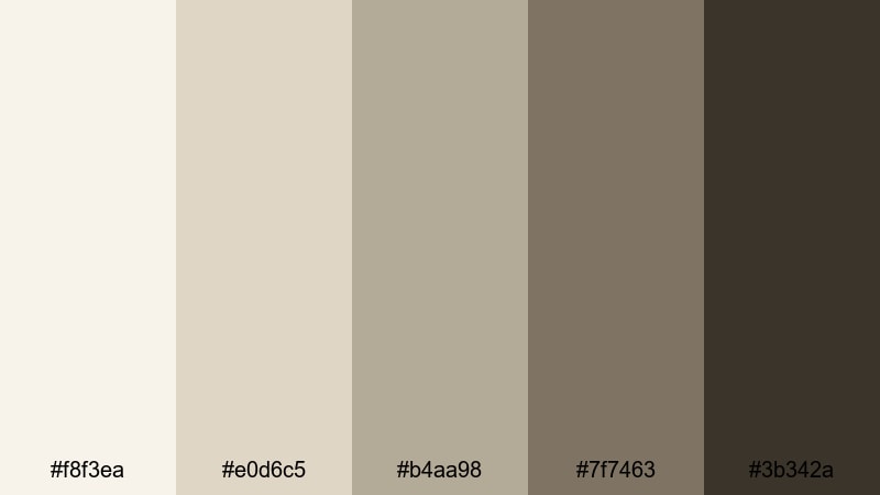
- HEX Codes: #f8f3ea, #e0d6c5, #b4aa98, #7f7463, #3b342a
- Mood: Cozy, introspective, and slightly moody, like journaling at dawn.
- Use for: Great for study-with-me content, productivity vlogs, and subtle title cards for long-form videos.
Quiet Morning Desk mixes creamy highlights with deep ink-brown shadows, giving you a balanced, introspective look. The palette feels like warm paper, worn leather, and a cup of coffee beside your notebook.
In Filmora, this works wonderfully for study-with-me overlays, gentle timers, and long-form productivity vlogs where you want low distraction but a bit more depth. Use the darkest shade for body text and timestamp bars, and the mid-tones for subtle frames around your footage or thumbnail subject.
Featherlight Interface
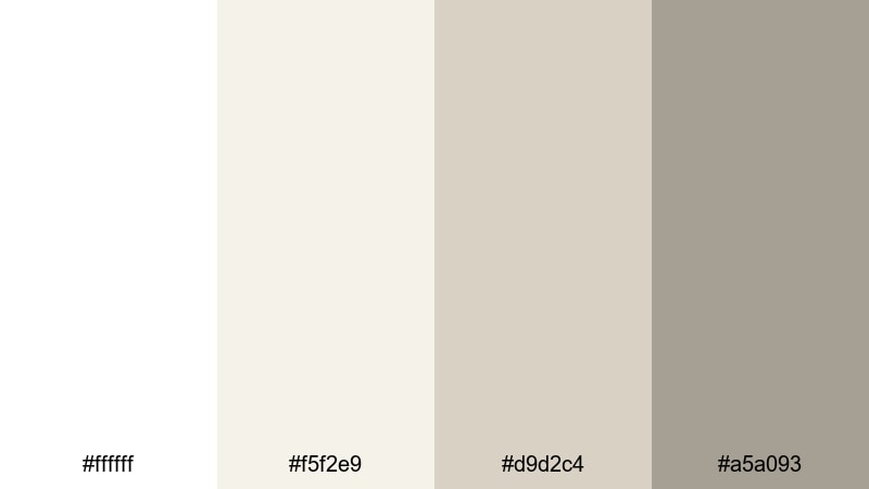
- HEX Codes: #ffffff, #f5f2e9, #d9d2c4, #a5a093
- Mood: Crisp, ultra-light, and modern, with a barely-there softness.
- Use for: Perfect for app-style overlays, UI mockups in videos, and clean tutorial lower thirds.
Featherlight Interface sits very close to pure white, but with a soft greige undertone that stops it from feeling harsh. It is made for tech and design content that needs clarity and legibility above all else.
Use the brightest tones for clean, blank-space backgrounds in your app demos and UI animations, and the darker greige for understated text and icons. For thumbnails, combine the near-white background with a single accent color from your brand to make your subject pop without crowding the frame.
Romantic & Vintage Cream White Color Palettes
Antique Lace Memoir
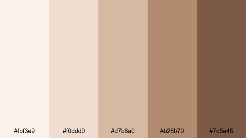
- HEX Codes: #fbf3e9, #f0ddd0, #d7b8a0, #b28b70, #7d5a45
- Mood: Nostalgic and tender, like leafing through an old lace-lined photo album.
- Use for: Suited for wedding highlights, heritage documentaries, and sentimental slideshow openings.
Antique Lace Memoir wraps your footage in the warmth of old photographs and heirloom fabrics. The creamy base and faded peach-browns create a timeless, story-driven mood that flatters skin tones and softens backgrounds.
Apply this palette to wedding highlight reels, anniversary slideshows, or family-history videos in Filmora. Use the lighter tones for backgrounds and photo frames, and reserve the deep chestnut shade for names, dates, and delicate script titles in your intros and end cards.
Blush Porcelain Dream
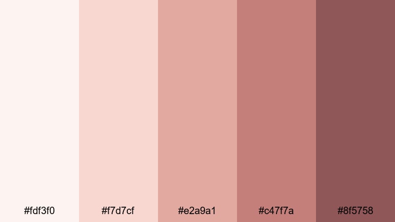
- HEX Codes: #fdf3f0, #f7d7cf, #e2a9a1, #c47f7a, #8f5758
- Mood: Softly romantic and feminine with a hint of vintage rose.
- Use for: Lovely for engagement reels, beauty tutorials, and brand intros aimed at a gentle, romantic aesthetic.
Blush Porcelain Dream pairs Cream White with romantic rose shades, creating a palette that feels delicate yet confident. It is ideal for brands or creators who want softness without going overly pastel or childish.
Use the lighter blush tones for gradient backgrounds in beauty tutorials, product close-ups, or perfume ads, and the richer rose for call-to-action buttons, subtitles, or logo marks. This palette can carry a full feminine brand system across thumbnails, IG reels, and long-form YouTube content.
Sepia Letterbox Love
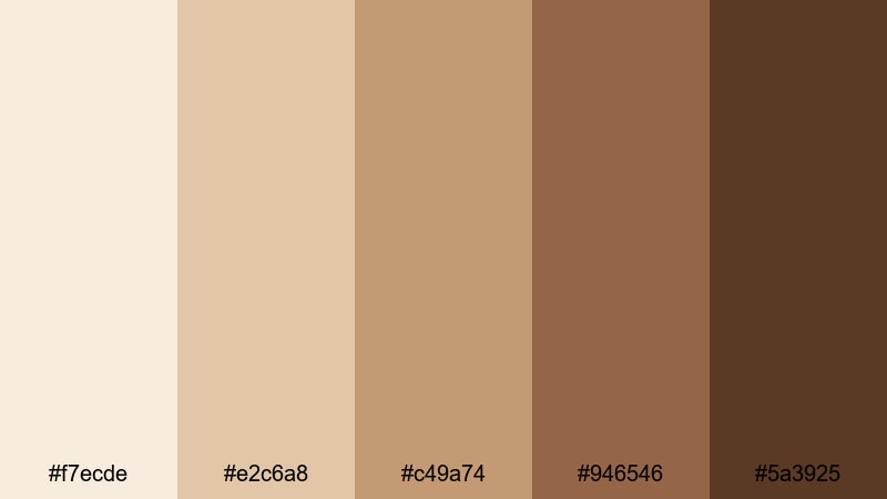
- HEX Codes: #f7ecde, #e2c6a8, #c49a74, #946546, #5a3925
- Mood: Warm, cinematic, and nostalgic, like sepia-toned film stills.
- Use for: Great for travel diaries, nostalgic storytime videos, and vintage-style title cards.
Sepia Letterbox Love is built to mimic old film stocks and photo prints. The creamy highlights melt into rich caramel and deep sepia shadows, giving your footage an instant cinematic nostalgia.
Use this palette when you add letterbox bars to travel diaries, road-trip montages, or reflective voice-over stories. In Filmora, combine these colors with a slight vignette and subtle grain to sell the retro mood in your intros, transitions, and outro frames.
Rose Gold Keepsake
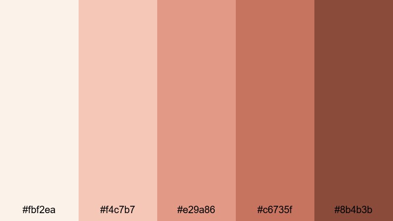
- HEX Codes: #fbf2ea, #f4c7b7, #e29a86, #c6735f, #8b4b3b
- Mood: Elegant, warm, and sentimental, like a treasured rose gold locket.
- Use for: Ideal for luxury wedding edits, jewelry promos, and soft cinematic openers.
Rose Gold Keepsake blends Cream White with metallic rose and copper tones for a luxurious, romantic impression. It feels high-end but still approachable, making it perfect for brands that want to suggest quality and intimacy.
Use the lighter creams and peaches for backgrounds around product shots, and the deeper copper shades for text, frames, or logo reveals. In thumbnails, a Cream White backdrop with a bold rose gold title can immediately signal elegance and style.
Modern & Luxurious Cream White Color Palettes
Champagne Loft Luxe

- HEX Codes: #fcf3e5, #edd9b8, #d4b484, #a98a5a, #715433
- Mood: Upscale and celebratory, like a golden-hour toast in a city loft.
- Use for: Great for fashion lookbooks, launch trailers, and premium lifestyle brand intros.
Champagne Loft Luxe combines Cream White with champagne gold, offering a warm, festive luxury. It feels like sunset light over brushed metal and polished wood, making it ideal for premium products and stylish creators.
Apply this palette to launch trailers, lookbooks, and brand videos where you want subtle glamour. Use the lighter creams as the base and the mid golds for headings, overlays, and animated accents in Filmora, while the deepest brown-gold shade can anchor logos and CTAs.
Marble Lobby Shine
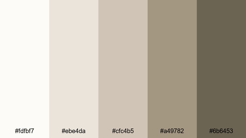
- HEX Codes: #fdfbf7, #ebe4da, #cfc4b5, #a49782, #6b6453
- Mood: Refined and corporate-chic, like a high-end hotel lobby.
- Use for: Perfect for brand decks, corporate explainers, and channel branding that needs quiet luxury.
Marble Lobby Shine is inspired by polished stone and soft lobby lighting. The layered neutrals feel structured and professional but still welcoming, making this palette a strong fit for brands that want to project trust.
In Filmora, use these tones for clean corporate openers, title slides, and infographic segments. The darker taupe can be your main text color, while the mid-light neutrals act as cards behind charts, lower thirds, and iconography for business content.
Pearl Spotlight Intro
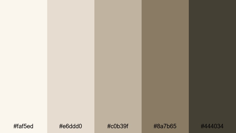
- HEX Codes: #faf5ed, #e6ddd0, #c0b39f, #8a7b65, #444034
- Mood: Sleek and cinematic, with a muted spotlight effect.
- Use for: Great for channel intros, logo reveals, and cinematic trailers that need subtle drama without harsh contrast.
Pearl Spotlight Intro combines pearl-toned creams with smoky neutrals to mimic a soft spotlight in a dark studio. It offers gentle contrast that feels cinematic without going overly bold or colorful.
Use the lightest tones as a vignette-like halo around your logo or title, and the darker hues as backgrounds for credits, text animations, and teaser cards. It is a strong choice for tech unboxings, studio tours, or any channel that wants a modern, cinematic Cream White base.
Vanilla Gold Premiere

- HEX Codes: #fdf4e6, #f0d6a8, #d3b06b, #a9823c, #6b4e23
- Mood: Warm, glamorous, and bold enough for a premiere night.
- Use for: Ideal for trailer-style edits, bold title cards, and packaging mockups for premium products.
Vanilla Gold Premiere pushes Cream White into bolder golds for an unmistakably glamorous feel. It is the kind of palette that looks like an award show graphic or luxury product launch.
Use the soft vanilla shade as your base, then bring in the mid and deep golds for strong title cards, countdowns, and hero text. In thumbnails, a Cream White backdrop with high-contrast gold lettering immediately suggests something exclusive and event-worthy.
Fresh & Natural Cream White Color Palettes
Olive Orchard Breeze
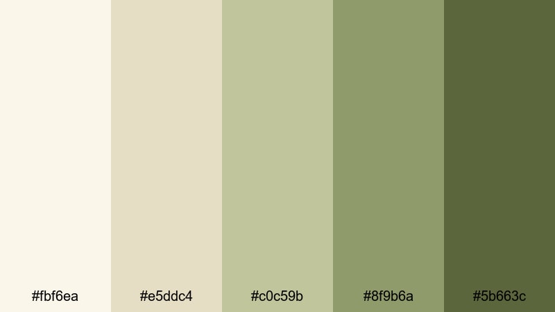
- HEX Codes: #fbf6ea, #e5ddc4, #c0c59b, #8f9b6a, #5b663c
- Mood: Earthy and calm, like walking through a sunlit olive grove.
- Use for: Great for slow living vlogs, farm-to-table content, and eco-friendly brand intros.
Olive Orchard Breeze pairs Cream White with gentle olive greens for an organic, grounded vibe. It feels like linen tablecloths, fresh herbs, and dappled sunlight, perfect for nature-centered content.
Use the lighter tones as your background for recipe cards, chapter titles, and location tags, and the deeper olives for buttons, badges, and highlight text. It suits sustainability brands, gardening channels, and any slow living content where calm, natural visuals matter.
Eucalyptus Bath Steam
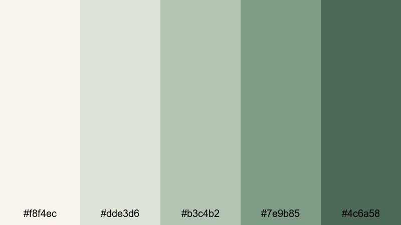
- HEX Codes: #f8f4ec, #dde3d6, #b3c4b2, #7e9b85, #4c6a58
- Mood: Spa-like, refreshing, and quietly uplifting.
- Use for: Perfect for self-care routines, skincare promos, and wellness channel branding.
Eucalyptus Bath Steam combines Cream White with misty, desaturated greens that feel airy and spa-inspired. The palette is refreshing but gentle on the eyes, ideal for long-form wellness or ASMR content.
Use the palest tones for spacious backgrounds, product text overlays, and step-by-step instructions. Let the deeper greens highlight key information like step numbers, benefit lists, or discount codes in thumbnails and end screens.
Coastal Shell Shore
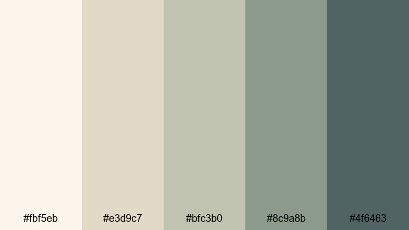
- HEX Codes: #fbf5eb, #e3d9c7, #bfc3b0, #8c9a8b, #4f6463
- Mood: Breezy and relaxed, like collecting shells on a quiet beach.
- Use for: Great for travel vlogs, beach wedding edits, and airy lifestyle reels.
Coastal Shell Shore marries Cream White with shell-inspired neutrals and sea-glass greens and blues. It feels breezy, light, and slightly coastal without being too blue or saturated.
Use this palette for seaside travel vlogs, beach weddings, and soft summer lookbooks. Light tones make perfect chapter cards or map overlays, while the darker teal-gray brings definition to titles, location tags, and navigation elements in your Filmora projects.
Tips for Creating Cream White Color Palettes
When you build your own Cream White color palette for video or design, think about balance: enough warmth to feel inviting, enough contrast for readability, and enough variety for text, backgrounds, and accents to each have their place.
- Pick a base Cream White that is slightly warm rather than pure white; it will be kinder to skin tones and easier on the eyes in thumbnails and long videos.
- Add one or two darker neutral tones (taupe, brown, olive, or charcoal) for legible text and UI elements; always test readability on mobile-sized previews.
- Limit your accent colors; one or two accent hues alongside Cream White is usually enough to keep branding clean and recognizable.
- Match your footage to your graphics by adjusting white balance and exposure in Filmora so backgrounds and highlights sit close to your chosen Cream White HEX code.
- Use higher contrast for small text and crucial calls to action, and lower contrast for large background shapes or overlays that should not distract.
- Create a hierarchy: reserve the deepest color for headlines or buttons, mid-tones for subtitles and icons, and the lightest cream for backgrounds.
- Check your palette in both light and dark environments by previewing on different screens; tweak saturation and brightness so it still looks elegant in each context.
- Save your go-to Cream White palette as reusable presets in Filmora (titles, color presets, LUT intensity) to keep every new project on-brand.
Cream White color palettes are powerful tools for shaping mood, clarity, and brand identity. With the right combinations, your intros feel softer, your thumbnails look more cohesive, and your entire channel or brand presence gets a calm, premium glow.
Use these 15 palettes as ready-made starting points, then refine them in Filmora until they match your exact aesthetic. Whether you are grading wedding highlights, designing tech explainers, or building a wellness brand, consistent Cream White tones can tie everything together on YouTube, Instagram, and beyond.
Open a new project in Filmora, drop in a few clips, and start applying these HEX codes to your titles, overlays, and color grading. Small adjustments to your Cream Whites can make your visuals look instantly more intentional and professional.
secure downloadNext: Champagne Color Palette
