
 100% Security Verified | No Subscription Required | No Malware


 ChatGPT
 Perplexity
 Gemini
 Claude
 Grok
Grok
Gold Blue is one of the most cinematic color pairings you can use. Deep blues communicate trust, depth, and calm, while gold adds warmth, luxury, and a sense of spotlight. Together they feel premium and modern at the same time, which is why you see this combo in movie posters, tech brands, and high end events.
For video creators, this makes Gold Blue perfect for YouTube thumbnails, intros, title cards, overlays, and even full channel branding. Below you will find ready to use Gold Blue color palettes with HEX codes that you can drop straight into Filmora and your design tools to keep your thumbnails, lower thirds, and social clips looking consistent and professional.
In this article
Elegant Gold Blue Color Palettes
Midnight Regalia
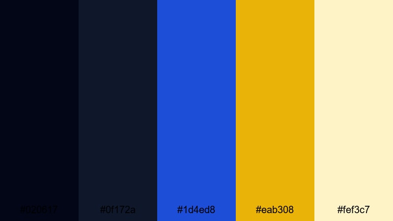
- HEX Codes: #020617, #0f172a, #1d4ed8, #eab308, #fef3c7
- Mood: Regal, dramatic, and luxurious with a cinematic nighttime feel.
- Use for: Perfect for luxury brand intros, title cards, and dramatic product reveals in video.
Midnight Regalia layers inky navy and royal blue with rich gold and soft champagne for a truly premium feel. The deep tones (#020617, #0f172a) give you a strong, cinematic background, while the gold and pale highlight colors pop beautifully on top.
Use the darkest blue as your base for frames, full screen title cards, or lower thirds. Drop the royal blue on buttons or icon details, and reserve the gold for logos, call to action text, or highlight borders in thumbnails. The champagne tone is ideal for subtle gradients, elegant subtitles, and UI elements in product demos or luxury themed videos.
Pro Tip: Build a Cinematic Gold Blue Look in Filmora
To keep Midnight Regalia consistent across an entire edit, start by setting your background and text colors in Filmora to match the HEX codes. Use the darkest blue for your title backgrounds and overlay shapes, then apply the gold accents only where you want viewers to focus, such as on product names or key stats.
You can save these colors in Filmora as custom swatches so that your intro, B roll captions, end screens, and social cutdowns all share the same Gold Blue identity. This helps your channel look more branded and cinematic, even if you are editing on a tight schedule.
AI Color Palette
If you have a still frame, branding board, or thumbnail mockup using Midnight Regalia, you can use Filmora's AI Color Palette feature to spread that look across your entire project. AI Color Palette analyzes the colors from a reference clip and applies a matching grade to other shots so your Gold Blue balance stays cohesive.
This works especially well for intros and product reveals where you want footage, text graphics, and B roll to share the same luxurious night look. Import your reference frame, run AI Color Palette on the rest of your clips, and then fine tune intensity to keep skin tones natural while your blues and golds stay on brand.
 secure download

HSL, Color Wheels & Curves
Once your Gold Blue base is in place, use Filmora's HSL, color wheels, and curves controls to polish the look. You can deepen the blues in the shadows for more drama, warm up midtones to make gold accents glow, or lift highlights slightly so text and logos stay readable over dark footage. Filmora's advanced color tools make it easy to adjust saturation and contrast without breaking your chosen palette.
Try pushing the blue hue slightly toward teal for a cooler, modern feel, or roll it toward indigo for a more royal, classic vibe. A gentle S curve on the RGB curve panel can give your Midnight Regalia grading more punch while keeping skin tones smooth and natural.
secure download1000+ Video Filters & 3D LUTs
If you want to stylize Midnight Regalia even faster, you can start from Filmora's built in presets. Filmora's video filters and 3D LUTs make it easy to add cinematic contrast, soft bloom, or a subtle fade to your Gold Blue look with just a few clicks.
Layer a film style LUT on top of your palette to get natural roll off in the highlights, or use glow and vignette filters to make golden titles feel like they are lit by spotlights in a dark theater. Save your favorite combinations as custom presets so every future intro or thumbnail can reuse the same Gold Blue style.
secure downloadRoyal Ballroom Glow
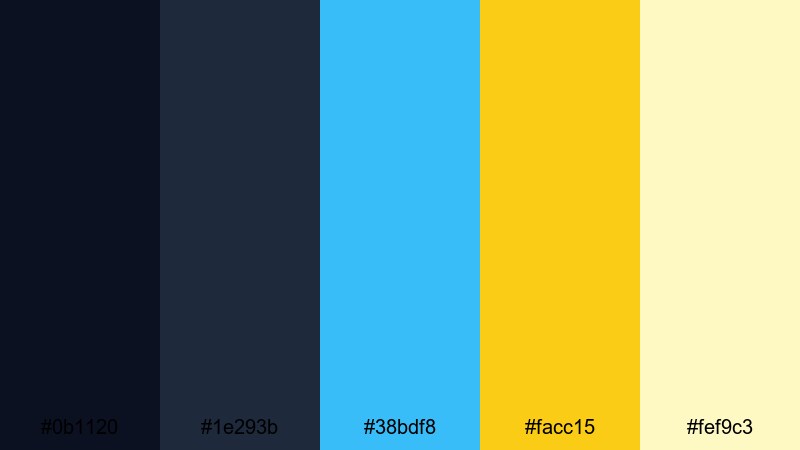
- HEX Codes: #0b1120, #1e293b, #38bdf8, #facc15, #fef9c3
- Mood: Opulent yet refined, like a grand evening event lit by chandeliers.
- Use for: Great for wedding highlight reels, fashion lookbooks, and editorial style thumbnails.
Royal Ballroom Glow mixes deep evening blues with a gentle sky blue and luminous gold. The palette feels like a candlelit hall where the darkest tones frame the scene and the golden accents pick out jewelry, fabrics, and elegant typography.
Use the light blue and cream tones for soft backgrounds in romance videos, wedding highlight reels, or fashion lookbooks. Let the gold accent your key titles, lower thirds with names and roles, or callouts on thumbnails to signal luxury without feeling too loud.
Gilded Navy Minimal
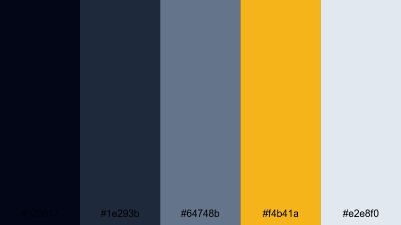
- HEX Codes: #020617, #1e293b, #64748b, #f4b41a, #e2e8f0
- Mood: Minimal, modern, and polished with subtle luxury accents.
- Use for: Use in clean UI overlays, lower thirds, and corporate explainers that need a premium touch.
Gilded Navy Minimal keeps things clean and modern. The cool navy and slate blues create a serious, professional base that works perfectly for tech, SaaS, or corporate presentations, while a single focused gold tone gives just enough luxury.
Use the light gray as your neutral canvas for infographics, charts, and UI mockups, then lean on gold for key metrics, subscribe buttons, or logo reveals in your explainers. In thumbnails, a navy backdrop with gold text offers great contrast and feels instantly high end.
Champagne Sapphire Gala
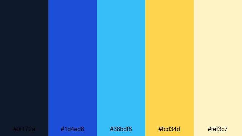
- HEX Codes: #0f172a, #1d4ed8, #38bdf8, #fcd34d, #fef3c7
- Mood: Festive, sparkling, and sophisticated like a high end gala.
- Use for: Perfect for event recaps, launch trailers, and celebration themed openers.
Champagne Sapphire Gala blends rich sapphire blues with bright gold and champagne highlights for a glamorous, party ready atmosphere. It feels like confetti and stage lights over an elegant night sky.
Use the brighter blues in animated lines, transitions, or progress bars, while the gold and champagne shades make confetti, badges, or animated text shine. This palette is ideal for milestone videos, launch trailers, and any thumbnail where you want to shout celebration but still look polished.
Bold Gold Blue Color Palettes
Electric Aurora Crest
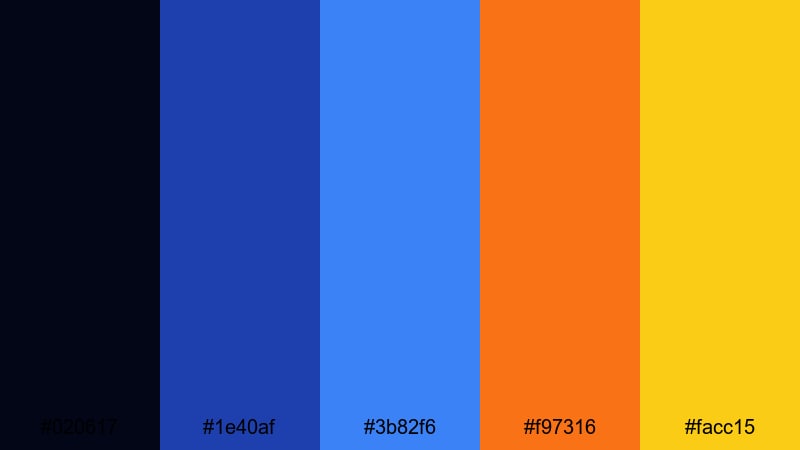
- HEX Codes: #020617, #1e40af, #3b82f6, #f97316, #facc15
- Mood: High energy and electric, with a bold neon edge.
- Use for: Best for gaming intros, high tempo sports edits, and dynamic YouTube thumbnails.
Electric Aurora Crest pushes blue into a vivid, high energy space and charges it with orange and gold accents. The strong contrast between deep navy, neon like blues, and warm highlights grabs attention instantly.
Use this palette for fast paced gaming intros, sports montages, or hype reels. The orange and gold are perfect for kill counts, scores, timers, and subscribe buttons, while the blues form streaky motion graphics and glitch transitions that read clearly on mobile.
Neon Harbor Royal
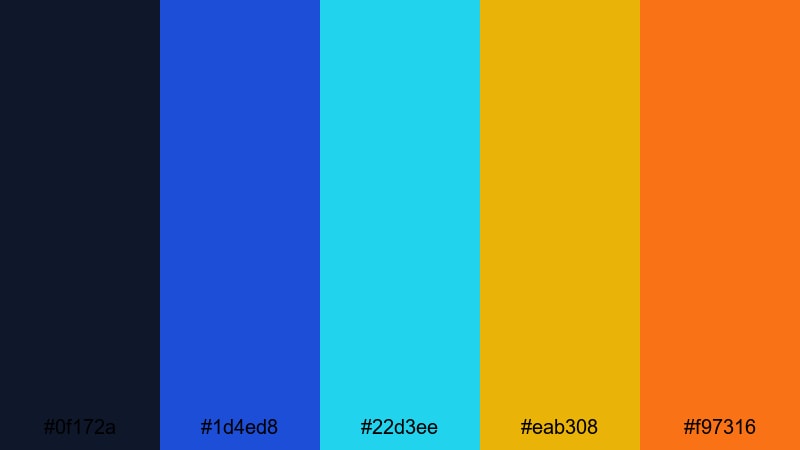
- HEX Codes: #0f172a, #1d4ed8, #22d3ee, #eab308, #f97316
- Mood: Vibrant, modern, and slightly futuristic with nightlife vibes.
- Use for: Great for music videos, club promos, and reels that need a nightlife inspired punch.
Neon Harbor Royal feels like a city harbor at night lit by neon. Deep navy anchors the palette so the cyan and royal blue can glow, while gold and orange add a club light intensity.
Use the neon cyan for outlines, glows, and animated strokes around text or people. Gold and orange can highlight beats, transitions, or lyrics in music videos. It is perfect for nightlife vlogs, DJ promo reels, or any thumbnail that needs to scream energy and rhythm.
Turbo Stream Highlights
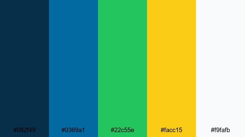
- HEX Codes: #082f49, #0369a1, #22c55e, #facc15, #f9fafb
- Mood: Energetic and optimistic with a sporty, streaming era attitude.
- Use for: Use for creator branding, esports channels, and energetic tutorial series.
Turbo Stream Highlights pairs fresh teals and blues with lime green and gold for a fast, modern interface style. It feels like a streaming dashboard crossed with a sports broadcast.
Use the bright green and gold for live indicators, subscribe callouts, and important stats in overlays. The light background color gives you a clean surface for text, while the darker teal and blue can frame webcams, chat boxes, and panels in your streaming or tutorial layouts.
Impact Frame Duo
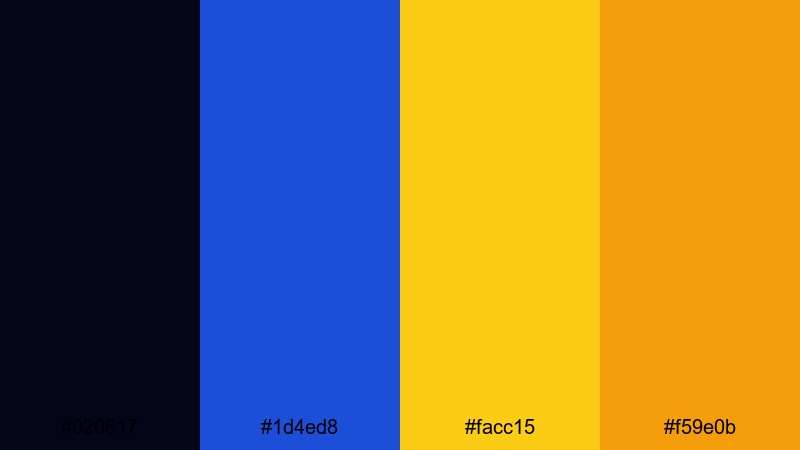
- HEX Codes: #020617, #1d4ed8, #facc15, #f59e0b
- Mood: Strong, confident, and attention grabbing with crisp contrast.
- Use for: Perfect for bold text on thumbnails, end screens, and punchy callout graphics.
Impact Frame Duo is short and sharp: dark blue, intense royal blue, and two bold golds. This high contrast combo makes titles extremely readable even over busy footage.
Use the darkest blue as a bar behind text in thumbnails or end screens, with white or gold lettering on top. The royal blue and deeper orange gold are great for borders, arrows, and stroke outlines that pull the eye directly to your subject or CTA button.
Soft Gold Blue Color Palettes
Morning Harbor Mist
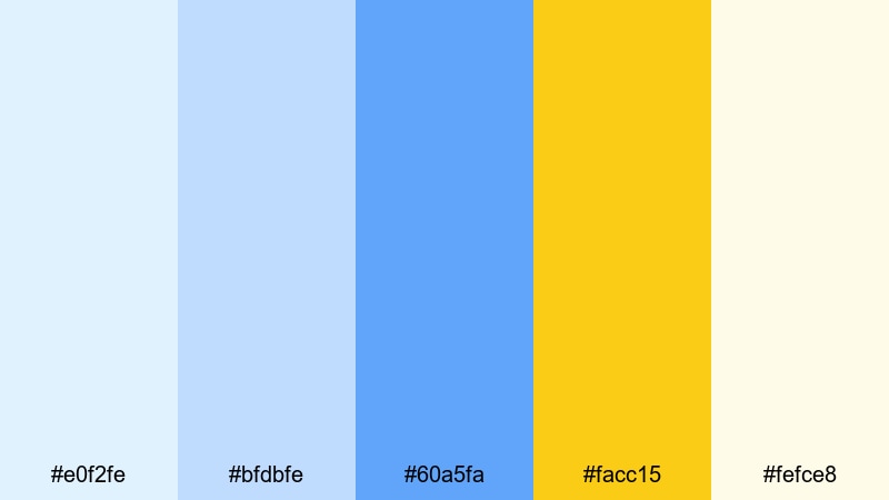
- HEX Codes: #e0f2fe, #bfdbfe, #60a5fa, #facc15, #fefce8
- Mood: Gentle, calm, and uplifting like a quiet morning by the sea.
- Use for: Use in lifestyle vlogs, travel diaries, and calm productivity videos.
Morning Harbor Mist is light, airy, and soothing. Soft sky blues paired with a gentle golden accent create a peaceful mood that suits morning routines, study-with-me content, and relaxed travel vlogs.
Use the paler blues for background blocks, lower thirds, and simple shapes behind text. Reserve the gold for subtle emphasis on chapter titles, timestamps, or call to action lines so your video feels calm but still visually guided.
Dusty Cornflower Luxe
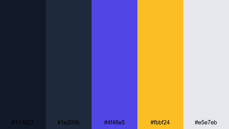
- HEX Codes: #111827, #1e293b, #4f46e5, #fbbf24, #e5e7eb
- Mood: Subtle, sophisticated, and slightly nostalgic.
- Use for: Great for educational content, podcasts, and storytelling channels with a calm tone.
Dusty Cornflower Luxe mixes muted blues and indigo with soft gold and light gray. It offers a sophisticated, low contrast look that feels calm and thoughtful, perfect for long form content.
Use the darker blues for frames and title backgrounds, then let the light gray hold body text or bullet points in explainer videos. The gold is ideal for highlighting key ideas, episode numbers, or important definitions without making your visuals feel noisy.
Cloudlight Gilded Drift
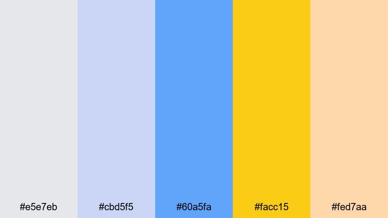
- HEX Codes: #e5e7eb, #cbd5f5, #60a5fa, #facc15, #fed7aa
- Mood: Dreamy, warm, and gentle with a whimsical touch.
- Use for: Perfect for family content, craft channels, and soft spoken voiceover videos.
Cloudlight Gilded Drift uses pale grays and powdery blues as a soft base, then adds warm gold and peach highlights for a dreamy, whimsical feel. It is kind and approachable, great for family friendly channels.
Turn these shades into soft gradients behind your titles, with gold and peach used for frames around photos, step labels, or simple doodle elements. It works beautifully in craft tutorials, parenting content, and any thumbnail aiming for warmth and trust.
Cinematic Gold Blue Color Palettes
Noir Premiere Credits
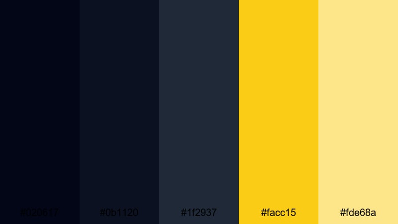
- HEX Codes: #020617, #0b1120, #1f2937, #facc15, #fde68a
- Mood: Moody, cinematic, and dramatic with a classic film feel.
- Use for: Use for short films, trailers, and dramatic story driven edits.
Noir Premiere Credits takes deep midnight blues and pairs them with golden highlights that echo old Hollywood posters. It feels serious, dramatic, and ideal for narrative work.
Use the darkest tones for your opening and closing credits backgrounds, letting gold and soft yellow highlight names, chapter titles, and key on screen text. This palette also works well in documentary style thumbnails, where a dark backdrop and golden type immediately suggest a cinematic story.
Deep Sea Title Card
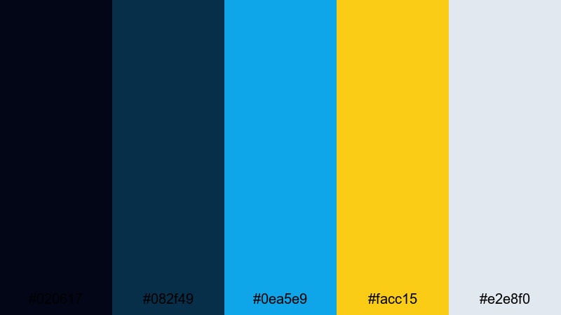
- HEX Codes: #020617, #082f49, #0ea5e9, #facc15, #e2e8f0
- Mood: Immersive and atmospheric with an adventurous edge.
- Use for: Great for documentary intros, travel openers, and underwater themed content.
Deep Sea Title Card layers dark oceanic blues with bright aqua and gold accents, creating a sense of depth and exploration. It feels like diving into unknown waters lit by beams of sunlight.
Use the dark blue gradient for title cards and chapter slates, then let the aqua trace map routes, lower third lines, or motion graphics around points of interest. Gold works well for accenting location names, dates, or important stats in your travel or nature documentaries.
Skyline Trailer Accent
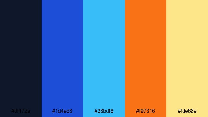
- HEX Codes: #0f172a, #1d4ed8, #38bdf8, #f97316, #fde68a
- Mood: Urban, dynamic, and modern with sunset over city vibes.
- Use for: Perfect for tech promos, startup reels, and cityscape b roll sequences.
Skyline Trailer Accent combines vibrant blues with warm sunset gold and orange. It captures the feeling of a city skyline just as the sun drops, when lights and sky colors mix.
Use the blues for cityscape overlays, UI elements, and text frames, while the orange and golden tones emphasize key phrases like "Beta Launch", "Trailer", or "New Episode". It suits tech promo reels, startup highlight videos, and fast paced urban B roll edits.
Retro Tape Memories
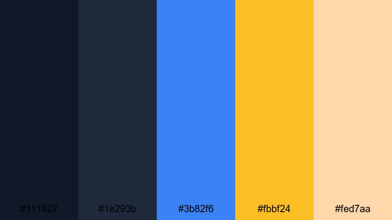
- HEX Codes: #111827, #1e293b, #3b82f6, #fbbf24, #fed7aa
- Mood: Nostalgic, warm, and story focused with a vintage hint.
- Use for: Use in memory montages, travel retrospectives, and documentary style vlogs.
Retro Tape Memories softens blues with warm golden and peach tones to mimic faded film stills. It feels nostalgic and personal, great for storytelling content.
Use the darker blues as a base for faux VHS frames, date stamps, or Polaroid style borders. Gold and peach can tint light leaks, overlays, or cursive titles to give your memory montages, family recaps, and travel retrospectives an emotional, vintage touch.
Tips for Creating Gold Blue Color Palettes
When you build your own Gold Blue color combinations for video and design, focus on balance, readability, and how the palette supports your story or brand identity.
- Use dark blues as your primary background tones and keep gold as an accent so your designs stay elegant, not overwhelming.
- Check text contrast on mobile by testing white, gold, and light blue text over your darkest blue; adjust brightness if subtitles feel hard to read.
- Limit yourself to 1 or 2 highlight colors (usually gold plus one support shade) so thumbnails and overlays remain clean.
- Match your palette to footage: cooler, desaturated blues feel more documentary, while saturated blues and bright golds feel more gaming or nightlife.
- Keep branding consistent by reusing the same HEX codes in your logo stings, lower thirds, end screens, and channel art.
- Use gradients that move from deep blue to lighter blue, then place gold elements on top; this helps draw the eye toward your subject or CTA.
- In Filmora, save your Gold Blue swatches and export presets so future edits automatically pick up the same color treatment.
- Be mindful of skin tones: if your blues are very strong, reduce saturation slightly or warm the midtones so faces stay natural and flattering.
Gold Blue color palettes are powerful tools for shaping mood, guiding attention, and making your brand look cohesive across platforms. From luxury intros and cinematic trailers to cozy vlogs and bold gaming thumbnails, this combination can be tuned to fit almost any creative style.
Try dropping a few of these palettes into Filmora, then build matching titles, overlays, and color grades around them. With AI Color Palette, HSL controls, and filters, you can quickly customize each scheme while staying true to its core Gold Blue character.
The more consistently you use these colors in your videos, thumbnails, and social clips, the faster your audience will recognize your channel and connect it with a clear, professional identity.
secure downloadNext: Teal Gray Color Palette
