
 100% Security Verified | No Subscription Required | No Malware


 ChatGPT
 Perplexity
 Gemini
 Claude
 Grok
Grok
Pastel orange sits between warm orange and soft peach, bringing a mood that feels optimistic, approachable, and gently energetic. It suggests sunrise light, cozy cafes, and friendly brands without the harshness of pure neon or saturated orange. On screen, this color helps content feel inviting and modern, which is why it shows up so often in lifestyle channels, productivity vlogs, and soft aesthetic feeds.
For video creators, YouTube thumbnails, social intros, and branding overlays, the right pastel orange color palette can instantly set the tone. Below are 15 ready-to-use pastel orange color combinations with HEX codes, designed for creators and Filmora users who want consistent visuals across intros, b-roll, titles, and channel branding.
In this article
Soft & Dreamy Pastel Orange Palettes
Sunrise Cream Glow
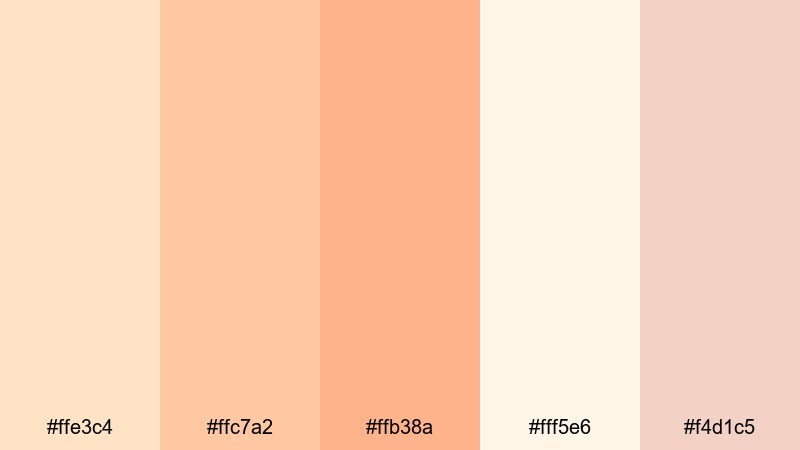
- HEX Codes: #ffe3c4, #ffc7a2, #ffb38a, #fff5e6, #f4d1c5
- Mood: Gentle, hopeful, and softly radiant.
- Use for: Ideal for sunrise vlog intros, calm travel reels, and dreamy lifestyle thumbnails.
Sunrise Cream Glow feels like the first warm light coming through a window. The creamy whites and soft oranges wrap your footage in a subtle glow that flatters skin tones and makes everything feel calm and uplifting.
Use this palette for vlog intros, morning routines, studio b-roll, and YouTube thumbnails where you want a fresh yet relaxed look. In titles, use the deeper orange for headlines and the lighter creams as backgrounds, lower-thirds, and subtle overlays across your Filmora timeline.
Pro Tip: Keep Your Sunrise Pastel Orange Aesthetic Consistent in Filmora
When you fall in love with a pastel orange mood like Sunrise Cream Glow, consistency is everything. In Filmora, you can save your favorite HEX codes as title colors, use them in shape layers, and reuse them across intros, lower-thirds, subscribe buttons, and end screens, so every video feels like part of the same visual world.
Combine these soft oranges with gentle fades, slow zooms, and light grain in Filmora to create a signature sunrise aesthetic that carries from your main video to Shorts, Reels, and community posts.
AI Color Palette
If you have a reference still or thumbnail mockup using Sunrise Cream Glow colors, you can let Filmora do the heavy lifting. Filmora's AI Color Palette feature analyzes your reference frame and transfers that pastel orange look to the rest of your clips in a few clicks.
Import your sunrise shot, choose it as the reference, and apply the AI Color Palette to your entire sequence. This keeps your oranges creamy instead of neon and maintains a soft, dreamy balance between highlights and shadows across the whole edit.
 secure download

HSL, Color Wheels & Curves
To keep pastel orange tones soft instead of harsh, adjust them carefully with Filmora's HSL controls, color wheels, and curves. You can desaturate the orange range slightly, lift the shadows to keep them creamy, and use the midtone wheel to nudge everything toward a warmer, sunrise feel.
For more advanced looks, use curves to add a gentle S-curve for contrast while protecting highlights from clipping. This is especially useful if you are matching multiple cameras or balancing your pastel orange aesthetic with other scenes, as shown in Filmora's color correction tools overview.
secure download1000+ Video Filters & 3D LUTs
If you want to stylize your pastel orange palettes quickly, Filmora’s video filters and 3D LUTs make it easy to experiment. Start with a clean grade, then layer subtle filters like film looks, soft focus, or light leaks that complement the warm orange tones instead of overpowering them.
Once you find a combination you love for your pastel orange aesthetic, save it as a custom preset. You can then apply it to vlogs, Shorts, or client work with a single click, keeping your brand look consistent across every upload.
secure downloadPeach Cloud Whisper
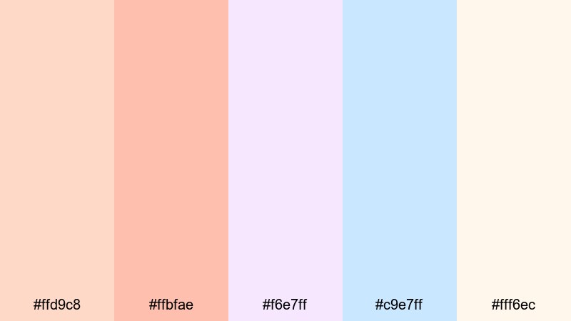
- HEX Codes: #ffd9c8, #ffbfae, #f6e7ff, #c9e7ff, #fff6ec
- Mood: Airy, delicate, and imaginative.
- Use for: Perfect for aesthetic study vlogs, journaling content, and cinematic b-roll overlays.
Peach Cloud Whisper mixes gentle peach tones with pale lavender and sky blue, giving your visuals a light, daydreamy feeling. It is ideal when you want a soft pastel look with enough contrast to keep text readable and subjects clear.
Try using the warmer oranges for main elements like titles or call-to-action buttons, and balance them with the cooler blues and lilacs in backgrounds, frames, or b-roll overlays. This palette works beautifully for Notion setup videos, desk tours, and quiet cinematic edits made in Filmora.
Blossom Apricot Mist
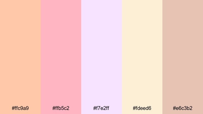
- HEX Codes: #ffc9a9, #ffb5c2, #f7e2ff, #fdeed6, #e6c3b2
- Mood: Romantic, nostalgic, and tender.
- Use for: Use for wedding highlight videos, engagement reels, or dreamy product lookbooks.
Blossom Apricot Mist brings together apricot, blush pink, and misty neutrals to create a soft floral feeling. It suggests bouquets, silk dresses, and golden-hour portraits without leaning into overly strong pink.
Use the richer apricot and blush shades for text, keyframes, and accent graphics, while the paler tones make perfect backdrops for wedding titles, logo animations, or romantic product reveals. In Filmora, this palette shines in slow-motion sequences, lens blur shots, and delicate typography animations.
Silk Petal Morning

- HEX Codes: #ffd4b2, #ffcabf, #f4e3da, #e9d1ff, #cde7f5
- Mood: Calm, graceful, and comforting.
- Use for: Great for slow-morning routines, skincare promos, and cozy home tours.
Silk Petal Morning feels like a spa day at home. Silky peach tones, soft lilacs, and cool blue accents combine to make your frames feel clean, hydrated, and relaxed.
Apply this palette to skincare flat-lays, home decor walkthroughs, or morning routines by using the warm oranges for skin and product labels, while the cooler lilacs and blues soften your backgrounds. Paired with smooth camera moves and soft music in Filmora, it creates a premium yet approachable lifestyle aesthetic.
Warm & Cozy Pastel Orange Palettes
Honeyed Latte Haze
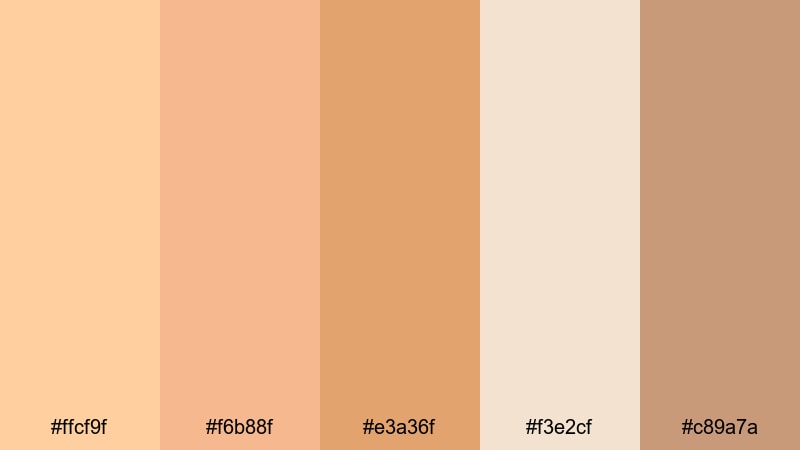
- HEX Codes: #ffcf9f, #f6b88f, #e3a36f, #f3e2cf, #c89a7a
- Mood: Comforting, toasty, and relaxed.
- Use for: Use for cafe vlogs, recipe videos, and cozy podcast cover art.
Honeyed Latte Haze wraps your visuals in the warmth of a good coffee shop. The honey oranges and latte browns instantly suggest baked goods, warm drinks, and quiet conversation.
Use the deeper browns for typography and icons on thumbnails, while the soft oranges and creams can fill backgrounds, overlays, and animated shapes in Filmora. It is a great choice for food close-ups, coffee b-roll, and talking-head podcast scenes that need to feel intimate but not dark.
Autumn Knit Comfort
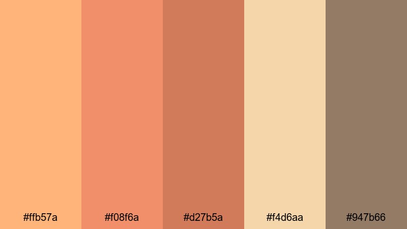
- HEX Codes: #ffb57a, #f08f6a, #d27b5a, #f4d6aa, #947b66
- Mood: Earthy, nostalgic, and homely.
- Use for: Perfect for fall lookbooks, cabin trips, and storytelling shorts with a nostalgic tone.
Autumn Knit Comfort brings muted pumpkin oranges and earthy browns together for a soft fall feeling. It references knitted sweaters, fallen leaves, and wood cabins without going fully dark or heavy.
In your edits, use the richer oranges as accent colors for text and transitions, and keep the lighter creams for title cards and lower-thirds. This palette is perfect for seasonal playlists, cozy storytelling videos, and nostalgic montages in Filmora with slow dissolves and gentle film grain.
Candlelit Brunch
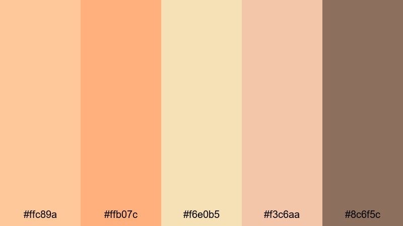
- HEX Codes: #ffc89a, #ffb07c, #f6e0b5, #f3c6aa, #8c6f5c
- Mood: Inviting, intimate, and gentle.
- Use for: Ideal for brunch vlogs, food close-ups, and lifestyle reels centered around gatherings.
Candlelit Brunch combines glowing pastel oranges with creamy beige and soft brown to suggest flickering candles and shared meals. It adds warmth to your visuals while keeping them bright and airy.
Use the darker brown sparingly for key text or icons, and lean on the oranges and creams for plates, table setups, and background elements. In Filmora, blend this palette with soft vignette effects and subtle blur transitions to make brunch scenes, dinner parties, and lifestyle reels feel intimate and welcoming.
Fireside Apricot Cider
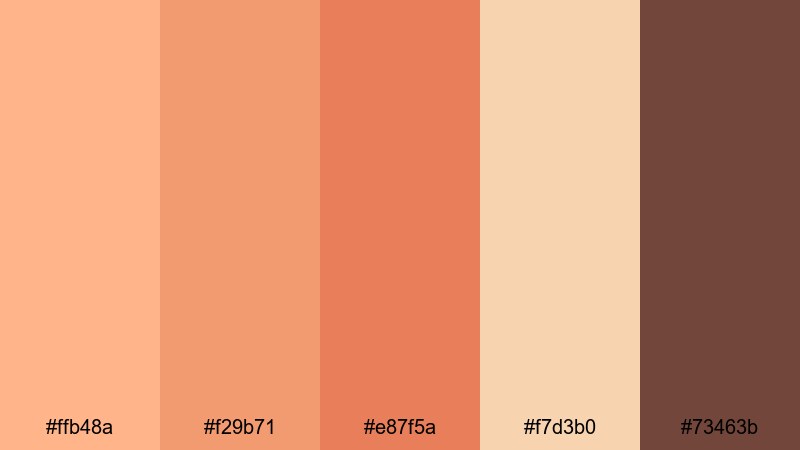
- HEX Codes: #ffb48a, #f29b71, #e87f5a, #f7d3b0, #73463b
- Mood: Warm, story-driven, and slightly rustic.
- Use for: Use in cinematic b-roll, campfire scenes, or narrative shorts with emotional depth.
Fireside Apricot Cider blends soft apricot with deeper ember tones, giving your footage a warm yet slightly dramatic character. It feels like storytelling around a campfire or a reflective evening indoors.
In thumbnails and titles, let the deeper orange and brown carry emotional weight, while the lighter apricot and cream keep things readable. It is ideal for narrative vlogs, travel diaries, and cinematic shorts where you want warmth, but also a hint of depth and tension in your color grading.
Modern & Minimal Pastel Orange Palettes
Muted Terracotta Interface
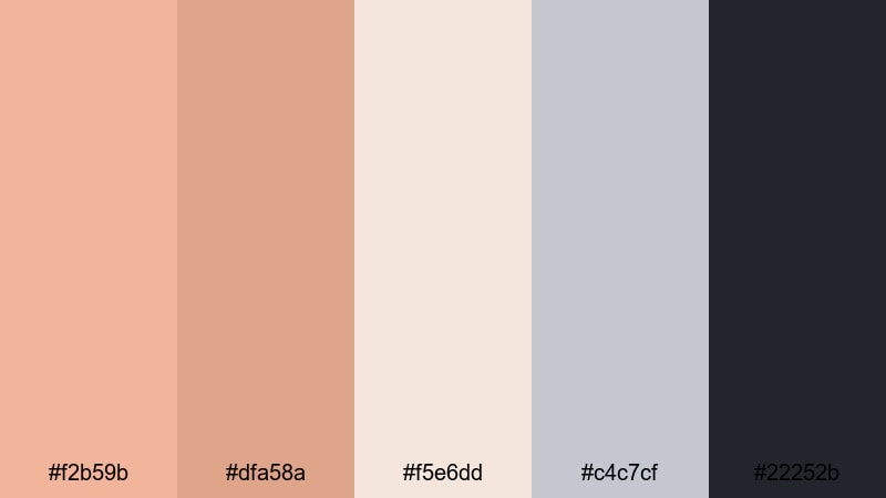
- HEX Codes: #f2b59b, #dfa58a, #f5e6dd, #c4c7cf, #22252b
- Mood: Clean, grounded, and modern.
- Use for: Perfect for app UI mockups, motion graphics, and minimalist channel branding.
Muted Terracotta Interface uses soft terracotta oranges against cool grays and a charcoal accent. This contrast keeps your look warm but distinctly modern, ideal for tech or productivity channels that still want personality.
Use the dark charcoal for text and outlines, the light neutrals for backgrounds, and the terracotta shades as accent buttons, icons, or progress bars in your motion graphics. In Filmora, this palette works well for lower-thirds, animated UI overlays, and minimalist intros that feel both polished and human.
Clean Studio Peach
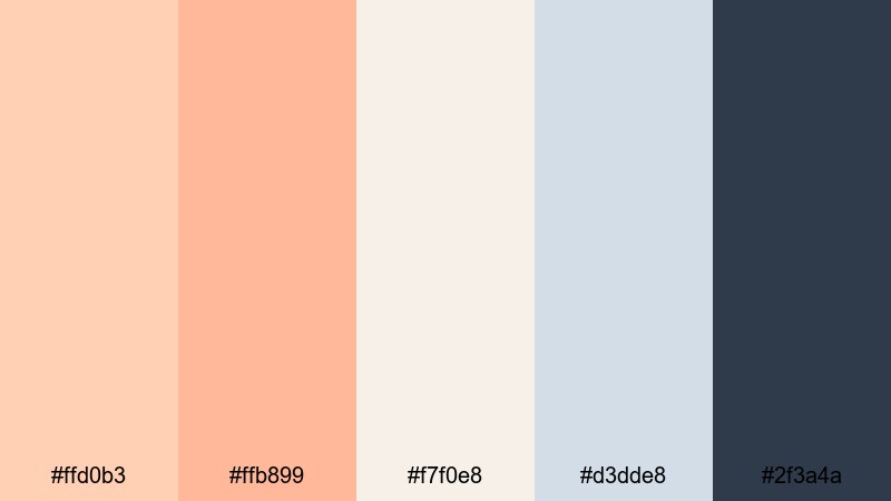
- HEX Codes: #ffd0b3, #ffb899, #f7f0e8, #d3dde8, #2f3a4a
- Mood: Professional, fresh, and polished.
- Use for: Great for studio tours, design portfolio reels, and educational videos with a clean aesthetic.
Clean Studio Peach pairs studio-ready peach tones with cool blue-grays. It keeps your visuals bright, professional, and camera-ready without feeling sterile or cold.
Use the deeper navy for text, diagrams, and UI-style elements, while the peaches and off-whites support your on-camera shots, thumbnails, and chapter titles. This palette fits perfectly with design tutorials, course content, and studio BTS videos edited in Filmora.
Soft Brand Monoline
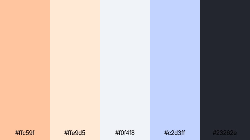
- HEX Codes: #ffc59f, #ffe9d5, #f0f4f8, #c2d3ff, #23262e
- Mood: Balanced, approachable, and brand-friendly.
- Use for: Ideal for logo animations, lower-thirds, and channel intro templates.
Soft Brand Monoline blends gentle pastel orange with off-whites, soft blues, and a dark neutral, giving you a versatile brand-ready scheme. It is minimal enough for professional use, but still warm and friendly.
Use the dark neutral sparingly as a base for text and logo outlines, and rely on the orange and blue accents for shapes, icons, and intro animations. In Filmora, this palette is easy to standardize across templates for intros, outros, and overlays so your channel identity stays consistent.
Minimal Apricot Grid
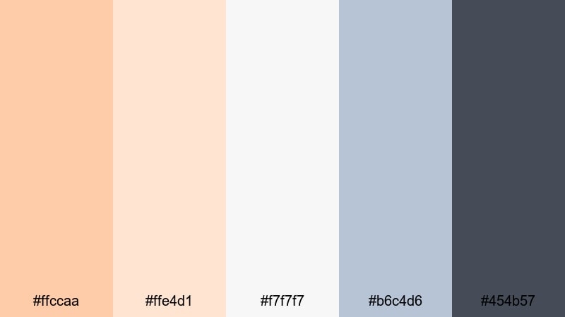
- HEX Codes: #ffccaa, #ffe4d1, #f7f7f7, #b6c4d6, #454b57
- Mood: Orderly, calm, and lightly playful.
- Use for: Use for grid-based layouts, infographics, and clean typography-focused edits.
Minimal Apricot Grid builds a neat visual system around apricot accents, soft neutrals, and a cool steel blue. It is designed for clarity, making your information look organized and easy to follow.
Use the apricot for highlights in graphs, progress bars, or key numbers, with the neutrals and blue tones anchoring backgrounds and labels. In Filmora, it works well for explainer videos, dashboards, and case-study edits where you want a calm but engaging color story.
Playful & Retro Pastel Orange Palettes
Retro Soda Fizz
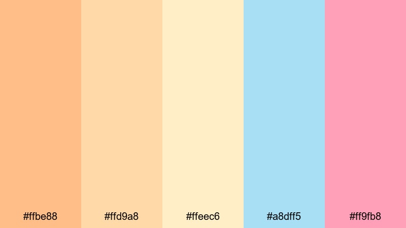
- HEX Codes: #ffbe88, #ffd9a8, #ffeec6, #a8dff5, #ff9fb8
- Mood: Fun, nostalgic, and bubbly.
- Use for: Perfect for retro edits, channel trailers, and playful product promos.
Retro Soda Fizz combines creamy orange, candy pink, and fizzy blue to create a vintage soda-shop feel. It is energetic and nostalgic, but softened by pastel tones so it does not overwhelm the viewer.
Use the orange and pink for bold text and sticker-style graphics, and reserve the blue for contrast in backgrounds or badges. In Filmora, this palette is great for bouncy motion graphics, kinetic typography, and upbeat channel trailers with retro music.
Playroom Sherbet Pop
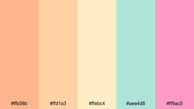
- HEX Codes: #ffb58b, #ffd1a3, #ffebc4, #aee4d8, #ff9ac5
- Mood: Cheerful, youthful, and energetic.
- Use for: Great for family vlogs, kids content, and playful social ads.
Playroom Sherbet Pop feels like a box of colorful toys or a pack of sherbet candies. The pastel oranges are supported by mint and candy pink, giving your visuals a playful, kid-friendly energy.
Use this palette for family vlogs, birthday recaps, and kids product promos. In thumbnails and intros, let the orange and pink draw attention to faces and text, while mint and cream soften everything else. Paired with fast cuts and fun transitions in Filmora, it keeps your content bright and joyful.
Vintage Film Fade
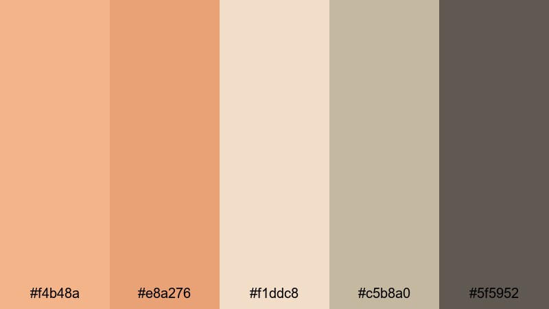
- HEX Codes: #f4b48a, #e8a276, #f1ddc8, #c5b8a0, #5f5952
- Mood: Softly retro, cinematic, and reflective.
- Use for: Use for film-inspired travel diaries, memory montages, and muted retro edits.
Vintage Film Fade uses faded oranges and dusty neutrals to echo old film stills. The palette is gentle and slightly desaturated, perfect for nostalgic edits and reflective storytelling.
Use the darker neutral for key text, frames, or letterbox bars, with the muted oranges filling your scenes and backgrounds. Add Filmora effects like subtle grain, light leaks, and soft transitions to complete the retro film look for travel diaries, memory montages, or anniversary videos.
Tips for Creating Pastel Orange Color Palettes
When building your own pastel orange color combinations for video and design, focus on balance, readability, and how the palette feels across an entire edit, not just in a single frame.
- Pair pastel orange with at least one cool tone (blue, mint, or lilac) to prevent your visuals from looking too warm or flat.
- Always include a dark neutral (charcoal, deep navy, or dark brown) for text and icons so your titles remain easy to read on thumbnails and overlays.
- Use the most saturated pastel orange sparingly as an accent for CTAs, buttons, or important words, and keep larger areas in softer creams or off-whites.
- Test your palette on both light and dark backgrounds inside Filmora to see how it behaves in different lighting conditions and scenes.
- Match your color grading to your graphics: if your titles use soft pastel orange, warm up your footage slightly so skin tones and highlights feel cohesive.
- Create a simple brand kit with 1 main pastel orange, 1 secondary accent, 1 light background, and 1 dark text color, then reuse it across intros, lower-thirds, and end screens.
- Check your palette on mobile by viewing exported thumbnails at small sizes to ensure contrast is strong enough for quick scrolling.
- Save your favorite HEX codes and preset filters in Filmora so you can apply your pastel orange aesthetic quickly across new projects.
Pastel orange palettes can completely shift how your channel or brand feels: from soft and dreamy to cozy, minimal, or retro. By choosing the right combination of oranges, neutrals, and accent hues, you can communicate warmth, creativity, and friendliness in every frame.
Use these 15 pastel orange color palettes as starting points for your thumbnails, intros, b-roll, and overlays. Then refine them inside Filmora with AI tools, color controls, and filters until they match your personal style.
The more consistently you apply your chosen palette across videos and platforms, the more recognizable your visual identity becomes. Open Filmora, drop in your clips, and start testing these pastel orange combinations on your next project.
secure download