
 100% Security Verified | No Subscription Required | No Malware

Pink sits in a sweet spot of color psychology: it feels romantic, playful, gentle, and youthful all at once. Lighter blush tones suggest softness and comfort, while bolder magenta shades communicate confidence and fun. In video and graphic design, pink can turn a simple frame into something emotional, dreamy, or full of attitude, depending on how you combine it with other hues.
This guide gathers 15 curated pink color palettes with exact HEX codes, moods, and usage tips. Whether you edit in Filmora, design thumbnails and overlays, or build brand visuals as a marketer or designer, you’ll find ready‑to‑use pink color combinations that work beautifully across intros, titles, b-roll, logos, and social posts.
In this article
Soft & Romantic Pink Color Palettes
1. Rosewater Daydream
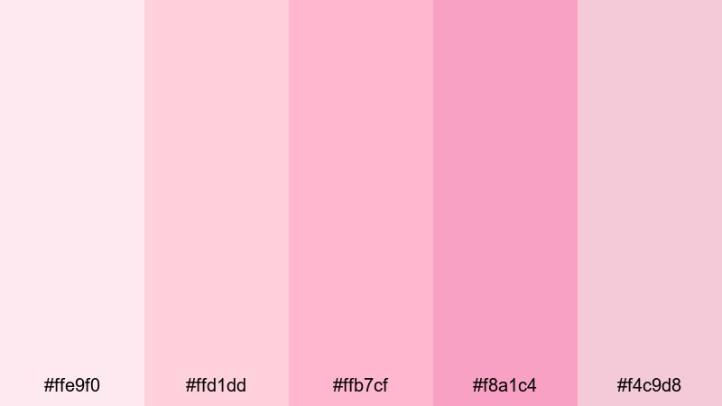
- HEX Codes: #ffe9f0, #ffd1dd, #ffb7cf, #f8a1c4, #f4c9d8
- Mood: romantic and airy
- Use for: Ideal for wedding highlight reels, engagement videos, and dreamy storytelling thumbnails.
Rosewater Daydream is a delicate blend of blush and rosewater tones that feels light, dreamy, and intimate. The progression from very soft pinks (#ffe9f0, #ffd1dd) into slightly richer rose shades (#ffb7cf, #f8a1c4) gives you enough contrast to layer titles, overlays, and callouts while keeping everything gentle on the eyes.
Use this palette when you want romance without overpowering color. In video, it works beautifully for bridal prep shots, first-look sequences, and slow-motion b-roll. In design, pair the lighter hex codes as backgrounds with the deeper pinks for text, icons, or borders to create cohesive save‑the‑date graphics, wedding logo locks, or soft channel branding.
Pro Tip: Enhance Your Pink Visuals with Filmora
To apply Rosewater Daydream consistently across your whole project, Filmora makes it simple to style intros, titles, b-roll, and social cutdowns with the same palette. You can color-match footage, design matching text and graphics, and keep every scene aligned with this soft, romantic look.
AI Color Palette
Filmora's AI Color Palette lets you pull these exact rosewater tones from a color card or reference image and apply them across your edit. Extract the key pink hues once, then sync them to multiple clips, transitions, and titles so your entire video keeps the same dreamy mood with almost no manual tweaking.
 secure download

HSL, Color Wheels & Curves
Once you’ve set your main palette, you can fine‑tune pink tones in Filmora using HSL, color wheels, and curves. Target the pink range to nudge the hue warmer or cooler, lower saturation in backgrounds while keeping bouquets and decor vibrant, or gently lift luminance for a soft, airy look that flatters skin tones without washing out the image.
secure download1000+ Video Filters & 3D LUTs
Filmora's library of video filters and 3D LUTs helps you quickly build different pink moods, from faded vintage romance to high‑gloss modern blush. Start with Rosewater Daydream, then test a few filters to see how a touch of film grain, bloom, or stylized contrast enhances the softness without losing your carefully chosen HEX codes.
secure download2. Blushing Evening Sky
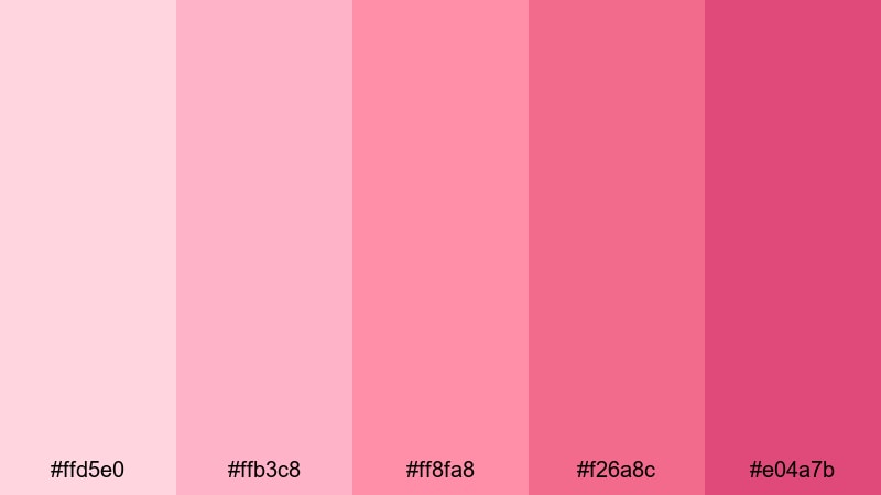
- HEX Codes: #ffd5e0, #ffb3c8, #ff8fa8, #f26a8c, #e04a7b
- Mood: warm and sentimental
- Use for: Works beautifully for cinematic love stories, lifestyle vlogs, and soft gradient title cards.
Blushing Evening Sky is inspired by warm sunset clouds, mixing soft blush (#ffd5e0, #ffb3c8) with deeper, more saturated pinks (#ff8fa8, #f26a8c, #e04a7b). The gradient potential here is strong, making it perfect for backgrounds, animated lower thirds, or intro cards that slowly shift from light to deep pink.
Use the lighter tones around faces to keep skin flattering and the darker tones for accents, buttons, or bold typography. This palette suits cinematic love stories, sentimental lifestyle vlogs, or any project where you want your visuals to feel like golden-hour light captured in pink.
3. Petal-Soft Whispers
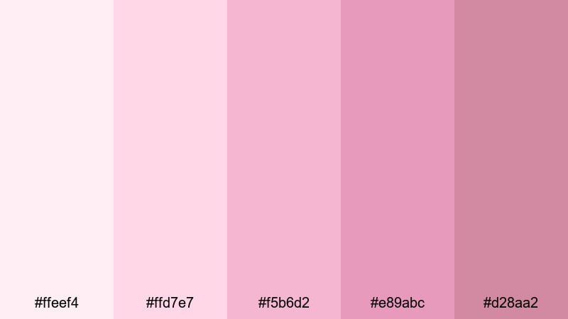
- HEX Codes: #ffeef4, #ffd7e7, #f5b6d2, #e89abc, #d28aa2
- Mood: tender and soothing
- Use for: Perfect for calm talking-head videos, beauty content, and subtle lower-third graphics.
Petal-Soft Whispers leans into ultra-soft pinks that feel calming and intimate. The palette moves from almost white blush (#ffeef4) into quiet, muted rose tones (#e89abc, #d28aa2), giving you a smooth range for gentle gradients and minimal layouts.
It’s especially effective for calm talking‑head videos, wellness content, and beauty tutorials where you want the palette to support the subject, not distract from it. Use the palest shades as backgrounds and the mid-pinks for subtle lower thirds, light UI elements, or icons that appear soft but still readable.
4. Vintage Love Letters
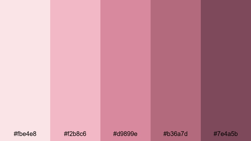
- HEX Codes: #fbe4e8, #f2b8c6, #d9899e, #b36a7d, #7e4a5b
- Mood: nostalgic and intimate
- Use for: Use in retro edits, memory montages, and film-inspired wedding or anniversary videos.
Vintage Love Letters combines dusty rose and muted berry tones, echoing the look of faded ink and old photographs. The lighter shades (#fbe4e8, #f2b8c6) sit comfortably as vintage paper-style backgrounds, while the richer berry tones (#d9899e, #b36a7d, #7e4a5b) work well for titles, frames, and overlays.
This palette shines in memory montages, anniversary edits, or any sequence meant to feel like a found box of keepsakes. In design, it’s a strong choice for retro-inspired branding, postcards, and thumbnails that hint at nostalgia and handwritten love notes.
Bold & Vibrant Pink Color Palettes
5. Electric Neon Crush
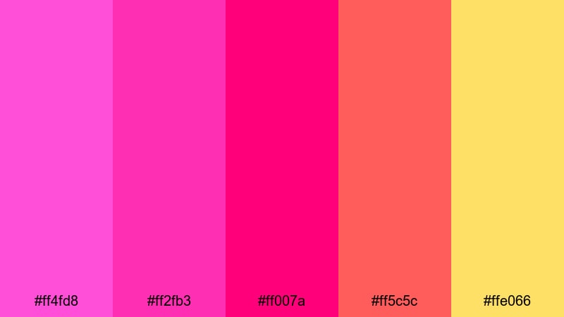
- HEX Codes: #ff4fd8, #ff2fb3, #ff007a, #ff5c5c, #ffe066
- Mood: energetic and playful
- Use for: Great for gaming intros, music videos, kinetic typography, and bold YouTube thumbnails.
Electric Neon Crush is all about maximum impact. Intense neon pinks (#ff4fd8, #ff2fb3, #ff007a) pair with a hot coral red (#ff5c5c) and a punchy yellow (#ffe066) to create a palette that practically vibrates on screen.
Use it when you want fast, high-energy visuals: glitchy gaming intros, animated music video titles, or kinetic typography that pops against darker footage. The yellow makes an excellent highlight color for subscribe buttons, key words, or UI elements that must stand out at a glance.
6. Hot Magenta Pop
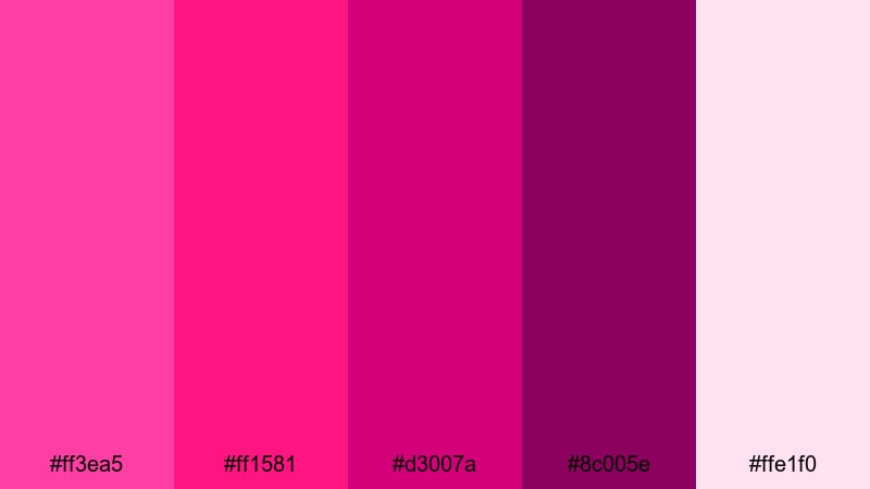
- HEX Codes: #ff3ea5, #ff1581, #d3007a, #8c005e, #ffe1f0
- Mood: confident and edgy
- Use for: Ideal for bold brand intros, creator logos, and striking call-to-action screens.
Hot Magenta Pop is driven by strong magenta pinks with a clear, modern attitude. The saturated hues (#ff3ea5, #ff1581, #d3007a) and deep accent (#8c005e) feel bold and fashion-forward, while #ffe1f0 offers a soft supporting tone.
This palette works well for creators who want to project confidence and edge. Use the lighter pink as a background, then stack logo marks, CTAs, and key typography in the darker magentas. It’s great for bold brand intros, reels for makeup or streetwear, and any graphic that needs to feel unmistakably “now.”
7. Tropical Fuchsia Sunset
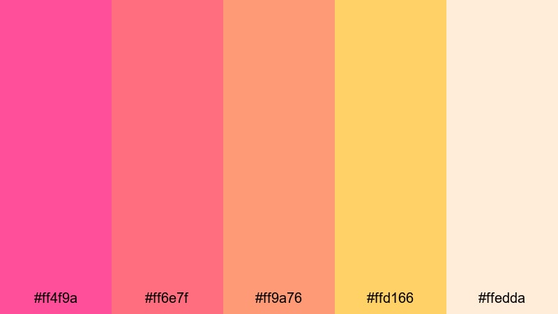
- HEX Codes: #ff4f9a, #ff6e7f, #ff9a76, #ffd166, #ffedda
- Mood: sunny and adventurous
- Use for: Perfect for travel vlogs, summer campaigns, and upbeat product promos.
Tropical Fuchsia Sunset captures the warmth of a beach evening with fuchsia pink (#ff4f9a), coral and peach tones (#ff6e7f, #ff9a76), sunny gold (#ffd166), and a soft sand-like highlight (#ffedda). The mix feels bright and adventurous without being harsh.
It’s ideal for travel vlogs, festival recaps, and summer product campaigns. Use fuchsia and coral for overlays and transitions, reserve the yellow for highlight elements and animated icons, and keep #ffedda as a gentle base that holds text, maps, or schedule graphics.
8. Candy Arcade Glow
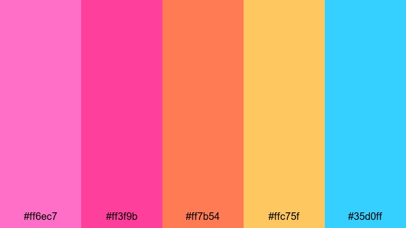
- HEX Codes: #ff6ec7, #ff3f9b, #ff7b54, #ffc75f, #35d0ff
- Mood: fun and futuristic
- Use for: Use for short-form social clips, gaming overlays, and playful motion graphics.
Candy Arcade Glow mixes neon-like pinks (#ff6ec7, #ff3f9b) with candy orange (#ff7b54), bright yellow (#ffc75f), and electric blue (#35d0ff). The palette feels like an arcade sign—playful, colorful, and slightly futuristic.
It’s a natural fit for short-form social clips, gaming overlays, and animated motion graphics for young audiences. Use blue for contrast against pink titles, orange and yellow as accent strokes or borders, and keep the bright pinks as your main brand and button colors.
Pastel Pink Color Palettes
9. Cotton Candy Cloudscape
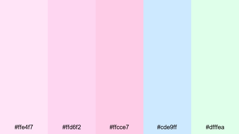
- HEX Codes: #ffe4f7, #ffd6f2, #ffcce7, #cde9ff, #dfffea
- Mood: dreamy and lighthearted
- Use for: Great for channel art, whimsical intros, and thumbnails targeting younger audiences.
Cotton Candy Cloudscape blends soft pinks (#ffe4f7, #ffd6f2, #ffcce7) with airy blue (#cde9ff) and mint (#dfffea). Together, they create a cloud‑like, dreamy vibe that feels light and approachable.
This palette suits channel art, whimsical intros, and thumbnails for kids’ content or lighthearted vlogs. Use the pinks as your main brand base, then introduce blue and mint for secondary elements—tabs, buttons, and small illustrations that add a gentle pop without breaking the soft aesthetic.
10. Strawberry Milk Studio
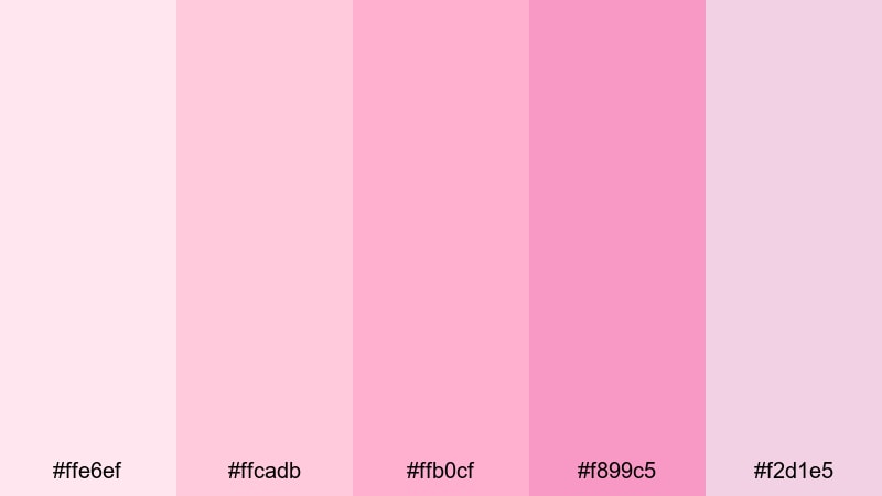
- HEX Codes: #ffe6ef, #ffcadb, #ffb0cf, #f899c5, #f2d1e5
- Mood: cozy and cute
- Use for: Perfect for beauty tutorials, cozy studio setups, and soft-brand packaging concepts.
Strawberry Milk Studio uses milky, creamy pink tones that feel sweet and welcoming. From the softest blush (#ffe6ef) to richer strawberry shades (#ffb0cf, #f899c5), the palette stays cohesive but offers enough variation for backgrounds, accents, and typography.
It’s ideal for beauty channels, cozy studio setups, or packaging mockups for skincare and lifestyle products. Use the lighter pinks for full-screen backgrounds and the slightly deeper hues for buttons, badges, and logo marks that still look soft but stand out clearly.
11. Bubblegum Day Party
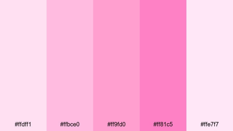
- HEX Codes: #ffdff1, #ffbce0, #ff9fd0, #ff81c5, #ffe7f7
- Mood: cheerful and youthful
- Use for: Use in birthday edits, party highlights, and colorful channel branding for playful content.
Bubblegum Day Party is made of bright pastel pinks that feel cheerful and youthful. The mid-range tones (#ffbce0, #ff9fd0, #ff81c5) add energy, while the paler shades (#ffdff1, #ffe7f7) keep the overall palette light and breathable.
It’s perfect for birthday edits, party highlight reels, and playful channel branding. Use the bolder pinks for celebratory text, confetti-style graphics, and animated stickers, while the soft tones support as background washes for photo collages or montage sequences.
12. Powder Puff Morning
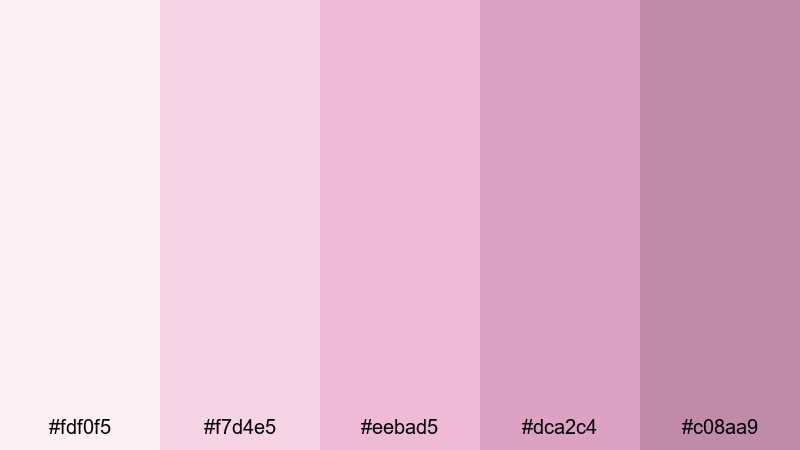
- HEX Codes: #fdf0f5, #f7d4e5, #eebad5, #dca2c4, #c08aa9
- Mood: gentle and serene
- Use for: Best for morning routines, wellness content, and minimal, soft UI overlays.
Powder Puff Morning focuses on powdery pinks with subtle mauve accents. The almost-white base (#fdf0f5) and the soft transitions to deeper mauves (#dca2c4, #c08aa9) give your visuals a slow‑morning, relaxed character.
It’s a great fit for morning routines, coffee journaling, and wellness or self-care content. In design, use the lightest shades as canvas for minimal UI overlays and chapter titles, then lean on the mauves for small, elegant icons, progress bars, and captions.
Elegant & Modern Pink Color Palettes
13. Rose Gold Minimalist
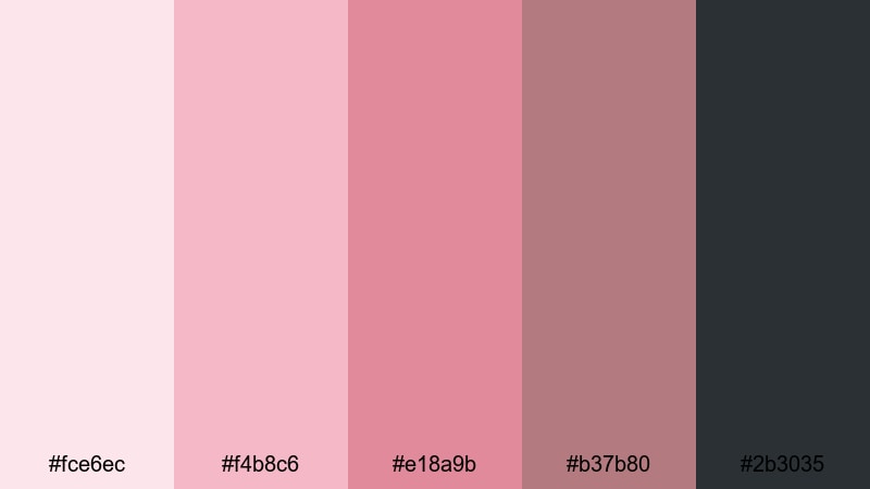
- HEX Codes: #fce6ec, #f4b8c6, #e18a9b, #b37b80, #2b3035
- Mood: sophisticated and polished
- Use for: Ideal for premium brand intros, product reveals, and minimalist titles.
Rose Gold Minimalist pairs rose-tinted pinks (#fce6ec, #f4b8c6, #e18a9b) with a muted warm neutral (#b37b80) and a deep gray (#2b3035). The overall effect is chic and polished, echoing rose-gold metal without relying on literal metallic textures.
This palette suits premium brand intros, high-end product reveals, and minimalist title sequences. Use the deep gray for typography and key lines, the mid-pinks for logo marks and accent shapes, and the lightest shade as a clean, modern backdrop for close-up product shots.
14. Urban Mauve Contrast
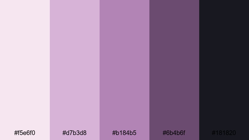
- HEX Codes: #f5e6f0, #d7b3d8, #b184b5, #6b4b6f, #181820
- Mood: moody and refined
- Use for: Use for fashion lookbooks, editorial-style reels, and cinematic openers.
Urban Mauve Contrast leans into muted mauves (#f5e6f0, #d7b3d8, #b184b5) set against inky charcoal tones (#6b4b6f, #181820). This combination creates a moody, editorial feel that’s ideal when you want pink to look grown‑up and artful.
Use the darkest shades for backgrounds or letterbox bars, then layer mauve titles and overlays for fashion lookbooks, portrait reels, and cinematic openers. The softer mauves keep visuals stylish and refined, while the deep charcoal anchors the palette and provides strong contrast for text.
15. Blush & Charcoal Luxe
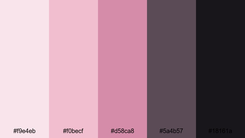
- HEX Codes: #f9e4eb, #f0becf, #d58ca8, #5a4b57, #18161a
- Mood: luxurious and modern
- Use for: Perfect for brand trailers, high-end product ads, and sleek title sequences.
Blush & Charcoal Luxe balances soft blush tones (#f9e4eb, #f0becf, #d58ca8) with deep charcoal shades (#5a4b57, #18161a). The result is a clean, luxury aesthetic that still feels warm and inviting.
It’s a strong choice for high-end product ads, brand trailers, and sleek title sequences. Let the charcoal shades handle bold typography, lines, and background panels, while the blush tones highlight products, key frames, and subtle UI details that suggest sophistication without feeling cold.
Tips for Creating Pink Color Palettes
Pink is versatile, but it works best when you’re deliberate about balance, contrast, and emotional tone. Keep these tips in mind as you design your own pink color combinations or adapt the palettes above.
- Balance pink with neutrals such as white, beige, gray, or charcoal to keep layouts clean and professional, especially for branding and UI.
- Decide between warm pinks (with hints of orange or coral) and cool pinks (with mauve or blue undertones) based on the mood you want—warm for friendly and playful, cool for calm and sophisticated.
- Use gradients that move from very light to mid-tone pinks for smooth backgrounds; reserve the deepest shades for text, icons, and key accents.
- Always check readability: test pink text on light and dark backgrounds and increase contrast for subtitles, captions, and call‑to‑action buttons.
- Test your pink palette on different screens (phones, tablets, and monitors) to make sure it doesn’t look too pale or too saturated on smaller devices.
- Combine pink with one strong accent color (like yellow, blue, or mint) instead of many to avoid overwhelming the viewer, especially in fast-paced edits.
- Match the emotional context of your content—soft blush for romance and wellness, bright bubblegum for parties and kids’ content, deep magentas for edgy, fashion-driven edits.
- For video, keep skin tones in mind: adjust HSL so pink overlays enhance rather than distort natural skin color, especially in beauty and lifestyle content.
Pink can communicate so many things—romance, playfulness, nostalgia, luxury, or youthful energy—depending on the shades you choose and how you combine them. With these 15 pink color palettes, you can quickly set a clear visual mood for your videos, thumbnails, logos, and social graphics.
Filmora makes it easy to bring these palettes into your video workflow. With AI Color Palette, you can extract and apply your favorite pink combinations; with HSL, color wheels, and curves, you can fine‑tune tones and balance skin; and with over 1000 filters and 3D LUTs, you can experiment with different pink styles in just a few clicks.
Try a few palettes that match your style, then build consistent branding across your channel, campaigns, and client projects—all while keeping your pinks looking intentional and on‑brand.
secure downloadNext: Purple Color Palette
