Purple sits between calm blue and passionate red, which is why it often feels both soothing and powerful at the same time. It is linked to creativity, luxury, spirituality, and mystery, and instantly adds a cinematic edge to any frame. From gentle lilacs to deep violet blacks, purple can make your visuals feel dreamy, futuristic, romantic, or dramatic depending on the combination you choose.
For video creators and brands, a clear purple color palette is a shortcut to consistent thumbnails, intros, overlays, and social graphics. Below you will find ready-made purple color palettes with HEX codes you can plug into your thumbnails, lower thirds, titles, and color grading. They are perfect for creators working in Filmora who want fast, beautiful purple looks across entire projects.
In this article
Soft & Romantic Purple Color Palettes
Lavender Daydream Glow
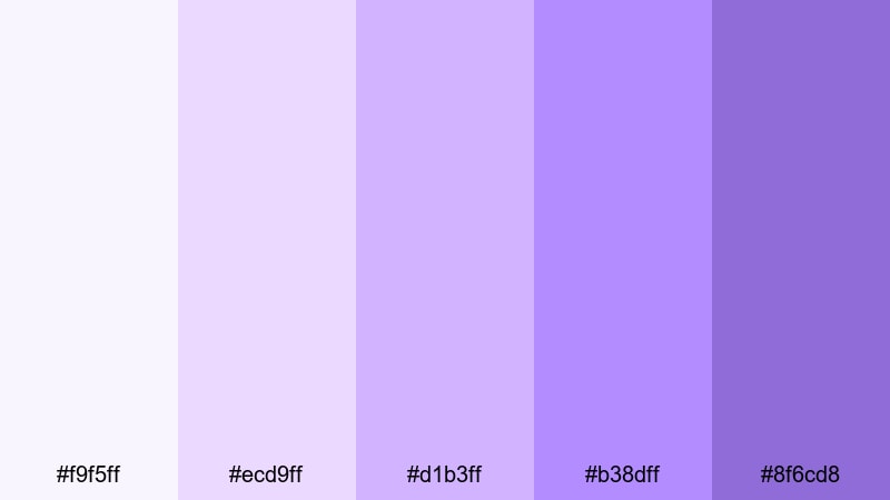
- HEX Codes: #f9f5ff, #ecd9ff, #d1b3ff, #b38dff, #8f6cd8
- Mood: Calm, dreamy, and tender, like a slow sunrise over lavender fields.
- Use for: Ideal for romantic vlogs, dreamy travel montages, and gentle brand intros that need a soft, whimsical touch.
This palette drifts from near-white lavender haze into soft violet, creating a weightless, almost cloud-like feeling. It is delicate without being dull, so your frames stay bright and airy while still feeling distinctly purple.
Use Lavender Daydream Glow for romantic storytelling, self-care content, minimalist product shots, and soft YouTube thumbnails. In Filmora, you can bring these HEX codes into titles, lower thirds, and background blocks so your intro cards, B-roll overlays, and end screens all share the same dreamy lavender atmosphere.
Pro Tip: Enhance Your Purple Visuals with Filmora
When you work with gentle purples like this palette, consistency is everything. In Filmora, you can combine lavender title cards, subtle gradients, and matching overlays so your whole edit feels like one seamless daydream, from the first frame of the intro to the last card of the outro.
Try using one of the lighter HEX codes as a background for text and one of the medium purples for icons, frames, and call-to-action buttons. Then copy and paste these styled elements across all your sequences in Filmora to keep your branding soft, romantic, and instantly recognizable.
AI Color Palette
If you have a reference image of lavender fields, a pastel moodboard, or a brand style card, you can quickly transfer that purple look onto your entire video. Filmora's AI Color Palette feature lets you sample the colors from a single clip or image and apply that palette across other shots so your vlog, intro, and B-roll all share the same soft purple tone.
Import your reference frame, run AI Color Palette, and let Filmora harmonize other clips to match, even if they were shot in different lighting. This keeps your lavender aesthetic cohesive without hours of manual color grading.
HSL, Color Wheels & Curves
Even with a preset palette, every camera and scene will treat purple differently. In Filmora, you can fine-tune lavender tones using the HSL sliders, color wheels, and curves, gently pulling purples toward blue for a cooler, serene look or toward magenta for a more romantic glow. A quick pass of color correction, as shown in Filmora's color correction tutorial, helps you avoid muddy or grayish lilacs.
Use the color wheels to cool down shadows while keeping midtones soft and pastel, and then shape the contrast curve so highlights stay airy. This keeps skin tones natural while your backgrounds and overlays stay true to the Lavender Daydream Glow palette.
1000+ Video Filters & 3D LUTs
To stylize this soft purple look even faster, you can start from Filmora's built-in filters and LUTs. Filmora's video filters and 3D LUTs make it easy to add pastel, cinematic, or dreamy overlays that support your lavender palette instead of fighting it.
Layer a light film-style LUT with a subtle glow or vignette to enhance the romantic mood, then tweak opacity until your footage, graphics, and text all feel like they belong in the same purple storyworld.
Blush Orchid Whisper
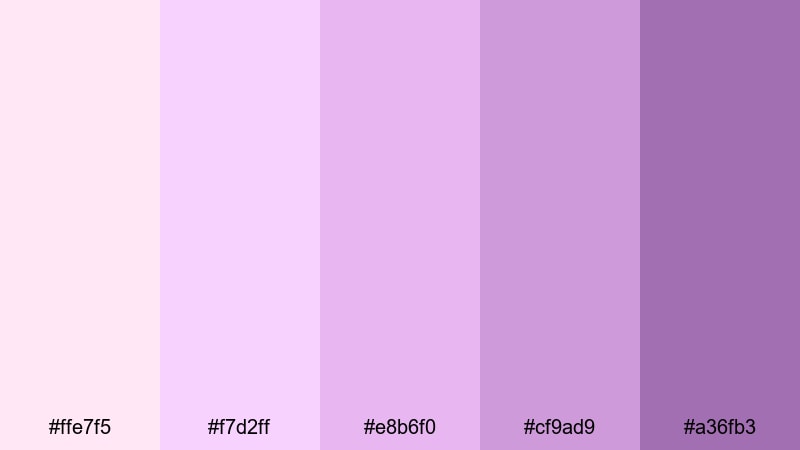
- HEX Codes: #ffe7f5, #f7d2ff, #e8b6f0, #cf9ad9, #a36fb3
- Mood: Romantic, feminine, and gentle, with a hint of nostalgic warmth.
- Use for: Perfect for wedding highlight reels, couple story edits, and product videos for beauty or skincare brands.
Blush Orchid Whisper blends soft pinks with muted orchid purples for a tender, intimate feeling. The warmer blush notes add a nostalgic glow, while the deeper orchid tones keep everything feeling elegant and mature.
Use the lightest shades for backgrounds on save-the-date titles, wedding lower thirds, or beauty thumbnails. Deeper purples work well for text, badges, and icons in Filmora, so your romantic vlogs, couple edits, and skincare promos all feel part of one cohesive brand story.
Twilight Lilac Breeze
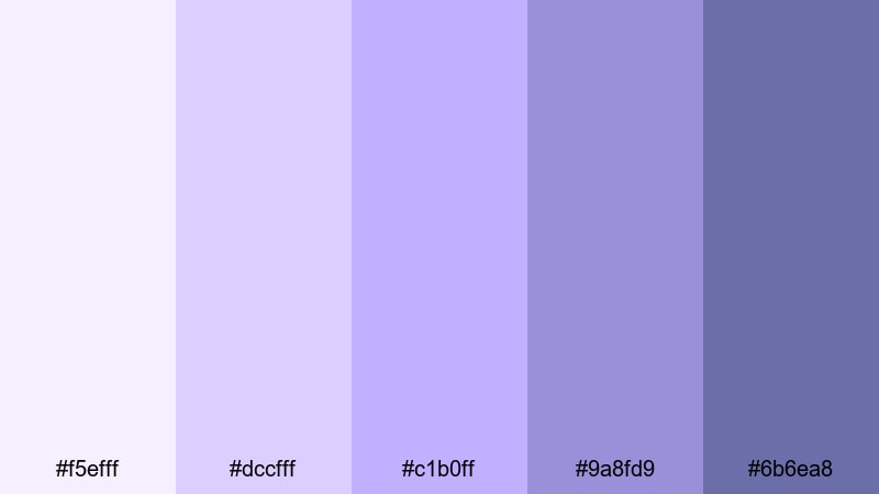
- HEX Codes: #f5efff, #dccfff, #c1b0ff, #9a8fd9, #6b6ea8
- Mood: Airy, peaceful, and reflective, inspired by quiet early-evening skies.
- Use for: Great for reflective storytelling, aesthetic B-roll, and channel banners that aim for calm, cinematic vibes.
Twilight Lilac Breeze moves from pale lilac into cooler, duskier purples, echoing the slow fade from day to night. It feels introspective and calm, perfect for slower-paced content.
Bring this palette into your channel art, journaling thumbnails, and soft B-roll overlays. Use the lighter tones for backgrounds and the medium lilacs for subtle shapes or frames around your main subject, keeping your Filmora edits peaceful but visually rich.
Petal Mist Morning
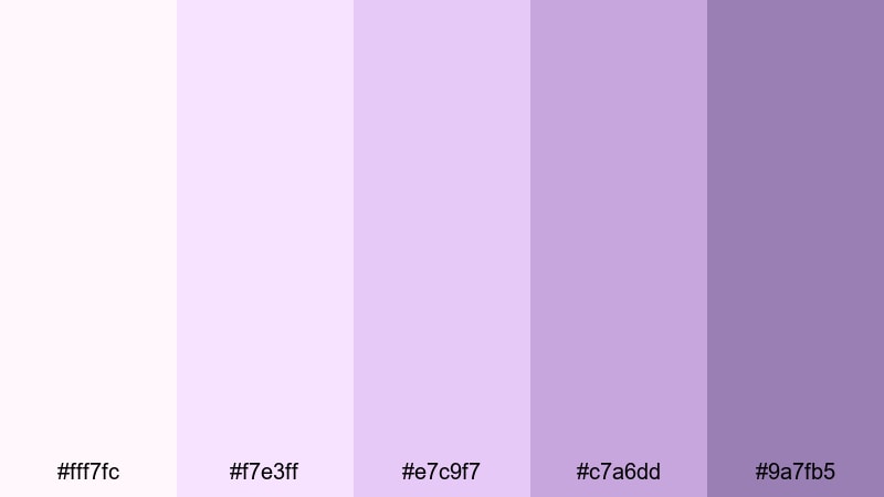
- HEX Codes: #fff7fc, #f7e3ff, #e7c9f7, #c7a6dd, #9a7fb5
- Mood: Light, hopeful, and optimistic, like soft petals in morning haze.
- Use for: Use for morning routine videos, soft lifestyle thumbnails, and promo graphics for gentle, feel-good content.
Petal Mist Morning is full of pale petal pinks and diffused purples that feel fresh and uplifting. It has the energy of a quiet, sunny morning and works especially well for lifestyle creators.
Build your morning routine titles, checklist graphics, and story highlight covers with this palette. In Filmora, combine the softest tones as backgrounds and the medium purples as accent bars or bullet markers to keep your visuals gentle but organized and easy to read.
Bold & Vibrant Purple Color Palettes
Neon Amethyst Pop

- HEX Codes: #f6e1ff, #d18cff, #a43dff, #7b00ff, #2a0f7f
- Mood: Energetic, futuristic, and eye-catching with a neon punch.
- Use for: Designed for striking YouTube thumbnails, tech intros, gaming overlays, and bold social ads.
Neon Amethyst Pop explodes with juicy mid and deep purples, anchored by a dark amethyst base. It feels digital, electric, and made for attention-grabbing visuals.
Use the bright purples for call-to-action buttons, stroke lines around your subject, and glitch-style text in Filmora. The darkest shade works perfectly for backgrounds or drop shadows on gaming overlays and tech thumbnails to keep everything bold but readable.
Electric Grape Splash
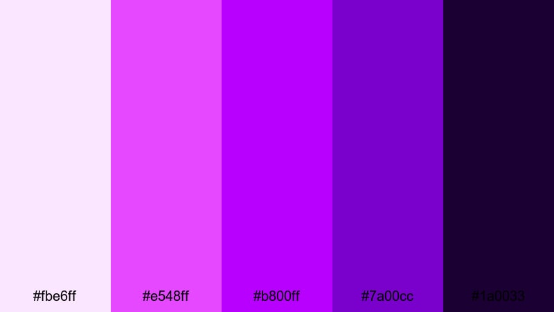
- HEX Codes: #fbe6ff, #e548ff, #b800ff, #7a00cc, #1a0033
- Mood: Intense, playful, and ultra-digital, like club lights and glitch effects.
- Use for: Best for music videos, dance edits, festival recaps, and dynamic motion graphics.
Electric Grape Splash mixes neon magentas with dense grape purples, giving you a club-light feel on screen. It feels loud, fast, and perfect for beat-driven edits.
Use the brightest tones for waveform-like shapes, beat markers, and animated transitions in Filmora. The nearly-black grape gives you a strong base for titles and overlays so text stays legible even when the rest of the frame is exploding with color.
Festival Violet Energy
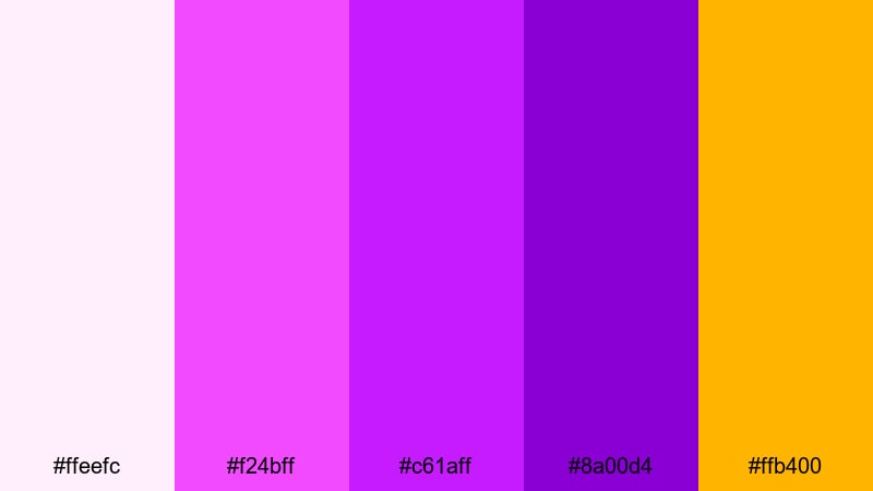
- HEX Codes: #ffeefc, #f24bff, #c61aff, #8a00d4, #ffb400
- Mood: Festive, confident, and adventurous with a playful golden accent.
- Use for: Perfect for event promos, festival recaps, party vlogs, and social campaign visuals.
Festival Violet Energy is dominated by bold violets and magentas, with a vibrant golden accent that instantly feels celebratory. It captures the chaos and joy of festivals and night events.
Use the gold as a highlight color for prices, dates, or limited-offer labels in your promo graphics. In Filmora, combine the magentas and violets in gradient backgrounds or animated shapes that frame your subjects in party vlogs and social ad creatives.
Ultra Vivid Magenta Pulse
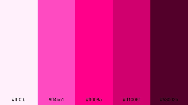
- HEX Codes: #fff0fb, #ff4bc1, #ff008a, #d1006f, #53002b
- Mood: Bold, passionate, and dynamic with a strong pop-culture edge.
- Use for: Use for fashion reels, bold beauty campaigns, and standout creator branding.
Ultra Vivid Magenta Pulse leans into hot magentas and berry tones, with a deep wine base. It feels fierce, glamorous, and a bit rebellious, ideal for fashion and beauty content.
Use the lighter tint for background panels behind product shots and the deepest shade for typography and logos. In Filmora, this palette shines on TikTok-style edits, beauty transitions, and creator intros that want to project confidence and attitude.
Elegant & Modern Purple Color Palettes
Plum & Charcoal Luxe
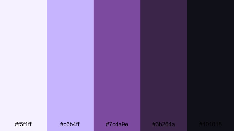
- HEX Codes: #f5f1ff, #c6b4ff, #7c4a9e, #3b264a, #101018
- Mood: Sophisticated, polished, and moody with a premium edge.
- Use for: Great for brand openers, logo stings, UI mockups, and portfolio reels that need a luxury feel.
Plum & Charcoal Luxe combines soft highlights with rich plum and inky charcoal tones. It immediately reads as premium and editorial, ideal for design studios and high-end products.
Use the darkest shades as backgrounds for logo reveals and sleek lower thirds in Filmora. Accent them with the lighter plums for thin lines, icons, and hover-style buttons in your on-screen graphics to create a clean, luxurious aesthetic.
Royal Aubergine Accent
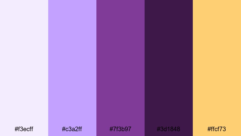
- HEX Codes: #f3ecff, #c3a2ff, #7f3b97, #3d1848, #ffcf73
- Mood: Regal, confident, and modern with a touch of warm glamour.
- Use for: Ideal for brand identities, title cards, and course graphics that need authority and style.
Royal Aubergine Accent is built around deep aubergine purples, softened by pastel highlights and lifted with a warm gold accent. It feels authoritative yet approachable.
Apply the gold selectively to key details: course titles, pricing info, or important CTAs in thumbnails. In Filmora, let the mid purples define your lower thirds and banners, while the darkest shades form the foundation for sleek intros and educational slide-style sequences.
Modern Mauve Neutrals
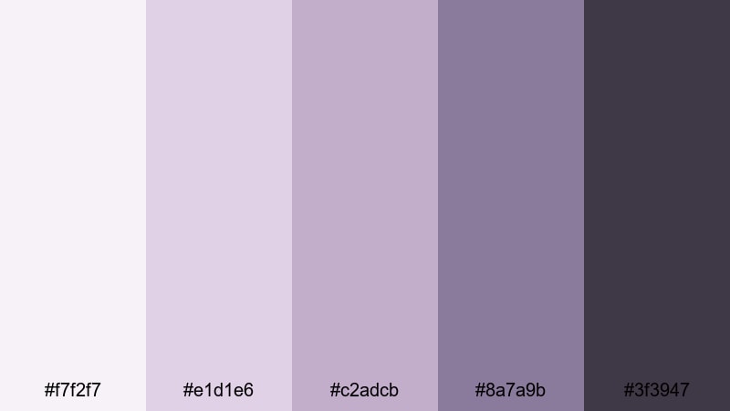
- HEX Codes: #f7f2f7, #e1d1e6, #c2adcb, #8a7a9b, #3f3947
- Mood: Minimal, calm, and contemporary with a muted designer feel.
- Use for: Perfect for UI layouts, productivity channels, educational content, and clean brand systems.
Modern Mauve Neutrals pairs muted mauves with soft grays, giving you a subtle, designer-friendly palette that never distracts from your content. It feels organized, calm, and professional.
Use the lightest tones as background for screen recordings, text overlays, and infographics in Filmora. The medium mauves make excellent accent bars and icon colors, while the darkest shade is ideal for headlines and body text for maximum readability.
Midnight Orchid Minimal
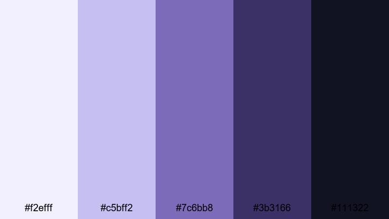
- HEX Codes: #f2efff, #c5bff2, #7c6bb8, #3b3166, #111322
- Mood: Cool, focused, and refined with a hint of mystery.
- Use for: Use in cinematic title sequences, app promos, and channel branding that leans sleek and professional.
Midnight Orchid Minimal slides from soft orchid to deep, inky blues and purples. It keeps a clean, restrained look while still feeling cinematic and slightly mysterious.
Use the darker shades for full-screen title cards and minimalist lower thirds in Filmora. The lighter orchid tones can highlight icons, timeline markers, and subtle backgrounds behind screenshots or app demos, keeping your branding cool and tech-friendly.
Moody & Cinematic Purple Color Palettes
Stormy Violet Noir

- HEX Codes: #f4f0ff, #b39dd9, #6c5a96, #3a3157, #0b0915
- Mood: Brooding, cinematic, and atmospheric, like a stormy city at night.
- Use for: Great for short films, dramatic trailers, true crime intros, and story-driven edits.
Stormy Violet Noir layers dusty violets over deep, inky shadows to create a smoky, film-noir mood. It feels urban, moody, and full of tension.
Use the mid violets for accent lights, title frames, or overlay gradients, while the darkest tone becomes your primary background for credits and intro cards. In Filmora, this palette works beautifully with slow zooms, light leaks, and subtle grain to push your edit toward a cinematic short-film style.
Cosmic Nebula Purple

- HEX Codes: #f7f0ff, #c89dff, #8d4bff, #351b5f, #05040d
- Mood: Ethereal, sci-fi, and expansive with cosmic depth.
- Use for: Ideal for space-themed edits, tech explainers, sci-fi intros, and futuristic motion graphics.
Cosmic Nebula Purple glows with nebula-like mid purples that fall into near-black space tones. It feels futuristic, visionary, and expansive, perfect for anything tech or sci-fi.
Use the bright purples for star-like particles, neon HUD elements, and animated lines in Filmora. The darkest shades serve as infinite space backgrounds for titles, explainers, and transitions that need a modern, outer-space flair.
Noir Velvet Grape

- HEX Codes: #f3eaff, #cda6ff, #8b4fb8, #412154, #120912
- Mood: Intimate, velvety, and dramatic with a vintage noir twist.
- Use for: Use for moody music videos, slow fashion films, and editorial social campaigns.
Noir Velvet Grape pairs velvety grape tones with deep wine shadows, giving your visuals a rich, tactile feeling. It has a vintage, almost jazz-club mood while still feeling modern.
Apply the lighter shades to highlight faces, fabrics, or product textures, and reserve the deepest tones for frames, letterbox bars, and typography. In Filmora, slow dissolves, soft focus, and gentle camera moves match this palette beautifully in music videos and fashion-forward edits.
Tips for Creating Purple Color Palettes
Whether you choose soft lavender or intense neon violet, thoughtful color combinations will keep your purple palette readable, on-brand, and cinematic across all your videos and designs.
- Pair purple with clear neutrals: use white, off-white, or charcoal so your main purple accents do not compete with the background.
- Check text contrast: always test white text on dark purple and dark text on light purple to make sure thumbnails and lower thirds are easy to read on mobile.
- Limit accent colors: add just one accent (gold, teal, or pink) to your purple palette to keep branding simple and memorable.
- Match footage lighting: cool lighting works better with bluish purples, while warm indoor shots often pair better with magenta-leaning purples.
- Use purple for hierarchy: reserve the most saturated purple for buttons, CTAs, and key words so viewers know where to look first.
- Stay consistent across platforms: reuse the same HEX codes in your YouTube thumbnails, channel banner, Instagram stories, and Filmora title templates.
- Balance mood and genre: choose lighter purples for lifestyle and wellness, mid purples for education and branding, and deeper tones for drama, music, and film-style content.
- Test on different screens: preview your purple designs on phones, tablets, and desktops to catch any tones that look too dark or too washed out.
Purple is one of the most versatile colors in visual storytelling. From soft lilac mornings to neon festival lights and deep noir shadows, the right purple palette can instantly define your mood, sharpen your brand identity, and make your videos stand out in crowded feeds.
Use these 15 purple color palettes and HEX codes as ready-made starting points for your thumbnails, intros, overlays, and transitions. Then, bring them to life in Filmora with AI-powered color tools, manual grading controls, and creative filters that keep your look cohesive from scene to scene.
Open a new project, drop in your footage, and start applying these palettes to your next vlog, promo, or short film. With a consistent purple aesthetic and Filmora's editing tools, your visuals can look polished, cinematic, and unmistakably yours.


 100% Security Verified | No Subscription Required | No Malware
