
 100% Security Verified | No Subscription Required | No Malware


 ChatGPT
 Perplexity
 Gemini
 Claude
 Grok
Grok
Amber sits between yellow and orange on the color wheel, carrying the warmth of firelight and the glow of late afternoon sun. In color psychology, amber is linked to positivity, optimism, and cozy comfort, but it can also feel bold and energetic when pushed toward neon or marigold tones. That makes an amber color palette a powerful tool when you want your visuals to feel welcoming, nostalgic, or intensely high-energy.
For video creators, designers, and brand builders, amber works beautifully in YouTube thumbnails, channel art, logo animations, intros, outros, and color grading. The right combination of amber color shades can make your vlogs feel like golden hour, your product shots feel premium, or your gaming edits feel electric. Below you will find 15 ready-to-use amber color palettes with HEX codes that you can apply directly in your designs or recreate inside Filmora for consistent, cinematic projects.
In this article
Warm Cinematic Amber Color Palettes
Golden Hour Storyboard
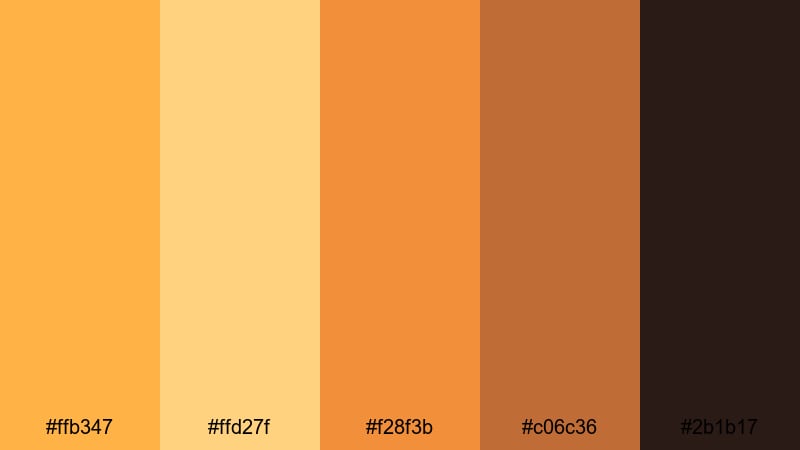
- HEX Codes: #ffb347, #ffd27f, #f28f3b, #c06c36, #2b1b17
- Mood: Nostalgic, cinematic, and sun-drenched.
- Use for: Use this palette for travel vlogs, wedding highlights, and cinematic b-roll sequences that need a glowing sunset feel.
Golden Hour Storyboard is a classic mix of soft amber, glowing orange, and deep shadow browns. It feels like the last warm light of the day hitting skin, fabric, and buildings, with rich shadows that keep the scene cinematic instead of flat.
This amber color palette works beautifully for wedding films, slow-motion b-roll, romantic reels, and storytelling intros. Use the lighter hex codes for skin tones and highlights, the mid ambers for titles and overlays, and the deep brown as a grounding color for text or logo lockups in thumbnails and end screens.
Pro Tip: Build a Cinematic Amber Glow in Filmora
To keep a golden hour look consistent across an edit, build your grade once in Filmora and reuse it across all clips. Start with a neutral base exposure, then gently warm your midtones and highlights toward amber while keeping shadows rich and slightly desaturated. This helps your vlog intro, A-roll, and B-roll feel like they were all shot in the same dreamy sunset window.
In Filmora, you can save your favorite amber settings as custom presets. Apply them to your cinematic b-roll, YouTube thumbnails (exported frames), and short-form social edits so your entire channel keeps that recognizable golden glow.
AI Color Palette
If you already have a perfect golden hour frame or a color card with these amber shades, you can use Filmora's AI Color Palette feature to match it across your whole timeline. Pick the reference shot with the best amber glow, then let AI transfer that color mood to all other clips in a few clicks.
This is ideal when some shots were captured at different times of day or on different cameras. AI Color Palette smooths out those differences so your amber color combinations stay cohesive in intros, talking-head segments, cutaways, and end cards.
 secure download

HSL, Color Wheels & Curves
For precise amber control, use Filmora's HSL, color wheels, and curves. You can gently shift yellows and oranges toward a softer honey tone, deepen shadows into a warm brown, or cool off highlights if skin tones start to look too orange. Tools like these, explained in Filmora's color correction guide, help you balance warmth with clarity.
Try lifting the midtone wheel slightly toward amber while keeping the shadow wheel closer to neutral or a touch of deep brown. Then add a soft S-curve to increase contrast without crushing details, so your golden scenes feel cinematic rather than overexposed.
secure download1000+ Video Filters & 3D LUTs
If you prefer fast workflows, Filmora's video filters and 3D LUTs make it easy to push your footage toward amber without manual tweaking. Choose warm cinematic LUTs or vintage-inspired looks to instantly give your clips that sun-drenched, nostalgic feel.
Once you find a filter that supports this amber palette, stack it with subtle color adjustments and use it across all your footage, YouTube intros, and Instagram Reels. This keeps your channel visually consistent and gives viewers an immediate sense of your brand identity.
secure downloadFestival Lights Glow
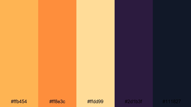
- HEX Codes: #ffb454, #ff8e3c, #ffdd99, #2d1b3f, #111827
- Mood: Energetic, celebratory, and dramatic.
- Use for: Use this palette for concert recaps, festival promos, and party highlight videos that need bold warm tones against deep night shadows.
Festival Lights Glow mixes bright, punchy ambers and oranges with inky purples and midnight blue-blacks. It feels like stage lights cutting through darkness, capturing the excitement, sweat, and motion of live events.
This is a strong amber color combination for thumbnails where you want text and subjects to pop against a dark background. Use the lightest amber and cream tones for titles and overlays, the saturated oranges for light flares and accents, and the deep blue-black as your main background in YouTube banners, event promos, and concert recaps.
Desert Lens Flare
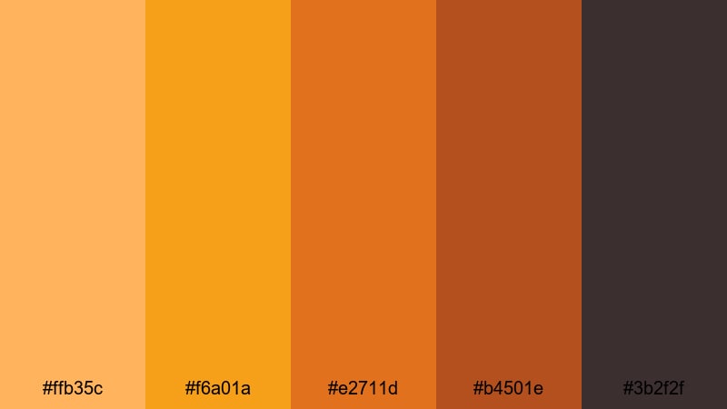
- HEX Codes: #ffb35c, #f6a01a, #e2711d, #b4501e, #3b2f2f
- Mood: Sun-baked, adventurous, and intense.
- Use for: Use this palette for road trip films, outdoor gear promos, and desert or beach scenes that need heat and grit.
Desert Lens Flare leans into hot amber, sand, and burnt orange tones anchored by earthy browns. It feels dry and rugged, like shooting under a harsh midday sun with dust in the air and long stretches of empty road.
Try this palette for travel vlogs, overland adventures, and outdoor brand content. Use the brighter ambers to simulate sun flares or graphics, and the darker browns for lower thirds, logo reveals, or Instagram Story text so everything stays readable over bright footage.
Vintage Amber Reel
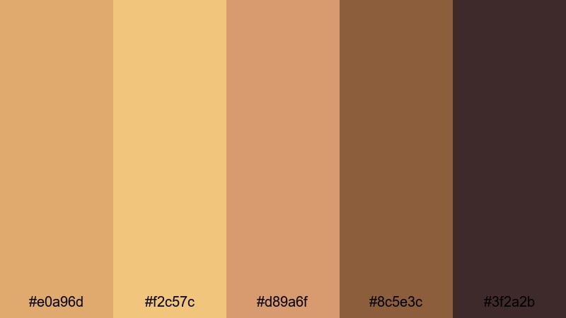
- HEX Codes: #e0a96d, #f2c57c, #d89a6f, #8c5e3c, #3f2a2b
- Mood: Retro, cozy, and film-inspired.
- Use for: Use this palette for nostalgic edits, family archives, and lifestyle reels that need a warm, analog vibe.
Vintage Amber Reel is a muted blend of amber and sepia browns that mimics old film stock and aged prints. Nothing here is neon or overly bright; instead, it feels soft, comforting, and a bit grainy in spirit.
Apply this palette to family videos, memory montages, or retro-styled brand stories. The lighter ambers make great backgrounds for handwritten-style titles, while the darker browns are perfect for film borders, vignette frames, or classic lower thirds in your edits and reels.
Soft & Cozy Amber Color Palettes
Honeycomb Morning
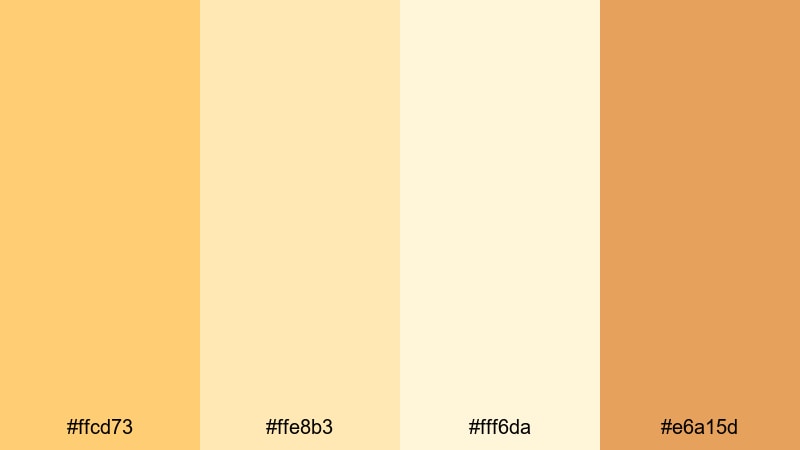
- HEX Codes: #ffcd73, #ffe8b3, #fff6da, #e6a15d
- Mood: Gentle, bright, and comforting.
- Use for: Use this palette for morning routines, home vlogs, and wellness content that should feel light and inviting.
Honeycomb Morning combines soft honey ambers with creamy off-whites for a clean, sun-kissed feel. It evokes quiet kitchen light, warm tea, and slow, gentle starts to the day.
Use the lightest tone as a background for text, captions, and channel banners, then bring in the richer ambers for call-to-action buttons and icons. It is ideal for wellness creators, routine vlogs, and thumbnail designs where you want viewers to feel calm and welcomed.
Caramel Latte Edit
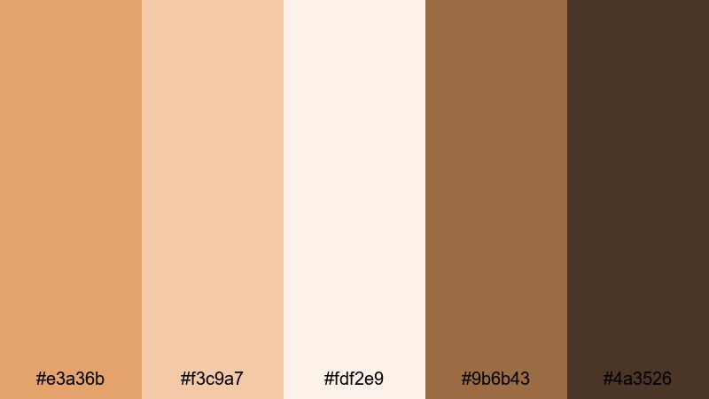
- HEX Codes: #e3a36b, #f3c9a7, #fdf2e9, #9b6b43, #4a3526
- Mood: Cozy, indulgent, and relaxed.
- Use for: Use this palette for cafe vlogs, study-with-me videos, and product shots of lifestyle or beauty brands.
Caramel Latte Edit feels like a warm drink on a rainy day. Creamy amber tones mix with coffee browns and soft creams, creating a gentle, indulgent atmosphere without heavy contrast.
This amber color palette works well for aesthetic study edits, cafe content, and beauty flat lays. Use the mid-tone amber for overlay shapes and highlight elements, the light cream for backgrounds and negative space, and the darker browns for body text and logo marks so everything stays legible on thumbnails and covers.
Amber Linen Daylight
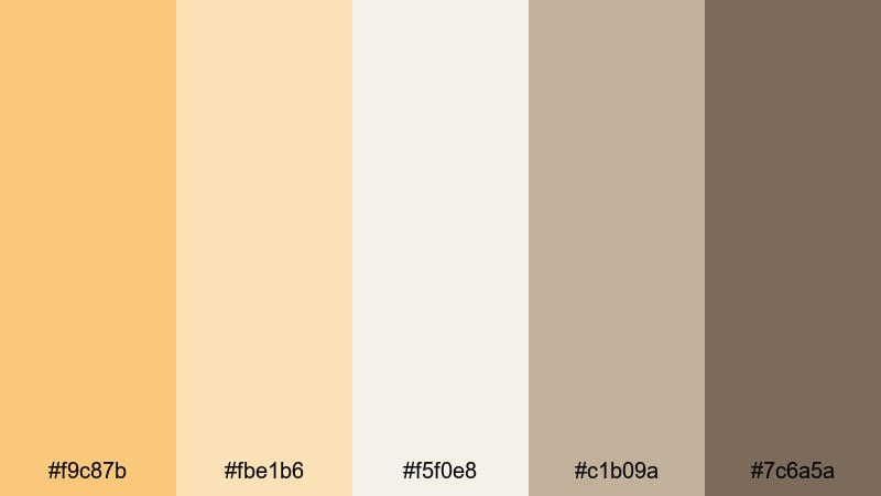
- HEX Codes: #f9c87b, #fbe1b6, #f5f0e8, #c1b09a, #7c6a5a
- Mood: Airy, natural, and understated.
- Use for: Use this palette for interior tours, slow living content, and minimalist fashion lookbooks.
Amber Linen Daylight pairs light amber tones with linen-inspired neutrals and soft taupes. The overall effect is airy and minimal, like natural light filtering through thin curtains onto neutral fabrics.
It is ideal for interior design walkthroughs, slow living channels, and minimalist fashion branding. Use the warm amber as a subtle accent color for buttons and icons, keep most backgrounds in soft off-white, and rely on the taupes and browns for text and UI elements in overlays and end screens.
Candlelit Reading Nook
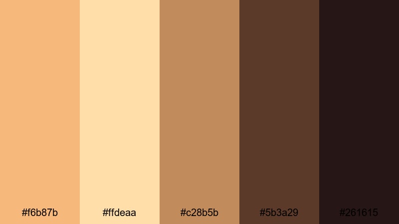
- HEX Codes: #f6b87b, #ffdeaa, #c28b5b, #5b3a29, #261615
- Mood: Intimate, quiet, and story-driven.
- Use for: Use this palette for booktube content, quiet night routines, and cinematic indoor scenes lit by practical lamps.
Candlelit Reading Nook captures the glow of warm lamps and candles against deep, chocolate shadows. It is intimate and moody, perfect for content that feels personal and reflective.
In thumbnails and titles, the brighter ambers can highlight book covers, cozy props, or key text, while the richer browns form the backdrop. Use this palette for book reviews, writing vlogs, and any nighttime storytelling where you want scenes to feel like a safe, quiet corner.
Bold & High-Impact Amber Color Palettes
Electric Marigold Punch
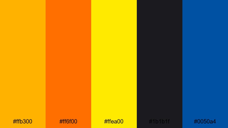
- HEX Codes: #ffb300, #ff6f00, #ffea00, #1b1b1f, #0050a4
- Mood: High-energy, daring, and loud.
- Use for: Use this palette for sports edits, hype reels, and attention-grabbing intros or outros.
Electric Marigold Punch is built for impact. Vivid marigold and hot amber tones clash dynamically with deep charcoal and a punchy electric blue accent, giving your visuals serious scroll-stopping power.
Use the bright ambers and yellows for main headlines and energy bursts, the blue as a striking secondary accent, and the dark charcoal as your base backdrop. This amber color palette is perfect for sports montages, product drops, countdowns, and kinetic typography where your message needs to be instantly readable on small screens.
Blackout Amber Contrast
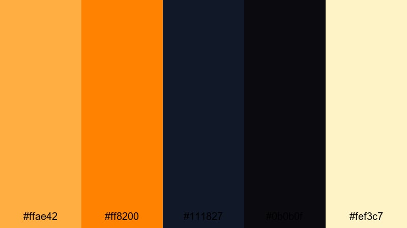
- HEX Codes: #ffae42, #ff8200, #111827, #0b0b0f, #fef3c7
- Mood: Edgy, modern, and punchy.
- Use for: Use this palette for tech promos, gaming highlights, and bold title cards that need maximum contrast.
Blackout Amber Contrast uses blazing amber accents on near-black backgrounds, with a pale highlight tone to add sharp definition. The contrast is extreme, which makes this palette ideal for bold, graphic layouts.
Use the deep blacks and navy as your canvas, drop in bright amber for callouts, score lines, and key icons, and reserve the pale cream for secondary text. This combination makes overlays and YouTube thumbnails for gaming, tech reviews, and edgy brand content clear and impactful even at a small size.
Neon Amber Headline
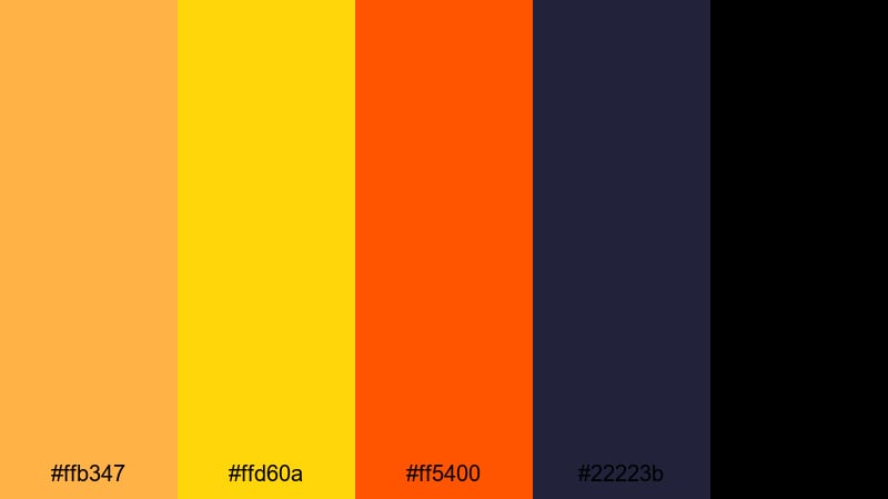
- HEX Codes: #ffb347, #ffd60a, #ff5400, #22223b, #000000
- Mood: Urban, futuristic, and intense.
- Use for: Use this palette for kinetic typography, promo teasers, and social ads that must read clearly on small screens.
Neon Amber Headline takes amber into a neon territory with bright yellow and searing orange on top of deep navy and black. It feels like city lights, digital billboards, and fast-moving graphics.
Make your main text the bright amber or yellow, your accents the hot orange, and keep backgrounds in navy or black for contrast. This amber aesthetic color scheme is perfect for ad creatives, teaser trailers, and YouTube channel trailers where strong typography drives the story.
Elegant Modern Amber Color Palettes
Amber Champagne Branding
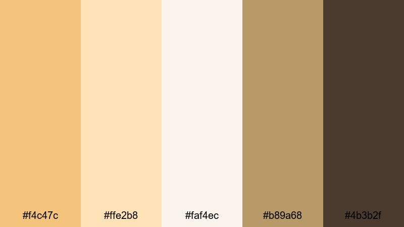
- HEX Codes: #f4c47c, #ffe2b8, #faf4ec, #b89a68, #4b3b2f
- Mood: Luxurious, polished, and celebratory.
- Use for: Use this palette for brand idents, product launches, and upscale event recaps.
Amber Champagne Branding feels like a toast at a high-end event. Sparkling champagne ambers and soft creams pair with a grounded brown accent, creating a refined and upscale look.
Use the light creams and soft ambers as backgrounds for product shots and logo reveals, and the deeper brown as an anchor color for text and borders. This palette is ideal for premium beauty brands, luxury event highlights, and elegant title sequences for your videos.
Gilded Minimal Logo
- HEX Codes: #f0b35a, #f8e1c0, #ffffff, #25262b, #111827
- Mood: Refined, minimal, and confident.
- Use for: Use this palette for logo animations, lower thirds, and clean UI overlays that hint at luxury without clutter.
Gilded Minimal Logo leans into a gold-leaning amber paired with crisp white and deep charcoals. It feels modern and minimal with just a hint of luxury.
In practice, keep most of your frames clean and light, then use amber sparingly for logos, key icons, and important buttons. The dark grays serve well for small text, menu bars, and subtle UI elements in overlays, motion graphics, and channel branding.
Urban Brass Highlights
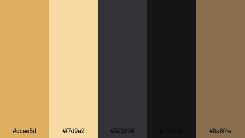
- HEX Codes: #dcae5d, #f7d9a2, #323338, #151515, #8a6f4e
- Mood: Industrial, stylish, and cinematic.
- Use for: Use this palette for city portraits, fashion promos, and brand films set in modern urban spaces.
Urban Brass Highlights uses brassy amber highlights against muted neutrals and dark grays, giving footage an industrial yet stylish sheen. It feels like warm light bouncing off metal and concrete in a modern city.
This amber color palette is perfect for fashion content, street portraits, and brand films. Let the darker grays dominate the frame while using brassy amber for key highlights, text, and accent shapes. It keeps your visuals sophisticated and cinematic without feeling too flashy.
Gallery Spotlight Amber
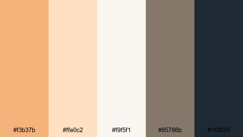
- HEX Codes: #f3b37b, #ffe0c2, #f9f5f1, #85786b, #1f2933
- Mood: Artful, calm, and curated.
- Use for: Use this palette for portfolio reels, product showcases, and gallery-style slides that need soft focus on key details.
Gallery Spotlight Amber combines subtle spotlight ambers and off-whites with muted grays. It feels like a quiet gallery where the lighting is carefully designed to draw attention to the art.
Use the warm ambers for hero objects, product frames, or important text, and rely on the grays and off-whites as neutral backgrounds. This palette works especially well for portfolio videos, slideshows, case studies, and clean product demos where you want the viewer to focus on details rather than loud colors.
Tips for Creating Amber Color Palettes
Amber is versatile, but it can easily overpower a design if used without balance. These tips will help you combine amber with supporting colors so your videos, thumbnails, and branding feel intentional and easy to read.
- Pair amber with deep neutrals (navy, charcoal, chocolate brown) to create contrast for text and UI elements, especially in thumbnails and lower thirds.
- Use lighter amber and cream tones for backgrounds and mid-tones, reserving the richest ambers for accents, buttons, and key callouts.
- Keep skin tones in mind when grading; warm them gently toward amber, but avoid pushing saturation so far that faces look orange or unnatural.
- For branding, choose one primary amber and 2 to 3 supporting neutrals. Reuse the same HEX codes across your logo, titles, and end cards to build recognition.
- Check readability on mobile by zooming out on your thumbnails; if amber text blends into the background, darken the backdrop or add a contrasting outline or drop shadow.
- Match your color palette to your content theme: soft honey ambers for cozy routines, bold marigolds for action, and muted sepias for nostalgic storytelling.
- Use gradients that shift between soft amber and cream for smooth, modern backgrounds behind product shots or typography.
- When color grading video, adjust saturation and luminance, not just hue, to keep amber highlights luminous while shadows remain rich and controlled.
Amber color palettes can instantly warm up your visuals, signal your brand personality, and guide how viewers feel about your stories. From soft honey tones to bold marigolds and brassy highlights, the HEX codes above give you ready-made combinations for vlogs, intros, thumbnails, and branding systems.
Experiment with these palettes inside Filmora: apply them as color grades, adopt them in your titles and overlays, and test which combinations give your channel or campaign the most distinctive look. With saved presets, AI tools, and filters, you can keep your amber aesthetic consistent across every platform.
Whether you shoot weddings, run a cozy vlog, or produce high-energy promos, dialing in the right amber scheme will help your videos feel more polished, intentional, and memorable to your audience.
secure downloadNext: Melon Color Palette
