
 100% Security Verified | No Subscription Required | No Malware

Ash Grey sits in a sweet spot between warm and cool neutrals. It feels calm, modern, and quietly confident, which is why you see it everywhere in UX design, tech branding, and cinematic grading. In video, Ash Grey helps backgrounds fade away so faces, products, and key messages stand out without harsh contrast or distracting colors.
For creators and Filmora users, Ash Grey is a powerful base for thumbnails, titles, lower thirds, intros, and LUTs. Below are 15 Ash Grey color palettes with ready-to-use HEX codes you can drop straight into your video overlays, channel branding, and social content while keeping everything cohesive from frame to thumbnail.
In this article
Calm & Minimal Ash Grey Color Palettes
Quiet Studio Morning
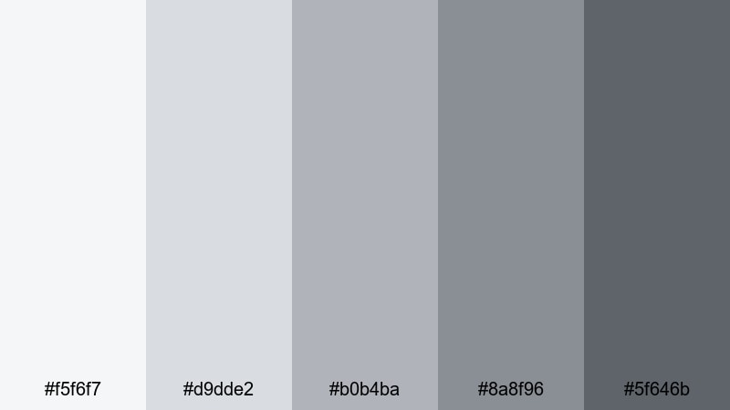
- HEX Codes: #f5f6f7, #d9dde2, #b0b4ba, #8a8f96, #5f646b
- Mood: Soft, focused, and quietly productive.
- Use for: Ideal for clean tutorial layouts, productivity vlog overlays, and simple title cards that need to feel calm yet professional.
Quiet Studio Morning layers misty whites with gentle Ash Grey midtones, like early sunlight on a tidy desk. It keeps your visuals light and breathable while still providing enough contrast for sharp text and icons.
Use this palette for tutorial slides inside your video, minimal YouTube thumbnails, and overlay panels that sit on top of screen recordings. The lighter tones (#f5f6f7 and #d9dde2) work beautifully as backgrounds, while the deeper greys (#8a8f96 and #5f646b) are ideal for titles, UI outlines, and subtle borders that keep viewers focused on the content, not the design.
Pro Tip: Keep Your Ash Grey Scenes Consistent In Filmora
When you build a minimal Ash Grey look, inconsistency between shots can instantly break the calm mood. In Filmora, you can set one clip as your visual reference for Quiet Studio Morning and then match exposure, contrast, and saturation across your entire timeline. Reuse the same HEX values for text, shapes, and overlays so your tutorials, intros, and b-roll all share the same quiet studio vibe.
Save this palette as part of a Filmora project template or preset. That way every new video in a productivity series inherits the same Ash Grey backgrounds, title cards, and lower thirds without you redesigning everything from scratch.
AI Color Palette
If you have a still image or mood board that perfectly captures your Quiet Studio Morning palette, Filmora's AI Color Palette feature can automatically spread those tones across your whole video. Import your reference frame, let Filmora analyze the Ash Grey balance, and then apply the look to other clips with just a few clicks.
This is especially helpful if you mix camera footage, screen recordings, and stock clips. AI Color Palette keeps them all aligned in the same soft, neutral Ash Grey space, so your thumbnails, intros, and main content feel like parts of one coherent brand.
 secure download

HSL, Color Wheels & Curves
Even within a neutral Ash Grey palette, small tweaks in saturation and brightness radically change the mood. Use Filmora's HSL sliders to gently desaturate blues and yellows so your greys stay clean, then push midtones slightly warmer or cooler with the color wheels to match your brand. A soft S-curve in the curves panel adds contrast for crisp text while keeping highlights from looking blown out.
If you want a deeper dive into balancing greys and skin tones, you can follow Filmora's advanced color correction tutorial while you experiment. It is a practical way to learn how curves and color wheels interact when you are shaping subtle Ash Grey looks.
secure download1000+ Video Filters & 3D LUTs
Once your base Ash Grey palette is in place, Filmora's video filters and 3D LUTs make it easy to push the look toward cinematic, vintage, or ultra-modern styles. You can start with an Ash Grey-friendly LUT, then reduce opacity so your Quiet Studio Morning colors remain readable for text and UI.
Stack subtle vignette, glow, and sharpen filters over your neutral greys to guide the eye toward faces or products. Because your base is calm and minimal, these extra effects feel intentional rather than overdone, especially in intros, outros, and short-form social edits.
secure downloadConcrete Loft Light
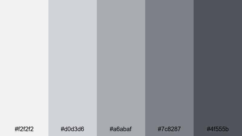
- HEX Codes: #f2f2f2, #d0d3d6, #a6abaf, #7c8287, #4f555b
- Mood: Urban, airy, and understated.
- Use for: Works well for design breakdowns, architecture content, and sleek lower thirds on lifestyle or interior design videos.
Concrete Loft Light feels like soft daylight bouncing off concrete walls and brushed steel. It is neutral and polished, giving your layouts an urban edge without heavy contrast or harsh blacks.
Use the lightest shades as background fields for before-and-after frames or architecture diagrams, then save the darker greys for clean title bars and subtitles. This Ash Grey color combination is perfect for design-focused thumbnails, interior styling reels, and any video where the set or product shots already carry most of the color.
Foggy Harbor Walk
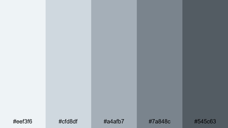
- HEX Codes: #eef3f6, #cfd8df, #a4afb7, #7a848c, #545c63
- Mood: Peaceful, reflective, and slightly nostalgic.
- Use for: Use for travel vlogs, voiceover stories, or reflective montages where you want a soft, cinematic calm without bold colors.
Foggy Harbor Walk leans into blue-tinted Ash Greys, like a quiet harbor morning wrapped in mist. It introduces a cool, cinematic calm that feels reflective and slightly nostalgic, without ever becoming cold or unfriendly.
Apply the pale tones behind captions or chapter cards in travel vlogs and narration segments, using the deeper greys for time stamps, location tags, and minimalist icons. The subtle blue cast pairs naturally with seascapes, rainy windows, and city b-roll, making your vlogs look cohesive from intro to end card.
Soft Graphite Workspace
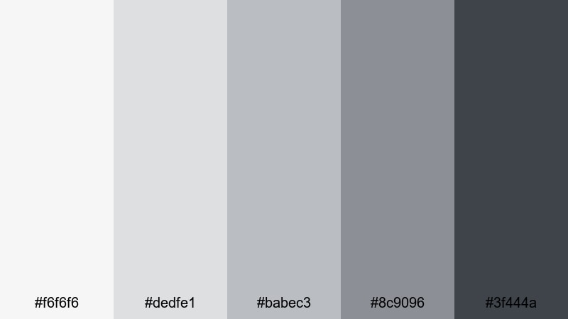
- HEX Codes: #f6f6f6, #dedfe1, #babec3, #8c9096, #3f444a
- Mood: Organized, neutral, and tech-friendly.
- Use for: Ideal for tech explainers, screen recordings, and UI demos where you want clean contrast without harsh black and white.
Soft Graphite Workspace balances warm and cool Ash Grey tones, echoing laptops, tablets, and a neat desktop setup. It feels clean and tech-ready, giving your videos a professional but friendly interface-style look.
Use the lighter greys as overlays under cursor highlights or annotation callouts in tutorials. Reserve the darkest shade (#3f444a) for key text, icons, and button-like shapes in your graphics. This palette keeps your UI elements readable on top of screen recordings while avoiding the eye strain of pure white backgrounds or stark black boxes.
Elegant & Modern Ash Grey Color Palettes
Urban Penthouse Chic
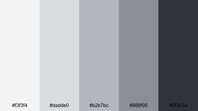
- HEX Codes: #f3f3f4, #dadde0, #b2b7bc, #888f95, #2f343a
- Mood: Polished, upscale, and confident.
- Use for: Perfect for luxury product promos, fashion lookbooks, and sleek openers for brand or portfolio videos.
Urban Penthouse Chic blends cool Ash Grey tones with a deep charcoal anchor, creating a refined, editorial mood. It feels like glass, metal, and soft textiles in a high-rise apartment, making everything in your frame look a little more premium.
Use the brighter shades to frame product shots or lookbook clips, then employ the darkest tone as a background for logo reveals and hero titles. This palette is ideal for cinematic fashion thumbnails, high-end brand bumpers, and portfolio reels that need to project confidence and style without flashy colors.
Silver Lining Branding
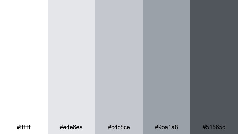
- HEX Codes: #ffffff, #e4e6ea, #c4c8ce, #9ba1a8, #51565d
- Mood: Optimistic, refined, and versatile.
- Use for: Great for brand style guides, logo reveals, and channel rebrands where you need a reliable neutral base with a premium touch.
Silver Lining Branding combines pure white with layered silver and Ash Grey tones, giving you a bright but stable base for long-term branding. It feels optimistic and timeless, ideal if you want your channel or brand to look fresh without chasing trends.
Use the middle greys for consistent thumbnail frames and end screen layouts, then let white and the darkest grey anchor titles, logos, and taglines. Because this palette is so flexible, it works across intros, tutorials, and shorts, keeping your aesthetic consistent even as your content topics change.
Monochrome Luxe Edit
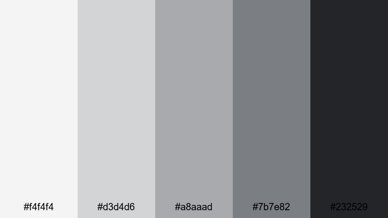
- HEX Codes: #f4f4f4, #d3d4d6, #a8aaad, #7b7e82, #232529
- Mood: Editorial, sleek, and cinematic.
- Use for: Use for beauty edits, lookbook reels, and minimal reels where the footage color is the star and UI stays tastefully in the background.
Monochrome Luxe Edit runs from soft fog to inky grey-black, echoing magazine spreads and gallery catalogs. It gives you a sleek, cinematic base that keeps attention on skin tones, fabrics, or product finishes while your graphics stay understated.
Use lighter shades for border frames, safe-area bars, and background panels; then apply the darkest grey as a grounded base for bold typography. This Ash Grey color palette is perfect when you want your footage to carry the color story and your UI to feel intentionally minimal.
Chrome Accent Titles
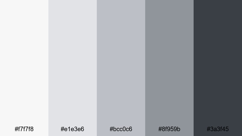
- HEX Codes: #f7f7f8, #e1e3e6, #bcc0c6, #8f959b, #3a3f45
- Mood: Techy, crisp, and forward-looking.
- Use for: Best for motion graphics titles, SaaS explainers, and gadget reviews where you want subtle chrome-like depth without true metallic rendering.
Chrome Accent Titles mimics brushed metal and soft reflections using only cool Ash Grey midtones. It delivers a techy, future-focused look that feels premium without needing actual metallic shaders.
Use the lighter tones for subtle gradients inside title blocks and lower thirds, then reserve the darkest grey for outlines, drop shadows, and HUD-style interface details. This palette fits perfectly into software demos, gadget reviews, and start-up pitch videos where clarity and innovation are the main message.
Moody & Cinematic Ash Grey Color Palettes
Rainy Night Street
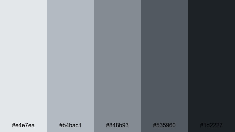
- HEX Codes: #e4e7ea, #b4bac1, #848b93, #535960, #1d2227
- Mood: Moody, cinematic, and introspective.
- Use for: Ideal for cinematic vlogs, narrative shorts, and music videos that lean into reflective nighttime moods.
Rainy Night Street captures the feel of wet pavement and soft city lights in drizzle. Its Ash Grey tones deepen toward charcoal, adding a quiet drama that suits late-night monologues, reflective walks, and slow, atmospheric b-roll.
Use the lighter greys for subtitles and captions over darker footage, then apply the deeper shades as background plates for credits, end cards, and title sequences. This palette is especially strong for cinematic vlogs and music videos where you want emotions to read clearly without bright colors pulling focus.
Noir Framed Moments
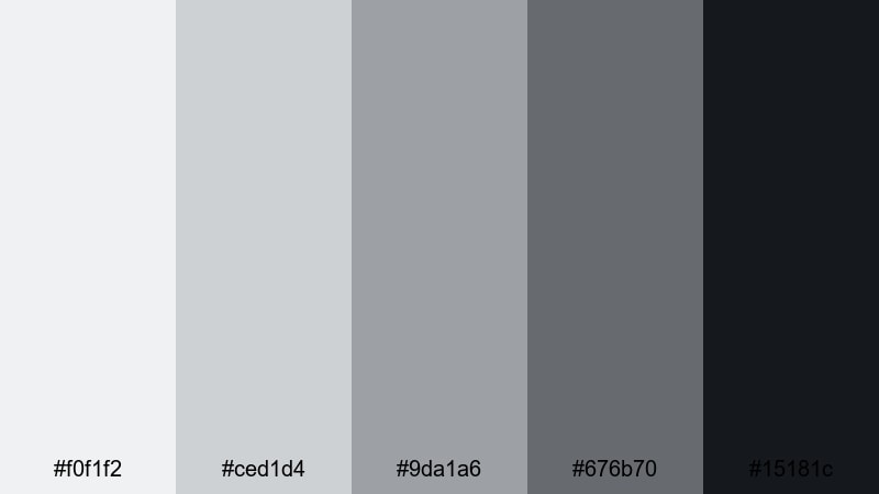
- HEX Codes: #f0f1f2, #ced1d4, #9da1a6, #676b70, #15181c
- Mood: Timeless, suspenseful, and bold.
- Use for: Use for teaser trailers, documentary intros, and title cards that echo classic film noir aesthetics.
Noir Framed Moments offers a high-contrast mix of pale mist and deep shadow. It instantly calls back to film noir and classic crime dramas, making your visuals feel more story-driven and intense.
Use the near-white as a base for bold, centered typography and the near-black (#15181c) for thick frame borders or letterbox bars. This palette works well for documentary teasers, investigative series, and any project where you want title cards and interstitials to feel cinematic and suspenseful.
Stormcloud Transitions
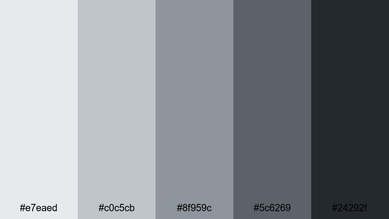
- HEX Codes: #e7eaed, #c0c5cb, #8f959c, #5c6269, #24292f
- Mood: Tense, atmospheric, and dynamic.
- Use for: Great for glitch cuts, suspense reels, or chapter cards in long-form videos that need a cohesive dark-neutral tone.
Stormcloud Transitions layers cool, stormy Ash Greys that feel like clouds building before heavy rain. It brings tension and movement to your edits without overwhelming them with pure black.
Use these tones for animated wipes, glitch transitions, and chapter markers in long-form content. The mid-greys work well as backgrounds for minimal icons or timestamps, while the darkest shade anchors dramatic cuts between acts or sections in story-driven videos.
Shadowbox Trailer Grade
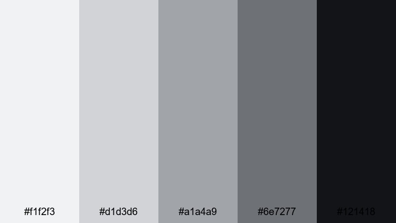
- HEX Codes: #f1f2f3, #d1d3d6, #a1a4a9, #6e7277, #121418
- Mood: Cinematic, focused, and intense.
- Use for: Perfect for trailers, podcast promos, and commentary videos that want serious tone without going fully monochrome black and white.
Shadowbox Trailer Grade feels like a carefully lit studio set, with soft top light and dense shadows. It delivers a serious, cinematic Ash Grey tone that is ideal for trailers, promos, and commentary with weighty topics.
Use the lighter greys for spotlight-style boxes behind faces or key text, and the darkest tone for backgrounds, intros, and end slates. This palette is strong for podcast channels and commentary thumbnails where you want clarity and gravity without the harshness of pure black-and-white grading.
Soft & Cozy Ash Grey Color Palettes
Cashmere Throw Afternoon
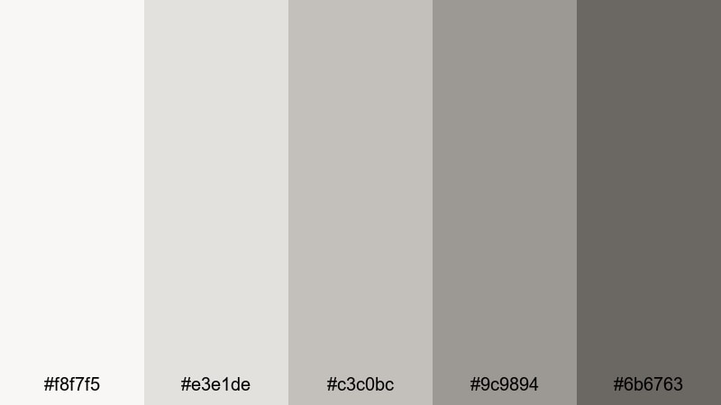
- HEX Codes: #f8f7f5, #e3e1de, #c3c0bc, #9c9894, #6b6763
- Mood: Warm, relaxed, and inviting.
- Use for: Great for lifestyle vlogs, home decor content, and creator intros that aim to feel approachable and homey.
Cashmere Throw Afternoon mixes cream-tinted greys and soft browns, like cozy blankets and afternoon light through curtains. It is an Ash Grey palette that leans warm, making your videos feel more personal and lived-in.
Use the lighter tones for background panels under text in lifestyle vlogs or home tours, and the deeper shades for gentle headlines, lower thirds, and section labels. This palette works especially well in thumbnails for cozy vlogs, decor makeovers, or slow-living content where you want viewers to feel instantly at ease.
Steam From The Mug
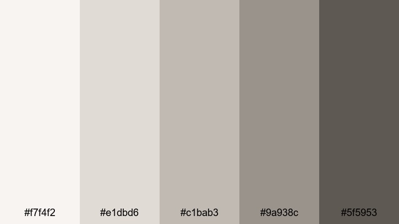
- HEX Codes: #f7f4f2, #e1dbd6, #c1bab3, #9a938c, #5f5953
- Mood: Comforting, intimate, and calm.
- Use for: Ideal for coffee chats, journaling videos, and soft-spoken ASMR where the visuals should feel warm but still neutral.
Steam From The Mug brings together misty Ash Grey with muted taupe, like a warm drink on a rainy day. It is soothing and intimate, perfect for close-up, voice-led videos where you want the visuals to feel safe and relaxed.
Use the softest tones as background gradients behind subtitles or handwritten-style titles. Let the darker neutrals support subtle frames and simple icons, especially in ASMR, journaling, or advice videos. This palette keeps your aesthetic neutral enough for any topic while still hinting at warmth and comfort.
Overcast Sunday Vlog
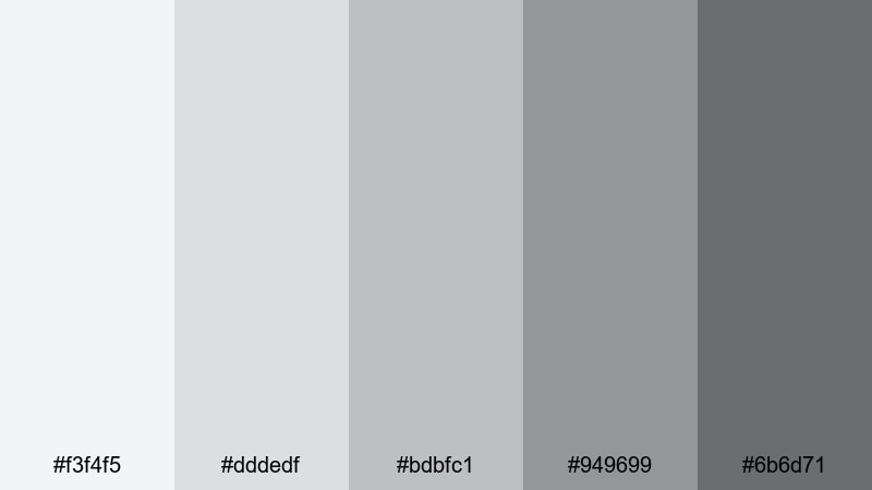
- HEX Codes: #f3f4f5, #dddedf, #bdbfc1, #949699, #6b6d71
- Mood: Casual, honest, and down-to-earth.
- Use for: Use for daily vlogs, chatty sit-down videos, or behind-the-scenes clips where you want a soft, unpolished but cohesive feel.
Overcast Sunday Vlog is built from soft, even Ash Greys that feel like a cloudy sky. It smooths out harsh shadows and color casts, flattering skin tones and real-life spaces without making them look overly edited.
Use this palette for chatty sit-down videos, daily diaries, or behind-the-scenes content where authenticity matters. The mid-greys are great for simple chapter markers and timestamp overlays, while the lightest shades make clean backgrounds for casual, handwritten fonts on thumbnails and title cards.
Tips for Creating Ash Grey Color Palettes
Ash Grey is incredibly flexible, but a few practical habits will help you combine it with other colors and keep your videos clear, on-brand, and easy to watch.
- Set a primary grey range: choose one light, one mid, and one dark Ash Grey and reuse them across overlays, titles, and background shapes.
- Add one accent color: pair Ash Grey with a single accent (such as Red Pink, teal, or gold) for buttons, highlights, and key icons so your CTAs stand out.
- Check text contrast: always test titles and subtitles on mobile; dark grey text on very light grey backgrounds usually reads better than pure black on white.
- Match your footage: if your footage leans warm (tungsten lights, wood), choose slightly warm greys; if it is cool (daylight, tech), use cooler blue-tinted greys.
- Keep thumbnails bolder: within a subtle Ash Grey palette, push contrast slightly higher for thumbnails than for in-video graphics so they still pop in the feed.
- Stay consistent per series: lock one Ash Grey palette for each playlist or show on your channel so viewers recognize it instantly.
- Test on multiple screens: quickly preview your designs on a phone, tablet, and monitor to be sure your greys do not shift too blue or too brown.
- Save presets in Filmora: once you dial in text colors, backgrounds, and LUTs, save them as presets or project templates to reuse the same palette effortlessly.
Ash Grey color palettes are a powerful way to shape mood, from soft productivity vibes to moody cinematic trailers and cozy vlog diaries. By choosing a consistent set of greys and one accent color, you can build a recognizable visual identity that works across thumbnails, intros, lower thirds, and end cards.
With Filmora, it is easy to test these 15 Ash Grey color combinations directly on your footage. Use AI Color Palette, HSL and curves, plus filters and LUTs to refine each look until it fits your brand, then save it as a repeatable style for future uploads.
Try a few of these palettes on your next project, tweak them to match your lighting and subject, and let Ash Grey become the quiet backbone of your cinematic, modern channel design.
secure downloadNext: Red Pink Color Palette
