
 100% Security Verified | No Subscription Required | No Malware


 ChatGPT
 Perplexity
 Gemini
 Claude
 Grok
Grok
Beige orange sits between soft neutrals and warm citrus tones. It blends the calm stability of beige with the friendly energy of orange, creating palettes that feel cozy, sunlit, and cinematic instead of loud or neon. In color psychology, this range suggests comfort, approachability, and understated optimism, which makes it ideal for creators who want warmth without overwhelming the viewer.
In video editing, branding, thumbnails, and channel intros, beige orange color palettes can unify your visuals: from lifestyle vlogs and travel edits to cafe branding and UI overlays. Below you will find ready to use beige orange color combinations with HEX codes, so you can quickly match your visuals in Filmora, keep your look consistent, and design cohesive social media graphics, overlays, and titles.
In this article
Soft & Cozy Beige Orange Color Palettes
Warm Latte Morning
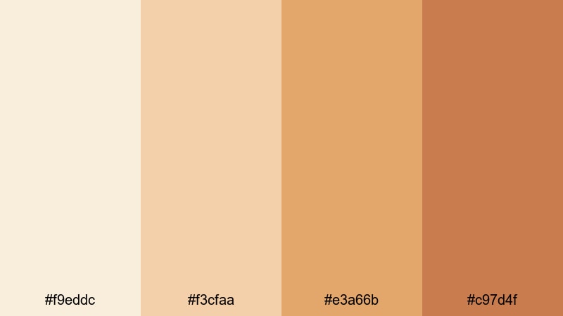
- HEX Codes: #f9eddc, #f3cfaa, #e3a66b, #c97d4f
- Mood: Comforting, relaxed, and homely with a gentle cafe warmth.
- Use for: Perfect for lifestyle vlogs, morning routines, and thumbnail designs that should feel soft, slow, and welcoming.
Warm Latte Morning is a creamy mix of latte beige, honey tan, and soft orange brown. It feels like quiet time in a small cafe, with sunlight on a notebook and steam rising from a mug. The gentle contrast keeps everything easy on the eyes, ideal for creators who want a warm aesthetic without going full orange.
Use this palette for self care vlogs, journaling shots, and calm productivity content. In Filmora, you can color match your A-roll and B-roll to these tones, then design titles, lower thirds, and YouTube thumbnails using the lightest beige for backgrounds and the deeper orange brown for text, buttons, and subscribe prompts.
Pro Tip: Build a Soft Beige Orange Aesthetic in Filmora
To keep a latte inspired beige orange look consistent, start by choosing one hero shade from this palette as your base. In Filmora, use that shade on your intro background, text boxes, and end screen frames so viewers instantly recognize your style, even when the footage changes from desk shots to cafe scenes.
You can then apply gentle color correction to cool, flat clips so they lean into the same warm orange browns. Save this as a custom preset in Filmora and reuse it across morning routines, weekly vlogs, and social edits to maintain a recognizable beige orange brand.
AI Color Palette
If you already have a reference photo that nails your Warm Latte Morning vibe, you can turn it into a one click look. Filmora's AI Color Palette feature analyzes your reference colors and applies the same beige orange balance to any clip on the timeline.
Simply drop your clip on the timeline, choose the reference frame, and let AI handle the grading. This is especially useful for creators who film on different devices or under mixed lighting, yet want a consistent creamy cafe look from intro to outro.
 secure download

HSL, Color Wheels & Curves
Even with a preset palette, every clip needs small tweaks. Use Filmora's HSL controls to selectively warm your oranges and desaturate any distracting reds, while keeping skin tones natural. In the color wheels, push midtones slightly toward orange and highlights toward a soft beige, then use curves to add gentle contrast for a more cinematic, latte like depth.
If you want a deeper walkthrough, the Filmora color grading guide shows how to balance shadows and highlights so your beige orange aesthetic looks polished across intros, B-roll, and thumbnails.
secure download1000+ Video Filters & 3D LUTs
Once your beige orange base is set, you can speed up styling with ready made looks. Filmora's video filters and 3D LUTs make it easy to add subtle film grain, soft glow, or vintage warmth on top of your latte toned grade.
Apply a soft cinematic LUT to your main sequence, then reduce intensity so your beige and orange hues stay natural. Save this as a custom look you can reuse in intros, reels, and shorts to keep your brand firmly in the cozy beige orange space.
secure downloadLinen Bedroom Glow
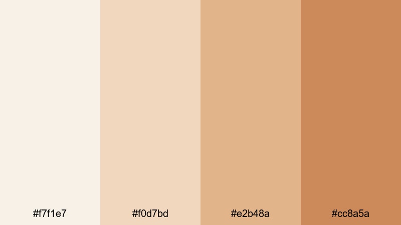
- HEX Codes: #f7f1e7, #f0d7bd, #e2b48a, #cc8a5a
- Mood: Airy, tender, and intimate like golden light on fresh linens.
- Use for: Ideal for bedroom makeovers, home decor reels, and aesthetic lookbooks needing a soft, dreamy filter.
Linen Bedroom Glow layers pale cream, soft sand, and muted orange for a hazy morning feel. It is delicate and breathable, like natural fabrics catching the first light of the day. There is enough warmth to feel inviting, but the overall look stays understated and minimal.
Use this palette in makeover videos, room tours, or fashion lookbooks where you want your scene to feel dreamy but not overly filtered. In thumbnails and channel banners, use the lightest beige for backgrounds and the medium orange for titles, while keeping the richest shade for accents like frames, icons, and CTAs.
Candlelit Journaling
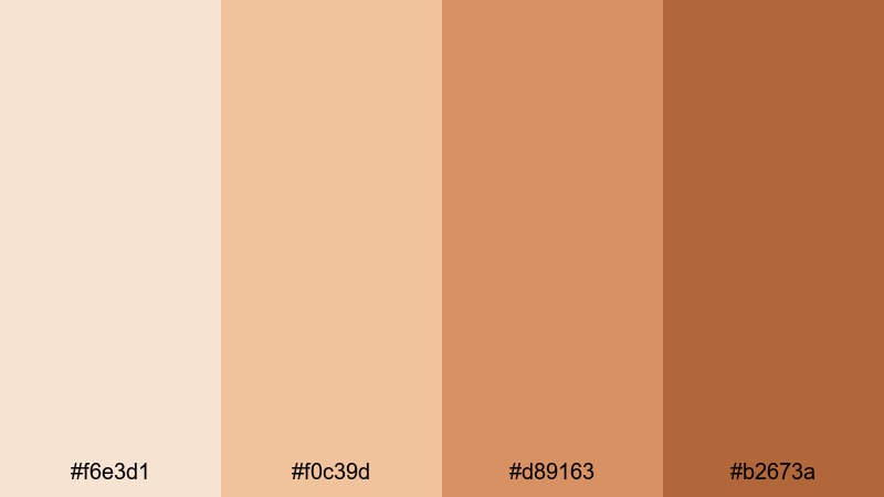
- HEX Codes: #f6e3d1, #f0c39d, #d89163, #b2673a
- Mood: Introspective, warm, and slightly nostalgic, like writing by candlelight.
- Use for: Great for study vlogs, cozy night routines, and B roll overlays that need a comforting amber glow.
Candlelit Journaling moves from a soft parchment beige into caramel and amber browns, echoing firelight on pages and wood. It feels intimate and reflective, ideal when you want your video to feel like a quiet evening spent offline.
Apply this palette to study sessions, reading vlogs, or slow living edits. Color grade your footage toward these warm oranges, then design overlays like to do lists, chapter cards, or timestamps using the light beige for background boxes and the deepest brown as headline text for good contrast.
Autumn Knit Sweater
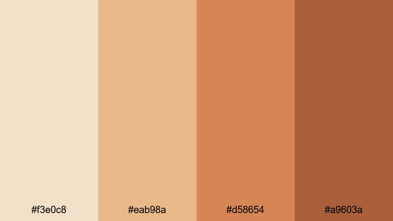
- HEX Codes: #f3e0c8, #eab98a, #d58654, #a9603a
- Mood: Snug, nostalgic, and seasonal like pulling on a favorite sweater.
- Use for: Use for fall vlogs, booktube intros, and cozy product showcases that should feel warm and tactile.
Autumn Knit Sweater captures creamy beige, pumpkin orange, and burnt rust tones that instantly say fall. It is nostalgic and tactile, like knitted fabric, falling leaves, and warm drinks in cold air.
This palette is perfect for seasonal branding and playlists. Use the lighter tones as background for quote cards and story slides, and reserve the richer oranges for headers, badges, and discount tags in fall product promos or book recommendations.
Modern Minimal Beige Orange Color Palettes
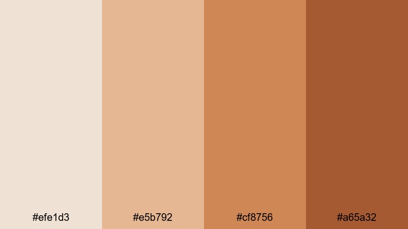
Sandstone Studio
- HEX Codes: #f3e6d6, #e1c29b, #c49464, #8c6440
- Mood: Grounded, refined, and creative with a modern studio edge.
- Use for: Perfect for creator branding, channel banners, and portfolio visuals that need to feel polished yet warm.
Sandstone Studio combines structured beiges and orange browns that feel like sculpted stone and wood in a design studio. It is warm but professional, making it a good fit for creators who want credibility without resorting to cold grays.
Use it for portfolio reels, channel rebrands, and educational content. Build title slides with the lightest beige as the main canvas, the medium tones for sidebars or infographics, and the darkest orange brown for logos, section titles, and key stats that must stand out.
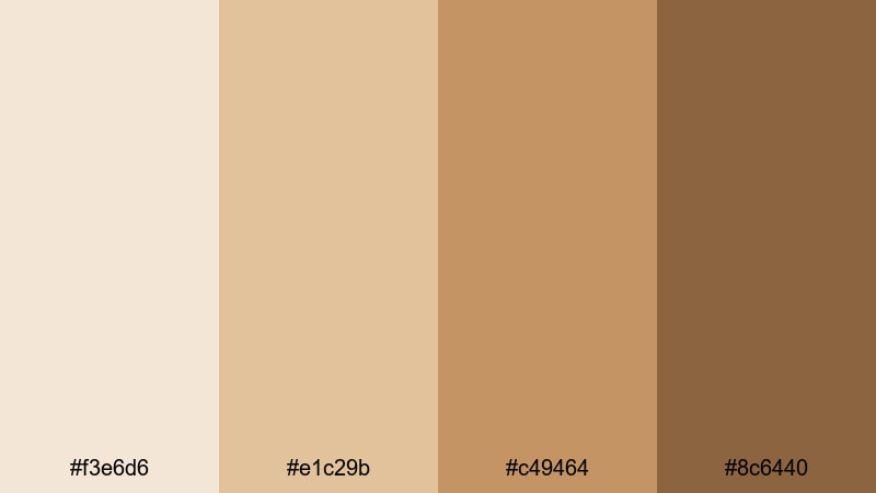
Minimal Amber Grid
- HEX Codes: #fbf1e4, #f1cda4, #e0a268, #be7441
- Mood: Orderly, bright, and design forward with a soft amber accent.
- Use for: Great for UI overlays, tutorial templates, and clean YouTube intros that balance clarity with warmth.
Minimal Amber Grid uses a very light beige base with organized amber accents. It feels like a neatly arranged workspace or a UX mockup brought to life, keeping attention on your content while still giving the frame personality.
Use this palette for tutorials, tech explainers, and productivity videos. Build grids, progress bars, and info cards using the two mid ambers, and keep the darkest shade for important labels and buttons so viewers always know where to look and what to click.
Clay Loft Calm
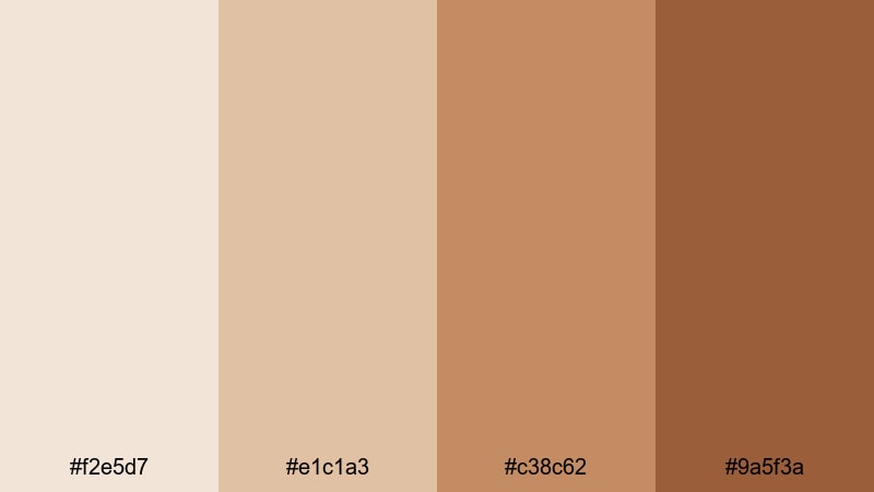
- HEX Codes: #f2e5d7, #e1c1a3, #c38c62, #9a5f3a
- Mood: Quiet, artistic, and thoughtfully curated like a modern loft.
- Use for: Use for branding packages, subtle title cards, and aesthetic reels showcasing art, design, or interior spaces.
Clay Loft Calm blends clay beiges and sculptural orange browns, evoking pottery, gallery walls, and high ceilings. It is warm but restrained, perfect for creators in art, design, or interior styling who want a modern yet human look.
Feature this palette in aesthetic reels, moodboards, and lookbooks. In Filmora, you can use the lighter tones for background plates under typography and the darker shades for logo locks, section frames, and animated dividers between chapters.
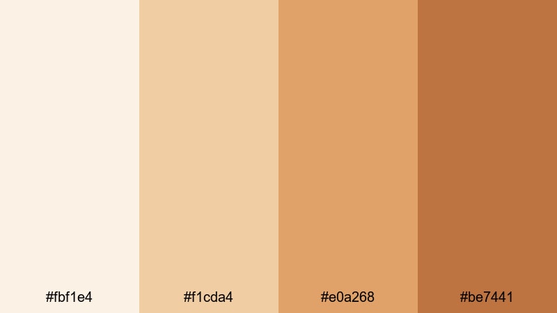
Terracotta Interface
- HEX Codes: #efe1d3, #e5b792, #cf8756, #a65a32
- Mood: Modern, tactile, and confident with terracotta inspired depth.
- Use for: Ideal for app style overlays, lower thirds, and motion graphics that aim for a warm yet tech ready aesthetic.
Terracotta Interface brings together soft beige with strong terracotta oranges for a warm digital look. It feels tech ready but grounded, like a UI designed with natural materials in mind.
Apply it in app demos, startup explainers, and social media promos. Use the mid terracotta tone for card backgrounds, highlight states, and progress steps, while the deepest shade works well for icons, badges, and bold CTA labels in your motion graphics.
Vibrant Sunset Beige Orange Color Palettes
Apricot Sky Fade
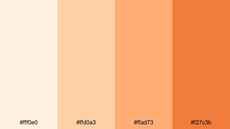
- HEX Codes: #fff0e0, #ffd0a3, #ffad73, #f27c3b
- Mood: Optimistic, dreamy, and cinematic, like a lingering sunset.
- Use for: Perfect for travel vlogs, dreamy transitions, and thumbnails that need an eye catching yet soft gradient feel.
Apricot Sky Fade moves from pale apricot into glowing orange, mimicking the sky as it slips from afternoon to golden hour. It is bright but not harsh, and works beautifully as a gradient background for cinematic text reveals.
Use it in travel vlogs, couples montages, and dreamy B-roll sequences. Build vertical gradients from the lightest to deepest shade in intros, then use the mid tones for text and icons so your titles float over a soft, sunset inspired wash of color.
Golden Hour Streets
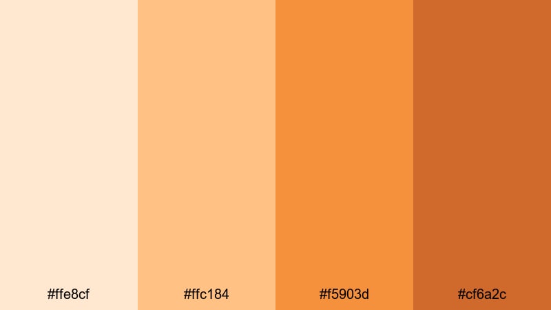
- HEX Codes: #ffe8cf, #ffc184, #f5903d, #cf6a2c
- Mood: Energetic, urban, and cinematic like sunlit city streets.
- Use for: Use in street style edits, skate videos, and dynamic reels that should feel lively and warm.
Golden Hour Streets pairs soft highlights with punchy oranges that feel like light bouncing off concrete and glass. The palette is kinetic and urban, giving your footage an instant late afternoon attitude.
Apply it to skate edits, outfit reels, or city travel diaries. Lean on the lighter beige for text boxes and overlays, then let the saturated oranges power bold typography, brush titles, and accent shapes that track motion in your shots.
Tropical Papaya Crush
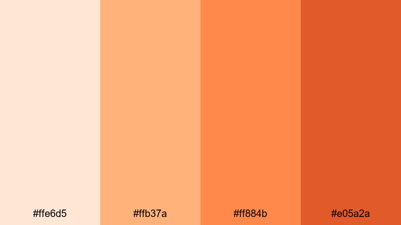
- HEX Codes: #ffe6d5, #ffb37a, #ff884b, #e05a2a
- Mood: Playful, juicy, and bold with a sun drenched vacation vibe.
- Use for: Great for travel montages, summer campaigns, and social ads targeting a young, fun audience.
Tropical Papaya Crush combines peachy beige with vivid papaya oranges that scream summer and salt water. It is youthful and energetic, instantly drawing the eye in crowded feeds.
Use it in travel montages, festival recaps, and social campaigns. Let the brightest oranges power your main headlines and sticker style graphics, while the softer beige tones keep your backgrounds light, breezy, and still easy to read.
Neon Peach Sign
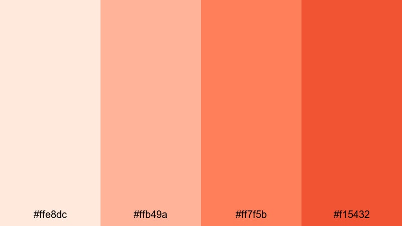
- HEX Codes: #ffe8dc, #ffb49a, #ff7f5b, #f15432
- Mood: Bold, trendy, and attention grabbing like a glowing sign at night.
- Use for: Ideal for music videos, announcement cards, and creator intros that need instant impact and a modern edge.
Neon Peach Sign sits closer to the neon side of beige orange, mixing soft peach backgrounds with electric orange accents. It feels like a glowing sign or pop art graphic, making it ideal when you need viewers to stop scrolling.
Use the lighter tones for clean backgrounds in announcements and the more saturated oranges for drop shadows, outlines, and animated strokes around key phrases like New Video or Live Premiere. This palette works especially well for music and creator intros with bold motion typography.
Earthy Natural Beige Orange Color Palettes
Desert Dune Caravan
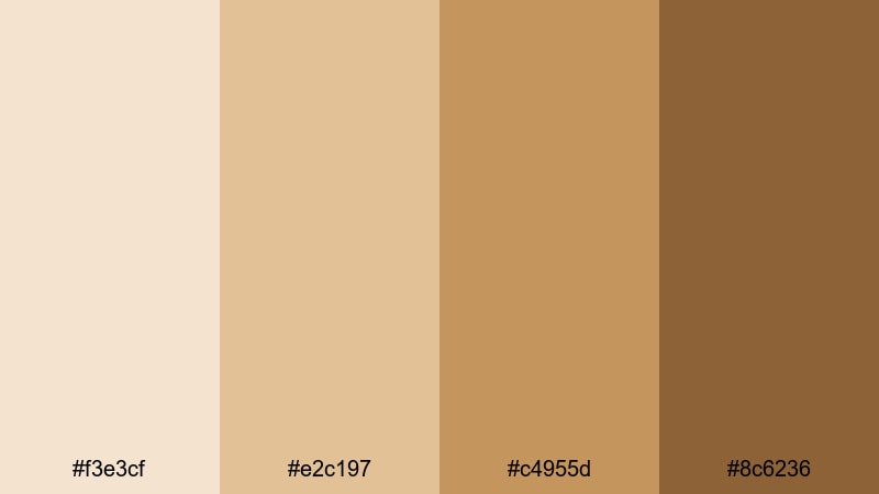
- HEX Codes: #f3e3cf, #e2c197, #c4955d, #8c6236
- Mood: Adventurous, grounded, and timeless like a sunlit desert trail.
- Use for: Perfect for travel documentaries, outdoor brand stories, and nature B roll that need an earthy, cinematic touch.
Desert Dune Caravan fades from pale sand into sun baked orange browns, echoing dunes and ancient paths. It feels adventurous but calm, suited to long form storytelling and documentary style edits.
Use this palette to grade landscape shots, hiking sequences, and overland travel stories. The lighter shades work as matte overlays behind location titles, while the deeper browns can anchor map graphics, chapter headers, and brand marks for outdoor or Earth focused channels.
Harvest Market Stall
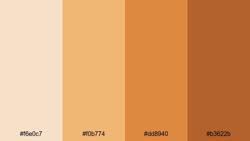
- HEX Codes: #f6e0c7, #f0b774, #dd8940, #b3622b
- Mood: Lively, rustic, and abundant like a local harvest market.
- Use for: Great for food videos, farmers market reels, and small business promos focused on handmade or organic products.
Harvest Market Stall mixes creamy beige with pumpkin and caramel oranges, suggesting wooden stalls, baskets, and fresh produce. It is rustic and generous, perfect for content that celebrates real food and handmade goods.
Use it in recipe videos, farmers market reels, and small business branding. In your thumbnails and lower thirds, let the light beige keep things airy around food shots while the richer oranges highlight prices, menu items, and brand slogans in a way that still feels natural and trustworthy.
Rustic Bakery Morning

- HEX Codes: #f7ebdd, #f2c898, #e49b60, #c26b3b
- Mood: Inviting, artisanal, and warm like a small town bakery.
- Use for: Ideal for cafe branding, cooking channels, and product shots that highlight baked goods or handcrafted items.
Rustic Bakery Morning pairs buttery beige with toasted orange browns that look like fresh bread, croissants, and wooden counters. It is inviting and artisanal, ideal for brands and creators centered around comfort food and local spots.
Use this palette on menus, packaging mockups, and cafe style intros. In Filmora, color grade your food shots toward these tones, then design simple overlay cards with the lightest beige as a base and the deeper oranges for headings like Daily Special or New Recipe so everything feels warm and cohesive.
Tips for Creating Beige Orange Color Palettes
Beige orange works best when it balances warmth with readability and fits your brand story. When you design your own palette or adapt the ones above, keep both screen usability and emotional tone in mind.
- Always pair light beige backgrounds with darker orange or brown text to keep titles readable on mobile screens.
- Use the most saturated orange sparingly for CTAs, buttons, and key thumbnails so viewers know exactly where to look.
- Keep skin tones natural by pushing only mids and highlights toward beige orange; avoid over saturating reds and yellows.
- For branding, pick one hero beige and one signature orange, and reuse them in intros, end screens, and social graphics.
- Mix beige orange with a subtle dark neutral (like deep brown or charcoal) for subtitles and icons that need strong contrast.
- Test your palette on both light and dark footage to make sure overlays and text remain visible in every scene.
- Save your grading as presets in Filmora so you can apply the same beige orange mood across series, playlists, and shorts.
- When in doubt, desaturate slightly; a softer beige orange often feels more cinematic and professional than a very bright one.
Beige orange color palettes are versatile enough to handle soft mornings, bold sunsets, and earthy stories, all while giving your brand a warm, approachable identity. By locking in a few favorite combinations and using them consistently, your audience will recognize your videos and thumbnails at a glance.
Try dropping these HEX codes into your titles, overlays, and Filmora color settings, then refine them with AI Color Palette, HSL, and LUTs until they feel like your own. With a unified beige orange aesthetic, everything from your intros to your end screens will feel connected and intentional.
Whether you create lifestyle vlogs, food content, or travel films, Filmora gives you straightforward tools to keep your beige orange tones consistent across every platform and aspect ratio.
secure downloadNext: Earth Color Palette
