
 100% Security Verified | No Subscription Required | No Malware

Blue dark green sits between deep ocean blues and earthy forest greens, giving it a mood that feels cinematic, calm, and quietly powerful. It suggests depth, trust, and sophistication while still feeling connected to nature and water. That is why this range works so well for aesthetic vlogs, cinematic title cards, modern branding, and moody thumbnails that stand out in a crowded feed.
For video creators and designers using Filmora, a good blue dark green color palette can keep your intros, overlays, lower thirds, and channel identity consistent from project to project. Below you will find 15 ready-made blue dark green color palettes with HEX codes, so you can match your footage, graphics, and thumbnails quickly and build a memorable look.
In this article
Cinematic Blue Dark Green Color Palettes
Midnight Harbor Noir
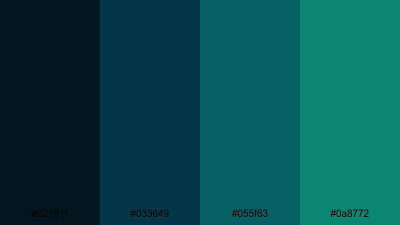
- HEX Codes: #02151f, #033649, #055f63, #0a8772.
- Mood: Moody, cinematic, and mysterious, like a nighttime harbor scene.
- Use for: Perfect for thriller or noir-style title sequences, dramatic intros, and dark gaming thumbnails.
Midnight Harbor Noir layers inky navy with dense teal greens to capture the feeling of a harbor lit only by distant lights. It is dramatic without being overly saturated, which makes it ideal when you want suspense and intrigue to drive the visuals.
Use this palette for cold open sequences, crime or mystery edits, dark game montages, and cinematic thumbnails with bold typography. In branding and channel art, it creates a high-end, serious identity that still feels modern and stylish.
Pro Tip: Build a Cinematic Blue Dark Green Look in Filmora
When you use a deep palette like Midnight Harbor Noir, consistency is everything. In Filmora, you can pick one of the midtones as your main accent color for titles and lower thirds, then reuse it across intros, B-roll overlays, and end screens to keep your blue dark green identity locked in.
Combine solid color layers, gradients, and subtle vignette effects in Filmora to frame your subject with these rich tones. Adding a light teal highlight to buttons or callouts helps guide the viewer’s eye while keeping the overall look dramatic and cohesive.
AI Color Palette
If you have a reference frame graded in this blue dark green style, Filmora’s AI Color Palette feature can automatically match that look across the rest of your clips. This saves you from having to tweak every shot by hand while keeping the mood consistent.
Simply choose your best graded shot or a color card based on this palette, then let AI Color Palette analyze and apply similar tones to the rest of your timeline. It works especially well for thrillers, vlogs, and cinematic travel edits where all scenes must share the same blue dark green atmosphere.
 secure download

HSL, Color Wheels & Curves
To fine-tune a noir-style blue dark green grade, use Filmora’s HSL, color wheels, and curves to separate shadows, midtones, and highlights. Slightly pushing shadows toward the deepest blue, while adding a hint of teal into midtones, can make your footage feel more cinematic and cohesive.
You can also use the curves and color correction tools in Filmora to lift or crush blacks, control contrast, and protect skin tones. This lets you keep the strong harbor blues and greens without losing important detail in faces or key objects.
secure download1000+ Video Filters & 3D LUTs
If you want to get a blue dark green mood fast, Filmora’s video filters and 3D LUTs make it easy to test multiple cinematic looks. Start with a teal-and-orange or moody night LUT, then adjust intensity so your midnight harbor tones stay rich but not overdone.
You can stack filters, add glow, or introduce subtle grain to give this palette a filmic feel. Once you like the result, save it as a custom preset and reuse it on intros, shorts, and full-length videos to keep your channel visuals on-brand.
secure downloadStormy Teal Horizon
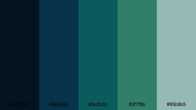
- HEX Codes: #031320, #06324a, #0a5b5b, #2f7f6b, #95b9b5.
- Mood: Tense yet hopeful, like a storm clearing over the ocean.
- Use for: Use in travel vlogs, dramatic B-roll sequences, or cinematic overlays for adventure films.
Stormy Teal Horizon blends inky blues with stormy teals and a misty highlight, echoing clouds slowly breaking after heavy rain. It feels dramatic but still uplifting, perfect when your story moves from conflict toward resolution.
Apply this palette to time-lapse skies, drone shots over water, and moody travel vlogs. Use the lighter #95b9b5 for text, lower thirds, and interface-style graphics so your titles stay readable against darker horizons.
Deep Ocean Title Card
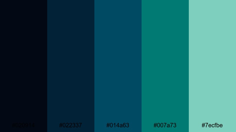
- HEX Codes: #020914, #022337, #014a63, #007a73, #7ecfbe.
- Mood: Immersive and bold, evoking deep-sea exploration and techy sophistication.
- Use for: Great for movie-style title cards, sci-fi intros, and sleek logo animations.
Deep Ocean Title Card dives from near-black navy into bright aqua, giving you strong contrast for cinematic typography and logo reveals. The darker shades create a sense of depth, while the luminous #7ecfbe acts like a spotlight in the abyss.
Use the darkest tones as your background, then animate type or logos in the lighter teal and aqua. This combination works well for tech channels, science explainers, product launches, and sleek lower thirds that feel both modern and premium.
Neo Noir Skyline
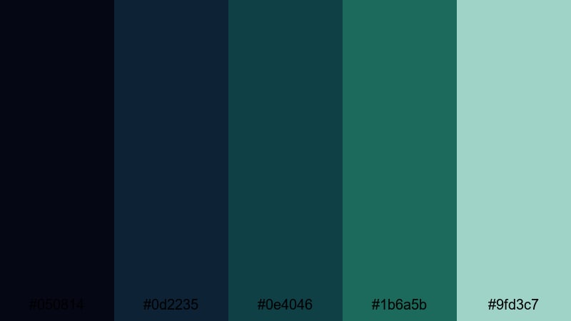
- HEX Codes: #050814, #0d2235, #0e4046, #1b6a5b, #9fd3c7.
- Mood: Urban, stylish, and slightly futuristic, like a city lit by teal neon.
- Use for: Ideal for cityscape B-roll, cyberpunk edits, and stylish channel trailers.
Neo Noir Skyline stacks cool blues and teal greens with a subtle mint highlight, giving your frames a neon-lit city vibe. It feels sleek and slightly futuristic, great for edits that mix nightlife, technology, and street culture.
Use the darkest hues for backgrounds and vignette edges, then pick #1b6a5b or #9fd3c7 to highlight signs, UI graphics, and titles. This palette suits YouTube intros, cyberpunk montages, fashion reels, and tech-focused branding that leans into a modern urban mood.
Minimalist Blue Dark Green Color Palettes
Clean Studio Slate
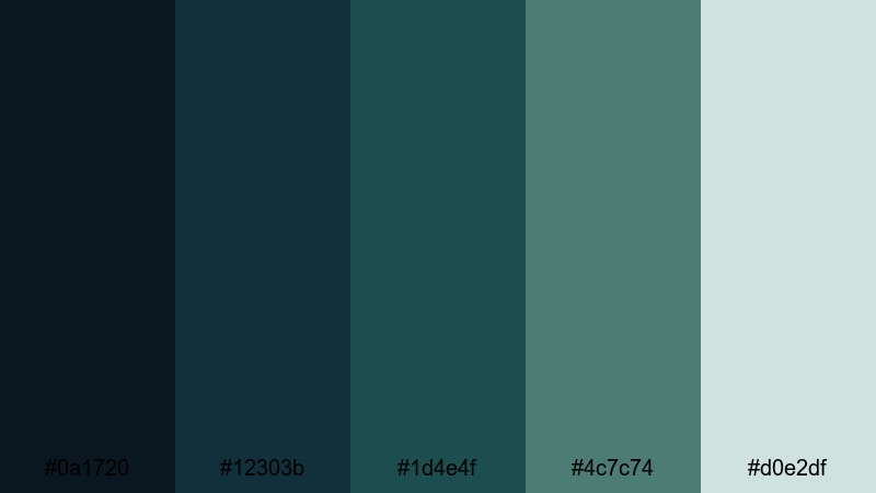
- HEX Codes: #0a1720, #12303b, #1d4e4f, #4c7c74, #d0e2df.
- Mood: Calm, thoughtful, and professional, with a polished studio feel.
- Use for: Great for tutorial backdrops, product shots, or clean UI overlays in explainer videos.
Clean Studio Slate mixes deep slate blues with controlled teal greens and a soft pale accent. The result is a calm, uncluttered aesthetic that feels like a well-lit studio with minimal distractions.
Use the darker shades for background planes or overlays, then reserve #d0e2df for key text, callouts, and interface-style elements. This palette is ideal for educational content, SaaS explainers, productivity app demos, and branding that wants to look trustworthy and polished.
Quiet Interface Teal
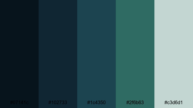
- HEX Codes: #07141c, #102733, #1c4350, #2f6b63, #c3d6d1.
- Mood: Focused and modern, designed for clarity and easy readability.
- Use for: Perfect for app mockups, dashboard UIs, and lower-thirds graphics in tech explainers.
Quiet Interface Teal is built for clarity. Layered blue dark green tones create a sense of depth, while the soft light accent ensures that text and icons remain easy to read.
For video, use this palette to design lower thirds, sidebar panels, and animated UI elements that appear over screen recordings. In branding, it supports tech, finance, and productivity channels that want a modern but understated interface style.
Frosted Aqua Grid
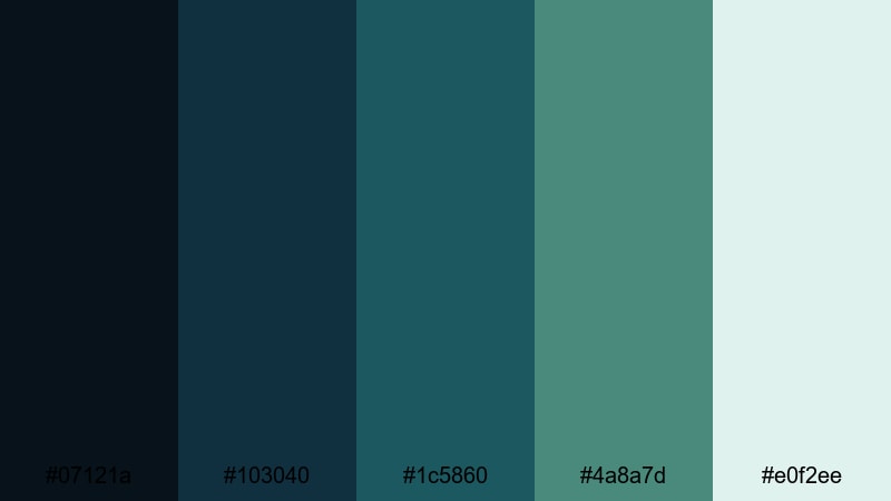
- HEX Codes: #07121a, #103040, #1c5860, #4a8a7d, #e0f2ee.
- Mood: Cool, airy, and organized, like glass panels in a modern workspace.
- Use for: Use in infographic animations, clean logo stings, and minimalist portfolio reels.
Frosted Aqua Grid feels like looking through tinted glass panels: deep blue-greens contrasted with a frosted aqua highlight. It is organized and precise, which works well for structured layouts and grids.
Use #07121a and #103040 as base layers for panels or full-screen backgrounds, then bring in #e0f2ee as a highlight for charts, numbers, and logo elements. This palette suits portfolio reels, data explainers, and brand identities that want to feel fresh but not loud.
Calm Dashboard Deep
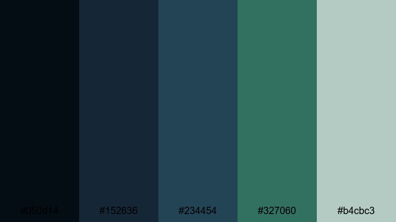
- HEX Codes: #050d14, #152636, #234454, #327060, #b4cbc3.
- Mood: Stable, analytical, and reassuring, suited for data-heavy visuals.
- Use for: Best for analytics dashboards, SaaS product demos, and financial explainer videos.
Calm Dashboard Deep uses steady blue dark green tones with muted highlights to create a data-focused, trustworthy feel. It avoids flashy contrasts, which keeps viewers focused on numbers and insights.
Use the deepest shades for chart backgrounds and panels, then let #b4cbc3 handle labels and key figures. This palette is excellent for financial channels, SaaS demos, and any video where charts, graphs, and interface mockups are front and center.
Nature Inspired Blue Dark Green Color Palettes
Evergreen Fjord Mist
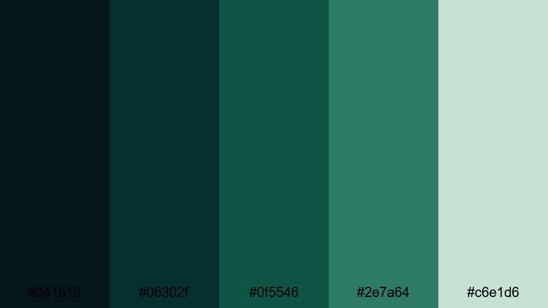
- HEX Codes: #041619, #06302f, #0f5546, #2e7a64, #c6e1d6.
- Mood: Fresh, grounded, and tranquil, like a misty forest by cold water.
- Use for: Great for travel films, outdoor brand videos, and eco-conscious product promos.
Evergreen Fjord Mist combines deep forest greens and cool water tones with a light misty highlight. It instantly evokes pine forests, fjords, and crisp morning air, making it ideal for nature-driven storytelling.
Use darker hues for landscapes and overlays, adding #c6e1d6 for text, logos, and simple icons. This palette fits sustainable brands, hiking and camping channels, and any content where you want viewers to feel grounded and close to nature.
Rainwashed Pine Lake
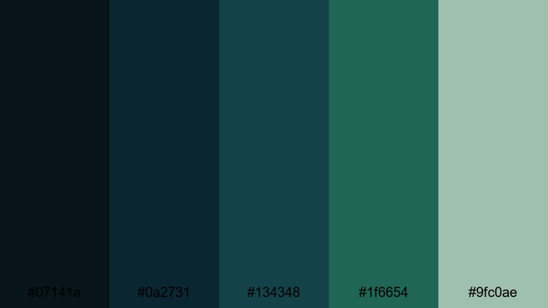
- HEX Codes: #07141a, #0a2731, #134348, #1f6654, #9fc0ae.
- Mood: Refreshing and reflective, like pine trees after a rain by a still lake.
- Use for: Use in calming vlog aesthetics, wellness content, and slow-travel sequences.
Rainwashed Pine Lake uses rainy blues and pine greens to create a gentle, reflective atmosphere. It feels fresh and slightly nostalgic, like breathing in the air after a storm.
Apply it to slow-travel vlogs, mindfulness or wellness content, and quiet B-roll of forests and lakes. The soft #9fc0ae works well for lower thirds, title cards, and end screens that aim to relax rather than excite.
Glacier Bay Forest
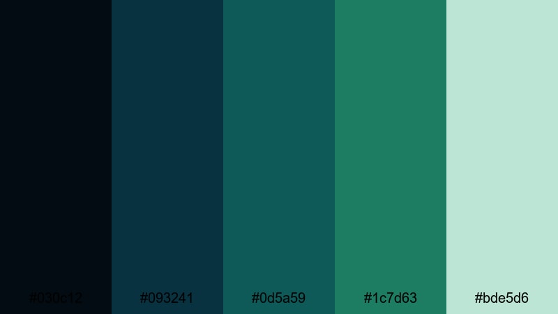
- HEX Codes: #030c12, #093241, #0d5a59, #1c7d63, #bde5d6.
- Mood: Crisp and invigorating, combining icy water with dense forest tones.
- Use for: Ideal for documentary-style edits, hiking reels, and sustainable brand storytelling.
Glacier Bay Forest brings together glacial blues and rich forest greens, topped by a pale mint highlight. It feels energetic and clean, like a cold wind over a mountain lake.
This palette fits outdoor documentaries, hiking and adventure reels, and brands that focus on ecology and sustainability. Use the pale #bde5d6 for clean overlays and minimal typography so your footage of cliffs, ice, and trees stays center stage.
Tidal Kelp Reflections
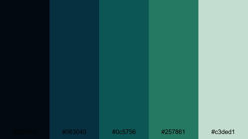
- HEX Codes: #020910, #063040, #0c5756, #257861, #c3ded1.
- Mood: Organic and rhythmic, evoking gentle tides over seaweed beds.
- Use for: Perfect for underwater footage, coastal brands, and calming loop backgrounds.
Tidal Kelp Reflections blends deep tidal blues with kelp greens and a light foam accent. It feels organic, rhythmic, and soothing, like slow waves moving across underwater plants.
Use this palette for underwater B-roll, ocean-themed motion graphics, and looping backgrounds for meditation or study content. The light #c3ded1 is great for simple icons, logos, or text layers that float above darker, textured footage.
Retro Blue Dark Green Color Palettes
Vintage Teal Arcade
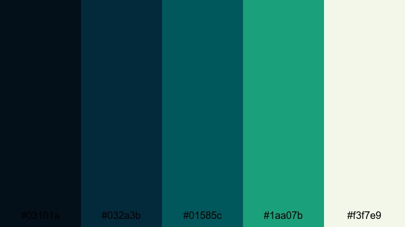
- HEX Codes: #03101a, #032a3b, #01585c, #1aa07b, #f3f7e9.
- Mood: Playful and nostalgic, with a hint of old-school arcade glow.
- Use for: Great for gaming intros, retro-style motion graphics, and fun channel branding.
Vintage Teal Arcade pairs punchy teal and blue dark green tones with a warm off-white accent, echoing old arcade screens and CRT monitors. It feels playful and nostalgic without looking dated.
Use the darker shades as background for pixel art, glitch transitions, and retro text animations. Let #1aa07b and #f3f7e9 power your main titles, badges, and UI elements for gaming channels or retro-flavored lifestyle content.
90s Ocean Screensaver
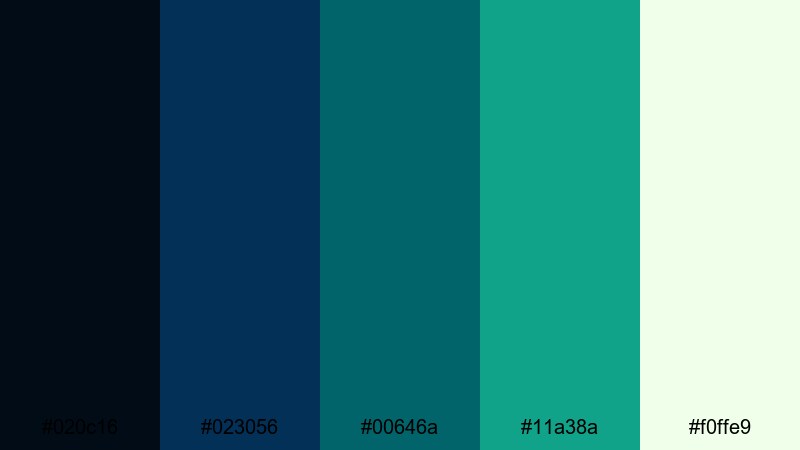
- HEX Codes: #020c16, #023056, #00646a, #11a38a, #f0ffe9.
- Mood: Lighthearted and techy, inspired by 90s desktop screensavers and wave effects.
- Use for: Use in nostalgic edits, Y2K-inspired branding, and playful lower-thirds.
90s Ocean Screensaver blends saturated aqua and teal shades that recall classic desktop animations and wave visuals. It feels lighthearted and slightly techy, perfect for nostalgic or Y2K-inspired themes.
Use the darker blues as a base, animate simple geometric waves or bouncing elements in #00646a and #11a38a, and keep #f0ffe9 for legible text. This palette fits playful intros, retro tech reviews, and fun social edits.
Retro Neon Lagoon
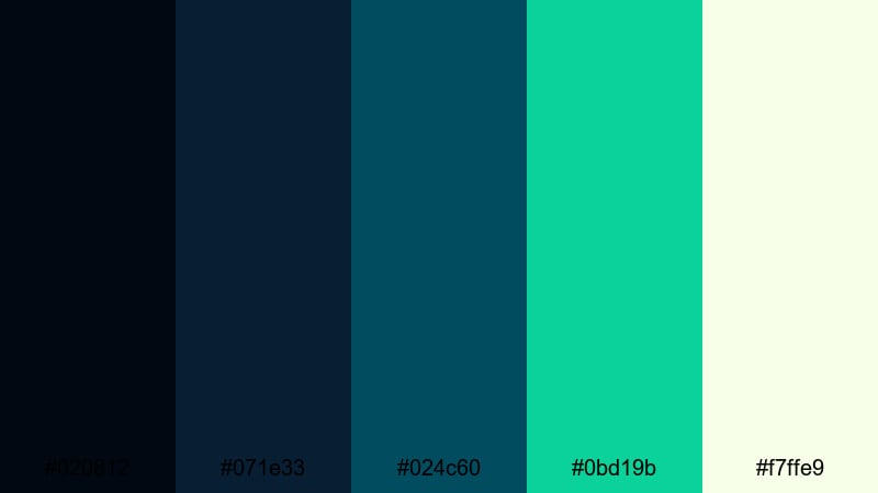
- HEX Codes: #020812, #071e33, #024c60, #0bd19b, #f7ffe9.
- Mood: Electric and bold, marrying dark lagoon tones with neon highlights.
- Use for: Ideal for party promos, EDM visuals, and high-energy motion graphics overlays.
Retro Neon Lagoon fuses inky lagoon blues with a bright neon mint highlight. The contrast is strong and energetic, making this palette stand out on feeds and video platforms.
Use the darker shades as a base for animated shapes, waveform visuals, and club-style lighting, then let #0bd19b and #f7ffe9 handle outlines, titles, and glow effects. It is especially effective for music videos, party promos, and energetic intro animations.
Tips for Creating Blue Dark Green Color Palettes
Blue dark green is flexible, but it looks best when you balance depth, contrast, and readability across footage, graphics, and thumbnails. Use these tips to craft palettes that look great in Filmora and stay on-brand for your channel or business.
- Pick a base: Start with one dominant deep blue or teal-green for backgrounds, then build supporting shades lighter and darker around it.
- Control contrast: Use at least one light accent color (soft aqua, mint, or off-white) so text, icons, and UI elements remain easy to read over dark footage.
- Limit your accent colors: 1–2 accents are usually enough; too many competing bright tones can dilute the cinematic blue dark green mood.
- Match footage and graphics: When color grading in Filmora, pull your footage slightly toward your chosen palette so overlays, titles, and video frames feel unified.
- Think platform thumbnails: Test your palette at small sizes; ensure your text color still pops on YouTube thumbnails or social covers.
- Use complementary warmth: Add a subtle warm tone (like camel, beige, or soft orange) for skin tones, call-to-action buttons, or small details to keep images from feeling too cold.
- Stay consistent across assets: Reuse the same HEX codes in your logo, lower thirds, title templates, and end screens so viewers instantly recognize your brand.
- Save presets: In Filmora, save your favorite color settings and text styles as presets so every new project can reuse your signature blue dark green look.
Conclusion
Blue dark green color palettes can make your videos feel cinematic, trustworthy, and distinctive, whether you are shooting moody cityscapes, quiet nature scenes, or retro-inspired edits. By choosing a small set of HEX codes and sticking to them, you create a visual language that viewers quickly recognize as your own.
The 15 palettes above give you ready-made combinations for intros, overlays, titles, thumbnails, and branding systems. Try them inside Filmora, adjust them with HSL and curves, and experiment with filters and LUTs until the look perfectly matches your story.
Once you lock in a blue dark green style you love, build templates, presets, and reusable assets so every future video feels on-brand and professional with far less effort.
secure downloadNext: Camel Color Palette
