
 100% Security Verified | No Subscription Required | No Malware

Blue Emerald sits between teal and deep ocean blue, blending the calm of blue with the richness of emerald green. It feels clean, modern, and trustworthy, but also slightly mysterious and cinematic. That is why this color family works beautifully for channels that want to look professional yet warm, from lifestyle vlogs and travel films to tech reviews and brand promos.
Used well, a Blue Emerald color palette can unify your thumbnails, intros, overlays, and logo animations so everything feels like part of one visual world. Below you will find 15 Blue Emerald color palettes with ready-to-use HEX codes, plus ideas on how to apply them in Filmora for thumbnails, color grading, titles, and full edits.
In this article
Calm & Coastal Blue Emerald Color Palettes
Pacific Glass Depths
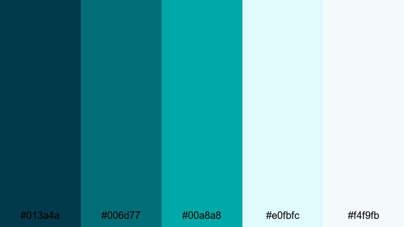
- HEX Codes: #013a4a, #006d77, #00a8a8, #e0fbfc, #f4f9fb
- Mood: Calm, refreshing, and quietly powerful.
- Use for: Perfect for cinematic travel vlogs, underwater intros, and serene b-roll transitions.
Pacific Glass Depths layers inky teal with clear aqua and soft, misty highlights. It feels like looking through thick glass into deep water: peaceful on the surface, with a strong, steady energy underneath. On screen, this kind of Blue Emerald palette reads as clean and modern without feeling sterile.
Use the darker tones for background blocks, lower thirds, and color grading shadows in your footage. The pale aqua hex codes (#e0fbfc and #f4f9fb) work beautifully for titles, subtitles, and UI-style overlays on thumbnails. This palette is ideal for channels built around ocean stories, nature documentaries, study-with-me videos, or any edit where you want viewers to relax and keep watching.
Pro Tip: Build a Cinematic Blue Emerald Look in Filmora
To keep a Blue Emerald look consistent from intro to outro, start by defining these exact HEX codes in your titles, shapes, and overlays inside Filmora. Save them to the custom color swatches so you can quickly re-use the same emerald and aqua tones across your thumbnails, openers, and b-roll transitions.
When you color grade, gently cool the midtones and add a hint of teal in the shadows, then keep your highlights closer to the soft whites in this palette. This gives your whole video a cinematic, underwater-glass feel that still looks clean on social feeds and YouTube home pages.
AI Color Palette
If you have a reference image of the ocean or a mood board that already uses this palette, you can turn it into a full video look with Filmora's AI Color Palette feature. Import your reference shot, then let Filmora analyze its colors and apply the same Blue Emerald balance to all your clips.
This is perfect when you are editing a series: vlogs, shorts, and highlight reels can all share the same cool teal shadows and soft aqua highlights with just a few clicks, instead of grading each clip from scratch.
 secure download

HSL, Color Wheels & Curves
After matching your base look, refine your Blue Emerald tones with HSL, color wheels, and curves in Filmora. Use the color wheels to add teal into shadows while keeping skin tones natural in the midtones. Slight S-curve adjustments can deepen the darker emeralds and make the glassy aqua highlights pop without blowing out whites.
To keep things consistent over different lighting conditions, slightly desaturate overly green cyans in the HSL panel and nudge them toward the rich Blue Emerald band. For more ideas on balancing contrast and saturation, the Filmora color correction guide covers practical grading workflows you can adapt to this palette.
secure download1000+ Video Filters & 3D LUTs
Once your base Blue Emerald grade is set, you can speed up styling with Filmora's video filters and 3D LUTs. Layer subtle teal-boosting looks over your edit to create a cohesive mood without spending hours micro-tweaking every clip.
Combine a soft cinematic LUT with gentle vignette or glow filters to make your emerald shadows richer and your aqua highlights smoother. Save your favorite combinations as presets so future travel vlogs, ocean edits, and study playlists instantly match this Pacific Glass Depths aesthetic.
secure downloadLagoon Morning Mist
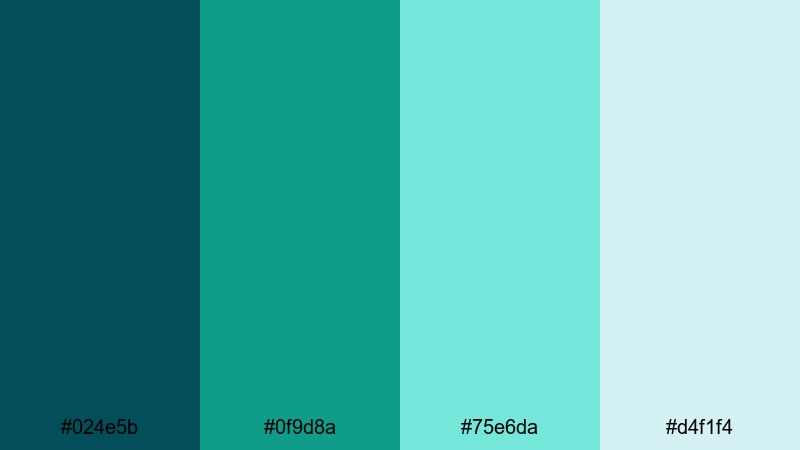
- HEX Codes: #024e5b, #0f9d8a, #75e6da, #d4f1f4
- Mood: Fresh, airy, and uplifting.
- Use for: Ideal for channel banners, wellness content, and clean lifestyle tutorials.
Lagoon Morning Mist pairs deeper sea-teal with light, hazy aquas that feel like early sunlight over calm water. It is softer than a pure cyan palette, with just enough green to add warmth and life to your visuals.
Use the darker shades in your logo lockups, navigation bars, or banner backgrounds, and let the pale lagoon colors carry your main text, icons, and call-to-action buttons. This works especially well for wellness, skincare, minimal lifestyle, and productivity content where you want clarity and freshness without harsh contrast.
Tidal Sand & Foam
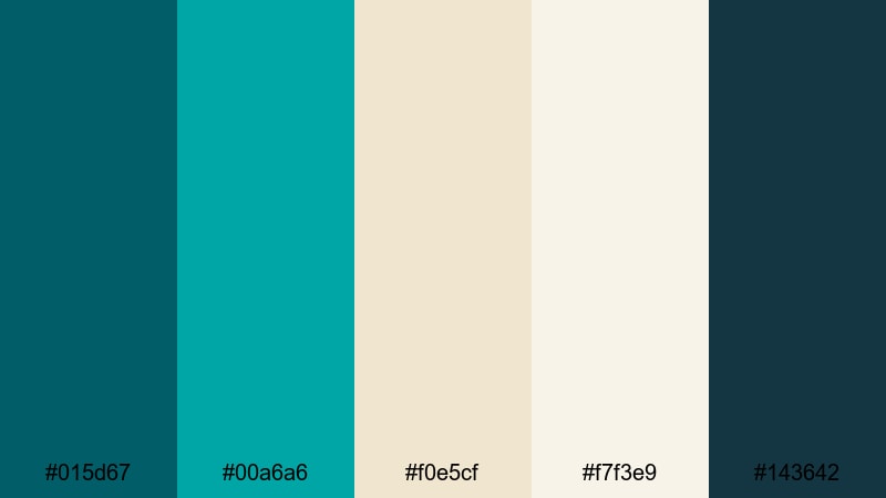
- HEX Codes: #015d67, #00a6a6, #f0e5cf, #f7f3e9, #143642
- Mood: Grounded, coastal, and inviting.
- Use for: Great for vlog thumbnails, travel titles, and subtle lower thirds with a beachy vibe.
Tidal Sand & Foam blends rich Blue Emerald tones with warm sand neutrals, capturing the feeling of waves washing over a sunlit beach. The teal shades keep things cool and modern, while the creams and beiges add a grounded, human touch.
Use the sandy tones for backgrounds in your intros and end screens, then layer teal accents for key text, borders, or icons. On thumbnails, a warm beige base with teal titles stands out clearly without looking clickbaity, making this palette great for everyday travel vlogs, documentaries, and family content.
Harbor Dusk Horizon
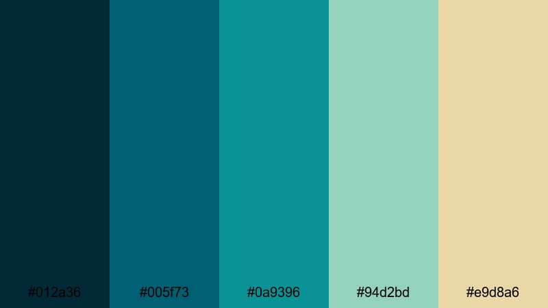
- HEX Codes: #012a36, #005f73, #0a9396, #94d2bd, #e9d8a6
- Mood: Reflective, cinematic, and serene.
- Use for: Use for moody cinematic intros, travel montages, or thoughtful documentary pieces.
Harbor Dusk Horizon moves from dark harbor blues through muted emerald into a faded golden highlight, like a sunset reflecting on water. It feels introspective and cinematic, ideal for storytelling that is more emotional or reflective.
Try using the darkest hues for letterbox bars and background panels, then let the muted greens and soft gold highlight your titles and key moments. This palette works beautifully with slow-motion b-roll, voiceover-driven edits, or reflective city and harbor scenes where you want the audience to feel calm but engaged.
Bold & Cinematic Blue Emerald Color Palettes
Neon Port City
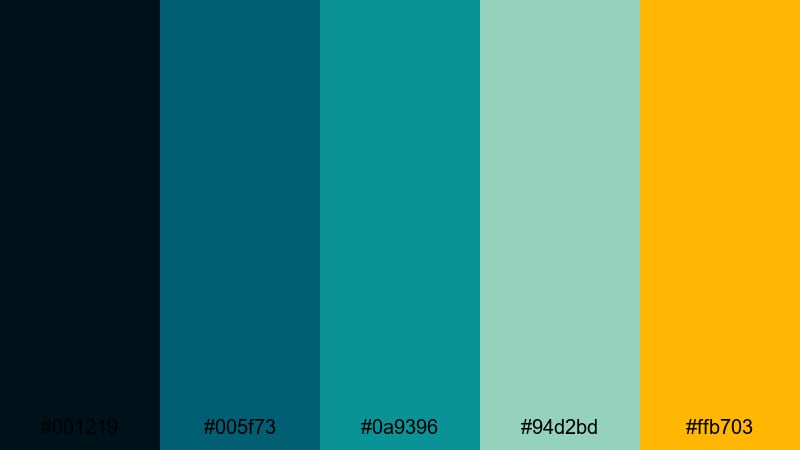
- HEX Codes: #001219, #005f73, #0a9396, #94d2bd, #ffb703
- Mood: Energetic, modern, and urban.
- Use for: Perfect for tech reviews, energetic channel trailers, and cyberpunk-style title cards.
Neon Port City mixes deep, moody blues with glowy emeralds and a punchy neon amber accent. It feels like a futuristic harbor at night, lit by LED billboards and reflections on wet streets.
Use the dark tones as your base grade for background footage and overlays, then reserve the bright amber (#ffb703) for subscribe buttons, logo details, and attention-grabbing words in thumbnails. This palette suits tech channels, urban travel, motion graphics-heavy intros, and any branding that leans into a sleek, digital city vibe.
Cyberwave Emerald Glow
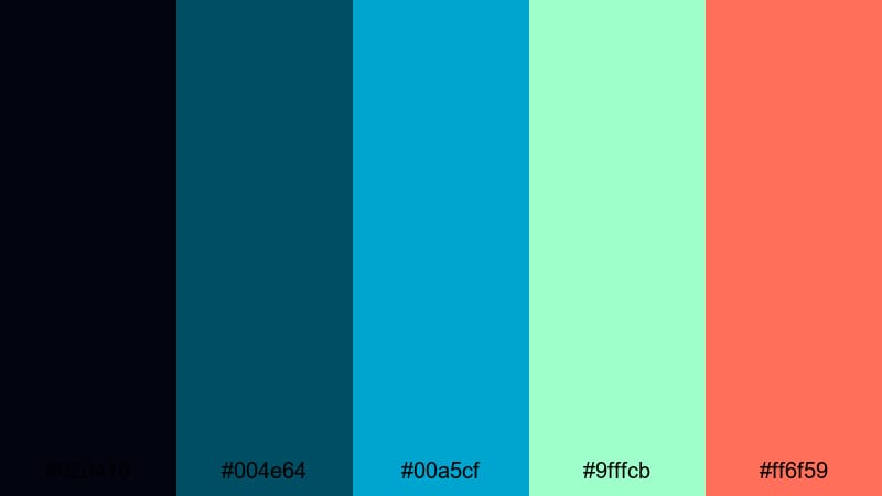
- HEX Codes: #020410, #004e64, #00a5cf, #9fffcb, #ff6f59
- Mood: Futuristic, electric, and high-contrast.
- Use for: Ideal for gaming overlays, stream packages, and glitchy motion graphics in Filmora.
Cyberwave Emerald Glow pushes Blue Emerald into a neon, cyberpunk space with electric cyan, glowing mint, and a sharp coral accent. Against the deep midnight background, every highlight feels like a piece of glowing UI.
Use the darkest blue for full-screen overlays and panels, then build your HUD elements, lower thirds, and alerts from the cyan and mint shades. The coral accent (#ff6f59) is perfect for kill counts, donation alerts, or key words in gaming thumbnails. This palette keeps your stream layout readable while delivering that energetic, futuristic punch.
Thriller Night Tide
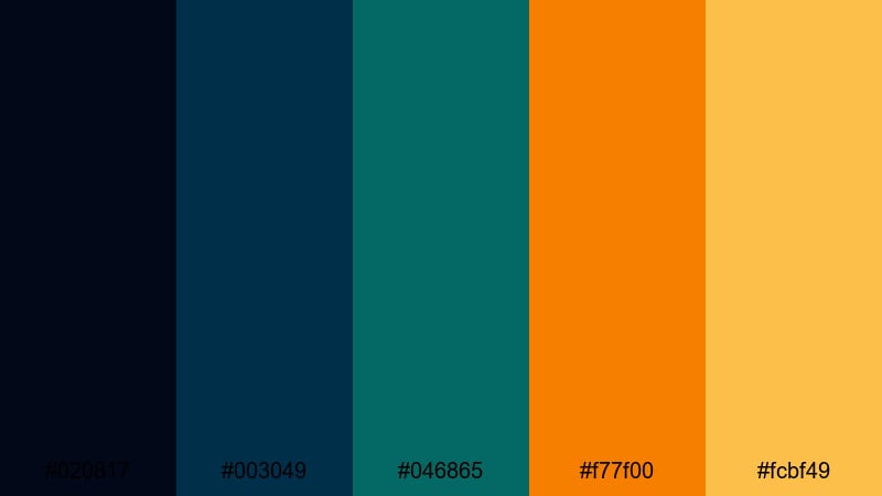
- HEX Codes: #020817, #003049, #046865, #f77f00, #fcbf49
- Mood: Tense, dramatic, and cinematic.
- Use for: Great for short film posters, suspenseful trailers, and dramatic storytime thumbnails.
Thriller Night Tide pairs brooding Blue Emerald shades with fiery orange and gold, creating instant tension through complementary contrast. It feels like a thriller movie poster: dark, moody, and full of energy.
Grade your footage toward the teal-blues for shadows and midtones, then use the warm oranges for titles, warning labels, or important objects in frame. This palette is particularly strong for narrative shorts, true crime storytimes, urban night scenes, or any video that leans on suspense and high stakes.
Gaming Stream Surge
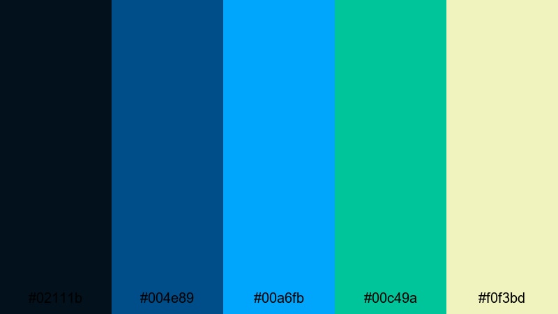
- HEX Codes: #02111b, #004e89, #00a6fb, #00c49a, #f0f3bd
- Mood: Playful, competitive, and high-impact.
- Use for: Perfect for esports branding, Twitch layouts, and bold YouTube gaming thumbnails.
Gaming Stream Surge is all about high-contrast, high-energy blues and emeralds, accented with bright cyan and fresh lime. It grabs attention fast and reads clearly even at small thumbnail sizes.
Use the dark navy as your canvas for overlays and background shapes, then apply the neon cyan and emerald for borders, buttons, and stream labels. The soft yellowish highlight (#f0f3bd) works well as a friendly accent for text or badges. This palette makes your stream graphics pop while still feeling cohesive and professional.
Elegant & Luxe Blue Emerald Color Palettes
Emerald Atrium Marble
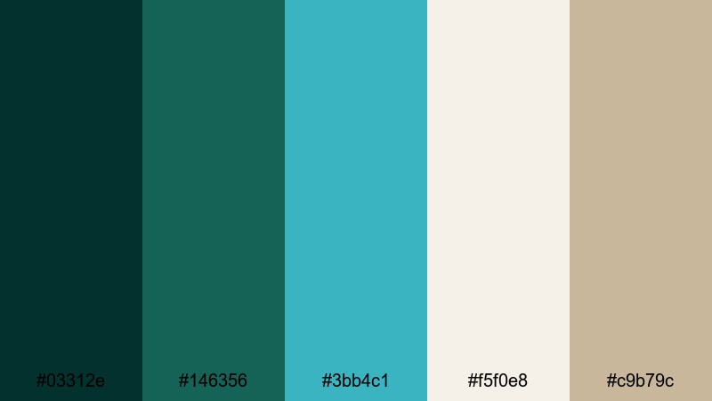
- HEX Codes: #03312e, #146356, #3bb4c1, #f5f0e8, #c9b79c
- Mood: Sophisticated, calm, and luxurious.
- Use for: Ideal for brand intros, luxury product promos, and polished portfolio reels.
Emerald Atrium Marble combines velvety Blue Emerald shades with creamy stone neutrals and soft aqua accents. It feels like an upscale hotel lobby or a boutique store interior: calm, refined, and premium.
Use the deep greens for backgrounds and typography, especially for logo reveals or name cards. The marble-like creams and warm beige (#c9b79c) add softness in title screens, lower thirds, and product info cards. This palette is perfect for beauty, fashion, architecture, or any brand that wants to look high-end yet approachable.
Art Deco Riviera
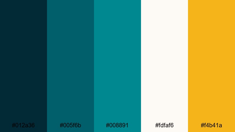
- HEX Codes: #012a36, #005f6b, #008891, #fdfaf6, #f4b41a
- Mood: Glamorous, sunny, and refined.
- Use for: Use for fashion lookbooks, resort promos, and stylish travel guides.
Art Deco Riviera uses architectural Blue Emerald tones with champagne white and a hit of warm gold. It channels vintage seaside glamour with a modern, minimal twist.
Let the deep teal and emerald colors frame your visuals in borders, geometric shapes, and split screens, while the off-white background keeps everything bright and luxurious. The gold accent (#f4b41a) is best used sparingly for lines, icons, and key words so every golden touch feels special. This palette is a strong fit for premium travel, fashion, jewelry, and hotel content.
Midnight Yacht Club
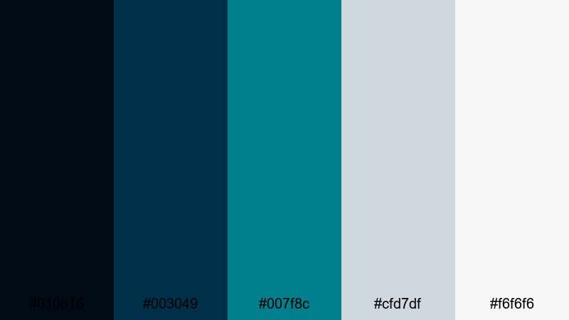
- HEX Codes: #010b16, #003049, #007f8c, #cfd7df, #f6f6f6
- Mood: Cool, exclusive, and polished.
- Use for: Great for corporate reels, event recaps, and sleek typography-based openers.
Midnight Yacht Club pairs deep navy and Blue Emerald hues with crisp silvery grays and clean white. It feels like a private members club or luxury tech brand: understated, cool, and confident.
Use the darker colors for full-bleed backgrounds and gradient overlays, and reserve the silvery tones for text, icons, and subtle dividers. This palette shines in corporate intros, event highlight reels, conference recaps, or any edit where you want sophistication without flashy colors.
Soft & Pastel Blue Emerald Color Palettes
Seafoam Storyboard
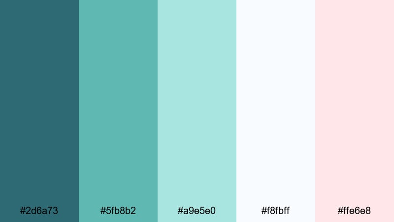
- HEX Codes: #2d6a73, #5fb8b2, #a9e5e0, #f8fbff, #ffe6e8
- Mood: Gentle, dreamy, and approachable.
- Use for: Perfect for lifestyle vlogs, day-in-the-life edits, and soft educational content.
Seafoam Storyboard softens Blue Emerald into muted teals and pastel seafoam, with very light pink and white highlights. The result is a friendly, low-contrast look that is easy on the eyes for long viewing sessions.
Use the mid-tone teals for your main UI elements, text boxes, and overlays, while the pastels carry your backgrounds and supporting shapes. This palette is ideal for aesthetic vlogs, productivity channels, tutorials, and any series where you want viewers to feel relaxed and comfortable staying for multiple episodes.
Minted Travel Diaries
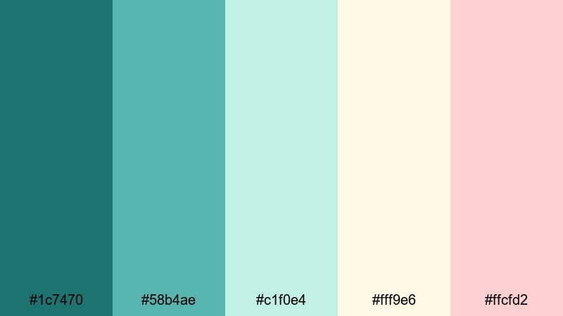
- HEX Codes: #1c7470, #58b4ae, #c1f0e4, #fff9e6, #ffcfd2
- Mood: Fresh, nostalgic, and light-hearted.
- Use for: Ideal for travel recaps, journaling-style shorts, and cozy vlog aesthetics.
Minted Travel Diaries mixes soft emerald and mint with gentle creams and blush tones, like pages of a watercolor travel journal. It has a nostalgic, personal feel that pairs well with handheld footage and voiceover stories.
Use deeper greens for key titles and location labels, and let the mint and cream tones sit behind your text as cards or frames. The blush hex (#ffcfd2) is great for subtle stickers, hand-drawn arrows, or highlight shapes on thumbnails, giving your content a warm, personal signature.
Dreamy Harbor Vlog
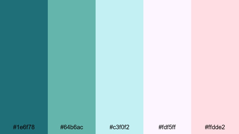
- HEX Codes: #1e6f78, #64b6ac, #c3f0f2, #fdf5ff, #ffdde2
- Mood: Romantic, soft, and whimsical.
- Use for: Great for daily vlogs, couple travel content, and aesthetic B-roll sequences.
Dreamy Harbor Vlog places light Blue Emerald tones next to pastel lilac and blush, creating a romantic, airy aesthetic. It feels like golden hour at the harbor with a soft filter over everything.
Use the teal shades to keep your brand anchored, while the lilac and blush colors add dreamy flourishes in titles, captions, and overlay graphics. This palette is perfect for couple vlogs, city walks, slow-living edits, and reels where the story is about feeling and memory rather than pure information.
Quiet Coastal Morning
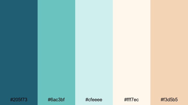
- HEX Codes: #205f73, #6ac3bf, #cfeeee, #fff7ec, #f3d5b5
- Mood: Peaceful, bright, and comforting.
- Use for: Perfect for morning routines, productivity videos, and calm ASMR or study channels.
Quiet Coastal Morning captures the first light over the sea with a gentle mix of Blue Emerald, misty aqua, and soft creams. It is bright without being glaring, and calm without feeling sleepy.
Use the deeper teal for accents such as timers, progress bars, and key headings, while the creams and light aquas become your background for to-do lists, step-by-step guides, or ASMR overlays. This palette works beautifully for study-with-me content, morning routines, planning videos, and channels that want a gentle, optimistic mood.
Tips for Creating Blue Emerald Color Palettes
Blue Emerald is versatile, but it becomes even more powerful when you pair it with the right neutrals and accents for your specific video or design style. These tips will help you combine it with other tones for better contrast, readability, and brand consistency.
- Decide the role of Blue Emerald first: is it your main background color, an accent for text, or the base of your color grade? Build the rest of the palette around that choice.
- Pair deep Blue Emerald with warm creams or soft beiges if you want a welcoming, coastal feel; use crisp whites and cool grays for a more techy or corporate look.
- For thumbnails and titles, always check contrast: test your Blue Emerald text over both light and dark backgrounds to make sure it remains readable on mobile screens.
- Limit bold accent colors. One strong contrast tone (like gold, amber, or coral) is usually enough to guide the eye without making your design feel chaotic.
- Match your color palette to your footage by gently shifting your video shadows toward teal and your highlights toward soft neutral whites, so overlays and graded clips feel like one world.
- Keep branding consistent: save your chosen HEX codes and reuse them in every intro, lower third, end screen, and thumbnail so viewers can recognize you instantly.
- Use softer, pastel Blue Emerald combinations for long-form or educational content, and higher-contrast, neon-leaning palettes for high-energy montages and gaming edits.
- When in doubt, desaturate slightly. A slightly muted Blue Emerald palette often feels more cinematic and professional than very bright, fully saturated teal.
Blue Emerald color palettes can do a lot of heavy lifting for your channel: they set the mood, hint at your niche, and make your brand memorable before anyone even presses play. Whether you lean into calm coastal tones, bold cinematic contrasts, or soft pastel teals, the right palette can tie your thumbnails, intros, and videos into a single, recognizable style.
Use the HEX codes above as starting points, then refine them inside Filmora to match your footage and storytelling. With tools like AI Color Palette, HSL adjustments, and filters, you can turn a single Blue Emerald reference image into a complete, repeatable visual system for your channel.
The more you experiment, the faster you will discover which palettes feel like your voice. Try a few of these combinations in your next edit, save your favorites as presets, and let Blue Emerald become a signature part of your visual identity.
secure download