
 100% Security Verified | No Subscription Required | No Malware


 ChatGPT
 Perplexity
 Gemini
 Claude
 Grok
Grok
Blue, green, and purple sit next to each other on the color wheel, so they blend into naturally harmonious gradients. Together they suggest calm oceans, twilight skies, and futuristic neon. In color psychology, blue conveys trust and clarity, green adds balance and renewal, and purple brings creativity and a touch of magic. Combined, a blue green purple color palette can feel cinematic, soothing, or high-energy depending on how bright and contrasted the shades are.
For video creators, designers, and YouTubers, this trio is perfect for vlogs, channel branding, intros, overlays, and thumbnails. Below you will find ready-made blue green purple color combinations with HEX codes you can copy directly into your editing or design tools. Every palette is creator friendly and works beautifully in Filmora, whether you are styling titles, color grading footage, or designing cohesive social assets around your brand colors.
In this article
Soft & Dreamy Blue Green Purple Color Palettes
Aurora Shoreline Glow
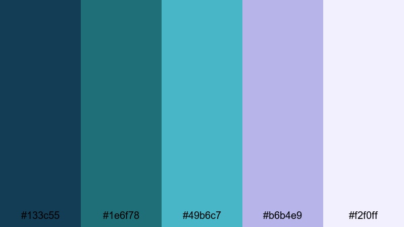
- HEX Codes: #133c55, #1e6f78, #49b6c7, #b6b4e9, #f2f0ff
- Mood: Calm, cinematic, and gently optimistic.
- Use for: Ideal for peaceful travel vlogs, ambient B-roll, and dreamy channel intros where you want soft coastal vibes.
Aurora Shoreline Glow feels like a slow sunrise over the ocean. Deep navy blue (#133c55) and teal (#1e6f78) anchor the frame, while the lighter aqua (#49b6c7), lavender (#b6b4e9), and near-white (#f2f0ff) soften everything with a hazy, cinematic glow.
This blue green purple color palette is perfect when you want calm, cinematic visuals without looking dull. Use the darker tones for lower thirds, overlays, or background shapes, and let the pastel lavender and off-white support airy titles, vlog thumbnails, or intro animations. In Filmora, you can echo these HEX codes across your entire project for consistent branding on YouTube, Instagram, and shorts.
Pro Tip: Build a Cinematic Blue Green Purple Look in Filmora
To keep Aurora Shoreline Glow consistent across your edit, treat it as your master look. Set your primary blue and teal as the base in your footage, and then use lavender and off-white for titles, callouts, and motion graphics. In Filmora, you can create a custom preset from one graded clip, then apply it to all your shots so your travel vlog, intro, and B-roll share the same blue green purple mood.
When designing thumbnails and end screens, sample the exact HEX values for backgrounds, buttons, and frames. This way, viewers instantly recognize your channel by its soft coastal gradient, even when scrolling quickly through YouTube or TikTok.
AI Color Palette
If you have a frame or mood board that perfectly captures your blue green purple aesthetic, you can turn it into a look for your whole video. Filmora's AI Color Palette feature analyzes the colors in a reference image or clip, then matches your other footage to that style in one step.
Import a still showing Aurora Shoreline Glow tones, apply it as the reference, and let Filmora spread those deep blues, soft aquas, and lavenders across all your scenes. This is especially helpful for multi-camera shoots or mixed lighting, where you want a unified, dreamy vibe without manually grading every clip.
 secure download

HSL, Color Wheels & Curves
Once you have the overall palette in place, refine the blue, green, and purple tones using Filmora's HSL, color wheels, and curves. Gently lower saturation in the shadows to keep dark blues rich but not muddy, then lift the midtones to let the teal and lavender breathe. Tools like HSL and curves are explained in depth in Filmora's color correction and grading guide, which you can follow while you experiment.
Use color wheels to warm up skin tones while keeping the background cool, or push highlights slightly toward lavender for a subtle dreamy glow. A soft S-curve can add cinematic contrast without crushing the delicate pastel edges of this blue green purple color palette.
secure download1000+ Video Filters & 3D LUTs
To move even faster, you can blend this palette with Filmora's built-in looks. Many filters and LUTs lean toward teal and blue, giving you an instant cinematic base that you can then nudge toward lavender with a few subtle tweaks. Filmora's video filters and 3D LUTs make it easy to stylize your footage around a blue green purple theme without starting from scratch.
Try stacking a teal-and-orange style LUT with light bloom or vignette filters, then adjust intensity until your footage matches the mood of Aurora Shoreline Glow. This approach works especially well for travel vlogs, nature B-roll, and dreamy lifestyle montages that need consistent, on-brand color grading.
secure downloadMisty Lagoon Haze
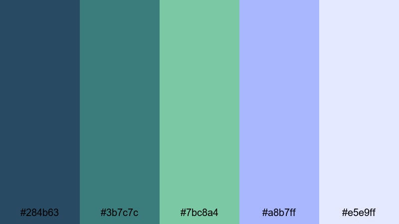
- HEX Codes: #284b63, #3b7c7c, #7bc8a4, #a8b7ff, #e5e9ff
- Mood: Soothing, introspective, and slightly mysterious.
- Use for: Great for reflective voiceover videos, dreamy montage edits, and calming app promo visuals.
Misty Lagoon Haze combines deep slate blue (#284b63) and teal (#3b7c7c) with soft mint (#7bc8a4) and periwinkle accents (#a8b7ff, #e5e9ff). It feels like early morning fog over water, with just enough color to stay interesting but not enough to distract from your story.
Use the darker hues for backgrounds behind text or UI mockups, and let the mint and periwinkle highlight buttons, chapter markers, or call-to-action text. This palette is excellent for reflective narration, app demos, and minimal YouTube thumbnails where you want calm tech vibes and clear readability.
Twilight Cotton Clouds
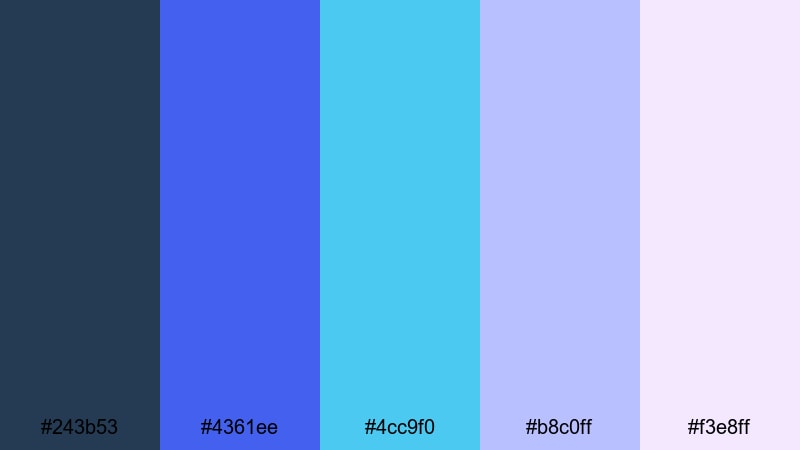
- HEX Codes: #243b53, #4361ee, #4cc9f0, #b8c0ff, #f3e8ff
- Mood: Romantic, uplifting, and airy.
- Use for: Use in wedding highlight reels, upbeat lifestyle vlogs, and dreamy storytelling thumbnails.
Twilight Cotton Clouds mixes rich twilight blue (#243b53), vivid royal blue (#4361ee), and bright aqua (#4cc9f0) with soft lilac and blush whites (#b8c0ff, #f3e8ff). The result feels like cotton-candy skies just after sunset.
For wedding highlights and lifestyle edits, use the deeper blue for lower thirds and overlay frames, while the lighter lilac tones make elegant title cards and logo animations. On YouTube thumbnails, a bright aqua accent around the subject can draw clicks, while the pastel background keeps everything gentle and dreamy.
Moonlit Garden Whispers
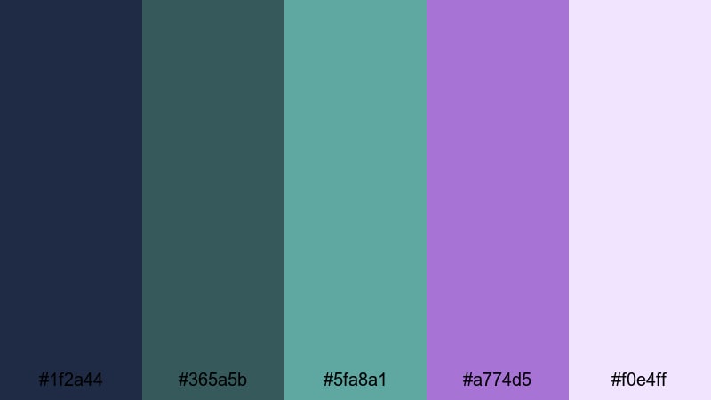
- HEX Codes: #1f2a44, #365a5b, #5fa8a1, #a774d5, #f0e4ff
- Mood: Whimsical, gentle, and slightly magical.
- Use for: Perfect for fairytale edits, fantasy game clips, and relaxing nighttime study or lo-fi videos.
Moonlit Garden Whispers leans into deeper blues (#1f2a44) and muted greens (#365a5b, #5fa8a1), then sprinkles in lilac and lavender highlights (#a774d5, #f0e4ff). It feels like a quiet, enchanted garden at night with soft glow and subtle contrast.
This blue green purple color palette works beautifully for fantasy game edits, lo-fi study mixes, or any content that needs cozy night-time ambiance. Use darker colors for backgrounds and overlays, then bring attention to characters, text, or UI with the lilac accents. Paired with gentle motion graphics in Filmora, this palette turns simple footage into storybook scenes.
Bold & Neon Blue Green Purple Color Palettes
Cyber Wave Energy
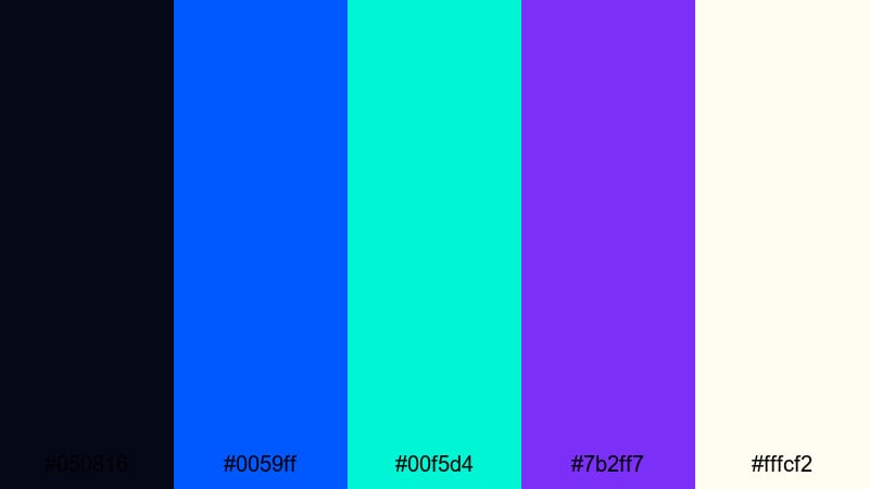
- HEX Codes: #050816, #0059ff, #00f5d4, #7b2ff7, #fffcf2
- Mood: High-energy, futuristic, and electrifying.
- Use for: Designed for tech promos, gaming montages, glitch transitions, and cyberpunk style title cards.
Cyber Wave Energy is all about punchy contrast: inky black-blue (#050816) sets the stage for electric blue (#0059ff), neon aqua (#00f5d4), and vivid purple (#7b2ff7), with a pale off-white (#fffcf2) to keep text readable. It screams sci-fi, esports, and high-speed edits.
Use the darkest shade as your base for backgrounds and letterboxing, then hit viewers with neon strokes on titles, HUD-style overlays, and animated icons. In thumbnails, combine the aqua and purple around your subject with bold white text to stand out instantly in crowded gaming or tech feeds.
Arcade Nebula Pop
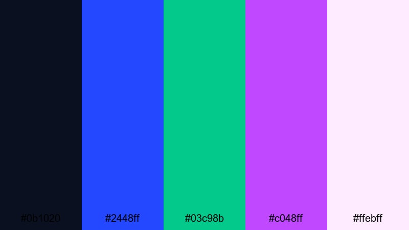
- HEX Codes: #0b1020, #2448ff, #03c98b, #c048ff, #ffebff
- Mood: Playful, retro-futuristic, and vibrant.
- Use for: Great for gaming channels, retro intros, beat-synced lyric videos, and kinetic typography sequences.
Arcade Nebula Pop blends a dark space blue (#0b1020) with saturated primary-style blue (#2448ff), cosmic green (#03c98b), and neon purple (#c048ff). A soft pink-white (#ffebff) rounds it out for text and highlights, giving a nostalgic arcade glow.
This palette is ideal for beat-synced edits, kinetic typography, and retro intros. Let the deep blue create negative space, then fire neon strokes across the screen for transitions and text animations in Filmora. On YouTube, this blue green purple combination makes gaming thumbnails, reaction videos, and music edits feel loud and instantly clickable.
Electric Reef Storm
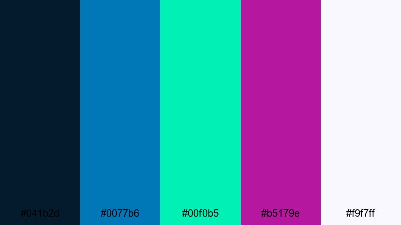
- HEX Codes: #041b2d, #0077b6, #00f0b5, #b5179e, #f9f7ff
- Mood: Intense, adventurous, and dramatic.
- Use for: Use for action sports edits, product launches, and bold YouTube thumbnail designs that must stand out.
Electric Reef Storm fuses stormy navy (#041b2d) with bright oceanic blue (#0077b6) and glowing reef green (#00f0b5), then smashes in hot magenta purple (#b5179e). A light neutral (#f9f7ff) ensures your copy stays readable against all that energy.
Use this palette when you need an action-forward blue green purple theme for sports, product reveals, or dramatic trailers. Dark blues can frame the shot and make colors pop, while magenta accents highlight key text or product edges. In Filmora, combine this with quick cuts and lens flare effects for intense, cinematic energy.
Ultra Violet Splash
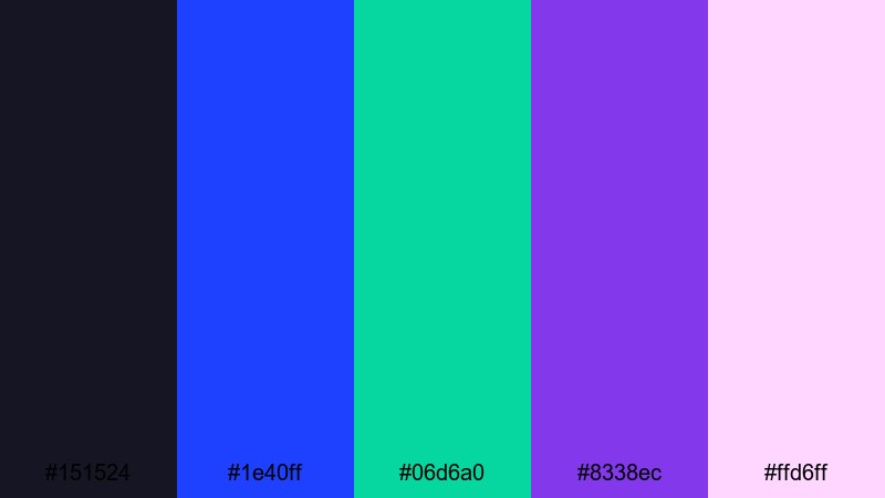
- HEX Codes: #151524, #1e40ff, #06d6a0, #8338ec, #ffd6ff
- Mood: Confident, trendy, and expressive.
- Use for: Perfect for music videos, fashion lookbooks, reels, and shorts that need a bold, modern splash of color.
Ultra Violet Splash centers around a strong violet core (#8338ec), reinforced by deep midnight blue (#151524), electric blue (#1e40ff), and vibrant aqua green (#06d6a0). The pale pink (#ffd6ff) keeps things playful and ideal for modern social content.
Use violet and deep blue as your main backgrounds, then layer neon green and blue as accents on beats, transitions, and text reveals. This palette shines in vertical reels, fashion lookbooks, and cover art where you want a bold, expressive blue green purple identity that feels very current.
Elegant & Cinematic Blue Green Purple Color Palettes
Royal Harbor Cinema
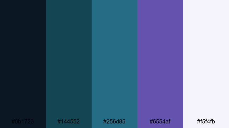
- HEX Codes: #0b1723, #144552, #256d85, #6554af, #f5f4fb
- Mood: Sophisticated, cinematic, and grounded.
- Use for: Best for documentary titles, cinematic travel films, and premium brand promos needing a polished feel.
Royal Harbor Cinema uses deep navy (#0b1723), harbor teal (#144552, #256d85), and muted royal purple (#6554af) with a soft off-white (#f5f4fb). It feels polished and cinematic without leaning into neon or pastel territory.
This palette suits documentaries, premium brand promos, portfolio reels, and cinematic travel stories. Use the navy and teal for backgrounds, gradient overlays, and letterboxing, then introduce purple for logo stings and title text. The off-white keeps copy sharp for lower thirds and end screens in Filmora.
Opulent Teal Reverie
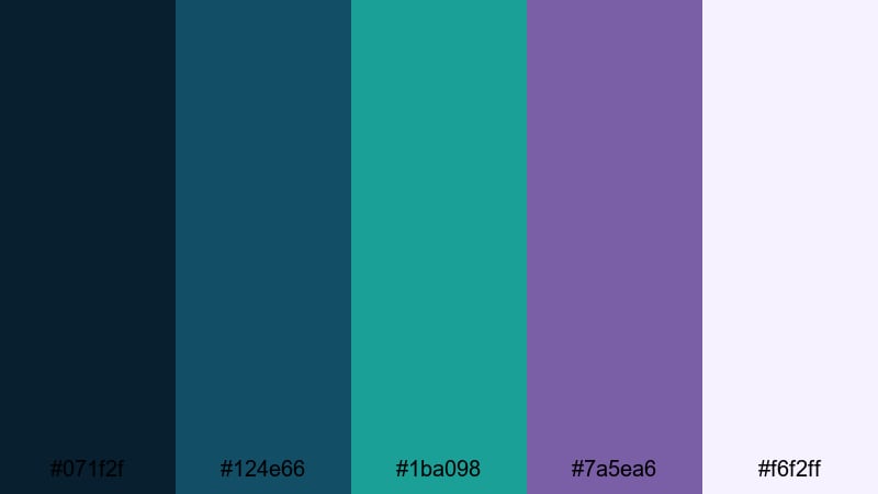
- HEX Codes: #071f2f, #124e66, #1ba098, #7a5ea6, #f6f2ff
- Mood: Luxurious, dreamy, and professional.
- Use for: Ideal for premium product spots, logo reveals, and channel branding focused on elegance and trust.
Opulent Teal Reverie layers inky blue (#071f2f) with rich teal and sea greens (#124e66, #1ba098) and velvety violet (#7a5ea6). A clean off-white (#f6f2ff) rounds out the palette, keeping it upscale yet approachable.
Reach for this blue green purple color combination when working on premium product ads, logo reveals, or educational channels that want to feel trustworthy and refined. In Filmora, use the teal and violet in smooth gradients behind your titles and logo, and keep text in the lightest shade for clear, professional branding.
Deep Indigo Tide
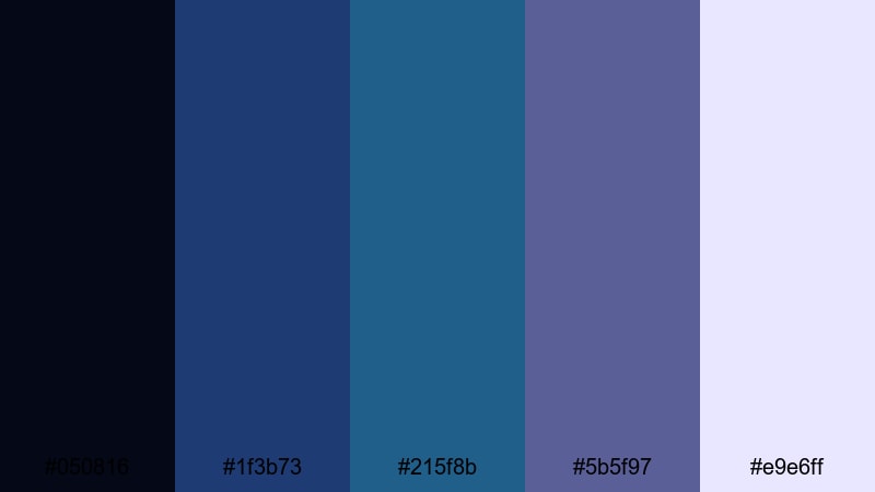
- HEX Codes: #050816, #1f3b73, #215f8b, #5b5f97, #e9e6ff
- Mood: Moody, thoughtful, and immersive.
- Use for: Great for narrative shorts, moody b-roll sequences, and story-driven brand or portfolio reels.
Deep Indigo Tide flows from almost-black navy (#050816) through rich indigo and blue (#1f3b73, #215f8b) into muted purple (#5b5f97), supported by a delicate off-white (#e9e6ff). It is ideal when you want emotional depth without losing clarity.
Use this palette for narrative shorts, poetic travel films, or brand stories with a reflective tone. In Filmora, use the darkest shades for vignettes and letterboxing, and let the indigo and muted purple control your midtones while off-white handles titles and captions. The subtlety of this blue green purple combination keeps focus on faces and storytelling.
Studio Luxe Gradient
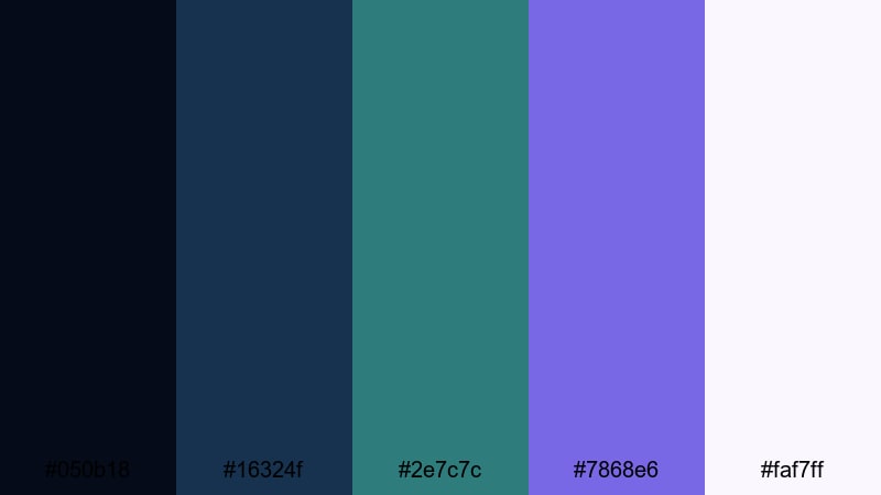
- HEX Codes: #050b18, #16324f, #2e7c7c, #7868e6, #faf7ff
- Mood: Modern, polished, and versatile.
- Use for: Use for channel rebrands, lower thirds, and smart UI overlays that need a modern but cinematic tone.
Studio Luxe Gradient balances deep studio navy (#050b18, #16324f) with teal (#2e7c7c) and smooth violet (#7868e6), finished with a bright off-white (#faf7ff). It has a modern, tech-savvy feel while still reading as cinematic and premium.
This palette is versatile enough for channel rebrands, UI-style overlays, and tutorial intros. In Filmora, create gradients that shift from teal into violet behind your text, keeping the darkest navy for background plates and the lightest shade for typography and icons. It works especially well for creators in tech, productivity, and design niches.
Pastel & Minimal Blue Green Purple Color Palettes
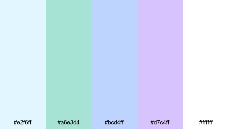
Soft Orchid Drift
- HEX Codes: #d8f3ff, #b3e9e3, #c7d2ff, #e0c7ff, #fdfbff
- Mood: Gentle, airy, and optimistic.
- Use for: Perfect for lifestyle vlogs, productivity content, and minimal title cards with a soft, approachable feel.
Soft Orchid Drift is a pastel daydream: pale sky blue (#d8f3ff), minty green (#b3e9e3), soft periwinkle (#c7d2ff), and orchid purple (#e0c7ff) against a nearly pure white (#fdfbff). It feels light, friendly, and full of breathing room.
Use this blue green purple palette for lifestyle vlogs, plan-with-me videos, or productivity content where you want calm focus and positive energy. Keep backgrounds white or very light, then use the pastels for icons, bullet points, and section titles in Filmora. It also works beautifully for clean YouTube channel art and Instagram story templates.
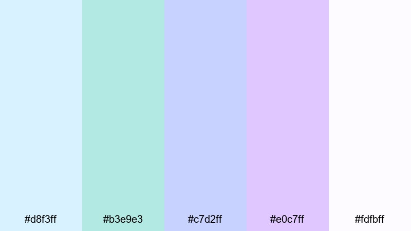
Minted Sky Frames
- HEX Codes: #e2f6ff, #a6e3d4, #bcd4ff, #d7c4ff, #ffffff
- Mood: Fresh, clean, and light.
- Use for: Use in minimalist intros, educational content, and mobile UI mockups where clarity and freshness matter.
Minted Sky Frames pairs icy blue (#e2f6ff) with fresh mint (#a6e3d4), powder blue (#bcd4ff), and lilac (#d7c4ff) on a pure white base (#ffffff). The overall effect is crisp, modern, and uncluttered.
This palette is great for educational videos, mobile UI walkthroughs, and minimal brand explainer graphics. In Filmora, use white as your main canvas and drop in mint and lilac frames or blocks to organize content sections and highlight key points. It keeps your blue green purple color scheme soft while maintaining high readability.
Calm Pixel Mirage
- HEX Codes: #dbeeff, #b9e6ff, #a8e6cf, #c6b9ff, #fbf9ff
- Mood: Relaxed, digital, and softly futuristic.
- Use for: Great for app walkthroughs, soft tech explainers, and creator dashboards or overlays.
Calm Pixel Mirage brings together very light digital blues (#dbeeff, #b9e6ff), minty green (#a8e6cf), muted lavender (#c6b9ff), and a soft white (#fbf9ff). It feels like a clean, futuristic interface but without harsh contrast.
Use this palette when you want a tech or creator dashboard look that stays welcoming and low-stress. In Filmora, build overlays, panels, and charts using the pale blues and greens, then reserve lavender for callouts and section headers. It is ideal for SaaS demos, productivity dashboards, and channel overlays that support your content instead of stealing attention.
Tips for Creating Blue Green Purple Color Palettes
Blue green purple color palettes are flexible enough for calm vlogs, neon gaming edits, and premium brand stories. A few practical rules will help you combine them with other colors and keep your videos and designs clear and on-brand.
- Pick a hero color: Choose either blue, green, or purple as the dominant shade, and use the others as supporting accents to avoid a noisy frame.
- Control contrast for readability: Use the darkest shades for backgrounds and the lightest HEX codes (#fdfbff, #ffffff, etc.) for text and UI to keep subtitles and titles easy to read.
- Limit saturation: Mix one or two saturated neon tones with more muted or pastel variants so your thumbnails pop without becoming overwhelming.
- Match footage lighting: If your clips are shot in warm sunset light, gently cool them down before pushing blue green purple tones, so skin tones do not turn gray or unnatural.
- Use gradients, not just solids: Gradients from blue to teal or teal to violet look more cinematic than flat blocks and work well for backgrounds, lower thirds, and title cards.
- Keep branding consistent: Reuse the same 3 to 5 HEX codes for logos, intros, lower thirds, and end screens so viewers recognize your channel at a glance.
- Plan thumbnails separately: Increase contrast and saturation slightly for thumbnail colors compared with in-video colors, so they stand out in feeds while keeping the same palette.
- Test on multiple screens: Preview your blue green purple palette on phones, tablets, and monitors; adjust brightness and contrast in Filmora if some shades look too dark or washed out.
Blue green purple color combinations can feel calm, luxurious, or electrifying, depending on how you balance brightness, saturation, and contrast. By starting from a curated palette, you lock in a clear emotional tone for your videos and designs while building a recognizable visual identity.
Whether you lean toward soft pastels, bold neon, or elegant cinematic grading, these 15 blue green purple color palettes give you ready-to-use HEX codes for intros, overlays, thumbnails, and brand assets. Drop them into Filmora, build a few presets, and you will be able to keep every vlog, reel, or promo aligned with your chosen aesthetic.
Experiment with different palettes on duplicate timelines, compare how they change the mood of the same edit, and refine until you find the blue green purple style that feels like your personal brand.
secure downloadNext: Bronze Color Palette
