
 100% Security Verified | No Subscription Required | No Malware


 ChatGPT
 Perplexity
 Gemini
 Claude
 Grok
Grok
Boysenberry sits between deep purple and rich magenta, combining the mystery of violet with the warmth of red. It feels creative, romantic, and slightly luxurious, which makes it a powerful choice for visual storytelling. Used well, boysenberry can suggest intimacy, nostalgia, or high-end style without feeling too harsh or over-saturated.
In video editing and design, boysenberry works beautifully in YouTube thumbnails, intro screens, lower thirds, branding kits, and cinematic color grading. Below you will find ready-made boysenberry color palettes with HEX codes, designed for creators and Filmora users who want cohesive looks for vlogs, reels, promos, and more.
In this article
Soft & Romantic Boysenberry Color Palettes
Blush Orchard Dream
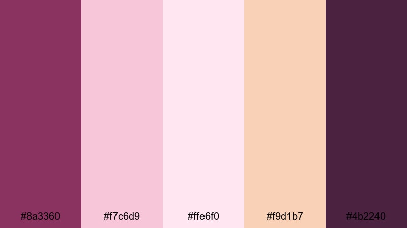
- HEX Codes: #8a3360, #f7c6d9, #ffe6f0, #f9d1b7, #4b2240
- Mood: Gentle, nostalgic, and dreamy with a soft berry glow.
- Use for: Perfect for wedding highlight reels, proposal videos, and sentimental vlog openings that need a warm, romantic feel.
Blush Orchard Dream feels like pastel petals falling in slow motion at golden hour. The main boysenberry tone (#8a3360) anchors the palette, while blush pinks and peach highlights soften everything for a tender, dreamy mood. The deeper plum accent (#4b2240) keeps it from feeling too sugary and adds just enough depth for cinematic shots.
Use this palette for wedding films, engagement announcements, lifestyle intros, and any brand that leans into romance or soft femininity. Apply boysenberry to titles and lower thirds, keep backgrounds in the light blush and peach tones, and reserve the darkest shade for subtle borders, shadows, or logo marks. It also works beautifully for YouTube thumbnails where you want a gentle but eye-catching romantic vibe.
Pro Tip: Build a Romantic Boysenberry Look in Filmora
To keep a soft boysenberry look consistent across a full edit, start by setting your primary text, overlay shapes, and transitions in the deeper berry tones. Then use light blush and peach as your background colors for intros, end cards, and chapter screens in Filmora. This keeps your wedding highlights, proposals, and lifestyle vlogs feeling cohesive from the first frame to the final credits.
When you cut between close-ups, B-roll, and titles, reuse the same HEX codes for your text and graphic elements so viewers instantly recognize your style. Filmora makes it easy to save these shades as presets for callouts, lower thirds, and split screens, so every export carries the same romantic boysenberry identity across YouTube, Instagram, TikTok, and more.
AI Color Palette
If you have a favorite still from your shoot or a boysenberry mood board, you can turn that into a full video look with Filmora's AI tools. Filmora's AI Color Palette feature lets you pick a reference image with soft pinks and berry tones, then automatically apply that color style to other clips in your timeline.
Instead of manually matching every shot, you simply choose the reference frame, run AI Color Palette, and let Filmora even out the tones. Skin tones stay natural, while your shadows pick up hints of boysenberry and your highlights lean into blush and peach. It is a fast way to make proposal videos, bridal reels, and romantic vlogs look like they belong to the same dreamy world.
 secure download

HSL, Color Wheels & Curves
Once your boysenberry palette is in place, fine-tune the look using HSL, color wheels, and curves in Filmora. Slightly desaturate magentas and purples in HSL to keep skin tones flattering, then use the midtone color wheel to nudge your image toward warm pinks for a romantic glow. To get an even more cinematic result, gently lift the shadows with curves while lowering the highlights, so bright whites roll off into soft blush instead of harsh pure white.
For a step-by-step walkthrough of balancing colors and contrast, you can follow Filmora's color correction guide and adapt the techniques to your boysenberry tones. This combination of creative grading and careful contrast adjustment helps your romantic videos feel polished and intentional, rather than simply tinted purple.
secure download1000+ Video Filters & 3D LUTs
To speed up your workflow, pair this boysenberry palette with ready-made looks from Filmora. Filmora's video filters and 3D LUTs make it easy to push your edit toward soft pastels, vintage film, or dreamy glow without complex manual grading. You can start with a pastel or wedding-focused filter, then adjust intensity so your berry, blush, and peach tones remain the heroes.
Stack subtle filters with your own boysenberry color corrections to create a signature style that you can reuse across intros, outros, reels, and shorts. Once you find a combination that works, save it as a custom preset so every new project can instantly inherit the same romantic orchard feel.
secure downloadTwilight Rose Whispers

- HEX Codes: #7b2d55, #f4b6c4, #fbe9f2, #cba3d8, #3e2140
- Mood: Romantic, intimate, and slightly moody like twilight skies.
- Use for: Great for cinematic storytelling sequences, indie film titles, and poetry readings where you want soft emotion with depth.
Twilight Rose Whispers feels like the last light of day drifting into night. The central boysenberry shades sit between dusky rose and muted plum, while pale pinks and lavender (#cba3d8) add an ethereal softness. The deep accent (#3e2140) suggests evening shadows and keeps the palette from becoming too light or airy.
Use this scheme for poetic voiceovers, indie short films, and intros for creative channels. Let the lighter tones support backgrounds and subtle gradients, while the darker berry and plum tones carry titles, borders, and graphical frames. It is perfect for thumbnails that promise intimate storytelling or late-night reflections.
Lavender Jam Serenity

- HEX Codes: #883464, #e6c5ff, #f4e5ff, #b3a1ff, #4a2449
- Mood: Calm, soothing, and slightly whimsical.
- Use for: Use in calming wellness content, ASMR channels, or meditation visuals where you want gentle, reassuring color.
Lavender Jam Serenity leans into the softer, cooler side of boysenberry. The main berry shade (#883464) is cushioned by milky lavender and lilac tones, creating a cocoon-like calm. The deeper plum (#4a2449) acts as a grounding element so the palette still feels intentional and designed.
This palette is ideal for wellness branding, meditation screens, sleep playlists, and ASMR thumbnails. Use the lighter purples for backgrounds and overlay shapes, and keep titles, icons, and buttons in boysenberry. In Filmora, you can apply a subtle vignette using the darker plum to gently focus attention without breaking the peaceful mood.
Berry Petal Sunrise
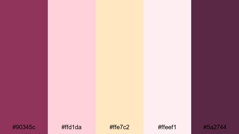
- HEX Codes: #90345c, #ffd1da, #ffe7c2, #ffeef1, #5a2744
- Mood: Optimistic, tender, and softly radiant like early morning light.
- Use for: Perfect for morning routines, travel diaries at dawn, and uplifting social edits that need a gentle glow.
Berry Petal Sunrise balances deep berry tones with sun-washed peaches and soft pinks. The main boysenberry (#90345c) pairs with creamy peach (#ffe7c2) and delicate highlights (#ffeef1) to mimic the gentle brightness of sunrise. The deeper accent (#5a2744) adds contrast for text and icons.
Try this palette for morning routine vlogs, day-in-the-life edits, and optimistic brand visuals. Use peach and light pink for backgrounds and gradient washes, while boysenberry appears in titles, markers, and buttons. For thumbnails, place a subject cutout against the lighter tones and frame with boysenberry shapes so the overall image feels fresh but still branded.
Velvet Mauve Keepsake
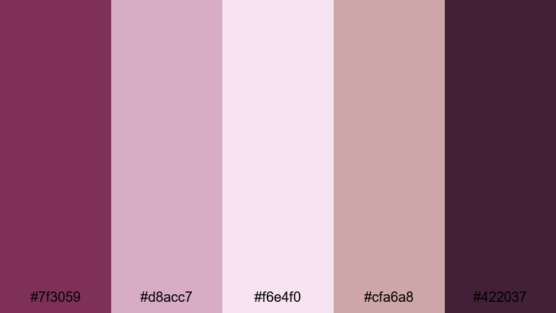
- HEX Codes: #7f3059, #d8acc7, #f6e4f0, #cfa6a8, #422037
- Mood: Vintage, sentimental, and quietly luxurious.
- Use for: Use in memory montages, anniversary films, and brand stories that lean into nostalgia and timeless elegance.
Velvet Mauve Keepsake feels like an old photo album translated into color. The boysenberry core (#7f3059) is wrapped in soft mauves and faded pinks, suggesting age and emotional depth without losing clarity. The darkest shade (#422037) works almost like a sepia-tinted black, perfect for grounding your visuals.
Use this palette for anniversary videos, legacy brand stories, and reflective storytelling pieces. Let mauves and pale pinks fill the screen in overlays, frames, and split screens, while boysenberry and the dark accent support typography and logos. In thumbnails, this mix reads as premium and nostalgic at the same time, ideal for audiences who value history and sentiment.
Bold & Vibrant Boysenberry Color Palettes
Electric Berry Neon
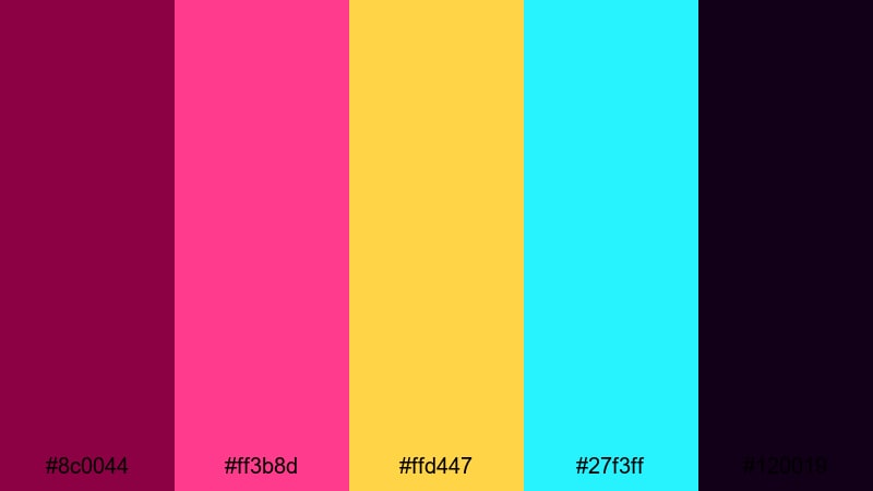
- HEX Codes: #8c0044, #ff3b8d, #ffd447, #27f3ff, #120019
- Mood: High-energy, playful, and unapologetically bold.
- Use for: Ideal for gaming intros, music videos, and high-impact YouTube thumbnails that need instant attention.
Electric Berry Neon takes boysenberry into full arcade mode. The dark berry base (#8c0044) is supercharged with hot magenta, neon cyan (#27f3ff), and punchy yellow (#ffd447). The almost-black background shade (#120019) lets the neons glow like LED signs in a dark room.
This palette is perfect for gaming channels, EDM music videos, and hyper-edited TikToks. Use the darkest tone as your background, then layer bold shapes and titles in neon cyan, yellow, and magenta. In Filmora, you can add glitch transitions or glow effects on the bright accents so your thumbnails, intros, and lower thirds explode with energy.
Festival Lights Fusion
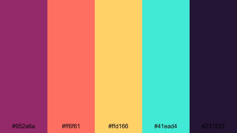
- HEX Codes: #952a6a, #ff6f61, #ffd166, #41ead4, #231533
- Mood: Festive, dynamic, and colorful like an outdoor night festival.
- Use for: Perfect for event recaps, concert edits, and party highlight reels with lots of movement and rhythm.
Festival Lights Fusion brings together warm corals (#ff6f61), golden yellow (#ffd166), and cool teal (#41ead4) around a rich boysenberry core (#952a6a). The dark indigo base (#231533) sets the stage like a night sky filled with stage lights and lanterns.
Use this palette for party recaps, live music reels, and festival vlogs. Let boysenberry and indigo carry backgrounds and shadow areas, then add bright coral, yellow, and teal as animated titles, shapes, and confetti overlays. Thumbnails with these colors immediately signal excitement and movement, especially when you frame performers or crowds with bold colored borders.
Midnight Pop Remix
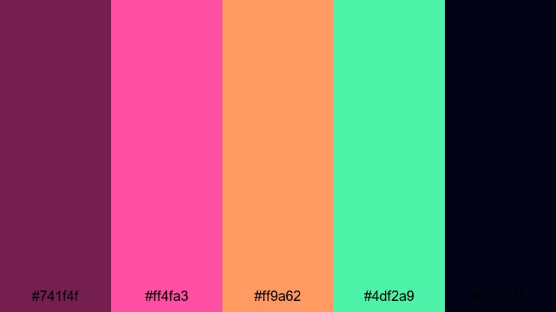
- HEX Codes: #741f4f, #ff4fa3, #ff9a62, #4df2a9, #020315
- Mood: Edgy, modern, and club-inspired with a midnight punch.
- Use for: Use in fashion reels, dance content, and fast-cut TikTok edits where you want a bold, trendy vibe.
Midnight Pop Remix combines deep boysenberry (#741f4f) with candy pink, citrus orange (#ff9a62), and neon mint (#4df2a9) over almost-black midnight (#020315). The result feels like a pop music video or a street-style shoot under club lights.
Use midnight as your canvas for full-screen shots and overlays, then bring in pops of pink, orange, and mint in kinetic typography, stickers, and animated accents. In thumbnails, a dark background with bright boysenberry and pink headlines makes your video stand out quickly in crowded feeds, especially for dance challenges and fashion lookbooks.
Cosmic Berry Blast
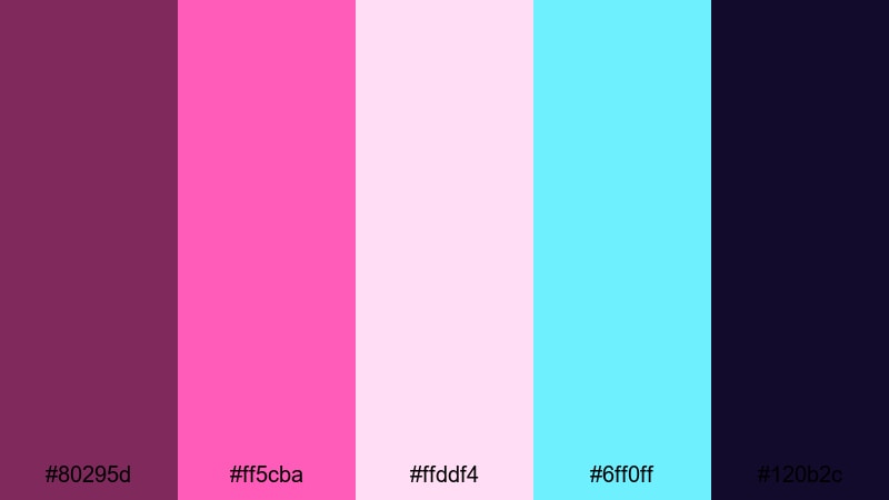
- HEX Codes: #80295d, #ff5cba, #ffddf4, #6ff0ff, #120b2c
- Mood: Futuristic, cosmic, and slightly surreal.
- Use for: Perfect for sci-fi intros, tech explainers, and space-inspired motion graphics with a fun twist.
Cosmic Berry Blast orbits a rich boysenberry core (#80295d) with starry pinks (#ff5cba), pale cosmic highlights (#ffddf4), and glowing cyan (#6ff0ff). The deep space background (#120b2c) grounds everything in a sci-fi atmosphere.
Use this palette in animated explainers, HUD-style overlays, and futuristic channel branding. Let the darkest tone wash your background, then add boysenberry and bright cyan in lines, grids, and geometric shapes. The pastel pinks help soften the look for thumbnails and titles, making the sci-fi vibe feel more accessible and playful.
Urban Graffiti Berries
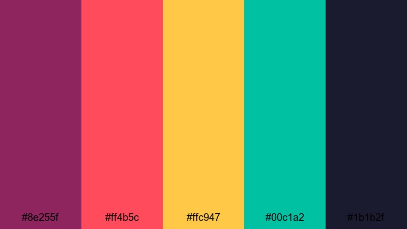
- HEX Codes: #8e255f, #ff4b5c, #ffc947, #00c1a2, #1b1b2f
- Mood: Street-smart, rebellious, and full of attitude.
- Use for: Great for skate edits, street fashion lookbooks, and urban documentary bumpers with strong personality.
Urban Graffiti Berries mixes gritty navy (#1b1b2f) and boysenberry (#8e255f) with graffiti-style reds (#ff4b5c), bold yellow (#ffc947), and teal (#00c1a2). It feels like painted walls, stickers, and street art translated into a digital palette.
Use the navy and boysenberry as your base, then treat the bright tones like spray paint on top. In Filmora, build sticker-style titles, graphic tags, and bold lower thirds using the yellows, reds, and teals. This combination works especially well for skate montages, street interviews, and edgy brand promos that want an authentic, urban look.
Elegant & Modern Boysenberry Color Palettes
Minimal Plum Interface
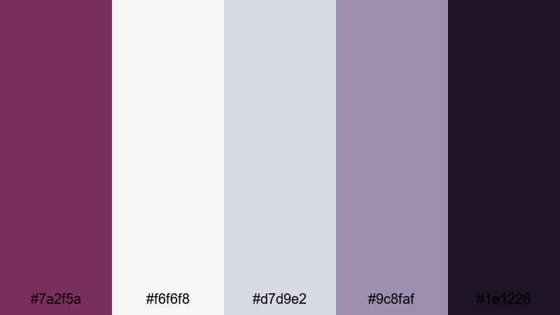
- HEX Codes: #7a2f5a, #f6f6f8, #d7d9e2, #9c8faf, #1e1226
- Mood: Clean, sophisticated, and product-focused.
- Use for: Ideal for app walkthroughs, SaaS demos, and UI-focused explainer videos that need a modern premium look.
Minimal Plum Interface uses boysenberry (#7a2f5a) as a refined accent against cool grays and soft whites. The palette feels like a sleek dashboard or UI kit, with #f6f6f8 and #d7d9e2 providing clean surfaces and #1e1226 offering a deep, modern contrast.
Use this scheme for software demos, app tutorials, and screen-focused explainers. Keep backgrounds light and neutral, then apply boysenberry and deep plum to key buttons, section titles, and callouts. In thumbnails, a mostly white layout with a strong boysenberry accent bar or badge instantly signals professionalism and clarity.
Gallery Wine Statement
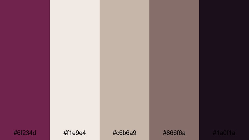
- HEX Codes: #6f234d, #f1e9e4, #c6b6a9, #866f6a, #1a0f1a
- Mood: Artful, curated, and subtly luxurious.
- Use for: Use in portfolio reels, gallery promos, and creative studio branding to convey refined taste.
Gallery Wine Statement pairs deep wine-boysenberry (#6f234d) with creamy neutrals (#f1e9e4) and warm taupes. The dark accent (#1a0f1a) frames everything like a gallery wall, while the muted midtones keep the palette sophisticated and understated.
This combination is ideal for photographers, illustrators, and studios building portfolio videos or case study reels. Place artwork or product shots on the light neutrals, then frame them with boysenberry borders and titles. For thumbnails and channel branding, a strip of wine color with minimalist text over cream instantly reads as refined and artistic.
Editorial Berry Contrast
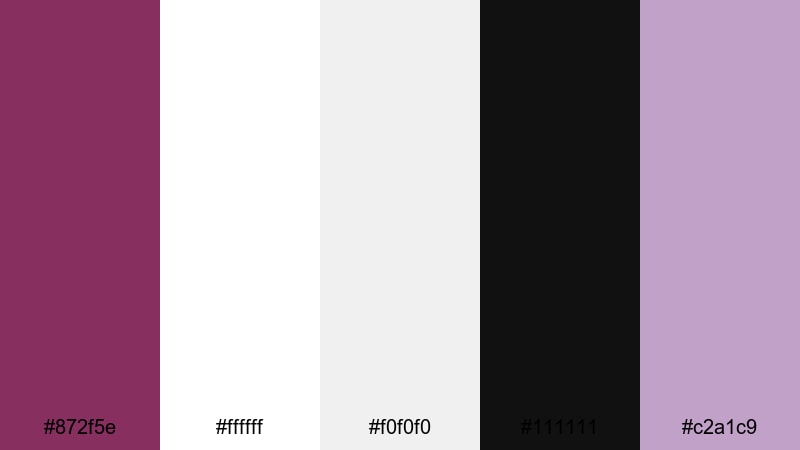
- HEX Codes: #872f5e, #ffffff, #f0f0f0, #111111, #c2a1c9
- Mood: High-contrast, polished, and magazine-like.
- Use for: Perfect for editorial-style talking head videos, beauty channels, and sharp infographic content.
Editorial Berry Contrast combines pure white and deep black with a rich boysenberry accent (#872f5e) and a soft lilac highlight (#c2a1c9). The sharp contrast gives your layouts a magazine cover feel, while the berry and lilac tones add personality.
Use this palette for beauty tutorials, expert interviews, and sleek educational content. Keep most of your frames white or pale gray, use black for body text, and reserve boysenberry for headings, dividers, and key statistics. In thumbnails, a white background with a bold boysenberry title bar over a subject photo looks clean, clickable, and on-brand.
Luxury Label Noir
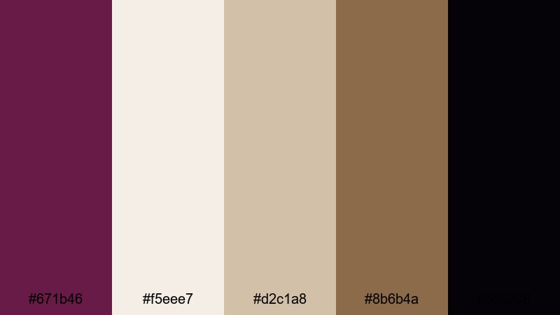
- HEX Codes: #671b46, #f5eee7, #d2c1a8, #8b6b4a, #050308
- Mood: Opulent, dark, and brand-forward.
- Use for: Ideal for premium product reveals, fragrance or jewelry promos, and upscale brand intros.
Luxury Label Noir wraps deep boysenberry (#671b46) in champagne beige (#f5eee7), warm gold-browns (#d2c1a8, #8b6b4a), and inky black (#050308). It feels like high-end packaging or a luxury boutique, perfect for brands that want to signal exclusivity.
Use black and boysenberry for backgrounds and product stages, then highlight details with champagne and soft gold. In Filmora, pair slow-motion product shots with minimal text in beige or gold over boysenberry panels. Thumbnails using this mix immediately communicate premium quality for fragrances, jewelry, skincare, and high-end fashion.
Tech Noir Boysenberry
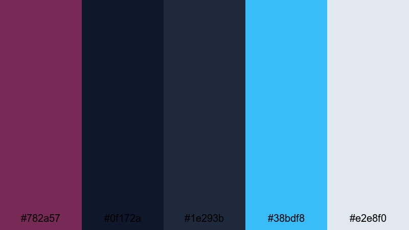
- HEX Codes: #782a57, #0f172a, #1e293b, #38bdf8, #e2e8f0
- Mood: Sleek, futuristic, and confidently professional.
- Use for: Great for tech brand videos, cybersecurity explainers, and modern channel branding that needs edge and clarity.
Tech Noir Boysenberry combines structured navy tones (#0f172a, #1e293b) with a precise boysenberry accent (#782a57), icy blue highlight (#38bdf8), and soft cool gray (#e2e8f0). It feels both technical and cinematic, like a UI from a sci-fi film.
Use the dark blues as your base, layering grids, lines, and panels in gray and blue. Let boysenberry appear in key callouts, logo marks, and segment titles to give your tech content a distinctive brand color. In thumbnails, a navy background with cyan lines and a boysenberry title instantly fits cybersecurity, coding, data, and IT topics.
Tips for Creating Boysenberry Color Palettes
Boysenberry is versatile enough to feel romantic, bold, or ultra-modern, depending on what you pair it with. When you build your own palettes for video and design, a few practical guidelines will help you keep everything readable, on-brand, and easy to grade in Filmora.
- Use boysenberry as your anchor color, then choose two supporting tones: a light shade for backgrounds and a dark shade for contrast. Build the rest of the palette around these three.
- Check text readability by previewing small thumbnails. White or very light text on deep boysenberry is usually safest for titles, while dark text works well on pale pinks, creams, or pistachio greens.
- Balance warm and cool accents. For romantic or lifestyle content, pair boysenberry with peaches and warm neutrals; for tech or sci-fi edits, combine it with navies and cool cyans.
- Limit vivid accent colors to 1 or 2 per palette. Neon cyan, bright yellow, or graffiti red can look great with boysenberry, but too many accents at once will compete for attention.
- Match your footage to the palette in Filmora by gently nudging shadows toward berry or navy, and highlights toward blush, cream, or soft gray, rather than applying a single strong tint.
- Keep branding consistent by reusing the same HEX codes in your intros, lower thirds, subtitles, and end screens. Save these shades in Filmora so you do not have to guess them each time.
- Test your palette on both dark mode and light mode layouts. Boysenberry usually pops better on lighter backgrounds, but dark UIs can feel more cinematic for gaming and tech channels.
- Experiment with a complementary or analogous twist, such as pairing boysenberry with soft pistachio greens, muted oranges, or adjacent purples to create subtle, cinematic gradients.
Used thoughtfully, boysenberry can shape how your audience feels about your content and your brand. Soft palettes support love stories and wellness channels, bold neons power up gaming and music content, while elegant mixes give creative studios and tech brands a clear visual identity.
Try a few of these palettes in Filmora, save your favorites as presets, and refine them with AI Color Palette, HSL adjustments, and filters until they feel like your own signature style. Over time, viewers will start to recognize your boysenberry combinations the moment your video appears in their feed.
Whether you are designing thumbnails, building intros, or color grading full edits, a deliberate boysenberry color palette can make your videos feel more cinematic, consistent, and memorable across every platform.
secure downloadNext: Pistachio Color Palette
