
 100% Security Verified | No Subscription Required | No Malware

Brown Turquoise is a rich blend of earthy stability and refreshing clarity. Brown keeps your visuals grounded, warm, and approachable, while turquoise adds energy, creativity, and a touch of coastal escape. Together, they create a palette that feels cinematic yet natural, perfect for channels that want to look stylish without losing authenticity.
In video editing, branding, and YouTube thumbnails, Brown Turquoise works beautifully for travel vlogs, lifestyle content, tech reviews, and story-driven intros. Below are 15 Brown Turquoise color palettes with HEX codes created for creators and Filmora users, so you can quickly apply these looks to titles, overlays, color grading, and channel branding.
In this article
Earthy Brown Turquoise Color Palettes
Desert Oasis Drift

- HEX Codes: #8c5a3c, #4a2f25, #1ea7a3, #cbe7e3, #f4f0e8
- Mood: Calm, grounded, and quietly adventurous.
- Use for: Ideal for travel vlog intros, desert-themed B-roll, and warm yet refreshing YouTube thumbnails.
Desert Oasis Drift combines sunbaked browns with clear turquoise and soft off-whites, creating the feeling of a hidden spring in the middle of a canyon. The darker browns anchor your frame, while the turquoise and pale neutrals bring in light, air, and a sense of discovery.
Use this palette for travel vlogs, slow pan B-roll over dunes or rocky landscapes, and thumbnails that mix warm sand tones with a pop of aqua in your text or graphics. In Filmora, it works well for soft cinematic grading on outdoor clips, cohesive channel covers, and intro cards that feel both adventurous and soothing.
Pro Tip: Build a Cinematic Brown Turquoise Look in Filmora
To keep a Brown Turquoise look consistent across a full edit, start by choosing which color will dominate. Let the browns control your backgrounds and wardrobe, then use turquoise only for accents like titles, lower thirds, or a few highlighted props. Filmora makes it easy to reuse this combo with saved presets and custom color settings for your text and overlays.
You can also set up one main Brown Turquoise grade for your A-roll and then lightly adjust it for B-roll, intros, and social cutdowns. By copying effects and color settings inside Filmora, your entire project feels like one cohesive, cinematic world instead of a mix of random clips.
AI Color Palette
If you have a reference image that perfectly captures this Desert Oasis Drift look, you can turn it into a unified grade for your whole video. Filmora's AI Color Palette feature analyzes your reference colors, including those warm browns and turquoise highlights, and applies a matching color style to other clips with just a few clicks.
This is especially useful for travel or vlog footage shot in different locations or lighting conditions. You can match all your scenes to one hero shot, so your Brown Turquoise aesthetic stays balanced from the first intro frame to the closing shot.
 secure download

HSL, Color Wheels & Curves
To refine a Brown Turquoise palette like this, use HSL to nudge hues and saturation: deepen the oranges and browns for richer sand tones, and slightly desaturate the turquoise in midtones to keep it cinematic instead of neon. In Filmora, the color wheels let you cool the shadows while keeping highlights warm, which adds subtle contrast and depth to your footage.
For even more control, open curves to gently lift the highlights and create a soft, filmic roll-off while protecting shadow detail in your browns. The combination of HSL, color wheels, and curves in Filmora, as shown in its dedicated color correction tools overview, helps you dial in a Brown Turquoise look that feels polished and professional.
secure download1000+ Video Filters & 3D LUTs
Once your Brown Turquoise base is in place, you can quickly stylize it using Filmora's built-in filters and LUTs. A subtle warm filter can make the browns feel like golden hour, while a teal-and-orange style LUT can push the turquoise into a more cinematic, blockbuster direction without breaking your palette.
Filmora's video filters and 3D LUTs make it easy to test different moods on top of the same color scheme. Try soft matte filters for calm travel vlogs, or stronger contrast LUTs for dramatic desert sequences, all while keeping your Brown Turquoise aesthetic consistent.
secure downloadCopper Patina Shore
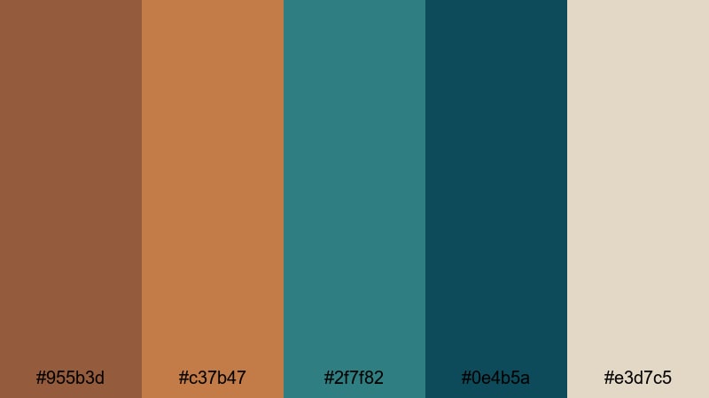
- HEX Codes: #955b3d, #c37b47, #2f7f82, #0e4b5a, #e3d7c5
- Mood: Rustic, coastal, and a bit nostalgic.
- Use for: Works well in cinematic travel montages, sailing vlogs, and intro titles with a handcrafted feel.
Copper Patina Shore pairs burnished copper browns with deep turquoise and a soft sandy neutral. It feels like weathered metal on a harbor pier and old boats resting at sunset, with a slightly vintage, handcrafted charm.
Use it when you want your videos and thumbnails to look artisan and tactile: sailing vlogs, coastal coffee shop stories, maker channels, or travel sequences around old ports. In Filmora, apply this palette to titles, logo stings, and subtle overlays to tie together footage shot on overcast days and bright afternoons.
Weathered Teak Lagoon
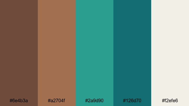
- HEX Codes: #6e4b3a, #a2704f, #2a9d90, #126d70, #f2efe6
- Mood: Natural, relaxed, and subtly luxurious.
- Use for: Great for product b-roll, cozy cabin vlogs, and storytelling overlays that need an organic premium look.
Weathered Teak Lagoon mixes rich wood tones with lagoon turquoise and a soft light neutral, creating a palette that feels like a high-end eco lodge by the water. It is calm and organic, but the deeper turquoise accents add just enough sophistication.
This is a strong choice for product B-roll on wooden tables, cozy cabin or vanlife vlogs, and branded content for nature-focused or sustainable brands. Use the browns for backgrounds and props, and let the turquoise appear in graphics, call-to-action buttons, and title text to guide the viewer's eye.
Terracotta Tidepool

- HEX Codes: #a75b3f, #e07a5f, #2f8f9d, #0f4c5c, #f1faee
- Mood: Earthy, sunlit, and lightly tropical.
- Use for: Perfect for travel reels, beach vlogs, and thumbnail frames that balance warmth with refreshing blues.
Terracotta Tidepool brings together sunbaked terracotta, bright coral-brown, and vivid turquoise with a fresh off-white. It feels like a warm, sunlit courtyard opening onto a cool, shallow pool, balancing heat and refreshment in one frame.
Use this palette for energetic travel reels, tropical beach vlogs, and Instagram or YouTube thumbnails that need strong contrast between warm skin tones and cool water. The off-white is perfect for readable title text, while the deeper teal (#0f4c5c) works well for outlines, badges, and logo accents.
Modern Brown Turquoise Color Palettes
Urban Loft Splash
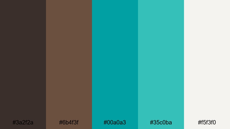
- HEX Codes: #3a2f2a, #6b4f3f, #00a0a3, #35c0ba, #f5f3f0
- Mood: Sleek, modern, and refreshingly energetic.
- Use for: Best for tech reviews, channel branding, and minimalist title cards with a pop of color.
Urban Loft Splash pairs dark coffee browns with bright turquoise accents and a soft off-white. The result is city-chic: grounded and minimal, but with energetic teal highlights that feel like neon reflections on polished concrete.
Apply this palette to tech reviews, productivity channels, and design-focused content. Use the deep brown as your background, off-white for clean typography, and reserve the turquoise shades for call-to-action buttons, progress bars, and animated icons in Filmora's motion graphics.
Minimal Teal Leather

- HEX Codes: #40312a, #755339, #1bb3b0, #e1f5f4, #ffffff
- Mood: Clean, confident, and stylishly minimal.
- Use for: Ideal for logo reveals, lower thirds, and UI-inspired overlays in tutorials or review videos.
Minimal Teal Leather blends supple mid browns, a crisp teal, and plenty of white space. It looks like a premium notebook next to a modern app interface, mixing tactile warmth with clean digital clarity.
This palette is perfect for tutorial channels, UX breakdowns, and minimalist branding. In Filmora, build lower thirds and logo reveals using the browns as subtle shapes behind text, with teal used sparingly for key icons or highlighted keywords. The whites ensure that on-screen text remains sharp and easy to read.
Graphite Poolside
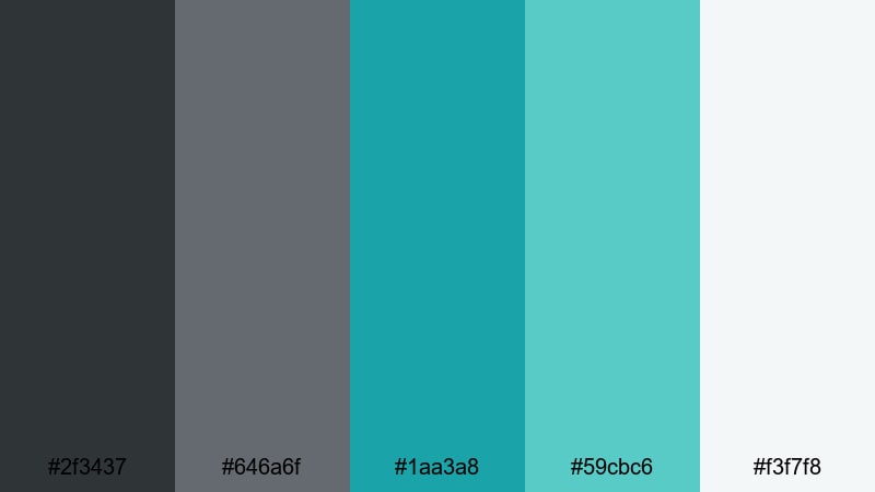
- HEX Codes: #2f3437, #646a6f, #1aa3a8, #59cbc6, #f3f7f8
- Mood: Cool, professional, and quietly playful.
- Use for: Great for channel banners, business explainers, and app promo videos needing a fresh yet serious tone.
Graphite Poolside leans into charcoal and cool gray tones, lifted by bright turquoise and a pale almost-white. It feels like a sleek office building with a rooftop pool: professional and structured, but with a splash of fun.
Use this palette for business explainers, SaaS or app promos, and LinkedIn-friendly content where you still want a hint of personality. Greys make excellent backgrounds for data overlays, while turquoise (#1aa3a8 and #59cbc6) highlight key numbers, timeline markers, and animated icons in your Filmora projects.
Chrome Cafe Aqua

- HEX Codes: #4a3b33, #877063, #0f9ba9, #42c5c7, #f8f6f3
- Mood: Trendy, polished, and cafe-casual.
- Use for: Perfect for lifestyle channels, coffee shop b-roll, and stylish lower thirds on social edits.
Chrome Cafe Aqua combines cozy cafe browns with glossy turquoise accents and a creamy off-white. It feels like latte art next to a modern smartphone, ideal for channels that bridge lifestyle and tech or creative freelancing.
Use it in aesthetic B-roll of coffee shops, entrepreneur day-in-the-life vlogs, or Instagram Reels where you want both comfort and polish. In Filmora, this palette works beautifully for animated subtitles, chapter labels, and subtle background shapes behind text or product shots.
Soft & Pastel Brown Turquoise Color Palettes
Seafoam Latte Haze
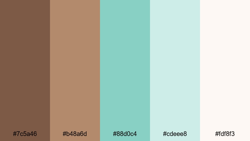
- HEX Codes: #7c5a46, #b48a6d, #88d0c4, #cdeee8, #fdf8f3
- Mood: Soft, dreamy, and comforting.
- Use for: Lovely for morning routines, cozy vlog intros, and pastel-themed channel art.
Seafoam Latte Haze blends creamy latte browns with misty seafoam turquoise and an almost-cloudlike neutral. It feels hazy and gentle, like a slow morning with soft light through sheer curtains.
Use this palette for morning routines, self-care vlogs, planning videos, or ASMR content where harsh contrast would feel out of place. In Filmora, pair pastel turquoise (#88d0c4, #cdeee8) with rounded fonts and gentle transitions for intros, end screens, and playlist covers.
Dusty Aqua Storybook
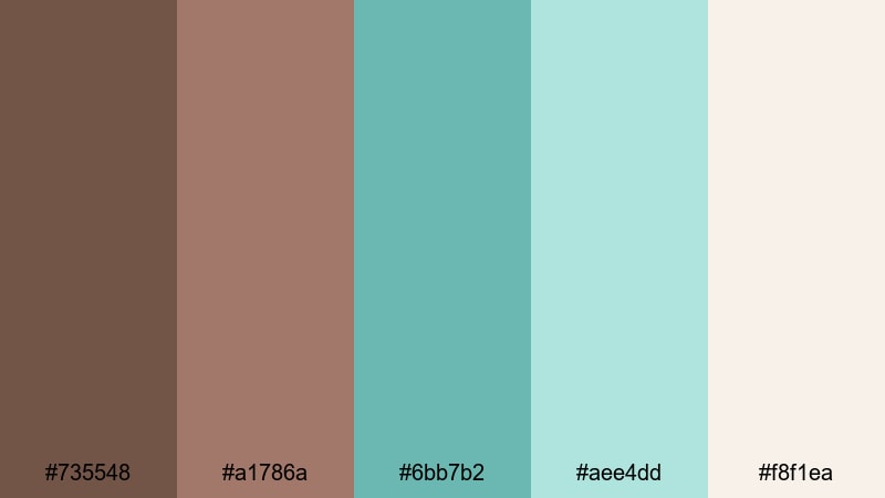
- HEX Codes: #735548, #a1786a, #6bb7b2, #aee4dd, #f8f1ea
- Mood: Whimsical, nostalgic, and story-driven.
- Use for: Great for narrative vlogs, journaling videos, and title cards for storytelling series.
Dusty Aqua Storybook uses muted browns and softened aqua greens, giving the feeling of sun-faded pages and shoreline memories. It has a quiet, nostalgic quality that suits slower, narrative content.
Apply this palette to journaling videos, travel diaries, and story-driven edits where you want viewers to lean in and listen. Use the lighter tones for backgrounds behind handwritten-style text and the deeper brown (#735548) for frames, borders, or sketch-like doodles created in Filmora.
Vintage Teal Postcard
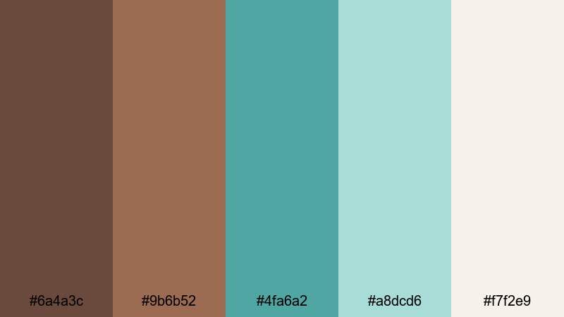
- HEX Codes: #6a4a3c, #9b6b52, #4fa6a2, #a8dcd6, #f7f2e9
- Mood: Retro, tender, and slightly romantic.
- Use for: Perfect for travel diaries, scrapbook-style edits, and soft cinematic LUTs.
Vintage Teal Postcard layers muted browns with washed teal and a warm paper-like neutral. It looks like an old postcard from a favorite coastal town, slightly faded but full of feeling.
This palette is great for scrapbook edits, romantic travel diaries, and slow cinematic cuts. In Filmora, combine it with vignette effects and a gentle film grain to enhance the retro mood, using teal in small accent graphics and brown for frames, titles, and captions.
Cinematic Brown Turquoise Color Palettes
Moody Harbor Night
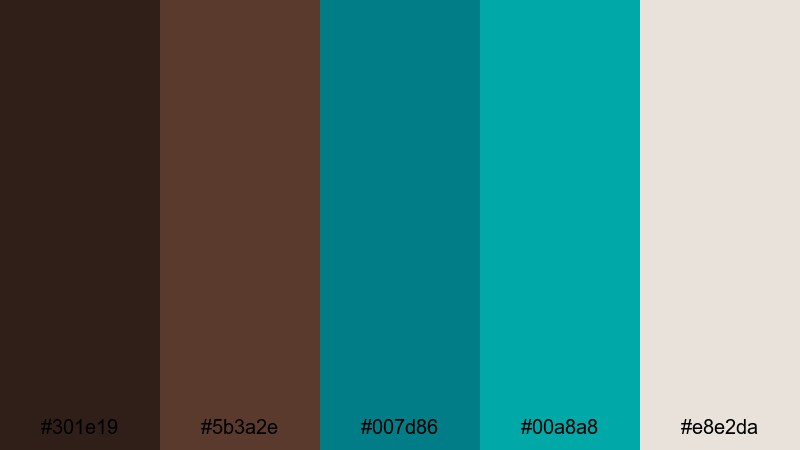
- HEX Codes: #301e19, #5b3a2e, #007d86, #00a8a8, #e8e2da
- Mood: Dramatic, cinematic, and slightly mysterious.
- Use for: Use for short films, dramatic intros, and night-time city or harbor sequences.
Moody Harbor Night combines inky browns with punchy turquoise accents and a muted highlight neutral. It feels like a harbor at midnight: deep shadows, colored reflections on the water, and a hint of mystery.
Use it for short film intros, noir-inspired city sequences, or moody brand openers. In Filmora, keep most of the frame in dark browns and let turquoise show up in light streaks, graphic accents, and title text, so every bright element carries emotional weight.
Tropical Storm Cut
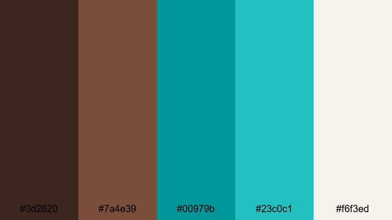
- HEX Codes: #3d2620, #7a4e39, #00979b, #23c0c1, #f6f3ed
- Mood: Intense, energetic, and stormy-tropical.
- Use for: Great for action-packed travel edits, drone shots, and dramatic teaser trailers.
Tropical Storm Cut sets stormy dark browns against electric turquoise and bright aqua. It feels like a tropical sky just before the rain hits, with a lot of energy and contrast built into the color pairing.
Use this palette for drone footage over oceans or jungles, fast-paced travel edits, and hype trailers. In your Filmora timeline, combine quick cuts and punchy transitions with this high-contrast color combo to keep viewers hooked from the first second.
Canyon Reef Dusk

- HEX Codes: #5a3627, #a35e3c, #0e767a, #13a3a8, #f1ebe1
- Mood: Epic, adventurous, and sunset-softened.
- Use for: Ideal for travel documentaries, hiking vlogs, and cinematic landscape sequences.
Canyon Reef Dusk merges rugged canyon browns with reef-inspired turquoise and a warm dusk-like neutral. It captures that moment when the sun is low, and both land and water start to glow.
This palette is ideal for cinematic landscape work: hiking vlogs, travel documentaries, or outdoor brand films. In Filmora, grade your footage to emphasize warm highlights on cliffs and cooler turquoise tones in water or sky, then use the light neutral for titles that sit clearly on top of both.
Bronze Wave Credits
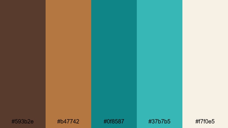
- HEX Codes: #593b2e, #b47742, #0f8587, #37b7b5, #f7f0e5
- Mood: Refined, cinematic, and conclusion-ready.
- Use for: Perfect for end cards, rolling credits, and polished sponsor segments.
Bronze Wave Credits pairs shimmering bronze browns with clean turquoise and a soft light neutral. It feels like the polished final scene of a film, stylish and complete without being overly flashy.
Use this palette for end cards, sponsor messages, and rolling credits where you want to leave a strong final impression. In Filmora, build simple layouts using bronze for background bars, turquoise for key lines or icons, and the light neutral for clear, legible text that works on any screen.
Tips for Creating Brown Turquoise Color Palettes
When you combine Brown Turquoise with supporting colors, the goal is to balance warmth and freshness while keeping your visuals readable and on-brand. These practical tips will help you design palettes that look great in Filmora and across your channel.
- Decide your hero color: let either brown or turquoise lead, and keep the other as an accent so your frames do not feel visually noisy.
- Use neutrals for breathing room: off-whites, light beige, or soft gray will stop Brown Turquoise from feeling heavy, especially in thumbnails and overlays.
- Check text contrast: place white or very light text on darker browns and deep turquoise, and use dark brown or charcoal text on pale aqua or beige backgrounds.
- Match palette to content mood: softer, pastel Brown Turquoise works best for routines and journaling; darker, high-contrast palettes suit cinematic travel and night scenes.
- Keep branding consistent: reuse the same 3–5 HEX codes across intros, lower thirds, end screens, and social crops so viewers immediately recognize your style.
- Test on mobile first: preview titles and graphics at small sizes to ensure Brown Turquoise elements remain clear and do not blend into busy footage.
- Grade footage toward your palette: in Filmora, nudge overall temperature, saturation, and tint so real-world scenes lean slightly more brown or turquoise to match your graphic design.
- Limit accent colors: if you add another accent (like Wine Red), keep it minimal so it supports rather than competes with your Brown Turquoise scheme.
Brown Turquoise color palettes can instantly shape how your channel feels: grounded yet fresh, cinematic yet approachable. Whether you lean into earthy travel tones, modern tech-inspired combos, or soft pastel aesthetics, these 15 palettes give you ready-made HEX codes to start designing thumbnails, titles, intros, and color grades with confidence.
Try applying one palette across an entire project in Filmora, from your opening animation to B-roll overlays and end cards. As you experiment with AI Color Palette, HSL controls, and LUTs, you will quickly see how a consistent Brown Turquoise look can strengthen your brand identity and make your videos stand out in any feed.
As you get comfortable with Brown Turquoise, you can gradually introduce complementary shades like Wine Red for emphasis, always using Filmora to keep your visuals cohesive across platforms and formats.
secure downloadNext: Wine Red Color Palette
