
 100% Security Verified | No Subscription Required | No Malware

Burgundy maroon sits between red and brown, carrying the passion of crimson with the depth and maturity of chocolate tones. It instantly suggests romance, luxury, and a cinematic mood, which is why you often see it in movie posters, premium branding, and stylish social feeds. On screen, this color feels warm, grounded, and intimate, making it ideal for emotional storytelling and elegant visual identities.
For video creators, YouTubers, and designers, a well chosen burgundy maroon color palette can tie together thumbnails, intros, lower thirds, and end screens into one recognizable look. Below are ready made burgundy maroon color combinations with HEX codes so you can copy them straight into your editor or design tools. Every palette is tailored to common content types, and you can easily bring them into Filmora to color match your footage, graphics, and branding.
In this article
Romantic & Moody Burgundy Maroon Color Palettes
Velvet Wine Evening
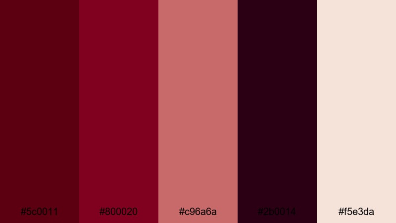
- HEX Codes: #5c0011, #800020, #c96a6a, #2b0014, #f5e3da
- Mood: Intimate, cinematic, and richly dramatic.
- Use for: Perfect for emotional story-driven videos, moody title cards, and romantic short film posters.
Velvet Wine Evening is all about deep, inky burgundy maroon paired with soft blush and beige. The darkest tones (#5c0011, #2b0014) feel like velvet theater curtains, while the lighter pink and cream (#c96a6a, #f5e3da) soften the mood and keep your visuals from feeling too heavy. Together they create a sophisticated, romantic look that instantly feels cinematic.
Use this palette for love stories, poetry reels, dreamy vlog sequences, or thumbnails where you want the subject to feel cherished and dramatic at the same time. It works beautifully for lower thirds, intro titles, and subtle overlays that hint at passion without screaming bright red. In branding, Velvet Wine Evening gives channels an upscale, intimate personality that stands out in a crowded feed.
Pro Tip: Build a Cinematic Burgundy Maroon Look in Filmora
When you design around Velvet Wine Evening in Filmora, treat the darkest burgundy maroon as your anchor color for titles, frames, and transitions. Then use the blush and beige tones for backgrounds or subtle gradient overlays so your footage sits inside a warm, cinematic world instead of against a flat black or white background.
You can save this palette inside Filmora by reusing the same custom color codes for text, shapes, and filters across your entire project. That way, your intro, B-roll sequences, lower thirds, and end screens all share the same burgundy maroon identity, whether you are editing a short film, a romantic vlog, or a brand promo.
AI Color Palette
If you have a screenshot or thumbnail mockup that already uses the Velvet Wine Evening colors, you can turn it into a reference for your whole video. Filmora's AI Color Palette feature lets you analyze that image and apply the same mood and tones to other clips with just a few clicks.
Import your reference frame, pick it as the source, and let Filmora match your other shots to its warm burgundy maroon atmosphere. This keeps skin tones, shadows, and highlights consistent from scene to scene, so the entire edit feels unified, like it was graded in one carefully controlled studio.
 secure download

HSL, Color Wheels & Curves
To fine tune your burgundy maroon tones, start with HSL in Filmora to nudge reds and magentas slightly darker and richer, while desaturating any stray oranges that pull attention away from your subject. Then use color wheels to warm up midtones and cool down shadows, which adds depth and makes the maroon look more cinematic instead of flat.
For subtle polish, use curves to lift the highlights just a touch while keeping deep burgundy shadows intact. If you are new to grading, the Filmora color correction guide walks through practical ways to balance exposure and contrast so your Velvet Wine Evening palette feels intentional, not accidental.
secure download1000+ Video Filters & 3D LUTs
Once your base colors are in place, you can push the Velvet Wine Evening style further with Filmora's filters and LUTs. A warm cinematic LUT will deepen burgundy maroon shadows and add a golden glow to highlights, while soft focus or vignette filters can make your scenes feel even more romantic and intimate.
Filmora's video filters and 3D LUTs make it easy to experiment until you find a look that suits your channel: dark and dramatic for short films, soft and dreamy for wedding highlights, or rich and glossy for brand promos. You can save your favorite combo as a repeatable style so every new video instantly matches your burgundy maroon aesthetic.
secure downloadRose Petal Letters
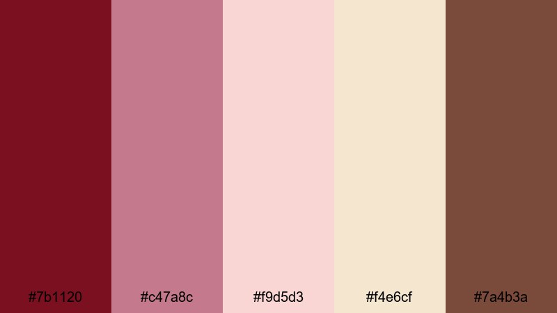
- HEX Codes: #7b1120, #c47a8c, #f9d5d3, #f4e6cf, #7a4b3a
- Mood: Soft, nostalgic, and handwritten-romantic.
- Use for: Works well for wedding highlight videos, nostalgic vlogs, and handwritten style lower thirds.
Rose Petal Letters layers a rich burgundy base with dusty rose, creamy parchment, and a warm brown accent. Together they feel like an old love letter pressed with dried flowers. The palette is gentle, nostalgic, and perfect when you want romance without overwhelming saturation.
Use it for wedding highlight films, anniversary slideshows, or vlogs that lean into memory, journaling, or handwritten overlays. In thumbnails, place titles on the lighter parchment tones for readability, then frame them with the darker burgundy maroon and rose to keep everything feeling soft but emotionally focused.
Twilight Cabernet Glow
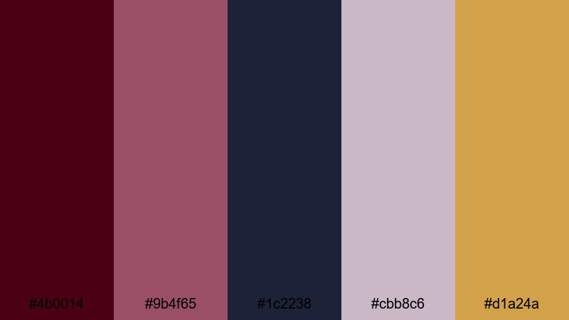
- HEX Codes: #4b0014, #9b4f65, #1c2238, #cbb8c6, #d1a24a
- Mood: Mysterious, artistic, and twilight-lit.
- Use for: Use for atmospheric title sequences, dreamy travel edits, or cinematic channel intros.
Twilight Cabernet Glow mixes inky wine tones with mauve, deep navy, and muted gold. It feels like an early evening skyline reflected in a glass of red, with a soft glow of streetlights just turning on. The combination of burgundy maroon and blue creates a moody contrast, while the gold adds a sophisticated highlight.
Apply this palette to fashion lookbooks, cinematic intros, or travel edits filmed at blue hour. Use the navy and maroon for backgrounds and frames, the mauve and pale lavender for text or UI details, and the gold as a small but powerful accent on buttons, subscribe badges, or key title words.
Autumn Orchard Romance
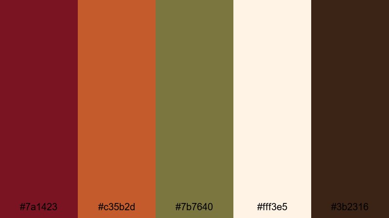
- HEX Codes: #7a1423, #c35b2d, #7b7640, #fff3e5, #3b2316
- Mood: Cozy, rustic, and seasonal.
- Use for: Great for fall vlogs, lifestyle b-roll, and seasonal promo graphics or end screens.
Autumn Orchard Romance blends maroon with burnt orange, olive, and warm cream, capturing the feeling of a harvest afternoon. The palette is cozy and rustic without losing refinement, making it great for content tied to fall, pumpkin patches, or homely gatherings.
Use burgundy maroon and burnt orange to frame your thumbnails or highlight titles, while the cream background keeps text readable. Olive and dark brown work well for icons, borders, or subtle pattern overlays on your intros and end screens. It is a strong choice for lifestyle creators who want a consistent fall theme across YouTube, Instagram, and shorts.
Candlelit Bordeaux Dream
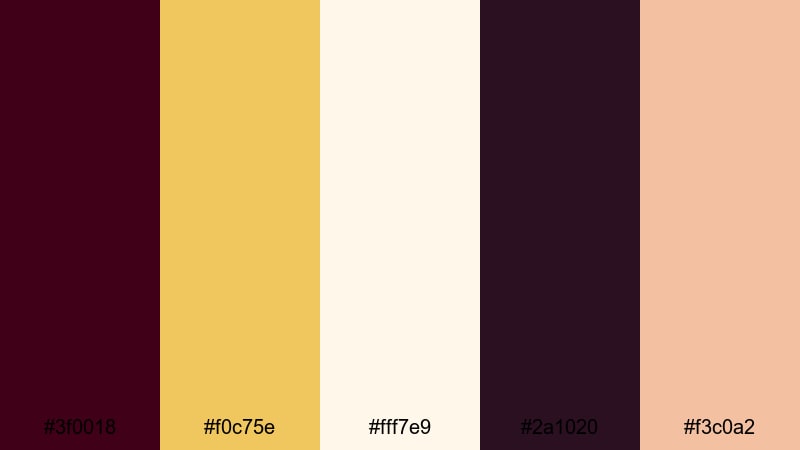
- HEX Codes: #3f0018, #f0c75e, #fff7e9, #2a1020, #f3c0a2
- Mood: Warm, intimate, and candlelit-luxurious.
- Use for: Ideal for slow-paced storytelling, romantic ads, and soft-focus product closeups.
Candlelit Bordeaux Dream sets deep wine and plum tones against candle gold, peach, and cream. The contrast between dark burgundy maroon and glowing highlights creates a feeling of luxury and intimacy, like a quiet evening in a high end restaurant or a softly lit bedroom.
Use the darkest shades for backgrounds or vignettes around product shots, then let the gold and peach colors pick out text, call to action buttons, or logo marks. It works especially well for beauty, perfume, jewelry, and lifestyle brands that want their intros and product reels to feel indulgent yet approachable.
Modern & Minimal Burgundy Maroon Color Palettes
Maroon Metro Minimal
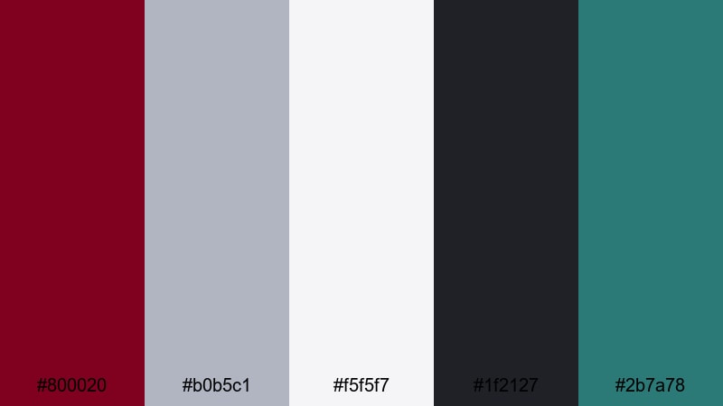
- HEX Codes: #800020, #b0b5c1, #f5f5f7, #1f2127, #2b7a78
- Mood: Clean, urban, and design-forward.
- Use for: Perfect for tech reviews, modern channel branding, and minimalist lower thirds.
Maroon Metro Minimal pairs a classic, slightly brighter maroon with cool grays, off white, charcoal, and a sharp teal accent. The palette feels like a sleek city apartment or a modern app interface, making it ideal for creators who want style without clutter.
Use off white and light grey for backgrounds, maroon for logos and key text, charcoal for subtle frames, and teal as a sparing accent on icons or key buttons in thumbnails. The result is a professional, tech friendly aesthetic that looks great in product explainers, software reviews, and channel rebrands.
Slate Loft Chic
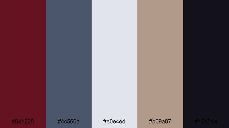
- HEX Codes: #641220, #4c566a, #e0e4ed, #b09a87, #12131a
- Mood: Sophisticated, editorial, and loft-styled.
- Use for: Works well for interior design tours, architectural reels, and minimalist openers.
Slate Loft Chic combines deep maroon with slate blue, soft greys, and warm stone neutrals. It feels like a high ceiling loft with exposed brick and carefully curated furniture. The palette is calm yet distinctly premium, perfect for content that leans toward architecture, interiors, or lifestyle design.
Use the pale grey for clean backgrounds, maroon as your signature accent, and slate blue for supportive text or graphic lines. The warm beige stone tone is ideal for subtle overlays or text highlights. In thumbnails or title cards, this palette reads as modern and editorial, like a page from a design magazine brought to life.
Clean Editorial Merlot
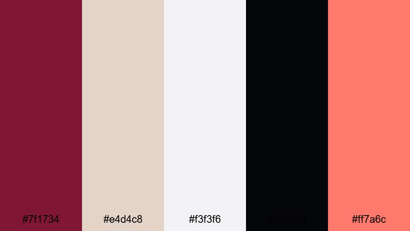
- HEX Codes: #7f1734, #e4d4c8, #f3f3f6, #050609, #ff7a6c
- Mood: Polished, bold, and magazine editorial.
- Use for: Use for talking head videos, channel rebrands, and thumbnail text blocks.
Clean Editorial Merlot sets a rich merlot accent against sand, crisp grey, near black, and a lively coral. The burgundy maroon here works as a confident, grown up brand color, while coral injects just enough energy for call to action buttons, subscribe badges, or highlight text.
This palette is great for commentary channels, educational content, and any format where bold typography is front and center. Place your presenter or subject on a light neutral background, frame with merlot blocks or lines, and reserve coral for only the most important elements so nothing feels overwhelming.
Muted Studio Frame
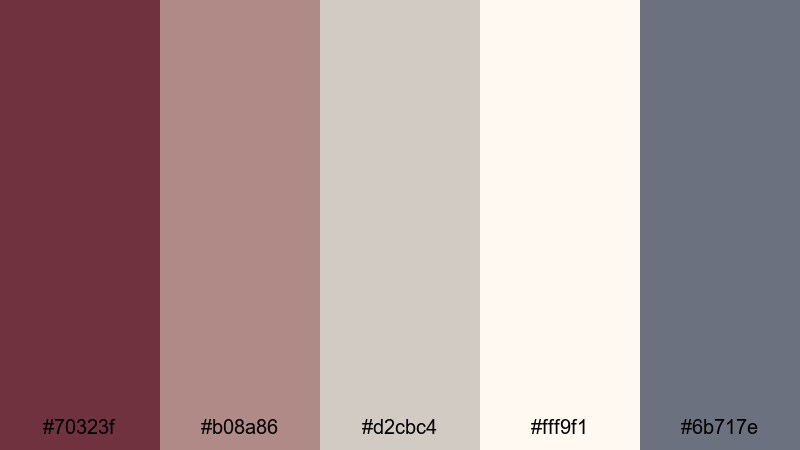
- HEX Codes: #70323f, #b08a86, #d2cbc4, #fff9f1, #6b717e
- Mood: Calm, neutral, and studio ready.
- Use for: Great for creator brand kits, intro animations, and subtle overlay graphics.
Muted Studio Frame softens burgundy into a dusty maroon, surrounded by taupe, ivory, and soft grey blue. The result is a very calm, neutral palette that still carries a hint of warmth and personality. It feels like a tidy creator studio with soft-box lighting and carefully chosen decor.
Use ivory or light taupe as your base for backgrounds or lower thirds, with muted maroon for logos and key titles. Grey blue works beautifully for supporting details like menu bars, graphics, or icons. This palette is ideal if you want a consistent brand kit that looks professional in podcasts, tutorials, and educational content without drawing attention away from your message.
Warm Grid Aesthetic
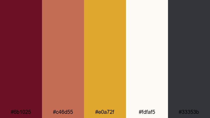
- HEX Codes: #6b1025, #c46d55, #e0a72f, #fdfaf5, #33353b
- Mood: Warm, creative, and productivity-core.
- Use for: Perfect for Notion-style layouts, study vlogs, and productivity themed motion graphics.
Warm Grid Aesthetic layers maroon with terracotta, mustard, soft white, and dark charcoal. It feels like a cozy workspace filled with notebooks, sticky notes, and a warm lamp glow. The palette balances creativity with structure, which suits productivity, planning, and study content.
Use soft white for clean backgrounds and grid layouts, maroon and terracotta for headings and section dividers, and mustard as a highlight for key metrics or dates. In thumbnails, this combination stands out while still looking approachable and organized, encouraging viewers to click on your planning or study videos.
Luxurious & Festive Burgundy Maroon Color Palettes
Garnet Gala Lights
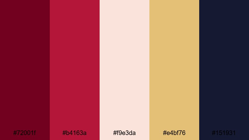
- HEX Codes: #72001f, #b4163a, #f9e3da, #e4bf76, #151931
- Mood: Glamorous, celebratory, and high-energy.
- Use for: Use for event promos, gala invitations, countdowns, and award-style intros.
Garnet Gala Lights flashes deep garnet and ruby reds against champagne, gold, and a rich navy. It feels like a red carpet moment under spotlights, perfect for content that wants to celebrate, impress, or build anticipation.
Use burgundy maroon and ruby for main accents and typography, champagne for backgrounds or cards, and gold for key highlights like countdown numbers or trophy icons. The navy shade works beautifully as a night sky or stage backdrop in intros, outros, and award show style overlays.
Holiday Port Sparkle
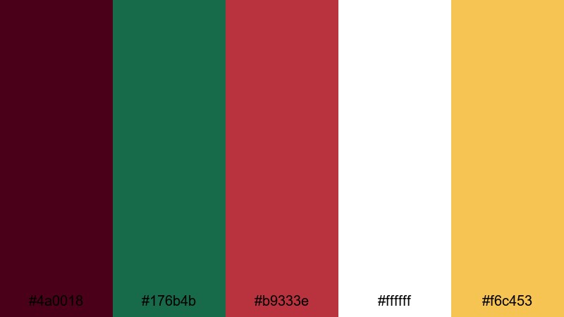
- HEX Codes: #4a0018, #176b4b, #b9333e, #ffffff, #f6c453
- Mood: Festive, cozy, and cheerful.
- Use for: Great for holiday promos, Christmas vlogs, and seasonal social ads.
Holiday Port Sparkle mixes deep port wine with holly green, berry red, snow white, and warm gold. It is a classic festive palette that instantly reads as holiday content without looking childish or overly bright.
Use burgundy maroon and berry red as your main brand colors, green for supporting details like leaves, ribbons, or icons, and white for clean, readable text. Gold adds just the right amount of sparkle for call to action buttons, countdown timers, or animated elements in intros and story templates.
Opulent Theater Velvet
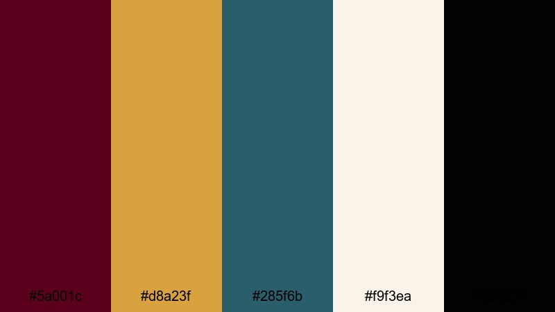
- HEX Codes: #5a001c, #d8a23f, #285f6b, #f9f3ea, #020203
- Mood: Dramatic, theatrical, and premium.
- Use for: Ideal for trailers, luxury brand intros, and cinematic typography sequences.
Opulent Theater Velvet puts curtain maroon front and center, backed by antique gold, smoky teal, ivory, and rich black. It feels like an old opera house or a high end cinema, making it a natural choice for dramatic trailers or luxury product launches.
Use maroon and black to frame your content, gold for elegant serif titles or logo marks, teal for secondary accents, and ivory as a soft background. This palette gives typography heavy intros and logo animations a strong, theatrical impact that still feels tasteful.
Wedding Toast Burgundy
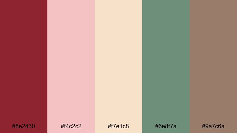
- HEX Codes: #8e2430, #f4c2c2, #f7e1c8, #6e8f7a, #9a7c6a
- Mood: Romantic, elegant, and celebratory.
- Use for: Perfect for wedding highlight films, save the date clips, and bridal branding.
Wedding Toast Burgundy softens a classic burgundy with blush, champagne beige, eucalyptus green, and taupe. It captures the look of bouquets, table settings, and candlelit receptions, making it a go to choice for wedding videographers and bridal brands.
Use blush and champagne as your main backgrounds, with burgundy for titles, decorative lines, and key callouts. Eucalyptus green and taupe are perfect for subtle flourishes like floral icons, frames, or dividers. This palette keeps everything gentle and romantic while still giving you a recognizable, upscale brand color.
Midnight Jazz Lounge
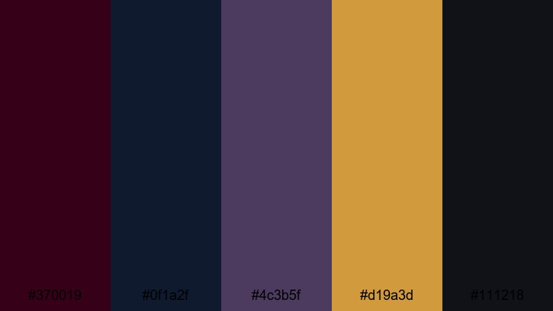
- HEX Codes: #370019, #0f1a2f, #4c3b5f, #d19a3d, #111218
- Mood: Moody, jazzy, and late-night luxe.
- Use for: Use for music visualizers, bar or lounge promos, and sophisticated nightlife content.
Midnight Jazz Lounge combines midnight maroon with navy, smoky purple, amber, and charcoal. It feels like a dimly lit jazz bar with brass instruments catching the light, making it ideal for music and nightlife visuals.
Use the darkest tones for backgrounds and silhouettes, letting the maroon and purple build depth around your subject. Amber is your spotlight color for titles, equalizer graphics, or animated accents. This palette is perfect for music visualizers, bar promos, and any content that aims for a sultry, late night mood.
Tips for Creating Burgundy Maroon Color Palettes
Burgundy maroon is powerful on its own, but it really shines when combined thoughtfully with neutrals, metallics, or subtle accent hues. Use these tips to build palettes that look great on screens, thumbnails, and motion graphics while staying legible and on brand.
- Pair burgundy maroon with light neutrals (ivory, beige, soft grey) to keep text and UI elements readable, especially on small mobile screens.
- Add one accent color only (gold, teal, mustard, or eucalyptus green) so your thumbnails pop without becoming chaotic or confusing.
- Use the deepest burgundy or near black shade for frames, borders, and drop shadows instead of pure black to keep your visuals cohesive.
- Check contrast between text and background using your HEX codes; white or pale beige text on maroon often works best for titles.
- For branding, choose one main burgundy maroon tone and keep it consistent across logos, lower thirds, intros, and end cards.
- Match your footage to the palette in Filmora by adjusting color temperature and tint so skin tones feel natural against warm maroon overlays.
- Use gradients that blend burgundy maroon into a darker plum or navy to add depth behind titles and avoid flat, single color backgrounds.
- Test your palette on different devices by exporting a thumbnail or short clip; tweak saturation or brightness if burgundy looks too dark on phones.
Burgundy maroon color palettes are a powerful way to shape mood, from romantic and nostalgic to urban, luxurious, or festive. With the right mix of supporting neutrals and accents, this color can define your channel identity and make viewers recognize your thumbnails and intros at a glance.
Use these 15 palettes as ready made starting points, then refine them in Filmora using AI Color Palette, HSL, color wheels, curves, filters, and LUTs. Whether you are editing vlogs, weddings, trailers, or productivity content, a consistent burgundy maroon scheme will make your videos feel more intentional and professional.
Experiment, save your favorite combinations as presets, and keep reusing them across your intros, lower thirds, and end screens. Over time, your burgundy maroon aesthetic can become a signature look that sets your videos apart.
secure download