
 100% Security Verified | No Subscription Required | No Malware


 ChatGPT
 Perplexity
 Gemini
 Claude
 Grok
Grok
Carolina Blue sits in a sweet spot between playful sky blue and professional navy. It feels clean, optimistic, and trustworthy, which is why you see it so often in sports teams, tech brands, and modern UIs. On screen, this shade of blue instantly adds clarity and freshness, whether you are grading cinematic travel footage or designing YouTube thumbnails.
For creators and Filmora users, a well built Carolina Blue color palette makes it easier to keep your thumbnails, intros, lower thirds, and titles on brand. Below are 15 ready to use Carolina Blue color palettes with HEX codes so you can quickly match your video overlays, channel art, and color grading for a polished, consistent look.
In this article
Soft & Airy Carolina Blue Color Palettes
Morning Sky Drift
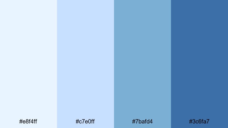
- HEX Codes: #e8f4ff, #c7e0ff, #7bafd4, #3c6fa7
- Mood: Calm, optimistic, and softly uplifting like a clear morning sky.
- Use for: Ideal for lifestyle vlogs, travel intros, and calm storytelling thumbnails.
Morning Sky Drift feels like opening your window to a quiet city just after sunrise. The pale blues and gentle midtones create a light, hopeful atmosphere that never feels harsh on the eyes. It is a great aesthetic color palette for vlogs where you want viewers to settle in and feel relaxed.
Use this Carolina Blue combination in soft gradients for YouTube thumbnails, lower thirds, and intro titles. In Filmora, pair it with clean sans serif text and simple transitions so your content feels fresh and inviting while still looking polished and professional.
Pro Tip: Build a Soft Carolina Blue Aesthetic with Filmora
For gentle palettes like Morning Sky Drift, consistency is everything. In Filmora, create a simple style guide: use the lightest blue for backgrounds or frames, the mid Carolina Blue for titles, and the deepest blue for icons or callouts. Save these settings as presets so every intro, b roll sequence, and end screen keeps the same calm visual identity.
You can also combine this palette with soft blur effects and slow zooms to echo that early morning stillness. Keeping your overlays, subtitle bars, and transitions in the same Carolina Blue range helps your channel feel cohesive across videos, shorts, and social teasers.
AI Color Palette
If you have a screenshot or still frame that perfectly shows your Morning Sky Drift look, you can turn it into a reference for your whole project. Filmora's AI Color Palette feature lets you sample the color mood from one clip and apply it across your timeline so all your shots share the same airy Carolina Blue grading.
Just import your reference image or pick a key clip, then use AI Color Palette to match the tones on your other footage. It is a fast way to avoid mismatched whites or dull blues when you film on different days, keeping your sky blues, highlights, and shadows in harmony.
 secure download

HSL, Color Wheels & Curves
To fine tune your Carolina Blue color palette, use Filmora's HSL, color wheels, and curves controls. You can gently desaturate blues in the shadows to keep them soft, then add a touch of cyan into the highlights for that clear sky feel without pushing skin tones too far. Tools like the color correction options in Filmora make it easy to balance warmth from indoor lighting with your cooler blue overlays.
On the curves panel, try lifting the midtones slightly to avoid crushed details in bright backgrounds. With color wheels, add a subtle teal tint to the midtones while keeping highlights close to neutral white so your text stays readable yet still matches the Carolina Blue aesthetic.
secure download1000+ Video Filters & 3D LUTs
Once your base colors are set, you can use Filmora's video filters and 3D LUTs to stylize your Carolina Blue look. Soft pastel LUTs work beautifully with Morning Sky Drift, giving your footage a dreamy, slightly cinematic cast without overpowering the palette.
Try stacking subtle filters like glow or light leak overlays on your b roll, while keeping talking head shots clean. This keeps your Carolina Blue color combinations feeling intentional and aesthetic across intros, transitions, and end cards.
secure downloadCoastal Breeze Wash
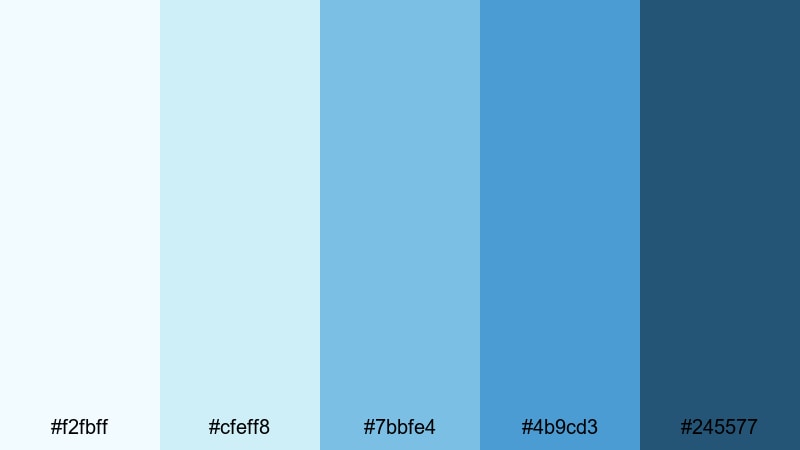
- HEX Codes: #f2fbff, #cfeff8, #7bbfe4, #4b9cd3, #245577
- Mood: Fresh, coastal, and slightly adventurous with ocean depth.
- Use for: Perfect for beach travel edits, summer lookbooks, and channel banners with a seaside feel.
Coastal Breeze Wash layers pale foam tones over richer ocean blues, capturing the feeling of walking along a breezy shoreline. The light colors handle backgrounds and frames, while the darker Carolina Blue anchors text and key elements.
Use this palette for travel vlogs, packing videos, or surf edits. In thumbnails and title cards, let the deepest blue (#245577) handle important call to action text, and keep lighter blues behind your subject for a fresh, open look.
Cotton Cloud Daydream
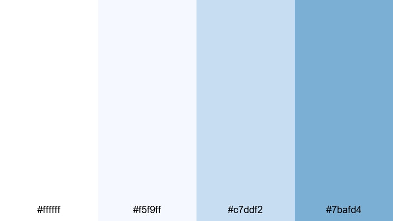
- HEX Codes: #ffffff, #f5f9ff, #c7ddf2, #7bafd4
- Mood: Dreamy, weightless, and pure with a hint of whimsy.
- Use for: Great for productivity videos, study-with-me series, or minimal YouTube channel branding.
Cotton Cloud Daydream is almost entirely built from white and soft blue tints, which keeps frames bright and distraction free. It is perfect when you want your face, product, or text to be the clear focus against a calm backdrop.
Apply the clean whites to backgrounds and panels, then use the deeper Carolina Blue as a subtle accent on icons, progress bars, and chapter markers. This palette works especially well for channels that lean into minimal design and clear information.
Lakefront Quiet Hour
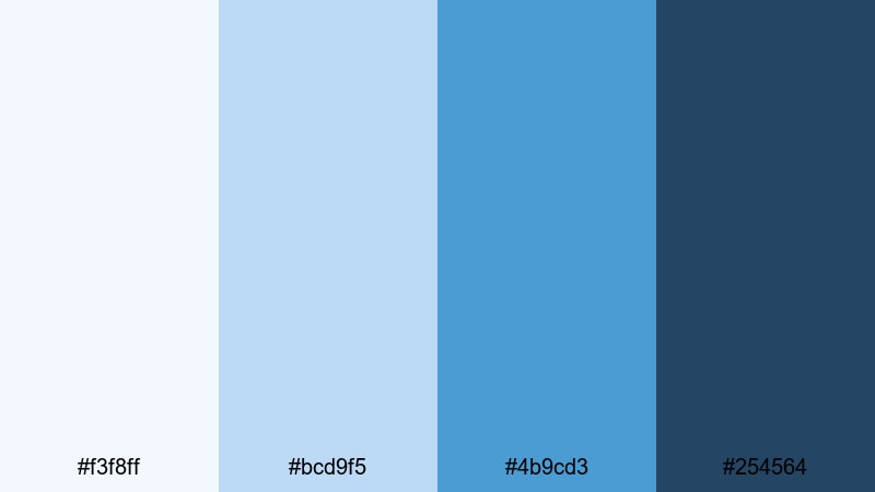
- HEX Codes: #f3f8ff, #bcd9f5, #4b9cd3, #254564
- Mood: Peaceful and reflective with a calm twilight edge.
- Use for: Ideal for cinematic b roll, slow travel diaries, and reflective storytelling content.
Lakefront Quiet Hour feels like the moment the sun dips just below the horizon. Soft misty blues drift down into a deeper lake tone, creating a reflective, introspective mood that suits slower edits and voiceover based storytelling.
Use the darkest shade (#254564) in your title bars and outros, and keep the lighter tones in b roll overlays and simple gradient backgrounds. It is a strong choice for cinematic color grading where you want calm, cool visuals without going too dark or moody.
Bold & Sporty Carolina Blue Color Palettes
Stadium Lights Pop
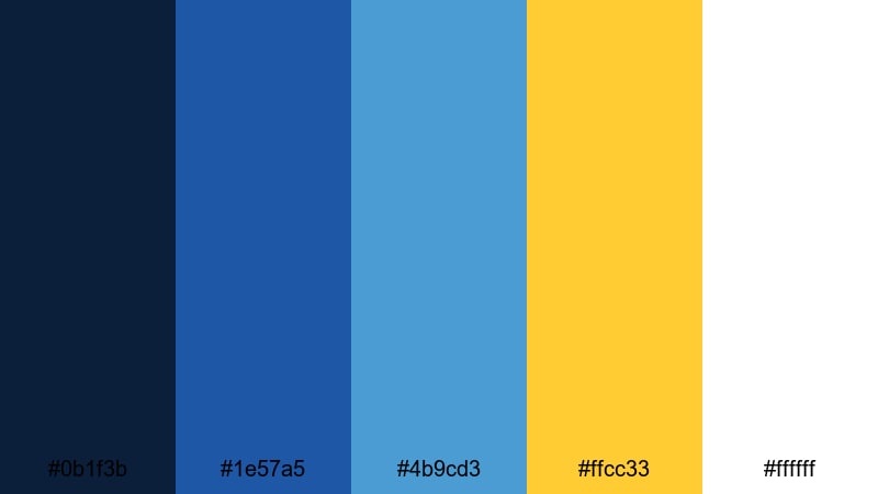
- HEX Codes: #0b1f3b, #1e57a5, #4b9cd3, #ffcc33, #ffffff
- Mood: High energy, competitive, and bright under stadium lights.
- Use for: Perfect for sports highlight reels, hype montages, and energetic event promos.
Stadium Lights Pop combines deep navy and punchy Carolina Blue with a bold gold accent that screams game day. The stark contrast between the dark background and bright highlights makes motion graphics, scores, and player names easy to read even in fast cuts.
Use the gold (#ffcc33) sparingly for scores, wins, and key stats, while keeping blues and white for the main interface. This palette is great for YouTube sports channels, esports recaps, and any thumbnail where you want immediate impact.
Game Day Energy
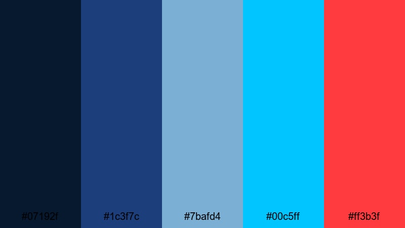
- HEX Codes: #07192f, #1c3f7c, #7bafd4, #00c5ff, #ff3b3f
- Mood: Explosive, competitive, and full of motion.
- Use for: Great for esports intros, team branding overlays, and bold lower thirds.
Game Day Energy pushes Carolina Blue into a more electric space with bright cyan and a sharp red accent. The result is a palette that feels fast, modern, and wired for competition, ideal for sports highlight color palettes and gaming channels.
Use the red (#ff3b3f) only on kill counts, scores, or urgent alerts so it really stands out. The layered blues give you plenty of flexibility for backgrounds, HUD style overlays, and animated title cards.
Racing Stripe Impact
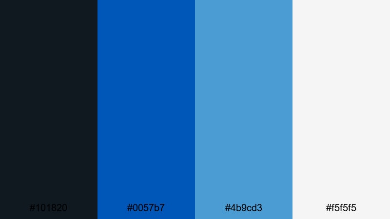
- HEX Codes: #101820, #0057b7, #4b9cd3, #f5f5f5
- Mood: Sleek, fast, and decisive with a pro sports feel.
- Use for: Ideal for fitness channels, car reviews, and dynamic motion graphics.
Racing Stripe Impact leans into a performance driven look, using dark charcoal with strong blue accents. It feels like a streamlined dashboard, perfect for content that is all about speed, stats, and clean motion.
Use the light gray (#f5f5f5) for text over dark backgrounds and rely on the two blues for stripes, borders, and animated shapes. This palette can carry everything from gym timer graphics to lower thirds in car review videos.
Electric Court Glow
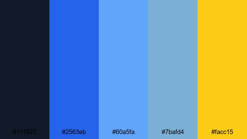
- HEX Codes: #111827, #2563eb, #60a5fa, #7bafd4, #facc15
- Mood: Urban, electric, and energetic like a lit up night court.
- Use for: Perfect for basketball edits, streetwear promos, and bold YouTube titles.
Electric Court Glow feels like a night game under bright LED lights. Deep midnight blues set the stage while neon leaning blues and a vivid yellow highlight create plenty of punch for titles, scores, and motion graphics.
Use the yellow (#facc15) to trace lines, underline text, or highlight important stats. The stacked blues work beautifully for animated backgrounds or glitch style transitions in sports edits and urban fashion content.
Elegant & Minimal Carolina Blue Color Palettes
Nordic Studio Calm
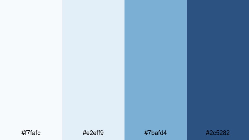
- HEX Codes: #f7fafc, #e2eff9, #7bafd4, #2c5282
- Mood: Quiet, refined, and softly professional.
- Use for: Great for productivity channels, design portfolios, and studio tour videos.
Nordic Studio Calm brings a Scandinavian feel to your frames with soft off whites and balanced blues. It is understated and professional, making it perfect for channels that want to feel polished without looking sterile.
Use the darker blue (#2c5282) for your logo, name tag bars, and key headings, while keeping backgrounds in the lightest tones. This palette is ideal for talking head videos, portfolio reels, and any minimal Carolina Blue aesthetic.
Clean Tech Interface
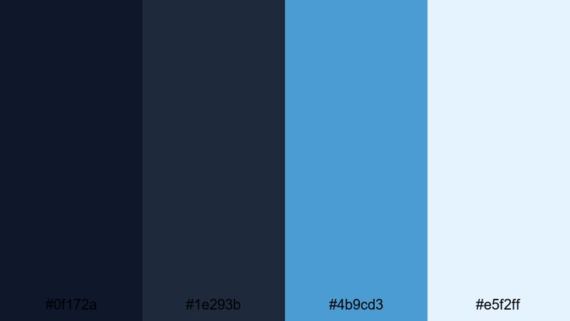
- HEX Codes: #0f172a, #1e293b, #4b9cd3, #e5f2ff
- Mood: Modern, focused, and tech forward.
- Use for: Ideal for SaaS explainer videos, app demos, and sleek UI overlays.
Clean Tech Interface mirrors modern dashboards and SaaS websites. Dark inky blues ground the frame, while Carolina Blue and pale highlights pop for buttons, graphs, and UI elements.
Use the lightest shade (#e5f2ff) to create card style panels or callouts over darker footage. This palette works well for overlay graphics on screen recordings and explainer animations in Filmora.
Gallery Wall Whisper
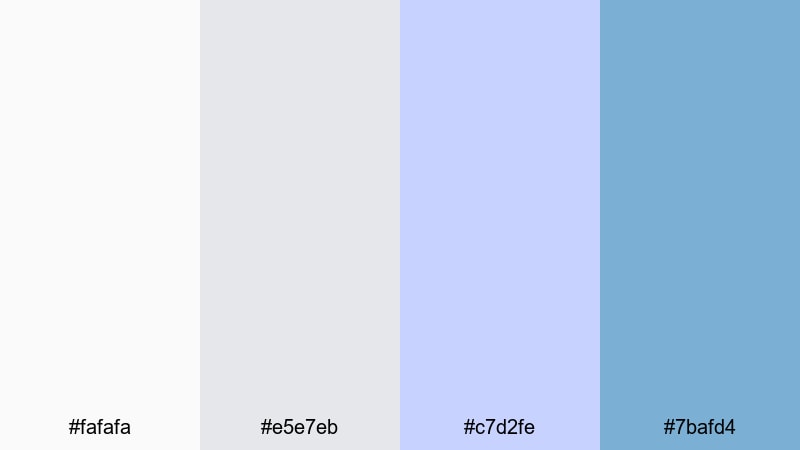
- HEX Codes: #fafafa, #e5e7eb, #c7d2fe, #7bafd4
- Mood: Subtle, curated, and softly artistic.
- Use for: Perfect for art reels, photography slideshows, and aesthetic room tours.
Gallery Wall Whisper is a quiet mix of gentle grays and muted blues that feels like a curated exhibition space. It is soft enough not to compete with photography, illustrations, or décor shots.
Use the gray tones as neutral backgrounds and frames, and reserve the Carolina Blue accents for titles, tags, and subtle borders. It is an excellent choice for aesthetic room tours, lookbooks, and portfolio videos where the artwork should stand out.
Blueprint Precision
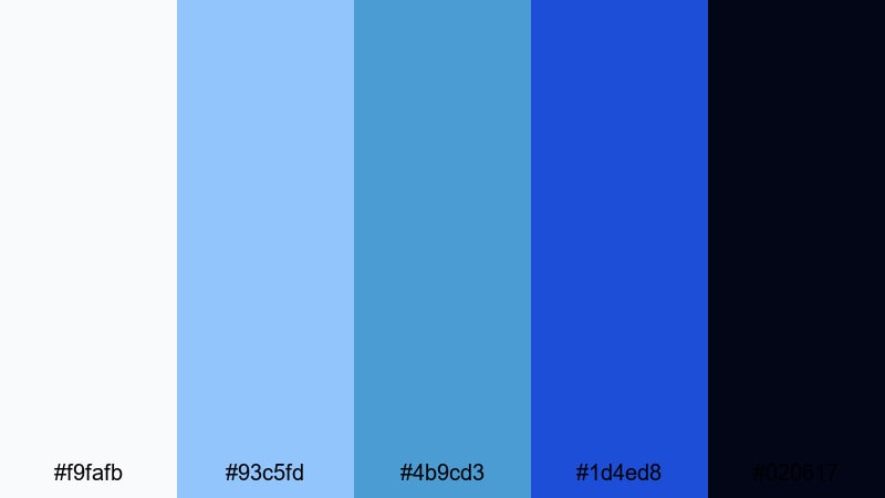
- HEX Codes: #f9fafb, #93c5fd, #4b9cd3, #1d4ed8, #020617
- Mood: Technical, confident, and engineered.
- Use for: Great for tutorials, product breakdowns, engineering content, and infographic style motion graphics.
Blueprint Precision runs from clean off white all the way down to almost black, with several strong Carolina Blue steps in between. It immediately evokes blueprints, schematics, and tech diagrams.
Use the darkest shade (#020617) for backgrounds, drawing bright grid lines and diagrams with the lighter blues. This palette is perfect for educational content, software walkthroughs, and any video where you want your graphics to feel smart and exact.
Retro & Nostalgic Carolina Blue Color Palettes
90s Camcorder Chill
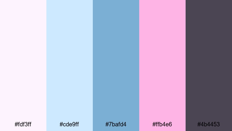
- HEX Codes: #fdf3ff, #cde9ff, #7bafd4, #ffb4e6, #4b4453
- Mood: Nostalgic, lo fi, and cozy like old home videos.
- Use for: Perfect for retro vlog edits, childhood memory montages, and vintage styled title cards.
90s Camcorder Chill softens Carolina Blue with pastel pinks and hazy purples, echoing VHS tapes and old family clips. It brings a cozy, lo fi charm to your edits while still feeling clean enough for modern platforms.
Use the muted blue and pink in gradients behind text and blend with a little film grain or VHS style overlays in Filmora. This palette is ideal for throwback storytimes, nostalgic vlogs, and memory montage sequences.
Vintage College Crew
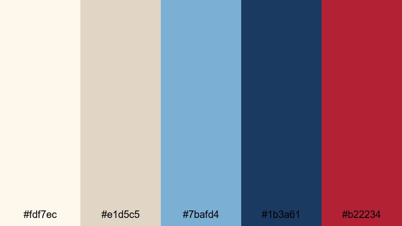
- HEX Codes: #fdf7ec, #e1d5c5, #7bafd4, #1b3a61, #b22234
- Mood: Classic, preppy, and slightly worn in.
- Use for: Ideal for campus vlogs, sports nostalgia edits, and documentary style storytelling.
Vintage College Crew pairs warm cream and parchment tones with Carolina Blue, deep navy, and a collegiate red accent. It feels like old yearbooks, faded jerseys, and campus posters brought to life on screen.
Use the warm neutrals for background cards and transitions, then let the blues and red handle titles, lower thirds, and simple badges. This palette works well for university themed channels, alumni stories, and retro sports highlight edits.
Polaroid Pier Afternoon
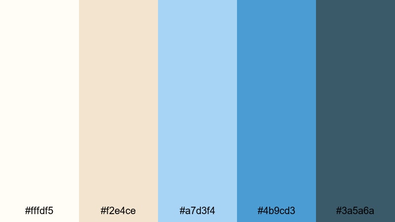
- HEX Codes: #fffdf5, #f2e4ce, #a7d3f4, #4b9cd3, #3a5a6a
- Mood: Warm, sun faded, and quietly sentimental.
- Use for: Great for travel diaries, coastal memories, and softly graded cinematic vlogs.
Polaroid Pier Afternoon blends warm cream tones with washed blues to mimic sun faded instant photos. It feels gentle and memory rich, perfect for storytelling edits about travel, relationships, or personal milestones.
Use the warmer hues for frames, borders, and background shapes, and keep the blues for titles and subtle overlays. Add a hint of vignette and film grain in Filmora to complete the Polaroid inspired Carolina Blue aesthetic.
Tips for Creating Carolina Blue Color Palettes
When you build your own Carolina Blue color combinations for video and design, balancing contrast, warmth, and readability will keep your visuals looking intentional and on brand.
- Pair Carolina Blue with soft neutrals (white, light gray, beige) for clean, minimal layouts that keep attention on your subject.
- Use a darker companion blue or navy for text and outlines so titles stay readable on bright thumbnails and mobile screens.
- Add one accent color (gold, red, or yellow) for CTAs and key stats instead of many competing hues, so your brand feels focused.
- Check your palette against real footage in Filmora and adjust saturation so skin tones remain natural while blues stay vivid.
- Keep at least one very light and one very dark shade in your palette to handle backgrounds, shadows, and high contrast overlays.
- Reuse the same HEX codes in intros, lower thirds, end screens, and channel art to build a recognizable Carolina Blue themed brand.
- For cinematic grading, gently shift shadows toward teal and highlights toward warm vanilla tones for a balanced teal and orange feel that still centers on Carolina Blue.
- Test your palette in both light mode and dark mode style layouts to ensure your graphics work across websites, apps, and social platforms.
Carolina Blue is versatile enough to feel sporty, minimal, or nostalgic depending on what you pair it with. By choosing a clear palette and sticking to a few core HEX codes, you can shape mood, build trust, and make your channel instantly recognizable.
Use these 15 Carolina Blue color palettes as starting points, then refine them inside Filmora to match your footage, niche, and personal style. Whether you are designing YouTube thumbnails, sports highlight packages, or cinematic vlogs, a consistent blue aesthetic will help your videos stand out in the feed.
Open a new project in Filmora, drop in one of these palettes, and experiment with overlays, filters, and LUTs until you find a Carolina Blue look that feels like your brand.
secure downloadNext: Vanilla Color Palette
