
 100% Security Verified | No Subscription Required | No Malware


 ChatGPT
 Perplexity
 Gemini
 Claude
 Grok
Grok
Cerise sits between magenta and deep pink, carrying the emotional punch of red with a softer, more romantic edge. It feels bold, youthful, and a little luxurious, which makes it perfect when you want your visuals to feel passionate without turning aggressive. Used well, cerise can signal confidence, romance, creativity, and high energy all at once.
For video creators, cerise is a powerful accent for thumbnails, intros, lower thirds, and branding elements. In this guide you will find 15 cerise color palettes with HEX codes you can apply directly to YouTube thumbnails, vlog graphics, title cards, overlays, and full color grades in Filmora. Each palette is designed to help you keep your visuals consistent, eye-catching, and on-brand.
In this article
Soft & Romantic Cerise Color Palettes
Blushing Dawn Cerise
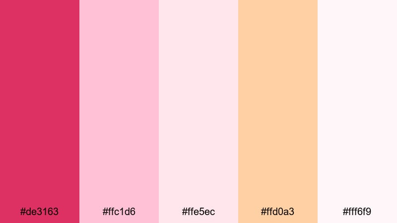
- HEX Codes: #de3163, #ffc1d6, #ffe5ec, #ffd0a3, #fff6f9
- Mood: Gentle, hopeful, and romantic like an early sunrise.
- Use for: Lovely for wedding highlight reels, engagement announcements, and soft lifestyle vlogs that need a dreamy touch.
Blushing Dawn Cerise blends a rich cerise accent with blush pink, peach, and airy off-white, creating a soft glow that feels like morning light on rose petals. It is tender and uplifting, ideal when you want your visuals to feel fresh, intimate, and full of promise.
Use this palette for wedding and engagement titles, gentle lower thirds, and thumbnail backgrounds that frame your couple shots or lifestyle portraits. In Filmora, you can apply these HEX codes to text, shapes, and overlays, then match your color grade so the entire video shares the same dreamy cerise aesthetic from intro to closing card.
Pro Tip: Enhance Your Cerise Storytelling With Filmora
When you build a romantic look like Blushing Dawn Cerise, consistency is everything. In Filmora, you can use the same cerise and blush tones in titles, transitions, and overlays so your wedding highlight, engagement teaser, and short social edits all feel like one cohesive story.
Save your cerise title style as a preset, then reuse it across intros, chapter cards, and end screens. Combine soft vignette filters and gentle blur effects with your palette to keep attention on faces while the cerise accents guide the viewers eye through every scene.
AI Color Palette
If you have a favorite still frame, moodboard, or color card that captures this blush cerise mood, you can use Filmoras AI Color Palette to spread that look across an entire timeline. Filmoras AI Color Palette feature analyzes your reference image and automatically adjusts other clips to match its tones.
Import your romantic hero shot, pick it as the color source, and let Filmora adapt exposure, warmth, and saturation to echo that same cerise sunrise feel in every cut. This keeps your thumbnails, intros, and B-roll sequences visually unified without endless manual tweaking.
 secure download

HSL, Color Wheels & Curves
To make cerise tones look polished on real footage, fine-tune them with HSL, color wheels, and curves inside Filmora. You can gently lower saturation in skin tones while keeping cerise accents vibrant, or cool down the shadows to add contrast to warm cerise highlights.
Use HSL to target magenta, red, and pink channels, then rely on the color wheels and curves described in Filmoras color correction tutorial to balance contrast and create a soft, cinematic roll-off in the highlights. This keeps your romantic palette rich without clipping or harsh edges.
secure download1000+ Video Filters & 3D LUTs
Instead of grading from scratch, you can start with Filmoras built-in presets and then nudge them toward your cerise palette. Filmoras video filters and 3D LUTs make it easy to give your footage an instant romantic, cinematic, or pastel look that pairs beautifully with cerise graphics.
Apply a soft film LUT or pastel filter, then adjust intensity so it enhances rather than hides your cerise accents. This workflow lets you move quickly from raw footage to a finished, on-brand look for reels, shorts, and full-length videos.
secure downloadRosy Whisper Glow
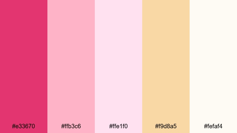
- HEX Codes: #e33670, #ffb3c6, #ffe1f0, #f9d8a5, #fefaf4
- Mood: Soft, glowy, and intimate with a warm blush.
- Use for: Perfect for beauty tutorials, cozy room tours, and dreamy Instagram Reels or Shorts thumbnails.
Rosy Whisper Glow wraps a lively cerise accent in layers of rose, cream, and warm beige. It feels like candlelight on soft fabrics, making it ideal for beauty, self-care, and lifestyle channels that want an intimate, warm aesthetic without going too bold.
Use the deeper cerise for call-to-action buttons or keyword highlights in thumbnails, and keep the lighter pinks and creams for backgrounds and text boxes. In Filmora, this palette works beautifully for soft gradient overlays behind makeup close-ups, room tours, and product B-roll shots.
Vintage Rose Ceremony
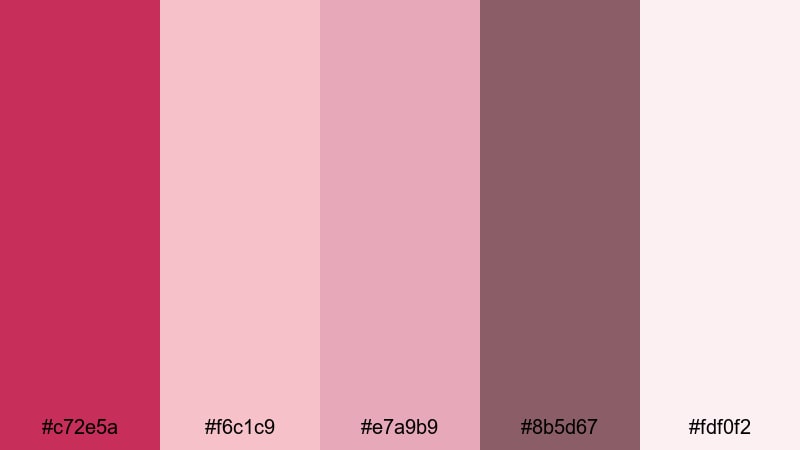
- HEX Codes: #c72e5a, #f6c1c9, #e7a9b9, #8b5d67, #fdf0f2
- Mood: Nostalgic, elegant, and sentimental with a vintage flair.
- Use for: Works beautifully for retro wedding edits, memory slideshows, and cinematic love stories.
Vintage Rose Ceremony leans into dusty cerise, muted rose, and mauve for a timeless, nostalgic mood. The deeper wine tones and soft off-whites echo film photography and old photo albums, making modern footage feel instantly more sentimental.
Try this palette for anniversary slideshows, family history videos, or love stories with a retro twist. Combine it with Filmoras film grain, vignette, and light leak effects to complete the vintage look in your titles, chapter markers, and outro screens.
Petal Kiss Afternoon
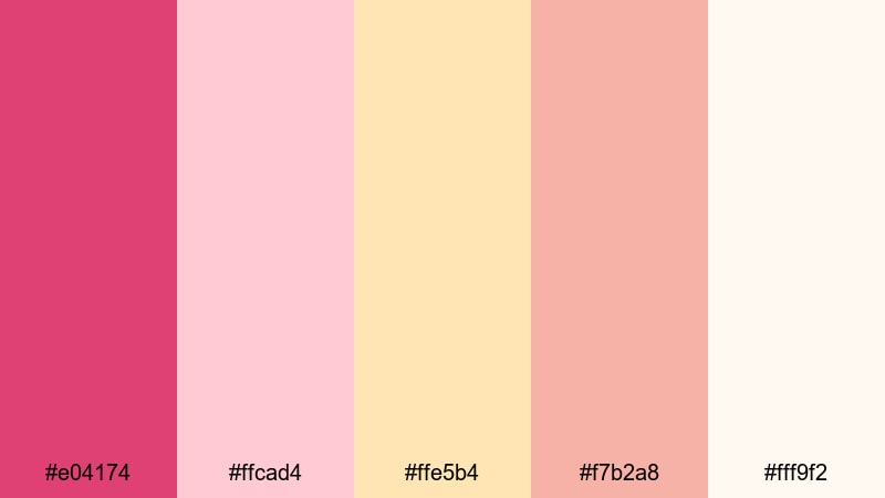
- HEX Codes: #e04174, #ffcad4, #ffe5b4, #f7b2a8, #fff9f2
- Mood: Warm, playful, and softly sunlit like a golden afternoon.
- Use for: Great for couple vlogs, picnic scenes, and lifestyle thumbnails that need warmth and charm.
Petal Kiss Afternoon combines bright cerise with peach and petal pinks that feel sunlit and cheerful. It captures that late afternoon warmth you see in picnic or park dates, with enough color depth to stay interesting on screen.
Use the stronger cerise for titles and logo marks, and the peaches and creams for backgrounds on cards, captions, and subscribe CTAs. In Filmora, a subtle warm color grade plus this palette in your graphics can turn simple vlogs into charming, feel-good stories.
Bold & Vibrant Cerise Color Palettes
Neon Pop Cerise
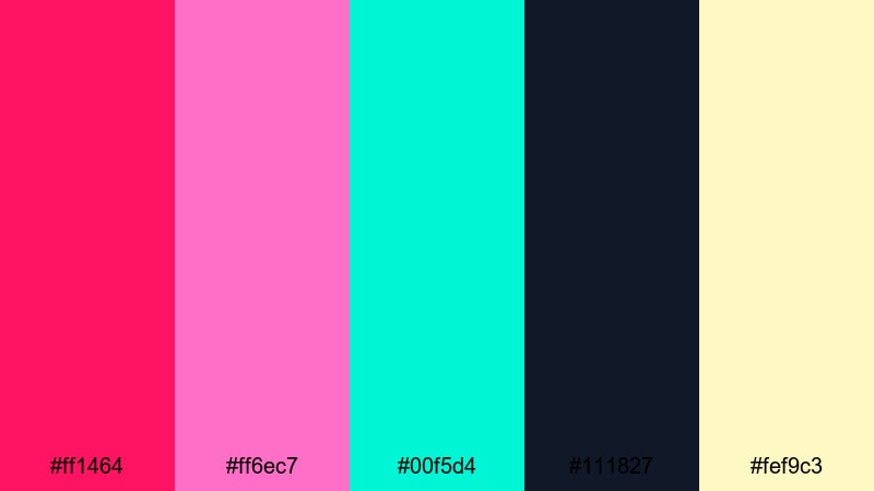
- HEX Codes: #ff1464, #ff6ec7, #00f5d4, #111827, #fef9c3
- Mood: High-energy, neon-bright, and attention-grabbing.
- Use for: Best for gaming intros, bold YouTube thumbnails, and high-impact promo graphics.
Neon Pop Cerise is built to stop the scroll. Electric cerise and fuchsia clash playfully with teal and acid yellow against a deep navy base, delivering maximum contrast and instant energy.
Use navy as your background, cerise for keywords and icons, and teal or yellow as secondary accents. In Filmora, this palette is perfect for motion graphics in gaming intros, callout titles in tech reviews, and animated subscribe buttons that viewers cannot miss.
Electric Night Boulevard
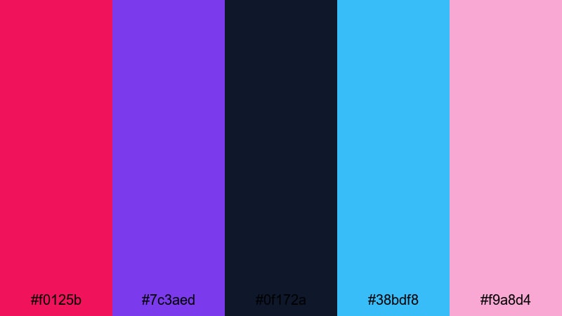
- HEX Codes: #f0125b, #7c3aed, #0f172a, #38bdf8, #f9a8d4
- Mood: Moody yet electric, like city lights after dark.
- Use for: Perfect for nightlife vlogs, music videos, and cinematic trailers with urban energy.
Electric Night Boulevard mixes vivid cerise with violet, neon blue, and deep night blues for a downtown-after-dark atmosphere. It feels modern and stylish, with just enough neon to suggest billboards and club lights.
Use it in Filmora for lyric videos, nightlife highlight reels, or travel vlogs focused on cityscapes. Cerise and neon blue can drive your titles and overlays, while the dark navy tones become gradients or frames that make your footage glow.
Tropical Fuchsia Splash
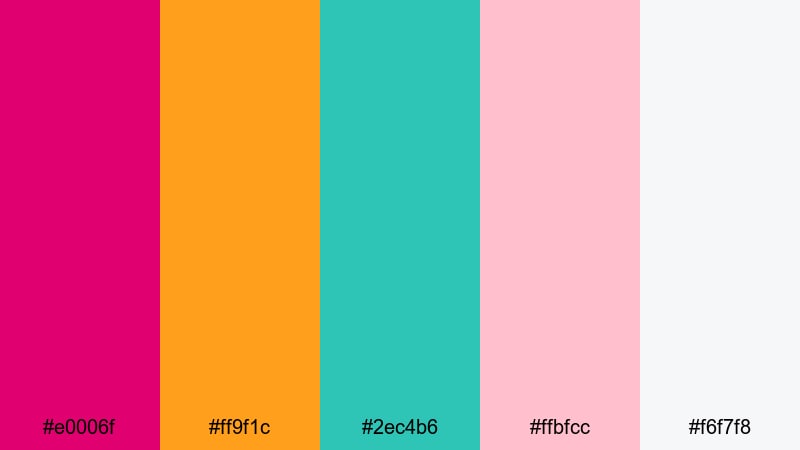
- HEX Codes: #e0006f, #ff9f1c, #2ec4b6, #ffbfcc, #f6f7f8
- Mood: Sunny, tropical, and playful with vacation energy.
- Use for: Awesome for travel vlogs, summer campaigns, and upbeat brand intros or outros.
Tropical Fuchsia Splash brings together juicy cerise, sunset orange, refreshing aqua, and soft pink for a beach-party vibe. It is bright and optimistic, ideal for content that sells fun, freedom, and sunny destinations.
Use cerise and orange for thumbnail text and icons, aqua for accent lines or frames, and light neutrals for background panels. In Filmora, pair this palette with smooth zoom transitions and upbeat music for travel intros, festival recaps, or summer product promos.
Arcade Retro Cerise
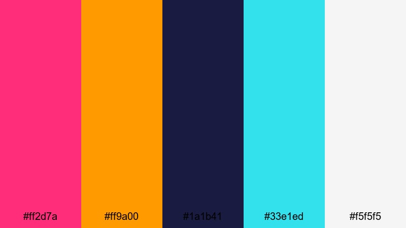
- HEX Codes: #ff2d7a, #ff9a00, #1a1b41, #33e1ed, #f5f5f5
- Mood: Retro, playful, and nostalgic like an 80s arcade.
- Use for: Ideal for retro gaming videos, tech reviews, and nostalgic edits with glitch or VHS effects.
Arcade Retro Cerise blends a punchy pink with neon cyan, retro orange, and deep indigo, echoing classic arcade cabinets and early computer graphics. It is nostalgic but still feels fresh on modern platforms.
Use indigo and off-white as your base, then drop in cerise, orange, and cyan for titles, neon outlines, and HUD-style overlays. In Filmora, combine this palette with glitch transitions, VHS filters, and pixel fonts for gaming intros and retro-styled tutorials.
Modern & Minimal Cerise Color Palettes
Cerise On Concrete
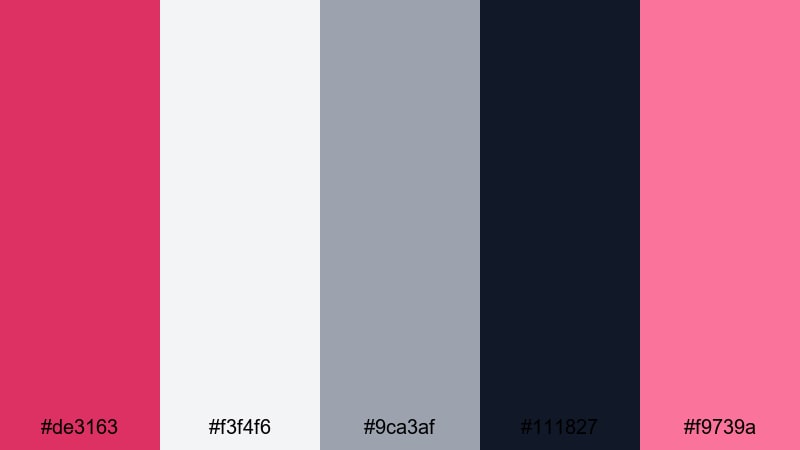
- HEX Codes: #de3163, #f3f4f6, #9ca3af, #111827, #f9739a
- Mood: Clean, confident, and contemporary with a pop of color.
- Use for: Strong for tech explainers, SaaS promos, and minimalist UI overlays in tutorials.
Cerise On Concrete pairs a sharp cerise accent with cool grays and deep charcoal, delivering a modern, almost architectural feel. The palette is mostly neutral, so the cerise elements really stand out and feel like a signature brand color.
Use dark charcoal or light gray backgrounds with cerise buttons, timeline markers, and key phrases in your thumbnails or explainer videos. In Filmora, this palette works especially well for screen recordings, UI walkthroughs, and product demos where clarity and professionalism matter.
Monochrome Studio Cerise
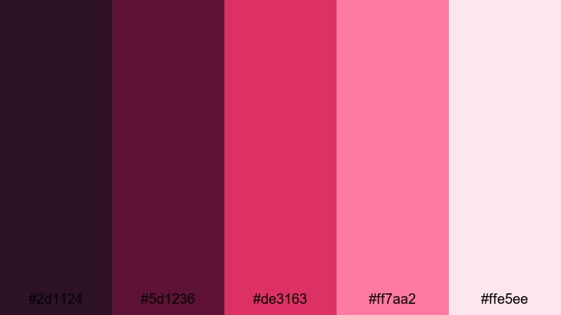
- HEX Codes: #2d1124, #5d1236, #de3163, #ff7aa2, #ffe5ee
- Mood: Stylish, editorial, and studio-polished.
- Use for: Great for fashion lookbooks, product promos, and brand reels that lean into a strong color identity.
Monochrome Studio Cerise stacks multiple shades of cerise from deep wine to airy blush, keeping everything in the same color family. The result feels editorial and curated, like a magazine spread or campaign shoot.
This is perfect when you want your brand to own cerise as its core identity. Use the darkest tones as backgrounds or shadow gradients, with mid-cerise for logos and lighter shades for text boxes in Filmora. It works especially well for fashion reels, perfume promos, and minimal product ads.
Muted Cerise Interface
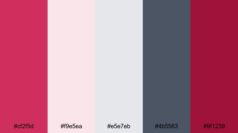
- HEX Codes: #cf2f5d, #f9e5ea, #e5e7eb, #4b5563, #9f1239
- Mood: Understated, professional, and UI-friendly with character.
- Use for: Ideal for app mockups, channel overlays, and clean tutorial graphics.
Muted Cerise Interface softens cerise into a more professional, UI-ready tone and balances it with near-neutrals and slate gray. It still has personality, but it will not overwhelm icons, diagrams, or screen-capture footage.
Use this palette to design lower thirds, chapter labels, and clear annotation boxes in Filmora. The light pinks and grays are perfect for backgrounds that keep text readable, while the deeper cerise can highlight buttons, timestamps, or important tips in your videos.
Cinematic Cerise Color Palettes
Midnight Cinema Cerise
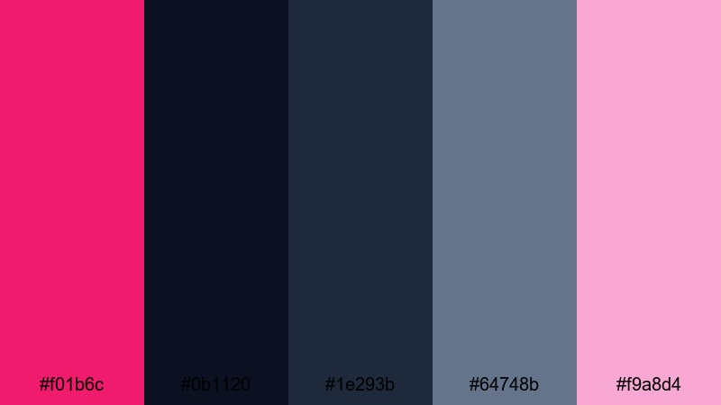
- HEX Codes: #f01b6c, #0b1120, #1e293b, #64748b, #f9a8d4
- Mood: Cinematic, mysterious, and emotionally charged.
- Use for: Perfect for trailers, short films, and story-driven edits with dramatic arcs.
Midnight Cinema Cerise contrasts a vivid cerise highlight against deep midnight and steel blues. The palette feels like a movie poster, with bright emotional accents cutting through darkness and shadow.
Use dark blues as your base grade, then let cerise pick out titles, key objects, or important moments in your edit. In Filmora, this palette is great for dramatic teasers, narrative shorts, and commentary videos where you want a serious tone with a strong visual hook.
Cerise Sunset Gradient
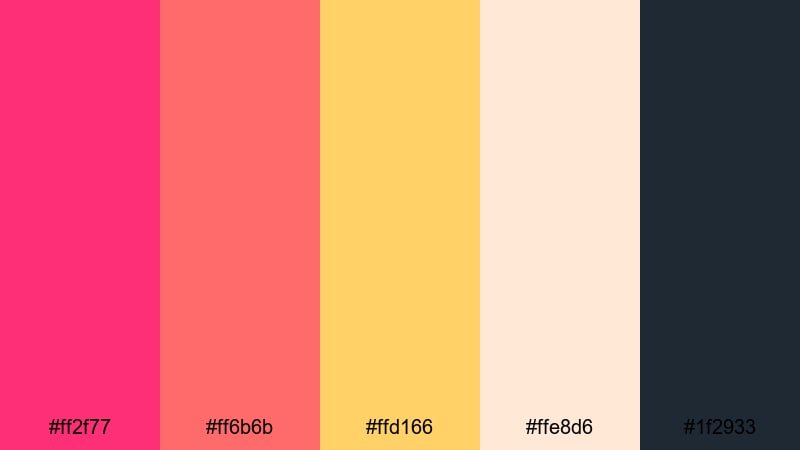
- HEX Codes: #ff2f77, #ff6b6b, #ffd166, #ffe8d6, #1f2933
- Mood: Glowing, cinematic, and warm like a long sunset.
- Use for: Great for travel montages, romantic golden hour scenes, and dreamy outros.
Cerise Sunset Gradient flows from bright cerise into coral, then sunlit gold and soft cream, all anchored by a deep charcoal. It captures the feeling of a slow, beautiful sunset and looks stunning as a gradient.
Use it as a full-screen gradient for opening titles, chapter transitions, or end cards in Filmora. It also works well as a color grade reference when you want your footage to feel like golden hour, even if it was shot at a different time of day.
Noir Drama Cerise

- HEX Codes: #b3134d, #111827, #4b5563, #e5e7eb, #fbb6ce
- Mood: Dark, dramatic, and stylish with a soft edge.
- Use for: Strong for thriller teasers, fashion films, and moody commentary videos.
Noir Drama Cerise combines a deep noir base with muted grays, pale highlights, and a rich cerise accent. The contrast is strong but controlled, giving your visuals a premium, editorial mood rather than a harsh, high-contrast look.
Use it in Filmora for serious commentary, fashion lookbooks, or thriller-style edits. Keep backgrounds dark and text light, reserving cerise for brand elements, key phrases, or subtle glow effects around important subjects.
Neon City Romance
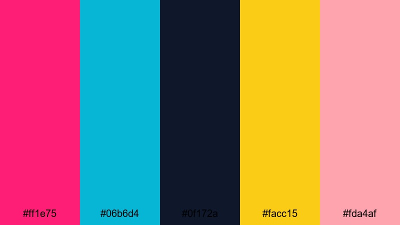
- HEX Codes: #ff1e75, #06b6d4, #0f172a, #facc15, #fda4af
- Mood: Romantic, futuristic, and buzzing with city energy.
- Use for: Perfect for K-pop edits, city love stories, and stylized music videos.
Neon City Romance mixes neon cerise, teal, and gold over deep city-night blues, delivering a cyber-romantic, slightly futuristic feel. It is energetic but still emotional, ideal for music-driven storytelling.
Use this palette for lyric videos, dance edits, or K-pop fan edits in Filmora. Cerise and teal can drive animated text and particle effects, while gold and blush highlights give your characters and scenes a warm, human touch amid the neon.
Tips for Creating Cerise Color Palettes
Cerise is powerful, so building a palette around it means managing contrast, emotion, and readability. These tips will help you combine cerise with supporting colors that look great in both design and video.
- Pair cerise with soft neutrals (warm creams, light gray, or off-white) to give the eye a place to rest and keep thumbnails from feeling too crowded.
- Use deep blues, charcoals, or near-black as grounding colors when you want a cinematic or neon effect; they make cerise accents glow without straining viewers eyes.
- Check text contrast on mobile by viewing your thumbnails at very small sizes; if cerise text on a bright background is hard to read, switch the contrast (light text on dark or dark text on light).
- Limit strong accent colors to one or two tones alongside cerise; too many saturated hues can look messy and reduce your brand recognition.
- Match your color grade to your graphics: warm, golden grades support romantic cerise palettes, while cooler, blue-tinted grades enhance neon or cyberpunk cerise looks.
- Reuse the same HEX values for logos, titles, and call-to-action buttons across all your videos to strengthen brand consistency.
- Test your cerise palette on both light and dark modes if you design overlays or UI elements; adjust brightness and saturation so it works in both environments.
- Save your favorite combinations as presets in Filmora so you can apply them quickly to new projects, keeping your channel or brand visuals cohesive over time.
Cerise color palettes can shift your entire visual identity, from soft romantic stories to bold neon intros or sleek, modern explainers. Choosing a palette that fits your content mood and audience makes your thumbnails more clickable and your videos more memorable.
Use these 15 cerise combinations as starting points in Filmora, then refine them with AI Color Palette, manual color tools, and filters until they feel uniquely yours. With consistent colors in your titles, overlays, and grades, every upload will look like part of the same polished universe.
Experiment with a few different cerise moods, save the looks that match your brand best, and build templates so you can create new content faster while keeping your signature style.
secure downloadNext: Chocolate Color Palette
