
 100% Security Verified | No Subscription Required | No Malware


 ChatGPT
 Perplexity
 Gemini
 Claude
 Grok
Grok
Chestnut sits between warm brown and soft red, echoing wood grain, roasted coffee, and autumn leaves. It feels grounded, trustworthy, and nostalgic, which makes it a powerful color for storytelling, branding, and cinematic visuals. Used well, chestnut can add depth to your scenes, make skin tones look richer, and give thumbnails a cozy, premium vibe.
Below you will find chestnut color palettes with ready-to-use HEX codes, designed for creators, designers, and Filmora users. Whether you are building YouTube thumbnails, vlog intros, logos, or social video templates, these palettes make it easy to keep a consistent chestnut look across your whole project.
In this article
Warm & Rustic Chestnut Color Palettes
Autumn Market Stroll
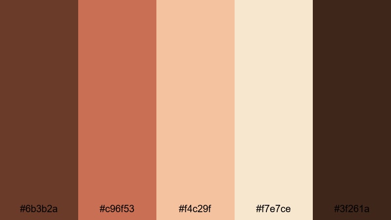
- HEX Codes: #6b3b2a, #c96f53, #f4c29f, #f7e7ce, #3f261a
- Mood: Cozy, nostalgic, and inviting like a slow walk through a fall street market.
- Use for: Perfect for autumn vlogs, cozy lifestyle thumbnails, and food videos that highlight warm, homely moments.
This palette wraps your visuals in deep chestnut, baked terracotta, and creamy light tones, just like late-afternoon sun on a fall street. The darker browns (#6b3b2a, #3f261a) ground your frames, while the apricot and cream highlights (#f4c29f, #f7e7ce) keep everything soft and approachable.
Use the richer tones for text, overlays, and borders on your YouTube thumbnails, and let the lighter colors handle background cards or lower thirds in your intros. In Filmora, you can color grade your footage toward this warm chestnut range for seasonal vlog series, recipe videos, or any storytelling edit that should feel cozy and nostalgic.
Pro Tip: Build a Cinematic Chestnut Look in Filmora
To keep an Autumn Market Stroll mood across an entire edit, start by choosing one or two key shots that capture this chestnut warmth. Grade those shots in Filmora until the shadows lean into deep brown, midtones feel terracotta, and highlights are creamy instead of pure white. Then use that shot as your visual reference for the rest of the timeline.
Apply matching title cards, subtitles, and end screens using the same HEX values from this palette. In Filmora, save your customized text presets and overlays so every vlog intro, B-roll sequence, and community post video shares the same chestnut identity.
AI Color Palette
If you already have a chestnut-toned photo or color card that you love, you can use it as the foundation for your whole video. Filmora's AI Color Palette feature analyzes your reference frame and applies its colors to other clips automatically, so your autumn look stays consistent from scene to scene.
Import a still frame that shows your ideal chestnut grading, open AI Color Palette, and select the rest of your shots as targets. With a few clicks, Filmora spreads that cozy brown, terracotta, and cream balance across your vlog, B-roll, and talking-head segments, saving you from grading every clip manually.
 secure download

HSL, Color Wheels & Curves
To fine-tune chestnut tones, work in Filmora's HSL, color wheels, and curves. You can gently desaturate yellows and oranges to get a softer, filmic brown, then cool the shadows a touch while keeping midtones warm for extra depth. The dedicated color correction tools in Filmora give you precise control over how your browns, reds, and creams interact in the final image; this Filmora color correction guide walks through those adjustments step by step.
Use curves to pull down the deepest shadows for a more cinematic look, and lift just the highlights to keep skin and steam from coffee cups glowing. Color wheels let you nudge shadows toward chestnut, push midtones slightly orange, and leave highlights close to neutral so text and graphic elements stay readable.
secure download1000+ Video Filters & 3D LUTs
If you want to stylize your chestnut palette faster, reach for Filmora's filters and LUTs. Filmora's video filters and 3D LUTs make it easy to add vintage warmth, cinematic contrast, or soft matte looks to your Autumn Market Stroll colors in a single step.
Layer a warm film LUT over your chestnut grade for richer browns, then reduce the intensity slider to keep it subtle. For thumbnails and shorts, you can use matching filters on stills and vertical clips to maintain one consistent chestnut style across platforms.
secure downloadRustic Cabin Glow
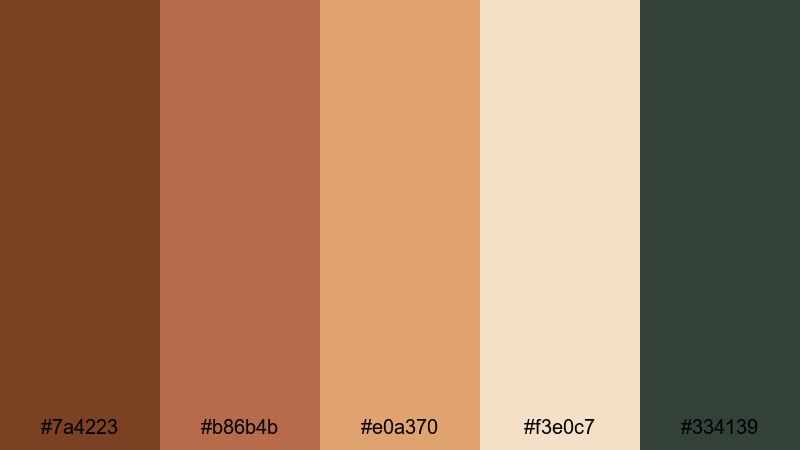
- HEX Codes: #7a4223, #b86b4b, #e0a370, #f3e0c7, #334139
- Mood: Warm, grounded, and intimate with a hint of forest retreat calm.
- Use for: Ideal for travel reels, cabin getaways, and documentary-style intros that need a natural, grounded feel.
Rustic Cabin Glow mixes firelit chestnut browns with amber highlights and a hint of forest green (#334139). It feels like a night in a wooden cabin, with warm light inside and dark trees outside the window.
Use the deepest brown for lower thirds and logo marks, the amber tones for text highlights and buttons, and the pale beige for backgrounds on titles or end screens. In your video edits, lean into this palette for travel vlogs, nature B-roll, and storytelling intros where you want to emphasize warmth and authenticity.
Harvest Coffee Break
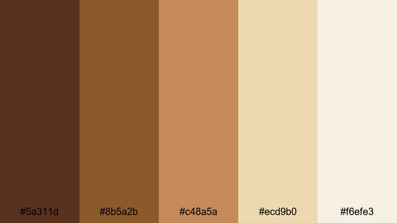
- HEX Codes: #5a311d, #8b5a2b, #c48a5a, #ecd9b0, #f6efe3
- Mood: Comforting, slow, and relaxed like a quiet coffee on a Sunday morning.
- Use for: Great for cafe b-roll, product shots, and vlog title cards centered on routines, study days, or productivity.
Harvest Coffee Break moves from dark espresso (#5a311d) through caramel browns to creamy off-whites (#f6efe3). It instantly suggests coffee foam, pastries, and handwritten notes.
Use the darker tones behind white or pale text to ensure strong readability on YouTube thumbnails and chapter cards. The soft creams are ideal for minimal backgrounds in study-with-me edits, productivity dashboards, or brand kits for cafes and lifestyle channels.
Woodland Storytime
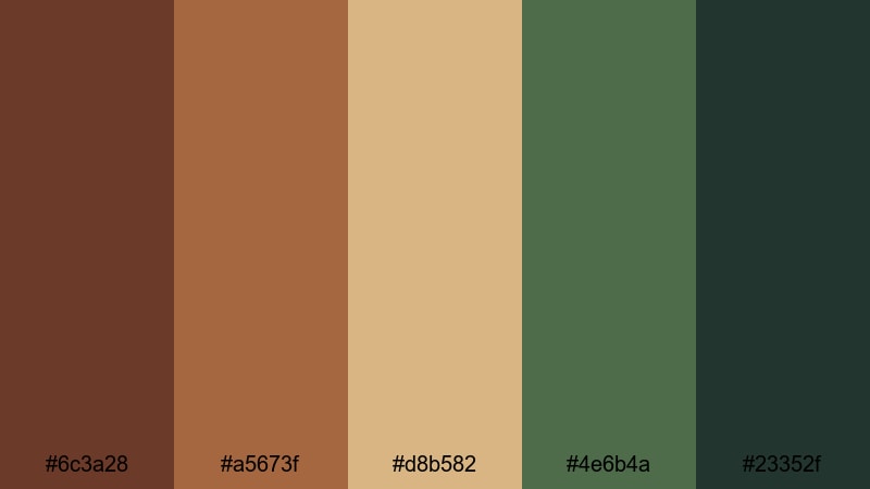
- HEX Codes: #6c3a28, #a5673f, #d8b582, #4e6b4a, #23352f
- Mood: Whimsical yet grounded, like reading a storybook in a quiet forest.
- Use for: Use for nature vlogs, educational videos, and narrative shorts that mix earthy realism with a soft fairy-tale vibe.
Woodland Storytime pairs chestnut woods with mossy greens (#4e6b4a, #23352f) and honeyed neutrals. It feels cinematic but gentle, perfect for connecting nature and narrative.
Try using the greens for accent elements like icons or progress bars, and keep the chestnut and honey tones for titles and overlays. This palette works especially well in thumbnails that hint at adventure, calm, or educational content set outdoors.
Elegant & Modern Chestnut Color Palettes
Chestnut Urban Luxe
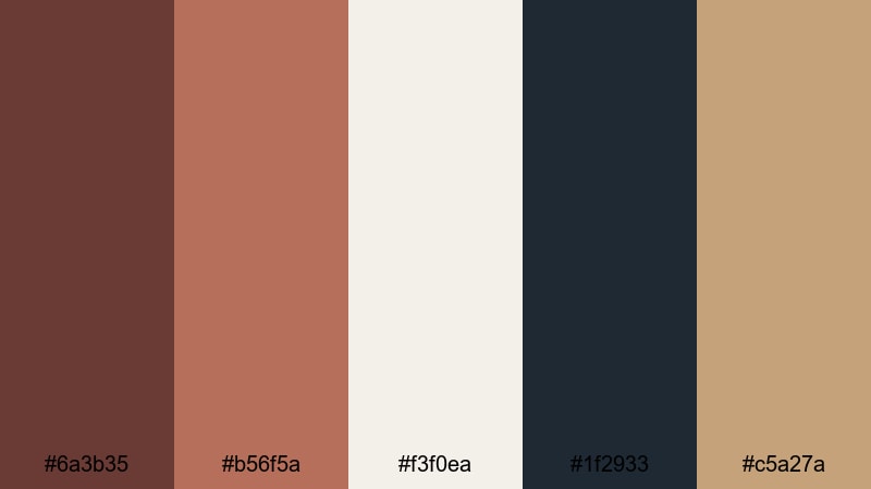
- HEX Codes: #6a3b35, #b56f5a, #f3f0ea, #1f2933, #c5a27a
- Mood: Sophisticated, polished, and city-chic with a warm edge.
- Use for: Perfect for channel branding, logo animations, and lifestyle or fashion intros that need an upscale, modern look.
Chestnut Urban Luxe blends polished browns with copper accents, soft ivory (#f3f0ea), and inky charcoal (#1f2933). It feels like a high-end loft or boutique brand, warm but very controlled.
Use the dark charcoal as your base for intros and lower thirds, overlaying chestnut and copper for text, frames, and logo reveals. The ivory tone is perfect for clean slide backgrounds in explainers or product showcases, while the muted gold-beige (#c5a27a) can highlight CTAs or pricing on social ads.
Copper Loft Minimal
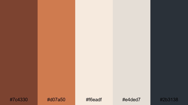
- HEX Codes: #7c4330, #d07a50, #f6eadf, #e4ded7, #2b3138
- Mood: Clean, airy, and design-forward with subtle industrial warmth.
- Use for: Ideal for tech explainers, portfolio reels, and UI mockups where you want warmth without losing minimal clarity.
Copper Loft Minimal balances burnished chestnut and copper (#d07a50) against soft off-whites and cool slate gray (#2b3138). It gives your visuals a clean, editorial look without feeling cold.
Use the pale neutrals as your main backgrounds, with chestnut and copper reserved for key text, icons, and separators. In film-style UI mockups or portfolio reels, this palette keeps the focus on the content while still giving your brand a distinct, warm character.
Midnight Chestnut Gold
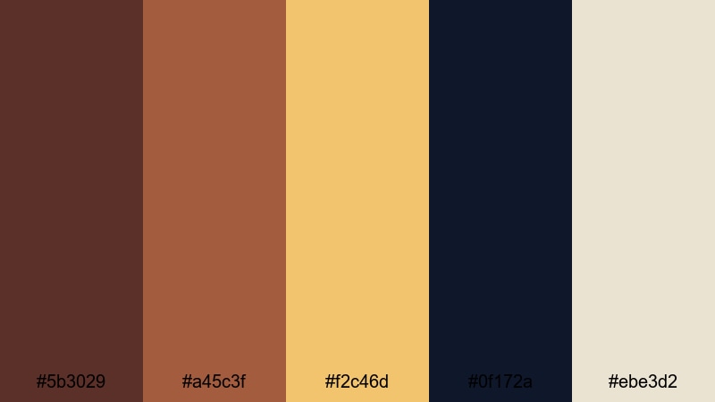
- HEX Codes: #5b3029, #a45c3f, #f2c46d, #0f172a, #ebe3d2
- Mood: Dramatic, refined, and cinematic with a hint of luxury.
- Use for: Great for cinematic trailers, channel intros, and award-style graphics that need depth and glamour.
Midnight Chestnut Gold combines deep chestnut and navy (#0f172a) with soft gold (#f2c46d) and porcelain beige (#ebe3d2). It creates a night-time, spotlight feel that is perfect for dramatic intros and event-style videos.
Use navy as your main backdrop, chestnut for secondary elements, and gold for accents like borders, dividers, or animated strokes around logos. This palette works especially well for award graphics, cinematic title sequences, or premium product launches.
Soft Studio Leather
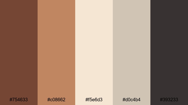
- HEX Codes: #754633, #c08662, #f5e6d3, #d0c4b4, #393233
- Mood: Calm, curated, and editorial like a high-end studio set.
- Use for: Use for talking-head setups, branding kits, and social templates that should feel premium but approachable.
Soft Studio Leather softens chestnut into supple leather tones, paired with warm neutrals and a soft charcoal (#393233). It feels like a carefully lit studio, tailored for interviews and content where the creator is the focus.
Use the lighter neutrals for background blocks behind your subject or text, while the chestnut and leather tones frame the image as borders or sidebar strips. This palette is ideal for consistent thumbnail frames, channel banners, and Instagram or TikTok cover templates.
Soft & Romantic Chestnut Color Palettes
Blush Chestnut Whisper
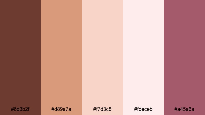
- HEX Codes: #6d3b2f, #d89a7a, #f7d3c8, #fdeceb, #a45a6a
- Mood: Gentle, romantic, and dreamy with a warm, human touch.
- Use for: Perfect for wedding videos, engagement reels, journaling vlogs, and aesthetic shorts with a soft storytelling tone.
Blush Chestnut Whisper softens rich brown (#6d3b2f) into rose-tinted chestnut and blush pinks, supported by airy creams (#fdeceb). It brings a tender, human warmth that feels ideal for emotional storytelling.
Use the darker chestnut for elegant serif titles, the blush tones for overlays and frames, and the lightest shade as your main background. This palette makes wedding highlight films, romantic B-roll, and aesthetic journaling vlogs feel cohesive and gently cinematic.
Rosewood Keepsake
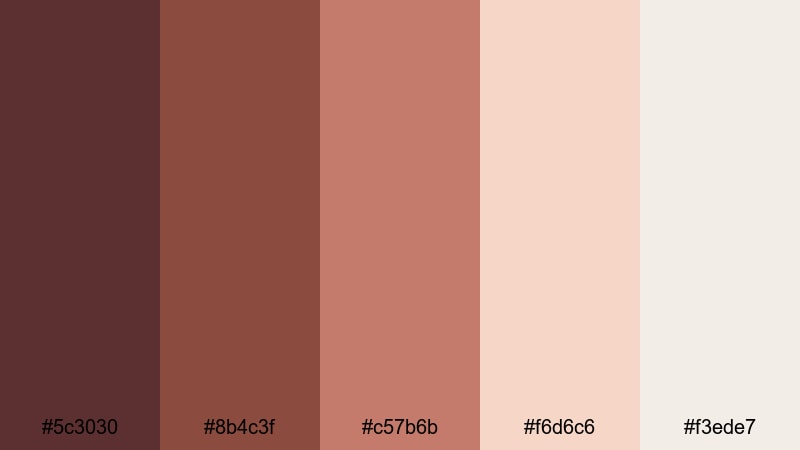
- HEX Codes: #5c3030, #8b4c3f, #c57b6b, #f6d6c6, #f3ede7
- Mood: Sentimental, intimate, and timeless like old letters and photos.
- Use for: Great for memory videos, family montages, scrapbook edits, and brand stories with emotional depth.
Rosewood Keepsake uses rose-tinted browns and chestnut with soft peach and ivory. It feels like aged paper, printed photos, and treasured keepsakes.
Use the deeper rosewood tones for frames, photo borders, and chapter cards, while the peach and ivory shades support captions and subtle animations. This palette is strong for legacy videos, brand documentaries, and family recap edits that should feel heartfelt but still polished.
Evening Wedding Lights
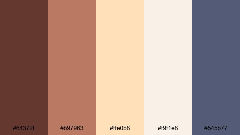
- HEX Codes: #64372f, #b97963, #ffe0b8, #f9f1e8, #545b77
- Mood: Romantic, celebratory, and softly cinematic like golden hour at a reception.
- Use for: Ideal for wedding highlight films, save-the-date edits, and event recaps that need warmth and subtle elegance.
Evening Wedding Lights brings together chestnut and caramel with champagne highlights (#ffe0b8) and soft slate blue shadows (#545b77). It captures the glow of string lights and dusk skies.
Use warm tones on text and decorative flourishes, while the slate blue adds gentle contrast in shadows or background blocks. This palette works beautifully for save-the-date teasers, wedding highlight trailers, and event recaps where you want romance without losing clarity.
Bold & Cinematic Chestnut Color Palettes
Cinema Noir Chestnut
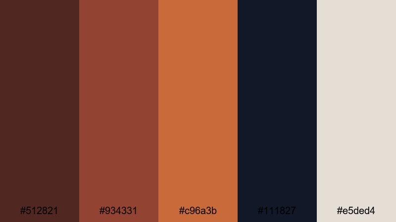
- HEX Codes: #512821, #934331, #c96a3b, #111827, #e5ded4
- Mood: Moody, bold, and cinematic with strong contrast and drama.
- Use for: Perfect for trailers, short films, and story-driven edits that lean into high contrast and narrative tension.
Cinema Noir Chestnut mixes inky shadows (#111827) with smoky chestnut and copper (#c96a3b), lifted by a soft light beige (#e5ded4). It delivers high drama and contrast, ideal for thriller-style or narrative videos.
Use the darkest shade as your background for titles and credit screens, with chestnut and copper drawing attention to names and key words. The light beige can highlight subtitles, pull quotes, and content labels without breaking the noir mood.
Desert Ember Frame
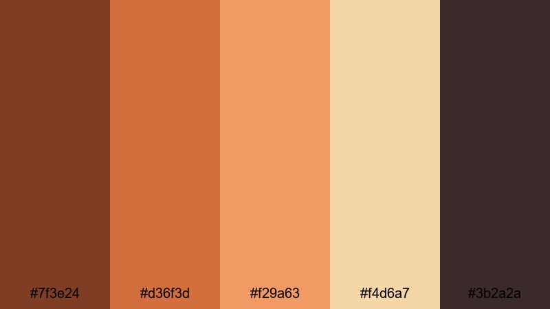
- HEX Codes: #7f3e24, #d36f3d, #f29a63, #f4d6a7, #3b2a2a
- Mood: Sun-baked, intense, and adventurous like a road trip through the desert.
- Use for: Use for travel vlogs, drone sequences, and action montages that need heat, grit, and cinematic punch.
Desert Ember Frame pushes chestnut toward fiery ember oranges (#d36f3d, #f29a63) and sandy highlights (#f4d6a7), anchored by soot-dark shadows (#3b2a2a). It feels dry, hot, and full of movement.
Apply the deeper tones to black bars, logo stings, and bold title cards, while the brighter oranges emphasize motion graphics and transitions. This palette suits extreme travel, desert shots, road movies, or any series where you want to convey heat and intensity.
Vintage Film Reel
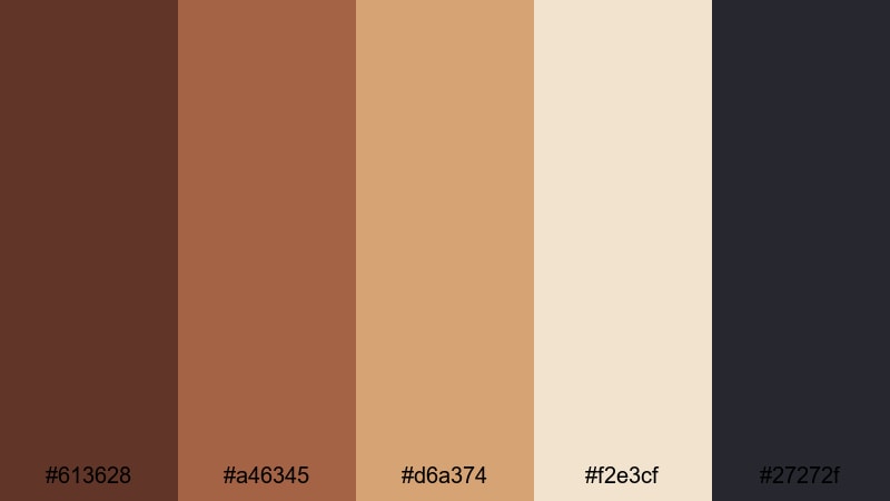
- HEX Codes: #613628, #a46345, #d6a374, #f2e3cf, #27272f
- Mood: Retro, textured, and cinematic like aged celluloid frames.
- Use for: Great for retro edits, documentary intros, and vlog series openers with an old-film personality.
Vintage Film Reel uses dusty chestnut, sepia gold (#d6a374), faded ivory (#f2e3cf), and deep slate (#27272f) to imitate aged film stock. It is nostalgic but still sharp enough for modern content.
Combine this palette with light film grain, subtle vignettes, and slightly reduced saturation in Filmora to sell the retro mood. It is perfect for documentary intros, retro-style vlogs, or any content that references archives, memories, or history.
Stormy Harbor Chestnut
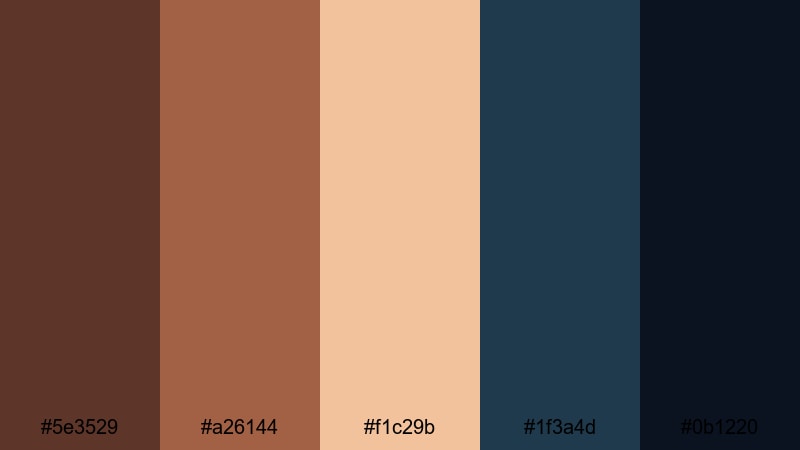
- HEX Codes: #5e3529, #a26144, #f1c29b, #1f3a4d, #0b1220
- Mood: Brooding, powerful, and atmospheric like a storm rolling over a coastal town.
- Use for: Perfect for travel films, moody B-roll, and dramatic storytelling where you want both warmth and tension.
Stormy Harbor Chestnut opposes warm chestnut and driftwood browns with stormy navy (#1f3a4d) and midnight blue (#0b1220). The result is rich contrast between human warmth and looming weather.
Use the deep blues for backgrounds, fades, and letterboxing, while chestnut and sand tones (#f1c29b) highlight titles, location tags, and subtle graphics. This palette is strong for coastal travel films, intros that hint at conflict, or any story where atmosphere is a key character.
Tips for Creating Chestnut Color Palettes
Chestnut pairs naturally with neutrals, golds, greens, and deep blues, but the balance of contrast, saturation, and brightness will determine whether your project feels cozy, modern, romantic, or dramatic. Use these tips to shape chestnut palettes that work on both video and design elements.
- Decide on the mood first. Cozy and homely palettes lean on warm creams and soft oranges; cinematic or moody palettes combine chestnut with navy, charcoal, or deep teal.
- Control contrast for readability. Use the darkest chestnut or navy as backgrounds behind light text, and avoid mid-tone-on-mid-tone combinations in thumbnails and lower thirds.
- Limit accent colors. Let chestnut be your main brand color, then add one accent (gold, blush, or teal) plus 1 to 2 neutrals for a clean, professional look.
- Match chestnut to skin tones. Slightly warm shadows and midtones in Filmora so skin does not look gray against rich browns; keep highlights close to neutral for natural faces.
- Use saturation carefully. For long-form content, keep chestnut slightly desaturated to avoid visual fatigue; for thumbnails and short clips, you can push saturation for stronger impact.
- Create a hierarchy. Reserve the boldest chestnut or gold for CTAs, key titles, and logos; use lighter shades for backgrounds and supportive shapes.
- Test across devices. Check your chestnut palette on mobile and desktop to ensure text is legible and color differences remain visible on smaller, dimmer screens.
- Save presets in Filmora. Once you dial in a chestnut look, save color presets and title templates so every video in a series shares the same palette automatically.
Chestnut color palettes can make your videos feel grounded, cinematic, and emotionally engaging. From rustic coffee tones to bold noir combinations, the right chestnut mix shapes both your story and your brand identity across thumbnails, intros, and full edits.
Try these palettes as starting points, then refine them inside Filmora until they match your channel personality. With AI Color Palette, detailed color controls, and filters, you can keep a consistent chestnut style from your first frame to your final end screen.
Explore different combinations, save your favorite looks, and build a recognizable chestnut aesthetic that viewers associate instantly with your content.
secure download