
 100% Security Verified | No Subscription Required | No Malware


 ChatGPT
 Perplexity
 Gemini
 Claude
 Grok
Grok
High-contrast color palettes instantly tell the viewer where to look. Sharp light-dark separation and bold complementary hues feel energetic, confident, and modern, which is why creators rely on contrast for viral thumbnails, strong branding, and cinematic title cards. Used well, contrast can make even a simple frame feel polished and professional.
This guide collects 15 ready-to-use contrast color palettes with HEX codes so you can drop them straight into your YouTube thumbnails, intros, logos, or motion graphics. Each palette is creator-friendly and works perfectly inside Filmora, whether you are designing overlays, grading footage, or building a consistent look for your channel.
In this article
Bold & Vibrant Contrast Color Palettes
Neon Night Billboard
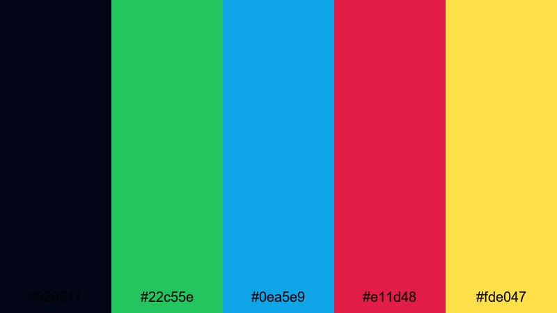
- HEX Codes: #020617, #22c55e, #0ea5e9, #e11d48, #fde047
- Mood: Hyper-energetic and attention-grabbing, like a city of neon signs at midnight.
- Use for: Perfect for high-impact YouTube thumbnails, promo banners, and title cards that need instant clicks.
This palette throws electric green, cyan blue, hot pink, and glowing yellow against an almost-black navy. It feels like standing under a bright billboard in a busy nightlife district, where every sign is fighting for your attention.
Use it when you want your video thumbnail, channel banner, or intro title to scream for clicks in a crowded feed. The deep base (#020617) is perfect for backgrounds, while the neon accents highlight text, arrows, callouts, and subscribe buttons that must be readable on both desktop and mobile.
Pro Tip: Maintain Neon Contrast Across Your Edit in Filmora
When you are working with a loud neon contrast palette like this, consistency is everything. In Filmora, you can save custom colors from your thumbnails and reuse them across titles, shapes, and overlays so your intro, lower thirds, and end screen all share the same neon energy.
Build a reusable style by setting your brand greens, blues, and pinks in the Title editor and graphic elements, then duplicating those clips across your timeline. This keeps your entire video package looking cohesive, even if you mix live action, screen recordings, and motion graphics.
AI Color Palette
If you already mocked up a Neon Night Billboard look in a graphic tool or grabbed inspiration from a city photo, you can carry that exact contrast into your video. Filmora's AI Color Palette feature analyzes a reference frame and transfers its color style to other clips on the timeline.
Import your brightest reference shot or design, use AI Color Palette to match your talking-head footage and b-roll, and your entire video will share the same high-voltage tones. This is ideal for creators who want their thumbnails, intros, and in-video colors to feel like one unified brand.
 secure download

HSL, Color Wheels & Curves
Neon palettes can easily look too harsh or washed out on camera footage. With Filmora's HSL and color wheels, you can desaturate skin tones while keeping the greens and pinks intense, or shift your shadows slightly toward blue for a richer night-time vibe. Curves let you deepen blacks just enough to make the neons glow without losing detail.
Combine selective HSL adjustments with the color wheels to push highlights into warmer yellow while shadows drift cool, as shown in Filmora's advanced color correction tutorials on YouTube. This gives your neon contrast a more cinematic, less flat look that works beautifully for intros and music edits.
secure download1000+ Video Filters & 3D LUTs
Once you have your basic contrast in place, Filmora's video filters and 3D LUTs make it easy to stylize your neon palette in one click. You can stack glow, glitch, or cyberpunk-style filters to push the nightlife mood even further while keeping your brand colors recognizable.
Save a custom LUT that matches the Neon Night Billboard vibe and apply it to every clip in your project. This keeps thumbnails, intros, overlays, and main footage unified, whether you are editing gaming highlights, street footage, or high-energy promo videos.
secure downloadElectric Pop Duo-Tone
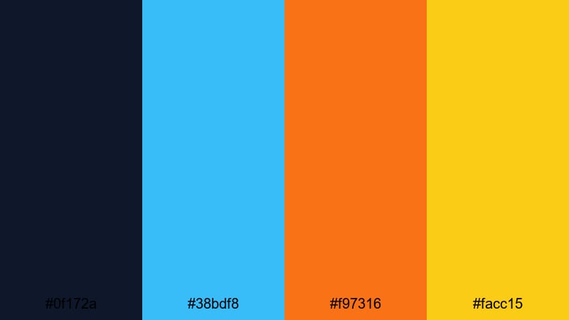
- HEX Codes: #0f172a, #38bdf8, #f97316, #facc15
- Mood: Sharp, electric, and modern with striking warm-cool contrast.
- Use for: Great for duo-tone overlays, kinetic text, and energetic social shorts in Filmora.
Here, deep navy becomes the stage for a bright cyan, vivid orange, and punchy yellow. The cool-versus-warm clash creates instant energy, while the dark base keeps everything grounded and readable.
It is perfect for duo-tone poster-style thumbnails, fast-moving lyric videos, and bold captions over B-roll. Use the navy (#0f172a) for backgrounds, cyan (#38bdf8) for outlines and UI elements, and the warm tones (#f97316, #facc15) to highlight key words like FREE, NEW, or GIVEAWAY in your titles and end screens.
Viral Thumbnail Splash
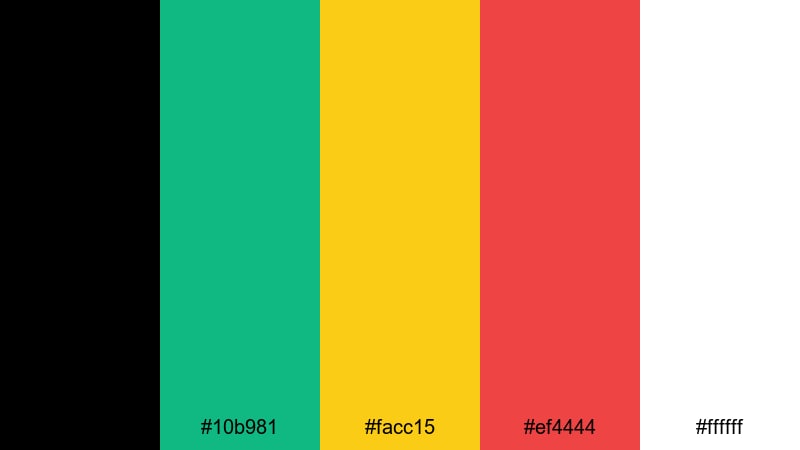
- HEX Codes: #000000, #10b981, #facc15, #ef4444, #ffffff
- Mood: Click-worthy, bold, and optimized to stand out in crowded feeds.
- Use for: Designed for eye-catching thumbnails, bold callout text, and subscribe overlays.
This palette combines pure black and white with saturated green, yellow, and red for maximum contrast. It is the classic YouTube-style look that jumps off the homepage and still feels clean on mobile screens.
Use black or white as your main background, green (#10b981) for positive callouts, yellow (#facc15) for price tags or headlines, and red (#ef4444) for warning labels or subscribe buttons. The strong color separation makes it ideal for reaction videos, tutorials, commentary channels, and any content that relies on big facial expressions and bold text.
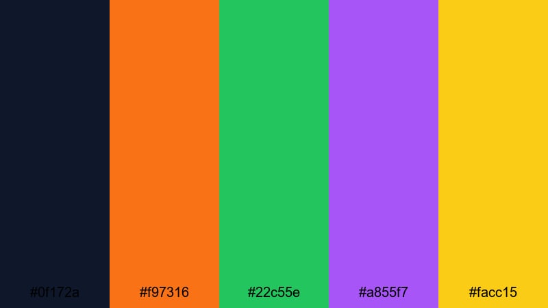
High Voltage Gaming
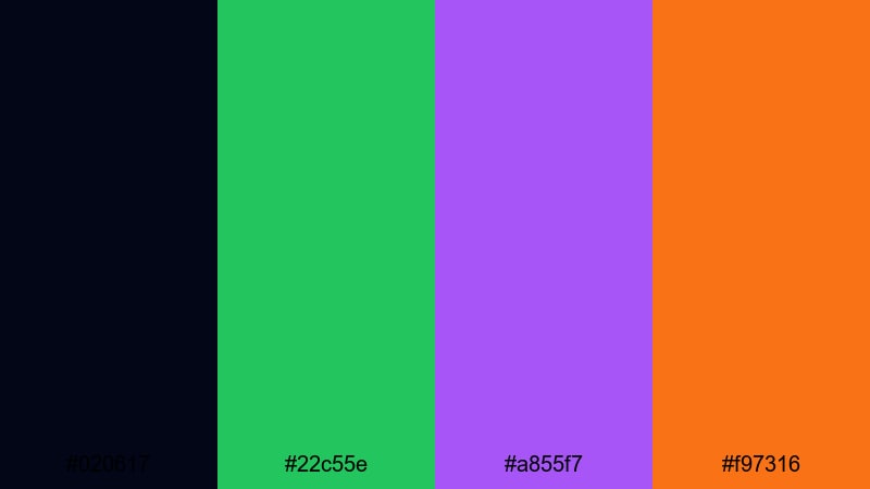
- HEX Codes: #020617, #22c55e, #a855f7, #f97316
- Mood: Edgy, futuristic, and charged with arcade-style intensity.
- Use for: Use for gaming intros, stream overlays, and animated stingers with sharp contrast.
High Voltage Gaming builds a dark midnight base with electric green, neon purple, and hot orange accents. It feels like RGB keyboard lights in a dark room or the glow of a gaming rig at full power.
Use the deep navy-black background to frame your gameplay, then bring attention to score counters, kill feeds, and lower thirds with the bright accent colors. Green (#22c55e) and purple (#a855f7) work well for team colors or brand elements, while orange (#f97316) is ideal for urgent alerts like FINAL ROUND or NEW RECORD.
Tropical Contrast Burst
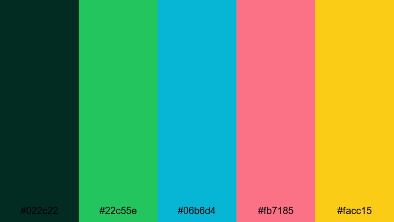
- HEX Codes: #022c22, #22c55e, #06b6d4, #fb7185, #facc15
- Mood: Sunny, bold, and playful with vacation-level vibrance.
- Use for: Great for travel vlogs, summer promos, and fun lifestyle reels that need punchy color.
Lush deep teal sets the tone for leaf green, aqua, coral pink, and bright yellow. This combination instantly suggests beaches, smoothies, and poolside vlogs, with enough contrast to keep overlays readable in bright scenes.
Use the dark teal (#022c22) as a grounding background for titles or end cards, then layer aqua (#06b6d4) and coral (#fb7185) as accent blocks behind text. Yellow (#facc15) is perfect for star icons, arrows, and CTA buttons in thumbnails for travel, food, and festival videos.
Minimal & Modern Contrast Color Palettes
Charcoal Mint Minimal
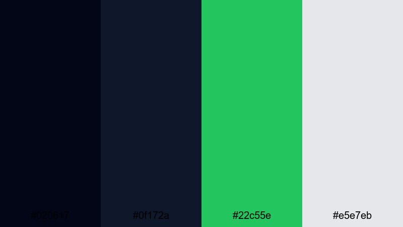
- HEX Codes: #020617, #0f172a, #22c55e, #e5e7eb
- Mood: Clean, confident, and refined with a fresh pop of color.
- Use for: Ideal for modern logo reveals, tech explainers, and minimalist lower thirds.
Two shades of charcoal pair with a soft gray and fresh mint green, creating a sharp but understated contrast. It feels professional and techy without looking cold or clinical.
Use the dark tones for backgrounds and text, keep mint (#22c55e) as your single strong accent, and apply light gray (#e5e7eb) for panels or info boxes. This palette is excellent for SaaS demos, productivity tutorials, and clean portfolio intros where you want contrast and legibility but minimal visual noise.
Clean Contrast UI
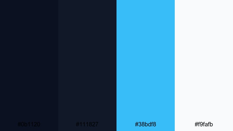
- HEX Codes: #0b1120, #111827, #38bdf8, #f9fafb
- Mood: Professional and tech-forward with crystal-clear legibility.
- Use for: Perfect for app demos, UI walkthroughs, and tutorial overlays.
Layered dark blues create depth behind a bright cyan accent and almost pure white. It looks like a sleek dashboard interface or a modern developer tool.
Use the darker blues for background panels and navigation bars, cyan (#38bdf8) for active states and highlight text, and white (#f9fafb) for body copy. This palette keeps screen recordings and UI overlays easy to follow in Filmora, especially when you are zooming into menus or adding callout graphics for tutorials.
Monochrome Accent Pop
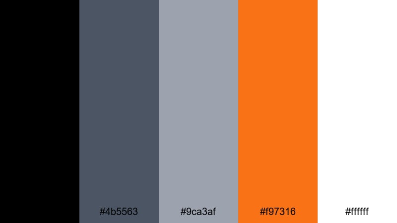
- HEX Codes: #000000, #4b5563, #9ca3af, #f97316, #ffffff
- Mood: Understated and modern with a single bold spark of energy.
- Use for: Use for minimalist brand packs, text-based reels, or cinematic title sequences.
A grayscale range from black to silver is interrupted by a single vivid orange accent. This creates very strong hierarchy: almost everything stays neutral, so anything orange immediately feels important.
Use the grayscale tones for backgrounds, frames, and typography, and reserve the orange (#f97316) for logos, key words, or timeline markers. It is ideal for channels that want a serious, editorial style for case studies, documentaries, or motivational speeches while still keeping one signature color.
Studio Loft Contrast
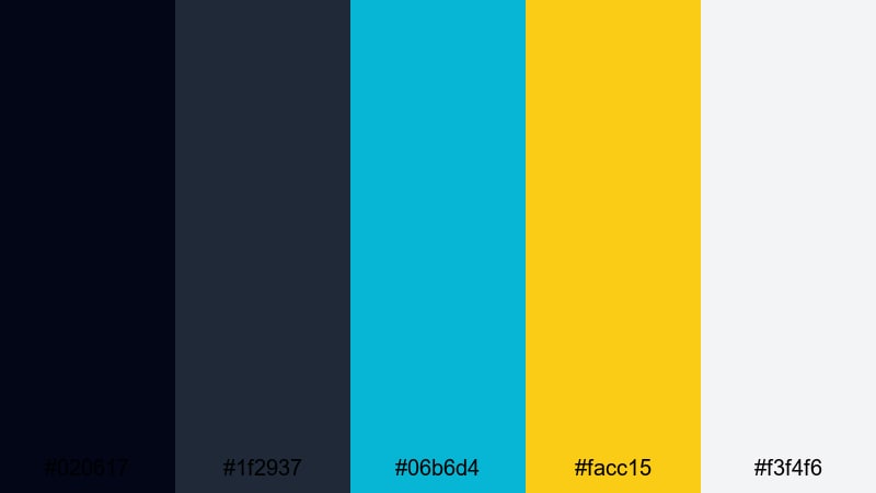
- HEX Codes: #020617, #1f2937, #06b6d4, #facc15, #f3f4f6
- Mood: Stylish and editorial with gallery-style brightness and depth.
- Use for: Great for creator intros, podcast visuals, and educational content.
Smoky charcoals pair with teal and yellow accents plus a soft off-white. The result feels like shooting in a modern loft studio with a mix of shadows and daylight.
Use dark tones as your frame, off-white (#f3f4f6) for content panels or quote boxes, teal (#06b6d4) for subtle accents, and yellow (#facc15) to draw attention to CTAs or key timestamps. This palette works especially well for talking-head podcasts, design tutorials, and carousel-style video explainers where clarity matters.
Cinematic Dark Contrast Color Palettes
Noir Highlight Drama
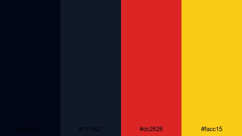
- HEX Codes: #020617, #111827, #dc2626, #facc15
- Mood: Intense, moody, and cinematic with razor-sharp highlights.
- Use for: Perfect for trailers, dramatic story videos, and title cards with a thriller vibe.
Inky blacks and charcoal shadows are interrupted by fierce red and golden highlights. The palette feels like a thriller movie poster, where a dark world is cut by a few dangerous lights.
Use the reds (#dc2626) for warnings, conflict, or intense emotions, and the yellow (#facc15) for key titles, dates, or logo reveals. It is ideal for storytime videos, crime or mystery channels, dramatic edits, and cinematic trailers that need strong emotional contrast.
Cyberpunk Alley
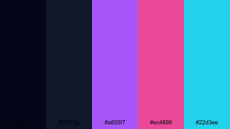
- HEX Codes: #020617, #0f172a, #a855f7, #ec4899, #22d3ee
- Mood: Futuristic, neon-lit, and slightly gritty with sci-fi attitude.
- Use for: Use for tech intros, synthwave edits, and cyberpunk-style music visuals.
Deep blues create a night-time base, while violet, magenta, and cyan blaze across the frame. It is a classic cyberpunk alleyway look: dark, glossy, and filled with glowing signs.
Use the darker blues for shadows and backgrounds, then color text and graphic elements with violet (#a855f7), magenta (#ec4899), and cyan (#22d3ee). This palette suits tech review channels, programming or AI tutorials, glitch edits, and music videos with synthwave or EDM tracks.
Moody Teal Spotlight
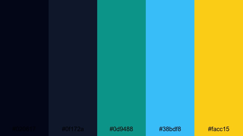
- HEX Codes: #020617, #0f172a, #0d9488, #38bdf8, #facc15
- Mood: Cool, cinematic, and atmospheric with precise highlights.
- Use for: Great for cinematic b-roll, product hero shots, and dramatic openers.
Dark navy tones blend into teal and sky blue, with a single warm yellow highlight. The palette feels like a spotlight in a dark studio, ideal for product-focused visuals and polished brand intros.
Use teal (#0d9488) for subtle branding, blue (#38bdf8) for accents such as UI elements or streaks of light, and yellow (#facc15) only for the most important text or logo. It works well with moody b-roll, macro shots, or slow-motion sequences that you grade toward teal and blue in Filmora.
Playful High-Contrast Color Palettes
Creator Candy Pop
- HEX Codes: #0f172a, #f97316, #22c55e, #a855f7, #facc15
- Mood: Fun, youthful, and upbeat with candy-like saturation.
- Use for: Perfect for vlogs, haul videos, and playful shorts with animated stickers and emojis.
A dark navy base holds a burst of orange, green, purple, and yellow. The palette feels cheerful and slightly chaotic in a good way, like a bag of mixed candy.
Use navy as your background, then assign each bright color a role: orange (#f97316) for headings, green (#22c55e) for positive labels, purple (#a855f7) for decorative shapes, and yellow (#facc15) for emojis or badges. It is a strong choice for lifestyle channels, shopping hauls, and fun edits with lots of text animations and stickers.
Vlog Morning Energy

- HEX Codes: #f97316, #facc15, #22c55e, #0f172a, #ffffff
- Mood: Bright, optimistic, and energizing like a sunny morning routine.
- Use for: Use for lifestyle vlogs, morning routines, and wellness content intros.
Warm orange and yellow combine with fresh green, anchored by deep navy and clean white. It feels like sunlight pouring into a kitchen during a morning coffee vlog.
Use orange and yellow for backgrounds or gradient bars, green (#22c55e) for wellness or habit-tracking graphics, and navy (#0f172a) and white for text. This palette makes your routines, productivity hacks, and self-care edits feel friendly and approachable while staying highly readable.
Retro Arcade Contrast
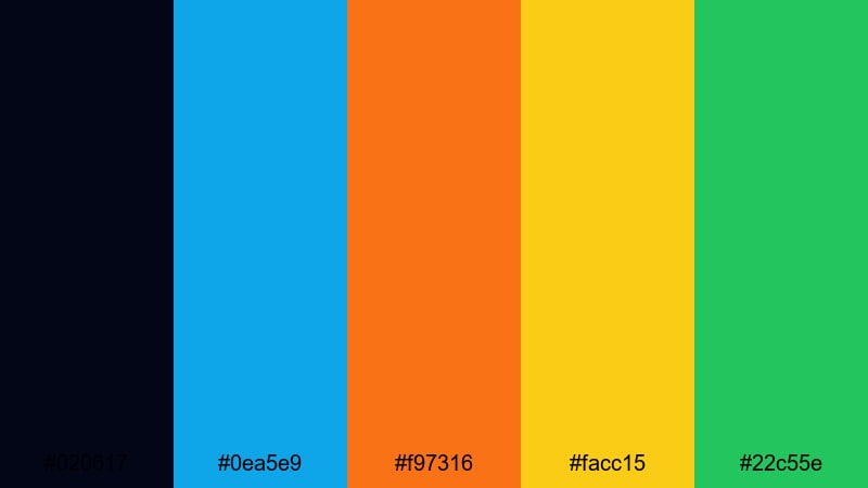
- HEX Codes: #020617, #0ea5e9, #f97316, #facc15, #22c55e
- Mood: Nostalgic, playful, and fast-paced with classic arcade vibes.
- Use for: Great for retro gaming edits, challenge videos, and punchy motion graphics.
A dark background lets cyan, orange, yellow, and green glow like old-school arcade pixels. The palette feels nostalgic but still clean enough for modern content.
Use the dark base for gameplay or challenge footage, then create pixel-style titles, score counters, and banners in the bright accent colors. Cyan (#0ea5e9) and green (#22c55e) suit player names or HUD elements, while orange and yellow work well for combos, achievements, and timers in your edits.
Tips for Creating Contrast Color Palettes
Strong contrast palettes are about more than bright colors; they balance light and dark, warm and cool, and saturation levels so your message is always easy to read and on-brand. Here are practical tips to build and use contrast color combinations effectively in video and design.
- Start with a dark or light base color that will carry most backgrounds, then add 1 to 3 accent colors for highlights and CTAs.
- Test text readability on mobile by placing white and black text over your chosen background shades; adjust brightness until both are clear.
- Use warm colors (orange, red, yellow) for urgent or emotional elements and cool colors (blue, teal, green) for calm or informational elements.
- Limit your strongest accent to one or two elements per frame (like a button or keyword) so the viewer instantly knows where to look.
- Keep branding consistent by reusing the same HEX codes across thumbnails, end screens, titles, and lower thirds in Filmora.
- Match your palette to your footage: push grade and lighting slightly toward your chosen colors instead of fighting against the existing tones.
- Use mid-contrast combinations (dark blue with light gray, for example) for larger areas, and reserve extreme contrasts (pure black vs pure white) for text and icons.
- Save your favorite palettes as presets or project templates, so every new video starts with consistent contrast and color hierarchy.
High-contrast color palettes are powerful tools for shaping mood, focus, and brand identity. Whether you want neon energy, minimalist clarity, cinematic tension, or playful nostalgia, these 15 HEX-coded palettes give you a starting point that already works on screens of all sizes.
Experiment with each palette inside Filmora: build matching titles, recolor overlays, and grade your footage so everything shares the same visual language. Over time, your audience will start to recognize your contrast style before they even read your channel name.
Save the palettes that feel most like your personality or brand, turn them into reusable presets, and let Filmora handle the heavy lifting for color-matching and stylizing your edits.
secure downloadNext: Jasmine Color Palette
