
 100% Security Verified | No Subscription Required | No Malware


 ChatGPT
 Perplexity
 Gemini
 Claude
 Grok
Grok
Coral orange sits between warm orange and soft pink, making it one of the most inviting colors you can use on screen. It feels optimistic, friendly, and a little bit playful, which is why you see it so often in lifestyle channels, beauty content, travel vlogs, and modern brands that want to look warm but still polished.
In video editing, coral orange works beautifully for YouTube thumbnails, intro sequences, lower thirds, channel branding, and even subtle color grading. Below you will find 15 ready-made coral orange color palettes with HEX codes, designed for creators and Filmora users who want consistent, aesthetic visuals across thumbnails, intros, B-roll, and social edits.
In this article
Soft & Romantic Coral Orange Palettes
Blush Coral Morning

- HEX Codes: #ffb19a, #ffe0d2, #ffd0c1, #f89a7d, #f7f1eb
- Mood: Gentle, cozy, and uplifting with a soft sunrise glow.
- Use for: Use this palette for lifestyle vlogs, cozy morning routines, and intro screens that need a warm, approachable feel.
This palette feels like a quiet morning with soft light coming through the window. The blush coral oranges and creamy neutrals give your footage a gentle, welcoming look that flatters skin tones and makes any frame feel more human and relatable.
Use Blush Coral Morning for vlog openers, channel banners, and YouTube thumbnails where you want viewers to feel instantly at ease. It is also great for text overlays, lower thirds, and Instagram Reels covers that lean into a soft, romantic coral orange aesthetic.
Pro Tip: Build a Cinematic Coral Orange Morning Look in Filmora
To keep this soft coral orange vibe consistent, start by using the same HEX codes from this palette in your titles, shapes, and graphics inside Filmora. Use the boldest coral shade for key accents such as Subscribe buttons or callouts, and the lighter creams as backgrounds behind text for readability.
Once you have your intro, lower thirds, and end screen styled, save them as presets or project templates. That way every new morning routine, lifestyle vlog, or aesthetic B-roll sequence can reuse the same Blush Coral Morning look with just a few clicks.
AI Color Palette
If you have a reference image that perfectly captures this blush coral morning light, you can let Filmora match your entire video to it. Filmora's AI Color Palette feature analyzes your reference frame and applies a similar color style across selected clips, so your A-roll, B-roll, and cutaways all share the same warm coral glow.
Import your clips, choose a frame or color card based on this palette, and use AI Color Palette to transfer those tones. It is an easy way to unify your thumbnails, intros, and social teasers with one cohesive coral orange color story.
 secure download

HSL, Color Wheels & Curves
To fine-tune coral orange skin tones and highlights, head into Filmora's HSL, color wheels, and curves controls. You can gently desaturate bright oranges, push midtones slightly warmer, and lift shadows a touch to keep that soft morning feel without clipping details.
If you want a deeper dive into grading, Filmora's color correction tools guide shows how to balance exposure and color so your oranges stay rich while whites remain clean. Use curves to add a subtle S-curve for contrast, then use color wheels to nudge shadows cooler and midtones warmer for a cinematic coral orange look.
secure download1000+ Video Filters & 3D LUTs
If you want to stylize this coral orange palette quickly, start with Filmora's built-in looks. Filmora's video filters and 3D LUTs make it easy to add gentle pastel tints, dreamy glow, or film-inspired contrast that complements Blush Coral Morning.
Apply a soft cinematic LUT as a base, then stack subtle filters for bloom or vignette. Adjust intensity so your coral accents stay clear in thumbnails, intro cards, and reels while the overall frame feels polished and on-brand.
secure downloadPetal Kiss Coral
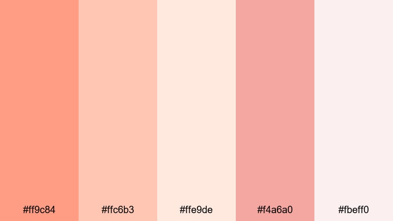
- HEX Codes: #ff9c84, #ffc6b3, #ffe9de, #f4a6a0, #fbeff0
- Mood: Romantic and sentimental, like pressed flower petals in a journal.
- Use for: Ideal for wedding highlight reels, engagement stories, and sentimental montage sequences with a dreamy tone.
Petal Kiss Coral blends soft coral orange with dusty pinks and airy creams for a tender, romantic feel. It is perfect for slow-motion shots, close-ups of hands, details, and emotional beats where you want the color to echo the story.
Use the deeper coral for titles and calligraphy-style lower thirds, with the pale pinks behind text or as frames in wedding thumbnails. This palette also works well for save-the-date animations, invitation-style intros, and Instagram Reels covers for love stories.
Apricot Love Story
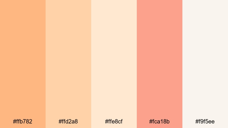
- HEX Codes: #ffb782, #ffd2a8, #ffe8cf, #fca18b, #f9f5ee
- Mood: Warm, nostalgic, and tender like golden-hour memories.
- Use for: Use for nostalgic vlogs, family stories, and cinematic B-roll overlays that need a gentle, affectionate atmosphere.
Apricot Love Story leans into sunlit apricot and creamy beige, creating a nostalgic warmth that feels like old family photos. It flatters outdoor footage shot at golden hour and helps everyday moments feel more cinematic.
Use this palette for family montages, memory recaps, or storytime intros. Apply the lighter tones to background panels and frames in your thumbnails, and reserve the richest apricot coral for key headlines, timestamps, and call-to-action buttons.
Soft Coral Daydream
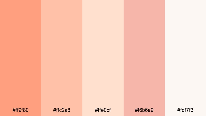
- HEX Codes: #ff9f80, #ffc2a8, #ffe0cf, #f6b6a9, #fdf7f3
- Mood: Dreamy, hopeful, and light as a quiet afternoon nap.
- Use for: Perfect for aesthetic study vlogs, calm productivity videos, and dreamy social content backgrounds.
Soft Coral Daydream uses feather-light coral and pastel neutrals to create a soothing, floaty atmosphere. It is gentle enough for long watch sessions but still colorful enough to stand out in feeds.
Use it for Notion-style overlays, study timers, and clean layouts in productivity videos. On thumbnails, pair the softest neutrals with bold typography and let the mid-tone coral act as a highlight strip behind text or as an accent border.
Bold & Energetic Coral Orange Palettes
Neon Coral Splash
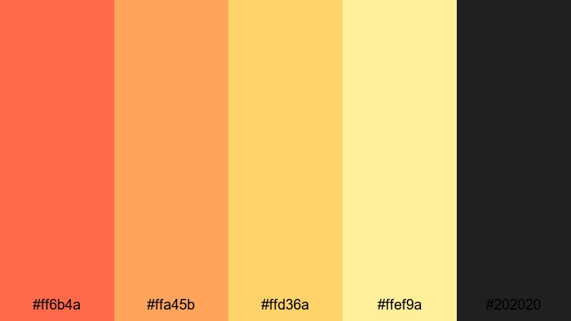
- HEX Codes: #ff6b4a, #ffa45b, #ffd36a, #ffef9a, #202020
- Mood: High-energy, playful, and attention-grabbing with a neon pop.
- Use for: Use for energetic YouTube intros, gaming highlights, and hype edits where you want instant visual impact.
Neon Coral Splash combines punchy coral oranges and glowing yellows with a deep charcoal base, creating a neon-like contrast that jumps off the screen. It is made for fast cuts, transitions, and short-form content where you need a bold look in seconds.
Use the darkest shade as your background and let the coral and yellow act as neon lines, glitch effects, or animated outlines around text. This palette is great for gaming overlays, hype montage titles, and eye-catching YouTube thumbnail borders.
Tropical Coral Punch

- HEX Codes: #ff7e47, #ffb347, #ffd966, #00b8a9, #024059
- Mood: Vibrant, tropical, and adventurous like a beach party at sunset.
- Use for: Great for travel vlogs, summer campaigns, and festival highlight reels that need a sunny, upbeat vibe.
Tropical Coral Punch pairs juicy coral oranges with teal and deep ocean blue, giving a clear beach and cocktail association. It is energetic without feeling harsh, ideal for sunny footage and travel B-roll.
Use the teal and deep blue for backgrounds and lower thirds, then let coral and yellow highlight maps, locations, timestamps, or chapter markers. In thumbnails, place coral orange behind your subject and use teal for bold headline text to get both contrast and a cohesive tropical theme.
Electric Coral Pop
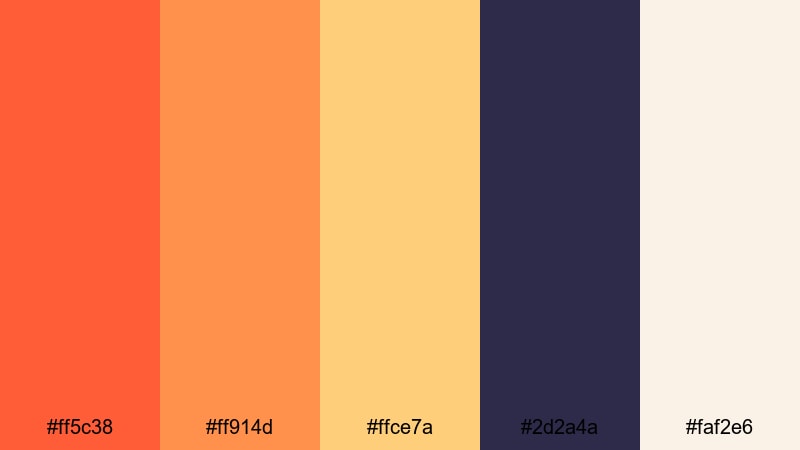
- HEX Codes: #ff5c38, #ff914d, #ffce7a, #2d2a4a, #faf2e6
- Mood: Bold, edgy, and modern with a pop-art twist.
- Use for: Use for music videos, fashion lookbooks, and reels where you want loud, confident visuals that stand out in feeds.
Electric Coral Pop mixes intense coral oranges with inky violet and soft cream for a palette that feels modern and graphic. The contrast between warm and cool hues creates a striking, pop-art inspired look.
Use the dark violet as a base for title cards and split screens, then layer coral shapes and animated blocks over it. For fashion lookbooks or dance edits, sync rapid color flashes and graphic elements with the beat while keeping text on the cream shade for clean legibility.
Fiery Coral Festival

- HEX Codes: #ff5a3c, #ff8a3d, #ffd37b, #8b1e3f, #1b1b1b
- Mood: Intense, celebratory, and dramatic like fireworks at night.
- Use for: Ideal for event recaps, dance videos, and fast-cut trailers that need a fiery, festival-ready color story.
Fiery Coral Festival feels like sparks and fireworks, mixing hot coral flames with golden highlights and deep wine accents. It is naturally suited to night scenes, stage lights, and crowds.
Use the dark shades as backgrounds for countdown timers, bold text, and animated shapes, with the coral and gold reserved for flares, streaks, and callouts. On thumbnails, a dark base with glowing coral text and warm yellow accents instantly suggests drama and celebration.
Modern & Minimal Coral Orange Palettes
Coral Sand Minimal
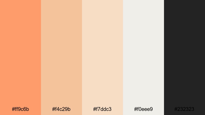
- HEX Codes: #ff9c6b, #f4c29b, #f7ddc3, #f0eee9, #232323
- Mood: Clean, calm, and contemporary with a warm accent.
- Use for: Perfect for modern channel branding, minimalist titles, and UI-style overlays in tutorials and product demos.
Coral Sand Minimal uses a single warm coral accent over soft sand neutrals and charcoal. It feels understated and modern, great for creators who want to look professional but still friendly.
Use the light neutrals as your main canvas for titles, screen recordings, and product shots, while the coral orange highlights buttons, progress bars, and key terms. On thumbnails, a mostly neutral layout with one strong coral block or circle behind your subject looks clean and very clickable.
Coral Charcoal Contrast
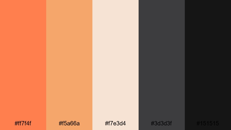
- HEX Codes: #ff7f4f, #f5a66a, #f7e3d4, #3d3d3f, #151515
- Mood: Sophisticated yet bold with sharp, modern contrast.
- Use for: Use for tech reviews, cinematic titles, and logo animations where you want a premium, design-forward feel.
Coral Charcoal Contrast balances rich coral orange against layered charcoals and soft beige, creating a sleek and cinematic feel. It combines the energy of coral with the seriousness of dark neutrals.
Use charcoal as the base for hero titles, device mockups, or talking-head frames, then place coral accents on buttons, icons, and logo reveals. This palette works especially well in YouTube tech thumbnails and product reviews where you want to stand out from typical blue-heavy tech palettes.
Muted Coral Interface
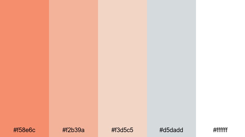
- HEX Codes: #f58e6c, #f2b39a, #f3d5c5, #d5dadd, #ffffff
- Mood: Balanced, airy, and professional with a friendly warmth.
- Use for: Great for lower thirds, app-style overlays, and explainer videos needing clean UX-inspired colors.
Muted Coral Interface softens coral into a more pastel, UI-friendly set of tones, paired with cool grays and white. The result is clean and readable, ideal for tutorials or SaaS explainers.
Use white and light gray for backgrounds and info cards, then use the muted coral shades for buttons, tags, and highlight boxes behind key text. On thumbnails, this palette can mimic a clean app UI, with coral used to frame your face or spotlight a feature.
Coral Grid Studio
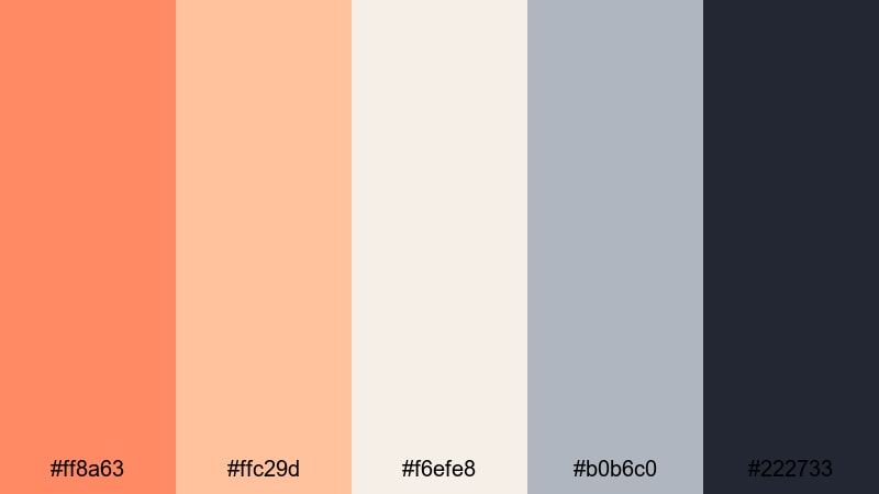
- HEX Codes: #ff8a63, #ffc29d, #f6efe8, #b0b6c0, #222733
- Mood: Creative, structured, and studio-chic.
- Use for: Ideal for design breakdowns, editing tutorials, and channel rebrands that need a polished but approachable identity.
Coral Grid Studio combines studio neutrals and slate blue-gray with coral accents, giving your layouts a structured, design-studio vibe. It feels organized yet approachable, perfect for educational or design-oriented channels.
Use the darker blue-gray and charcoal tones for backgrounds and grid lines, with coral as the highlight for selected layers, callouts, or section titles. This palette works beautifully for motion graphics, before/after design breakdowns, and branding-focused thumbnails.
Sunset & Beachy Coral Orange Palettes
Sunset Coral Horizon
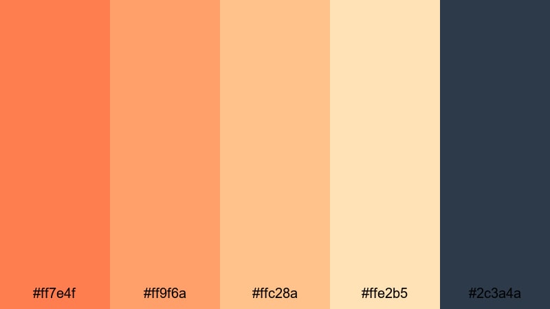
- HEX Codes: #ff7e4f, #ff9f6a, #ffc28a, #ffe2b5, #2c3a4a
- Mood: Serene, cinematic, and expansive like an endless horizon.
- Use for: Use for cinematic travel sequences, drone shots, and time-lapse sunsets to enhance natural warmth.
Sunset Coral Horizon stacks warm coral oranges and sandy golds over a twilight navy, echoing the gradient of a seaside sunset. It instantly makes wide shots and landscapes feel more cinematic.
Use the navy as a base for titles, captions, and location tags over your travel B-roll. Let the coral and gold mimic the sky in your graphics, whether as gradient overlays, lower-third backgrounds, or thumbnail frames around silhouetted subjects.
Beach Bonfire Coral

- HEX Codes: #ff7643, #ffae6f, #ffe0af, #4f6f6c, #1c2526
- Mood: Cozy, adventurous, and nostalgic like a night by the waves.
- Use for: Perfect for surf vlogs, camping trips, and moody evening recaps around the fire.
Beach Bonfire Coral contrasts glowing coral flames and toasted sands with cool sea greens and deep night tones. It captures the feeling of late-night stories around a fire.
Use the darker greens and charcoal as backgrounds for time stamps, maps, and subtitles, with coral orange used to highlight sparks, transitions, and important callouts. Thumbnails with a dark sea-green base and warm coral text immediately signal a cozy, night-time adventure.
Golden Tide Coral
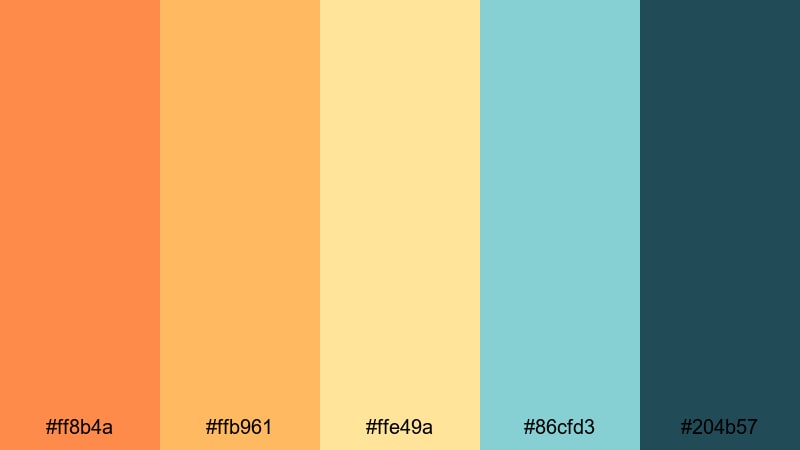
- HEX Codes: #ff8b4a, #ffb961, #ffe49a, #86cfd3, #204b57
- Mood: Uplifting, breezy, and sun-washed like golden tides.
- Use for: Great for beach holidays, resort promos, and upbeat travel reels with lots of sky and water shots.
Golden Tide Coral mixes sunlit coral orange and honey gold with seafoam teal and deep surf blue. It is bright, breezy, and perfect for vacations, resorts, and island content.
Use the teal and blue as backgrounds for pricing cards, travel tips, or itinerary overlays, then highlight key words and icons in coral and gold. On thumbnails, a blue or teal sky with coral typography and gold accent lines feels fresh and highly clickable.
Tips for Creating Coral Orange Color Palettes
When you build your own coral orange color combinations for video and design, think about balance, contrast, and how your colors will look on different screens and in small thumbnail sizes.
- Pair coral orange with a grounding neutral (white, beige, charcoal, or navy) so your designs do not feel too loud or washed out.
- Always test text contrast: use dark text on light coral backgrounds or light text on dark accents so titles stay readable on phones.
- Use cooler companions like teal, blue, or slate gray to stop coral orange from feeling overly warm, especially in long-form videos.
- Keep 1 or 2 key accent colors and let the rest of the palette be supporting neutrals to avoid a cluttered look in thumbnails and overlays.
- Match your palette to your footage: push coral hues if your scenes already have warm light, or lean more neutral if your footage is very colorful.
- Stay consistent across platforms: reuse the same coral HEX codes for your logo, lower thirds, end screens, and social cover images to build brand recognition.
- For vlog channels, create a light and dark variation of your coral palette so you have options that work on both bright daytime and moody night shots.
- Export a few frames from your edit and check them on mobile in YouTube or Instagram mockups to be sure your coral accents still pop at small sizes.
Coral orange is a powerful way to shape how your videos feel: soft and romantic, bold and energetic, minimal and modern, or sun-drenched and beachy. With the right palette, your thumbnails, intros, and overlays can instantly communicate your channel identity before viewers even hit play.
Use these 15 coral orange color palettes and HEX codes as ready-made starting points, then refine them inside Filmora to match your own footage, lighting, and niche. When you keep your color story consistent from thumbnail to end screen, your channel looks more professional and more memorable.
Open Filmora, drop in your clips, and start experimenting with these coral orange combinations in your titles, graphics, and color grading. Small color tweaks can transform everyday footage into a cohesive, branded visual experience.
secure downloadNext: Pink Teal Color Palette
