
 100% Security Verified | No Subscription Required | No Malware

Dark turquoise sits between deep teal and ocean blue, carrying both calm and energy in a single shade. It feels modern, cinematic, and slightly mysterious, which makes it a favorite for tech brands, travel creators, and aesthetic vloggers. Used well, a dark turquoise color palette can suggest trust, depth, and creativity without looking cold or clinical.
In video editing, branding, thumbnails, and motion graphics, dark turquoise works beautifully as a base color or as an accent against warm skin tones and neutral backgrounds. Below you will find 15 ready-made dark turquoise color palettes with HEX codes, tailored for creators and Filmora users who want consistent visuals across intros, titles, overlays, and entire edits.
In this article
Modern Dark Turquoise Color Palettes
Urban Neon Current
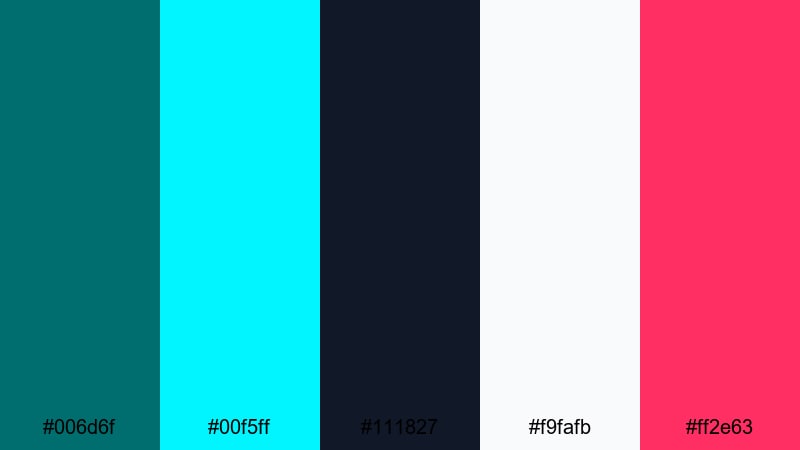
- HEX Codes: #006d6f, #00f5ff, #111827, #f9fafb, #ff2e63
- Mood: Electric and futuristic with a sleek city-at-night edge.
- Use for: Perfect for high-energy gaming intros, cyberpunk edits, and techy motion graphics.
This palette is built around a strong dark turquoise (#006d6f) anchored against charcoal navy (#111827), then supercharged with neon aqua (#00f5ff), crisp white (#f9fafb), and hot pink (#ff2e63). It feels like glowing billboards, RGB keyboards, and rainy city streets at midnight. The contrast between the deep base and the neon accents makes everything feel fast, digital, and high-stakes.
Use Urban Neon Current for YouTube gaming thumbnails, motion-graphic intros, glitch transitions, or tech review overlays. Let dark turquoise be the main background or button color, then use neon cyan and pink for titles, subscriber callouts, and UI-style frames. In Filmora, you can easily color-pick these HEX values for text and shapes so your entire edit feels like one cohesive, urban neon world.
Pro Tip: Build a Cinematic Dark Turquoise Neon Look in Filmora
To keep a neon dark turquoise style consistent, build one main look and apply it across every part of your edit. In Filmora, you can create a custom color preset where your dark turquoise shadows and neon accents are dialed in, then reuse it for intros, gameplay footage, B-roll, and end screens. This helps your channel feel instantly recognizable, even when you mix live footage, overlays, and screen captures.
Combine color grading with matching title templates and shape overlays in the same HEX codes from Urban Neon Current. Use #006d6f as your base for backgrounds and lower thirds, and reserve #00f5ff and #ff2e63 for key actions like Subscribe, New Video, or limited-time promotions. This simple hierarchy keeps your layout clean while still feeling intense and futuristic.
AI Color Palette
If you already have a reference image that nails this neon turquoise vibe, you can let Filmora do the heavy lifting. Filmora's AI Color Palette feature can analyze that frame and apply the same toning across your entire video or a sequence of clips, so every shot shares the same electric mood.
Import your favorite cyberpunk screenshot or thumbnail mockup, then use AI Color Palette to match your gameplay capture, talking head footage, and B-roll. This keeps skin tones natural while pushing backgrounds, shadows, and highlights toward the dark turquoise and neon hues of Urban Neon Current, so your video looks designed rather than accidental.
 secure download

HSL, Color Wheels & Curves
Once your base palette is in place, use Filmora's HSL sliders, color wheels, and curves to fine-tune the dark turquoise tones. For example, you can push cyans slightly toward green for a more teal, hacker-style interface, or lean them toward blue for a cooler sci-fi feel. Adjusting luminance in HSL lets you darken turquoise shadows while keeping neon accents bright and legible.
With color wheels and curves, you can warm up skin tones while leaving backgrounds in the dark turquoise range, or add a subtle S-curve to increase contrast for more cinematic thumbnails. If you want a deeper dive, check out Filmora's color correction tools to understand how these controls shape your final look.
secure download1000+ Video Filters & 3D LUTs
If you want to speed up your color workflow, you can start from Filmora's built-in looks and then nudge them toward dark turquoise. Filmora’s video filters and 3D LUTs make it easy to give your footage a consistent base grade, then you can refine the turquoise and neon accents with a few manual tweaks.
Apply a cinematic or cyberpunk-style LUT to unify contrast and saturation across all clips, then layer your custom dark turquoise elements on top. This approach works well for channels that publish frequently: your neon turquoise aesthetic stays intact while you spend less time manually color grading every new video.
secure downloadGlass UI Turquoise
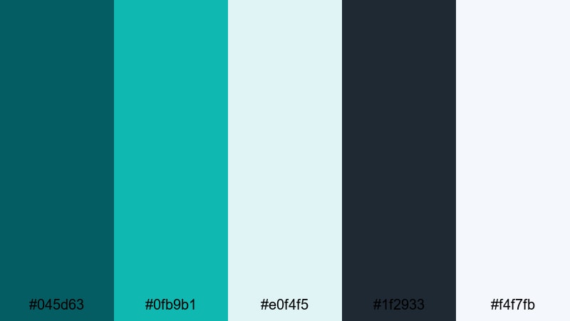
- HEX Codes: #045d63, #0fb9b1, #e0f4f5, #1f2933, #f4f7fb
- Mood: Clean, airy, and polished like a modern app interface.
- Use for: Ideal for sleek lower thirds, UI-style overlays, and software tutorial branding.
Glass UI Turquoise blends deep teal (#045d63) with a lighter, glassy teal (#0fb9b1) and plenty of soft off-whites (#e0f4f5, #f4f7fb). A charcoal navy (#1f2933) adds enough contrast for text and icons. The result is fresh and minimal, like a well-designed dashboard or mobile app.
This palette is perfect for tutorials, SaaS explainers, productivity content, and channel branding that needs to feel professional but not boring. In Filmora, you can use the darker tones for backgrounds and sidebars, the pale colors for panels and captions, and the teals as accent lines and buttons in call-to-action screens or chapter markers.
Digital Grid Surge
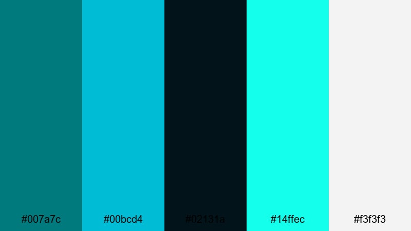
- HEX Codes: #007a7c, #00bcd4, #02131a, #14ffec, #f3f3f3
- Mood: High-contrast and energetic with a digital sci-fi vibe.
- Use for: Best for animated backgrounds, HUD elements, and dynamic title cards in tech reviews.
Digital Grid Surge leans into a crisp dark turquoise (#007a7c) set against almost-black navy (#02131a). Bright cyan (#00bcd4), neon mint (#14ffec), and soft white (#f3f3f3) create a strong contrast that feels like holograms, HUDs, and futuristic dashboards.
Use this palette for animated lower thirds, overlay grids, and kinetic titles in reviews, unboxings, or tech commentary videos. Dark turquoise can be your base line color for charts and icons, while neon accents highlight specs, ratings, or timestamps. In thumbnails, a dark background with bright cyan outlines and white text will pop even at small sizes.
Minimal Studio Teal
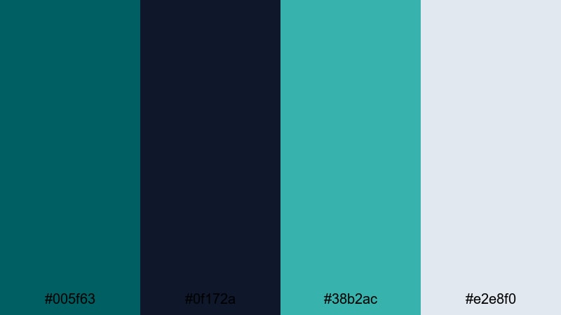
- HEX Codes: #005f63, #0f172a, #38b2ac, #e2e8f0
- Mood: Understated, modern, and design-forward.
- Use for: Use for branded intros, minimal title slates, and clean product explainer videos.
Minimal Studio Teal pairs a grounded dark turquoise (#005f63) with inky navy (#0f172a), a soft teal accent (#38b2ac), and cool gray (#e2e8f0). It feels calm, elegant, and intentional, like a curated studio set or a design portfolio.
This palette works well when you want your content to feel premium without being flashy. Use it for minimalist intros, typography-driven end screens, and product shots where the background stays subtle and the subject stands out. In Filmora, keep transitions clean, use simple shapes in these HEX codes, and let the color palette quietly carry your brand.
Coastal Dark Turquoise Color Palettes
Deep Reef Horizon
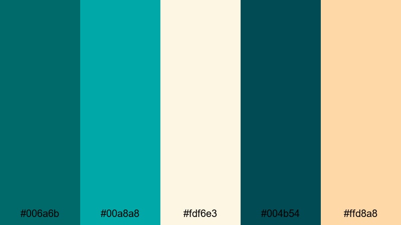
- HEX Codes: #006a6b, #00a8a8, #fdf6e3, #004b54, #ffd8a8
- Mood: Adventurous and tranquil, like an ocean expedition at golden hour.
- Use for: Great for travel vlogs, underwater footage, and nature documentaries with a warm coastal feel.
Deep Reef Horizon mixes rich dark turquoise (#006a6b) and teal (#00a8a8) with sandy ivory (#fdf6e3), deep sea green (#004b54), and soft peach (#ffd8a8). The palette feels like a dive trip at sunset, balancing cool water tones with a warm sky glow.
Use this for coastal travel vlogs, snorkeling or diving sequences, sailing content, or any B-roll that features water. Dark turquoise can tint your shadows and midtones, while the warm peach and ivory are perfect for titles, lower thirds, and map graphics. This combination gives your footage a gentle cinematic look without heavy color filters.
Tidepool Reflections
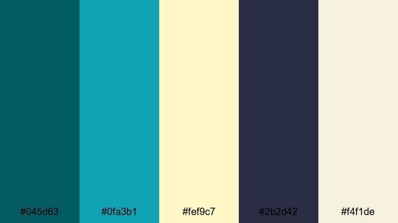
- HEX Codes: #045d63, #0fa3b1, #fef9c7, #2b2d42, #f4f1de
- Mood: Calm, reflective, and slightly nostalgic.
- Use for: Perfect for reflective travel edits, slow beach montages, and dreamy lifestyle reels.
Tidepool Reflections sets dark turquoise (#045d63) and sea teal (#0fa3b1) against creamy sand tones (#fef9c7, #f4f1de) with a moody slate accent (#2b2d42). The vibe is calm and emotional, like walking along the shore at the end of the day.
In practice, this palette is great for slowed-down B-roll, voiceover storytelling, and soft lifestyle content. Use the lighter tones for overlays, text boxes, and borders; let dark turquoise shape the water and shadows. The slate color is ideal for readable body text in captions and on-screen quotes.
Seagrass Sunrise
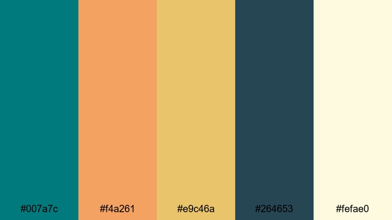
- HEX Codes: #007a7c, #f4a261, #e9c46a, #264653, #fefae0
- Mood: Warm, optimistic, and coastal-boho.
- Use for: Use for outdoor lifestyle vlogs, sunrise timelapses, and chilled surf edits.
Seagrass Sunrise combines strong dark turquoise (#007a7c) with sunlit amber (#f4a261), golden sand (#e9c46a), deep blue-green shadows (#264653), and a soft cream highlight (#fefae0). It feels carefree and summery, like early-morning surf or beach yoga.
Use this palette for upbeat outdoor vlogs, vanlife edits, or boho-inspired Instagram Reels. Dark turquoise works well for logo marks, straplines, and chapter titles, while the warm yellows and ambers are perfect for gradient overlays and light leaks. Together they create a bright but grounded look that suits natural light footage.
Lagoon Mist Drift
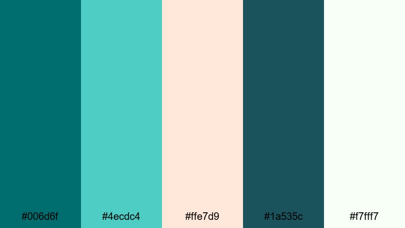
- HEX Codes: #006d6f, #4ecdc4, #ffe7d9, #1a535c, #f7fff7
- Mood: Soft, breezy, and slightly dreamy.
- Use for: Ideal for spa promos, wellness content, and relaxing B-roll overlays.
Lagoon Mist Drift uses a deep lagoon turquoise (#006d6f) and teal navy (#1a535c) softened by fresh aqua (#4ecdc4), blush sand (#ffe7d9), and hazy white (#f7fff7). The palette feels light, airy, and peaceful.
It is a natural fit for wellness videos, spa ads, ASMR channels, and slow, meditative montages. In your edits, keep typography soft and rounded, apply gentle transitions, and use the lighter tones as semi-transparent panels over your footage. Dark turquoise can define the brand while the pastels keep the overall look soothing.
Moody Dark Turquoise Color Palettes
Nocturne Turquoise Glow
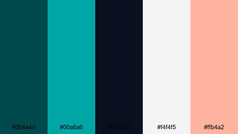
- HEX Codes: #004a4d, #00a6a6, #0b1020, #f4f4f5, #ffb4a2
- Mood: Mysterious yet softly romantic, like city lights reflecting on water at night.
- Use for: Use in cinematic trailers, lyric videos, and emotional storytelling edits.
Nocturne Turquoise Glow pairs inky turquoise (#004a4d) and deep navy (#0b1020) with a softer teal accent (#00a6a6), pale neutral (#f4f4f5), and gentle peach (#ffb4a2). It is moody and atmospheric, but with a romantic softness.
This palette is ideal for music videos, lyric animations, emotional vlogs, or narrative shorts. Use the dark tones as your main backdrop, then bring attention to key words, titles, or faces with the peach and teal highlights. In thumbnails, a dark background with a subtle turquoise vignette and peach-toned subject can feel both dramatic and inviting.
Inkstone Teal Noir
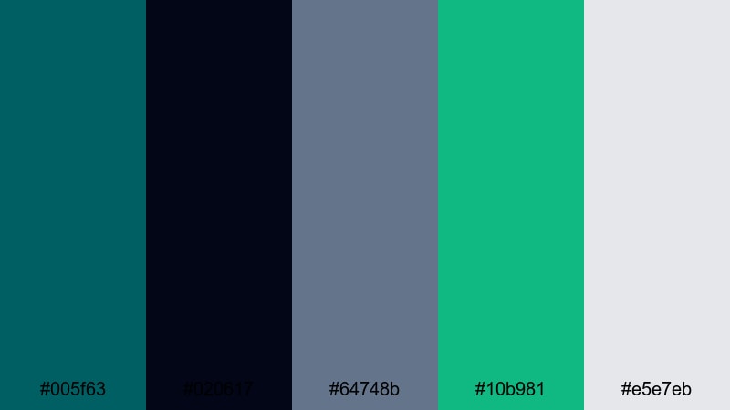
- HEX Codes: #005f63, #020617, #64748b, #10b981, #e5e7eb
- Mood: Cinematic, serious, and slightly edgy.
- Use for: Great for tech noir edits, documentary titles, and stylish commentary videos.
Inkstone Teal Noir anchors dark turquoise (#005f63) against near-black ink (#020617), soft slate blue (#64748b), emerald mint (#10b981), and foggy gray (#e5e7eb). It feels like a modern noir film adapted for screens and streams.
Use this palette for thoughtful commentary, documentary intros, or tech and security topics. The very dark tones are perfect for letterboxed frames and interview backgrounds, while the mint and slate can highlight on-screen stats and chapter headings. Keep motion graphics slow and deliberate to match the serious mood.
Storm Harbor Lights
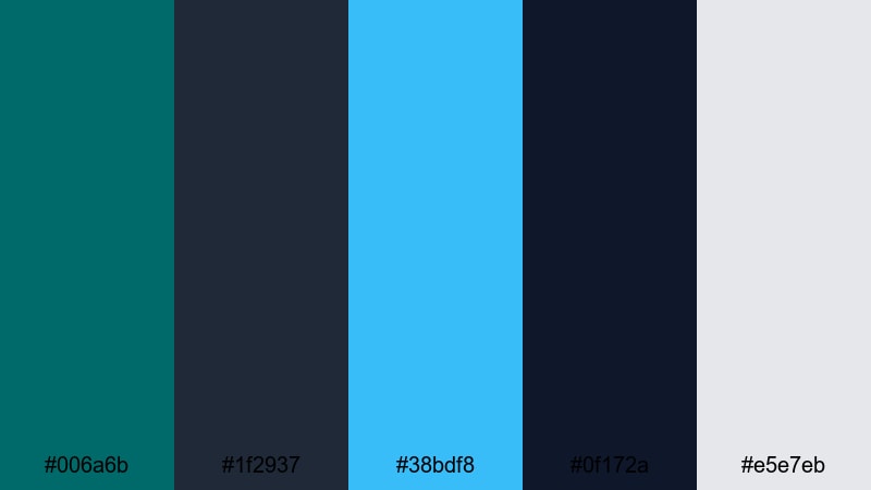
- HEX Codes: #006a6b, #1f2937, #38bdf8, #0f172a, #e5e7eb
- Mood: Dramatic, stormy, and atmospheric with bright highlights.
- Use for: Perfect for weather B-roll, cinematic B-roll sequences, and intense narrative cuts.
Storm Harbor Lights mixes dark turquoise (#006a6b) with stormy charcoals (#1f2937, #0f172a), a bright sky blue highlight (#38bdf8), and soft gray (#e5e7eb). It creates a sense of tension and clarity at the same time, like lightning breaking through heavy clouds.
This palette suits dramatic B-roll, city-in-the-rain montages, or high-stakes storytelling. Use dark turquoise and charcoal to frame the scene and add vignettes, then deploy the bright blue for key callouts, location labels, or map paths. In titles, a mix of white and sky blue over darker backgrounds keeps everything readable and cinematic.
Cyber Dusk Mirage
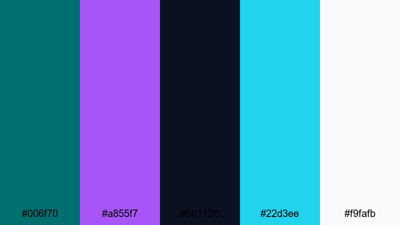
- HEX Codes: #006f70, #a855f7, #0b1120, #22d3ee, #f9fafb
- Mood: Moody and futuristic with a neon fantasy edge.
- Use for: Use for sci-fi intros, music visualizers, and stylized montage sequences.
Cyber Dusk Mirage combines dark turquoise (#006f70) and deep midnight blue (#0b1120) with violet neon (#a855f7), bright cyan (#22d3ee), and clean white (#f9fafb). This swaps the classic teal-and-orange look for a cooler, fantasy cyberpunk palette.
Use it for sci-fi channel branding, synthwave edits, or animated visualizers. Dark turquoise and midnight blue build the base; violet and cyan create glowing edges, lines, and text. In Filmora, layer light leaks, blur, and glow effects using these colors to give your video a dreamy, otherworldly atmosphere.
Playful Dark Turquoise Color Palettes
Candy Arcade Turquoise
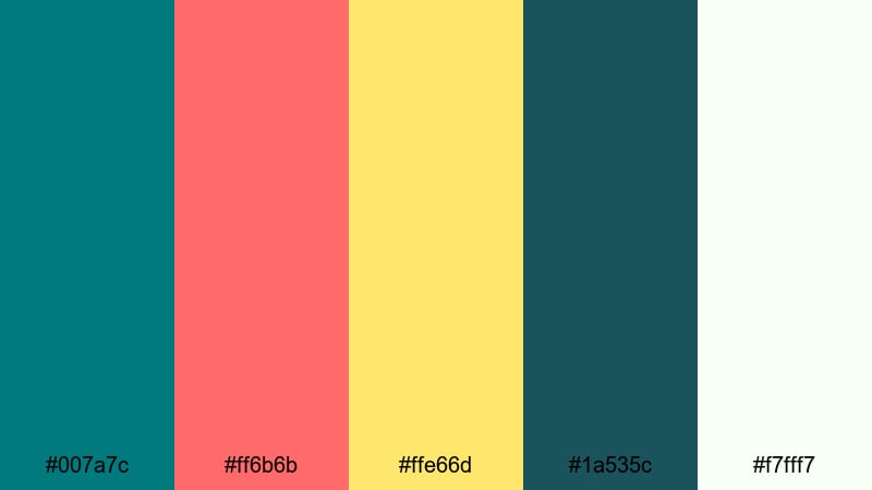
- HEX Codes: #007a7c, #ff6b6b, #ffe66d, #1a535c, #f7fff7
- Mood: Playful, bold, and candy-bright with a retro arcade feel.
- Use for: Great for gaming channels, pop edits, and energetic YouTube thumbnails.
Candy Arcade Turquoise pits bold dark turquoise (#007a7c) and deep teal (#1a535c) against bubblegum red (#ff6b6b), sunny yellow (#ffe66d), and soft white (#f7fff7). It instantly feels fun, nostalgic, and full of motion, like classic arcade screens and pinball machines.
Use this palette for playful gaming intros, jump-cut vlogs, or pop culture edits. Let dark turquoise handle your backgrounds and buttons, while red and yellow grab attention for scores, reactions, and Subscribe CTAs. For thumbnails, placing a subject cutout over a turquoise backdrop with bright sticker-style text in red or yellow will stand out in any feed.
Retro Pool Party
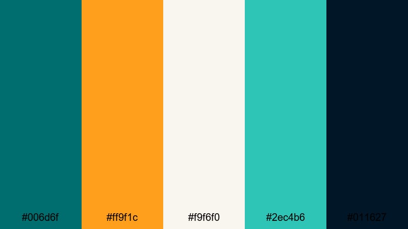
- HEX Codes: #006d6f, #ff9f1c, #f9f6f0, #2ec4b6, #011627
- Mood: Nostalgic, summery, and full of personality.
- Use for: Ideal for retro vlog aesthetics, lifestyle edits, and playful title screens.
Retro Pool Party mixes dark pool turquoise (#006d6f) and teal (#2ec4b6) with warm orange (#ff9f1c), creamy off-white (#f9f6f0), and a deep navy base (#011627). The result feels like vintage vacation posters updated for social media.
This palette is ideal for summer vlogs, throwback edits, and lifestyle content with a hint of nostalgia. Use navy and turquoise as your main backgrounds, then add orange and cream for titles, badges, and lower thirds. Grain, film-burn overlays, and retro fonts in Filmora will complete the look.
Pop Vlog Splash
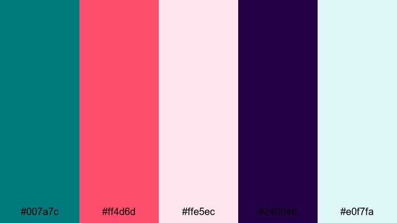
- HEX Codes: #007a7c, #ff4d6d, #ffe5ec, #240046, #e0f7fa
- Mood: Fresh, youthful, and social-media ready.
- Use for: Use for vlogs, shorts, and Reels where you want bright, clickable visuals.
Pop Vlog Splash centers dark turquoise (#007a7c) around juicy pink (#ff4d6d), soft blush (#ffe5ec), deep purple (#240046), and fresh aqua (#e0f7fa). It feels trendy and energetic, perfect for creators targeting YouTube, TikTok, or Instagram.
Use this palette to brand your vlog intros, title cards, and transitions. Dark turquoise can be your recurring accent in frames, borders, and icons, while pink and purple make your text and stickers pop. In Shorts or Reels, bold color blocks in these HEX codes behind captions will keep your content legible and on-brand, even when watched without sound.
Tips for Creating Dark Turquoise Color Palettes
Dark turquoise is versatile, but it needs the right supporting colors to shine on video and in design. These tips will help you build palettes that look great on screens, stay readable, and match your brand or footage.
- Pair dark turquoise with at least one light neutral (off-white, pale gray, or cream) for readable text and clean space in thumbnails and overlays.
- Use a warm accent color (peach, coral, amber) to balance the coolness of turquoise, especially in vlogs or videos where you want to keep skin tones flattering.
- Limit strong accent colors to one or two per palette; let dark turquoise and neutrals handle most of the frame so your calls-to-action stand out.
- Check contrast on mobile by zooming out on your thumbnail; if text over dark turquoise is hard to read, lighten the text or add a semi-transparent panel behind it.
- Match your grading to your palette: if your brand uses dark turquoise heavily, push shadows and midtones slightly into teal while keeping highlights more neutral.
- Keep branding consistent: reuse the same HEX codes for titles, lower thirds, and end screens across multiple videos so viewers recognize your style immediately.
- Adapt to footage: for beach or travel clips, let real-world blues and greens lead, then nudge them toward your chosen turquoise range in Filmora.
- Create multiple variations: build a primary dark turquoise palette for your main edits and a softer or bolder version for stories, shorts, or seasonal campaigns.
Dark turquoise can feel modern, coastal, or cinematic depending on what you pair it with. Whether you lean into neon sci-fi tones, soft seaside hues, or playful retro brights, these palettes give you ready-made HEX codes you can drop straight into Filmora for titles, overlays, and color grading.
Try a few of these combinations on your next intro, thumbnail, or full edit. Save your favorite turquoise looks as presets in Filmora so every new project starts with a strong, consistent color identity that matches your channel or brand.
Once you are comfortable with these palettes, experiment by blending dark turquoise with other aesthetics, like Dark Academia, for moody storytelling or creative edits.
secure download