
 100% Security Verified | No Subscription Required | No Malware


 ChatGPT
 Perplexity
 Gemini
 Claude
 Grok
Grok
Fern Green sits between muted forest tones and lively botanical hues, so it instantly feels natural, grounded, and trustworthy. In color psychology, this shade suggests growth, balance, and calm energy, which is why it works so well for brands that want to feel eco friendly, mindful, or down to earth. On screen, Fern Green can soften harsh lighting, balance bold accent colors, and give your content a fresh, organic foundation.
For creators and Filmora users, Fern Green is a powerful base color for YouTube thumbnails, intros, lower thirds, logo stings, and color grading. Below are 15 Fern Green color palettes with HEX codes you can plug directly into your branding, vlog aesthetics, and video edits. Whether you are designing social posts, building a channel look, or color matching your B roll, these ready made combinations will keep your visuals cohesive.
In this article
Earthy & Natural Fern Green Color Palettes
Mossy Forest Escape
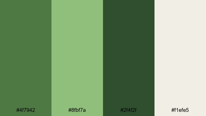
- HEX Codes: #4f7942, #8fbf7a, #2f4f2f, #f1efe5
- Mood: Grounded, organic, and quietly adventurous.
- Use for: Use this palette for outdoor travel vlogs, hiking montages, and nature documentary intros.
This palette layers deep Fern Green with soft moss, dark undergrowth, and a warm off white highlight. It feels like walking through a shaded forest trail where the light filters in softly through the leaves. The combination is calm but not flat, with enough contrast to feel alive and exploratory.
Use Mossy Forest Escape for travel vlog titles, on screen maps, and chapter cards that follow a hiking route or camping story. In YouTube thumbnails, let the off white hold text while the deeper greens frame your subject. In Filmora, you can use these HEX codes for title backgrounds, lower thirds, and subtle color grading to give all your footage a consistent, earthy Fern Green wash.
Pro Tip: Build Cinematic Fern Green Forest Scenes in Filmora
When you edit with a nature heavy palette like Mossy Forest Escape, consistency matters more than intensity. In Filmora, sample the key greens from your favorite frame and reuse them across titles, overlays, and end screens so your viewers feel like they stay inside the same forest from intro to outro.
Create a simple brand kit inside your project: set the Fern Green as your primary accent for text highlights and progress bars, use the dark green for lower thirds, and reserve the off white for backgrounds and clean typography. This keeps hiking B roll, drone shots, talking head segments, and shorts feeling like part of one visual story.
AI Color Palette
Instead of manually matching every clip, you can use Filmora to transfer the Mossy Forest Escape look across your entire timeline. Capture a still frame that shows your ideal Fern Green balance, or import a custom palette image, then let Filmora analyze it and spread that color style to the rest of your footage.
Filmora's AI Color Palette feature helps you keep your greens cohesive, whether you filmed at golden hour, under cloudy skies, or with a mix of cameras. Apply the palette once, then fine tune intensity so the effect feels cinematic, not over processed.
 secure download

HSL, Color Wheels & Curves
Once your base colors match, you can refine the Fern Green tones using Filmora's HSL sliders, color wheels, and curves. Lighten the mossy midtones to add softness, deepen the forest shadows for more drama, or shift the yellows slightly toward green so foliage feels lush instead of dusty.
If you want guidance, you can follow this Filmora color grading tutorial to see how HSL and curves shape mood in real scenes. A gentle S curve in the greens and a cool push in the shadows can instantly turn everyday woodland footage into a cinematic Fern Green grade.
secure download1000+ Video Filters & 3D LUTs
If you want a quick stylized Fern Green look, start with Filmora's built in filters and LUTs. Combine a soft film LUT with your Mossy Forest Escape colors to add grain and subtle contrast, or pick a teal and orange style and dial it down to keep greens natural while warming up skin tones.
Filmora's video filters and 3D LUTs make it easy to test different moods without re grading from scratch. Try a matte filter for calm, slow living vlogs or a punchier LUT for energetic trail montages, always anchored by your Fern Green palette.
secure downloadRustic Cabin Morning
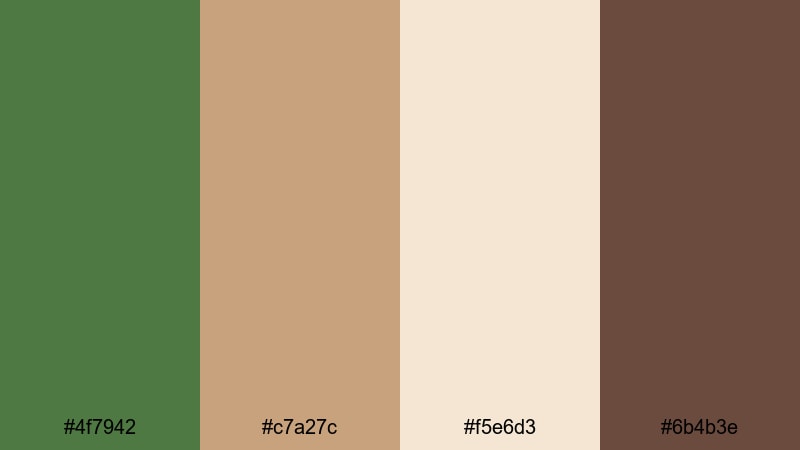
- HEX Codes: #4f7942, #c7a27c, #f5e6d3, #6b4b3e
- Mood: Cozy, nostalgic, and storytelling driven.
- Use for: Ideal for slow living vlogs, homestead content, and warm lifestyle b roll sequences.
Rustic Cabin Morning pairs Fern Green with caramel browns, milky cream, and a deeper wood tone. The combination feels like warm coffee, wool blankets, and sunbeams through a log cabin window. It is perfect when you want your video to feel intimate and lived in, not overly polished.
Use the cream for background cards and subtitles, let the browns frame products or props, and keep Fern Green as your accent on buttons, icons, or subtle overlays. In thumbnails and intros, this palette will signal warmth and authenticity, ideal for channels about homesteading, crafts, baking, or rural living.
Woodland Trail Adventure

- HEX Codes: #355e3b, #4f7942, #9ccfa3, #f0f5f0
- Mood: Fresh, energetic, and outdoorsy.
- Use for: Great for adventure travel intros, trail running reels, and scenic drone shots.
Woodland Trail Adventure stacks pine green, classic Fern Green, bright leafy green, and a crisp off white highlight. It feels clean and invigorating, like cool air and fast movement through the trees. The lighter green and white give plenty of space for text while the darker tones add depth.
Use this palette for sporty overlays, GPS style maps, lower thirds with run stats, and dynamic chapter titles. In Filmora, you can color pick the bright green for motion graphics elements and let the pine tones influence your midtones and shadows, creating a cohesive outdoorsy look across reels, Shorts, and full length edits.
Garden Herb Market

- HEX Codes: #4f7942, #b5d99c, #ffe6b3, #f7f2ea
- Mood: Wholesome, fresh, and farmer market inspired.
- Use for: Perfect for food channels, recipe shorts, and sustainable lifestyle branding.
Garden Herb Market combines Fern Green with light herb greens, soft sunshine yellow, and a creamy neutral. It feels bright and nutritious, ideal for content about fresh ingredients, organic recipes, or eco friendly habits.
Use the yellow for price tags, callouts, and playful badges, while Fern Green anchors logos, tags, and lower thirds. This palette shines in cooking shorts, ingredient close ups, and thumbnail designs where you want to highlight freshness without overwhelming the viewer.
Modern & Minimal Fern Green Color Palettes
Clean Studio Green
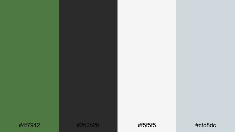
- HEX Codes: #4f7942, #2b2b2b, #f5f5f5, #cfd8dc
- Mood: Minimal, modern, and design forward.
- Use for: Use for tech reviews, clean product demos, and minimalist channel branding.
Clean Studio Green pairs Fern Green with charcoal gray, near white, and a soft cool gray accent. It feels like a clean studio backdrop where the product is the hero. The palette is neutral enough for tech and design content but still distinctive thanks to the green accent.
Use white and light gray as your primary canvas for titles and UI mockups, then apply Fern Green sparingly to draw attention to CTAs, timelines, and important stats. In thumbnails, a simple product cutout on a light background with subtle Fern Green borders looks professional and highly clickable.
Urban Loft Greens
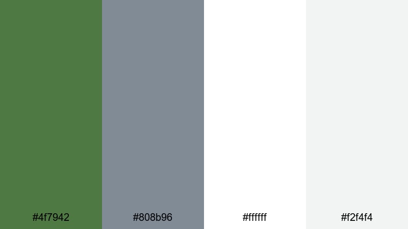
- HEX Codes: #4f7942, #808b96, #ffffff, #f2f4f4
- Mood: Contemporary, airy, and understated.
- Use for: Ideal for interior tours, architecture edits, and modern portfolio reels.
Urban Loft Greens blends Fern Green with cool gray, pure white, and a soft off white. The result feels bright, urban, and quietly stylish, like a plant filled loft with concrete floors and large windows.
Use white and off white to showcase photography or architecture footage, keep gray for subtle text, and let Fern Green highlight key details like dimensions, prices, or portfolio sections. This palette keeps interiors looking editorial, making it perfect for real estate tours, design breakdowns, and minimalist portfolios.
Fresh Dashboard UI

- HEX Codes: #4f7942, #00b894, #ecf0f1, #2d3436, #ffffff
- Mood: Clean, techy, and data driven.
- Use for: Great for motion graphics, dashboards, explainer videos, and app demos.
Fresh Dashboard UI combines Fern Green with bright teal, soft gray, dark slate, and white. It feels sharp and digital, ideal for analytics dashboards, product explainers, or UI/UX case studies.
Let white and light gray dominate your charts, while Fern Green and teal highlight progress bars, KPIs, and key numbers. In Filmora, this palette works beautifully with animated infographics, app walkthroughs, and split screen layouts that mix screen recordings with talking head commentary.
Neutral Workspace Glow

- HEX Codes: #4f7942, #e0d7c6, #f8f5ef, #a89f91
- Mood: Productive, calm, and slightly luxe.
- Use for: Use for productivity vlogs, study with me videos, and personal brand intros.
Neutral Workspace Glow fuses Fern Green with warm beiges and taupes. It feels like a clean desk with soft afternoon light, perfect for productivity and creator lifestyle content.
Use the light neutrals for backgrounds and notebook style overlays, while Fern Green appears in checklists, progress markers, and brand logos. This palette keeps your workspace footage calm and inviting, encouraging viewers to stay focused along with you.
Soft & Calming Fern Green Color Palettes
Misty Fern Dawn

- HEX Codes: #4f7942, #a1c7a3, #dde8dd, #f8faf8
- Mood: Gentle, peaceful, and slow paced.
- Use for: Perfect for meditation content, relaxing b roll, and ambient music visuals.
Misty Fern Dawn softens Fern Green with light sage, misty gray green, and almost white highlights. It feels like early morning air and quiet movement, great for videos that invite deep breaths and slow scrolling.
Use the lightest shades as expansive negative space for quotes or affirmations, with Fern Green reserved for subtle logos, progress bars, or timestamps. This palette suits meditation playlists, nature ASMR, and calming montage edits.
Serene Spa Retreat
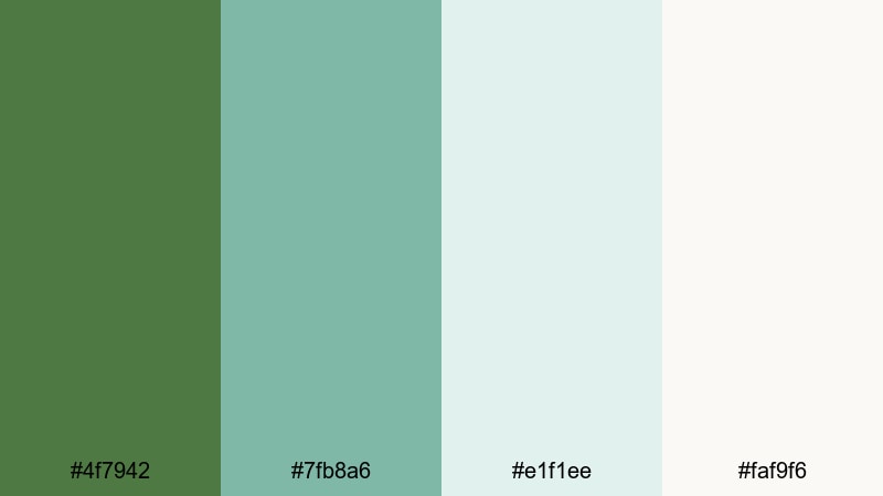
- HEX Codes: #4f7942, #7fb8a6, #e1f1ee, #faf9f6
- Mood: Spa like, soothing, and restorative.
- Use for: Use for wellness brands, spa promos, self care reels, and ASMR backgrounds.
Serene Spa Retreat pairs Fern Green with soft aqua, pale seafoam, and creamy white. The palette feels clean, refreshing, and slightly luxurious, like a high end spa with plants and natural light.
Use the aqua and seafoam for overlay panels, product info blocks, and price lists, while Fern Green anchors logos and CTAs. In Filmora, this palette works beautifully with slow motion water shots, skincare routines, and minimal typography set over soft b roll.
Rainy Window Greens
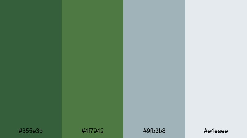
- HEX Codes: #355e3b, #4f7942, #9fb3b8, #e4eaee
- Mood: Melancholic, cinematic, and reflective.
- Use for: Great for mellow vlogs, reflective storytelling, and lo fi study edits.
Rainy Window Greens combines dark and mid Fern Greens with muted blue gray and a light rainy sky tone. It feels introspective and cinematic, like writing in a notebook while raindrops streak down the glass.
Use the cooler grays for title cards and chapter markers, with Fern Green shading your footage through gentle grading. This palette is ideal for moody day in the life vlogs, lo fi beats animations, and storytelling shorts that lean into nostalgia.
Gentle Study Corner

- HEX Codes: #4f7942, #f7f4ea, #d8cbb5, #b9d3b0
- Mood: Comforting, focused, and homely.
- Use for: Ideal for study with me videos, plan with me content, and cozy writing sessions.
Gentle Study Corner mixes Fern Green with creamy off white, warm beige, and soft sage. It feels like a tidy desk with plants, notes, and warm light, built for long focus sessions.
Use the light tones as notebook style backgrounds with lined or grid overlays, then let Fern Green mark headings, timers, or to do list checkmarks. In thumbnails and overlays, this palette instantly signals cozy productivity and gentle motivation.
Bold & Dramatic Fern Green Color Palettes
Night Jungle Neon
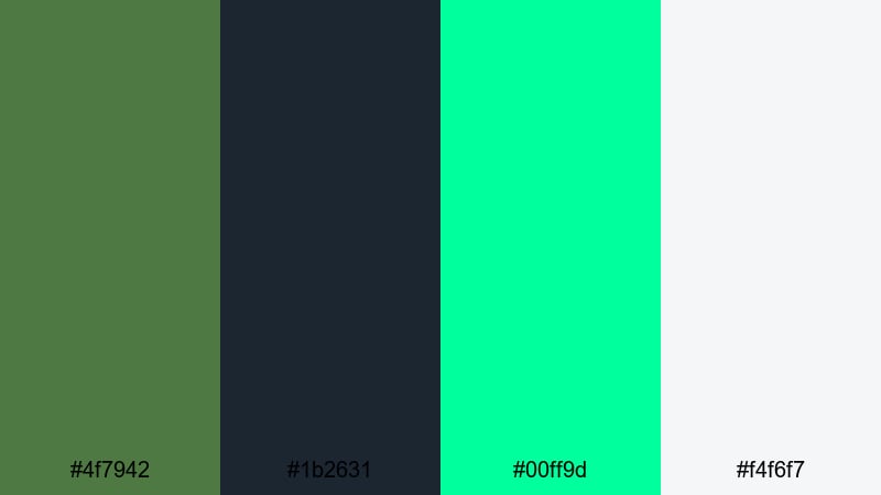
- HEX Codes: #4f7942, #1b2631, #00ff9d, #f4f6f7
- Mood: Edgy, electric, and cinematic.
- Use for: Use for music videos, gaming intros, and bold motion titles that need high contrast energy.
Night Jungle Neon throws deep Fern Green and inky navy against a glowing neon mint and a soft light neutral. It feels like a cyberpunk jungle or a nightclub in the forest, perfect when you want intensity and contrast.
Use the dark tones as backgrounds for titles and motion graphics, then let neon mint light up outlines, strokes, and glitch effects. In Filmora, this palette works well with animated titles, beat synced cuts, and gaming overlays that lean into a futuristic jungle vibe.
Cinematic Shadow Greens
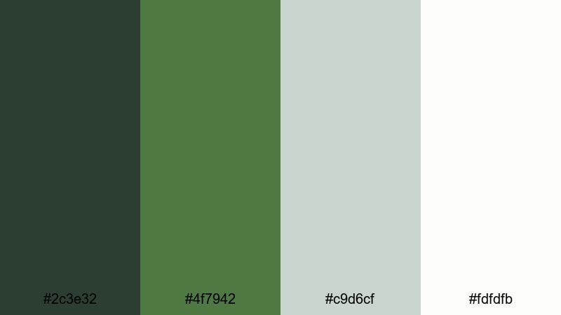
- HEX Codes: #2c3e32, #4f7942, #c9d6cf, #fdfdfb
- Mood: Moody, polished, and filmic.
- Use for: Perfect for short films, narrative trailers, and dramatic storytelling edits.
Cinematic Shadow Greens layers a dark, almost black green with Fern Green mids and soft highlight tones. It feels like a modern film grade, subtle but emotive, with plenty of room for text and faces to stand out.
Use the darker green in your shadows through color grading, and reserve the light neutrals for title cards and end screens. This palette fits narrative shorts, trailers, and cinematic b roll where you want depth without oversaturated color.
Festival Title Pop
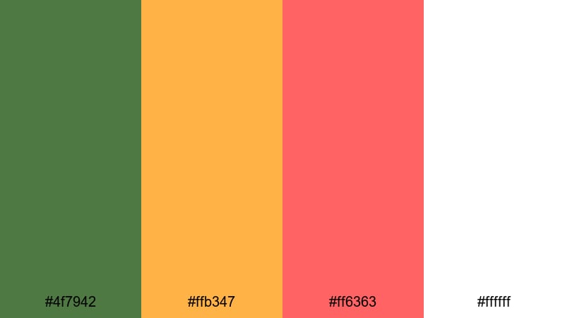
- HEX Codes: #4f7942, #ffb347, #ff6363, #ffffff
- Mood: Playful, high energy, and attention grabbing.
- Use for: Great for event promos, festival recaps, and bold YouTube thumbnails.
Festival Title Pop combines Fern Green with mango orange, bright coral, and pure white. It feels loud, fun, and ready for crowds, making it ideal for concerts, fairs, travel festivals, and energetic channels.
Use white as the base for bold, thick typography, and let orange and coral highlight dates, places, and special offers. Fern Green provides a recognizable brand accent that ties all your posters, thumbnails, and title screens together without fighting the vivid warm tones.
Tips for Creating Fern Green Color Palettes
Fern Green is flexible enough to pair with neutrals, pastels, neons, and warm accents, but it looks best when you plan around readability and mood. Use these tips to build palettes that work both in design tools and inside Filmora.
- Decide on the role of Fern Green first: main background, accent color, or grade tint. Then choose supporting colors that do not compete with that role.
- Always test text contrast on mobile. If Fern Green is your background, set headings in white or very dark gray and avoid thin fonts for small thumbnails.
- Pair Fern Green with warm neutrals (beige, cream, taupe) for cozy and lifestyle content, and with cool grays or aquas for clean, modern branding.
- Limit yourself to one strong accent color alongside Fern Green (such as coral or neon mint) to prevent your palettes from feeling chaotic on screen.
- Use Filmora to sample exact HEX codes from your design mockups or brand kit so overlays, lower thirds, and graded footage all share the same Fern Green tone.
- Match your grading to your palette: if you use soft, pastel greens in graphics, keep your footage gentle and low contrast; if your palette is bold, push contrast and saturation a bit higher.
- Check your palettes in both light and dark modes by previewing them on pale and dark backgrounds. This is especially important for UI demos and dashboard explainers.
- Create reusable presets in Filmora (color presets, title templates) using your chosen Fern Green palette so every new video on your channel feels on brand.
Fern Green can be calm, bold, modern, or nostalgic depending on how you combine it with neutrals, warm tones, and highlight colors. With the right palette, your videos and designs gain a clear visual identity that viewers will recognize in their feed.
Use these 15 palettes as starting points: plug the HEX codes into your thumbnail templates, motion graphics, and Filmora color tools, then tweak saturation and contrast to match your footage. Over time, a consistent Fern Green aesthetic can become a signature part of your personal or business brand.
Open a new project in Filmora, test a few of these combinations on titles, overlays, and grades, and save the versions that feel most like you. The more you reuse your palette, the more cohesive and professional your content will look across platforms.
secure downloadNext: Amethyst Color Palette
