Gray sits between black and white, so it naturally feels balanced, stable, and calm. In color psychology, gray often signals professionalism, minimalism, and reliability, but it can also become dramatic and cinematic when you push contrast and shadows. That is why so many tech brands, lifestyle vloggers, and cinematic editors lean on gray color palettes for polished, timeless visuals.
In video editing and design, gray is a flexible backdrop for thumbnails, titles, logos, lower thirds, and intro sequences. It lets skin tones, product shots, and accent colors stand out while keeping your brand identity consistent. Below you will find 15 gray color palettes with ready to use HEX codes, created for creators and Filmora users who want aesthetic color combinations for YouTube thumbnails, vlogs, cinematic edits, and minimalist designs.
In this article
Minimalist & Modern Gray Color Palettes
Monochrome Studio Glow
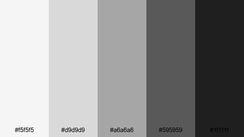
- HEX Codes: #f5f5f5, #d9d9d9, #a6a6a6, #595959, #1f1f1f
- Mood: Clean, polished, and professional with a subtle cinematic edge.
- Use for: Perfect for tech explainers, minimalist title cards, and software tutorial interfaces.
This grayscale gradient moves smoothly from a soft off white to deep charcoal, giving you a neutral but stylish base. It feels like a modern studio lit with softboxes, where nothing distracts from the content. The lighter tones are ideal for backgrounds, while the darker shades create clear hierarchy for text and UI elements.
Use Monochrome Studio Glow for YouTube thumbnails, tutorial overlays, clean lower thirds, or logo reveals where you want a premium but understated look. It is also perfect for pairing with a single accent color, like teal or green peach, to highlight subscribe buttons, CTAs, or key frames in your edit while keeping your overall gray color palette consistent.
Pro Tip: Build a Sleek Gray Aesthetic in Filmora
When you edit in Filmora, you can apply this monochrome gray palette across your entire project so every intro, B roll, and end screen feels like part of the same brand. Use the darker grays for titles and shapes, then keep your footage slightly desaturated so it blends naturally with the minimalist interface look.
Create a project template in Filmora with preset text styles, background solids, and overlays using these exact HEX codes. Then reuse that template for each new upload so your thumbnails, chapter cards, and shorts all share the same clean gray color combinations.
AI Color Palette
If you already designed a thumbnail or mood board using Monochrome Studio Glow, you can let Filmora match that look to your whole video. Filmora's AI Color Palette feature analyzes the colors in a reference image or clip and applies a similar palette to other shots in your timeline.
Import a frame that shows your ideal gray balance, set it as the reference, and let AI Color Palette harmonize your A roll, B roll, and overlay graphics. This keeps your neutral gray palette consistent from opening hook to outro, without manually adjusting every single clip.
HSL, Color Wheels & Curves
Even inside a neutral gray color palette, small adjustments make a big difference. In Filmora, use HSL to gently reduce saturation in any leftover color casts, then use the color wheels to cool down highlights or warm up shadows depending on your desired mood. Curves let you deepen blacks while protecting midtone detail, giving your gray themed video a more cinematic finish.
Once your base exposure is set, push the shadows slightly down on the RGB curve and add a gentle S curve to increase contrast. This keeps the monochrome look punchy enough for thumbnails and intros while still feeling professional on long form tutorials or screen recordings.
1000+ Video Filters & 3D LUTs
To move beyond pure monochrome, you can stack Filmora effects on top of this gray palette. Filmora's video filters and 3D LUTs make it easy to add subtle tints, film grain, or stylized contrast while keeping gray as the main character.
Try a soft cinematic LUT to add a cooler urban vibe, or a warm film filter to turn your neutral grays into something cozier for vlogs. Save your favorite combinations as presets so every new video, Reel, or short instantly matches your gray brand identity.
Concrete Workspace Calm
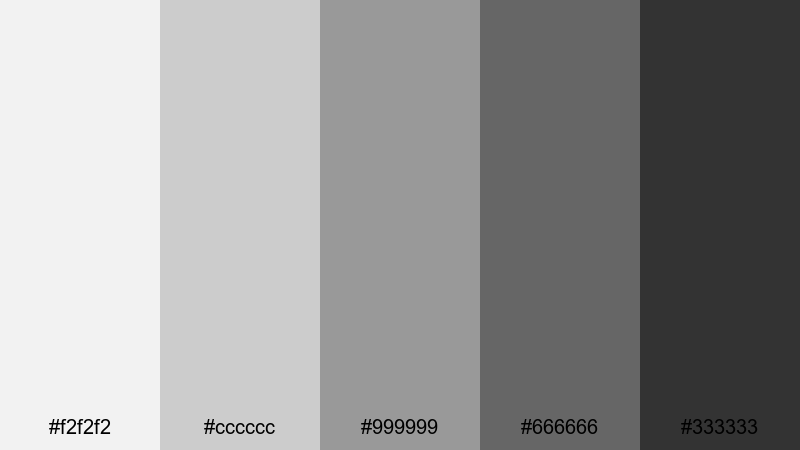
- HEX Codes: #f2f2f2, #cccccc, #999999, #666666, #333333
- Mood: Balanced and grounded, like a stylish co working loft.
- Use for: Ideal for productivity vlogs, office b roll overlays, and clean lower thirds.
Concrete Workspace Calm feels like polished concrete, brushed metal, and natural daylight. The mid grays are very usable for backgrounds, while the darker tones frame text and icons without feeling harsh. It is an easy choice for neutral gray color combinations that look organized and focused.
Use this palette for productivity channels, Notion style dashboards, or workspace tours. It keeps thumbnails and titles readable, works well with subtle accent colors, and makes your screen recordings or timeline screenshots look cohesive when edited together in Filmora.
Silver Screen Interface
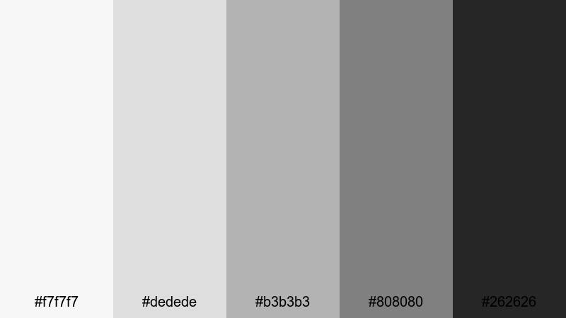
- HEX Codes: #f7f7f7, #dedede, #b3b3b3, #808080, #262626
- Mood: Techy and streamlined, with a hint of cinematic drama.
- Use for: Great for UI mockups, app demo videos, and sleek motion graphics backgrounds.
Silver Screen Interface looks like a modern operating system: light silver grays, soft midtones, and a deep neutral gray for contrast. It gives your visuals a tech forward feel while still leaving space for your footage and screen content.
Apply this palette to app walkthroughs, SaaS explainers, or template based motion graphics. Lighter grays work beautifully as card backgrounds or interface panels, while the darkest shade anchors navigation bars, title text, or logo locks in your video intro.
Graphite Grid Layout
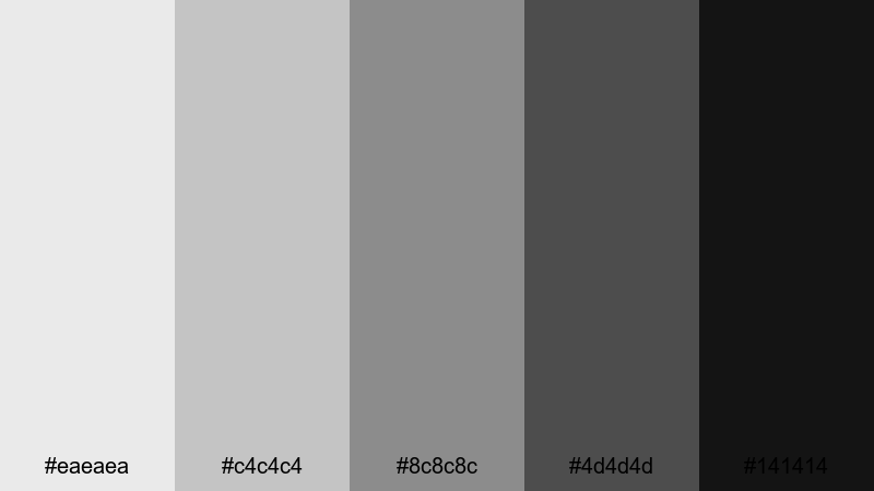
- HEX Codes: #eaeaea, #c4c4c4, #8c8c8c, #4d4d4d, #141414
- Mood: Structured and design driven, like a wireframe come to life.
- Use for: Use for grid based layouts, UI overlays, lower thirds, and infographic templates.
Graphite Grid Layout is made for order and structure. The range from pale gray to almost black gives you plenty of contrast to build grids, cards, and content blocks. It feels architectural and deliberate, perfect for design channels or workflow breakdowns.
Use it to create infographic style overlays, split screens, or animated layouts in Filmora. The darkest gray brings focus to headings and metrics, while the mid grays support icons, borders, and subtle drop shadows on thumbnails and slides.
Soft & Warm Gray Color Palettes
Morning Fog Latte
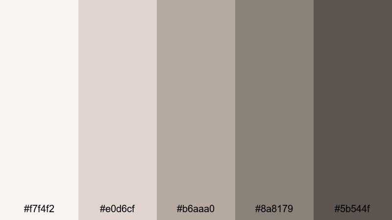
- HEX Codes: #f7f4f2, #e0d6cf, #b6aaa0, #8a8179, #5b544f
- Mood: Gentle, cozy, and inviting like a quiet cafe morning.
- Use for: Perfect for lifestyle vlogs, morning routines, and aesthetic study with soft overlays.
Morning Fog Latte blends warm gray with latte browns to create a soft, welcoming atmosphere. It feels like natural light on a wooden table, ideal for scenes that should look calm and unhurried.
Use the lighter tones for background cards and title screens, and the deeper coffee shades for text, lines, or accent blocks. This palette flatters skin tones, so it is a good match for lifestyle vlogs, booktube channels, and any aesthetic study setup you edit in Filmora.
Cozy Cloud Knit
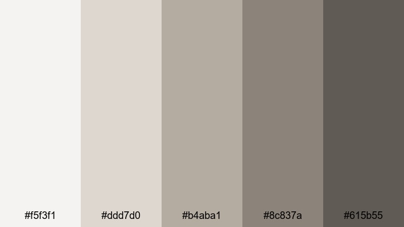
- HEX Codes: #f5f3f1, #ddd7d0, #b4aba1, #8c837a, #615b55
- Mood: Snug and homely, like a favorite knit sweater on a rainy day.
- Use for: Ideal for home decor tutorials, craft channels, and calming talking head videos.
Cozy Cloud Knit wraps your visuals in soft, warm neutrals. It has enough contrast for clear typography, but everything still feels gentle and low stress, which is perfect for slow living and DIY content.
Apply it to channel banners, lower thirds, and end screens to create a signature homely gray color palette. Pair it with soft music and gentle motion graphics in Filmora to build a relaxing viewer experience.
Blush Smoke Harmony
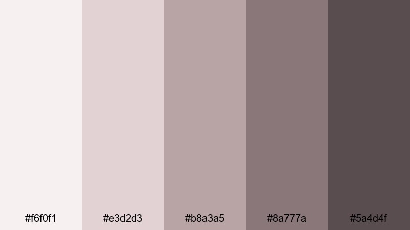
- HEX Codes: #f6f0f1, #e3d2d3, #b8a3a5, #8a777a, #5a4d4f
- Mood: Romantic and soft with a hint of vintage film grain.
- Use for: Great for wedding highlight reels, dreamy reels, and feminine branding.
Blush Smoke Harmony blends gray with dusty blush tones, creating a romantic but restrained aesthetic. It feels like a faded photograph or soft vintage film, which works wonderfully for emotional storytelling.
Use this palette in wedding highlight reels, engagement teasers, or feminine brand intros. The lighter hues support gentle overlays and title cards, while the darker smoky tones help important text and logo marks stand out in thumbnails and reels.
Warm Pebble Path
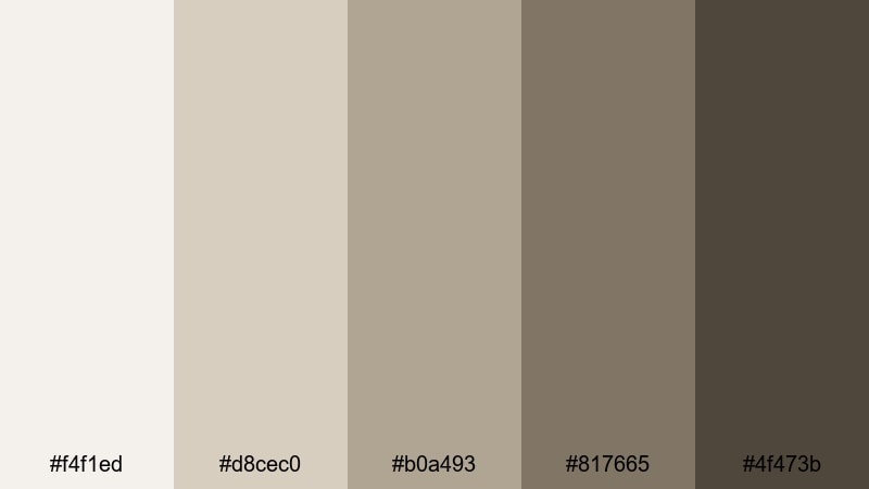
- HEX Codes: #f4f1ed, #d8cec0, #b0a493, #817665, #4f473b
- Mood: Earthy, grounded, and natural, like stones warmed by the sun.
- Use for: Use for travel diaries, nature vlogs, and brand stories with rustic interiors.
Warm Pebble Path takes inspiration from sun warmed stones and soft taupes. It is neutral enough to work with many skin tones and environments, but the earthy undertone gives it character.
Use it to grade nature vlogs, boutique hotel tours, or rustic brand storytelling. In thumbnails and titles, lean on the darker pebble shades for typography, and let the lighter tones carry your backgrounds, frames, and content blocks.
Dramatic & Moody Gray Color Palettes
Charcoal Cinema Night
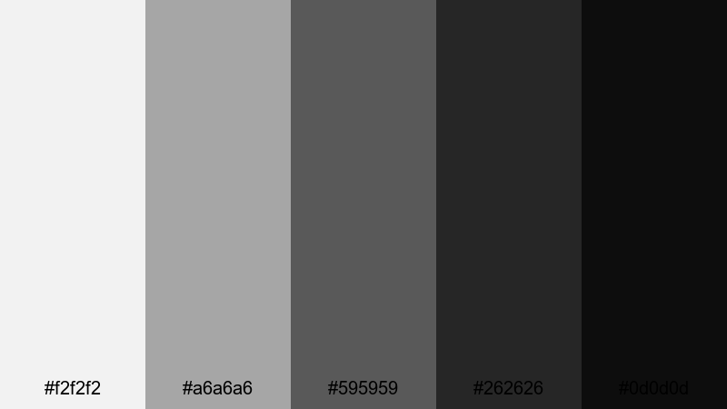
- HEX Codes: #f2f2f2, #a6a6a6, #595959, #262626, #0d0d0d
- Mood: Cinematic and bold, with strong shadows and highlights.
- Use for: Perfect for trailers, dramatic intros, and contrasty title sequences.
Charcoal Cinema Night is built for impact. The jump from bright highlight gray to deep charcoal creates instant drama and makes your footage look like a movie poster.
Use the lightest tone as a backdrop for big, bold typography, and reserve the darkest gray for text, borders, and letterbox bars. It is ideal for cinematic trailers, documentary intros, and any gray color grading where you want your video to feel intense and high stakes.
Stormy Skyline Drift
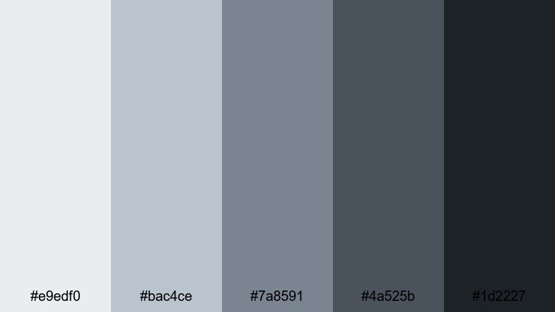
- HEX Codes: #e9edf0, #bac4ce, #7a8591, #4a525b, #1d2227
- Mood: Moody and atmospheric, like a city just before rainfall.
- Use for: Great for cityscape b roll, drone shots, and moody travel edits.
Stormy Skyline Drift mixes cool grays with bluish undertones, creating an overcast urban atmosphere. It works especially well with city lights, glass, and metal surfaces.
Use it for drone footage, timelapses, or reflective voice overs about travel and city life. The darker shades are perfect for titles and transitions, while the midtones keep your footage cohesive when you desaturate colors slightly in Filmora.
Ink Smoke Depth
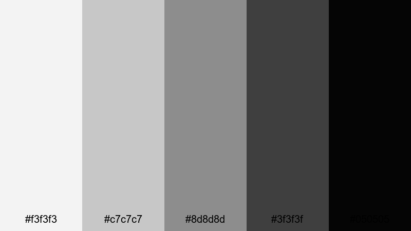
- HEX Codes: #f3f3f3, #c7c7c7, #8d8d8d, #3f3f3f, #050505
- Mood: Deep, mysterious, and intense with ink like shadows.
- Use for: Ideal for suspenseful edits, mystery podcasts, and dark cinematic overlays.
Ink Smoke Depth runs from foggy light gray to near black, maximizing depth and contrast. It is a natural choice for dark, suspenseful storytelling or tech content that leans into a noir vibe.
Use it to design podcast cover art, eerie intros, glitchy transitions, or title cards for mystery and crime content. The ink black tone is perfect for title text and icons, making them pop against subtle smoky backgrounds.
Industrial Noir Frame
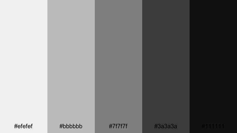
- HEX Codes: #efefef, #bbbbbb, #7f7f7f, #3a3a3a, #111111
- Mood: Gritty yet polished, like a warehouse turned gallery.
- Use for: Use for fashion lookbooks, product teasers, and gritty behind the scenes footage.
Industrial Noir Frame balances gritty midtones with clean highlights, evoking steel beams and studio spotlights. It feels both raw and curated, which suits fashion and product content very well.
Use the lighter grays to showcase product shots and model closeups, and the darker tones for frames, borders, and heavy typography in lookbooks or teaser trailers. This palette supports bold, minimalist layouts that still feel cinematic on screen.
Fresh & Urban Gray Color Palettes
Urban Neon Mist
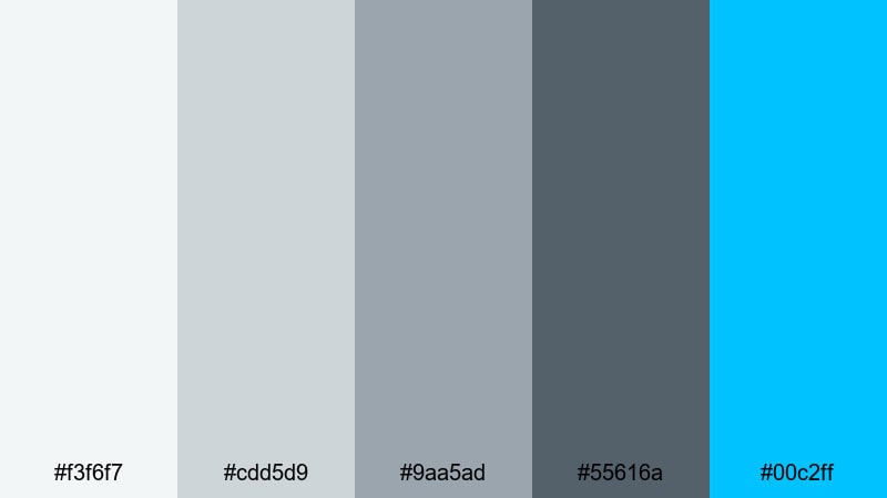
- HEX Codes: #f3f6f7, #cdd5d9, #9aa5ad, #55616a, #00c2ff
- Mood: Cool and energetic, like neon lights cutting through city fog.
- Use for: Perfect for streetwear brands, music videos, and dynamic channel intros.
Urban Neon Mist combines soft urban grays with a high energy electric cyan accent. The gray tones keep your visuals grounded, while the bright blue instantly grabs attention where you need it.
Use the cyan as a highlight color for subscribe buttons, key words, and animated shapes in intros or music visuals. Let the grays dominate your backgrounds and overlays so the neon accent really pops in thumbnails and channel art.
Subway Tile Clean
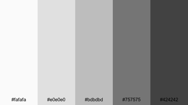
- HEX Codes: #fafafa, #e0e0e0, #bdbdbd, #757575, #424242
- Mood: Crisp, hygienic, and contemporary like a brand new subway station.
- Use for: Great for cooking channels, studio tours, and minimalist product demos.
Subway Tile Clean offers bright, clean grays that echo tiles and stainless steel surfaces. It is an excellent alternative to pure white, giving you a softer but still very fresh aesthetic.
Use it in cooking shows, beauty flat lays, or workspace tours where cleanliness and clarity matter. The darkest gray is strong enough for legible text on thumbnails, while the lighter tones prevent your visuals from feeling sterile.
Rainy Street Reflections
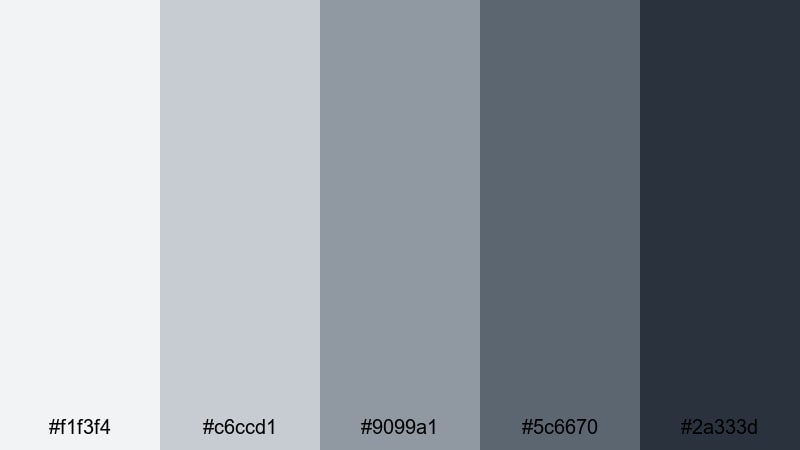
- HEX Codes: #f1f3f4, #c6ccd1, #9099a1, #5c6670, #2a333d
- Mood: Reflective and cinematic, with a subtle hint of melancholy.
- Use for: Ideal for travel montages, reflective voice overs, and cinematic b roll.
Rainy Street Reflections layers cool grays with blue undertones, evoking wet pavement and soft city lights. It is emotionally rich without being overly dark, perfect for reflective storytelling.
Use it to grade travel montages, slow city walks, or cinematic B roll between talking head segments. The mid and dark grays work well for chapter titles and overlays, keeping everything cohesive across your edit and social crops.
Tips for Creating Gray Color Palettes
Gray is a powerful base color for video and design because it supports almost any accent color and works across platforms. To get the most from your gray palettes, focus on contrast, readability, and how your colors match the real world footage you bring into Filmora.
- Balance light and dark grays so on screen text and icons remain readable on phones as well as desktops.
- Add one accent color (such as green peach, teal, or orange) to a neutral gray palette to guide attention to CTAs, subtitles, or key graphics.
- Keep brand elements like logos and lower thirds using the same 2 to 3 gray tones so your channel identity feels consistent across thumbnails and videos.
- When color grading footage in Filmora, gently desaturate strong background colors so they sit comfortably against your chosen gray UI and title cards.
- Use warmer grays for lifestyle, beauty, and home content to flatter skin tones, and cooler grays for tech, urban, and cinematic videos.
- Check your designs in both dark mode and light mode contexts; adjust midtone grays so they do not disappear into pure black or white.
- Save your favorite gray color combinations and HEX codes as custom presets in Filmora so you can apply them quickly to new edits.
- Test your gray palettes on a YouTube thumbnail, a 9:16 short, and a title card to be sure they stay clear and stylish in every format.
Gray color palettes can completely change how your content feels, from calm and minimalist to bold and cinematic. Whether you lean into warm latte inspired grays or cool industrial tones, the right neutral base makes your footage, typography, and accent colors stand out.
Use these 15 gray color combinations and HEX codes as starting points for your thumbnails, intros, logo stings, and cinematic color grading. Then refine them inside Filmora with AI Color Palette, HSL, curves, and filters until the look matches your personal brand.
The more you reuse a consistent gray palette, the faster viewers will recognize your channel at a glance. Open Filmora, pick one of these palettes, and start building a cohesive gray themed visual identity across all your edits.


 100% Security Verified | No Subscription Required | No Malware
