
 100% Security Verified | No Subscription Required | No Malware


 ChatGPT
 Perplexity
 Gemini
 Claude
 Grok
Grok
Gray green blue sits in a sweet spot between warm neutrals and cool teal. It feels calm, intelligent, and slightly mysterious, which is why it works so well for cinematic vlogs, productivity channels, tech explainers, and modern brand visuals. On screen, these muted tones help your audience relax and focus on the story instead of being distracted by loud colors.
For video creators, this palette can unify everything from intros and lower thirds to YouTube thumbnails, channel banners, and end screens. Below are 15 ready-made gray green blue color palettes with HEX codes you can drop straight into your next edit, thumbnail, or overlay. They are especially handy if you edit in Filmora and want consistent color grading and on-brand visuals across your entire project.
In this article
Calm & Minimal Gray Green Blue Color Palettes
Foggy Harbor Minimal
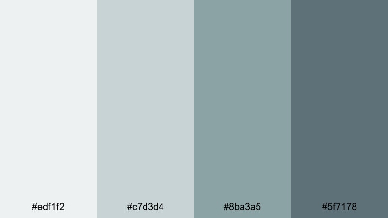
- HEX Codes: #edf1f2, #c7d3d4, #8ba3a5, #5f7178
- Mood: Soft, quiet, and contemplative with a modern coastal feel.
- Use for: Great for minimalist vlog intros, productivity channels, and calm tutorial backgrounds where you want a gentle, airy look.
This palette feels like an overcast morning at a calm harbor, where fog softens every edge. The pale grays (#edf1f2, #c7d3d4) create spacious, breathable backgrounds, while the deeper blue greens (#8ba3a5, #5f7178) add just enough contrast for text, icons, and subtle accents.
Use it for YouTube thumbnails with simple layouts, light lower thirds in talking-head videos, or intro screens that set a focused, distraction-free mood. It works especially well for productivity, wellness, and digital minimalism content where you want viewers to feel relaxed but still engaged.
Pro Tip: Build a Calm Gray Green Blue Aesthetic in Filmora
When you base your entire edit on a soft gray green blue palette like Foggy Harbor Minimal, consistency is everything. In Filmora, you can color-grade your interview shots, b-roll, and overlays so the grays stay gentle and the teal accents never get too saturated. Keep your titles, lower thirds, and thumbnail graphics using the same HEX codes to create a recognizable channel style.
Save a custom title preset in Filmora that uses one of the lighter grays for backgrounds and the deeper blue green for text or outlines. Reusing this preset across intros, chapter cards, and end screens keeps your visual identity cohesive without extra design work for every upload.
AI Color Palette
If you have a reference frame or mood board image that nails this foggy, coastal gray green blue, you can turn it into a look for your whole video. Filmora's AI Color Palette feature lets you sample the colors from a still image and instantly apply similar tones across your clips.
Import a screenshot that shows your ideal tones, use AI Color Palette to match your footage, then fine-tune intensity so the effect stays subtle. This is a fast way to lock in a consistent gray green blue grade on talking-head shots, b-roll, cutaways, and even different cameras.
 secure download

HSL, Color Wheels & Curves
To keep gray green blue tones looking polished instead of flat, refine them with HSL, color wheels, and curves inside Filmora. Slightly lower the saturation of your greens and cyans in HSL so skin tones stay natural while the environment keeps its cool, muted style. Then, use color wheels to push midtones a touch toward teal and lift shadows so details are not crushed.
Curves let you add a gentle S-curve for contrast while protecting highlights, which is ideal for creating a subtle cinematic feel. If you want more guidance, Filmora's color grading tips explain how to balance highlights, midtones, and shadows so gray green blue palettes remain clean and professional.
secure download1000+ Video Filters & 3D LUTs
If you want a gray green blue look without manual grading from scratch, Filmora’s video filters and 3D LUTs make it easy to stylize your footage. Apply a cinematic teal, cool fade, or soft film LUT, then tweak saturation and contrast so the result aligns with the Foggy Harbor Minimal HEX codes.
You can also stack subtle filters for grain, glow, or vignettes to give your muted palette more depth without making it harsh. Save your favorite combination as a preset so future videos keep the same calm gray green blue identity with just a couple of clicks.
secure downloadConcrete Tide Serenity
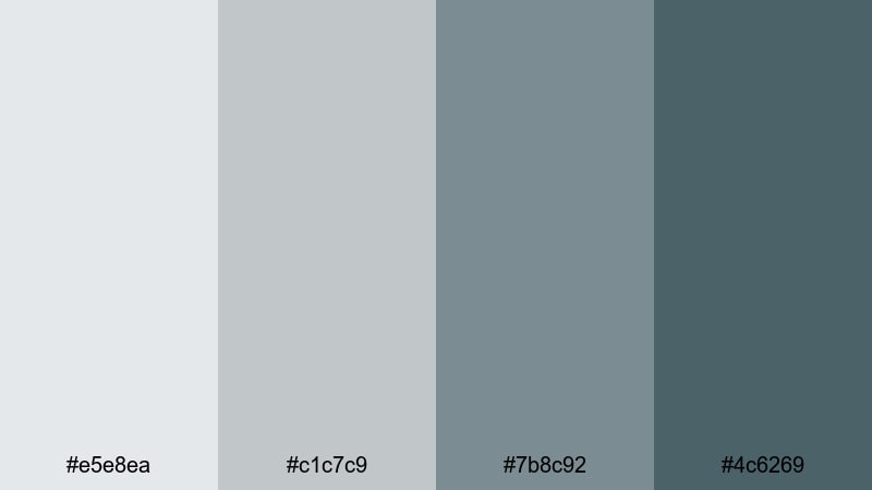
- HEX Codes: #e5e8ea, #c1c7c9, #7b8c92, #4c6269
- Mood: Urban, understated, and quietly sophisticated.
- Use for: Perfect for tech explainers, productivity apps, and UI-style motion graphics that need a polished but relaxed tone.
Concrete Tide Serenity mixes clean city grays with a hint of ocean blue, giving your visuals a modern but unflashy presence. The lighter tones are ideal for neutral backgrounds that feel like smooth UI panels, while the deeper blue gray accents guide the eye to key buttons, titles, and metrics.
Use this palette for app demo overlays, screencast frames, or thumbnails that highlight devices and dashboards. Because the colors are cool and subtle, they keep your focus on clarity and information, making them perfect for SaaS promos, productivity tutorials, and UX breakdowns.
Glass Tower Mist
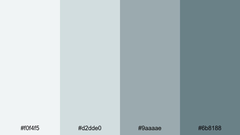
- HEX Codes: #f0f4f5, #d2dde0, #9aaaae, #6b8188
- Mood: Light, glassy, and professional with a subtle corporate calm.
- Use for: Use for business presentations, SaaS promos, and channel branding where clarity and neutrality are key.
Glass Tower Mist feels like a skyline of glass and steel softened by haze. The near-white and pale gray blues create bright, low-contrast canvases where charts, graphs, and text stay easy to read. The darker teal gray shades support logos, icons, and key callouts without overpowering the frame.
This palette shines in pitch decks, LinkedIn-style content, and B2B explainers, both in video and in thumbnails. Use the lightest color as your main background, the second as panel or card color, and reserve the two darker tones for typography, line art, and animated highlights in Filmora.
Muted Glacier Frame
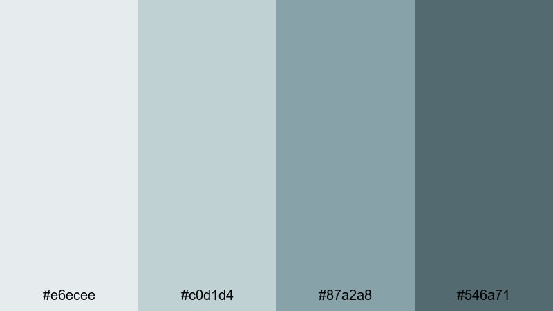
- HEX Codes: #e6ecee, #c0d1d4, #87a2a8, #546a71
- Mood: Cool, distant, and steady, like frozen mountain lakes.
- Use for: Great for cinematic travel vlogs, atmospheric b-roll, and intros where you want a calm but serious tone.
Muted Glacier Frame combines icy blue greens with soft grays for a look that feels composed and slightly distant. The palette works especially well over landscape and travel footage, where you want lakes, snow, and cloudy skies to feel cohesive and cinematic rather than overly saturated.
Use the mid and dark tones for title bars and letterbox effects, while the lighter grays can serve as semi-transparent overlays to make white text legible. It is a strong fit for moody travel intros, drone shots, and time-lapses where mood is more important than bold color.
Soft Pixel Patina
- HEX Codes: #edf2f1, #ccd9d3, #96aaa2, #5f736c
- Mood: Digital yet organic, soft and slightly nostalgic.
- Use for: Use for aesthetic study montages, desk setups, and ambient lofi edits that mix tech with warmth.
Soft Pixel Patina feels like a slightly aged monitor glow mixed with indoor plants and notebooks. The gray greens are gentle and desaturated, creating a subtle vintage tech vibe that never looks dated. The darker tones add structure for borders, interface elements, and typography.
Apply this palette to lofi study mixes, aesthetic desk tours, or productivity journals on video. Use the lighter colors for blurred background shapes and on-screen notes, and the darker shade for captions or minimalist thumbnail titles that hint at comfort and focus.
Cinematic Moody Gray Green Blue Color Palettes
Noir Sea Horizon
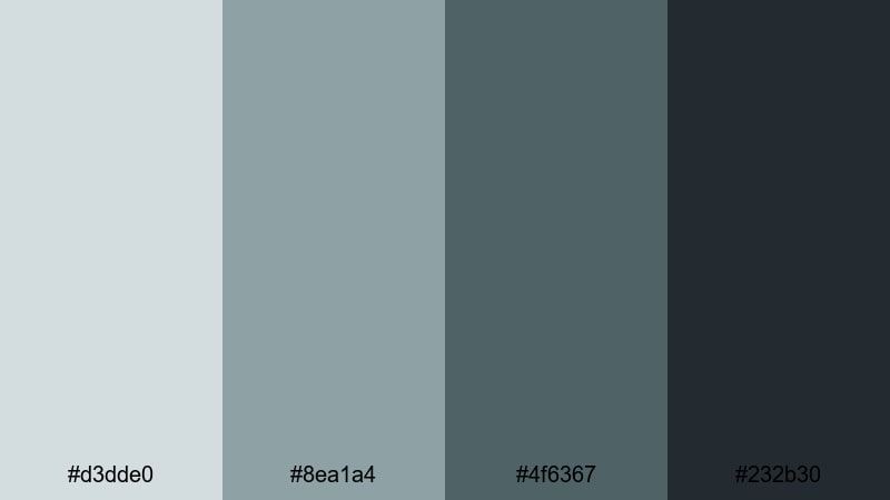
- HEX Codes: #d3dde0, #8ea1a4, #4f6367, #232b30
- Mood: Dramatic, cinematic, and slightly mysterious.
- Use for: Perfect for film-style trailers, narrative shorts, and thriller or mystery content needing a tense atmosphere.
Noir Sea Horizon layers foggy shoreline tones over deep charcoal and slate, creating a look that hints at secrets and suspense. The darker hues are strong enough for letterbox bars, title cards, and heavy vignettes, while the mid and light tones keep details visible in misty backgrounds.
Use this palette for thriller trailers, mystery podcasts on YouTube, or cinematic short films. Your thumbnails can lean heavily on the darkest shade with small flashes of the lighter grays to draw attention to characters or objects, keeping everything dramatic but controlled.
Stormlit City Grade
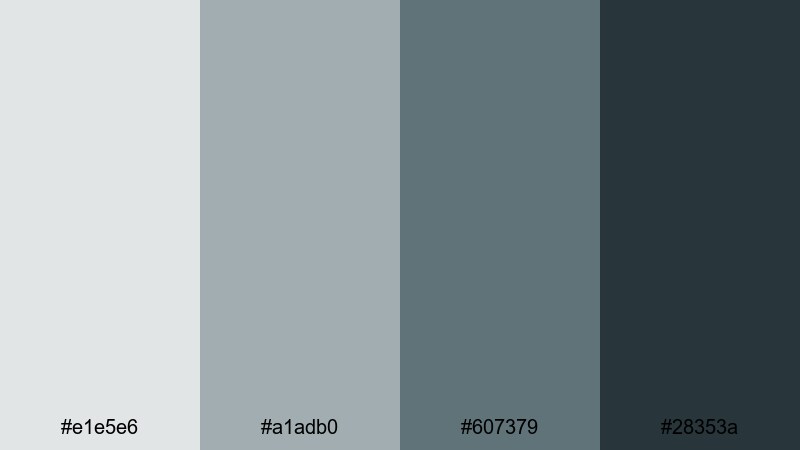
- HEX Codes: #e1e5e6, #a1adb0, #607379, #28353a
- Mood: Rainy, cinematic cityscape with a hint of neo-noir.
- Use for: Great for night city b-roll, cyberpunk edits, and tech reviews with a sophisticated edge.
Stormlit City Grade feels like wet asphalt and neon reflections under low clouds. The muted grays support bright signage and screens in your footage, while the blue green shadows add a subtle cyberpunk flavor without tipping into oversaturated teal.
Use it to color grade night city b-roll, car shots, or gadget close-ups where you want sleek, cinematic sophistication. For thumbnails, mix the lightest gray as a text panel over darker stills, using the mid blues for borders, strokes, or thin dividing lines that feel like city lights.
Midnight Teal Fade
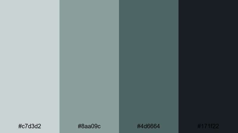
- HEX Codes: #c7d3d2, #8aa09c, #4d6664, #171f22
- Mood: Moody, introspective, and quietly intense.
- Use for: Use for emotional storytelling, cinematic vlogs, and music videos that live in the shadows.
Midnight Teal Fade moves from soft teal highlights down to inky shadows, capturing that late-night introspective feel. The darkest shade makes a strong base for frames, borders, and backgrounds, while the lighter teals add subtle glows around faces and key subjects.
This palette is ideal for emotional vlogs, narrative monologues, and music videos where you want intensity without bright colors. Use the lighter tones for on-screen lyrics or journal-style captions, and let the dark base color carry your negative space and emphasis.
Steelwave Thriller
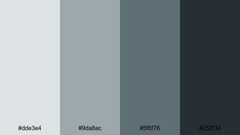
- HEX Codes: #dde3e4, #9da8ac, #5f6f76, #252f34
- Mood: Tense, industrial, and high contrast without bright colors.
- Use for: Ideal for tech thrillers, product cinematics, and dramatic unboxings where you want sleek intensity.
Steelwave Thriller mixes industrial steel grays with dark blue shadows for a controlled, technical mood. It is designed for scenes with machines, hardware, and precision tools, where the visual story relies on sharp edges instead of bright hues.
Use the lighter colors as clean stages for text and specs overlays, and the darker tones for hero shots of products or gear. Your thumbnails can pair a nearly white background with a deep gray frame, making devices or faces pop while still feeling very modern and cinematic.
Deep Channel Drama
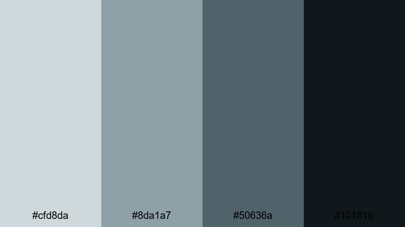
- HEX Codes: #cfd8da, #8da1a7, #50636a, #10181b
- Mood: Heavy, immersive, and cinematic like a deep sea trench.
- Use for: Best for intros, trailers, and time-lapse edits that rely on mood and depth over brightness.
Deep Channel Drama dives from misty surface tones into nearly black depths. The lighter grays work as atmospheric haze or foggy overlays, while the mid and dark blues create the sense of being pulled into something vast and unknown.
It is a powerful choice for dramatic intros, story trailers, or slow time-lapses of storms, oceans, or cities at night. Use the darkest shade for backgrounds and credits, then let the mid-tones outline titles and logos so they emerge from the darkness rather than shouting over it.
Fresh & Natural Gray Green Blue Color Palettes
Evergreen Coastal Haze
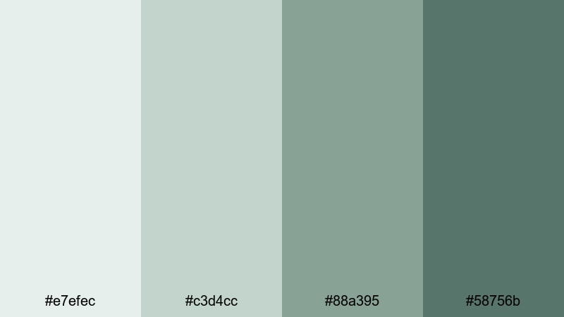
- HEX Codes: #e7efec, #c3d4cc, #88a395, #58756b
- Mood: Breezy, organic, and refreshing.
- Use for: Great for travel vlogs, nature reels, and wellness or lifestyle content that leans into fresh outdoor energy.
Evergreen Coastal Haze blends soft cloud grays with gentle pine and sea-glass greens. The result is airy and fresh, perfect for footage filled with forests, beaches, and open skies. The darker green tones act as anchors for text and graphics while still feeling natural.
Use this palette to build a brand look for nature channels, yoga or mindfulness content, or any vlog that celebrates time outside. In thumbnails, put the lightest color behind your subject cut-outs and reserve the deepest green for channel name, episode numbers, or small badges.
Riverstone Studio
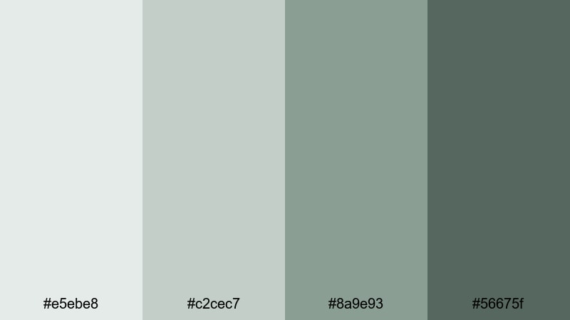
- HEX Codes: #e5ebe8, #c2cec7, #8a9e93, #56675f
- Mood: Grounded, balanced, and creative like a calm studio by the river.
- Use for: Use for maker channels, DIY tutorials, and cozy workspace tours with a natural but polished feel.
Riverstone Studio brings together stone-gray neutrals and mossy blue greens, evoking a workshop filled with wood, plants, and natural light. The palette is soft enough not to compete with your projects or products, yet structured enough to feel intentional and professional.
Apply these tones to background cards for step-by-step instructions, materials lists, and chapter markers in your DIY videos. For thumbnails, let the deeper shade frame your workspace photos and use the mid-tones for labels and hand-drawn style arrows or icons.
Mossy Screen Glow
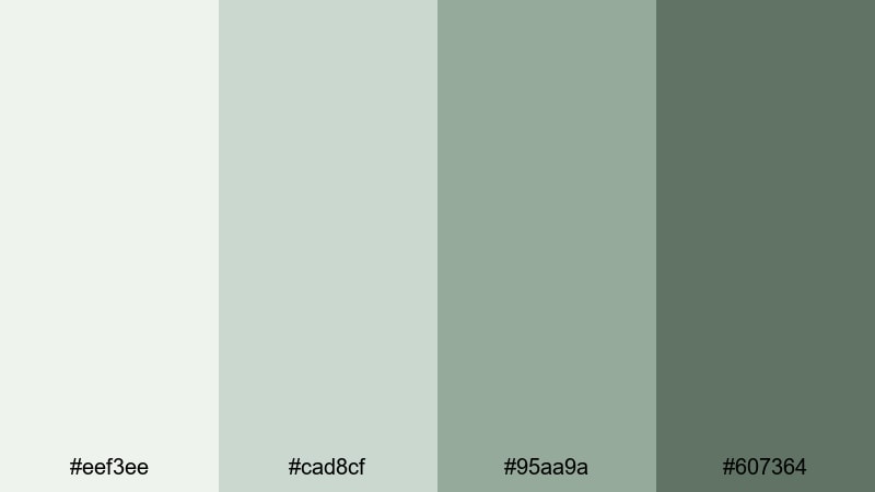
- HEX Codes: #eef3ee, #cad8cf, #95aa9a, #607364
- Mood: Fresh, slightly techy, and quietly optimistic.
- Use for: Ideal for eco-tech explainers, sustainable brand intros, and channels focused on mindfulness and productivity.
Mossy Screen Glow feels like a balance between circuit boards and indoor plants. The light, screen-like grays brighten the frame, while the soft greens keep everything grounded and eco-friendly. It is perfect for creators who talk about technology, but from a human, sustainable perspective.
Use this palette for explainer animations, infographic panels, and on-screen bullet points. For thumbnails, pair the pale background with a strong mid-green title and a darker accent bar behind your logo or profile photo to connect your tech and mindfulness themes.
Seagrass Overlay
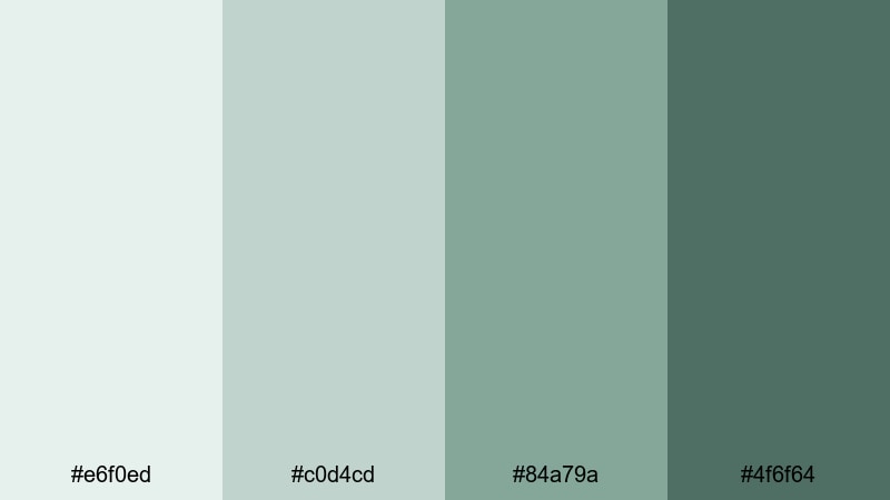
- HEX Codes: #e6f0ed, #c0d4cd, #84a79a, #4f6f64
- Mood: Coastal, relaxed, and gently invigorating.
- Use for: Perfect for beach vlogs, summer lookbooks, and calming BGM loops that still feel fresh.
Seagrass Overlay captures the feeling of walking through dunes toward the ocean: soft air, pale sand, and cool plant life. The lighter tones make great semi-transparent overlays for bright footage, helping text stand out without losing the sunny vibe.
Try the mid and dark greens for headers, transitions, and simple geometric shapes that slide over your beach or lifestyle clips. It is a great palette for playlists like morning routines, slow travel diaries, or ambient music loops where you want viewers to feel refreshed.
Driftwood Aqua Story
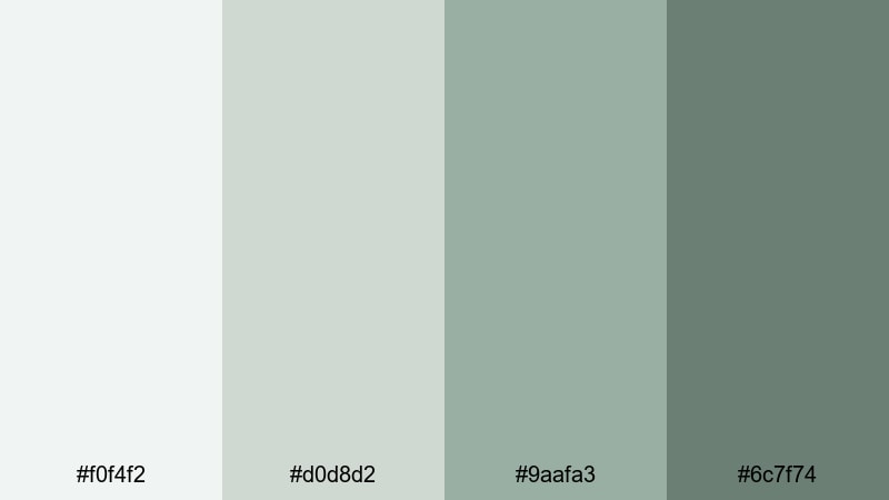
- HEX Codes: #f0f4f2, #d0d8d2, #9aafa3, #6c7f74
- Mood: Storylike, gentle, and close to nature with a modern twist.
- Use for: Great for documentary-style storytelling, family vlogs, and brand films that want authenticity without looking dull.
Driftwood Aqua Story pairs soft neutral grays with muted aqua greens, giving your footage a lived-in, real-world charm. It keeps skin tones flattering while gently cooling backgrounds, which is ideal for interviews, family moments, or behind-the-scenes footage that should feel honest and unforced.
Use the lighter colors for title backgrounds and simple frames around archival photos or text quotes. The deeper greens can highlight chapter titles, lower thirds, and logo marks so your visual language stays consistent across intros, b-roll overlays, and end cards.
Tips for Creating Gray Green Blue Color Palettes
Gray green blue palettes are flexible enough for tech, lifestyle, and cinematic content, but they work best when you pay attention to contrast, readability, and how your footage is already colored. Use these tips to build combinations that look strong both in Filmora and in your thumbnails or channel branding.
- Pick a clear role for each color: one for backgrounds, one for main text, one for accents, and one for shadows or frames.
- Check contrast between your text color and its background using both light and dark combinations so titles stay readable on mobile screens.
- Match your palette to your footage: if your clips already lean teal or green, choose grays that complement rather than fight those tones.
- Use saturation sparingly. Let gray and muted teal dominate, then keep brighter colors (like skin tones or product highlights) as intentional focal points.
- Create separate but related palettes for light-mode and dark-mode graphics so overlays work on both bright daytime and moody nighttime scenes.
- Test your palette inside Filmora by applying it to lower thirds, stickers, and title presets, then reuse those presets to keep your channel branding consistent.
- Export a few frames with your chosen colors and check them on different devices to be sure grays do not shift too blue or too green unintentionally.
- When in doubt, start with three core shades (light, mid, dark) and only add a fourth accent color if it truly improves hierarchy or navigation.
Gray green blue color palettes can make your videos feel calm, cinematic, or refreshingly natural while still looking modern and professional. By choosing the right combination of light grays, muted teals, and deep slate tones, you shape how viewers experience your story and remember your brand.
The 15 palettes above give you ready-made schemes for thumbnails, intros, subtitles, and overlays, and they translate directly into color grading looks inside Filmora. Experiment with them on your next edit, save your favorite combinations as presets, and refine them with Filmora’s color tools until the visuals match the mood in your head.
Whether you run a vlog, a tutorial channel, or a cinematic short film series, locking in a signature gray green blue style can make your content instantly recognizable. Open Filmora, drop in these HEX codes, and start building a cohesive visual identity across all your videos and social edits.
secure download