
 100% Security Verified | No Subscription Required | No Malware

Gray Turquoise sits between soft teal and cool gray, giving it a calm, modern, and slightly mysterious character. It feels clean and professional without being cold, which is why you see it often in tech brands, wellness visuals, and cinematic color grading. On screen, Gray Turquoise can make a frame feel more spacious and focused, while still carrying a hint of ocean-like freshness.
For video creators and designers, this makes Gray Turquoise perfect for YouTube thumbnails, intro screens, overlays, color grading, and even full channel branding. Below are ready-made Gray Turquoise color palettes with HEX codes, tailored for Filmora users and any creator who wants consistent, aesthetic color combinations for vlogs, trailers, reels, and more.
In this article
Calm & Minimalist Gray Turquoise Palettes
Misty Harbor Hush
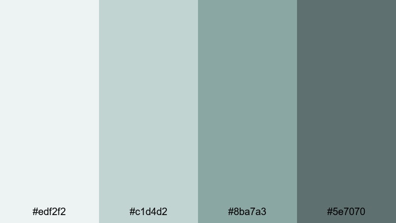
- HEX Codes: #edf2f2, #c1d4d2, #8ba7a3, #5e7070
- Mood: Peaceful, airy, and understated, like a foggy morning by the sea.
- Use for: Great for minimalist vlogs, calm talking-head videos, and meditative B-roll sequences.
Misty Harbor Hush mixes very soft off-whites with gentle Gray Turquoise tones for an ultra-breathable, minimalist feel. It looks like sea air and quiet docks, giving your visuals space to breathe without ever feeling flat.
Use this palette to keep your YouTube thumbnails and intro screens clean and soothing, especially for wellness, productivity, or slow living content. In Filmora, you can apply these shades to lower-thirds, shapes, text, and subtle overlays so your A-roll, B-roll, and channel banner all share the same calm Gray Turquoise signature.
Pro Tip: Build a Serene Gray Turquoise Look in Filmora
To keep this soft Gray Turquoise mood consistent, start by designing a simple title card in Misty Harbor Hush and reuse it as a template in Filmora. Apply the lighter tones (#edf2f2, #c1d4d2) to backgrounds and frames, and reserve the deeper hues (#8ba7a3, #5e7070) for text, icons, and accent shapes.
Duplicate this style across your intro, transitions, and end screen so viewers instantly recognize your channel. Filmora lets you save custom presets for titles and overlays, which makes it easy to keep your calm Gray Turquoise identity across full series, playlists, and shorts.
AI Color Palette
If you have a reference image for Misty Harbor Hush, such as a foggy harbor photo or a moodboard card, you can turn that into a video-wide grade with Filmora. Filmora's AI Color Palette feature analyzes your reference frame and transfers its Gray Turquoise balance to other clips automatically.
This is especially helpful when your footage comes from different cameras or lighting conditions. Apply the AI Color Palette once, then fine-tune intensity so that every shot, from your thumbnail stills to your outro clip, shares the same light, misty Gray Turquoise atmosphere.
 secure download

HSL, Color Wheels & Curves
To refine your Gray Turquoise tones, use Filmora's HSL, color wheels, and curves tools to keep everything subtle and eye-friendly. You can gently desaturate greens and cyans so faces look natural, while shifting shadows toward the deeper #5e7070 hue for a soft cinematic base.
Highlights can be nudged slightly warmer on the color wheels to avoid a sterile look, keeping your palette airy but still human. For more ideas on balancing tones, explore Filmora's color correction tools and apply similar adjustments across your entire timeline.
secure download1000+ Video Filters & 3D LUTs
Once your base Gray Turquoise palette is set, you can quickly stylize it with Filmora's filter and LUT library. Filmora's video filters and 3D LUTs make it easy to add subtle film grain, matte fades, or dreamy glows while still preserving your core Misty Harbor Hush colors.
Try combining a soft cinematic LUT with reduced contrast to keep that misty feeling, or choose a pastel-friendly filter for calm productivity vlogs and study-with-me videos. Apply the same filter stack to your thumbnail stills so your audience immediately recognizes your Gray Turquoise aesthetic in every feed.
secure downloadConcrete Tide Serenity
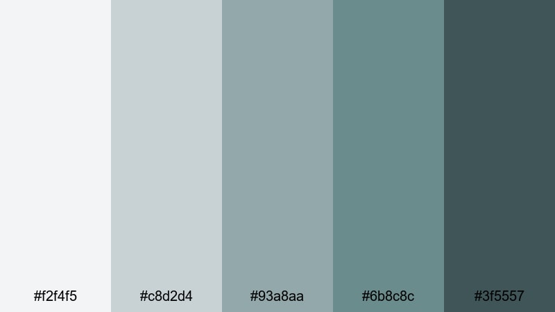
- HEX Codes: #f2f4f5, #c8d2d4, #93a8aa, #6b8c8c, #3f5557
- Mood: Cool, grounded, and composed with a subtle urban edge.
- Use for: Perfect for productivity videos, workspace tours, and understated tech reviews.
Concrete Tide Serenity blends soft concrete grays with deeper Gray Turquoise notes, giving your visuals a calm but clearly urban personality. It feels like a quiet office near the water, ideal when you want focus without harsh contrast.
Use the lightest shades for clean backgrounds and the darker Gray Turquoise tones for buttons, titles, lower-thirds, and icons in Filmora. This palette is perfect for Notion setups, desk tours, or any tech-focused thumbnail where you want modern polish instead of loud neon colors.
Scandi Tide Neutrals
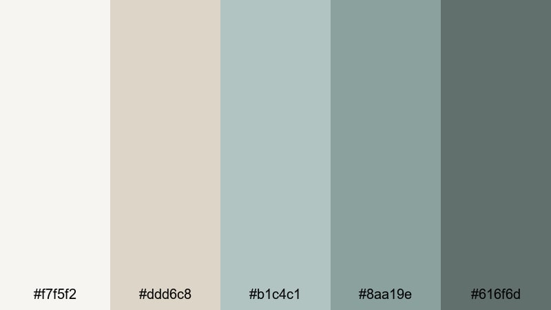
- HEX Codes: #f7f5f2, #ddd6c8, #b1c4c1, #8aa19e, #616f6d
- Mood: Warm minimalism with a coastal Scandinavian twist.
- Use for: Use for home decor reels, interior design tours, and lifestyle branding intros.
Scandi Tide Neutrals mixes warm beiges with cool Gray Turquoise for a look that is both cozy and refined. It feels like a sunlit Nordic apartment overlooking the sea, great for content that needs warmth without losing its minimalist structure.
On thumbnails, pair the beige tones with large negative space and use the Gray Turquoise hues for text and accent lines. In Filmora, this palette works beautifully for decor tours, home office makeovers, and lifestyle intros where you want your brand to feel calm, stylish, and approachable.
Soft Overcast Lagoon
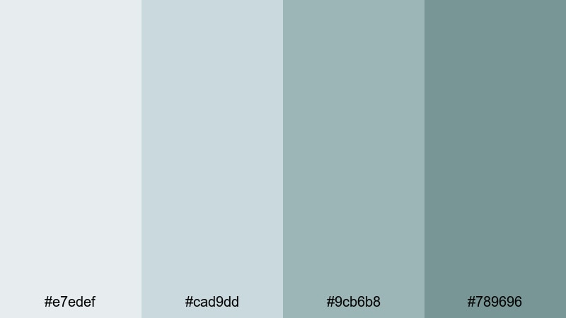
- HEX Codes: #e7edef, #cad9dd, #9cb6b8, #789696
- Mood: Gentle, cool, and introspective like a cloudy shoreline.
- Use for: Great for study-with-me videos, soft spoken narration, and reflective travel edits.
Soft Overcast Lagoon leans into muted blues and Gray Turquoise for a low-contrast, eye-friendly look. It suggests quiet, overcast light, which is perfect for long-form content people watch for hours, such as study-with-me or focus sessions.
Use the palest tone as a background for timers, progress bars, and subtitles, while the deeper Gray Turquoise shades highlight call-to-action text or chapter markers. This palette keeps your visuals calm and legible without distracting from your voice or music.
Modern & Urban Gray Turquoise Palettes
Steel & Surf Skyline

- HEX Codes: #f0f3f5, #c2c8cc, #8fa5aa, #4f6f73, #22292b
- Mood: Modern, sleek, and slightly moody with city-meets-ocean vibes.
- Use for: Ideal for tech intros, city b-roll sequences, and sleek title cards.
Steel & Surf Skyline marries cold steel grays with deep Gray Turquoise and near-black shadows. It is perfect if your footage mixes glass buildings, rainy streets, and glimpses of water, and you want a consistent, cinematic tone.
Use the near-black #22292b for text and logo marks, with mid Gray Turquoise for accent lines, buttons, or progress bars on your YouTube intros. In Filmora, add these tones to overlays and graphic elements for tech channels, urban travel, or cinematic city b-roll edits.
Neon Underpass Drift
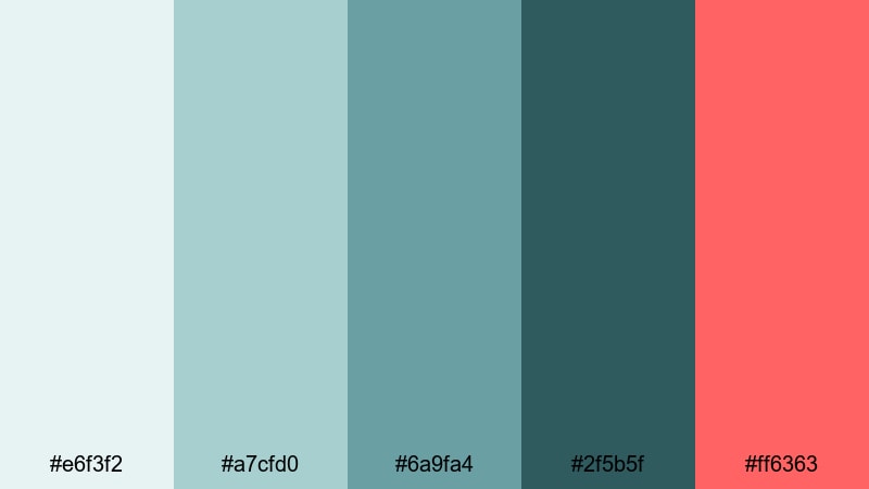
- HEX Codes: #e6f3f2, #a7cfd0, #6a9fa4, #2f5b5f, #ff6363
- Mood: Edgy and cinematic with a pop of neon energy.
- Use for: Great for street edits, music videos, and bold gaming or tech thumbnails.
Neon Underpass Drift gives you cool Gray Turquoise shadows and a powerful neon coral accent in #ff6363. It feels like an underpass lit by LED lights and car streaks, ideal for high-energy content with a modern twist.
Use the coral as a highlight for subscribe buttons, key words in your titles, or important UI-style elements on your thumbnails. The Gray Turquoise base keeps everything cohesive in Filmora while the neon pop draws the eye exactly where you want it.
Subway Glass Reflections
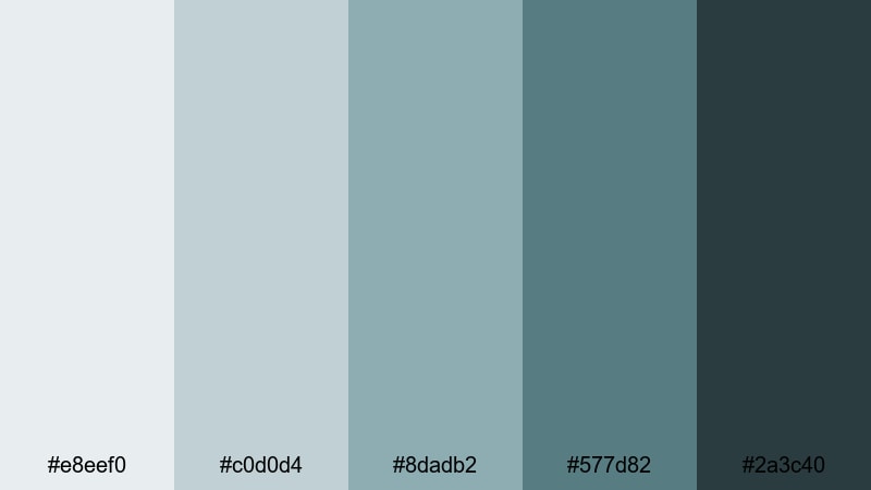
- HEX Codes: #e8eef0, #c0d0d4, #8dadb2, #577d82, #2a3c40
- Mood: Cool, reflective, and subtly dramatic like light on metro windows.
- Use for: Use for documentary-style edits, b-roll transitions, and brand openers.
Subway Glass Reflections layers bluish grays and Gray Turquoise to mimic city lights bouncing off glass and metal. It feels calm but slightly tense, great for documentary intros or brand stories set in urban environments.
Apply lighter colors behind titles and use the deep #2a3c40 for strong typography and logo reveals. In Filmora, this palette can drive your lower-thirds, motion graphics, and transitions for interview-based edits or city narratives.
Loft Window Seafoam
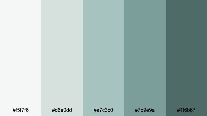
- HEX Codes: #f5f7f6, #d6e0dd, #a7c3c0, #7b9e9a, #4f6b67
- Mood: Bright, airy, and contemporary with a hint of industrial charm.
- Use for: Perfect for creative studio tours, design tutorials, and modern brand intros.
Loft Window Seafoam combines daylight whites with soft Gray Turquoise shadows, echoing a creative studio with big windows and metal frames. It keeps your visuals light, clean, and slightly industrial.
Use it to color your title cards, graphic frames, and on-screen UI elements for design tutorials or portfolio videos. In Filmora, pair it with crisp fonts and simple motion to create professional, Behance-style intros and reels.
Soft & Dreamy Gray Turquoise Palettes
Cloudveil Tidal Dream
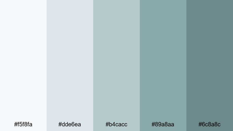
- HEX Codes: #f5f8fa, #dde6ea, #b4cacc, #89a8aa, #6c8a8c
- Mood: Dreamy, ethereal, and soothing like drifting clouds over water.
- Use for: Use for dreamy travel vlogs, slow montages, and intro animations.
Cloudveil Tidal Dream leans into feather-light blues fading into gentle Gray Turquoise. It feels floaty and romantic, perfect for drone shots over water, slow-motion sequences, and romantic travel vlogs.
Use the palest tones for hazy backgrounds behind titles and apply the deeper Gray Turquoise hues to delicate text and icons. In Filmora, this palette works beautifully with soft blur effects and slow transitions for ethereal intros and montage sequences.
Vintage Film Seaglass
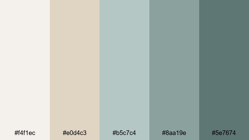
- HEX Codes: #f4f1ec, #e0d4c3, #b5c7c4, #8aa19e, #5e7674
- Mood: Nostalgic and gentle, like faded seaside prints and film photos.
- Use for: Great for retro travel edits, memory montages, and sentimental storytelling.
Vintage Film Seaglass mixes warm, film-like neutrals with softened Gray Turquoise tones, echoing old postcards and washed-out prints. It instantly adds a nostalgic, sentimental layer to family footage or travel memories.
Use the warm neutrals as your base, with Gray Turquoise appearing in titles, frames, and simple overlays. Add a bit of grain or vignette in Filmora and your vlogs, photo slideshows, and memory recaps will feel like they were shot on vintage film stock.
Pastel Pier Morning
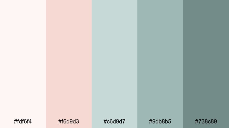
- HEX Codes: #fdf6f4, #f6d9d3, #c6d9d7, #9db8b5, #738c89
- Mood: Soft, hopeful, and romantic like sunrise pastel light on water.
- Use for: Ideal for morning routines, lifestyle vlogs, and gentle channel branding.
Pastel Pier Morning combines blush tones with cool Gray Turquoise for a dreamy, sunrise-inspired palette. It feels optimistic and gentle, ideal for self-care routines, lifestyle intros, and cozy daily vlogs.
Let the pinkish hues carry emotional warmth, while Gray Turquoise keeps things fresh and modern. In Filmora, use this combo for overlay shapes, animated titles, and simple frames around your footage to create a cohesive pastel brand look.
Faded Aqua Polaroid
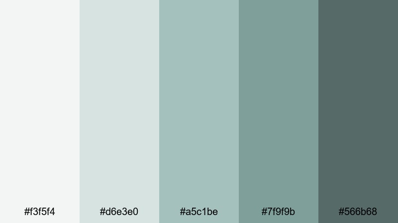
- HEX Codes: #f3f5f4, #d6e3e0, #a5c1be, #7f9f9b, #566b68
- Mood: Softly washed out and cinematic, like old instant film.
- Use for: Use for dreamy b-roll, montage sequences, and nostalgic vlog episodes.
Faded Aqua Polaroid gives you gentle aquas and Gray Turquoise with a slightly washed-out feel, reminiscent of old Polaroids. It is ideal for dreamy, reflective content that calls for a subtle retro mood.
Apply the lighter tones to your backgrounds and give titles or timestamps the deeper Gray Turquoise shades. Combined with Filmora's fade transitions and light film grain, this palette will make your montages and photo-based stories feel like treasured memories.
Bold & Cinematic Gray Turquoise Palettes
Storm Surge Spotlight

- HEX Codes: #e3edf0, #a5c4c5, #6d9496, #2f5556, #ffb15e
- Mood: Dramatic and energetic, mixing stormy seas with warm spotlight accents.
- Use for: Great for cinematic trailers, travel reels, and high-impact title cards.
Storm Surge Spotlight balances stormy Gray Turquoise shadows with a punchy amber highlight in #ffb15e. Think dramatic waves lit by a warm spotlight or sunset flare, perfect for punchy travel reels and trailer-style intros.
Use the amber sparingly on key words, subscribe CTAs, and important icons, while the Gray Turquoise base sets the cinematic tone. In Filmora, this palette is ideal for animated title sequences, bold lower-thirds, and impactful thumbnail designs.
Noir Harbor Titles

- HEX Codes: #dfe6e6, #9db7b4, #5f827f, #243738, #0c1415
- Mood: Dark, moody, and cinematic like a night harbor in a noir film.
- Use for: Perfect for thriller intros, moody b-roll, and dramatic title sequences.
Noir Harbor Titles dives into deep Gray Turquoise and near-black tones for a high-contrast, moody style. It feels like a rainy dock at night, with just enough light for silhouettes and bold typography.
Use the darkest shades (#243738, #0c1415) behind bright, minimal text for ultra-readable titles and credits. In Filmora, pair this palette with slow zooms, light leaks, or subtle film damage for thriller teasers, cinematic shorts, and dramatic brand reveals.
Midnight Teal Lensflare
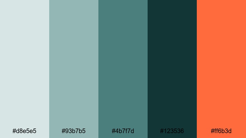
- HEX Codes: #d8e5e5, #93b7b5, #4b7f7d, #123536, #ff6b3d
- Mood: Intense and stylish with a glowing cinematic accent.
- Use for: Use for music videos, cinematic vlogs, and bold YouTube thumbnails.
Midnight Teal Lensflare layers rich Gray Turquoise and teal with a vivid orange flare in #ff6b3d. It feels like a stylized movie poster, with a strong color story and powerful focal points.
Use the orange accent for lens flare overlays, key text, or graphic markers on maps and timelines, while the Gray Turquoise base unifies your frames. In Filmora, this palette is excellent for bold music videos, cinematic vlogs, and thumbnails that need to stand out in a crowded feed.
Tips for Creating Gray Turquoise Color Palettes
Gray Turquoise is flexible enough to work with pastels, neutrals, and bold accents, as long as you control contrast and keep your branding consistent. Use these tips to build your own palettes and apply them smoothly in Filmora.
- Pair Gray Turquoise with soft neutrals (beige, off-white, warm gray) for calm, minimalist branding that suits productivity and wellness channels.
- Add a single warm accent color (coral, amber, orange) to a Gray Turquoise base when you need attention-grabbing CTAs or title highlights.
- Check text readability by testing white or near-white text over dark Gray Turquoise, and dark text over pale versions; adjust brightness or add subtle shadows in Filmora if needed.
- Use mid Gray Turquoise tones for overlays and lower-thirds so faces and important details in your footage stay clear and natural.
- Stay consistent: reuse the same 3 to 5 HEX codes across thumbnails, intro cards, and end screens so your channel feels cohesive at a glance.
- Match your color palette to your footage: if your video already has lots of teal water or blue-gray skies, pick Gray Turquoise tones that complement rather than fight the natural colors.
- For cinematic looks, push shadows slightly towards deep Gray Turquoise and keep highlights neutral or warm using Filmora's color wheels and curves.
- Export a still frame from your edit, then design your thumbnail using the same Gray Turquoise colors so the thumbnail and video feel like one unified story.
Gray Turquoise palettes are powerful tools for shaping mood, guiding attention, and building a recognizable visual identity. From soft, misty aesthetics to bold, cinematic contrasts, this color family can adapt to almost any niche, especially when combined thoughtfully with neutrals and warm accents.
Use the 15 palettes above as starting points for your thumbnails, intro screens, and color grades, then refine them inside Filmora to match your footage and storytelling style. With consistent Gray Turquoise combinations, your channel or brand will feel more intentional, polished, and memorable.
Open Filmora, drop in your clips, and begin experimenting with these HEX codes on titles, overlays, and color grading. Small, consistent color choices add up quickly, turning simple edits into cohesive, cinematic experiences.
secure downloadNext: Sea Blue Color Palette
